Understanding The Difference Between Type And Lettering
Coming out of the grunge, graffiti and David Carson era through the ‘90s, there has been a major resurgence of interest in typography. We have seen a number of designers and artists make their careers out of designing type or custom lettering, and it has become common to list typography among our skills and disciplines.
Unfortunately, as with any popularity surge, there have come with it a lot of misunderstandings of some of the terms and concepts that we use. This article will help you gain a clearer understanding of what typography is and isn’t, and why.
One rather common example of this is the myriad of blog posts and showcases claiming to display “hand-lettered typography” — I’ve even heard university professors say it. Though the phrase seems to make sense, it’s actually a contradiction in terms — hand-lettering is not typography at all! Before you throw your pens and brushes at me in protest, please let me explain!
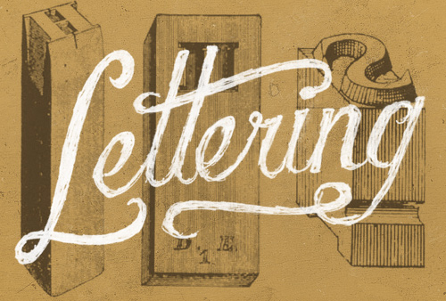
Even though lettering and typography share many of the same concepts, and a good eye and understanding of one will enable you in the other as well, they are completely different disciplines. Let’s begin by defining how we understand each term.
What Is “Typography”?
Typography is essentially the study of how letterforms interact on a surface, directly relating to how the type will be set when it eventually goes to press. One definition is stated as “the style, arrangement or appearance of typeset matter,” and is a product of the movable type printing system that much of the world has used for centuries. It is related to typesetting and can include type design. In our current digitally-driven design world, this means working with fonts on a daily basis for most of us.
Typography is actually a subset of lettering, because it is the study of letters applied to typefaces. Many designers have also taken up letterpress printing as a hobby or side interest, which also utilizes aspects of typography or typesetting, depending on the project.
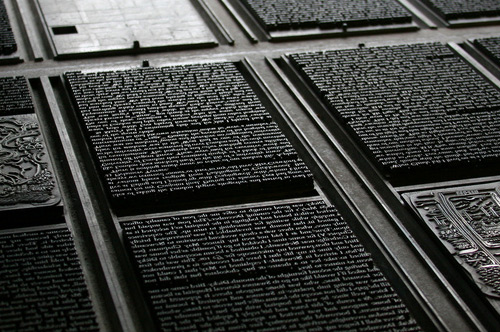
Gerrit Noordzij, professor of typeface design at the Royal Academy of Art in The Hague, Netherlands, from 1960 to 1990, defines typography as “writing with prefabricated characters.” Peter Bil’ak, founder of Typotheque, notes that this “implies a complete distinction from lettering, handwriting or graffiti, which are also concerned with creating letter-shapes, but don’t offer a repeatable system of setting these letters.”
It is quite common for people to refer to lettering as typography, but you should always avoid doing so when speaking with a client. Typography might be used in a logo, but so might custom lettering. Your client may not know the difference, but you do, and it’s important to have an educated client. This requires that we speak to them using the right terms, and it makes things easier to understand for both you and your client.
In addition, as designers of any sort, we strive to maintain a high level of professionalism, and using terminology correctly is an important part of showing pride in our line of work and being confident that we can do it, not simply to get the job done, but to produce excellent work.
What Is “Lettering”?
Lettering can be simply defined as “the art of drawing letters”. A lot goes into making lettering look right, and that’s an entirely different topic, but the concept is very simple: a specific combination of letterforms crafted for a single use and purpose as opposed to using previously designed letters as components, as with typography. Often lettering is hand-drawn, with pens, graphite or brushes, although some people start their work directly in Adobe Illustrator. Engraving and similar arts are related to lettering.
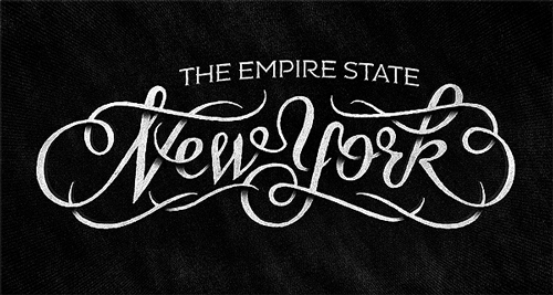
Just as typography is not lettering, lettering is not typography. Widely respected lettering artist Jessica Hische gave a talk on the subject at the FRONTEND 2011 conference, for those who “don’t understand the difference between lettering and type,” getting into the pertinent information with some concise definitions at around ¾ the way through the video.
Typography does indeed have similarities to lettering — it is still dealing with letters, but within the context of typefaces and their proper use. Therefore, it’s not a good idea to refer to typography as lettering, since they have different connotations and you don’t want to confuse your client by swapping terms. Again, accuracy in terms is an important element in any profession and design is no different.
Similarities And Differences
The visual concepts that are behind typography and lettering are largely shared by both disciplines. Letterspacing, consistent weight and contrast, the rules that we go by for what works and what doesn’t work, still apply. However, often the terms used are different. For space between two lines of text that are typeset, we use the term “leading,” referring to the strip of lead that printers would set between the lines of type to give more space. The same concept applied to lettering would simply be called “line spacing.”
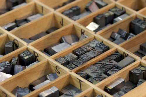
The space between letters is also an important concept, and lack of attention to it is responsible for much of the bad typography we see today. When working with type, we call adjusting the horizontal space between characters “kerning,” but this is a modernized understanding of the term. In typesetting, a kern is part of a glyph that extends beyond the type block on which the character is molded, e.g. the terminal of the “f” in the image below.
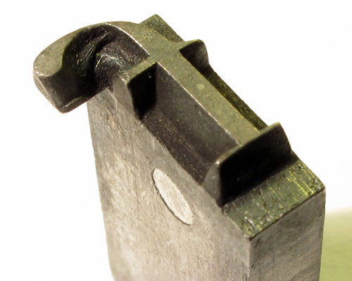
In lettering, however, avoid referring to this as kerning. Rather than saying that the “A” and the “V” could be kerned, we could say that the space between them could be tightened up.
Typography is used for endless applications, from titles to body text, some of which present a myriad of typographic considerations that those concerned with lettering will not have to think about. Lettering is almost exclusively used as display text — imagine lettering a few paragraphs of text by hand! Calligraphy is a much more likely to be used in longer passages of text. While calligraphy and lettering are once again related, there is a fundamental difference between the two that I’d like to point out.
Calligraphy is based on penmanship; it’s essentially “writing letters.” Lettering, on the other hand, is based on draftsmanship, i.e. “drawing letters.” Persevering calligraphers and scribes have famously done books as long as the Bible, which are incredible works of art in their own right (e.g. the Lindisfarne Gospels, the Book of Kells), but those were a lifetime endeavor, and for practical purposes we now use typefaces. Whew!
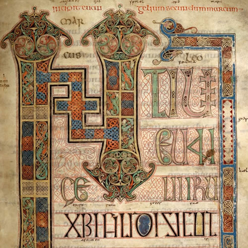
The differences, in the modern digital age, are sometimes theoretical, but the practical differences are huge — nobody wants to hand-letter 500 pages!
Some tenacious calligraphers, however, have undertaken monumental projects, such as the St. John’s Bible, a modern manuscript completely written and illuminated — a calligraphic term for embellishing — by hand. It took about 13 years, from commission to completion, using traditional techniques such as quill pens and manually-applied gold leaf, and cost an estimated $8 million. The incredible proportions of this project are a testament to the beauty of traditional techniques, but also a reflection on how printing and typography have changed the world.
Historically Speaking
The arts of both lettering and calligraphy have been around since time immemorial. Spoken languages quickly developed writing systems, which were then used to communicate through a more enduring medium than speech. Lettering and calligraphy evolved alongside each other, along with other letter-related arts such as engraving. We can follow the progression, from the Rosetta Stone and ancient Roman inscriptions to the works of scribal art mentioned above and more. History has provided us with endless examples of lettering and calligraphy, by engraving, pen and brush.
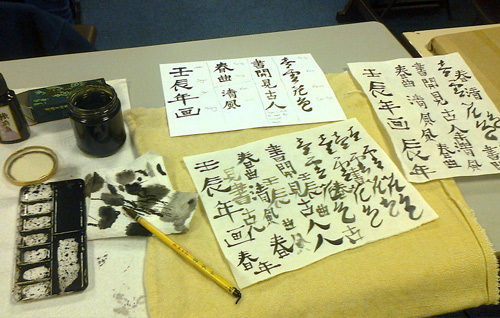
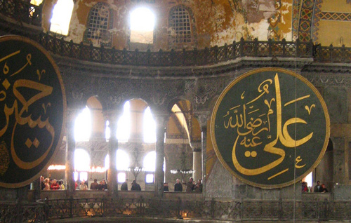
Although very few people could read, and writing was relegated to monasterial and royal scribes through the Middle Ages in Europe, we have some awe-inspiring work from that period. Unfortunately, we often overlook the beautiful calligraphy and lettering that was being done in Asia and the Middle East, where an education in the arts was much more accessible. Both lettering and calligraphy have thrived in the eastern hemisphere and continue to be a source of inspiration today.
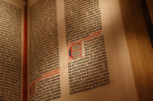
When Johannes Gutenberg built his printing press around 1439, the concept of typography, which had been developing slowly, was revolutionized. The moveable type system, metal alloy and casting methods gave the world a practical solution to printing. This gave rise to the discipline of typography as we know it, with kerning, leading and the terms we still use today. Each letter had its own type block on which it sat, and typesetters would arrange the type character by character.
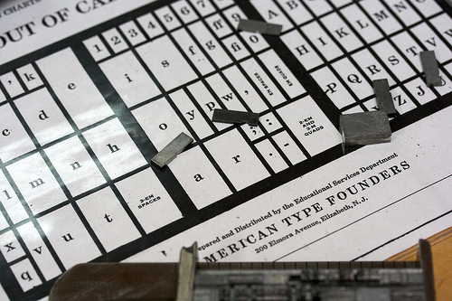
Typography was, and has continued to be, primarily the skill of setting type. It was a very time-consuming process, and people were constantly trying to find ways to streamline it and increase production rates. Standardized methods for arranging the glyphs so their positions could be memorized and picked up by the typographer without having to look were developed. This gave us our terms for upper case and lower case characters, because an upper case, or drawer, typically contained the capitals and the lower type-case the minuscules, before the California Job Case, popular in the United States in the 19th century, combined both levels into one larger case.
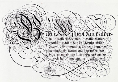
Leaving typography at this point in its development, I’ll follow the progression of lettering and calligraphy. During this period of experimentation with printing, calligraphy still played a huge role in communication, and the educated would write in a hand that amazes us today as to the beauty and accuracy of their manuscripts. Swashes, ascenders and descenders wove themselves into amazing patterns and borders, sometimes all but obscuring the text itself.
Lettering and calligraphy followed cultural trends, leaving the Rococo era and becoming more sober during the early 19th century, only to flower into ornament once again through the Victorian era and the florid shapes of Art Nouveau. The worlds of type and lettering constantly intermeshed. Many people, such as Oswald Cooper, achieved respect for their lettering and were hired by type foundries to design new typefaces.
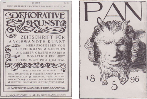
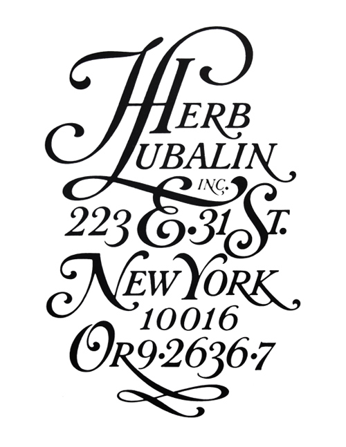
Lettering figured strongly through Art Deco and Modernism, for posters and ads, logotypes and book covers. The relatively recent art of film titles also provides us with a wide range of illustrative lettering styles from the 20th century. Coming out of the Modern era and through the latter half of the 20th century lettering went through a variety of permutations — the organic styles of the 70’s, the new modernism of the 80’s, and the grungy 90’s styles aforementioned — bringing us to our modern lettering scene, with a smorgasbord of visual references to every period of history imaginable. Designers such as Herb Lubalin and Doyald Young, the metaphorical giants of lettering, have left a huge legacy from this time period.
Here I will step back in time to pick the thread of typography back up. The development of techniques continued through the 19th century, and printing played an important role in world history, such as Benjamin Franklin’s publications and Thomas Paine’s printed materials — The Rights Of Man, Age Of Reason, et al — that were instrumental in the American Revolution.
Meanwhile, after many inventors had tried and failed to create a practical typesetting machine, Ottmar Mergenthaler succeeded in building the linotype machine in 1884, which revolutionized the newspaper industry. I won’t say more about it here, but if you’re interested in the history of typography, I would highly recommend taking a look at the documentary Linotype: The Film. This is not a sponsored statement, I simply enjoyed the documentary immensely and you may want to check it out!
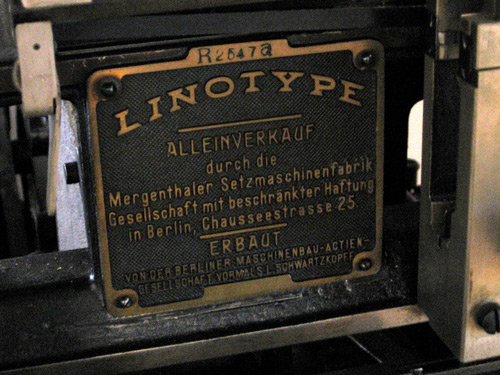
The linotype was just one of the machines used to expedite the typesetting and printing processes, and although some people still hand-set type, the industry as a whole was continuously changing to introduce faster and better techniques. Typography was explored in the various art movements, from Dada to Modernism and beyond, rethinking ways in which type could be used and given expression and meaning. As typography, experimental and traditional, progressed, the techniques segued to phototypesetting and from thence to the digital age in which we find ourselves today. Typography as a discipline looks very different than it did 50 years ago. Instead of setting metal type and locking in forms, we use panels in Illustrator or InDesign to kern, add leading and align our type.
Lettering has also moved into the digital format in which we enact most of our design work. Many artists, however, stay true to analog media by hand-drawing lettering.
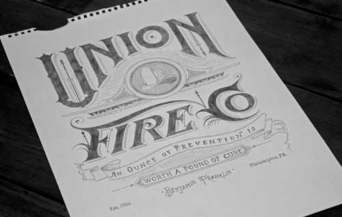
The digital amalgamation has been largely responsible for the confusion of lettering and typography, since they are now often created using the same programs — the difference between the two is no longer the difference between a brush and a letterpress machine, or a drafting table and linotype matrices. However, lettering and typography are still different concepts, and understanding them and their similarities and differences will help us become better designers.
Getting Started On Your Own Hand-Lettering
For those looking to begin creating hand-lettering of their own, it can feel a bit daunting. The letterforms that we see so often prove very difficult to draw freehand. Thankfully, there are a lot of tips and tricks you can use to familiarize yourself with the process and learn how to create pleasing compositions.
Tracing
Get some tracing paper, and print out samples of well-known typefaces. Trace them over a few times, letting your hand become used to the lines that type designers have carefully worked over and revised until they were perfect. Some good ones to start with are time-honored classics such as Garamond and Caslon, or exceptional recent works such as Okay Type’s Harriet. Avoid using free fonts, since they are often poorly crafted and wouldn’t provide a good model. This allows you to train your eye and hand using the work of masters.
Reading
Read voraciously! I’ve listed a number of resources at the end of the article for you to check out — books, blogs and other resources. Knowledge is power, and understanding principles behind type design and letterforms help you develop your eye.
Photo Safari
If you live near a town with a historic district or old buildings, make a point to spend a few hours on a weekend just walking around and finding samples of good typography and lettering. You can find great examples in outdoor signage, whether lighted signs, painted or vinyl. Often there are huge letters painted on brick walls at old factories or restaurants. Then, use your photos as models to draw historic styles of lettering.
Use a Grid, but Don’t Use a Grid
When lettering, you’ll find that perfect measurements often don’t actually look “right.” Draw lines to help yourself keep a consistent stress and even weight throughout your lettering, but trust your eye rather than the grid if something doesn’t look quite correct. This is particularly true if you’re doing something with a curved baseline. Remember, you’re making this to be seen, not measured, so perception trumps geometric perfection.
Resources
Here are a few resources that I have found to be particularly helpful, concerning both lettering and typography.
Books
- Dangerous Curves, Doyald Young This volume showcases some of the best work over Young’s illustrious lettering career, including rejected logotype options and in-process sketches.
- Scripts, Steven Heller and Louise Fili From two of our contemporary design landscape’s most respected proponents of lettering and type comes a “veritable festival of rare and unknown scripts.”
- Typography Sketchbooks, Steven Heller and Lita Talarico Heller teams up with Talarico to present a look inside the minds and processes of more than 100 esteemed letter-lovers.
- Designing Type, Karen Cheng Cheng walks us through a semantic look at the rationale and aesthetics behind the typefaces we see and use regularly, replete with diagrams and illustrations.
Websites
- Typeverything A tumblog of lettering and typography, curated by some of the most respected current lettering artists.
- Calligraphica Another Tumblr website showcasing calligraphy of all styles and languages, again curated by amazing calligraphers and letterers, including some of those involved in Typeverything.
- I Love Typography In-depth blog posts about type history and lettering, interviews with type designers, updates on upcoming type-related publications — ILT provides a good read for serious letter lovers.
- We Love Typography Compiled by typographers and designers of all sorts, another showcase of type and lettering with styles for everyone.
- Beautiful Type This site isn’t updated terribly often, but whatever and whenever they do post, it’s inspiring!
Portfolios
Here are a few portfolios from great lettering artists that have inspired many:
In Summary
Hopefully this dissertation on lettering and typography has enhanced your knowledge of design and will further equip you to improve your skills. Lettering and typography, so similar yet so diverse, are a huge part of design and thus deserve our full understanding.
Further Reading
- Beautiful Handwriting, Lettering and Calligraphy
- The Art Of Hand Lettering
- Respect Thy Typography
- The Perfect Paragraph


 SurveyJS: White-Label Survey Solution for Your JS App


 Agent Ready is the new Headless

