A Definitive Guide To The Android Carousel Design Pattern
One of the best patterns for browsing a small collection of featured products is the carousel. Unfortunately, many mobile app implementations do not offer an engaging or satisfying carousel experience and are not effective at driving conversions.
In this article, we’ll use the analogy of a real-world amusement park carousel to explain what makes for an authentically mobile user experience, and we’ll give you the design, the complete source code and a downloadable mini-app, which you can use today to add an enjoyable and effective carousel to your own app on phones and tablets.
How It Works
The carousel is fairly simple. The customer is able to view several images of products across a row, and they can swipe horizontally across the row to navigate to the next set of products. An arrow indicating the direction of the carousel’s movement is usually provided as a clue to how to interact with it. Optionally, the next set of products in the queue may be partially hidden, creating what we call the “teaser,” indicating that more content will be visible by swiping.
Example
One excellent example of this pattern is the Amazon app’s home screen.
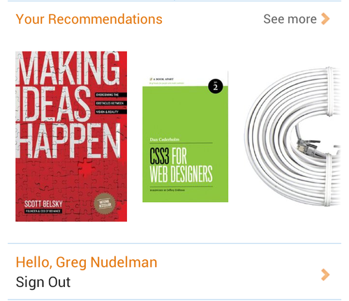
The carousel on the home screen of Amazon’s app is excellent. Larger preview.
This implementation of the carousel uses the teaser method to hint at the required interaction, showing only a small tantalizing glimpse of the naked CAT5E Ethernet cable, which is (and I have this from most reliable sources) completely irresistible to Amazon’s more impressionable customers, who can’t help but swipe across to see more of the naked cable and get to more of the content.
When And Where To Use It
The carousel is a fantastic pattern to show off featured items and relevant new arrivals. For example, new items matching the customer’s last search in their local area would be a sure winner.
In fact, consider using a carousel any time you have a small set of products (8 to 20 items) that are easily recognizable from just their picture. Augmenting the mostly visual content with a small amount of overlaid text is also sometimes effective. For example, in the screenshot below of the Pulse app on a 7-inch Android tablet, the carousel’s visual content is augmented with a semi-transparent dark-gray overlay, which provides the date and name of the comic. Without this overlay, the thumbnails of the carousel, especially in the first row, could be easily misinterpreted as belonging to a single comic.
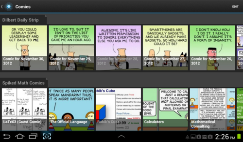
The visual carousel content with semi-transparent overlay helps with comprehension in the Pulse app. Larger preview.
I am a huge fan of semi-transparent layers in mobile design. This example is particularly effective because the overlay on the thumbnails is semi-transparent and thus does not interfere with viewing the thumbnails, all the while augmenting the carousel experience in a way that is both visually appealing and informative. (Well, it does interfere just a bit, but it keeps interference down to a minimum while making best use of the small screen space.) The example also demonstrates that a carousel is an exceptionally great pattern for the large swiping gestures that small and large tablets invite.
Why Use It?
The carousel is an attractive and still fairly underused control for presenting visual information. It takes full advantage of the multi-touch gesture of swiping available on a mobile device. The carousel is easy and intuitive to operate and takes full advantage of the compressed real estate on mobile devices, where few words are needed to support the content.
Other Applications
One of the best features of a carousel is that it works well for a wide variety of device sizes and screen resolutions. This includes the ever-tricky horizontal orientation, for which the carousel works even better than in the vertical orientation.
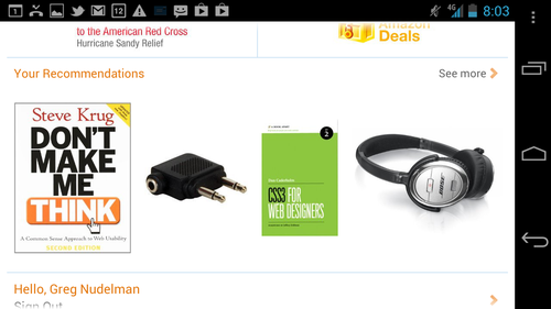
The carousel adjusts to various screen sizes, and it works even better in a horizontal orientation. Pictured here is Amazon’s app. Larger preview.
Whereas the usefulness of traditional search results is severely hindered by the lack of vertical space, a well-designed carousel shines by showing off even more inventory.
Also noteworthy is the presence of the “See all” link, which points to the featured products.
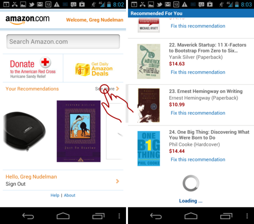
The “More like this” link in this carousel navigates to a list of search results. Larger preview.
A “More” link is an excellent idea if your carousel has a small subset of items (8 to 20) that fails to meet the customer’s desires but piques their interest. In this case, the entire carousel control serves as advertising of sorts, enticing the customer to explore the relevant area of Amazon’s massive inventory.
Caution
As with any pattern, many implementations of the carousel do not feel quite right. One instance is NewEgg’s “Shell shocker” carousel:
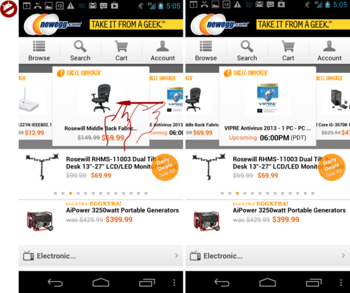
NewEgg’s carousel has a few issues. Larger preview.
Some recommendations based on the UX problems in NewEgg’s implementation might help.
Make The Scrolling Smooth
To begin with, NewEgg’s carousel is structured more like the iTunes cover flow feature on iOS, with a large central element and two partial elements on the periphery of either side.

The cover flow screen in iTunes on iOS emphasizes the central element. Larger preview.
Like Amazon’s carousel, NewEgg’s can be swiped faster to advance more quickly through the list of products. However, NewEgg’s carousel moves very jerkily because of the structure of the central element, making it hard to see the intermediate states while scrolling — a major disadvantage. Seeing the two peripheral elements change is particularly hard — things hop all over the place, instead of smoothly swimming by the way they do in Amazon’s app. Higher-end and traditional carousels accelerate and decelerate smoothly and provide a pleasant, mellow, smooth ride. A carousel should be a high-end visual viewing experience that induces calm in the user, not stress. All parts of the control, including transitions, should behave accordingly and work together smoothly.
Indicate The Scrolling Direction
NewEgg’s carousel appears to be scrollable in both the left and right directions, causing a confusion: Is this carousel meant to represent a circle? Have I seen everything already, or do I need to keep scrolling? Amazon uses Android 4.0’s standard “blue parallax” visual treatment to signal the end of the line, a much better approach.
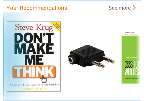
Amazon uses Android 4.0’s standard “blue parallax” to signal the boundaries of the carousel ride. Larger preview.
Just as a real carousel has papier-mâché horses that point you unambiguously in the right direction (you wouldn’t sit backwards on a horse now, would you?), so must your own carousel show which way the ride goes.
End The Ride Quickly
Good carousel implementations indicate the end of the list with the same parallax treatment seen at the beginning, and they present only 8 to 20 items, after which the ride is over and the customer can get off the carousel. Most importantly, the customer needs to exit the ride with the feeling of still wanting more. By contrast, NewEgg’s carousel seems to go on forever, so the customer does not get off until they feel bored (or, more likely given the jerky transitions, weak in the stomach). A much better approach would be to accompany the last element in the carousel with an obvious built-in “More like this” link, as shown below.
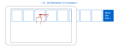
Show a “More like this” tile at the end of the carousel. Larger preview.
A “More like this” link can be used to jump into search results, which are more efficient for scanning large quantities of data and which are more likely to be relevant because of the sheer volume of items. Think of the “More” link as a premium combo ticket that grants admission to all of the remaining delights at the amusement park, conveniently presented after the cheap introductory carousel ride is over. Kind of puts a different spin on the entire carousel pattern, doesn’t it?
Make Sure Your Horses Look Amazing
No matter how smooth the ride is or how far or how fast the carousel goes, the best carousels have the best-looking horses, period. Make sure your horses (i.e. thumbnails) tell the story you want your audience to be told. For example, Amazon’s thumbnails are much better looking than NewEgg’s, although sometimes even the e-commerce giant screws up the ride, dropping thumbnails entirely:
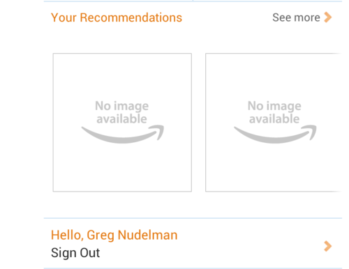
Amazon’s carousel sometimes misses thumbnails. Large preview.
It goes without saying that ghost horses make for a terrible ride, even on Halloween (unless you’re the Headless Horseman). Which brings up my next point: some products are just not that visual, making them poor candidates for inclusion in a carousel. A classic example from my first book, Designing Search: UX Strategies for Ecommerce Success (Wiley 2011), is coffee — Peet’s Coffee to be exact. Even though Berkeley, California-based Peet’s makes some of the world’s most divine premium coffee, all of the thumbnails are identical pictures of a generic coffee bag and some spilled beans.
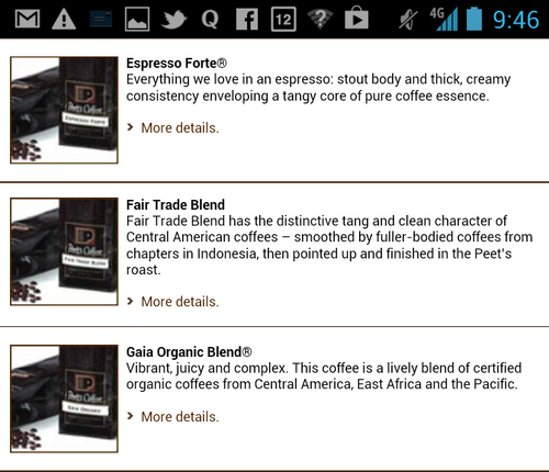
Some thumbnails, like these coffee bags from Peet’s, are not good candidates for the carousel pattern. Large preview.
Carousels are way more fun when the horses are all different; likewise, these generic bean-bag thumbnails are not good candidates for inclusion in a carousel pattern. A much more interesting horse would have been a close-up photo of a bean variety, or a map of a coffee-growing region, or a Tufte-style diagram of coffee taste attributes such as acidity, earthiness and body.
Even for products that have good thumbnails, presenting enough information can be a challenge. Including the right text in the individual tile is especially important for information scent; this could include key specifications such as processor speed, hard drive capacity and so on for the kind of technical gadgets sold by NewEgg. Picking an image resolution that can handle the amount of detail you are trying to show is also key. For example, can you tell what the item below is by looking at the small thumbnail and truncated description?
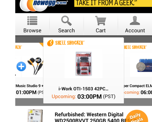
A small thumbnail and overly short description lead to “pogo-sticking.” Large preview.
Only by drilling down into the item do we see that it’s actually a screwdriver set. A larger thumbnail and better description would have helped a great deal and reduced the “pogo-sticking” (i.e. the frustrating navigation back and forth between carousel control and details page), which ruins the entire ride.
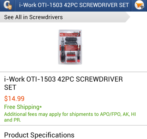
Having to pogo-stick between the carousel and details page ruins the ride. Large preview.
If the picture tells only half the story and you have to include a great deal of text, then you might find yourself having to increase the size of the individual element to the point that the carousel is no longer the best choice of presentation. For such items, think twice about whether you even really need a carousel, and whether a simple vertical list (more akin to a themed roller coaster) would make for a better experience.
Code
Carousel code can be fairly straightforward. One way to implement an ultra-simple demo using Java is shown below. Plugging cute pictures of puppies into the carousel, you should end up with a mini-app that looks something like this:
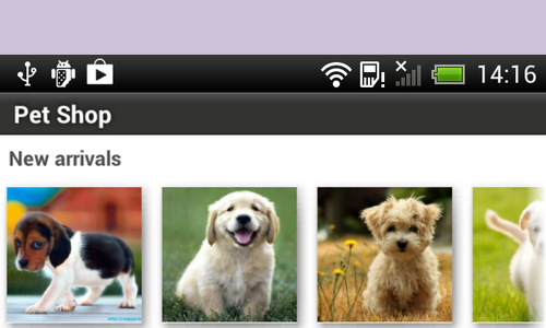
Mini-app with a puppy carousel. Large preview.
First, we define how many items to show, and compute the width of the carousel item based on the screen’s width. (You may need to use more sophisticated code that computes a dynamic INTIAL_ITEMS_COUNT if you’d like to accommodate longer carousels for tablet devices.)
/**
* Define the number of items visible when the carousel is first shown.
*/
private static final float INITIAL_ITEMS_COUNT = 3.5F;

// Compute the width of a carousel item based on the screen width and number of initial items.
final DisplayMetrics displayMetrics = new DisplayMetrics();
getWindowManager().getDefaultDisplay().getMetrics(displayMetrics);
final int imageWidth = (int) (displayMetrics.widthPixels / INITIAL_ITEMS_COUNT);
Next, for the purposes of this demo, we will create a static array of pictures. In a real app, this list would come from a database, of course.
// Get the array of puppy resources
final TypedArray puppyResourcesTypedArray = getResources().obtainTypedArray(R.array.puppies_array);
Then, we simply populate the carousel with items in the array and display it by overriding the onPostCreate() function. While onPostCreate() is mostly intended for framework use (according to the documentation), we can use it for this simple demo to simplify things a bit.
// Populate the carousel with items
ImageView imageItem;
for (int i = 0 ; i < puppyResourcesTypedArray.length() ; ++i) {
// Create new ImageView
imageItem = new ImageView(this);

// Set the shadow background
imageItem.setBackgroundResource(R.drawable.shadow);

// Set the image view resource
imageItem.setImageResource(puppyResourcesTypedArray.getResourceId(i, -1));

// Set the size of the image view to the previously computed value
imageItem.setLayoutParams(new LinearLayout.LayoutParams(imageWidth, imageWidth));

/// Add image view to the carousel container
mCarouselContainer.addView(imageItem);
}
This code is provided free of charge and distributed under the GNU General Public License v3. See the README_LICENSE file for details. Download the complete source code for the app.
Try It Out
If you want to see how the carousel app runs, the completed puppy carousel mini-app is available for you to download and try out. To install it, I recommend using an app installer (I use the one made by FunTrigger, which you can get free from the Play market).
Here’s how it works. Connect your Android device to your computer. You should see the Android file-transfer window open automatically. Download the APK source file (download the entire package), and place it in the “App Installer” directory (you may have to create it).
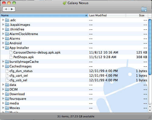
Place the APK file in Android’s file-transfer window. Large preview.
Now you will be able to launch the app installer on your device, navigate to the right directory, and tap the icon for the APK file that you want to install.
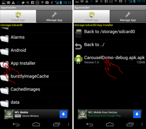
Use the app launcher to install the app. Large preview.
After a few customary Android disclaimers, the app will be installed in the normal apps area on your device, and you can launch it from there.
Conclusion
The carousel pattern is a microcosm of mobile design: deceptively simple. It is also a somewhat new Android pattern, and pitfalls abound. Nevertheless, if you take the time to get it right, the carousel is a fantastic pattern for showing off featured items and relevant new arrivals, as well any items that are highly visual. It dovetails perfectly with the local context by showing new items that match the customer’s last search in their local area. Finally, with the right implementation of the carousel, you will be supporting touch gestures on today’s Android devices to the fullest extent, fitting more products on the screen and making them accessible with a natural swiping gesture.
When designing your carousel control, think of it as you would its real-world namesake, the carnival ride. Make sure your horses look amazing; indicate the scrolling direction; make the scrolling smooth; and end the ride quickly, providing an exit to more of your inventory. We’ve provided you with the Java code and a demo implementation of the carousel pattern, so now you have no excuse not to try it!
Further Reading
- C-Swipe: A Solution To Navigation Fragmentation On Android
- An Exploration Of Carousel Usage On Mobile E-Commerce Websites
- Dropbox’s Carousel Design Deconstructed
- How To Design For Android Tablets


 Get a Free Trial
 Try if for free!
 Register for free today!


