How To Design Outstanding Feedback Loops
The products we build are full of feedback loops, whether we know it or not. People who study human behavior agree that feedback loops play a critical role in what we do. From biofeedback to the quantified self, designers and psychologists alike are discovering the real power that these cyclical interactions play in shaping our day-to-day choices. Designing for behavior change can increase user engagement, create business value and improve lives.
Whatever you’re designing, it probably involves feedback. Designing that feedback to be as effective as possible can mean the difference between a successful and failed product. This article discusses how to influence behavior by designing well-crafted feedback loops.
What They Are, And Where They Live
Feedback loops consist of a few simple steps:
- A person takes an action,
- The action has one or more effects,
- The important effects of this action are presented back to the person,
- This loop is repeated regularly.
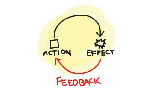
There are many natural feedback loops. They reveal to people whether they are making good or bad choices, and people learn from them. If someone eats something bad, they get sick. If they eat something good, it is delicious. If a person is nice to someone, and that someone responds in kind, the person feels good. If someone damages their body, it hurts. The brain has systems of reward and punishment that support basic survival.
There are now many man-made examples of these as well. People take tests on their knowledge and receive a grade. They post a status update to Facebook and get rewarded when people like or comment on it. “Post more stuff like this,” the feedback seems to say.
So, let’s dive into improving our own feedback loops!
Discover Your Product’s Basic Feedback Loops
The first step is to identify your product’s feedback loops. What are the fundamental repeated behaviors that your users engage in?
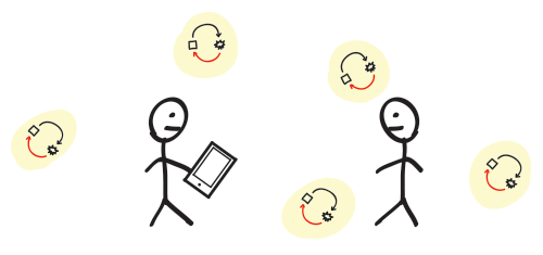
Many social apps share the following basic loop: a user posts something, people see it, people click a button to “like” it, and the likes are presented back to the user. Email has a strong, simple loop: log in, see new emails, deal with the emails.
But they can also be harder to see. Yelp has built great feedback loops around local reviews. A restaurant provides food and services, and better services lead to better reviews. Meanwhile, customers dine in and leave reviews, which themselves are reviewed in turn by other people (see those “Useful,” “Funny” and “Cool” buttons). Some people who leave enough reviews can get invited to special parties and more (“Yelp Elites”). These loops are purposefully designed: they drive people to engage with the website and to contribute content that is valuable to Yelp’s business.

Look for patterns of repeated behavior, and list the ones you find. These behaviors could span time, digital and physical space, channels of communication, and even different people. Look closely at user actions that trigger a notification sent to them or others. Investigate places where users communicate with each other or with employees, either directly or indirectly. These areas are fertile ground for feedback loops, and you should be able to draw up a robust list without much effort.
Understand How These Loops Are Broken, And Fix Them
Now that you have a list of areas that can be improved, identify the most important or common ones in your product. They can be improved in any one of these aspects:
- Speed,
- Measurability,
- Context,
- Connection to motivations.
1. Speed
"It’s too slow!"
Problem: The longer it takes for feedback to arrive, the less it will influence future decisions.
In operant conditioning, this is called “immediacy,” and it’s also related to “hyperbolic discounting.”
For example, when the user of a financial website makes an investment, seeing the outcomes of that investment could take years. Without any simulation of what their investment’s growth might look like, they have little emotional material to support that decision.

Solution: Tighten the feedback loop by presenting effects as soon as possible. This could entail revealing real effects, or simply simulating them. As long as they’re grounded in reality, they will have influence. Even presenting simulated feedback right before someone makes a decision is effective. Knowing that an investment will likely earn them $1,000 will help the user feel good about making that decision.
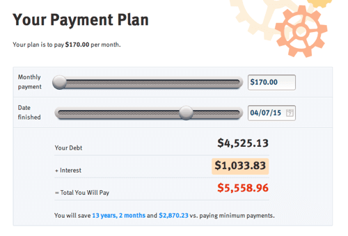
On ReadyForZero, our tool to help people organize and pay off debt, we enable the user to simulate the impact of different payment plans in real time, instantly revealing an outcome that could happen years from now.
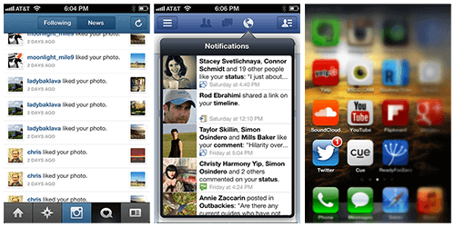
Smartphone push notifications have also gone a long way to giving immediate feedback. Posting something to Instagram, Facebook, Twitter and so on and then hearing one’s phone buzz with social feedback within minutes is a powerful loop. Always be sure to use push notifications when appropriate.
Credit cards provide a physical example of how delayed feedback can make for a dark pattern that drives harmful behavior. These cards have made banks huge amounts of money by alleviating a painful loop: pulling out your wallet and handing over your hard-earned cash. The more cash you spend, the more it disappears from your wallet. Soon, you are forced to go to the bank to get more, making you physically see and feel the effects of spending. Credit cards effectively delay the feedback on how much you spend until you bother to check the balance or are sent a bill at the end of the month. Even then, you have the option of delaying payment of the full balance (accruing interest in the meantime). This makes sliding into debt very easy.
2. Measurability
"How does it compare?"
Problem: Comparing vague, unquantifiable feedback to other factors in order to make an informed decision is too difficult.
Take nutrition, a notoriously vague problem space for feedback. How do people know whether they’re eating well? If they’ve heard that the thing they’re eating is unhealthy, how unhealthy is it? If the feedback is presented in some quantifiable way that relates to reality, it will be easier to understand and the person’s decisions will be more informed. Nutrition labels have made the effects of food more measurable. Now, someone can actually quantify the benefit of eating an apple, and the problem with eating a pile of bacon.

Solution: As nutrition labels have done for food, give quantifiable feedback to users. Use visual comparisons as well, when possible. The human brain is great with tangible comparisons between the sizes, locations and other variables of objects. Read up on the framing effect as well as anchoring for more on the psychological reasons for why this works.
Klout is attempting to make social influence measurable with its Klout score. It demonstrates the power of making things measurable, enabling users to objectively compare the online social influence of different people. It also highlights the risks of creating metrics where there were none before. The Klout score is interesting, but it’s based on a limited set of social signals, such as followers, likes, replies, retweets and comments. Metrics must be believable and must accurately reflect reality, a hard thing to accomplish with social influence.
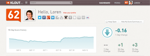
A lesson we’ve learned about measurability at ReadyForZero is to use numbers that are at a scale that people deal with in real life, typically up to 100. Telling a user that their debt will cost them $150,000 in interest means almost nothing to them other than “a lot of money” and isn’t that useful. Instead, we focus on how much someone’s debt costs them in interest every day, because this number tends to be in the $1 to $30 range and is comparable to many things they purchase daily, such as coffee and meals. Feeling good about their progress has helped our users significantly.
3. Context
"What does it mean?"
Problem: Feedback presented without the context of a larger goal isn’t as effective.
Saving some extra money can make someone feel good. But saving towards a goal is more meaningful. “This deposit of $500 has put me one third of the way towards my vacation.” Providing context for the feedback not only creates a signpost by which to measure progress, but actually frames the way people think about a problem. For example, “You’ve spent $1,200 this week” is a very different way to frame one’s finances than “You’ve spent $1,200 of your budgeted $700 this week,” even though they represent the same data.

Solution: Frame effects in the context of user goals. How much closer to or further from a goal has this action taken the user? On ReadyForZero, we show the amount of time and interest saved by making a big payment towards a debt, and the amount lost by buying things on a credit card.
This is a form of “anchoring.” By showing a desired goal, you’ve set the anchor by which the user can then evaluate their current situation. If they have not yet reached the goal, they’ll feel the tension of wanting to reach it.
The Nike+ Fuelband, along with many other quantified-self activity-tracking devices, explicitly creates feedback loops and goals around user behavior where there were none before. The user’s physical activity is tracked and reported throughout the day, compared to goals, and shared online. Note the strong use of progress bars, both on the watch and in the app, which communicate how close the user is to reaching their daily goal.

4. Motivations
"I don’t care."
Problem: Feedback that isn’t connected to the user’s true motivations doesn’t work sustainably.
“Gamified” feedback loops are able to make an impact, but points and badges that don’t connect to anything meaningful won’t last. People don’t care about points; they care about things such as health, happiness, friendship and wealth. Right now, which would you rather have: 30 Foursquare points, 30 likes on your next Facebook update, 30 extra minutes in your day or $30? The answers may vary, but I’ll bet the Foursquare points would be last on the list for everyone.
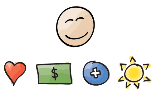
Solution: Discover what your users care about, give them the ability to reach those goals, and present feedback connected to that. Social rewards, such as comments on our thoughts and photos, connect to the need for human relationships. Feeling fit and looking great connects to the goal of being healthy. Money connects to the many things people spend it on.
On ReadyForZero, we help people pay down their debt by showing them a number of bits of important feedback. First, we tangibly show the progress that a potential payment would make towards their goal on a progress bar. The visual connection enhances the feeling of achievement. Secondly, we tell them the long-term implications of that payment in terms of interest and time saved.

Fully grasping what your users’ motivations are can be difficult. There are many theories about how motivation works, each with implications for design. A useful framework is the theory of self determination, which posits that people who have most of their basic needs met can begin to look for autonomy, relatedness and competence. The theory is that these motivations arise not from the outside world, but from inside, and are more powerful. Theory aside, however, the tried and true approach of speaking candidly and in depth with your users will reveal what they truly care about.
Two Things To Remember
With these categories in focus, you’re on your way to designing better feedback loops. However, keep two things in mind as you go.
1. Measure Your Success
Now that you’ve identified your areas for improvement and made changes to them based on our criteria, it’s important to measure the outcomes of these changes using analytics and user research. As stated, you can’t improve what you can’t measure.

Analytics and research are, in fact, your own internal feedback loop as a designer. Consider the key metrics to track and report, how often they are reported, and in what context. The design of this feedback loop will affect how you respond to user behavior, and it’s important that your team is optimizing for the right things.
2. Be Ethical
Finally, throughout the process, evaluate the ethics involved in each decision. The power of behavioral techniques should always inspire a discussion within your team as well as within yourself. Are you designing a health improvement app, a utility or a slot machine? Which of these is acceptable? Taking responsibility for influencing behavior requires a strong moral compass. Products that have taken the low road have been both successful and harmful.
Zynga has created a business model around extremely effective feedback loops, but the values informing many of these loops have been routinely criticized as being unethical. For example, Zynga uses progress bars, goals, levels and social pressures very effectively to monetize its signature game, Farmville. However, such games arguably succeed at the expense of the user’s time, cash and creativity. They focus on achieving business goals by manipulating user emotions.

Defining “fun” is beyond the scope of this article, but the clever timing of cash-based advances in gameplay is clearly designed for profit rather than for the player’s experience. Read about the fascinating Cow Clicker saga for an amusing critique of this model.
For a more rational approach to designing ethically, review Stephen Anderson’s guidelines, which take a deeper look at how to calibrate your moral compass.
In general, use the golden rule, and try to make the world a better place for everyone.
In Summary
Design can be used to nudge behavior, and great feedback loops are a vital piece of pulling it off. Assist your users in understanding and achieving their goals by continually optimizing your feedback loops. Focus on making them fast, meaningful, quantified and contextual, and your users will thank you for improving their lives.
Further Reading
- How Your Product Can Benefit From User Feedback
- Improving Reviews Using Science-Based Design
- A Guide To Validating Product Ideas With Quick Experiments
- How To Design Powerful Narratives On Mobile


 Register For Free
 Get a Free Trial
 JavaScript Form Builder — Create JSON-driven forms without coding.
 Enterprise UX Masterclass, with Marko Dugonjic


