We’re Gonna Need A Bigger API!
We’ve learned that users don’t want websites to look like a CSI console having a personal crisis; instead, we go for smooth transitions that enhance the experience, rather than being the experience themselves. In terms of animation APIs, we’ve been poorly catered to, leaving us to hack around with timers that weren’t really built for animation. Things have been steadily improving in that area, but the new Web Animation specification looks set to shake things up a lot.
So, why do we need a new animation spec? Don’t we have enough ways to animate things already?
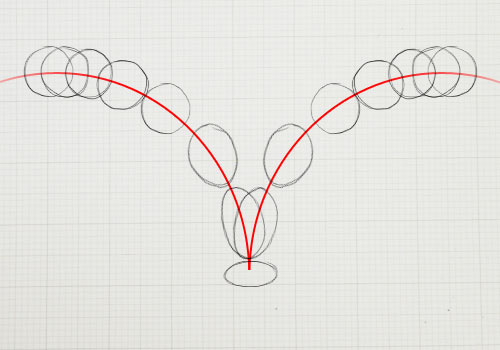
Optimizing the way to make things move. (Image source)
Let’s Animate A Thing!
Imagine we wanted to animate something horizontally from one left position to another, over three seconds, and then do something on completion. We can do this without JavaScript, using CSS animations, but if the start and end positions are programmatically determined, then we’ll need something that we can control from script.
Using requestAnimationFrame
If you’re performing visual updates with JavaScript, then you should be using requestAnimationFrame. It synchronizes itself to real screen updates, giving you as much time as possible to get everything ready for rendering. If the browser is on a 60 Hz screen (most are) and your frames can be constructed in less than a 60th of a second, then you’ll get 60 frames per second (FPS). requestAnimationFrame prevents you creating frames that don’t have time to display. Synchronizing to the screen’s rate is important; 30 FPS looks smoother than 40 FPS because 40 doesn’t divide into the screen’s native 60 Hz. HTML5 Rocks has a great article on syncing to the screen.
Unfortunately, jQuery uses setInterval, which isn’t as smooth as requestAnimationFrame. requestAnimationFrame doesn’t trigger while the tab or window isn’t visible, which is A Good Thing™. Unfortunately, this has created backwards incompatibility with websites that rely on setInterval’s less optimal behavior of continuing to run in the background. You can opt into requestAnimationFrame via a plugin. Go and add that to all of your pages using jQuery animation now — I promise to wait for you — just make sure that switching tabs doesn’t break your animations.
Anyway, enough chatting. Here’s a simple animation using raf, moving a box horizontally from 250px to 500px. Note that the box starts at 0px, so there’s a jump to 250px when the animation starts; this proves we can start the animation from a point other than its current rendered position.
Here’s the code:
// On button press…
animateLeft(elm, '250px', '500px', function() {
  console.log("Done!");
});

// The implementation
function animateLeft(elm, from, to, done) {
  // Turn our CSS values into numbers
  // We're being lazy and assuming they're in px
  from = parseInt(from, 10);
  to = parseInt(to, 10);
  // Work out the amount we need to move the box
  var diff = to - from;

  var duration = 3000;
  var startTime = performance.now();

  // Set initial position
  elm.style.transform = 'translate(' + from + 'px, 0)';

  function frame(time) {
    // How long has the animation been running?
    var animTime = time - startTime;
    // Are we done?
    if (animTime >= duration) {
      // It's likely that the last rendered position wasn't the
      // final position, so we set it here.
      elm.style.transform = 'translate(' + to + 'px, 0)';

      done();
    }
    else {
      // What position should the box be in?
      var position = from + (animTime / duration * diff);
      elm.style.transform = 'translate(' + position + 'px, 0)';
      // Request our next frame
      requestAnimationFrame(frame);
    }
  }
  // request our first frame
  requestAnimationFrame(frame);
}
The above is the ideal according-to-specification code. In the working example, I had to deal with vendor prefixes on requestAnimationFrame and transform. We’re animating using transform and translate, rather than left, because they allow for subpixel positioning and, therefore, smoother animation, one of the advantages that Flash had over HTML for so long.
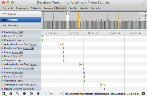
This is a pretty large and stinky chunk of code to simply animate a thing, and it would get a lot larger if we handled differing CSS units and easing. Of course, you could stick all of the complicated bits in a library and give yourself a simpler API. Here’s the frame-by-frame breakdown:
This is the timeline view of Chrome Developer Tools while the animation is running. Each frame executes some JavaScript, recalculates the style and layout, paints the box, and then sends that to the GPU, which composites it to the page. The draw time spikes a few times, resulting in a jolt in the animation. This is caused by delays in interacting with the GPU (the gray spikes) or delays caused by other JavaScript (the yellow spikes).
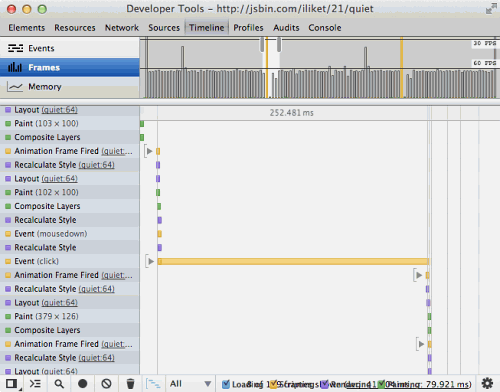
This highlights a performance bottleneck of JavaScript-driven animation:
Here, another bit of JavaScript does some stuff and takes 250 milliseconds to do it. While this is happening, our animation can’t move. In the real world, this could be a social-media button waking up and doing something slow, or it could be some of your own script triggered by a user interaction. In the example above, I made a button that performs a while loop for 250 milliseconds (I’m pretty sure this code is in every social-media button). If you press it during the animation, it will block the animation and look nasty.
I recently sung the praises of requestAnimationFrame for animating canvas, so why am I hatin’ on it now? JavaScript-driven animations aren’t a bad practice — they give you full control frame by frame and pixel by pixel when combined with <canvas> — but returning to JavaScript land 60 times a second is overkill for DOM animations that have a defined start and end. Ideally, we want to tell the browser all about our animation and leave it to do its thing, while we get on with something else.
Of course, we kinda have this already.
Using CSS Transitions
.whatever {
   transform: translate(250px, 0);
   transition: transform 3s linear;
}
.whatever:hover {
   transform: translate(500px, 0);
}
CSS transitions and animations let the browser make all kinds of optimizations because it knows the end point of the animation. They’re not blocked by JavaScript on some platforms, such as Chrome for Android and desktop Chrome with threaded compositing enabled in about:flags (expect threaded compositing to arrive in more browsers).
Let’s script it!
function animateLeft(elm, from, to, done) {
  // Set initial position
  elm.style.transform = 'translate(' + from + ', 0)';
  // Define the transition type
  elm.style.transition = 'all 3s linear';

  function transitionEnd(event) {
    // Beware of bubbled events
    if (event.target != elm) { return; }
    // Clear the transition
    elm.style.transition = ’;
    // We don't want that listener firing for future anims
    elm.removeEventListener('transitionend', transitionEnd);

    done();
  }

  // Listen for end of transition
  elm.addEventListener('transitionend', transitionEnd);
  // start the transition
  elm.style.transform = 'translate(' + to + ', 0)';
}
Here’s a live example. It’s much simpler than our raf example, but a bug has crept in. The from is ignored; the animation starts from the element’s current position, even though we’ve explicitly set it to something else. Why?
// Set initial position
elm.style.transform = 'translate(' + from + ', 0)';
// Define the transition type
elm.style.transition = 'all 3s linear';
// …and later…
// Start the transition
elm.style.transform = 'translate(' + to + ', 0)';
Changing properties in the style object doesn’t change the element’s computed style. The style is computed only when the browser needs to know the impact that those styles will have on the page (for example, when the element needs to be drawn). The element doesn’t need to be drawn between the two assignments to elm.style.transform, so the first assignment is ignored.
Of course, we can hack it:
// Set initial position
elm.style.transform = 'translate(' + from + ', 0)';
// Abracadabra!
elm.offsetWidth;
// Define the transition type
elm.style.transition = 'all 3s linear';
// …and later…
// start the transition
elm.style.transform = 'translate(' + to + ', 0)';
offsetWidth returns the rendered width of an element, including padding. To calculate this, the browser needs to take into account all of the styles on the page, including the transform that we set for the initial position. That works. Check out the live example.
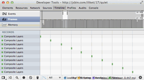
Performance is steady at 60 FPS. And we can see that each frame is a simple composite; all of the heavy lifting is farmed out to the GPU.
However, relying on offsetWidth to force the element into its starting position is hacky, and it’s conceivable that a future browser release will find a way to optimize out the reflow, breaking our hack.
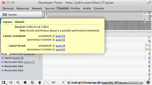
Reflows are not without cost either:
The Developer Tools warn us about this use of offsetWidth, because the browser calculates a layout that it never draws. The test page is very basic, so the layout cost is cheap, but things can be very different in the real world.
So, is there a less hacky, more reliable way?
Enter CSS Animations
CSS animations have explicit keyframe values. Let’s script them:
function animateLeft(elm, from, to, done) {
  // Create a style element for our animation
  var style = document.createElement('style');
  // Generate a unique name
  var animName = 'anim' + Date.now() + Math.floor(Math.random() * 10000);

  // Build the CSS
  style.textContent = ’ +
    '@keyframes ' + animName + ' { ' +
      'from { ' +
        'transform: translate(' + from + ', 0);' +
      '}' +
      'to {'
        'transform: translate(' + to + ', 0);' +
      '}' +
    '}';

  // Add it to the page
  document.head.appendChild(style);

  function transitionEnd(event) {
    // Beware of bubbled events
    if (event.target != elm) { return; }
    // Clear the animation
    elm.style.animation = ’;
    // Clean up the DOM
    document.head.removeChild(style);
    // Retain the final position
    elm.style.transform = 'translate(' + to + ', 0)';
    // We don't want that listener firing for future anims
    elm.removeEventListener('animationend', transitionEnd);

    done();
  }

  // Listen for end of transition
  elm.addEventListener('animationend', transitionEnd);

  // Start the animation
  elm.style.animation = animName + ' 3s linear forwards';
}
Ugh! All of that just to move a thing? It works, but all of that DOM work is heavy-handed for what we’re trying to achieve. Also, if an animation is cancelled halfway through (for example, if the animation style is changed), then animationend will not fire — meaning that our done callback won’t fire or, worse, it’ll fire at the end of some future unrelated animation. There is no animationcancel event.
Web Animations, Save Us From This Mess!
It’s early days for the Web Animations specification, but it’s pretty exciting. It brings a boatload of animation performance and synchronization features natively to the DOM that JavaScript libraries currently have to hack their way through.
The specification itself is kinda terrifying. My heart sank as I opened the page and watched the scrollbar get smaller and smaller. But, thankfully, most of it is implementation detail.
Here’s how we’d script our animation in the brave new world of Web Animation:
// Set our start position
elm.style.transform = 'translate(250px, 0)';
// Animate to the end position
var anim = elm.animate({
  transform: 'translate(500px, 0)'
}, 3);
// Do something on completion
anim.onend = function() {
  console.log('Done!');
};
Here, elm is an HTMLElement. The API is intuitive, especially if you’ve created animations with something like jQuery.
Like CSS animations and transitions, it gives the browser the full story up front, so we get all of the same optimizations without having to dynamically build CSS. Web Animations solves this by allowing us to tell the browser the full story of what we’re going to do. Then, the browser can go off and animate things itself.
Web Animations give us the scripting API to browser-driven animation that’s sorely missing. Above is the “Hello world” example. The specification includes advanced easing, path-based animation, parallelization, synchronization, interrupting and adapting, all in a way that the browser can take away from JavaScript land and optimize accordingly.
It’s still very early days, so don’t throw out your animation libraries yet. But if you want to experiment with the new API and provide feedback, a polyfill is tracking the rapidly evolving spec. Exciting times!
Further Reading
- The Guide To CSS Animation: Principles and Examples
- CSS3 Transitions: Thank God We Have A Specification!
- The State Of Animation 2014
- An Introduction To CSS3 Keyframe Animations


 Register Free Now
 SurveyJS: White-Label Survey Solution for Your JS App
 Celebrating 10 million developers
