How Much Has The Web Really Changed?
Responsive design is about more than just layout; it’s about designing for the Web, which means, mostly, for people with browsers. And that’s just about everything we know about the people who visit our websites: they are probably using a browser. All the rest, we just don’t know.
Up until not so long ago, we used to base our designs on some rather general assumptions about screen size and input type. With the rise of devices with various screen sizes and alternative ways to interact, these assumptions have turned out to be unreliable. We need to upgrade the defaults that we use when we start designing our websites.
Screen Sizes
In the 1990s, the Web was 640 pixels wide. In the early 2000s, it grew to 800 pixels. A few years later, we decided it should be 1024 pixels. But five years ago, all of a sudden, something strange happened. A device with a very small screen entered the market. Suddenly, our ideas about the size of the Web did not work anymore. Later on, tablets entered the market. People hold these things however they want. Today, the height of the viewport could be bigger than the width! But is that new? Not really.

We never really knew what size the window of our visitors would be. We just assumed it was at least the random pixel width that we felt comfortable with. These numbers were always arbitrary, and there were always people who could not see the entire website. We simply ignored them.
“Everyone Has A Mouse”
We’ve always assumed that everyone uses a mouse. Even though we knew that this was not always true, most designs completely ignored alternative ways of interacting. People who had to use a keyboard, for whatever reason, had a very hard time interacting with our websites.
But because most people did use a mouse, and because back then many designers thought that designing only for the majority was OK, we created websites that were unusable for a lot of people. And this turned out to be a growing number. Many mouseover interactions are completely dysfunctional on a touch device. Because people love these devices, and even managers and designers use them, they are harder to ignore.
“Everyone Has Broadband Internet”
Another thing we always assumed was that everyone had a super-fast Internet connection, at least as fast as our own. And if they didn’t already have it, they’d have it soon. This was again mostly true; speeds were increasing. But today, more and more people use crappy, unreliable 3G connections all the time. If you’ve ever travelled on a train in The Netherlands, you know what I mean. And if you’ve ever had to rely on the mythical “free hotel Wi-Fi,” then you know for sure that the assumption about the ever-increasing speed of our Internet connections is just not true. This is a big change in our thinking; we really should consider these users. This will have a major impact on what our designs look like.
“Everyone’s Computer Gets Faster Every Year”
It used to be true that computers would get faster and faster. If you waited half a year before buying a computer, you would get one that was twice as fast, for the same price. This was true of new desktop computers, but mobile devices have priorities other than processor speed. The most important thing for a phone, for instance, is battery life: you really don’t want to have to charge it after every phone call.
And there’s another trend: instead of creating ever-faster devices, many manufacturers are starting to sell ever-cheaper devices. Many people care about price and battery life more than about processor speed. This is also not new: what happened to your old computers? You probably sold them or gave them away. People keep using old stuff. Not everyone has the same hardware as we designers do.
“All Monitors Are Calibrated”
Well, we always knew this to be untrue, right? Only the monitors of visual professionals are calibrated. Most other monitors don’t display colors accurately, and many monitors are downright crappy. Most mobile phones that I’ve tested have pretty decent screens, until you start using them outside, in the sunshine. If you’re lucky, you can read the content, but you definitely cannot see the subtle gradients in low-contrast designs.
I haven’t even mentioned “modern” black and white screens. These, too, are not new. People have always used crappy monitors, and people with bad eyesight have always visited your websites. It’s just that more and more people are seeing a subpar color palette. Instead of buying a state of the art monitor, buying a cheap monitor and several low-end devices to test your work on might be a better investment.
All of these things are not new. In 2002, John Allsopp wrote the monumental article “A Dao of Web Design.” People such as Jeremy Keith and Roger Johansson have written about all of these facts for years and years. And yet, somehow, we’ve always managed to actively ignore them. But we really can’t anymore. The Web actually did change in the last five years, with new devices, new browsers and many, many cool new features. We need new defaults. The old ways of creating websites just don’t work anymore.

In the past few years, we’ve been actively researching new ways to deal with all of these different screen sizes. But apart from responsive design, there are many more challenges in today’s ever-growing pile of devices. We have to find new patterns of interaction: we need interfaces that work on any device. Maybe we have to reconsider that enormous photo carousel on the home page, now that we know that not everyone has a cheap and fast connection. New defaults are emerging, and I’ve collected a few for you here.
The things in this article are not new. Many clever people have written about them in many articles and many books. But these ideas, like all good stories, have to be repeated many times so that people understand and remember them.
New Default: Activate
I initially titled this section “New Default: Touch.” But I came to realize that “touch” has a different meaning for everyone. Some people, like me, think of a single tap when we hear the word. Others think about swiping and complex gestures. That’s why I settled on the heading “New Defaults: Activate.” All devices, no matter what kind of input they offer, let the user activate something in some way.
With a mouse, it’s a click; with a touch device, it’s a tap; on a keyboard, it’s the “Enter” key. There are ways to activate things by voice, and by waving your arms in the air. And many devices offer more than one way to interact. The only thing that all of these devices have in common is the action of activating. Most of them are capable of doing many other things, too, but all of them can activate stuff.
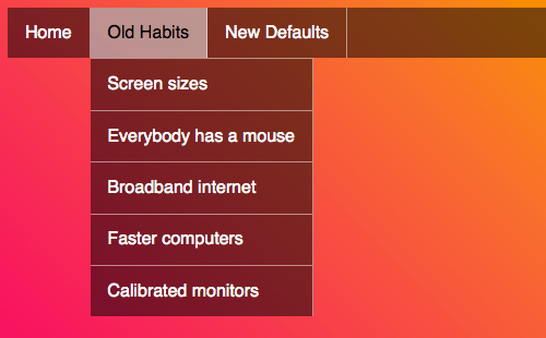
Only recently have we really started thinking about alternative methods of user input. We used to assume that everyone uses a mouse. Hiding content and showing it on mouseover was considered to be a decent design pattern. And it used to work for most people — until all of these wonderful touch devices entered the market. What should a device without a mouse do when content can be revealed only with a mouse? Different devices have different solutions. Let’s look at a simple drop-down menu.

When you hover over a menu item, a submenu appears. But apart from hovering over an item, you can also simply click on it to follow the link. Now, what should happen when you tap on the item with a touch device? Should the submenus appear, or should the link activate? Or both? Or should something else happen? On iOS, something else happens. The first time you tap a link like that, the submenu appears; in other words, the hover event fires. You have to tap a second time to actually follow the link. This is confusing, and not many people will tap a second time. On Android, the submenu appears and the link is followed simultaneously. I don’t have to explain to you that this is confusing.
It’s very well possible to think of complex solutions whereby you define different interactions for different input devices. But the better solution, I think, is to make sure that the default interaction, the activate event, just works for everybody. If you really need to, you could choose to enhance this default experience for certain users.
For instance, if you are certain that someone is using a mouse, you could enable some mouseover interactions. Or if you’re sure that someone has fat fingers, you could make small buttons a bit bigger. But only do so in addition to the default activate interaction, and only if there’s no doubt about it, and only if the enhancement would really make things better. Those are quite a few ifs, and some of them, such as the mouse usage, are very hard to detect — especially on devices that offer more than one way to interact, such as a laptop with an optional mouse, touch pad, camera, microphone, keyboard and touchscreen. Give it some serious thought. Do you really need to optimize for a mouse?
New Default: Small Screens
Growing is easy. Most things grow. Babies grow, trees grow, curious minds grow. They don’t grow by themselves, but you don’t need much energy to make things bigger. This is just what things do when they live. While shrinking things is definitely possible, it’s also much harder. You could, for instance, compress a car to a fraction of its original size. A compressed car does have a certain aesthetic appeal to it, but it is definitely not as useful as it was before. The same goes for websites. Shrinking a desktop website does not always result in a pleasant experience on a small screen.

To build a responsive website that works on all kinds of screens, designing for a small screen first is easiest. It forces you to focus on what’s really important: if it doesn’t fit in this small square, it is probably not terribly important. It forces you to think better about hierarchy, about the right order of components on the page.
The same principle that we follow for interactions — whereby we design the activate event first and enhance it later — applies to graphic design. We should start designing the things that we know everyone will see. That’s the content. No matter how big or small a screen is and no matter how minimal the feature set of a browser, it will be able to show letters. Because this is about the only thing we know for certain — since color is absent on most Kindles, most of the latest CSS doesn’t work on old browsers, and layout is of minor importance on small screens — starting with the text is logical.
I wrote an in-depth article about defining breakpoints on the basis of typography, so I won’t repeat every detail here. But the basic idea is that you start by designing the relationship between the different font sizes. Almost everyone, no matter what device they have, will be able to see this. When the typography is done, you would start designing the layout for bigger screens; you can think of this as an enhancement for people with bigger screens. And after that, when the different layouts are done, you could add the paint. And by paint, I mean color, gradients, borders, etc.
I’ve presented this as a very strict way of working; in real life, of course, things are not as rigid. I’m not talking about “activate only” or “small screen only.” When I say to start with typography, I don’t mean that you aren’t allowed to think about paint at the same time. Rather, I’m trying to find the things that all of these different devices, with all of their different screen sizes and all of their different features, have in common. It just seems logical to first design this shared core thoroughly. The strange thing is that this core is often overlooked: Web professionals tend to view their own creations with top-of-the-line devices with up-to-date browsers. They see only the enhancements. The shared core with the basic experience is often invisible.
New Default: Content
The way we designed our websites until recently was by putting a header with the logo and navigation at the top, putting the subnavigation on the left, putting some widgets on the right, and putting the footer at the bottom. When all of that was done, we’d cram the content into the little space that was left in the middle. All of the things we created first — the navigation, the widgets, the footer — they all helped the visitor to leave the page. But the visitor probably wanted to be there! That was weird. It was as if we were not so confident in our own content and tried our best to come up with something else that our guests might like.
But rather than pollute the page with all kinds of links to get people out of there, we should really focus on that thing in the middle. Make sure it works. Make sure it looks good. Make sure it’s readable. Make sure people will understand it and find it useful. Perhaps even delight them with it!
Once you’re done with the content, you can start to ask yourself whether this content needs a header. Or a logo. Or subnavigation. Does it need navigation at all? And does it really need all of those widgets? The answer to that last question is “No.” I’ve never understood what those widgets are for. I have never seen a useful widget. I have never seen a widget that’s better than white space.

By starting with the content first, you can come up with some very interesting solutions. For instance, does the logo really need to be at the top of every page? It could very well go in the footer on many websites; such as in digital style guides or on pages for registered users. Many links that we used to put in the subnavigation might work better in relevant spots in the main content.
For instance, the option to add extra luggage to a flight booking might be most effective right there in the overview of the flight, instead of in the middle of a list of links somewhere on the left of the page. And when looking at the hierarchy of a page, does the main navigation look more important than the main content? Most of the time it shouldn’t be, and I usually consider the navigation to be footer content. A simple “skip” link at the top of the page could either take the visitor to the navigation or fetch the navigation and show it at the top of the page.
In this era of responsive Web design, we need many new clever solutions. As we’ve seen here, our old defaults don’t work anymore. We need to reconsider how we work with interaction, how we approach design and how we shape our content. But we need to think about one other very important thing, and that is where our content comes from.
New Default: The API
Luke Wroblewski wrote a fantastic article about designing an application for the command line first, and then enhancing it for different needs. This is not just a nerdy idea, but a very practical idea, too. If you are able to design and develop your own application, you could test the functionality relatively easily before even starting to think about what it will look like on different devices. This requires designers to work with developers to design a feature that at first works only from the command line. If the feature does not work as expected, then you merely have to change the API, rather than also a bunch of visual designs. Once the API works as you want it to, enhancing it for all of the devices and screen sizes that you want to support becomes easier.
Most of the time, you wouldn’t design the entire API of the application that you’re building. Most companies would choose a content management system (CMS) of sorts or a specialized tool to help them achieve what they want to do. I’ve always been amazed that CMSes are so often chosen only by technical people and business people. This causes many problems during the design process.
Developers and business people have different goals than designers. Developers want stuff that is easy to develop on. Business people want stuff that’s cheap. But designers want to make the best and most beautiful things possible. These goals can easily conflict.
I’m not saying that designers alone should choose the system, but they should definitely be a part of the decision-making process. I’m convinced that the selection of CMSes will improve. And I’m convinced that CMS makers will start to improve their products once designers get involved. Right now, all CMSes I know of deliver hostile cruft unless you tweak them extensively.
But it works the other way around, too. If designers are involved in the selection process, they will have a say in the choice of tool and will understand how it works, what’s possible, what’s easy and what’s hard. This will result in designs that are based in part on the tool, not just on imagination. This is an important part of the design process that has not yet been optimized. Right now, the command line and the systems that deliver the content we design for are the domain of the developers, and designers have nothing to do with them. That is a pity. Just as you would want to take advantage of the knowledge of developers in the design process, you would want to take advantage of the knowledge of designers in the development process.
Progressive Enhancement
If you review the sections above, you’ll see that what I’ve described is nothing other than progressive enhancement. You start with the content, then design the content and optimize it for different screen sizes and devices, and after that you can further optimize for very specific features such as mouse usage and fat fingers. Many Web developers build websites according to this principle. They transform the beautiful Photoshop documents that they receive into all of the different layers described above.
This can work out fine if the developer has a good sense of design and a delicate attention to detail. But if they don’t — which is often the case — this can easily result in crappy usability and ugly details. I’m not saying that designers shouldn’t use Photoshop anymore. If that’s your tool, go ahead and use it. But do remember that you’re designing the layers of the Web, not the layers in Photoshop. There’s much more to the Web than a single beautiful image. People will see our creations in innumerable ways. We design for all of these people — remember that. We don’t just design for the CEO with a laptop. We also design for the people on the train and the people with “free hotel Wi-Fi.”
Tools
I’ve mentioned Photoshop a few times because it’s still widely misused for designing websites. One reason we have a hard time with progressive enhancement in the design process is due to a lack of good Web design tools. The tools we use are built to wow; they mostly help you to create the “paint,” not to design the core. Fortunately, more tools are popping up with very specific functions in the design process. These are micro-tools such as the International Measure Slider, which helps you to define breakpoints in your grid; tools such as Gridset, which helps you to create grids for different screen sizes; and excellent tools that help you to define typography. By incorporating these tools into our design workflow, we might start making better stuff.
Conclusion
The Web has always been a weird, borderless, flexible medium. In the last couple of years, we’ve started to realize that designing for this medium is fundamentally different from the design work we’ve done previously. The fixed dimensions and the singular ways of interacting that formed the basis of all types of media that we’ve worked with for centuries just don’t work on the Web. This truly is a unique medium.
We have to find new defaults, new starting points for our design process. I’ve explained some of these new defaults here, but of course there are many more. The way we work with forms, for instance, could probably use a whole series of articles by itself. Some new starting points are well established by now, but I’m sure many more will be invented in the near future.
I am curious to hear about new patterns and new defaults that you have discovered and have used successfully in your projects.
Further Reading
- Designing For The Future Web
- Does The Future Of The Internet Have Room For Web Designers?
- Changing Perspective: A New Look At Old Problems
- Logical Breakpoints For Responsive Design


 Register for free to attend Axe-con

 Register now for WAS 2026
 Celebrating 10 million developers
 SurveyJS: White-Label Survey Solution for Your JS App

