Building The New Financial Times Web App (A Case Study)
Update (10.10.2013): Good news: according to recent tests, Flexbox layout isn’t slow any longer. Author’s comments about the performance of Flexbox refer to the original (legacy) flexbox that used display: box;. A head-to-head comparison of old vs. new syntax is available as well. — Ed.
When the mockups for the new Financial Times application hit our desks in mid-2012, we knew we had a real challenge on our hands. Many of us on the team (including me) swore that parts of interface would not be possible in HTML5. Given the product team’s passion for the new UI, we rolled up our sleeves and gave it our best shot.
We were tasked with implementing a far more challenging product, without compromising the reliable, performant experience that made the first app so successful.
We didn’t just want to build a product that fulfilled its current requirements; we wanted to build a foundation that we could innovate on in the future. This meant building with a maintenance-first mentality, writing clean, well-commented code and, at the same time, ensuring that our code could accommodate the demands of an ever-changing feature set.
In this article, I’ll discuss some of the changes we made in the latest release and the decision-making behind them. I hope you will come away with some ideas and learn from our solutions as well as our mistakes.
Supported Devices
The first Financial Times Web app ran on iPad and iPhone in the browser, and it shipped in a native (PhoneGap-esque) application wrapper for Android and Windows 8 Metro devices. The latest Web app is currently being served to iPad devices only; but as support is built in and tested, it will be rolled out to all existing supported platforms. HTML5 gives developers the advantage of occupying almost any platform. With 2013 promising the launch of several new Web application marketplaces (eg. Chrome Web Store and Mozilla Marketplace), we are excited by the possibilities that lie ahead for the Web.
Fixed-Height Layouts
The first shock that came from the new mockups was that they were all fixed height. By “fixed height,” I mean that, unlike a conventional website, the height of the page is restricted to the height of the device’s viewport. If there is more content than there is screen space, overflow must be dealt with at a component level, as opposed to the page level. We wanted to use JavaScript only as a last resort, so the first tool that sprang to mind was flexbox. Flexbox gives developers the ability to declare flexible elements that can fill the available horizontal or vertical space, something that has been very tricky to do with CSS. Chris Coyier has a great introduction to flexbox.
Using Flexbox In Production
Flexbox has been around since 2009 and has great support on all the popular smartphones and tablets. We jumped at the chance to use flexbox when we found out how easily it could solve some of our complex layouts, and we started throwing it at every layout problem we faced. As the app began to grow, we found performance was getting worse and worse.
We spent a good few hours in Chrome Developers Tools’ timeline and found the culprit: Shock, horror! — it was our new best friend, flexbox. The timeline showed that some layouts were taking close to 100 milliseconds; reworking our layouts without flexbox reduced this to 10 milliseconds! This may not seem like a lot, but when swiping between sections, 90 milliseconds of unresponsiveness is very noticeable.
Back To The Old School
We had no other choice but to tear out flexbox wherever we could. We used 100% height, floats, negative margins, border-box sizing and padding to achieve the same layouts with much greater performance (albeit with more complex CSS). Flexbox is still used in some parts of the app. We found that its impact on performance was less expensive when used for small UI components.
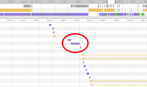
Page layout time without flexbox
Update: This post sparked a lot of debate over whether Flexbox was ready for production. Chris Coyier wrote 'Does Flexbox have a performance problem?' in which Paul Irish contributed some valuable metrics. Paul concluded that old Flexbox (display: box) was ~2.3x slower than its newer counterpart (display: flex). He then more recently followed this up with a more in depth article entitled 'Flexbox layout isn't slow' over on HTML5 Rocks.
Truncation
The content of a fixed-height layout will rarely fit its container; eventually it has to overflow. Traditionally in print, designers have used ellipses (three dots) to solve this problem; however, on the Web, this isn’t the simplest technique to implement.
Ellipsis
You might be familiar with the text-overflow: ellipsis declaration in CSS. It works great, has awesome browser support, but has one shortfall: it can’t be used for text that spans multiple lines. We needed a solution that would insert an ellipsis at the point where the paragraph overflows its container. JavaScript had to step in.
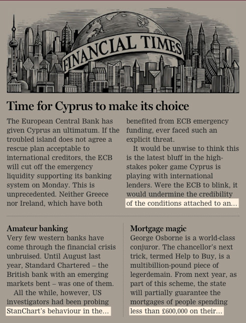
Ellipsis truncation is used throughout.
After an in-depth research and exploration of several different approaches, we created our FTEllipsis library. In essence, it measures the available height of the container, then measures the height of each child element. When it finds the child element that overflows the container, it caps its height to a sensible number of lines. For WebKit-based browsers, we use the little-known -webkit-line-clamp property to truncate an element’s text by a set number of lines. For non-WebKit browsers, the library allows the developer to style the overflowing container however they wish using regular CSS.
Modularization
Having tackled some of the low-level visual challenges, we needed to step back and decide on the best way to manage our application’s views. We wanted to be able to reuse small parts of our views in different contexts and find a way to architect rock-solid styling that wouldn’t leak between components.
One of the best decisions we made in implementing the new application was to modularize the views. This started when we were first looking over the designs. We scribbled over printouts, breaking the page down into chunks (or modules). Our plan was to identify all of the possible layouts and modules, and define each view (or page) as a combination of modules sitting inside the slots of a single layout.
Each module needed to be named, but we found it very hard to describe a module, especially when some modules could have multiple appearances depending on screen size or context. As a result, we abandoned semantic naming and decided to name each component after a type of fruit — no more time wasted thinking up sensible, unambiguous names!
An example of a module’s markup:
<div class="apple">
  <h2 class="apple_headline">{{headline}}</h2>
  <h3 class="apple_sub-head">{{subhead}}</h3>
  <div class="apple_body">{{body}}</div>
</div>
An example of a module’s styling:
.apple {}

.apple_headline {
  font-size: 40px;
}

.apple_sub-head {
  font-size: 20px;
}

.apple_body {
  font-size: 14px;
  column-count: 2;
  color: #333;
}
Notice how each class is prefixed with the module’s name. This ensures that the styling for one component will never affect another; every module’s styling is encapsulated. Also, notice how we use just one class in our CSS selectors; this makes our component transportable. Ridding selectors of any ancestral context means that modules may be dropped anywhere in our application and will look the same. This is all imperative if we want to be able to reuse components throughout the application (and even across applications).
What If A Module Needs Interactions?
Each module (or fruit) has its own markup and style, which we wrote in such a way that it can be reused. But what if we need a module to respond to interactions or events? We need a way to bring the component to life, but still ensure that it is unbound from context so that it can be reused in different places. This is a little trickier that just writing smart markup and styling. To solve this problem, we wrote FruitMachine.
Reusable Components
FruitMachine is a lightweight library that assembles our layout’s components and enables us to declare interactions on a per-module basis. It was inspired by the simplicity of Backbone views, but with a little more structure to keep “boilerplate” code to a minimum. FruitMachine gives our team a consistent way to work with views, while at the same time remaining relatively unopinionated so that it can be used in almost any view.
The Component Mentality
Thinking about your application as a collection of standalone components changes the way you approach problems. Components need to be dumb; they can’t know anything of their context or of the consequences of any interactions that may occur within them. They can have a public API and should emit events when they are interacted with. An application-specific controller assembles each layout and is the brain behind everything. Its job is to create, control and listen to each component in the view.
For example, to show a popover when a component named “button” is clicked, we would not hardcode this logic into the button component. Instead “button” would emit a buttonclicked event on itself every time its button is clicked; the view controller would listen for this event and then show the popover. By working like this, we can create a large collection of components that can be reused in many different contexts. A view component may not have any application-specific dependencies if it is to be used across projects.
Working like this has simplified our architecture considerably. Breaking down our views into components and decoupling them from our application focuses our decision-making and moves us away from baking complex, heavily dependent modules into our application.
The Future Of FruitMachine
FruitMachine was our solution to achieve fully transportable view components. It enables us to quickly define and assemble views with minimal effort. We are currently using FruitMachine only on the client, but server-side (NodeJS) usage has been considered throughout development. In the coming months, we hope to move towards producing server-side-rendered websites that progressively enhance into a rich app experience.
You can find out more about FruitMachine and check out some more examples in the public GitHub repository.
Retina Support
The Financial Times’ first Web app was released before the age of “Retina” screens. We retrofitted some high-resolution solutions, but never went the whole hog. For our designers, 100% Retina support was a must-have in the new application. We developers were sick of maintaining multiple sizes and resolutions of each tiny image within the UI, so a single vector-based solution seemed like the best approach. We ended up choosing icon fonts to replace our old PNGs, and because they are implemented just like any other custom font, they are really well supported. SVG graphics were considered, but after finding a lack of support in Android 2.3 and below, this option was ruled out. Plus, there is something nice about having all of your icons bundled up in a single file, whilst not sacrificing the individuality of each graphic (like sprites).
Our first move was to replace the Financial Times’ logo image with a single glyph in our own custom icon font. A font glyph may be any color and size, and it always looks super-sharp and is usually lighter in weight than the original image. Once we had proved it could work, we began replacing every UI image and icon with an icon font alternative. Now, the only pixel-based image in our CSS is the full-color logo on the splash screen. We used the powerful but rather archaic-looking FontForge to achieve this.
Once past the installation phase, you can open any font file in FontForge and individually change the vector shape of any character. We imported SVG vector shapes (created in Adobe Illustrator) into suitable character slots of our font and exported as WOFF and TTF font types. A combination of WOFF and TTF file formats are required to support iOS, Android and Windows devices, although we hope to rely only on WOFFs once Android gains support (plus, WOFFs are around 25% smaller in file size than TTFs).
![]()
The Financial Times’ icon font in Font Forge
Images
Article images are crucial for user engagement. Our images are delivered as double-resolution JPEGs so that they look sharp on Retina screens. Our image service (running ImageMagick) outputs JPEGs at the lowest possible quality level without causing noticeable degradation (we use 35 for Retina devices and 70 for non-Retina). Scaling down retina size images in the browser enables us to reduce JPEG quality to a lower level than would otherwise be possible without compression artifacts becoming noticeable. This article explains this technique in more detail.
It’s worth noting that this technique does require the browser to work a little harder. In old browsers, the work of scaling down many large images could have a noticeable impact on performance, but we haven’t encountered any serious problems.
Native-Like Scrolling
Like almost any application, we require full-page and subcomponent scrolling in order to manage all of the content we want to show our users. On desktop, we can make use of the well-established overflow CSS property. When dealing with the mobile Web, this isn’t so straightforward. We require a single solution that provides a “momentum” scrolling experience across all of the devices we support.
Overflow: Scroll
The overflow: scroll declaration is becoming usable on the mobile Web. Android and iOS now support it, but only since Android 3.0 and iOS 5. IOS 5 came with the exciting new -webkit-overflow-scrolling: touch property, which allows for native momentum-like scrolling in the browser. Both of these options have their limitations.
Standard overflow: scroll and overflow: auto don’t display scroll bars as users might expect, and they don’t have the momentum touch-scrolling feel that users have become accustomed to from their native apps. The -webkit-overflow-scrolling: touch declaration does add momentum scrolling and scroll bars, but it doesn’t allow developers to style the scroll bars in any way, and has limited support (iOS 5+ and Chrome on Android).
A Consistent Experience
Fragmented support and an inconsistent feel forced us to turn to JavaScript. Our first implementation used the TouchScroll library. This solution met our needs, but as our list of supported devices grew and as more complex scrolling interactions were required, working with it became trickier. TouchScroll lacks IE 10 support, and its API interface is difficult to work with. We also tried Scrollability and Zynga Scroller, neither of which have the features, performance or cross-browser capability we were looking for. Out of this problem, FTScroller was developed: a high-performance, momentum-scrolling library with support for iOS, Android, Playbook and IE 10.
FTScroller
FTScroller’s scrolling implementation is similar to TouchScroll’s, with a flexible API much like Zynga Scroller. We added some enhancements, such as CSS bezier curves for bouncing, requestAnimationFrame for smoother frame rates, and support for IE 10. The advantage of writing our own solution is that we could develop a product that exactly meets our requirements. When you know the code base inside out, fixing bugs and adding features is a lot simpler.
FTScroller is dead simple to use. Just pass in the element that will wrap the overflowing content, and FTScroller will implement horizontal or vertical scrolling as and when needed. Many other options may be declared in an object as the second argument, for more custom requirements. We use FTScroller throughout the Financial Times’ Web app for a consistent cross-platform scrolling experience.
A simple example:
var container = document.getElementById('scrollcontainer');
var scroller = new FTScroller(container);
The Gallery
The part of our application that holds and animates the page views is known as the “gallery.” It consists of three divisions: left, center and right. The page that is currently in view is located in the center pane. The previous page is positioned off screen in the left-hand pane, and the next page is positioned off screen in the right-hand pane. When the user swipes to the next page, we use CSS transitions to animate the three panes to the left, revealing the hidden right pane. When the transition has finished, the right pane becomes the center pane, and the far-left pane skips over to become the right pane. By using only three page containers, we keep the DOM light, while still creating the illusion of infinite pages.
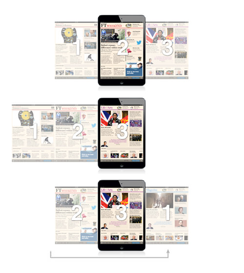
Infinite scrolling made possible with a three-pane gallery
Making It All Work Offline
Not many Web apps currently offer an offline experience, and there’s a good reason for that: implementing it is a bloody pain! The application cache (AppCache) at first glance appears to be the answer to all offline problems, but dig a little deeper and stuff gets nasty. Talks by Andrew Betts and Jake Archibald explain really well the problems you will encounter. Unfortunately, AppCache is currently the only way to achieve offline support, so we have to work around its many deficiencies.
Our approach to offline is to store as little in the AppCache as possible. We use it for fonts, the favicon and one or two UI images — things that we know will rarely or never need updating. Our JavaScript, CSS and templates live in LocalStorage. This approach gives us complete control over serving and updating the most crucial parts of our application. When the application starts, the bare minimum required to get the app up and running is sent down the wire, embedded in a single HTML page; we call this the preload.
We show a splash screen, and behind the scenes we make a request for the application’s full resources. This request returns a big JSON object containing our JavaScript, CSS and Mustache templates. We eval the JavaScript and inject the CSS into the DOM, and then the application launches. This “bootstrap” JSON is then stored in LocalStorage, ready to be used when the app is next started up.
On subsequent startups, we always use the JSON from LocalStorage and then check for resource updates in the background. If an update is found, we download the latest JSON object and replace the existing one in LocalStorage. Then, the next time the app starts, it launches with the new assets. If the app is launched offline, the startup process is the same, except that we cannot make the request for resource updates.
Images
Managing offline images is currently not as easy as it should be. Our image requests are run through a custom image loader and cached in the local database (IndexedDB or WebSQL) so that the images can be loaded when a network connection is not present. We never load images in the conventional way, otherwise they would break when users are offline.
Our image-loading process:
- The loader scans the page for image placeholders declared by a particular class.
- It takes the
srcattribute of each image placeholder found and requests the source from our JavaScript image-loader library. - The local database is checked for each image. Failing that, a single HTTP request is made listing all missing images.
- A JSON array of Base64-encoded images is returned from the HTTP response and stored separately in the local database.
- A callback is fired for each image request, passing the Base64 string as an argument.
- An
<img>element is created, and itssrcattribute is set to the Base64 data-URI string. - The image is faded in.
I should also mention that we compress our Base64-encoded image strings in order to fit as many images in the database as possible. My colleague Andrew Betts goes into detail on how this can be achieved.
In some cases, we use this cool trick to handle images that fail to load:
<img src="image.jpg" onerror="this.style.display='none';" />
Ever-Evolving Applications
In order to stay competitive, a digital product needs to evolve, and as developers, we need to be prepared for this. When the request for a redesign landed at the Financial Times, we already had a fast, popular, feature-rich application, but it wasn’t built for change. At the time, we were able to implement small changes to features, but implementing anything big became a slow process and often introduced a lot of unrelated regressions.
Our application was drastically reworked to make the new requirements possible, and this took a lot of time. Having made this investment, we hope the new application not only meets (and even exceeds) the standard of the first product, but gives us a platform on which we can develop faster and more flexibly in the future.
Further Reading
- Flexbox Is As Easy As Pie – Designing CSS Layouts
- 75 Instructive Case Studies – This Is How We Built It
- The Flexbox Reading List: Techniques And Tools
- Harnessing Flexbox For Today’s Web Apps


 How To Measure UX and Design Impact, 8h video + UX training
 Get a Free Trial
 JavaScript Form Builder — Create JSON-driven forms without coding.
 Devs love Storyblok - Learn why!
