How To Build A Portable Design Toolkit
It’s easy to get overwhelmed by the staggering array of resources and options available to designers. In this article, we’ll explore the idea of consciously restricting yourself to a set of core tools that you know, love and trust.
Take a traditional craftsman — let’s say a carpenter. While they may have access to a wide range of tools in their workshop, they will take a bag with just a few carefully chosen tools when working away. Similarly, an artist may have a wide range of paints, brushes and accessories in their studio, but will carefully select a limited palette and a few choice brushes when painting in the field.
In the same way, as a digital designer, you should know what your most precious tools are, and keep a portable set close at hand.
Recently I’ve been doing some oil paintings outside, away from the studio (a technique called en plein air). To facilitate this, I put together a pochade box to hold paints, brushes, palette and canvas panels. This needed to be small enough to fit in a backpack to be easily portable so that I can cycle around the countryside with it. The factors of space and weight force me to select a limited palette and a few choice brushes, and the size of the box determines the size of paintings I can make.
Working outside also forces me to work quickly — there’s no time to dally and over-think things. But, rather than being restrictions, these factors become the parameters for the work, directing me to work in a certain way, and helping me to develop a personal style and approach.
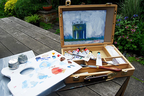
Working outdoors forces you to set limits.
Working With A Limited Palette
The benefits of working with a restricted range of tools and options are that you really get to know and understand your core set and can continually refine it over time. This is the path to mastery in your chosen discipline, as opposed to being a jack-of-all-trades but the master of none.
By mastering a limited number of tools and techniques, you will develop your own personal, identifiable style and workflow. It enables you to hit the ground running with each new project, to draw on your previous experience and to get something down quickly, which you can then refine, rather than face the blank screen and not know where to start.
A Lean, Portable Toolkit
What should be in your toolkit? This will obviously depend on your particular area of expertise, whether you are a designer or a developer, and the software applications you use. Each person will have their own software preferences, so I am not going to talk much about particular applications in this article. Instead, the focus will be on areas where you can consciously refine your choice of tools and assets within applications. I’ll also look at how, once you have created this limited palette, you can access your carefully selected toolkit wherever you are.
Keeping It All Together
Keep this lean, mean toolkit in a place you can access from anywhere. My preference is Dropbox, although any cloud-based hosting service, such as Google Drive or Microsoft Skydrive, would be great. Create a folder named Design Playbook, or whatever, and add subfolders for all of the assets you want to store in there. Sync it to the cloud and you’re good to go. For text and notes, I use Evernote — again, allowing me to access it from anywhere.
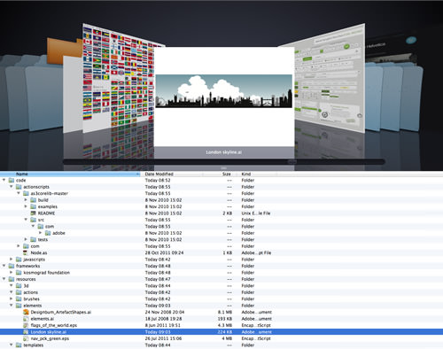
A sample folder structure of the toolkit
Graphic Resources
Grabbing every free resource you come across on the Web is tempting, whether it is vector art, Photoshop brushes and actions, bitmap textures and backgrounds, fonts, etc. But the downside of amassing such a huge collection is that it can become overwhelming and can lead to a lot of wasted time looking for just the right resource. If you are a download junkie, like me, then be prepared to pare down your collection, and put the ones you love and trust into a separate folder from all of the others, which you can review from time to time. Think of this separate folder as a special place where only the best assets and resources go.
Fonts are a prime cause of bloat. Over 300 fonts are in my font library, which I manage using Font Agent Pro (available for both Mac and Windows), but I find myself using the same 10 or so for most commercial work, and many of the 300 I’ll probably never use. Sifting through all of them is a real time sink, so I have a couple of sets with all of my go-to typefaces, which I have copied in Dropbox. The same applies to Web-based type management, such as Typekit. Find great type combinations that work for you, and use them repeatedly. It’s a part of how you establish your own recognizable style. Add new typefaces to your core collection sparingly.
Brushes (which are customizable plugins to apply paint effects in applications such as Photoshop, CorelDraw and Painter) are another resource for which too wide a choice would be overwhelming and inefficient — you’d find yourself scrolling through a huge list trying to find the one you’ve used before. Don’t be afraid to trim down the brush sets that you download, deleting the ones you have no use for. Save a consolidated set of brushes as a new set to your mobile toolkit and you’ll be good to go. The same approach can be applied to symbol libraries for Illustrator and Photoshop.
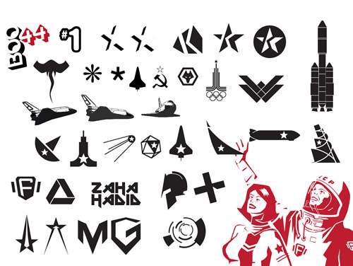
Illustration is one area in which your personal style can really shine through, so build a resource of vector elements. Having a collection of killer elements on hand is a great way to dive into a project and get inspiration. I’ve been slowly adding elements to my vector doodads Illustrator file for a couple of years now, inspired by the efforts of DesignBum, who has made a number of his project files available for downloading.

Great design explorations by Issara Willenskomer (aka DesignBum)
You’ll find yourself reusing certain background elements and textures; so, again, carefully select a few ones, and add them to your toolkit. Don’t worry about overusing these images — use them in comps and mockups, and then, once you have finalized the design, if you feel that you need a fresh image, go and find one. This will save you time from hunting for new images for every mockup.
You may find an online repository such as LayerVault or Pixelapse to be useful for storing image and vector assets, especially if you collaborate with other designers and want to share your toolkit with them.
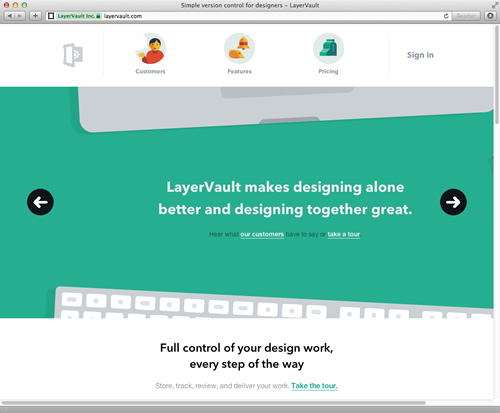
LayerVault is version-control software for designers.
Code Resources
As with graphics, you’ll inevitably find yourself wanting to use the same bits of code from one project to the next. Rather than constantly reinvent the wheel, reuse classes and functions and keep refining them.
If you work with a language such as Java or ActionScript, which support classes, then you’ll find yourself returning to the same third-party classes and libraries time and again, so keep them handy in your toolkit, and take the time to really understand them.
For other languages, such as JavaScript, group together functions that you commonly use in a self-contained .js library file. You can then keep this as part of your toolkit, or use a content delivery network such as CDN.net, so that you can directly reference it from your project.
Add to this, of course, essential third-party libraries, such as Modernizr and Require.js — I’m sure you have your own favorites — and any add-ons, such as small JavaScript libraries. Keep them somewhere handy, to be able to quickly drop them into a project.
Another place to put code libraries and classes is on a hosted version-control website, such as GitHub, Beanstalk or, my personal choice, Bitbucket. This is especially useful if you like to tinker and refine code or if you want to share your toolkit with other developers. If you want to open-source your code and make it publicly accessible, then GitHub or Google Code is ideal.
Another place to store code is Snipplr. As the name suggests, it’s great for storing little snippets of code — for example, code to retrieve the current date — that you’ll need time and again. You can make your snippets public or keep them to yourself. Snipplr is ideal for storing those little code hacks that you keep forgetting.
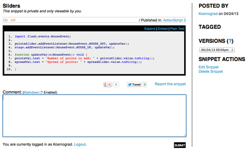
Snipplr is great for storing and sharing useful code snippets.
Template Resources
Using Web templates and frameworks will help you create prototypes more quickly and will also ensure that those prototypes bear a close resemblance to your comps and mockups. Whether you develop your own framework from scratch or use a popular one, such as Foundation or Bootstrap, get to know it inside out, and keep refining it to suit your needs.
Also, build your own “boilerplate” HTML5 file, which is a minimal basic file that serves as the starting point for any Web page you create. HTML5 Boilerplate is a good place to start. You’ll also find it worthwhile to create a skeleton website, set up with a file structure for images, CSS and JavaScript. Build yourself a basic CSS file that you can drop into any project. Add it all to the toolkit.
Mastering Your Tools
It might sound like I am suggesting that you keep reusing the same look and techniques across all of your work, but that is not the case. I am suggesting that you consciously limit your toolset, and then absolutely master those tools. You can then refine them according to project briefs, client feedback and your own inclination.
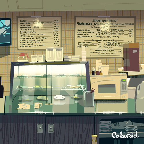
Kevin Dart’s Colouroids are a great example of self-set limitations.
Keep experimenting with your favorite tools. This year, inspired by Kevin Dart’s Colouroids, I set myself a challenge to create one vector image a day, to really master Illustrator. In these self-set projects, go outside of your comfort zone and try a new approach, process or technique.
Create A Playbook
"Design today has reached the stage where sheer inventiveness can no longer sustain it." – Christopher Alexander, 1963
Seek to master not just your tools but also your techniques. Understanding and refining your design process is critical, and the way you work will determine the work you produce. I call this your “playbook,” the guide to your design process. Each technique is a “play,” a set of instructions to follow.
The playbook can exist purely in your head, or be as formal as you like. My playbook is a series of notes and sketches on an iPad, using Evernote and Paper. Some are simple aphorisms — “Work from light to dark,” “Remove one element” — to make me think about the way I work, a kind of personal set of Oblique Strategies, but used less to break a creative block than to reinforce a working method I trust.
Other “plays” are more practical guides, such as step-by-step instructions on how to set up event listeners, or how to optimize images, or how to change copy on a live website. Developing conscious design patterns is the key to understanding the way you work, whether in visual design, interaction design or programming.
Formalizing your creative processes, tools and techniques is a critical step in becoming a better designer or developer. Just as football teams practice their plays, practice your techniques on self-set work, ready to be deployed in client work once you have mastered them.
The playbook is also the place to refine your workflows. How do you get from a paper sketch to a working website? How do you wireframe your code? Analyzing your process is all part of the playbook.
Evolving The Playbook And The Toolkit
In addition to refining your playbook, you will also need to update it and evolve it gradually over time, adding some elements while removing others. Obviously, the world of Web design is changing rapidly, both aesthetically and technically, so make sure to update your playbook, too. And by using elements you know and trust, you are still bringing your own style, rather than slavishly following fashion.
The Path Towards Mastery
If you look at the portfolios of designers you admire, you will see common elements and ideas that unite each person’s work. This applies not only to Web designers but to graphic designers, architects, industrial designers and visual artists. While the work evolves over time, a common thread — and a conscious decision to set self-imposed limits of exploration — runs through it all. Each creator has developed and refined their own design process, which defines the resulting work, the designer’s style. Poor designers will leap from one style to another, from one way of working to another. Lacking conviction, they will follow trends and the latest fancy technique, rather than develop their own style.
Learn to limit your choices and set parameters. These are not constraints, but rather guidelines to lead you to better work. Building a toolkit and developing a playbook is a way to help you define your own style and to master the tools you need to make your work unique, personal and memorable.
Further Reading
- 60 Brilliant Corporate Fonts
- Useful Resources, Tools and Services for Web Designers
- Behind The Design: 5 Stories Of Great Inspiration
- How To Boost Your Design Workflow With Setapp


 Agent Ready is the new Headless
 SurveyJS: White-Label Survey Solution for Your JS App