Great Products Focus On A Motif
What does it take to craft a great product? For those of us who design and build apps, websites and software, a great product means one that delights its users. But digital product development is a complex beast.
Delivering a successful product requires multidisciplinary teams to efficiently work through varying opinions and conflicting views and, ultimately, to gather behind a common vision with a focused plan. This is a challenging act of team management and collaboration, requiring such audacity that it’s no surprise that the average success rate of a startup bringing a new product or service to market is one out of four.
Maintaining focus on a singular vision during software development projects is not easy, especially for designers. Designers are often required to deprioritize the overall product vision in favor of lower-level work — we’re asked to consider every edge case, rather than optimize for a few essential ones. We end up in the weeds of wireframes and UI specifications, thinking through details such as gestural interactions, affordances and user flows.
What can designers, or any team member for that matter, do to increase the overall quality and success rate of the products we craft and to elevate our team’s batting average? An answer lies in the way artists and composers have worked for centuries to create paintings and music — by focusing on a singular, finite element that unifies the whole: a motif.

In art, literature and music, the word “motif” is often used to describe a salient, recurring element that has symbolic significance. Across artistic media, a motif is a small atomic unit that inspires everything else. In paintings, the motif could be a color, mood or message to be communicated. In music, a motif could be a set of notes, a melody or a rhythm. The great compositions and symphonies of the 19th and 20th centuries are masterpieces in which every note connected back to the motif.
A Motif Is Fundamental To Product Quality
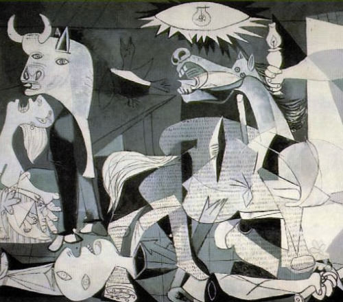
In 1937, during the Spanish Civil War, Italian and German forces devastated Guernica, a small defenceless Spanish town. The bombing shocked and inspired many artists, including Pablo Picasso, who later painted a mural named after the desecrated village. The motif of Picasso’s work is the tragedy of war, and from a singular anti-war sentiment came a painting you could look at for hours because of its complexity — layers of symbolism, hidden images, bodies, animals and fire, all frozen in form on a massive canvas.

Similarly, Beethoven’s Fifth Symphony is a classic example of the whole stemming from a single unit. The very first four notes of the symphony — three short, one long — are the genetic material from which the other thousands of notes stem. This motif is then transposed and transformed continuously through all four movements of the symphony. You can see this transformation in a visualization of the first movement, and follow how the motif gives the music a sense of unity and inevitability.

This concept of inevitability in music is often echoed in discussions of industrial design when we talk about an object or experience feeling “undesigned” — that is, having a level of quality and a perfection that would not benefit from any edits or changes. Jonathan Ive reiterates this in the film Objectified:
“A lot of what we seem to be doing in a product like [the iPhone] is actually getting design out of the way. And I think with that sort of reason — and they’re not just arbitrary shapes — it feels almost inevitable. It feels almost undesigned. It feels almost like, ‘Well, of course it’s that way. Why would it be any other way?‘”
This sense of designed inevitability is what Picasso, Beethoven and others achieved in the arts by focusing on motif.
The Motifs Of Great Digital Experiences
A motif in a digital product is something iconic and often part of the very first interaction a user has, as in the case of Vine. Vine’s motif is “capturing six-second video clips.” That’s the focal point of the product. So, making a looping six-second video clip the very first screen that new users see was a great design decision. The motif of Vine, as with Twitter, is a simple interaction that becomes part of every aspect of the product.
Quite similarly, do you remember your very first interaction with the iPhone? The first thing most new users do when picking up the device for the first time is slide to unlock. Swiping horizontally is also the gesture to navigate apps on the home screen; it’s the motif of the iPhone.
Before the iPhone, most consumers had only interacted with touchscreens at kiosks or with stylus-driven devices, and they had been accustomed to tapping and pressing rather than swiping. The decision to make a swipe the first interaction is the cornerstone of the iPhone’s brilliance: It introduces the motif right out of the box.
A poorly designed motif, on the other hand, can be a product’s Achilles heel. If you use LinkedIn, then you’re probably a job seeker, a recruiter or a professional networker. These three user types on LinkedIn all center on a common product motif: the professional profile page. Yet, for years now, LinkedIn’s search-indexed public profiles have been poorly designed. Small startups, including Vizualize.me and ResumUp, have exploited this to their advantage, building products that are differentiated from another’s lack of focus.
To Create Better Products, Own The Motif
Behind every great product ever made was someone who championed the motif, whether consciously or not. This could have been a designer, a developer or perhaps a small team within the larger group.
Designers are best poised to “own” the motif, because design is so intrinsically linked to product vision and direction. However, at the end of the day, what is crucial is not the role, but collaboration and stewardship. Everyone who works on a team can elevate the quality of the product they are helping to build by championing the motif. Below are three key ways to do so.
Be The Steward Of The Vision
Think about your product and try to identify the most critical, singular element of the whole? Like LinkedIn’s career profiles, a product motif will span user types and apply to every customer. The motif will be as simple and small as a single screen or interaction. Identify that outstanding element, and build agreement and understanding across the team. When you find yourself in the weeds of wireframes or feature creep, use the motif as a guide to help the whole team regain focus.
Work The Motif Into The First-Use Experience
Like the iPhone’s slide to unlock, a product’s motif can unify an experience. From first use to navigation to lower-level screens, the motif should be infused throughout the customer’s experience. By making it a part of the on-boarding experience in particular, you’ll help to welcome new users in a natural, unforced way, rather than having to rely on instructional coaching screens or tutorials.
Perfect The Motif Before Deploying
We all understand that iterating through multiple versions and gathering user feedback to refine a product will lead to more relevant, useful experiences. But how do you decide what part of a product to spend the most effort on? The motif will form the basis of your marketing — that quintessential part of the customer experience and the part that people will use and see the most. If you are going to polish any one aspect of a product out of the gate and continually refine it, the motif should be it.
Further Reading
- Giving Your Product A Soul
- How To Make Innovative Ideas Happen
- Better Product Pages Turn Visitors Into Customers
- Quick Course On Effective Website Copywriting


 Take a break with a 3D game built on Netlify!
 Check the frontend report!

 Click here to kickstart your project for free in a matter of minutes.
 Sponsor OWD on GitHub

