Recent Trends In Storytelling And New Business Models For Publishers
It is clear that the ongoing dramatic transformation of the media industry in all its formats (audio, video and text) leaves the door open for a complete reinvention of the publishing business. This transition has opened up opportunities for experimentation, and many players are trying to define the future of media in general, and journalism in particular.
"The publishing ecosystem is now primed for complete disruption."
— Craig Mod
The Media Industry As We Knew It Is Gone
The traditional music industry is on the verge of disappearing because iTunes, and then Spotify, contributed to a radical shift in audiences’ music consumption habits: from physical packages to digital-only ownership to cloud-based subscriptions.
In terms of movies and television shows, Kevin Spacey, who starred in Netflix’s own hit series “House of Cards,” spoke recently at a broadcasters summit in the UK about how the movie studios and cable TV channels are having the rug pulled from underneath them by online streaming services and audiences’ increasing preference for ongoing, complex character development.
Due to a multiplicity of financial and societal factors, deep character development falls beyond what Hollywood is willing to provide these days (and, to be fair, perhaps even beyond what a feature-length movie is able to deliver). TV series are best suited for that kind of storytelling, to speak nothing of the new behavior conditioned by the “anywhere, anytime” character of Internet services such as Amazon Instant Video and Netflix: We now binge on series, not wanting to wait for the following week to see what happens next.
Newspapers (and, to a lesser extent, magazines) have been struck the hardest by the ubiquitous availability of news and analysis on the Web. Their circulation figures have been plummeting for decades; but in the past few years, newspapers have suffered a vertiginous advertising decline that is affecting their quality of coverage and their adoption among young audiences.
Backing up this troubling diagnosis with research and figures no longer seems necessary, but here are three data points from “The State of the News Media,” published by The Pew Research Center’s Project for Excellence in Journalism (2012 numbers):
- “[Newspaper] print advertising revenue is now just 45% of what it was in 2006. The growth in online ad revenue has been slow.”
- “More than three-quarters of print classified revenue has been lost since 2000.”
- “[Magazine] newsstand sales continued to decline for a fifth consecutive year. Single copies dropped about 8% compared to the same period last year.”
The recent and surprising purchase of the historic Washington Post newspaper by Amazon founder Jeff Bezos caused in the industry both deep nostalgic lamentations and earnest (if uneasy) hope, at a time when audiences have grown accustomed to getting their news from somewhere else.
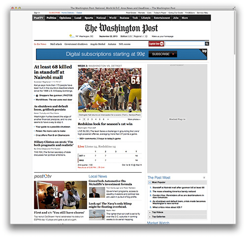
The Washington Post. (Large view)
In a recent interview, Bezos declared his belief in an upcoming “golden era” at the Washington Post. He knows the quality of the product and is ready to experiment to find out the best and most viable way forward for the journalistic enterprise. However, his optimism is not Pollyannish:
"The Post is famous for its investigative journalism. It pours energy and investment and sweat and dollars into uncovering important stories. And then a bunch of Web sites summarize that [work] in about four minutes and readers can access that news for free. One question is, how do you make a living in that kind of environment? If you can’t, it’s difficult to put the right resources behind it.… Even behind a paywall [digital subscription], Web sites can summarize your work and make it available for free. From a reader point of view, the reader has to ask, “Why should I pay you for all that journalistic effort when I can get it for free” from another site?"
The Rise Of Native Digital Journalism And Subcompact Publishing
Media companies that are native to the Web, such as The Huffington Post, The Daily Beast, Gawker and Buzzfeed, to name a few, seem to have been able to thrive in the current news-as-a-commodity world, despite all odds. The Huffington Post even won a Pulitzer Prize for its extended national reporting, at a time when these new media companies are criticized for being long on commentary and short on reporting.
Innovation is sorely needed in newsrooms worldwide. And innovation is what industry outsiders tend to be good at, because they look at existing problems with fresh eyes and no preconceptions or baggage. Their natural mode of operation is to start from scratch, which is what seems to be called for with newspapers and magazines.
The way stories are told and sold is, therefore, in the process of being expanded, if not reinvented, by many different players who are armed with digital technologies, from startups to individuals to established media companies. One such example of innovation is a relatively new trend known as subcompact publishing. Started by a few seminal articles written by former Flipboard designer Craig Mod, subcompact publishing is a cri de coeur for simple, delightful reading experiences delivered at a good price. It’s that simple — but then there’s so much more to it.
Subcompact publishing has been defined as a method of digitally publishing focused HTML-based content targeted at carefully identified audiences, primarily via mobile devices, in small, weekly (or so), mainly text-based issues, adhering to simple user-interface and navigation principles. Each issue may be free or may demand a small payment. Monetization happens via Apple’s Newsstand, Amazon’s Kindle platform and more.
Based on this definition, calling this trend “fresh” may seem unjustified. What’s the big deal? After all, advocating for simple navigation and standards-based coding is nothing new. But this collection of attributes represents nothing less than an entirely new mentality, birthing a new experience and, in the end, a new business model to support it, a business model centered on digital-only publishing (selective even to the point of using just iOS or Android), with low overhead and operational costs.
The reading experience is built on long-form content, delivered to the right audience — a public thirsty for it — primarily via mobile devices and wrapped in a delightfully uncomplicated user experience. It represents the minimal viable product, an experience that’s satisfying precisely because it’s both tailored and trimmed, a product that includes no extraneous or dubiously useful features. It fits its context and purpose naturally, like a glove.
At this point in the evolution of digital experiences, people are wary of flashy websites and apps. They just want something that works, that delivers the content and functionality they need without frills, anywhere and anytime they want it. Users are no longer amused by excessive navigational flights of fancy. They appreciate design for what design is good at: solving problems smartly, elegantly and beautifully, without excess or complication.
This pragmatic philosophy of design contrasts starkly with the majority of magazines currently available for tablets, whose issues can take a long time to download because of their heavy graphics and excessively dense contents. Publishing only once a month — a print-based schedule of production — requires that these magazines include a lot of articles in each issue. In essence, they are glorified PDFs — print layouts crammed into a very different platform and experience and, thus, unsuccessful in their attempts at attracting an audience.
Examples Of Subcompact Publications
Are there any examples of this minimal viable product, these subcompact publications? Craig Mod often mentions Marco Arment’s “The Magazine” (Arment is famous for having cofounded Tumblr and creating Instapaper) and Matter, a Kickstarter-funded publication that sells individual, high-quality, long-form stories at $0.99 each, for consumption on any device, alongside extras such as participation in the publication’s community and even access to authors.

The Magazine’s introductory description. (Large view)
The digital-only publication Quartz, whose publisher is the venerable Atlantic Media Company, seems to fit the idea of subcompact publishing quite well, too. Launched a little over a year ago, it has already gathered a reputation for solid content in a fresh package. Its HTML5 interface is optimized for tablets, and it shows: Its designers have dispensed with traditional global navigation and static taxonomies. Instead, the website features its contents using just a couple of templates that don’t significantly morph from desktop to tablet. Quartz’s smartphone experience is very minimal and effective for browsing and discovering content as well.

Quartz’s home page jumps right into an article. There are no section fronts. (Large view)
Another new and interesting media experiment in subcompact publishing is exemplified by Epic, a magazine founded by two former magazine writers with Hollywood experience, Joshuah Bearman and Joshua Davis. Epic aims to provide a platform for Hollywood studios to find great true stories, like the one on which the Oscar-winning movie Argo was based (whose script was written by Bearman). The publication also helps writers showcase their work and gain access to studios.
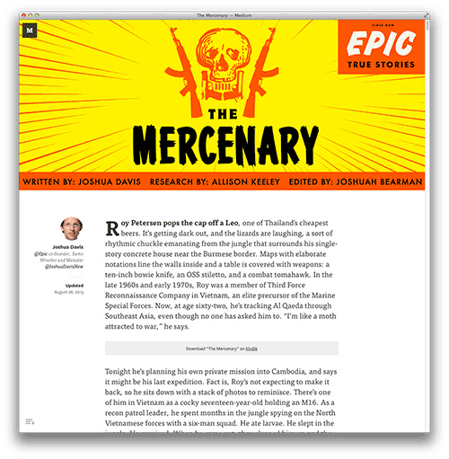
Epic’s article page. (Large view)
The Elements Of Subcompact Publications
The user interfaces of all of these subcompact publications have some commonalities — a few imperatives, if you will.
1. Flat Hierarchy
These publications avoid layering content, in favor of as flat a hierarchy as possible. Bring the audience directly into the story that you are highlighting, rather than ask people to “shop around” to find something they might be interested in reading and then have to click on successive levels of detail before getting to the heart of the matter.

The Magazine’s home page is the first story of each issue. (Large view)
2. Scrolling
Scrolling is favored over pagination to move users through content. And multi-column layouts are avoided. Layouts with vertical scrolling and single columns are easier for audiences to use on smartphone and even tablets, and they are certainly easier to design.
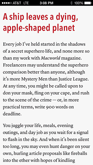
The Magazine’s single-column vertical-scrolling layout. (Large view)
3. Minimalism
The navigation is very minimalist: a simple table of contents per issue, with at most a link to previous issues, all tucked away in the now ubiquitous hamburger menu. This menu does not even need to be persistent, because the navigation drawer can be invoked by a familiar touch gesture (in this case, a swipe to the right). Trusting the user’s command of their own device’s interface means respecting the user enough not to burden them with excessive visual cues.

The Magazine’s drawer navigation. (Large view)
4. 7-Inch Tablets
Craig Mod notes that 7-inch tablets are the ideal form factor for consuming long-form content. Utility-based apps might have a different optimal size and shape but would ultimately also benefit from the “minimal viable product” mentality of subcompact publications.
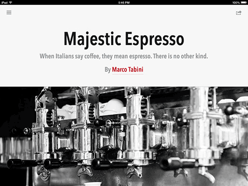
The Magazine’s portrait layout on tablets is the same single column as on smartphones. Simplicity is paramount. (Large view)
5. Typography
Beautiful custom typography is quickly becoming the norm across digital experiences. Featuring it on the Web has been difficult for years, but no more. Subcompact publications that rely on HTML5 embrace the best that the typographic tradition has to offer — myriad typefaces to choose from and optimized tracking and leading, line widths, contrast, sizing, ligatures, old-style figures and more. In fact, The Magazine considers text to be its main design element, recognizing its essential role as a vehicle of narrative and also a pillar of all Web content.
The Renaissance Of Long-Form And Multimedia Journalism
As we’ve seen, subcompact publishing is a good vehicle for another new trend in online media: the renaissance of long-form storytelling, as exemplified by Web platforms such as Medium and Longform. While the visual Web (think Instagram, Tumblr, Vine, data visualization and infographics) is in ascendancy, an almost contrary — or at least complementary — text-focused way of creating and consuming media is also on the rise.
Subcompact and long-form publications don’t shun photography or illustration, but they clearly favor written pieces over photo essays and videos. These long-form articles may be original or culled from in-depth journalistic and literary writing found online.
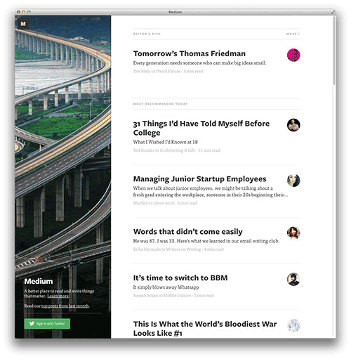
Medium’s home page. (Large view)
The popularity of long-form pieces on the Web flies in the face of research by Chartbeat. Technology writer Farhad Manjoo recently summarized the research’s conclusions for Slate. In essence, half of the people who visit a Web page tend to leave (or bounce) without engaging with it at all. Of the remaining users, only about 25% read past the mid-point of a typical 2,000 pixel-tall Web article. Slate was the subject in this particular study, but the results reflect reading patterns elsewhere on the Web. Given the coverage and interest that long-form journalism is getting these days, the audience for it must be large enough to support it, despite what this research suggests.
A different but equally interesting publishing experiment is Cowbird, a beautiful and inspiring collection of story units. Each of these units — or sagas, as the website calls them — comprises one or more photos plus brief essays to form a self-contained, deeply personal narrative that can be delightfully navigated via almost infinite horizontal scrolling. It’s a refreshing format, built on an economical yet impactful combination of photos and text. It speaks to the increasingly common yearning for a less overwhelming Web (a “slower” Web), one where discovery is serendipitous, not algorithmically powered, and where content is carefully curated, rather than firehosed. The website is fully supported by the donations of members of its online community.
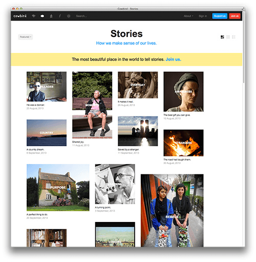
Cowbird’s home page. (Large view)
As of late, we have also witnessed the revival of an old trope: multimedia storytelling. Since the ancient time of the CD-ROM, the dream of a digital format that mixes modes of expression — text, photos, video, audio — has been pursued by publishers, including the famed Voyager Company. The time then was too early, and the technology never caught up with the vision. Or perhaps it never took off because it was an instance of additive (rather than innovative) thinking, trying to arrive at a wholly new medium by mixing together all previous media formats.
The New York Times rekindled that old multimedia flame when it published “Snow Fall,” an impressive multimedia experience that mixes words, photo galleries, infographics, audio and video, and laid out in tall single-page sections with parallax background effects. It took online publishing circles by storm. Twitter was buzzing with panegyrics, and some observers intimated that we might be witnessing the future of online storytelling. Since then, we have seen similar examples from ESPN and others. The New York Times itself followed up with another feature, titled “The Jockey.”
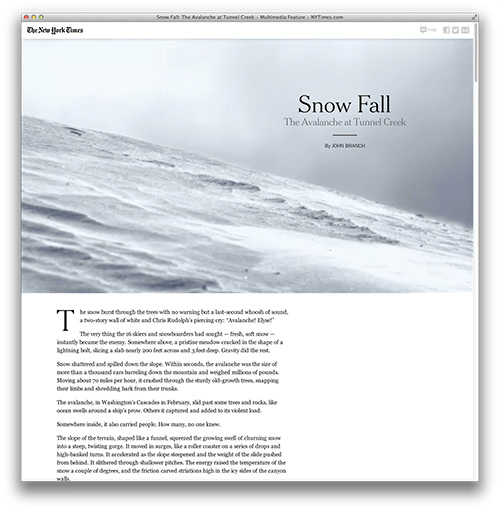
The New York Times’ “Snow Fall”. (Large view)
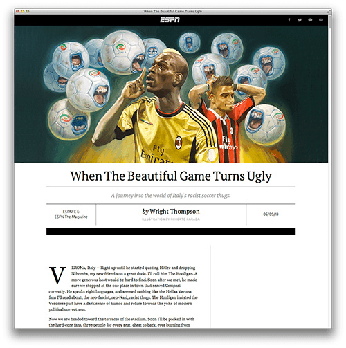
ESPN’s sports feature package. (Large view)
The New York Times’ pieces were impressive feats of narration, design and engineering, to be sure, but I feel a little overwhelmed by stories that present such a plethora of diversions from the main narrative trunk. Furthermore, in an era when most publishing enterprises are increasingly templated and automated by content management systems, pieces such as “Snow Fall” likely require a significant amount of manual design and coding. Publishing them regularly might be too expensive for most publications.
For instance, ESPN’s feature packages appear to be templated, and it shows. As beautifully designed as they are, they aren’t quite as rich, fluid and organic as their New York Times counterparts. This is all speculation, because I don’t know how the Times and ESPN approached their productions. However, on the occasion of Slate’s recent redesign, editor David Plotz compared its own plans for long-form content to the Times’ “Snow Fall”:
"We’re not a site that is going to invest six months of someone’s time to create a single beautifully designed story. I don’t think that is a sensible way to allocate resources at a spare and efficient magazine like ourselves."
On a separate note, to touch on the purely pecuniary, let’s next examine an ingenious new take on an old and perilous business model: donations. Flattr offers a way for users to support individuals whose content they enjoy, all in a seamless experience and paying per item according to a monthly budget that they set up when signing up for a Flattr account. When a user likes, favorites or stars an item in Instagram, YouTube, SoundCloud or another digital content platform, Flattr automatically credits the author of the piece.
Flattr recognizes that audiences are as or more loyal to particular writers and filmmakers than to the outlets through which their work is featured. Those outlets lend authors their credibility, but Twitter has contributed to the popularization of individual creators, and now audiences have developed an affinity for that level of personal brand. They literally follow them.
The problem with a model like Flattr’s is that, at the end of the day, it relies on a certain philanthropic impulse in the audience. Only a small proportion of people normally feel inclined to pay for stuff they can get for free.
Subcompact Publications In The Marketplace
Returning to our theme and to conclude, subcompact publications are not ubiquitous yet, particularly on platforms such as Apple’s Newsstand. The trend is less than a year old, but I would have guessed that many publishers would have by now adopted this smart and economical way to feature stories and to deliver issues automatically in the background to subscribers.
Part of the reason, perhaps, is that Apple’s Newsstand remains an underexploited digital ecosystem. TypeEngine is a company that is trying to facilitate the monetization of content on Newsstand. And there are others. In a way, it’s never been easier to start publishing long-form pieces and to charge for them. If the quality of the content is high and the publication is properly positioned for the given audience, authors can greatly benefit from direct access to their audiences.
The Future Of Journalism
While these business models and narrative experiments are encouraging and very much needed, the jury is still out on whether quality journalism, particularly the kind of expensive investigative reporting that made newspapers such as the Philadelphia Inquirer famous, will be commercially viable in a future of even more fragmentation of channels and audiences and of even more commoditization of the news.
Will investigative reporting and expensive foreign coverage find a new home in these all-digital subcompact publications? Can these activities be supported by these new publishing models? They might be in some cases, but will those be enough for a thriving civic society?
The democratization of amazing publishing avenues such as Newsstand is leading to increased competition and noise in the marketplace. Will what happened to blogs (extreme proliferation to the point of triviality) happen to subcompact publishing when almost anyone can start a publication and charge for content?
In sum, is journalism a viable business in an era of extreme audience fragmentation and dilution of advertising dollars? Or will it have to be subsidized by governments and other institutions to be viable in this new digital world? And will journalism be less or more independent if it has to be backed by patrons in order to sustain itself?
Here’s another twist: In the current gold rush to creating and disseminating content, major brands have an opportunity to become publishers, now that some traditional media outlets are on the wane and leaving gaps to be exploited. Here, the question of objectivity pops up again. But if brands are up front about the provenance of their content, offer accurate and valuable information, and tell engaging stories that capture the attention of their audiences, then their publishing efforts could end up significantly enriching our culture.
Further Reading
- The Art Of Storytelling Around An App
- Content Strategy: Optimizing Your Efforts For Success
- Make Your Content Make A Difference
- Practical Steps To Build Transparency In Your Remote Business


 Register Free Now

 SurveyJS: White-Label Survey Solution for Your JS App
 Celebrating 10 million developers


