Creating A Website Data Report: Three Degrees Of Separation
Having a comprehensive data report about your website is like having a Rosetta Stone to guide your decision-making process over the lifetime of the website. A powerful report combines data gathered from a variety of sources, including observation of and interviews with users, and analysis of the website’s analytics. Assembling this information into one place will help you to make effective design decisions and determine key priorities and will strengthen your position when working with stakeholders.
The goal is to put the key insights from your research of a website into a single document. The report would consolidate the most important discoveries from a variety of research techniques and would help you to identify trends. These trends would provide a more accurate view of your website than one research method alone could provide. Such a report is an extremely useful reference when redesigning a website or brainstorming about enhancements. It is also a deliverable that you can provide to your client, teammates or employer.
A well-rounded report is built with a combination of data gathered from three sources: personal (qualitative research), community (quantitative research) and network (website analytics). Gathering personal data is a boots-on-the-ground initiative that involves speaking to users and watching them test the website. Community data is gathered by reaching out to the user base with surveys and feedback forms. An analytics tool collects network data on your website automatically. While these types of data are gathered separately, they complement each other and give you a full picture of what is happening on the website. For this article, I’ve created a fictional Widgets website, which we’ll work on together to build a data report.
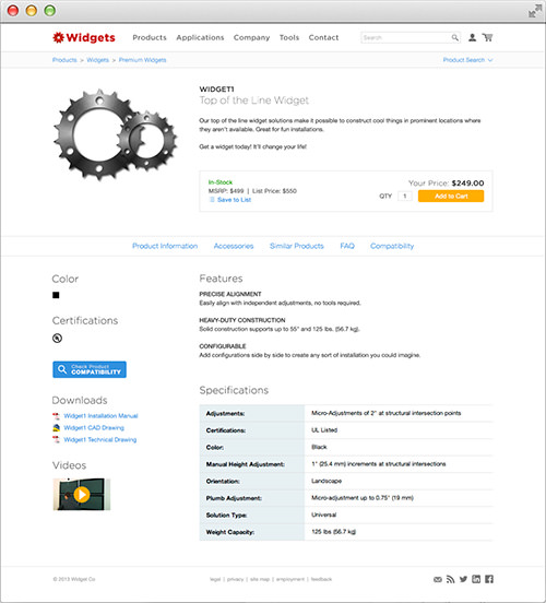
We’ll create a data report for our fictional Widgets website. (Large preview)
Gathering Personal Data (Qualitative Research)
The key to getting qualitative data from users is to observe them as they use the website. The first step is to gather some users to work through the most common tasks on the website. (If you’re unable to get a user in person, try out a service like UserTesting.) For our Widgets website, these tasks include finding a product, adding a product to the shopping cart, and finding a PDF download for one of the widgets.
To understand their thought process and experience their frustrations, have the user talk through what they are doing as you take notes. This qualitative data will tell you how users behave and help you understand why. When multiple users have the same good or bad experience, note the recurring comment. The benefit of observing users is that you can see them discover things that they might not mention in an interview (or even be conscious of). After walking all of the users through the testing process, sit down and create the report.
For this first section of our data report, list the action items from your notes. Multiple users found the same problem with our Widgets website, so we’ll mark that down, with a multiplier after the item to prioritize it in the list. A team is working on the Widgets website, so let’s break down the action items according to which groups would implement them. Only add to the report items that we might follow up on to update the website.
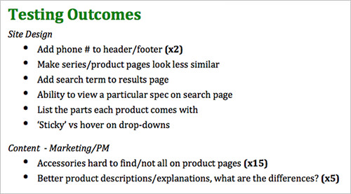
Action items from user testing, sorted by functional area.
Reaching Out To The Community (Quantitative Research)
Next, let’s get input from a broader group of users by sending a survey to our community or by conducting some interviews. The benefit of a survey is that we can quickly gather a lot of data and identify trends. A high number of responses will also help us to find some unique ideas and issues. The survey could be supplemented with in-person or phone interviews, which are opportunities to ask follow-up questions or to go completely off topic if something interesting comes up.
To get started, let’s create a relatively short and simple survey about our website using Survey Monkey. To formulate our questions, let’s think first about what we want to discover. For our Widgets website, we want to gather some fairly anonymous demographic information, including the user’s profession and how often they use the website, and then dive into particular areas of the website. Leave some questions open-ended to get feedback that you might not anticipate.
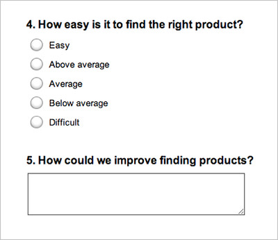
A survey created with Survey Monkey.
Having the user select from predefined answers will make it easier to compile results, but feedback is often better when the user enters their own thoughts. At the end of the survey, let’s ask some general questions, like what they like the most and the least about the website. These are all things that can be difficult to gather from analytics. Grow some thick skin because you might get some strong responses — but that’s what we’re looking for!
Then, email all of your user lists and link to the survey from your home page and social network pages to get as much feedback as possible. Let people know that your goal is to improve their experience of the website and that their input will make a difference. Once you’ve gotten enough feedback, add it to the report.
First, export all of the data from Survey Monkey into a spreadsheet and create some charts. For the open-ended questions, manually tally similar responses to show in a chart, or, if needed, list them as we did with individual testing.
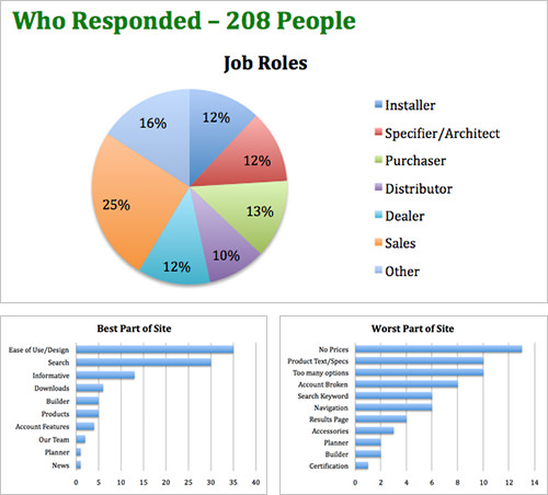
Charts created from survey data. (Large preview)
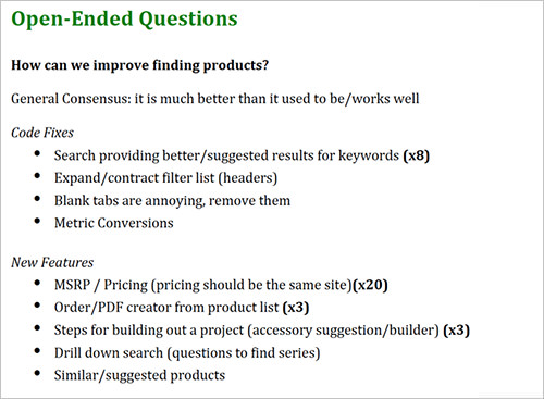
Open-ended questions listed and tallied.
Tapping Into Our Network (Website Statistics)
For the third component of our report, we will tap our inner geek and gather some data from Google Analytics, which has been running on our Widget website. Our users have already helped us understand how they use and experience the website, but analytics will give our report a foundation of solid data. Use analytics to track exactly how elements of the website are performing and to find some additional information about users. This data provides a perspective unclouded by emotion or opinion.
Start by listing things that would be useful to track (downloads, PDFs, button clicks, conversion rate, banners, outbound links), and then see whether that data is available. If it’s not, there is probably a way to start tracking it for future insight. Creating goals or dashboards with these key items will keep the report up to date.
The most interesting data points to track will depend on the type of website. If the website is content-driven, then categorize the content by topic or type (for example, infographic, review, press release, slideshow), and look at views, bounce rate and page duration. If it’s an e-commerce website, then set up some goal funnels, and compare the conversion rates of different products or pages. Look at your acquisitions to see where visitors are coming from (for example, social, search, email, direct, referral). This data will help you to identify where to focus your effort and will provide a point of comparison to measure the impact of that effort.
Additional ways to gather data include A/B testing, heat mapping, and social network analytics. For this report, we want not just a list of numbers, but powerful data that can be compared. When you’re figuring out what data would be helpful to have, consider these four common goals for a website:
- Simplification. What isn’t being used?
- Effectiveness. How do similar items perform?
- Discovery. What paths do users follow, and where do they stop?
- Technology. How do users access (and experience) your website?
For our Widgets website, let’s gather the following:
- Simplification. How often are some of the pages in the main navigation being viewed? (Or, more importantly, what isn’t being used?)
- Effectiveness. How popular are the various positions of the banner ads?
- Discovery. What percentage of users are browsing versus searching for products?
- Discovery. Where do users find news stories, and when do they read them?
- Technology. What types of devices are being used to view the website?
Find the data that answers these questions. Then, create dashboards in Analytics, or export the data to a spreadsheet and create charts to drop into the report. Let’s also include some brief descriptions below the charts to explain the data. Rely on a variety of charts; a report with only pie charts would look boring, and we want to use the type of chart that best represents each piece of data.
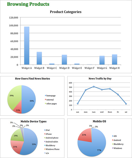
Charts representing data gathered from Google Analytics. (Large preview)
Finishing Our Report
Now that we’ve gathered all of this great data, let’s put the finishing touches on the report. In short, keep the content brief, use a lot of charts, and make the report easy to refer to; otherwise, you’ll cringe every time you have to dig in to find something.
We’ve got our three key sections now. Let’s briefly summarize at the very beginning of the report how we’ve gathered the data, how many people we’ve spoken to and what we’ve discovered. Here are some key headings:
- Purpose. What is our goal?
- Method. How did we find the information?
- Findings. What did we find?
- Implementation. What should we do with this information?
At the start of each section, briefly summarize the key discoveries, to make the section quicker to read through.
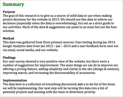
A summary of key discoveries across all sections of the report.
Putting The Report To Use
Now that we’ve got an awesome data report, it’s time to put it to use. Share it around the company, hold a meeting to go over the findings, and print it out so that it’s handy.
This report would be a helpful refresher to a freelancer who is switching projects and would be invaluable to someone who has just joined the company. Remember that this is a living document, so update it as needed.
Having gathered data from these three sources, we’ve got a well-rounded view of our website. This triangulation of data will surface some common insights and will give you a truer picture of the state of the website than by using one research method alone. This combination of data is extremely helpful for brainstorming, too. For instance, we could gather the team and share a data point from each section — such as, testing revealed that widget accessories are hard to find; our survey showed that users would like to be walked through how to build a solution; and analytics show that most of our users are on a tablet or large display — and then brainstorm on how to meet these needs.
In a few meetings, I’ve opened such a report on my laptop for quick access. It keeps me from having to dig for the right data or, better yet, prevents a debate that would derail the meeting. Such discussions would otherwise rely on guesswork or would be dominated by the highest paid person in the room — but not anymore with a trusty report at your side.
Further Reading
- Privacy Guidelines For Designing Personalization
- Facing Your Fears: Approaching People For Research
- A Closer Look At Personas
- A 5-Step Process For Conducting User Research
- A Better Way To Request App Ratings


 SurveyJS: White-Label Survey Solution for Your JS App
 Register Free Now
 Celebrating 10 million developers


