After Editorially: The Search For Alternative Collaborative Online Writing Tools
I’m going to let you in on a little secret: the best writers, be it your favorite authors or those that write for Smashing Magazine, don’t do it alone. Often, they work with an editor (or two), who will help them coalesce their words into something more compelling or easier to understand.
Having worked with several editors — and having been a technical editor myself — I’ve really come to appreciate this aspect of the writing process. Refinement is an essential aspect of any creative process. As refactoring code can make a program more logical and efficient, editing a text can allow an underlying idea to be more clearly stated, or make a piece more enjoyable to read.
I’m always on the look out for tools that can help me improve my craft. When I heard about Editorially, a collaborative writing tool designed with Web writers in mind, I immediately signed up. It quickly became an indispensable tool. From blog posts to talk outlines, I was bugging friends to provide feedback on my documents, which Editorially made very easy for them to do.
It had its shortcomings, of course. Two people couldn’t edit a document at the same time, while its focus on Web-based writing curtailed its utility; trying to tech edit a book with multiple chapters pushed the app beyond its natural limits. With the announcement that the service will close at the end of May, I’m left looking for an alternative. Can anything fill the void left by its untimely demise?
What Makes A Good Online Editing Tool?
Before we explore the alternatives, let’s examine what makes for a good Web-based collaborative writing tool.
- Distraction-free. Writing can be a difficult task, with writers prone to bouts of extended procrastination. In the space of writing this article I’ve cleaned my flat, washed the dishes and ironed clothes I don’t even wear! That is to say, the fewer distractions a writing tool can offer, the better.
- Markdown support. Markdown is popular with writers precisely because it requires little interaction with a UI, allowing them to focus on their words instead. Any Markdown editor should therefore provide keyboard shortcuts (bold, italic, heading levels, and so on), with the resulting text appropriately rendered; if you’ve wrapped a word in single asterisks to denote emphasis, you’d expect it to be appear italicized. Text also needs to be easy to read. Font face, type size, leading, and measure should be chosen with care.
- Annotation and discussion. Writing is just half the story, and a true collaborative writing tool should aid the activities that follow: sharing, editing, discussion, and review. Editors, co-authors and other collaborators should be able to highlight or replace passages of text, and annotate these changes if required. When working with multiple contributors, everyone’s remarks should be easy to differentiate. Somewhere to hold a general discussion about the document is useful, too.
- Document handling. A document can go through several revisions, so versioning is important to ensure earlier thoughts can be reinstated or referred back to later. Writers and editors can be working on many documents at a time, so having a means of organizing files and indicating their status (draft, review, final, and so on) is essential.
- Import and export. Finally, any tool should fit in with various production workflows. That means lots of import options (email, Dropbox, upload, sanitized copy-and-paste from Word) and plenty of export options (plain text, PDF, HTML, and the rest).
The Contenders
With these requirements in mind, what products are available, and how do they compare? When I heard about the closure of Editorially, I asked on Twitter for some recommendations. Here are some of the suggestions I received:
GitHub
One of the first suggestions was GitHub. While it is by no means designed for writing documents, for many writers on the Web, this is where their content will end up. Any text file can be edited directly within GitHub’s website, although the interface is more attuned to writing code than prose. Being based on Git, versioning comes free, although managing branches and pull requests may be a little convoluted.
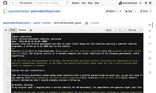
GitHub’s editing interface isn’t designed for writing prose. (Large preview)
Prose
If working directly with files in a GitHub repository appeals, you can improve the writing experience by using Prose, a beautifully designed and open-source editor built by Development Seed. Once you’ve authenticated with GitHub, the interface sits on top of your repos, providing an experience more suited to writing. This can be customized to expose any custom fields you have set up on a Jekyll or GitHub Pages install, too. Again, collaboration isn’t really a feature beyond that already provided by GitHub, but for small teams accustomed to that workflow, Prose may be a good fit.
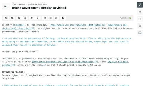
Prose layers an interface designed for writers on existing GitHub repos. (Large preview)
Penflip
Taking the Git analogy a step further, Loren Burton created Penflip, which he describes as a “GitHub for writers”. If you’ve used GitHub, you will be immediately familiar with this tool. Much like GitHub repos, documents (termed projects in Penflip) are viewable publicly by default, but if you wish to make them private, you can pay to do so (prices currently start from $8 a month).
The editing interface uses the same one as open-sourced by Prose. This is a great decision, as Development Seed has created a fantastic editor that provides keyboard shortcuts and fully styled Markdown that is essential in such a tool.
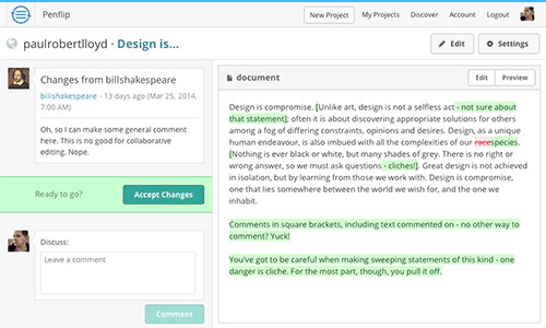
With no means of annotating edits within a document, editors have to resort to surrounding their comments with square brackets. (Large preview)
The editing experience is a little more complicated. Once a document is shared with another Penflip user, they will then have their own copy to which they can make edits. These changes are then submitted back to the master version, which the original author can accept, comment on, or ignore. This enforced Git-like workflow prevents more piecemeal collaboration, however, instead preferring an all-or-nothing affair with regards to editing.
Poetica
OK, let’s move on from Git-based workflows, and try something completely different. Poetica, currently in private beta, has an incredibly innovative (dare I say, skeuomorphic) interface that uses a written proofreading notation that copyeditors will be familiar with.
From a technical standpoint it’s a marvel to look at, but in practice it can be a bit finicky to use. In terms of the features outlined in the introduction, Poetica lacks in many areas. There is no support for Markdown, no place to discuss changes, while heavy edits may overwhelm the text being reviewed (in a few cases, remarks overlapped one another).
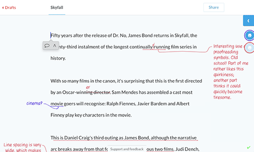
Poetica has an incredibly polished and visually delightful interface, yet its utility may be limited to proofreading smaller texts. (Large preview)
Poetica is clearly a very proficient tool, but I suspect its focus is much tighter than the other tools covered in this article. As a proofreading tool it could be really useful, but for longer works and more complex editing, writers may soon find its limits.
Draft
A popular suggestion was Draft, developed by Nathan Kontny. It’s easy to see why, given its uncluttered interface and a slew of features, including a “Hemingway mode”, the ability to send text to a simplification service, and the option to have documents copyedited by “college-educated staff” (15 minutes costs $8).
So much of what makes a good writing experience comes down to the details, though, and I can’t say I enjoyed using Draft. The distraction-free interface comes at the cost of lengthy menus and model windows, with the interface lacking consistency in these areas. You can customize the typeface and font size used within the editor; that said, I never felt the need to alter this in other apps, but I did here.
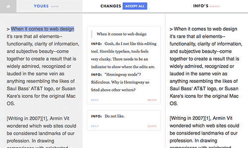
Draft allows authors to review changes using an interface familiar to programmers — but is it well-suited to editors? (Large preview)
When it comes to editing, changes are reviewed with a diff-like interface that I found truly baffling. Again, we see a tendency towards using programming concepts ill-suited to the free-flowing collaboration seen between writers and editors.
Typewrite
Typewrite aims to be “one of the best writing tools you’ve ever had”. It’s certainly one of the most beautiful, and competitors could learn a lot from Typewrite’s streamlined interface. Its Markdown editor is comparable to that of Prose and Penflip, although I found it to be quite buggy (inaccurate text selection and incorrect undos) but these issues can be easily ironed out. I also found it odd that the document title was missing from the UI, instead hidden behind a menu item. It’s the small things.
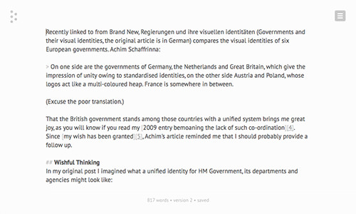
Typewrite has a beautifully stripped down interface, although its Markdown editor is a little buggy. (Large preview)
Perhaps Typewrite’s most interesting feature is its support for real-time editing, which allows multiple authors to work on the same text at the same time. This will be familiar to users of Google Docs (only excluded from this article due to its lack of Markdown support), although there is no means of knowing which author is making which changes. This feature also comes at the cost of any true editing features: there is no means of highlighting passages of text and adding remarks, for example.
As it currently stands, this tool is best suited to co-authoring rather than collaboration between an author and an editor or reviewer.
Onword
Also worthy of mention, Onword is a straightforward, stripped down editor created by Dan Eden. It features no collaboration or editing tools, and its Markdown editor is fairly basic. And yet, I find the simplicity of this app compelling. If Dan were to expand its capabilities to provide a workflow for editing documents, I would be a happy man.
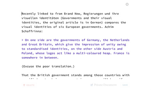
Onword provides a very stripped down interface for writing. (Large preview)
And The Winner Is…?
Before I sat down to write this article, I had only briefly glimpsed the homepages of the alternatives people had suggested to me. Each is beautifully designed and full of promise, but you should never judge a book by its cover (pun intended).
Only when examined in detail, do you realize the Herculean task that lies ahead of anyone wishing to write such an app — and for an audience so attuned to the details. Having reviewed the alternatives, I realize how much I took for granted in the design of Editorially, for which the highest praise that can be given is: it stayed out of the way.
In Editorially, we had a product for editors, by editors. In surveying the landscape of its competitors, we see many that provide wonderful, easy to use and distraction-free writing interfaces, but fail to understand the editing process. Mapping programming metaphors like branching and diffs seems like great ideas in abstract, but in practice impede the less structured act of review and refinement.
It’s important to remember that many of these tools are built as side-projects, whereas Editorially benefited from a full-time team working on the product for a year. There is plenty of promise in each of these apps, and with continued development we may see a worthy successor. Until that time, I suspect many will revert to whichever hacks and broken processes they were using previously: word-processors, emails, printouts and scribbled pen marks.
Further Reading
- Quick Course On Effective Website Copywriting
- The Overlooked Importance of Professional Journalism
- Getting Practical With Microcopy
- Five Copywriting Errors That Can Ruin A Company’s Website
Front page image credits: Torque.


 SurveyJS: White-Label Survey Solution for Your JS App
 Agent Ready is the new Headless


