Meet The Mobile Web Handbook
Argh! Weird browser bugs, inconsistent CSS/JavaScript support, performance issues, mobile fragmentation and complicated nuances such as device pixels, viewports, zooming, touch event cascade, pointer/click events and the 300ms delay. To make sense of it all, we created The Mobile Web Handbook, a new practical book by Peter-Paul Koch to help you understand technical issues on mobile and deal with them effectively.
We have all been there. With Responsive Web Design becoming a convenient strategy for device-agnostic design, we keep running into annoying technical issues that all those quirky (and not so quirky) mobile browsers are raising so very often. However, fixing these issues can be quite easy — once you understand exactly why they come up.

Printed Book
$29Print + eBookPrinted, georgeous hardcover.
eBook
$9.90eBookPDF, ePUB, Amazon Kindle.
The book will be useful for mobile strategists, developers, designers, and everybody willing to better understand the intricacies of mobile — both technical and market-related. Whether you want to get a better picture or dive deep into common browser bugs on mobile, this is just the book you need.
224 pages. Written by Peter-Paul Koch. Reviewed by Stephanie and Bryan Rieger. Designed by Stephen Hay. Shipping starts late September 2014. Get the book.
Why This Book Is For You
Developing websites for mobile is pretty much the same as it has always been, but it does require you to learn a few new things, and some of them are quite confusing. In Mobile Web Handbook, you’ll learn to:
- Make sense of the mobile value chain of operators and device/OS vendors,
- Distinguish between different mobile/proxy browsers and ongoing browser developments,
- See through the complicated browser situation on Android devices,
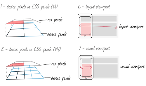
- Understand CSS pixels, physical pixels, device pixels,
- Make sense of layout viewport, visual viewport and ideal viewport,
- How zooming works and why page zoom is different than pinch zoom,
- The intricacies of the meta viewport and related CSS/JS properties,
- How to deal with technical issues of touch events in JS,
- Understand the touch event cascade and its bugs,
- Handle 300ms delay, pointer events and the click event,
- Fix common bugs caused by
position: fixed,overflow: autoandbackground-attachment, - Set up a device testing lab and test on mobile,
- Reconsider outdated development practices,
- Adjust expectations for mobile networks and latency.


Table Of Contents
| CHAPTER | TITLE | DETAILS |
|---|---|---|
| Chapter 1 | The Mobile World | |
Summary • The mobile world is a complicated, highly fragmented environment. The mobile value chain involves operators, device vendors and OS vendors—all having their own interests and goals that shape the device market and complicate things for us, web developers. If you read The Mobile Book already, this chapter is a revised and extended version of the chapter. It's been updated with the latest figures and developments, though, and contains a few new sections. Keywords • operators • networks • mobile value chain • device vendors • hardware • fragmented market • phone's production cycle • global device market • OS vendors and sales • developer relations • identity management • payments. | ||
| Chapter 2 | Browsers | |
Summary • If you’re used to the simple five-browser ecosystem that exists on the desktop, you’re in for a rough surprise in the mobile market. There are 30 mobile browsers, ranging from lousy to great. Besides, there are also proxy browsers, default browsers, downloadable ones, confusing Android ones, and of course WebViews. What do you need to know about prevailing browsers and prevailing platforms? A comprehensive overview of the browser market, worldwide market shares and ongoing developments—and a few browser stats. Keywords • browser ecosystem • rendering engines • WebKits • WebViews • Android browsers • platforms • proxy browsers • statistics. | ||
| Chapter 3 | Android | |
Summary • The most complex part of the mobile world is Android. With Android now spanning about three quarters of the smartphone market, it has a few problems and oddities that are uniquely its own. In this chapter we'll look at Google's wishes and actions, the reactions of the device vendors, and the complicated browser situation caused by the gradual replacement of Android WebKit by Chrome. Keywords • differentiation • Android updates • Android WebKit • Chrome. | ||
| Chapter 4 | Viewports | |
Summary • Mobile devices have far smaller screens than desktop/laptop computers. As a result, browser vendors had to perform some sleight of hand in order to make sure desktop-optimized websites also display decently. They split the viewport, which on desktop means the browser window, into three. What are these viewports and why do we need them? By discussing pixels, viewports, resolutions, the meta viewport, media queries, and related JavaScript events and properties, you'll gain some insight into how mobile browsers (and web developers) deal with the fundamental problem of the small screen. Keywords • device pixels • CSS pixels • layout viewport • visual viewport • ideal viewport • zooming • page zoom • pinch zoom • min/max-zoom • resolution • device-pixel-ratio • meta viewport • media queries • CSS/JavaScript • events. | ||
| Chapter 5 | CSS | |
Summary • There are a few CSS declarations that are harder to implement in mobile browsers than in desktop ones. Some, such as Keywords • position: fixed • overflow: auto • overflow-scrolling • background-attachment • vw and vh units • :active and :hover. | ||
| Chapter 6 | Touch Events | |
Summary • Mobile devices generally use touchscreens, and support a new set of touch events to monitor user actions. At first sight, touch events seem to be roughly the same as mouse events. What are the differences? How do they work? Do we need separate events for each interaction mode, or can we merge mouse and touch into one, as Microsoft wants? It is quite likely that future new web-enabled device classes such as TVs, cars, or even fridges, will bring new interaction modes and a new set of events. How do we prepare for them? That's exactly what this chapter is all about. Keywords • touchcancel • gesture events • dropdown menu • drag and drop • scrolling layer • event equivalencies • merging touch and mouse • detecting interaction modes • touch event cascade • the tap action • anatomy of a click • 300 ms delay • touchLists • pointer events. | ||
| Chapter 7 | Becoming a Mobile Web developer | |
Summary • This last chapter gives you practical details about how to become a mobile web developer, or to be more precise, how to set up a device library and conduct mobile tests. Which devices do you need? How do you run tests? What would an ideal device lab look like? And what should you keep in mind in terms of the improvements of the mobile networks in the future? Keywords • ideal device lab • acquiring and sharing devices • what and how to test • device test batches • managing updates • browser detection • JavaScript libraries • mobile networks • latency • connection speed. | ||
About The Author

Peter-Paul Koch (PPK) has been around for quite some time. Known for his browser compatibility tables on Quirksmode.org, he is a mobile platform strategist, browser researcher, consultant, and trainer in Amsterdam, the Netherlands. He specialises in the mobile web, and especially mobile browser research, advising mobile and desktop browser vendors on their implementation of web standards.
Technical Details
- 224 pages, 16.5 × 24.0 cm (6.5 × 9.5 inches).
- Quality hardcover with stitched binding and a ribbon page marker.
- The eBook is included with the printed book for free (PDF, EPUB, Kindle),
- Shipping starts late September 2014.
- Worldwide airmail delivery from Germany ($5 intl. shipping).
- Available as print and eBook.
Further Reading
- Accessible Target Sizes Cheatsheet
- Picture Perfect: Meet Pixo, A Photo Editor For Your End Users
- How To Become A Better Speaker At Conferences
- Understanding Privacy: A New Smashing Book Is Here


 Enterprise UX Masterclass, with Marko Dugonjic
 JavaScript Form Builder — Create JSON-driven forms without coding.
 Bring your design to life
 Register For Free


