Next-Generation Responsive Web Design Tools: Webflow, Edge Reflow, Macaw
To prepare for a talk about the changing roles of designers and developers, given at HOW Interactive a few months back, I interviewed 20+ web shops. Validated by my own experience, I found that many of them faced challenges fitting responsive design into their workflow, and the role of most web designers had changed to include coding in some form or another.
At least half of the designers knew HTML and CSS well but wanted a more visual way to get at it. Well, a new generation of visual responsive design tools has arrived. These responsive design tools are for anyone who understands HTML and CSS (or is willing to learn) and wants to visually design a responsive website — and have code to show for it.
Some of the newest and most notable visual responsive website builders are Webflow, Adobe Edge Reflow CC and Macaw. Yes, a million others are out there, including Squarespace, FROONT and Easel, but we’ll focus on a few in this article. My intention isn’t to champion these tools, but rather to familiarize you with them and discuss their strengths and weaknesses.
For the record, I’m a front-end developer who hand-codes responsive websites using several frameworks and my own code as a starting point (along with WordPress). I’ve always been leery of generated code, for good reason (remember GoLive?), but I also understand that tools like these have a time, a place and, yes, an audience. You could use one of these tools in the design process to create responsive comps, regardless of whether you intend to use the generated code. I’ve even taken to using a few for quick prototyping. Blasphemy!
So, let’s have a look, starting with Webflow.
Webflow
Like all of the tools we’ll discuss, Webflow is a relative newcomer to the scene. It’s an in-browser drag-and-drop editor for creating responsive websites without having to stare at code. It requires a monthly subscription and has multiple pricing levels for individuals and teams.
Included in all of the subscriptions is hosting on a content delivery network using a subdomain (yoursite.webflow.com), unless you want to pay a few dollars more for custom domain hosting. But you may also simply export the generated code and take it where you want. How’s the code that Webflow generates, you ask? It’s based on Bootstrap 3.0, and, yes, some of us could write cleaner, lighter, more semantic code, but all told, Webflow’s code is relatively clean.
After you sign up and log in, you get to Webflow’s dashboard. This is where you control your account, manage website settings and start your website. By default, there’s not much except a big blue button staring you in the face, urging you to create a website. You can either use a template or start from scratch. There’s even a marketplace for templates, paid and free, where you can sell your own Webflow templates.
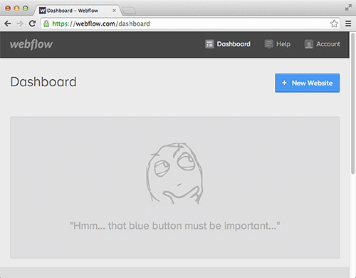
Getting started with Webflow (Large preview)
Building Blocks
Once you’ve started a website, you’re taken into Webflow’s designer, where the magic happens. In the designer, currently supported only in Chrome and Google Canary (which is basically Chrome for developers, with new features being added almost daily), you’ll be staring at your first page in the browser, with a toolbar on the left and several panels on the right.
Generic operations (such as adding pages, publishing and previewing) are on the left, and the nitty-gritty content and formatting options are on the right. From the “+” panel on the right, you can drag layout elements (divs or HTML5 elements set to a max-width or a width of 100%) and a customizable grid into the default desktop layout.
With your basic structure in place, you can begin inserting page content. Webflow comes with a set of standard web components (including lists, links and text blocks) and a series of customizable widgets (like social media icons and responsive sliders) that you can drag into the page’s structure. For images, you can use GIF, JPG, PNG or SVG, as well as images optimized for Retina and Hi-DPI displays. You can also drag the “Embed” widget into the design to add your own code.
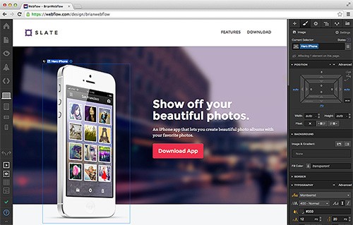
Webflow’s designer (Large preview)
Design
While Webflow is drag and drop, the experience isn’t quite like designing in Photoshop or Illustrator. The content you build fits together more like a jigsaw puzzle and is positioned using typical CSS properties such as padding, margin and position.
As a coder, I appreciate how effectively Webflow visually displays the HTML structure and CSS properties. As a result, working knowledge of HTML and CSS is necessary, and first-time website builders might be a bit perplexed by a few of the options, but that’s what the video help is for, along with the inline help icons (“?”) everywhere.
To be honest, the style panel on the right, where you adjust most of the CSS properties, is relatively intuitive, and the way it handles CSS properties such as padding and margin is pretty clever. CSS coders might feel it lacking and want to see the code. Sharing content between pages is pretty simple, and some SEO-related content, such as titles and descriptions, can be set per page.
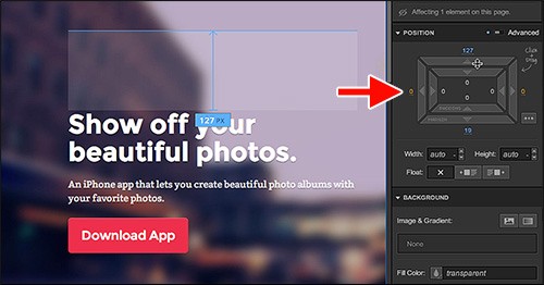
Edit styling (Large preview)
Defining Your Responsive Design
When it comes to how the content actually responds to browser size, Webflow follows how the industry originally approached responsive design: for three devices or breakpoints. As you add and design your content and areas, you can determine which device sizes (of three) they will appear on.
You can also easily preview the design in the three sizes from within the interface. Currently, the breakpoints aren’t editable in the designer, unless you add your own code in the dashboard or export the code and edit the CSS elsewhere.
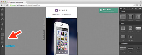
Switching between breakpoints (Large preview)
Fonts, Media, Forms And Linking
- Fonts. These days, hosted fonts are a must for any self-respecting designer. Integrating Google Fonts or a kit from a Typekit account can be done in the dashboard, and those fonts will then be accessible in the “Font” menu in the design area.
- Media. Adding media (including video from Vimeo and YouTube) is pretty easy, too. Webflow uses Embedly to embed content from a long list of providers.
- Forms. Simple contact forms are also available and can be set up and designed pretty easily. You can have the data sent by email: Just grab the form’s captured data from the settings in the dashboard, or hook the form to another script (or just insert your own form code).
- Linking. Aside from the typical linking options (like between website pages, email and phone), Webflow allows for linking to sections of your pages, with smooth scrolling between automatically inserted anchors. You can also insert a link block, which is an area of content with a single link applied to it. You can also easily adjust the appearance of your links by styling them.
Working With The Code
As with most other tools, some of the more advanced HTML and CSS features are hidden by default in the workspace but can be toggled on. If you’re feeling adventurous, you can also assign your own classes to content and rename and delete them in the Style Manager. If you’re handy with code, you can insert your own in the head and body tags in the dashboard. This opens the door to adding custom components, like jQuery plugins and a lot more.
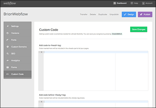
Inserting code (Large preview)
Integrating With A CMS
Webflow is currently a static website builder and isn’t tied to a content management system (CMS) or blogging system. You could export the code from your Webflow design to use as a starting point for a WordPress (or other) project or even as a flat-file CMS. But once the code is exported, it loses its connection to the original design in Webflow.
A useful feature of Webflow is the ability to save website versions. These days, most of us who develop websites for a living use some sort of version control, so that, in its simplest form, we can revert to earlier versions if a problem occurs. When designing in Webflow, you can either manually create a version or leave it to Webflow to create one automatically every 20th save.
A restore point will be created in the dashboard’s website settings, and you can add a note at each restore point. Then, if something happens, you can restore the entire file (i.e. website) to a previously saved version. So, writing yourself a note at each restore point to explain where the website is at is a good idea.
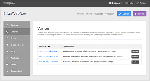
Restoring versions (Large preview)
Publishing And Exporting
Publishing to Webflow’s content delivery network (included in the cost) is pretty simple, as is exporting if you prefer to take the code elsewhere. I can imagine several uses for this: people using it to create their own static responsive website; designers using it to demo a responsive design or to hand off the exported code to a developer; and developers using pieces of the generated code in their projects. Webflow also enables users to work collaboratively (which costs more), including by sharing templates, transferring websites to clients and more.
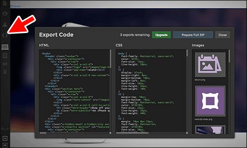
Exporting code (Large preview)
Adobe Edge Reflow CC
Edge Reflow is part of the family of Edge tools and services that Adobe has introduced in recent years. The family includes Edge Reflow, Edge Animate and Edge Inspect, and it is a part of the Creative Cloud, which is subscription-based. Unlike Webflow, which is browser-based, Edge Reflow is currently an application that you download and install on your hard drive. Because Reflow is still technically in public preview mode (like a beta that’s available to the world), it isn’t fully baked yet, and things will most likely change in future versions based on user feedback.
Edge Reflow is a design tool that captures the “in-betweens” of a responsive design, which are often difficult to convey when handing off a project to a developer or when presenting design concepts to a client. In other words, Edge Reflow makes Photoshop files more responsive-friendly.
Building Blocks
When beginning a project in Reflow, you can follow one of several methods. You can create a Reflow project that contains the pages of your website and start from a blank canvas, so to speak. You can import web images and Photoshop content and then build your design; doing this, you could even import the content into your Reflow project directly from a Photoshop CC file (version 14.1+ only — CS6 and earlier will not work) if the Photoshop file (PSD) has been set up properly.
A third method is to export a Reflow project from Photoshop CC (14.1+) as the starting point for a responsive design in Reflow. This allows you to import shapes, text and assets that you’ve defined in the Photoshop document. Using the generator technology built into Photoshop CC (14.1+), web-optimized images are automatically generated based on the layer names in Photoshop. This connection is one of Reflow’s big selling points for those of us who rely on Photoshop for web design.
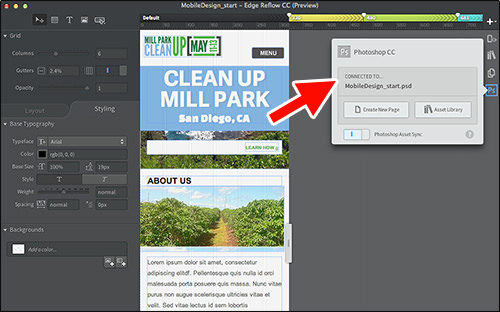
The Photoshop connection in Edge Reflow (Large preview)
Design
When it comes to design, Reflow is fairly similar to Photoshop and InDesign. You reposition elements visually, rather than edit the CSS and HTML to move them. Reflow also requires you to draw containing elements in the design space, rather than drag them in (like in Webflow). The float: left declaration is applied to all elements in Reflow by default, so dragging content that is on the page can be painful in the beginning. Once again, though, the application requires you to understand HTML and CSS concepts because most of the layout-related functionality is based on them.
To aid your designing, Reflow comes with an editable grid that allows you to edit columns, gutters and opacity. Each responsive breakpoint can have a different grid setting. You can create multiple pages, and the closest thing to adding CSS is to copy and paste the visual styles from one element to another. Reflow also allows you to access base CSS options for the body style (called the “page”) and the containing div (which all Reflow pages have).
Defining Your Responsive Design
Because responsive design is Reflow’s purpose in life, the one thing that really stands out is how you define breakpoints visually. In Reflow, the entire responsive spectrum is represented (not just three device sizes, as in Webflow). If parts of your design break between mobile and tablet, for instance, you can easily add a breakpoint by clicking a button and making the necessary changes. Reflow even allows you to set maximum and minimum breakpoints, which means you can design mobile-first, if you like.
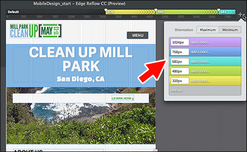
Defining breakpoints in Reflow (Large preview)
Fonts, Media, Forms And Linking
- Fonts. Fonts from a Tyepkit account can easily be used in the interface when you connect your kit. Reflow also comes with access to Edge Web Fonts (a collection of hosted web fonts from Adobe, Google and others).
- Media. Because you can’t inject your own code unless you edit the generated code, adding media in Edge Reflow isn’t possible. You can set a placeholder for media (such as images), using it as a visual cue for the production website.
- Forms. In Reflow, you can add a series of typical form elements, such as buttons, text fields and radio buttons (among others). Inserting these form elements in the page won’t add a
formtag to the generated code; so, the form elements are not meant to be functional out of the box. This reminds us again that Reflow is currently a mockup tool, suitable more for creating a proof-of-concept design than for generating production-ready code. - Linking. In the latest release of Edge Reflow CC, you can link to pages within the project and to external URLs, as well as control states like
hoverandactiveon any object in the design.
Integrating With A CMS
Reflow currently has no way to integrate with a CMS unless you take the code that is generated and do it yourself outside of the application.
Working With The Code
Editing code is not the purpose of Reflow because it’s meant to be used as a visual design tool. Nevertheless, using the Elements panel, you can name elements and organize the code (i.e. for the DOM) in a hierarchy that makes sense to you (and maybe to your developer). If you’re looking to add things like a jQuery slideshow, smooth scrolling or a video or insert your own HTML code, then you’ll need to edit the generated code in another application.
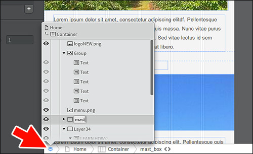
The Elements panel (Large preview)
Publishing And Exporting
Keep in mind that Edge Reflow currently has no exporting or publishing functionality. When previewing the website in a supported browser, Reflow generates the HTML and CSS, but inline comments warn you against using the code in a production environment. Judging by the response in Edge Reflow’s forums, this hasn’t stopped people from trying. Reflow does enable you to copy and paste the generated CSS to use further downstream on your actual website.
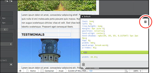
Copying CSS from Reflow (Large preview)
For an inside look at how Reflow came about, check out Aaron Shekey’s account of the process.
Macaw
The latest application on the scene is Macaw, which was just released to the public as version 1.0 on March 31st. Macaw is positioned as a web design tool that also writes semantic HTML and CSS. I think the tagline says it all, “Stop writing code, start drawing it.” Like Edge Reflow, Macaw is also an application that you download and install on your hard drive and is tied to a registered account. But unlike Webflow and Edge Reflow CC, there is no monthly fee. You pay only a one-time price.
After spending a few days with Macaw, I can tell you that it has great potential as a responsive web design tool. That’s a nice way of saying that it’s a pretty impressive 1.0 version, complete with some bugs. Coming from a web background, I can say that the interface is pretty intuitive, although I find myself missing basic features like right-click context menus and zooming. But considering that a handful of people kicked this thing off, not a large corporation, I’m impressed.
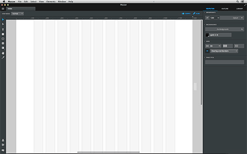
Macaw’s interface (Large preview)
Building Blocks
When you start a Macaw project, you are faced with a blank page, which is your design canvas. You can begin adding design elements to the page by importing images and adding text frames and the formatting to go with them, or you can jump right into adding breakpoints that you might expect to use. Macaw’s interface is pretty simple, and the average designer really won’t take very long to decipher where things are — that is, as long as they have working knowledge of HTML and CSS.
Like Reflow, Macaw is fairly similar to Photoshop and InDesign in its approach to design. You draw and reposition elements visually, rather than having to edit the CSS and HTML. Stream is the name of the engine that calculates all of the properties that place your design elements in the flow of the static document. As with Webflow and Reflow, you’ll need to understand HTML and CSS conceptually because most of the layout functionality is based on them.
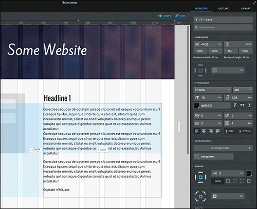
Layout elements in Macaw (Large preview)
Design
Macaw has what appears to be a pretty useful feature, called view mode, which shows you the design elements on the page as “normal,” “outline” or “wireframe.” Because many of us will be using Macaw as a wireframing and mockup tool, seeing the content as black outlines (“outline”) or gray boxes (“wireframe”) will be helpful.
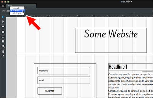
Macaw’s view mode (Large preview)
Defining Your Responsive Design
Having worked in Edge Reflow for a while, I was surprised at how similar Macaw’s workspace is. Like Reflow, Macaw lets you define breakpoints visually, although its interface is not as slick as Reflow’s in my opinion. The entire responsive spectrum is represented (not just three device sizes, as in Webflow).
If parts of your design break between breakpoints, you can easily add a breakpoint and make the necessary changes. Sadly, Macaw currently doesn’t allow for mobile-first design because you cannot set max and min breakpoints. The DOM is also locked at smaller breakpoints, preventing you from adding content (the tools are even grayed out). But people are chattering in Macaw’s forums that min-width breakpoints (for mobile-first design) are coming.
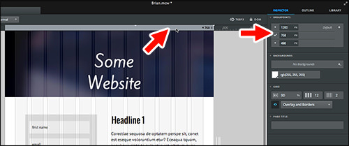
Setting breakpoints in Macaw (Large preview)
Fonts, Media, Forms And Linking
- Fonts. Google web fonts are integrated in the workspace, and you can also access Typekit fonts by connecting your account in the “Font” menu of the design area.
- Media. Currently, Macaw offers no easy way to insert media such as YouTube videos. You can, however, insert a placeholder element and tie some JavaScript to it, using the “Scripts” panel.
- Forms. Macaw has a variety of typical form elements, including buttons, text fields and radio buttons, that can be added to a design. As in Reflow, these are for visually representing a form, not for creating an actual working form. If you are feeling adventurous, you can group form elements together and change the tag to
formin the Outline editor. This will at least give you the building blocks for a functional form if you intend to use the generated code on your production website. - Linking. You can link to pages created in a project, as well as type in links in the “Links” menu.
Working With The Code
The closest thing to working with code in Macaw (aside from editing the published code) is editing elements in the Outline panel, which is a representation of the DOM. In the Outline panel, you can change HTML tags, nest and reorder content, apply CSS names and more. You can also create global styles (CSS) that can be applied to your content.
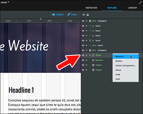
Editing tags in the Outline panel (Large preview)
Integrating With A CMS
Like Reflow, Macaw does not integrate with a CMS. Some people in the Macaw community are trying to figure out a workflow from Macaw to WordPress (and others platforms), but there is no direct connection yet.
Publishing And Exporting
Macaw has a publishing option that leads to a preview window. Unlike Reflow, Macaw offers options for exporting, under “Publish Settings.” In the dialog box there, you can choose which pages to export, inject code (such as for Google Analytics) into the head or body, tailor the CSS to your needs (by writing shorthands, adding vendor prefixes, consolidating styles, etc.), generate optimized images for high-definition screens and more.
The settings tell you that the generated code isn’t just for show. Once you publish, you are taken into a preview window, where you can view all of the code (HTML, CSS, JavaScript) and even go to preview the page in your default browser. Of the three applications, Macaw’s code is the most concise and the closest to what a front-end developer might actually write.
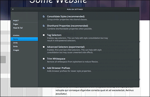
Options for publishing code (Large preview)
Wrapping Up
Below is a quick roundup of the most important features of each application. It doesn’t include everything we’ve discussed (or else I would have just slapped a table on the page and called it a day).
| Webflow | Edge Reflow CC | Macaw | |
|---|---|---|---|
| Price | Monthly subscriptions starting at $14 in Webflow | Reflow, Part of Adobe Creative Cloud (monthly subscription) | $179 (no monthly plan at Macaw) |
| Hosting | Included (each plan has different features) in Webflow | Five websites are included with Creative Cloud subscription, but Edge Reflow currently can’t export to Adobe web hosting. | None at Macaw |
| Code quality | Production quality: Webflow currently uses Normalize.css (version 2.1.3), Modernizr and jQuery (version 1.11.0), along with its own library. The code is relatively clean, with classes used instead of a ton of IDs. A base CSS file is used, and your modifications are saved in a separate file. | Testing quality: Reflow's code is currently optimized only for WebKit browsers (Chrome and Safari). The CSS from HTML5 Boilerplate is the base, and no JavaScript libraries are used. The code has a lot of IDs and doesn’t allow you to easily reuse styles when you’re editing the code directly. After being cleaned up, the code could be used as a starting point. | Production quality: in Macaw, Normalize.css (version 2.1.0) and jQuery (version 1.8.3) are used. The code is relatively clean, with classes used instead of a ton of IDs. A base CSS file is used, and each page has a separate CSS file for grid settings. Your modifications are saved in a separate CSS file. |
| Responsive Design | Webflow has three devices (or breakpoints) that you design for. As you create content and areas, you can determine which device sizes of the three they should appear in. Currently, the breakpoints aren’t editable within the application. | Adding and editing breakpoints to Reflow is visual. The entire responsive spectrum is represented. Adding a breakpoint is as easy as clicking a button and making the change. You can even set max and min breakpoints, which means you can design mobile-first. | Macaw lets you define breakpoints visually, and the entire responsive spectrum is represented. You can’t set max and min breakpoints, and so mobile-first design is not supported. The DOM locks at low breakpoints, preventing you from adding content. |
| Fonts | In Webflow, Google Fonts are integrated, and a kit from your Typekit account can be connected in the dashboard. | A kit from Typekit can be integratedin Reflow. It also provides access to the Edge Web Fonts collection. | Google Fonts are integrated in the workspace in Macaw, and you can access Typekit fonts by connecting your account. |
| Media | Adding media (Vimeo, YouTube, etc.) is pretty easy in Webflow. Embedly is used to embed content from a long list of providers. | Because you can’t inject your own code in the application, adding media isn’t possible in Reflow. | Inserting media, such as a YouTube video, is not easy in Macaw yet. You can, however, insert a placeholder element and tie some JavaScript to it, using the “Scripts” panel. |
| Forms | Simple contact forms are available and are easy to set up and design for Webflow. You can send the data via email or hook the form to another script (or just insert your own code). | You can add typical form elements, but a form tag will not be added to the generated code. The form in Reflow is just a placeholder and is not meant to be functional. | You can add typical form elements in Macaw, but they’re more for visual design, not an actual working form. |
| Working with the code | Advanced HTML and CSS features are hidden in Webflowby default but can be toggled on. You can assign classes to content and rename and delete them in the style manager. You can also insert your own in the head or body tag. | Editing code is not an option in Reflow. You can name HTML elements, generically assign CSS styles and organize the DOM into a hierarchy. External code cannot be injected into a project within Reflow. | The closest thing to working with code in Macaw is changing HTML tags, nesting and reordering content, applying CSS names and the like. You can also apply global styles to content and generate classes. |
| CMS integration | Webflow is a static website builder and doesn’t tie in with a CMS or blogging platform. You can, however, save website versions. | No integration yet in Reflow | No integration yet in Macaw |
| Publishing and exporting | Publishing to Webflow’s content delivery network (included in the cost) is pretty simple, as is exporting if you prefer to take the code elsewhere. | Edge Reflow CC currently has no exporting or publishing support. HTML and CSS are generated when you preview, but they are not intended for production. You can copy and paste the generated CSS. | A publishing option in Macawis offered, with various settings. The code is the most concise and the closest to what a front-end developer might actually write. |
These responsive design tools are probably here to stay in some form or other. Ever since mobile devices came on the scene, we’ve been trying to configure our workflows to accommodate responsive designs. These tools could potentially bridge that divide when used either as a starting point for front-end design or simply for wireframing and prototyping.
As you would expect, I’ve already seen people attempt to build a large CMS-based website using Reflow and then complain when they can’t inject their favorite responsive slideshow or bemoan that the code isn’t what they would write. Keep in mind that Macaw and Reflow are meant to be a part of a workflow, not the beginning and end. By using these tools as they are intended (and not forcing them into our workflow), we can cross the threshold of responsiveness, potentially saving ourselves and our clients time and headaches.
Further Reading
- Responsive Web Design Techniques, Tools and Strategies
- Responsive Web Design: What It Is And How To Use It
- Using Sketch For Responsive Web Design
- Photoshop Etiquette For Responsive Web Design


 Claim Your Free Spot!

 SurveyJS: White-Label Survey Solution for Your JS App
 Celebrating 10 million developers


