What 22 Billion Newsletters Tell Us About Designing For Mobile Email
Do you know which platforms and email clients to focus on when creating an email newsletter for yourself or a client? Using the data from over 22 billion email subscribers, we determined what designers should prioritize, both this year and beyond.
In this article, we’ll interpret the numbers from our “Email Marketing Trends” report to help designers like you make informed decisions about what works and what doesn’t in email newsletters. Here are some of the things we’ll cover:
- Which email clients and platforms should we be supporting now?
- Does responsive design matter for email (even though we’re still coding with tables)?
- Should we learn all of the email workarounds or just use existing builders and frameworks?
- “Beyond the click” matters. Are your landing pages letting you down?
- What should we prioritize in an email newsletter project?
Email: Is It Still All Table Layouts?
If you send email newsletters or have done even a cursory amount of design or coding for them, then you’ll know that CSS support in email clients is, well, broken. For the longest time, designers have avoided using even the most common CSS properties, in the fear that straying from the dullest table-based layout would result in significant rendering differences between email clients, including Outlook and Gmail.
However, some clients are more broken than others. And if you have the benefit of a lot of subscribers who read their email on, say, an iOS device, then you can probably create very web-like experiences in the inbox. A usage report for email clients can certainly guide you in this decision, as can some of the data we’ve collected.
A Look At The Numbers
Given the amazing volume of email that Campaign Monitor sends on behalf of its customers, we were able to collect and analyze data from over 6 million email campaigns and 22 billion(!) email recipients. In particular, we looked at opens across mobile, desktop and webmail clients; year-over-year trends; and patterns of click-through rates (CTR) based on opens by device.
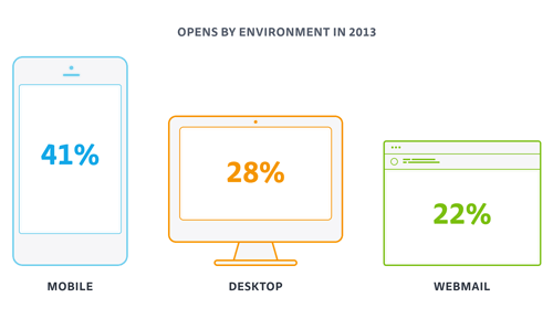
Some of what we found came as no surprise. As expected, mobile devices dominated market share across 2013 and 2014. Less obvious is what mobile’s upward trend means to designers who want to create a great email experience on all platforms — and, of course, get more opens and clicks in the process.
What We Can Learn?
Given our extensive experience in email design, we’ve rolled our findings into three practical tips that you can apply when building your next email campaign — and, not to mention, any landing pages. Without any further hesitation, here they are.
1. As With The Web, Design For Mobile First
In recent years, the market share of email clients has seriously shifted. In turn, designers have had to adapt to changes in email behavior. For example, desktop email clients dominated until early 2012, and now mobile devices are the natural environment for reading email. This means that playing it safe with a fixed-width, one-column layout isn’t enough anymore — we need to focus on making our content not only compelling, but easy to read and easy to navigate on a small screen. Responsive design for email is no longer a luxury, but a necessity.
If you zoom in on mobile market share, one thing jumps out: Nearly 90% of all mobile opens occur on Apple’s iOS devices. While this data is skewed by the fact that, unlike many Android email clients, iOS displays images by default (thereby registering more opens), it still shows how readily people consume email on iPhones and iPads.
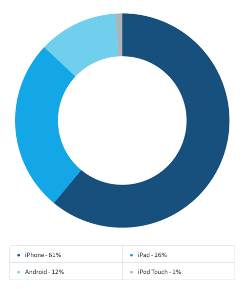
iOS’ dominance has a wonderful upside. It means that many email designers (particularly those with a high percentage of iOS users) can get really adventurous with creating web-like experiences for mobile. For example, Panic now regularly integrates SVG animation, web fonts and responsive design in its campaigns:
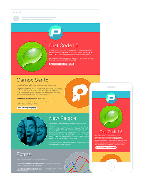
The lesson here is to ensure that any CSS techniques you use degrade gracefully in less-capable email clients. What looks amazing in Mail might be unusable in Outlook.
Also, in case you’re wondering, switching to a mobile-friendly email newsletter template does yield results. DEG Digital’s redesign for Crocs resulted in a 16% higher reading engagement overall and 8% more clicks, while recent tests by SitePoint show that the responsive version of its “Versioning” newsletter received 16% more clicks than the previous template.
My Smashing Magazine article from 2011 is still a great primer on tailoring the email experience to mobile devices. We also have the more recent “Guide to Responsive Email Design” to get you up to speed. That being said, almost every decent email-marketing service has a visual builder for creating mobile-ready newsletters — ours is called Canvas and is well worth a look.
2. But Desktop And Webmail Clients Will Not Die
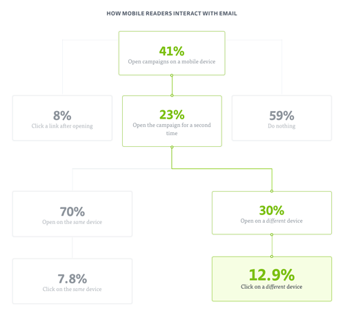
Given that mobile email readership is so far in the lead, is it even worth worrying about what’s happening in webmail or desktop email clients? Yes. While 87% of clicks happen when a reader opens an email for the first time, mobile readers who open an email a second time from their desktop are 65% more likely to click through in a given email, which goes to show that “email triage” is very much a real phenomenon.
So, where do opens occur? Outlook 2007+ (as distinct from Outlook.com) accounts for 56% of all desktop opens and nearly 16% of total opens in any environment. Unfortunately, that the majority of desktop opens happen in different editions of Outlook doesn’t make life any easier for designers. Each edition of Outlook has its own rendering challenges, which regularly require VML workarounds (for example, when applying background images). As backwards as it sounds, newer versions of Outlook for Windows are more difficult to work with than older ones: 2000 and 2003 render HTML email using Internet Explorer, whereas 2007, 2010 and 2013 use Microsoft Word (thus, the VML tomfoolery).
Refreshingly, Apple’s Mail (which, thanks to WebKit, offers excellent CSS support) has a 33% share of email clients. And, of all email clients, it tends to throw up the fewest rendering problems.
The webmail scene perhaps saw the biggest market share dip last year, but it still accounts for 22% of opens recorded. Looking at other email clients in Microsoft’s stable, Outlook.com (previously Hotmail) accounts for nearly half of all opens in this group. In comparison, Gmail and Yahoo Mail each has an almost 25% share of the webmail market, tying them for second place.
Like the desktop Outlooks, Gmail in particular has some quirks in its CSS support that can be problematic for designers. For starters, Gmail still strips CSS styles from the head element of HTML emails, making tools such as CSS Inliner a necessary resource (in case your email platform doesn’t have a tool like this built in).
In the end, if you’re coding newsletters from scratch, then learn the different rendering quirks across email clients — for your own sanity.
3. Go Beyond The Click
Almost no one runs an email campaign that doesn’t link to something. So, landing pages should be considered a part of the overall experience. While in some cases, people are willing to view email on two or more platforms, the same isn’t necessarily true with landing pages. A poor mobile experience can have a big impact on bounce rates. If your email newsletter is meant to generate online sales and yet 41% of subscribers can’t effectively navigate your pages via a mobile device, then you’re potentially losing a lot of revenue.
Looking at it positively, optimizing your website for mobile could have a positive impact not only on your email campaigns, but on your website and business overall. For instance, e-commerce is particularly tricky to get right on mobile devices. However, following a redesign using its ResponsiveJS framework, 5th Finger observed that one client measured a 54% increase in checkout conversions on smartphones and a 24% increase on tablets in less than 14 weeks.
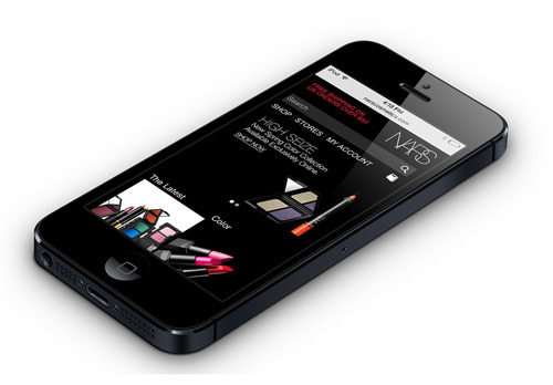
The good news is that a lot of landing-page builders (such as Unbounce), frameworks (such as Zurb Foundation) and CMS themes (looking at you, WordPress) focus on making mobile browsing pleasurable. These resources have been developed to do most of the hard work of building a responsive website: adapting navigation elements and forms to be usable, making text readable and scaling images.
In addition to the tools that handle the practical side of responsive design, designers also have formidable resources on the theory, including some great eBooks from Smashing Magazine. So, regardless of whether you’re more comfortable building out of the box, coding or simply telling a designer what to do, you can provide a good post-click experience for email recipients.
Where Do We Go From Here?
One thing we know about email marketing is that technology is shifting all the time. Knowing and adapting to your subscribers’ email usage — and understanding how they consume your content — is critical to the success of your email campaigns.
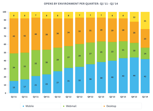
If we look at device trends, a few things are clear:
- Design mobile-first. Now that the majority of opens occur on mobile devices (and will continue to do so for the foreseeable future), designers have to move on from a fixed-width, table-based approach to email design. Instead, look at how to create better experiences using CSS, responsive layouts, web fonts and more. In the future, we may even start to use flexbox to create pleasing layouts across a variety of inboxes!
- But get comfortable with workarounds for desktop and webmail clients. Sadly, these email clients aren’t going away anytime soon. With 16% of all opens still occurring across Outlook’s desktop clients and an additional 15% being shared between Outlook.com and Gmail alone, both desktop and webmail clients are still very much in use — and will likely continue to be very broken. If working with VML isn’t your cup of tea, you have some great email builders to choose from, such as Canvas. These tools have a lot of insider knowledge built in and are a great starting point for a mobile-ready campaign.
- Think beyond the click. You probably don’t run email campaigns in isolation, so review the experience around them. On a mobile device, is it easy to subscribe, click through in a newsletter and then complete a goal (such as creating an account or purchasing an item on your website)? If 41% of your subscribers consume mail on a mobile device, then making all post-click interactions as easy as possible is critical.
- Prioritize testing. Finally, the email client landscape is as fragmented as ever. Our “Guide to CSS Support in Email” shows that the 18 email clients (split across three environments) all have very different levels of CSS support. If you’re designing and building an email campaign from scratch, then you probably won’t be able to get things “just right” in the most common email clients among your subscribers. So, put time into real-life device testing, or invest money in virtual tests, such as the ones found in many email platforms and via services such as Litmus.
Now that we’ve looked at what’s trending, it’s over to you. What kinds of email open trends are you seeing, and are they having an effect on how you design and send email campaigns? We’d love to hear your experiences in the comments below.
Other Resources
- “Email Marketing Trends,” Campaign Monitor
- Responsive Email Design, Campaign Monitor
- Canvas, Campaign Monitor An email newsletter builder
- Foundation, Zurb A responsive front-end framework
Further Reading
- The Art And Science Of The Email Signature
- Email Is (Still) Important And Here Is Why
- How To Improve Your Email Workflow With Modular Design
- An Introduction To Building HTML Email For Web Developers


 Agent Ready is the new Headless
 SurveyJS: White-Label Survey Solution for Your JS App


