Styling And Animating SVGs With CSS
Why is it so important to optimize your SVGs? Also, why even put in the effort to make them accessible? In this article, Sara Soueidan explais why, and also how to style and animate with CSS.
CSS can be used to style and animate scalable vector graphics, much like it is used to style and animate HTML elements. In this article, which is a modified transcript of a talk I recently gave at CSSconf EU and From the Front, I’ll go over the prerequisites and techniques for working with CSS in SVG.
I’ll also go over how to export and optimize SVGs, techniques for embedding them and how each one affects the styles and animations applied, and then we’ll actually style and animate with CSS.
Introduction
Scalable vector graphics (SVG) is an XML-based vector image format for two-dimensional graphics, with support for interactivity and animation. In other words, SVGs are XML tags that render shapes and graphics, and these shapes and graphics can be interacted with and animated much like HTML elements can be.
Animations and interactivity can be added via CSS or JavaScript. In this article, we’ll focus on CSS.
There are many reasons why SVGs are great and why you should be using them today:
- SVG graphics are scalable and resolution-independent. They look great everywhere, from high-resolution “Retina” screens to printed media.
- SVGs have very good browser support. Fallbacks for non-supporting browsers are easy to implement, too, as we’ll see later in the article.
- Because SVGs are basically text, they can be gzipped, making the files smaller that their bitmap counterparts (JPEG and PNG).
- SVGs are interactive and styleable with CSS and JavaScript.
- SVG comes with built-in graphics effects such as clipping and masking operations, background blend modes, and filters. This is basically the equivalent of having Photoshop photo-editing capabilities right in the browser.
- SVGs are accessible. In one sense, they have a very accessible DOM API, which makes them a perfect tool for infographics and data visualizations and which gives them an advantage over HTML5 Canvas because the content of the latter is not accessible. In another sense, you can inspect each and every element in an SVG using your favorite browser’s developer tools, just like you can inspect HTML elements. And SVGs are accessible to screen readers if you make them so. We’ll go over accessibility a little more in the last section of this article.
- Several tools are available for creating, editing and optimizing SVGs. And other tools make it easier to work with SVGs and save a lot of time in our workflows. We’ll go over some of these tools next.
Exporting SVGs From Graphics Editors And Optimizing Them
The three most popular vector graphics editors are:
- Adobe Illustrator,
- Inkscape,
- Sketch.
Adobe Illustrator is a paid application from Adobe. It is a highly popular editor, with a nice UI and many capabilities that make it the favorite of most designers.
Inkscape is a popular free alternative. Even though its UI is not as nice as Illustrator’s, it has everything you need to work with vector graphics.
Sketch is a Mac OS X-only graphics app. It is not free either, but it has been making the rounds among designers lately and gaining popularity, with a lot of resources and tools being created recently to improve the workflow.
Choose any editor to create your SVGs. After choosing your favorite editor and creating an SVG but before embedding it on a web page, you need to export it from the editor and clean it up to make it ready to work with.
I’ll refer to exporting and optimizing an SVG created in Illustrator. But the workflow applies to pretty much any editor, except for the Illustrator-specific options we’ll go over next.
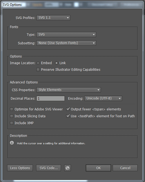
To export an SVG from Illustrator, start by going to “File” → “Save as,” and then choose “.svg” from the file extensions dropdown menu. Once you’ve chosen the .svg extension, a panel will appear containing a set of options for exporting the SVG, such as which version of SVG to use, whether to embed images in the graphic or save them externally and link to them in the SVG, and how to add the styles to the SVG (by using presentation attributes or by using CSS properties in a <style> element).
The following image shows the best settings to choose when exporting an SVG for the web:

The reasons why the options above are best are explained in Michaël Chaize’s excellent article “Export SVG for the Web With Illustrator CC.”
Whichever graphics editor you choose, it will not output perfectly clean and optimized code. SVG files, especially ones exported from editors, usually contain a lot of redundant information, such as meta data from the editor, comments, empty groups, default values, non-optimal values and other stuff that can be safely removed or converted without affecting the rendering of the SVG. And if you’re using an SVG that you didn’t create yourself, then the code is almost certainly not optimal, so using a standalone optimization tool is advisable.
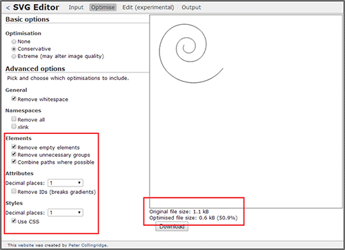
Several tools for optimizing SVG code are out there. Peter Collingridge’s SVG Editor is an online tool that you input SVG code into either directly or by uploading an SVG file and that then provides you with several optimization options, like removing redundant code, comments, empty groups, white space and more. One option allows you to specify the number of decimal places of point coordinates.

Peter’s optimizer can also automatically move inline SVG properties to a style block at the top of the document. The nice thing about it is that, when you check an option, you can see the result of the optimization live, which enables you to better decide which optimizations to make. Certain optimizations could end up breaking your SVG. For example, one decimal place should normally be enough. If you’re working with a path-heavy SVG file, reducing the number of decimal places from four to one could slash your file’s size by as much as half. However, it could also entirely break the SVG. So, being able to preview an optimization is a big plus.
Peter’s tool is an online one. If you’d prefer an offline tool, try SVGO (the “O” is for “optimizer”), a Node.js-based tool that comes with a nice and simple drag-and-drop GUI. If you don’t want to use an online tool, this one is a nice alternative.
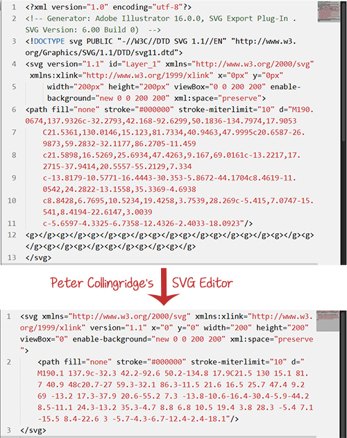
The following screenshot (showing the path from the image above) is a simple before-and-after illustration of how much Peter’s tool optimizes SVG.

Notice the size of the original SVG compared to the optimized version. Not to mention, the optimized version is much more readable.
After optimizing the SVG, it’s ready to be embedded on a web page and further customized or animated with CSS.
Styling SVGs With CSS
The line between HTML and CSS is clear: HTML is about content and structure, and CSS is about the look. SVG blurs this line, to say the least. SVG 1.1 did not require CSS to style SVG nodes — styles were applied to SVG elements using attributes known as “presentation attributes.”
Presentation attributes are a shorthand for setting a CSS property on an element. Think of them as special style properties. They even contribute to the style cascade, but we’ll get to that shortly.
The following example shows an SVG snippet that uses presentation attributes to style the “border” (stroke) and “background color” (fill) of a star-shaped polygon:
<svg xmlns="https://www.w3.org/2000/svg" version="1.1" width="300px" height="300px" viewBox="0 0 300 300">
  <polygon
fill = "#FF931E"
stroke = "#ED1C24"
stroke-width = "5"
points = "279.1,160.8 195.2,193.3 174.4,280.8   117.6,211.1 27.9,218.3 76.7,142.7 42.1,59.6 129.1,82.7 197.4,24.1 202.3,114 "/>
</svg>
The fill, stroke and stroke-width attributes are presentation attributes.
In SVG, a subset of all CSS properties may be set by SVG attributes, and vice versa. The SVG specification lists the SVG attributes that may be set as CSS properties. Some of these attributes are shared with CSS, such as opacity and transform, among others, while some are not, such as fill, stroke and stroke-width, among others.
In SVG 2, this list will include x, y, width, height, cx, cy and a few other presentation attributes that were not possible to set via CSS in SVG 1.1. The new list of attributes can be found in the SVG 2 specification.
Another way to set the styles of an SVG element is to use CSS properties. Just like in HTML, styles may be set on an element using inline style attributes:
<svg xmlns="https://www.w3.org/2000/svg" version="1.1" style="width: 300px; height: 300px;" viewBox="0 0 300 300">
<polygon
  style = "fill: #FF931E; stroke: #ED1C24; stroke-width: 5;"
  points = "279.1,160.8 195.2,193.3 174.4,280.8   117.6,211.1 27.9,218.3 76.7,142.7 42.1,59.6 129.1,82.7 197.4,24.1 202.3,114 "/>
</svg>
Styles may also be set in rule sets in a <style> tag. The <style> tag can be placed in the <svg> tag:
<svg xmlns="https://www.w3.org/2000/svg" version="1.1" width="300px" height="300px" viewBox="0 0 300 300">
  <style type="text/css">
  <![CDATA[
  selector {/* styles */}
  ]]>
  </style>
  <g id=".."> … </g>
</svg>
And it can be placed outside of it, if you’re embedding the SVG inline in the document:
<!DOCTYPE html><!-- HTML5 document -->
<html>
<head> … </head>
<body>
<style type="text/css">
  /* style rules */
</style>
<!-- xmlns is optional in an HTML5 document →
<svg viewBox="0 0 300 300">
<!-- SVG content -->
</svg>
</body>
</html>
And if you want to completely separate style from markup, then you could always link to an external style sheet from the SVG file, using the <?xml-stylesheet> tag, as shown below:
<?xml version="1.0" standalone="no"?>
<?xml-stylesheet type="text/css" href="style.css"?>
<svg xmlns="https://www.w3.org/2000/svg" version="1.1" width=".." height=".." viewBox="..">
  <!-- SVG content -->
</svg>
Style Cascades
We mentioned earlier that presentation attributes are sort of special style properties and that they are just shorthand for setting a CSS property on an SVG node. For this reason, it only makes sense that SVG presentation attributes would contribute to the style cascade.
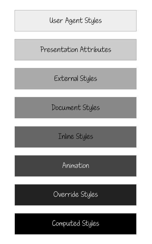
Indeed, presentation attributes count as low-level “author style sheets” and are overridden by any other style definitions: external style sheets, document style sheets and inline styles.
The following diagram shows the order of styles in the cascade. Styles lower in the diagram override those above them. As you can see, presentation attribute styles are overridden by all other styles except for those specific to the user agent.

For example, in the following code snippet, an SVG circle element has been drawn. The fill color of the circle will be deep pink, which overrides the blue fill specified in the presentation attribute.
<circle cx="100" cy="100" r="75" fill="blue" style="fill:deepPink;" />
Selectors
Most CSS selectors can be used to select SVG elements. In addition to the general type, class and ID selectors, SVGs can be styled using CSS2’s dynamic pseudo-classes (:hover, :active and :focus) and pseudo-classes (:first-child, :visited, :link and :lang. The remaining CSS2 pseudo-classes, including those having to do with generated content (such as ::before and ::after), are not part of the SVG language definition and, hence, have no effect on the style of SVGs.
The following is a simple animation of the fill color of a circle from deep pink to green when it is hovered over using the tag selector and the :hover pseudo-class:
<style>
circle {
  fill: deepPink;
  transition: fill .3s ease-out;
}

circle:hover {
  fill: #009966;
}
</style>
Much more impressive effects can be created. A simple yet very nice effect comes from the Iconic icons set, in which a light bulb is lit up when hovered over. A demo of the effect is available.
Notes
Because presentation attributes are expressed as XML attributes, they are case-sensitive. For example, when specifying the fill color of an element, the attribute must be written as fill=“…” and not Fill=“…”.
Furthermore, keyword values for these attributes, such as the italic in font-style=“italic”, are also case-sensitive and must be specified using the exact case defined in the specification that defines that value.
All other styles specified as CSS properties — whether in a style attribute or a <style> tag or in an external style sheet — are subject to the grammar rules specified in the CSS specifications, which are generally less case-sensitive. That being said, the SVG “Styling” specification recommends using the exact property names (usually, lowercase letters and hyphens) as defined in the CSS specifications and expressing all keywords in the same case, as required by presentation attributes, and not taking advantage of CSS’s ability to ignore case.
Animating SVGs With CSS
SVGs can be animated the same way that HTML elements can, using CSS keyframes and animation properties or using CSS transitions.
In most cases, complex animations will usually contain some kind of transformation — a translation, a rotation, scaling and/or skewing.
In most respects, SVG elements respond to transform and transform-origin in the same way that HTML elements do. However, a few inevitable differences result from the fact that, unlike HTML elements, SVG elements aren’t governed by a box model and, hence, have no margin, border, padding or content boxes.
By default, the transform origin of an HTML element is at (50%, 50%), which is the element’s center. By contrast, an SVG element’s transform origin is positioned at the origin of the user’s current coordinate system, which is the (0, 0) point, in the top-left corner of the canvas.
Suppose we have an HTML <div> and an SVG <rect> element:
<!DOCTYPE html>
…
<div style="width: 100px; height: 100px; background-color: orange"> </div>
<svg style="width: 150px; height: 150px; background-color: #eee">
  <rect width="100" height="100" x="25" y="25" fill="orange" />
</svg>
If were were to rotate both of them by 45 degrees, without changing the default transform origin, we would get the following result (the red circle indicates the position of the transform origin):

What if we wanted to rotate the SVG element around its own center, rather than the top-left corner of the SVG canvas? We would need to explicitly set the transform origin using the transform-origin property.
Setting the transform origin on an HTML element is straightforward: Any value you specify will be set relative to the element’s border box.
In SVG, the transform origin can be set using either a percentage value or an absolute value (for example, pixels). If you specify a transform-origin value in percentages, then the value will be set relative to the element’s bounding box, which includes the stroke used to draw its border. If you specify the transform origin in absolute values, then it will be set relative to the SVG canvas’ current coordinate system of the user.
If we were to set the transform origin of the <div> and <rect> from the previous example to the center using percentage values, we would do this:
<!DOCTYPE html>
<style>
  div, rect {
  transform-origin: 50% 50%;
}
</style>
The resulting transformation would look like so:

That being said, at the time of writing, setting the transform origin in percentage values currently does not work in Firefox. This is a known bug. So, for the time being, your best bet is to use absolute values so that the transformations behave as expected. You can still use percentage values for WebKit browsers, though.
In the following example, we have a pinwheel on a stick that we’ll rotate using CSS animation. To have the wheel rotate around its own center, we’ll set its transform origin in pixels and percentages:
<svg>
<style>
.wheel {
  transform-origin: 193px 164px;
  -webkit-transform-origin: 50% 50%;
  -webkit-animation: rotate 4s cubic-bezier(.49,.05,.32,1.04) infinite alternate;
  animation: rotate 4s cubic-bezier(.49,.05,.32,1.04) infinite alternate;
}

@-webkit-keyframes rotate {
  50% {
    -webkit-transform: rotate(360deg);
  }
}

@keyframes rotate {
  50% {
    transform: rotate(360deg);
  }
}

</style>
<!-- SVG content -->
</svg>
You can check out the live result on Codepen. Note that, at the time of writing, CSS 3D transformations are not hardware-accelerated when used on SVG elements; they have the same performance profile as SVG transform attributes. However, Firefox does accelerate transforms on SVGs to some extent.
Animating SVG Paths
There is no way to animate an SVG path from one shape to another in CSS. If you want to morph paths — that is, animate from one path to another — then you will need to use JavaScript for the time being. If you do that, I recommend using Snap.svg by Dmitry Baranovskiy, the same person behind the SVG library Raphaël.
Snap.svg is described as being to SVG what jQuery is to HTML, and it makes dealing with SVGs and its quirks a lot easier.
That being said, you could create an animated line-drawing effect using CSS. The animation would require you to know the total length of the path you’re animating and then to use the stroke-dashoffset and stroke-dasharray SVG properties to achieve the drawing effect. Once you know the length of the path, you can animate it with CSS using the following rules:
#path {
stroke-dasharray: pathLength;
stroke-dashoffset: pathLength;
/* transition stroke-dashoffset */
transition: stroke-dashoffset 2s linear;
}

svg:hover #path{
  stroke-dashoffset: 0;
}
In the example above, the path is drawn over the course of two seconds when the SVG is hovered over.
In the next demo, we’ll use the same technique and then use a CSS transition — with a delay — to light up the bulb once the path’s animation ends.
#cable {
  stroke: #FFF2B1;
  stroke-dasharray: 4000 4000;
  stroke-dashoffset: 4000;
  stroke-width: 4;
  transition: stroke-dashoffset 8s linear;
}

svg:hover #cable {
  stroke-dashoffset: 0;
}

/* turn lamp on */
.inner-lamp{
  fill:grey;
  transition: fill .5s ease-in 6s;
}

svg:hover .inner-lamp {
  fill: #FBFFF8;
}
/* … */
You can view the live demo on JS Bin. Note that you can also write stroke-dasharray: 4000; instead of stroke-dasharray: 4000 4000 — if the two line and gap values are equal, then you can specify only one value to be applied to both.
Sometimes, you might not know the exact length of the path to animate. In this case, you can use JavaScript to retrieve the length of the path using the getTotalLength() method:
var path = document.querySelector('.drawing-path');
path.getTotalLength();
//set CSS properties up
path.style.strokeDasharray = length;
path.style.strokeDashoffset = length;
//set transition up
path.style.transition = 'stroke-dashoffset 2s ease-in-out';
// animate
path.style.strokeDashoffset = '0';
The snippet above is a very simplified example showing that you can do the same thing we did with CSS but using JavaScript.
Jake Archibald has written an excellent article explaining the technique in more detail. Jake includes a nice interactive demo that makes it easy to see exactly what’s going on in the animation and how the two SVG properties work together to achieve the desired effect. I recommend reading his article if you’re interested in learning more about this technique.
Embedding SVGs
An SVG can be embedded in a document in six ways, each of which has its own pros and cons.
The reason we’re covering embedding techniques is because the way you embed an SVG will determine whether certain CSS styles, animations and interactions will work once the SVG is embedded.
An SVG can be embedded in any of the following ways:
1. as an image using the \\ tag:
<img src="mySVG.svg" alt="" />2. as a background image in CSS:
.el {background-image: url(mySVG.svg);}3. as an object using the <object> tag:
<figure class="aspect-ratio"><object type="image/svg+xml" data="mySVG.svg"><!-- fallback here --></figure></object>4. as an iframe using an <iframe> tag:
<iframe src="mySVG.svg"><!-- fallback here --></iframe>5. using the <embed> tag:
<embed type="image/svg+xml" src="mySVG.svg" />6. inline using the <svg> tag:
<svg version="1.1" xmlns="https://www.w3.org/2000/svg" …> </svg>The `


 Smart Interface Design Patterns, 45 lessons + UX training
 JavaScript Form Builder — Create JSON-driven forms without coding.
 Get a Free Trial
 Register For Free
