Designing Case Studies: Showcasing A Human-Centered Design Process
Designers are great at producing visual artifacts. We create mockups, images, code and all sorts of other material to document our solutions. But looking only at those artifacts doesn’t account for the actual creative process.
In their article “Documenting Design-In-Process,” John Bassani and Carolyn Barnes highlight a potential reason: We view our design approaches as intuitive and emotional, so we have a hard time developing documented, human-focused design processes.
Fortunately, there is a better way. Designers can create in-depth, documented case studies of their work. The best ones clarify the complex choices designers have to make and explain their thinking behind UX and visual decisions. They document and communicate that knowledge clearly, helping our design community to develop a more empathetic, human‐centered way of speaking about our process of design.
Writing in Design for Human Scale, Victor Papanek puts it like this:
"Design is a joyous, creative act. It concerns itself with problem solving and decision making. It provides the designer with enormous gratification to watch a concept move from the first explorative lines on a sheet of paper through different stages of development."
This article analyzes some key features of case studies and provides tips on how to use them to humanize your process of design.
State Both Broad And Concrete Goals
I’ve always tried to write up my design briefs with specific deliverables and concrete goals. But that doesn’t mean there can be no room for experimentation. Often this shows up as broad goals, ones that can’t necessarily be captured in a client brief. Making our broad and concrete goals clear in a case study keeps the focus on problem-solving, not just asset delivery.
Let’s look at two case studies that have this dual goal-setting.
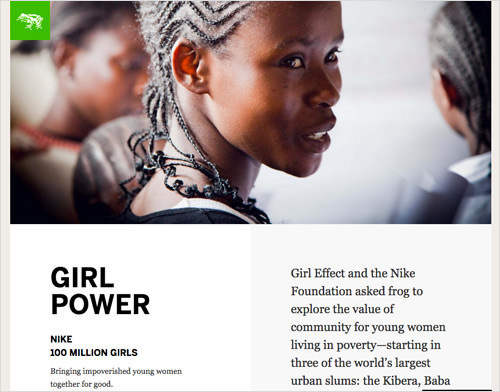
In the first example, Frog and the Nike Foundations’s Girl Effect case study contains both broad and concrete goals: “Explore the value of community for young women living in poverty” is paired with “modeled simple forms of digital communication.” Though simply stated, these keep the focus on the problem and the solution.
In the second example, Domain7 does this as well. The case study combines the city of Vancouver’s goals of digitizing and becoming responsive but also references the Domain7 team’s technical goals. The use of phrases like “We are up to the task!” tell us that their challenge was not simply to deliver code to the city, but also to solve a problem internally that they could be proud of.
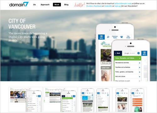
In these projects, the broad goals of the clients (Nike, Girl Effect, Vancouver) are paired with the needs of teams working on them. This dual framing gives us a deeper understanding of the general outcomes they explored, along with more specific project goals, always putting the human at the center of the process.
Tips
- Define your broad project goal early in the case study, with a focus on larger issues like community, the environment or empowerment.
- Attach your concrete goal to the deliverables of the project or the technical problems you hope to solve.
Focus On Process Before Artifact
We have taken the first step towards crafting a human-centered case study. Next is a look at how we can focus on process before artifact. But what exactly am I getting at when I say “design artifact”? Sandra Wolfe Wood explains (PDF):
“‘Design as artifact’ is framed around the solution, a physical deliverable like a logo or website; “design as process” places more emphasis on the problem-solving process.”
Well-documented case studies can show that design needs to be much more than a list of client deliverables. Focusing first on process shows design as a deliberate collaborative act, not a solitary one. The sketches, user journeys and mockups all help the reader to visualize the work and, more importantly, to see that it was created by human beings. We see how design comes into being, not just what the pieces look like like at the end.
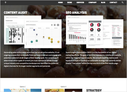
Gravitate’s Sahale case study shows this in action. From their work of defining user personas to the content audit and even the style tiles, we see how the team prioritizes their design process, almost enabling the reader to participate as the website takes shape.
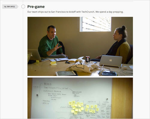
Another way to put the problem-solving process before artifact is to highlight contributors and team members. Dan Mall’s TechCrunch case study features a prominent list of collaborators, followed by a project outline and then sketching. He focuses on the design process, on starting, rather than finishing.
Tips
- Illustrate your design process to the reader with simple, easy-to-understand steps, ones that they can duplicate in their own projects.
- Show photographs of your team working collaboratively, in situations that illustrate your design process.
- If possible, list your collaborators and the roles they played. This moves the case study towards an exploration of people and process, beyond simply a description of design deliverables.
Show Research In Clear, Process-Oriented Chunks
Whatever the exact steps of your human-centered design process, it will need to include research and exploration. You can present research in case studies as process-oriented chunks. This could mean photos of a wall covered with stickies, complex illustrations and structural sketches, or even data models and usability results.
In his essay on the co-design process (PDF), Marc Steen develops the idea that we need co-inquiry and collaborative exploration in order to develop solutions to briefs. We define artifacts as the solution, but they need to come from a collaborative, human-centered approach to the design goals. Case studies are best when they show real relationships between research, data and solutions.
So, what are some of the key forms these process-oriented chunks can take?
Sketches And Prototypes
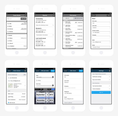
For Erskine, starting with rough interactive wireframes gave them the conceptual framework they needed to continue. With the goal of prototyping a fast, responsive website, they started with the concept and low-fidelity mockups and then gradually went into more and more detail as they refined the prototype.
Visualized Research
Mozilla’s Save for Later case study is another particularly strong example that focuses on explanation. Right from the beginning of the case study, the reader walks through research phases and content mapping. Conceptual work is illustrated with diagrams and icons, to clarify the findings. In each step of this case study, the research is explained and contextualized.
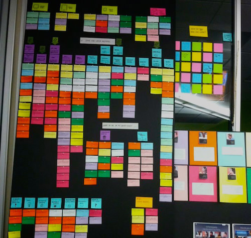
As I read through these, remembering all the times I’ve done something similar, I’m able to empathize with their research process and how it is visualized.
Code
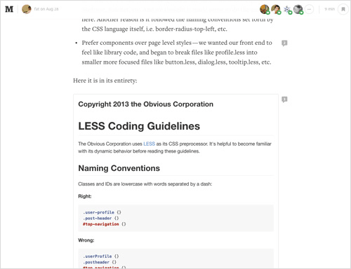
In this example, we see @fat speaking at length about how he approached the re-architecture of Medium’s CSS. The case study is organized into conceptual steps and lists five distinct “projects” he undertook, along with the code that came from those explorations. It’s more than that, though. Each research chunk is littered with references to the team, to “we” and to collaborative efforts to refactor the CSS. It shows research as a very human process.
User Experience Notes
As designers, we are intimately familiar with that mental transition from abstract research to real experience. Maggie Salter discusses her work in developing models to “rehumanize” information design, saying:
"At its genesis, information is humanized; in the systematization process, it loses its innate human-ness. This… represents an attempt to re-insert that humanized nature back into information design, hence its goal is to rehumanize information design."
As I looked at successful case studies, this theme came up again and again. Every piece of data, every artifact, every line of code needed to relate to human experience first.
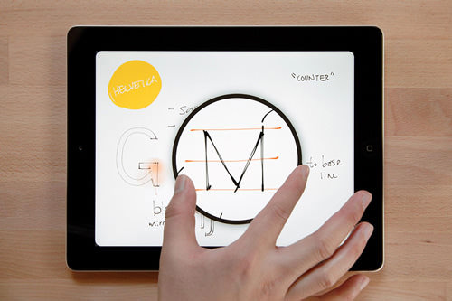
In the article about the zoom feature in FiftyThree’s Paper app, this focus on UX is a joy to read. With lines like “It usually makes people smile the first time they see it”, and the language written to “you,” the user, their technical research comes across as totally about the experience.
As you can see in these examples, sharing our design process is best with image, code and UX work that are deliberately focused on the research process. Ultimately, we need to create final design artifacts, websites and apps, but how we show our sometimes messy research is what makes the work accessible to readers and other designers.
Tips
- Show your research with photos, charts or a list of findings, even if it is not packaged neatly.
- For code, tools such as GitHub’s Gist or CodePen can illustrate your research to the technically savvy.
- Show relationships between data, research and design artifact, either in writing or by associating them visually for readers to compare.
Explain The Use Of Components And Modular Parts
Web design is increasingly a modular affair, what Matt Berridge calls “the cornerstone of modern web design”. We’ve moved away from the days of unwieldy HTML files and static PSDs, replacing them with more visual and structural abstraction. The popularity of front-end frameworks, pattern libraries and style tiles is a testament to the attractiveness of a modular approach.
In your case studies, show some of the modular elements you have designed, even if they are simply parts of a much larger set.
The Tele Finland case study from Werklig contains a wealth of iconography and type exploration. The whimsical shapes and colors all work together as modular elements. Even small details, like the rounded corners on elements and the custom typography, feel like parts of a larger modular system.
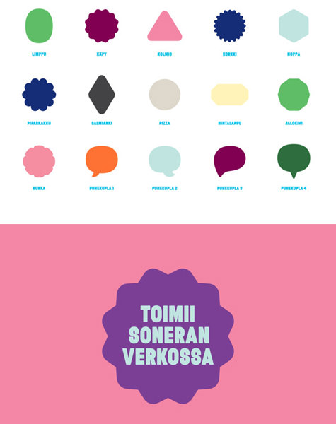
Choices of color, content types, UI elements and even illustration styles all play a part in this modular, block-level approach. Eugene Spiecher spoke of the need to be a “distinguished shape maker,” and that sounds perfect for what we do as web designers. Haraldur Thorleifsson does this very well, visually showing readers what kind of shape maker he is. The case studies on his website contain a large number of core design components, such as icons, and show how they fit together in interfaces.
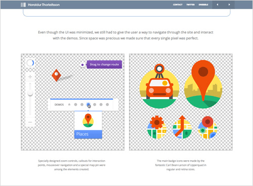
Earlier in this article, I emphasized process over artifact. So, does showing these components promote design artifact over the design process? Not at all. Visual and UI design choices come after we synthesize all of the research data we looked at earlier. We gather button styles, animations and visual patterns in case studies to show that we understand the problem and can craft solutions. In showing the components parts of a solution, we see the people and knowledge at work.
Tips
- Design artifacts can make your process come alive. Show them at work in your design.
- Present modular elements together in image sprites or charts to show visual relationships and systems.
- Use animations and GIFs to show different states or conditions of the modular elements.
List Any Crucial Lessons Learned
As we looked at before, case studies should emphasize design knowledge and creative processes. Of course, that includes visual, code and UX assumptions that didn’t hold up. There will always be lessons learned during projects, and sharing those is crucial so that others can learn from them.
Two types of lessons add greatly to case studies.
Lessons About The Creative Process
The Made by Many team talks candidly about their struggle not to jump to conclusions while they were building a new tool called Granny Cloud. They also note what happened after a prototype was built and the new constraints that put on their team.
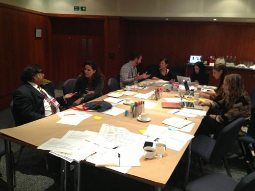
Part of your case study should be an explicit listing of what solutions you matched to your research in the end and why.
Lessons About Failure
The web is a complex medium. A lot of things fail. We get it wrong. A lot. Projects that are finished and pushed live don’t need to hint at all of the dead ends and failures you experienced. A case study is a much better place for those lessons. Walking your readers through these moments reinforces design as a time for exploration and iteration, not only polishing.
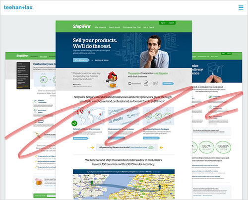
The beautiful case studies by Teehan + Lax contain a number of lessons about where they failed: “We knew we needed to pause and take a fresh look.” Over and over, the clear assessments and observations about their process take the reader along their journey to a better solution.
Tips
- Be honest. If a design process or tool didn’t work, tell that to your readers, so they don’t have to make the same mistake.
- Speak about ideas of creativity and inspiration. Many of your personal struggles with design and visual ideas will be powerful lessons for other designers.
Define The Quality Of The Experience
We have looked at concepts, process, components and even failures. Our next response may be to ask, “So, was this a high-quality experience?” Can we look back on websites we’ve worked on and be confident that the design had a real impact?
As much as we talk about concrete deliverables, our work as web designers is entwined with emotion. Users and clients feel joy, satisfaction, confidence, even confusion when using the websites and apps we build. Case studies provide us with a chance to define exactly what type of experience we were aiming for and whether or not our work matched up.
The quality of the experience can be explained in your case studies in a few different ways.
Numbers And Analytics
Give readers numerical proof that all your sketches and prototypes actually worked. Include the results of testing because they tell readers how certain features fared. They help us visualize the human reactions our design is creating. Even though numbers are tied to design artifacts, they are a very effective way to measure user experience.
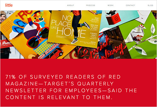
Little worked with Target to improve its corporate and internal communication. Through the success of publications and rewards systems, they can show numerically that their design process is working. For designers and studios selling their services online, these can also be very persuasive to clients.
Quotes And Testimonials
There’s something powerful about hearing directly from users, team members and clients. Short quotes that contain personal observations about the project are often the most accessible to readers. Another option is an interview format, with a longer Q&A from the client or user base. Clear responses from the people involved can make the case study feel truly human-centered. The most effective case studies take it a step further by providing first-hand accounts of a team’s design experience, not only the user experience. This provides real perspective for readers, who will often be other designers.
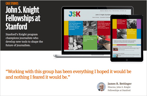
In their case study for the Knight Fellowships, Mule Design features a quote (Note: This link points to a version on archive.org as the example was recently taken offline.) from their client very prominently, a validation of the high-quality experience they designed.
Tips
- Use analytics and metrics that connect to your project’s original goals, establishing a link back to the beginning of your case study.
- By pairing quotes with photos, we show who is talking, enabling readers to connect and empathize with them.
How Was The Project Completed And Launched?
As simply as possible, show us a website or project as it exists in real life. That is, after all, what we are paid to do, right? The final product stands as a combination of your human design thinking and evidence that your creative process actually worked. Show it off proudly!
All that research, development and testing of interfaces act as context for this section of your case study. At the end, we should see clear examples of how your project was launched and viewed by the public.
Conclusion
I’ve tried to show that by focusing on process rather than artifact, we can build and share in-depth case studies. The studies allow us to reframe the conversation around design process and the humanity in what we create, rather than perfect deliverables.
Undoubtedly, case studies themselves are a type of complex design artifact. But we do the design community and ourselves a disservice when we fill them with overly rendered and unrealistic mockups of our work. Isometric mockups, for example, are a recent trend, and their staged flashiness obscures any real design solution. Emphasis is incorrectly put on the artifacts themselves as images, not on the process and creative solution behind them.
In his persuasive article “Learning to See,” Oliver Reichenstein says:
"The more knowledge you have about a product’s inner workings, that is, if you can see the construction, the hidden mechanism, and glimpse the process leading to its current state, the easier it becomes to see its design."
Digital design is a complex field, one requiring empathy, visual clarity and conceptual depth. If we are to continue to learn and grow as an industry, we must learn first-hand from our colleagues about strategy, critical thinking and design process. Studying the process of others, not just the artifacts, enables us to develop a more nuanced, human-centered approach to our own process, and to present that in carefully organized case studies.
Further Reading
- 75 Instructive Case Studies – This Is How We Built It
- Showcase of Case Studies in Design Portfolios
- 15 Impressive Case Studies from Behance
- Improving Smashing Magazine’s Performance: A Case Study


 Register For Free
 JavaScript Form Builder — Create JSON-driven forms without coding.
 Smart Interface Design Patterns, 45 lessons + UX training

 Devs love Storyblok - Learn why!

