The Making Of “In Pieces”: Designing an Interactive Exhibition With CSS Clip Paths
Web-based interactive experiences are widely used in the modern age for a variety of reasons, predominantly for the advertising of premium high-street products and services. After discovering the little-known clip-path property of CSS, I embarked upon a five-month interactive production journey of my own with a different purpose: to raise awareness of the struggles of 30 similarly little-known endangered species.
This article explores the inspiration for the project and aspects of how different parts were built, and I’ll dive into how you can use this greatly underrated line of CSS for your own projects. for your own projects.
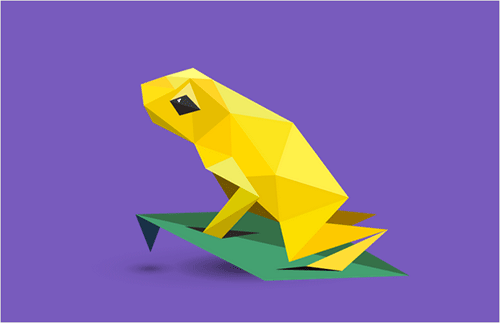
In Pieces is an interactive exhibition of 30 of the world’s most distinct but, sadly, endangered species. The experience is an informational reminder of the beauty we are in danger of losing every day, but it’s also a showcase of evolutionary distinction, because many of the species evolved in ways that make them genetically special. Users are told the stories and struggles of these unique lifeforms, as well as invited to dive into numerical data, download wallpapers and even obtain a poster featuring the entire collection — all completely viewable on mobile devices.
Inspiration: CSS Clip Paths And Animation
In Pieces started as experimentation and tinkering in code, not a grand plan for an interactive piece to help conservation, as romantic as that notion sounds. I remember reading about the polygon property of CSS’ clip-path in mid-2014 and learning of its amazing potential. A few months went by and I was surprised not to see it used much on the web, probably eclipsed by the attention given to SVG, canvas and WebGL. I felt that clip-path provided an opportunity to dive into something untouched and explore what could be made from it. At the same time, creating a project in pure CSS felt (rather ironically) cutting-edge.
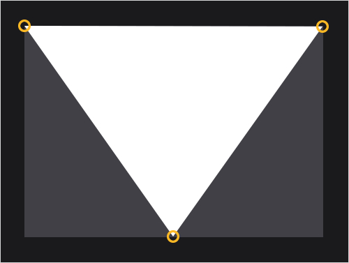
If you’re not familiar with CSS’ clip-path or its polygon possibilities, Dirk Schulze has a great tutorial. As one example, turning a regular div into a triangle is possible with a snippet of code:
.polygon-div {
  -webkit-clip-path: polygon(0% 0%, 50% 100%, 100% 0%);
}
The very first thing I wanted to see was whether the polygon property could have a conversation with CSS transitions, and how smoothly their first date would go. I was happy to see that the two were a natural union, especially when an easing curve is thrown in to add fluidity:
.polygon-div {
  -webkit-clip-path: polygon(9.38% 59.35%, 13.4% 58.95%, 9.28% 61.08%);
  transition: .18s cubic-bezier(.7,.3,0,1);
    &:hover {
    -webkit-clip-path: polygon(20% 59.35%, 30% 58.95%, 40% 61.08%);
  }
}
Concept And Art Direction
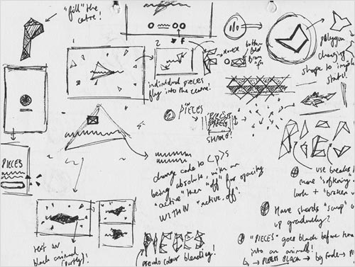
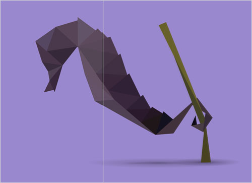
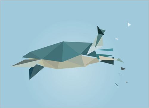
With this established, I wanted to think up a way that would make the polygon aesthetic matter and become some sort of visual simile — polygon animals seemed a natural visual area to explore. First, I want to get one thing straight: Polygonal species are not a new thing in terms of art direction. Hundreds of projects have used polygons to form animals, and they are easily findable on websites such as Behance (search for “polygon animals”). This point is very important when I talk about the “idea.” I’ve seen some really nice comments on the project, and some have included references to “origami” or “polygon style,” but they miss the mark a little in that the idea is not a visual style, but rather about the formation of the species through “pieces” and the analogy that their existence lies “in pieces,” and thus they themselves are all “in pieces.” Without this aspect, the project simply becomes visual periphery.
I think there is something very romantic and interesting in linking a piece of new technology directly with an idea and in designing and developing it in a way that hooks into and works directly around that idea. This really gets to the core of what In Pieces is about.
Other ideas came quickly after this initial experiment, such as the discovery that one animal would require around 30 pieces, which led to the decision to create 30 species, and the idea to use the polygonal forms to create data visualizations of species’ numerical histories and other statistics. Let’s dive into some specific parts and see how they were achieved and how you can use them for your own interactive projects.
Creating The Polygon Animals
Each triangular piece was hand-coded from scratch, because no tool or framework existed to help me. If you inspect the code for the species, you will see that they are made of 30 divs placed on top of each other, nested in a series of parent divs. Each of the 30 divs in turn contains a child that is essentially one of the 30 pieces.
Illustration
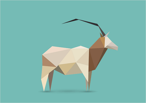
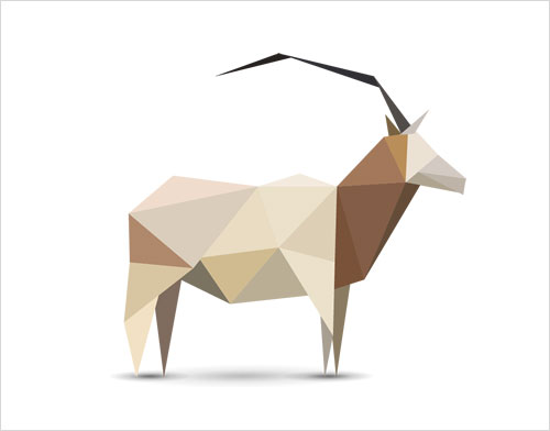
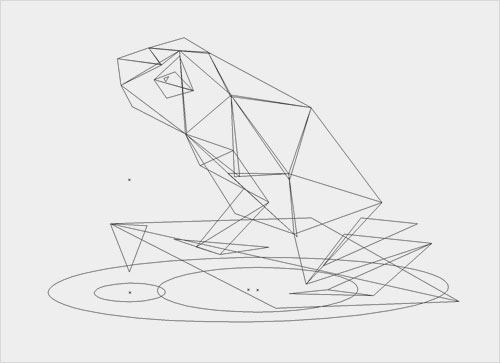
Perhaps the simplest aspect of the project was how the original illustrations were crafted in Adobe Illustrator. It was a tough task to create all 30, but it was also the most straightforward part of the project, the main restriction being the number of polygons. The second figure below shows the asset that was produced in the tracing phase.
Tracing
I then used these illustrations as flat PNGs in the browser to trace over — but with 30 illustrations to copy over to the code, I desperately needed a way to speed up the process, which consisted essentially of placing the 30 polygons in default positions and then individually moving each point to match the PNG beneath. Some online resources, such as CSS Plant Generator and Bennett Feely’s Clippy, are available for us to map out clip-path points, but I needed something much more bespoke — so, I created it in the form of a JavaScript function:
$('body').on('click', function (e){
  var mouseX = e.pageX;
  var mouseY = e.pageY;

  var shapesoffsetX = $('.polygon-wrap').offset().left;
  var shapesoffsetY = $('.polygon-wrap').offset().top;

  var polygonswidth=$('.polygon-wrap').width();
  var polygonsheight=$('.polygon-wrap').height();

  var shapesmouseX = mouseX - shapesoffsetX;
  var shapesmouseY = mouseY - shapesoffsetY;

  var mousepercentX = shapesmouseX / polygonswidth;
  var mousepercentY = shapesmouseY / polygonsheight;

  var finalmouseX = (mousepercentX) * 100 ;
  var finalmouseY = (mousepercentY) * 100 ;
  var normalisedX = parseFloat(finalmouseX).toFixed(3);
  var normalisedY = parseFloat(finalmouseY).toFixed(3);

  nodecount = nodecount+1;

  if (nodecount < 3) {
    nodescss = nodescss + normalisedX + '% ' + normalisedY + '% ,';
  } else
  if (nodecount == 3) {
    nodescss = nodescss + normalisedX + '% ' + normalisedY + '% );';
    alert(nodescss);
    nodescss = '-webkit-clip-path: polygon( ';
    nodecount = 0;
  }
});
This JavaScript function is fired upon a click on the body. You might want to run a query of a particular variable switch, like I did, so that it fires only when you’re tracing polygons. Here’s a quick summary of what the divs and variables are referencing:
mouseXandmouseYThis picks up the position of the mouse at the point of the click.shapesoffsetThis is the distance of the div from the top left of the browser window.shapesmouseXandshapesmouseYThis finds where the mouse is in the context ofpolygon-wrap.mousepercentXandmousepercentYThis calculates the percentage value of the mouse’s position in the context ofpolygon-wrap.finalmouseandnormalisedThese values turn these decimal percentages into usable CSS values.nodecountThis is how many times the user has clicked on the screen, from 0 to 3, before looping back to 0. Because the pieces are triangles, three points are required for each.
So, what’s going on here? Essentially, this function enables you to click three times over the flat PNG to find percentage plots in the context of the div you’re plotting. As you click, a string variable is sequentially made up until the third click outputs the full CSS line within an alert, ready to be copied and pasted.

Further Processing
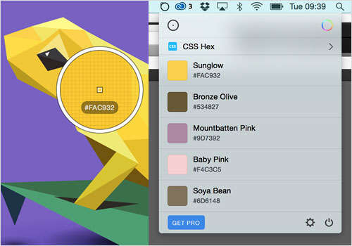
Once you have your code copied, it’s easy to paste, but I also needed to make sure that the appropriate shard was being colored while I did this. Copying every color from Adobe Illustrator and then pasting into Sublime seemed too lengthy a process, and there’s an app for that. I can’t recommend Sip enough because it directly copies the color you’ve picked to the clipboard, ready to be outputted to the code:
&:nth-child(4) {
  .shard {
    -webkit-clip-path: polygon(23.45% 56.143%, 34.66% 57.3%, 22.45% 71.714%);
    background-color: #D7C5A4;
    }
  }
I was able to output the code for all 30 pieces of each animal, one by one, using this tracing process. But there was still work to do — one of the big problems in rendering this style is the anti-aliasing between two shapes. If you fit two vectors perfectly alongside each other, you get a very faint but noticeable line running through, just as you do in Illustrator. So, I needed to very slightly overlap each vector via the Inspector and, thus, required a way to pinpoint which polygons were the troublemakers. This is where another of CSS polygons’ great advantages comes in: They automatically mask background images within the shape. So, I created repeating background images of all 30 numbers to track which polygons were which:
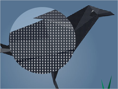
For me, polygon clip paths provide something special via masking like this. I used it to solve a problem (and later used it for the blood effect upon the “smash”), but ultimately I think extremely creative things can be done with the effect. One awesome potential lies in the fact that if you move a polygon, the image doesn’t follow the polygon — you’re altering the mask. If you mix the excellent performance that one polygon alone has when transitioning with a background image that can move simultaneously, then I think something really cool lies beyond. Maybe it will be the stem for a new personal project. Another thing to bear in mind is that you can mask elements, not just images. In fact, a few paragraphs down I go into a bit of detail on the “shimmering” effect on the species, which does exactly that.
I couldn’t find a way personally, but I’d bet with more digging you’d also find a way to make the polygons visually “outlines” (like the frog image a few paragraphs above). Again, this could lead to a supercool scientific look. It’s a tool with so much potential, and I’m excited to see new things made with it.
How The Species Change
In Pieces rests heavily on the addition, removal and alteration of class names, and the species themselves are no different. Changing the class name on one lone parent div to the respective species allows for the appropriate CSS changes to the elements inside it. The species are kept within an array, like so:
var animalList = ['crow', 'vaquita', 'tamarin', 'frog', 'owl', 'turtle', 'oryx', 'iguana', 'seahorse', 'armadillo', 'sloth', 'kakapo', 'echidna', 'penguin', 'damselfly', 'bear', 'parrotfish', 'camel', 'butterfly', 'ostrich', 'panda', 'tapir', 'sifaka', 'lynx', 'rhino', 'peccary', 'okapi', 'loris', 'hirola', 'drill' ];
Anytime a new species is called into play, whether it be the next one, the previous or one directly selected, I determine what the current status of the species is via this code:
prevAnimal = (animalList.indexOf($('#animalchanger').attr('class')));
For reference, #animalchanger is the parent div that controls the species, which is set to a string variable from the array animalList. This line determines the index (i.e. integer) for the current species’ name in the array. This is used to create the variable newAnimal — the name of the new species, depending on which button the user has clicked. As an example, the “Next species” button would be this:
newAnimal = prevAnimal + 1;
Of course, a whole host of other stuff is going on simultaneous to this, but with the index of the new animal established, this is then pushed into the div’s class:
$('#animalchanger').attr('class',animalList[newAnimal]);
Polygon Transitions And SASS For Loops
You now know how the polygons are created and that the alteration of the species’ polygons is processed via class changes to the parent div. Now to delve into the fun stuff, animation! As mentioned, everything is based on CSS, and the movement is no different; a wide variety of base transition settings are used to adapt the movement to the appropriate action taking place. Before we start with the CSS, I should mention that in the last coding example, another thing is calculated: the direction the user is going in (left to right or right to left).
if (prevAnimal > newAnimal) {
  $('.wrap').addClass('right-to-left');
  $('.wrap.left-to-right').removeClass('left-to-right');
} else {
  $('.wrap').addClass('left-to-right');
  $('.wrap.right-to-left').removeClass('right-to-left');
}
This assigning of a “direction” class leads to the species flowing in the direction that you are browsing and is done via two SASS for loops, depending on which of the two classes is in play.
$fluidpolygons: .7,.3,0,1;

.left-to-right {
  @for $i from 1 through 30 {

    $s: ($i*0.04+0.3s);
    $t: ($i*0.02s+0.2s);
    $ct: ($i*0.02s);

    :nth-child(#{$i}) {
      transition:
        -webkit-clip-path $s $t cubic-bezier($fluidpolygons),
        background-color $s $ct;
    }
  }
}

.right-to-left  {
  @for $i from 1 through 30 {

    $s: ((31-$i)*0.04+0.3s);
    $t: ((31-$i)*0.025s+0.2s);
    $ct: ((31-$i)*0.02s);

    :nth-child(#{$i}) {
      transition:
        -webkit-clip-path $s $t cubic-bezier($fluidpolygons),
        background-color $s $ct;
    }
  }
}
As you can see, there is a variety of speeds and delays for different properties. Sass’ for loop is utilized to alter both the transition’s duration and the transition’s delay, depending on which index the polygon has. For example, in a left-to-right movement, the 10th polygon will transition with a duration of .7 seconds and a delay of .4 seconds. The reverse direction is calculated simply by reversing the order — subtracting the index of the polygon from 31 instead.
Species Animation
Contrary to the impression of some, the species are not moved with CSS animations. The reason I veer away from CSS animation is that I don’t like the visible “cut” if the animation is interfered with halfway through. Instead, I’ve adjusted two classes that loop through two states: primary and secondary movement.
function animalStates(e) {
  setInterval(function(){
    e.removeClass('state-four');
    setTimeout(function(){
      e.addClass('state-two');
    }, 1000);
    setTimeout(function(){
      e.removeClass('state-two');
      e.addClass('state-three');
    }, 2000);
    setTimeout(function(){
    e.removeClass('state-three');
    e.addClass('state-four');
    }, 3000);
  },4000);
}

function animalStatesSecondLevel(e) {
  setInterval(function(){
    setTimeout(function(){
      e.addClass('two-state-two');
    }, 1000);
    setTimeout(function(){
      e.removeClass('two-state-two');
    }, 1100);
    setTimeout(function(){
      e.addClass('two-state-two');
    }, 1400);
    setTimeout(function(){
      e.removeClass('two-state-two');
    }, 1500);
  },3000);
}
There is new CSS for each state, and the polygons simply move to a new place, change color or otherwise alter as an override. Importantly, as soon as the “animation phase” kicks in (after a species has completed its transformation), the transition durations and delays on the polygons from the previous code are overwritten to be synchronized and faster.
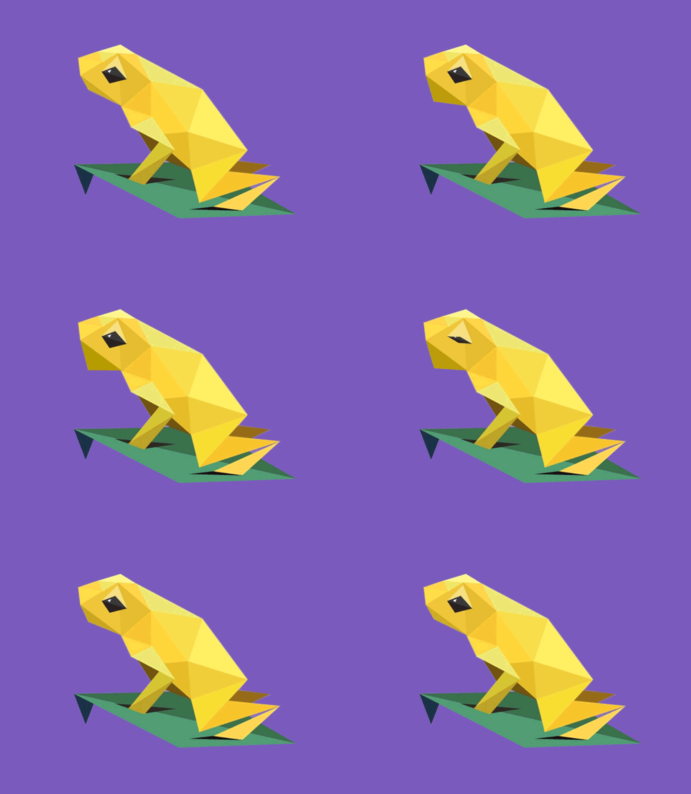
Below, you can see the two class sets in play: animalStates controls the movement of the Golden Poison Frog’s vocal sac, while animalStatesSecondLevel controls the sporadic changing of the eye through just one movement. This dual-layered approach to movement is seen across the set of species to create depth and disrupt visual repetition.
Shimmering
One of the quickest visual effects to implement on the website was the subtle shimmering effect that happens every few seconds across the species, adding an extra splash of 3D gloss to the mix. These shimmers take advantage of the excellent masking that clip-path gives you by default: Anything contained within an element that has a CSS clip-path applied to it will be seen only within the masked area. For the shimmer, I created a full-width and -height pseudo-element that lies within each shard.
.shard {
  &::before {
    content: ""; width: 100%; height: 100%;
    background: rgba(255,255,255,0); top: 0; left: 0;
    position: absolute;
  }
  @for $i from 1 through 30 {
    &:nth-child(#{$i}) .shard::before {
      $ad: ($i*0.05s+0.02s);
      @include animation(shimmer .8s $ad forwards);
    }
  }
}
@include keyframes(shimmer) {
  0% {
    background-color: rgba(255,255,255,0);
  }
  35% {
    background-color: rgba(255,255,255,.1);
  }
  100% {
    background-color: rgba(255,255,255,0);
  }
}
The shimmer is created by each pseudo-element simply fading in and out with transition delays. This sequential fade creates the nice flowing effect. Consider how bad this would look if the separated delays weren’t present. I’m using RGBa’s alpha value to change the transparency of the pseudo-elements, rather than opacity: RGBa is a lot less processor-intensive. Using opacity in my initial experiments led to huge glitches, as I’ll explain shortly.
Fallback
Clip paths are supported by all major browsers except for Internet Explorer, but one factor takes Firefox out of the equation as well. Firefox supports the technology, but only as an SVG-referenced path, meaning that alteration of the coordinate would need to be done outside of CSS. I’m sure someone with more of a developer’s brain could find a way to get this working across all browsers, but what I value in this project is, first, that it’s unabashedly experimental and, secondly, that it works across most mobile devices with good performance. The latter is absolutely key: Outside of the normal CSS media queries you would expect, getting the project to work on mobile was very much like dealing with Retina devices.
The fallback I went with for In Pieces is a simple image slideshow of the species. The idea is still there: Visually it’s very similar, but with the transition effects taken away.
Working With “Retina” And Bugs
With the technology still prefixed, it’s no surprise that you might encounter a number of problems when using CSS’ clip-path, especially when transitions are involved. First, they despise being overlapped with elements transitioning between opacity values — sometimes you’ll get visual “static” showing up, like an old television set that can’t find a signal.
The same goes for large transformations. As mentioned, I use a heavy sandwich of parent divs to translate, rotate and scale the species. Without this nesting, transforming the polygons directly created huge problems, which at one point almost ended the project prematurely.
In principle, Retina devices have no problem with clip-path, and you will probably be fine if your use of them is simple (i.e. for a few objects). But with 30 polygons, I found problems that probably relate back to the overlapping opacity issue. For example, you may notice that on non-Retina desktop screens, I have a nice vignette around the species that make the visuals appear a little more complete. Whether this used CSS gradients or an image didn’t matter — Retina screens and Safari choked unless this was taken away. So, it’s maintained as a “nice to have” for Chrome on non-Retina screens.
Performance
So much is going on within the website that it’s no surprise I had to do a lot of tinkering to maintain good performance. As noted above, Retina doesn’t play as nicely (this tends to be the case across intensely interactive content) and needed some things taken away. But I also did a lot of neat tricks with CSS to get performance running more smoothly, and they can be taken away and used again. I’ve talked about Sass’ for loops — 30 objects all being transitioned with slight delays to add depth to visual movement. But when used properly, this can also improve performance.
Imagine that you’re moving 30 objects at the same time; you are asking a lot of the browser, and it makes sense that this would create problems. If you have a speed of 0.199 seconds and a delay of 0.2 seconds on each object, you would fix the problem by moving only one object at a time. The fact that the same amount of total movement happens doesn’t matter: If the animation is done as a chain, performance is immediately improved by 30 times. Also, note that the “.99” kills any overlap in that instance. Of course, 0.2 × 30 would mean a total of 6 seconds, which would become draining to the user. So, in my case, I went for somewhere in the middle, with the number of shapes moving at once spread out, for a good visual but better performance. This is a great trick because it’s usable for so many things (it’s used across the website for delayed transitions) but also adds so much depth to the visual.
This approach was taken a little deeper in the introduction to the website — specifically on PCs. Unfortunately, I discovered quite late that PCs seemed to be very chuggy on the very first part of the website, which concerned me immensely. I tried a lot of things, but in the end the solution was a mixture of things — one of which was to alter the amount of crossover that transitioned elements had within their timelines. On PC, transitions are made faster to prevent overlap, and that helped a lot.
I know that the debate on the performance of CSS versus JavaScript animation is hot now, and I don’t wish to come across as someone who is saying that things should be done one way; we all have our quirks. For me, however, it was notable how little work I had to do to make mobile devices perform smoothly, and I do think that they seem happy to perform CSS-based animation — it was no different working with the polygons either.
How To: Main Menu
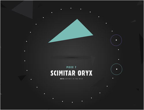
One of my favorite parts of the website is the main menu because of how it was built. I can imagine this technique probably has quite a lot of uses, and it is actually used again in the data visualization part.
The menu system looks like the height and width of the circle you see, but the entire div is actually anchored on a central parent div of no height or width. This div — positioned centrally — contains 30 separate divs for each species, and pseudo-elements within each are used extensively to give the little interactive touches upon opening and hovering. But all of that is pretty simple stuff — the part I want to delve into is how these were actually positioned. Below is a very simplified version of what’s going on:
.hover-detector {
  div {
    position: absolute;
    left: 0; top: 0;
    margin-left: -35px; margin-top: -35px;
    width: 70px; height: 70px;

    @for $i from 1 through 30 {
      &:nth-child(#{$i}) {
        $r: ($i*12deg - 7deg);
        @include transform(rotate($r) translateY(-230px));
      }
    }
  }
}
Say what?
Here, 30 div elements are being referred to here as div. I’m utilizing a Sass for loop to use each div’s central anchor (still the very center of the circle — each one is positioned absolutely on top of each other) to transform it from this center, depending on which child it is. Now, 12 degrees fits into 360 degrees 30 times; thus, 12 degrees is the value used to rotate each sequential div. The effect is completed by moving each div away from the center by 230 pixels.
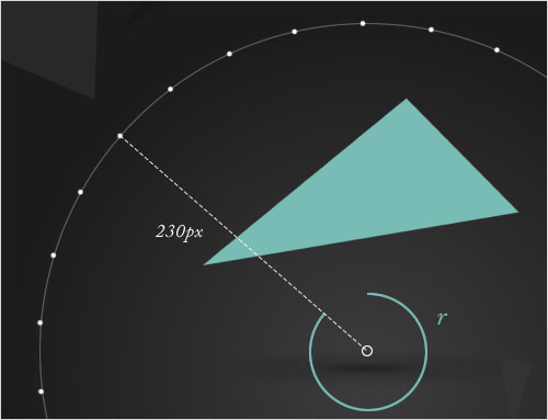
for loop.Little Touches: Data Visualization
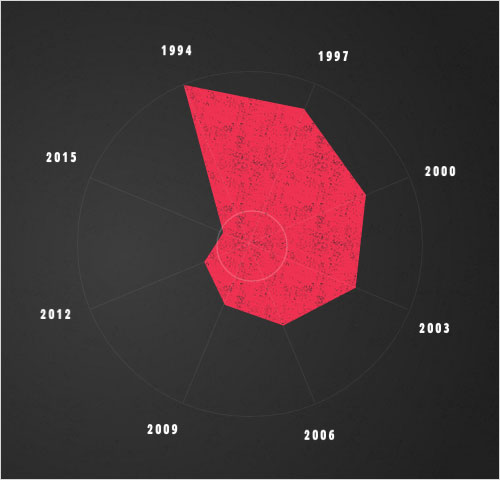
Tools such as D3 are really expanding what can be done with interactive data visualization, as we escape the constraints of squares, circles and rectangles to create tactile communication of information. But CSS polygons can be used in this way, too, very simply. In the data visualization charts in In Pieces, I use the same technique as I did for the main menu to position dates and numbers around the circular form, using a single div, while changing clip paths to sweep and move between shapes to tell a data-led story. Here’s a line of code used to generate a quick and easy polar chart, as used in the diagram above:
-webkit-clip-path: polygon(31% 4%, 66% 11%, 84% 36%, 81% 63%, 60% 74%, 43% 68%, 37% 55.5%, 42.5% 47%);
One thing you might notice in the piece is that the charts sometimes move from 8 data points to 4, 5 or 6. When doing something like this, you must maintain the same number of polygon coordinates to transition between. Much like in many other programming languages, if you have a different number of points, then CSS’ clip-path doesn’t know how to process movement, and so it simply pops the next state into place. For, say, a 6-point data chart, I just made the 2 “mute” data points have coordinates of 50% 50%, meaning that the points seamlessly zip to the center.
Little Touches: Type Scratchiness
Throughout the project, major headers rustle and agitate with life via a looping scratchiness within the type itself. This is done with another little fairly new CSS trick that I’ve kept my eye on for some time: masking imagery within text.
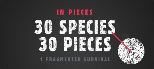
Targeting only WebKit browsers, the following code is used to achieve the effect:
.textured-type, .animal-nav-content h2 {
  background:
  url('../img/textured-ui/repeat-white.png') center center repeat;
  background-size: 80px 60px;
  -webkit-background-clip: text;
  -webkit-text-fill-color: transparent;
  animation: scratchy .253s linear forwards infinite;
}

keyframes scratchy {
  0% { background-position: 0 0; }
  25% { background-position: 0 0; }
  26% { background-position: 20px -20px; }
  50% { background-position: 20px -20px; }
  51% { background-position: 40px -40px; }
  75% { background-position: 40px -40px; }
  76% { background-position: 60px -60px; }
  99% { background-position: 60px -60px; }
  100% { background-position: 0 0; }
}
It essentially mixes the basic CSS text-masking technique now available to use in WebKit browsers with a CSS animation that simply moves the background image between a set of different places with quick-spurt movements, resulting in the scratchy effect. Simples!
Little Touches: Ambiguous Iconography And Tinkering With The Mental Journey

One piece of feedback I got several times relates to the user interface’s readability — specifically, the icons, especially those linking to the desktop wallpaper and data visualizations. It was a rare case of being pleased by negative feedback because it was actually exactly what I wanted. Essentially, I believe that if you have an experience like this one (I’m definitely not speaking of corporate websites, product-selling websites, etc.), spelling everything out spoils a lot of the user’s journey of discovery. You could probably guess that the icon on the right indicates desktop wallpaper or “imagery,” for instance, but it’s certainly not clear — however, this is completely intentional. Users who click the icon get a surprise when they open the window, another layer of content. Would people have clicked if they already knew what it is, and thus would people ever know that these desktop wallpapers are just a click away? I think that cleverly tinkering with the way a user mentally explores a website is just as important as creating a completely clear path for them.
The same could even be said of the most important call to action on the entire website — “What’s the threat?” The button jumps out with a subtle animation to engage the user, but the terminology doesn’t really explain a thing about what’s to come — the “smash moment.” Psychologically changing how a user is presented with information alters how they read it, in a state of surprise and intrigue.
Final Thought
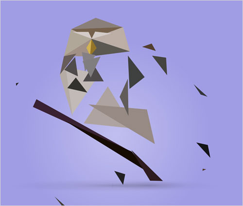
The reaction to In Pieces totally blew me away. We could have endless discussion about whether a WebKit-only website is suitable for client projects (and it’s a worthy argument to have) but actual hit numbers and public response has to take on importance. I think that CSS polygons have great potential for future projects, and I hope to see the technology used in crazier, more creative ways than what I have achieved.
I’ve had many moments while traveling of trying to get to the bottom of why the project worked out so well. The message is important, and I think it shows how a side project with a genuinely good cause can reach more people, because the general public is more intelligent than we in the industry sometimes give it credit for. I think a project with no commercial intention can be appreciated by a user in 2015, and I find that interesting when taking on client work.
I think it’s an interesting project for designer-developers to look at because there’s something about one or two people being in control of the whole thing that results in complete communication harmony. From concept to design to development, all of the parts speak directly to one another, and by the end they are holding hands in a circle rather than being separate things that are nice in their own right. The polygon style wouldn’t work visually without the technology behind it, and the technology wouldn’t be saying anything without the cause or message, and this concept would be nothing without the “pieces” element that the polygon style brings. I’ve mentioned to many friends that I don’t believe that the design, idea, development, sound or overall journey offered by the project is the best, each taken on its individual merit. But because they all communicate in unity, they become bigger than the sum of their parts. And I think that this potential provides a great opportunity for hybrid designer-developers.
Please note that Bryan’s code could have been written in different ways. The point of the article is to highlight the approach and the result of an experiment. – Ed.
Further Reading
- Animating Clipped Elements In SVG
- Designing an Interactive Exhibition With CSS Clip Paths
- Creating Shapes With Clip-Path And Breaking Out Of The Box
- Creating Cel Animations With SVG


 Agent Ready is the new Headless
 SurveyJS: White-Label Survey Solution for Your JS App


