Practical Techniques On Designing Animation
Animation, like any other facet of the web, must be designed. As web developers, we think about the effects of typography, layout, interaction, and shifting viewports, but when incorporating animation we have another factor to consider: time.
It’s not just an extra aspect to consider, either: it increases the complexity of each of the aforementioned parameters exponentially. Rather than viewing this as a heavy mass of ideas, we can bake animation into the core of our user experience process to create dazzling, exciting, and engaging work that pushes boundaries and collectively elevates the medium of the web.
“Form” And Function
Forms are one of the most important UI elements on a site. A contact form is the gateway to your company, the clearest way to capture lead generation and, therefore, revenue. The harder you make the form experience for the user, the more money you will lose. If you’re not thinking about the usability of this component, you do your company, and the user, an injustice.
The submit button is the most powerful part of a form. We usually address this by using strong colors to draw attention to it. But what happens when that submit button is activated? Does the user have to wait, not knowing if the form worked, or are they provided with instant feedback? A simple submit button, even with a push animation, sometimes cannot achieve this goal, while a button with a loader could keep the viewer engaged while data is loaded in the background. This helps with the anticipation part of the animation, but what happens when the form input is actually submitted? You should aim to give the customer a feedback rush when the process is completed. A success page is fine, but a smooth transition into something that snaps into view could give them better visual response and produce small but delightful results.
Because of the importance of the form, everyone needs to be able to access it, including screen readers. In this case, we should be using either CSS or SVG; if we use <canvas>, we should ensure there is navigable content by incorporating something like React.js, a JavaScript library that offers a virtual DOM.
See the Pen Form with Animation That Assists in UX by Sarah Drasner (@sdras) on CodePen.
These are the aspects we considered to put together the pieces of that one animation:
- What information are you trying to convey that can’t be done with UI design alone?
- What information does the user need to understand where they are going?
- What is the most subtle effect (in this case, for the push of the button)?
- What feelings are you trying to evoke (anticipation while the button loads, positive feedback when the form is successful, etc.)?
- Are the pieces of the UI accessible to screen readers?
What A Character
The first thing to realize when you’re designing for animation is that everything is a character. This may seem counterintuitive at first, but there are a few things to consider. Usability experts know that the key to creating a seamlessly designed system is the ability to empathize with the user:
- What is the quickest way to get to this information?
- What would make me feel at ease?
- What is the most compelling element I could place to direct attention?
We understand that we are inviting people into a situation they are unfamiliar with; a situation built from HTML elements rather than bricks and mortar, but a created façade all the same. A/B testing consistently shows that a viewer’s attention can meander away in fractions of a second. Designers and developers need to create experiences that are as compelling as possible without causing tension in these interstitial moments.
How does animation help in this scenario? By holding the attention of the audience. Animation creates a character out of our interfaces. Observe how this Stripe checkout illustrates invalid user data, for instance (from this really well-written article):
Not only does it allow you to understand that something went wrong, it does so without a big warning in red, which might cause anxiety in the user. Credit card payments are already an anxiety-ridden process… why make them more so?
In contrast, this input form becomes a character, one that we’re more likely to sympathize with, engage with, and one that can command our attention better than a simple static box.
Like actors, designers must know a character inside and out. Actors don’t just know what their lines are: they know what time their character gets up in the morning and their favorite flavor of ice cream. They might never use this information in performance, but they have a complete sense of who their character is, so that they can respond to any situation in a way that presents a believable, holistic portrait. When done well, we identify with this representation completely, and the artifice of the performance disappears. This is exactly what branding strives to accomplish.
The impact of Google’s material design, in my mind, lies less with the design language itself, and more with that it was the first major industry example of a company that incorporated animation guidelines in its branding. For the first time, people started thinking about the style of animation as a functioning entity that had a voice, one that must be designed in cohesion with everything else.
If our company is a well-trusted, stoic insurance company, the character of any animation on our site is going to be less flamboyant and more formal, and we’ll tend to use linear eases rather than bounce or elastic motion. But with branding that’s more comfortable and friendly, like Zendesk or MailChimp, the form should follow the branding and accordingly have more lively animation, while still communicating effectively; something with the charm of Chris Gannon’s loaders appear to be simple, yet exciting.
If you think back to the first time you cried because of a fictional character, it was likely animated. In Aarron Walters’ “Designing for Emotion”, he discusses how emotion is tied to the limbic system: we are more likely to remember something that becomes part of our emotional memory. Chapter 7 of his book goes into hard numbers of how much return on investment (ROI) can be gained by focusing on the impact of user’s emotive experiences.
If you have a static piece of content that looks like a Photoshop mockup on a webpage, the viewer engagement stops where your CSS does. Animation allows us to show rather than tell, a vital tactic considering users typically only scan body content. It allows customers to attach themselves to our UIs personally, for their needs to unfold before them. If done correctly, the potential for positive engagement is staggering.
There’s been a lot of talk lately about perceived user experience. Sometimes you can’t get around the time it takes to load something (though you should try your best). If you give your users nothing to do in the interim, you will likely lose them. Animation’s special sauce is that it can move users from one interface to another, and entertain them while they wait. Seconds that previously felt arduous and had them tabbing away to Facebook are now engaging and feel seamless. This is probably the single most important reason to use animation in UX.
Elevate This
Animation has to be taught to live on its own as a substantial part of the development process. We can accomplish this in several ways:
- Animation has to be designed just as the rest of the page is: with mock-ups, color palettes, storyboards with wireframes, and its own composition.
- Your design process should follow the same logical structure as your code.
- Animation must move toward being informative, appealing to rational actions and guiding users’ attention.
- Animation should follow branding guidelines, be part of a living style guide, and appeal to users’ emotions.
- We shouldn’t reinvent the wheel. Animation has existed outside of the web for ages. (Yes, you can go watch Toy Story for “research” purposes.)
Because animation is so engaging, it’s easy to overdo it, but not everything on the screen needs to be animated. You don’t start a war with the secret weapon. Animation can be a way of signifying the end or beginning of something, as well as directing your attention. With animation that is purposeful and planned according to viewer engagement, performance budget, and branding, we can elevate the medium. Val Head discusses this very clearly when she writes about invisible animation. Good animation should not seem out of place, nor be an afterthought.
Check out Oleg Solomka’s Bubble layout demo (it’s nice with the sound on): The animation is delightful enough to keep you engaged as you navigate, but gets out of your way while you’re reading the content. Keep in mind that the purpose of these tutorials is to showcase a particular method; in the wild, the implementation can even be toned down slightly to accommodate a professional, yet engaging effect.
Time Is Money
Animation is often considered an afterthought in the corporate development process. We make mock-ups, pass them, develop them, and at the very end add an animation on top. Because of this, animated components can often look like what they are: whipped cream fluff. It is only when animation is baked into the substance of layout, storyboard, and development processes that it holds meaning as a performant and substantial piece of a web experience.
Studios like Active Theory get away with engaging their clients with this conversation earlier in the design process because of their own branding. “We make bold things for the big guys.” Clients who seek out Active Theory’s work know they are paying for a blockbuster, knock-your-socks-off kind of web experience. This isn’t going to be the case 98% of the time.
How do we change this? Again, the way that we usually do. In salesman’s terms that means “increase the ROI.” In developer terms it means elevating the product to something that’s useful, that increases engagement, or has a positive experience, and then it won’t be a waste of time or money. For more information on how to communicate with clients effectively, consult Mike Monteiro’s “You’re my Favorite Client” or “Design is a Job”.
Before we gleefully skip into the sunset and make everything on the page move, we need to commit to some action items to make an effective change.
The first is communicating effectively with our clients. This does not mean railroading them into adhering to our beliefs. It means explaining the possible gains, assuring them we will A/B test our interfaces and produce measurable results, and meeting them halfway on time allowances.
Consider the form we worked on earlier. Show your client prototypes of two forms (you can show them other people’s work as an example if you don’t have the time to build; CodePen has a great design patterns resource). One form will present itself without feedback on the button, progress, or a snappy success UX; the other will incorporate all the lessons we’ve learned here. Or better yet, use A/B testing (usability testing with different variants) to prove the form with animation to be a more effective tool. Solid numbers are always better than subjective opinion, which can be shaped around trends, ignorance, or past bad experiences due to poor implementation.
Once we get the go-ahead, we can plan. You have performance budget allowances in new categories now:
- time
- experience
- performance budget
- color
- composition
- user’s time
This may seem overly complicated, but you should be able to give yourself basic ballpark figures within seconds for each of these, and they should be considered before you move on. Do you lack experience? Then you’ll need a little more time, as with most things. Do you currently have a lot of other heavy assets on the page? You will need to be very careful loading up images, SVGs, scripts, and animation libraries. Does your site already have a very rich palette? You’ll need to reuse those color variables. Are older browsers a consideration? Then you’ll likely have to use libraries like GreenSock, which have a much deeper cross-browser backwards compatibility than even native animation rendering on SVGs, while providing polyfills and fallbacks for any vector graphics.
The Good Stuff
Now that I’ve worried your project to a smooth curve, we can get to the fun stuff. Everyone has different ways of working and nothing is gospel, but here are a few key points that I have discovered after working at this for a while.
Pay attention to how stuff moves. This one might make you laugh, it’s so simple. But how often do you really watch water pour into a glass? What makes one person’s gait so recognizable?
Most people start with a ball bouncing, and that’s a great exercise, partly because the simplicity can show you character, weight and dynamism. Here are two balls bouncing: can you guess which is hard and which is soft?
See the Pen Bouncing ball demo by Sarah Drasner (@sdras) on CodePen.
How do you know which is which? First, there is the elasticity of the objects. One stays consistently round, the other is manipulated based on the impact. What else? Well, there’s the movement: one seems fairly rigid, and the other is more playful. Though they have the same timing, their physical motions imply different masses. Easing functions convey the density of the object.
Note also that even though they have the same timing, the easing function is used in such a way that they have different keyframes. If I placed a strobe light on these balls, you would see them at different places during the same time period. This concept has a term in old cel animation: spacing.
See the Pen Bouncing ball demo by Sarah Drasner (@sdras) on CodePen.
This can also come in the form of the motion of secondary elements. If someone shakes a glass, how is the water inside affected? When someone kicks a rock, how does the rock express the force of impact? Here’s a great example of elemental motion design.
As Hans Bacher discusses in Dream Worlds, when animators were working on “Beauty and the Beast” they were flown to London and France to observe the styles of these places. You might not have this kind of budget (but if you do, take me with you!); luckily the internet has plenty of visual, historical and spatial information for you to work from.
Follow your interests. If you have any leeway at all in the content of the animation, use that to your advantage. Genuine interest and enthusiasm is easily conveyed. You’re more likely to follow a project through if the content excites you.
Backwards To Move Forwards
Before you begin animating, you must storyboard. Storyboarding is a very important part of the process because it allows you to work modularly in your code, in scenes. It allows you to plan out timing. And it allows you to work backwards: to draw something and then slowly unveil it.
A common misconception is that your storyboards have to look like polished comics. I think that’s often why people don’t want to make them: they’re scared of drawing; they’re scared that their work has to look perfect; they’re scared of spending all of their creative energy in the planning process, and they just want to start working on the project. I understand this completely. To avoid all of it, I encourage you to forget the platonic ideal of a storyboard.
I was a scientific illustrator for the Field Museum of Natural History and Stanford. I was a professor of painting at a college. Can I draw? You betcha. Here’s what my storyboards look like:
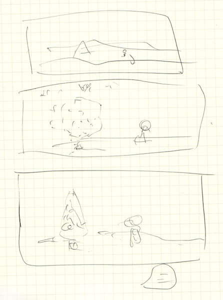
Am I ashamed of this? Not in the slightest. That storyboard took me 45 seconds and allowed me to understand and edit up front what I was going to spend many days making. Without it, my workflow would have doubled. Storyboards exist behind the scenes and are for personal communication. I’m not saying you can’t create beautiful standalone work like Rachel Nabors, just that you don’t have to.
Let’s revisit our discussion about user empathy. You can accomplish this with storyboarding all a user’s interaction from beginning to end, as well. Consider this article, “Story Map”. A story map takes you through the entire experience of visiting your site and becoming a customer from beginning to end. It’s a storyboard with muscle, one where you see the whole picture of their visit and therefore can make purposeful decisions based on desired direction and outcome.
It’s probably not new to hear about storyboards in animation: little comics that allow animators to break down tasks scene by scene. But did you know that there are also color scripts? Just as you design color and overall branding for your site, animators at Disney and other animation houses create color scripts that work well with the colors of their main characters and inform the scene. You should be doing this, too.
This means you should spend some time on Adobe Kuler crafting color swatches. It takes a small amount of time at the start, but saves buckets while you’re working. We all know color is meaningful. Working with it is made so much easier in CSS with preprocessor variables: use them to your advantage.
[codepen_embed height=“320” caption=“When you’re an introvert…” theme_id=“0” slug_hash=“dPqRmP” default_tab=“result” user=“sdras”]See the Pen When you’re an introvert… by Sarah Drasner (@sdras) on CodePen.[/codepen_embed]
The animation above uses two different color palettes: one for the “before” scene and one for the “after”. The palettes are related: they have to be, to create seamless events. Just as the animation palette for a large company must correspond to the company’s branding and the rest of the site. But the cool tones in the first scene in relation to the warmer hues of the second inform the viewer. They are part of the story. And if they weren’t planned before I started drawing, the animation wouldn’t have made any sense.
Design And Code Workflows
It’s clear that storyboarding pays off in the design and planning stages of animations, but it can easily reap rewards in your code architecture, too. If your code reflects the same logical organization you use for your design, you gain all the benefits of clear, legible structure; and the more it mirrors the design process, the easier it is to share implementations between the two.
Functions should be named according to the scene you are in: even “sceneOne” will do. Similarly named variables look nice and neat, but they’ll trip up you and your team in the long run, particularly as an animation gets more complex. Naming form elements as the characters they portray, and setting up your code in a clear way that mirrors your design means less worrying about scoping problems, and more concrete divisions between JavaScript and Sass variables and assignments. It’s also particularly helpful at the end when you have to go back in and adjust something: you will easily find your place again and know what follows.
Murder Your Darlings
It’s an old quotation, but it’s true. You’re never going to get things right the first time, so relax and make some mistakes. Don’t get too precious about it. Whether you’re a designer, a developer, or both, chances are you weren’t as good in the beginning as you are now and it took a lot of ugly stuff in the middle to get there. That’s OK. This means trying different types of animation on for size, and messing all of those up, too. Did you learn JavaScript by only programming one kind of interaction using only one library? No. Did you learn to design only using one composition? I certainly hope not. The same principles apply to learning to animate as well.
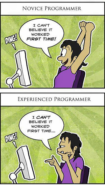
Perhaps you could have both graphics editor and text editor open at the same time. You need to move fluidly back and forth between them. Don’t be scared of retracing your steps, adding things, or editing. You will need ready access to your tooling, like optimization, so you can move quickly through it. The further you put these things away from you, the lazier and sloppier you will become about adjusting, editing, and re-creating images or code as you need them. And you will need them.
You’re going to have to redo your timing and easing a hundred times. Personally, I find it easiest when I’m using a tool like GreenSock’s TimelineLite to move pieces around. It lets you stack, stagger, overlap timings, and even animate full scenes
[codepen_embed height=“350” caption=“Understanding GSAP Timeline.” theme_id=“0” slug_hash=“ByEWON” default_tab=“result” user=“sdras”]See the Pen Understanding GSAP Timeline by Sarah Drasner (@sdras) on CodePen.[/codepen_embed]
CSS is great for very small UI interactions; in fact I really recommend it for those use cases because you don’t need to load other resources. However, if you have more than two animations set on an object, you should probably consider switching over to GSAP. The ability to move a little forward or behind the last animation, or set them to fire at the same time no matter what, is too powerful a tool to avoid, particularly when you need to rehearse and readjust the timing. CSS makes you recalculate all of your values if something in your animation changes at the start, but the GSAP timeline does not.
This wouldn’t be such a major issue if timing weren’t so vital. Have you ever noticed how some comics have frames where there is no action? They create the illusion of a pause, and your brain treats it as such. Timing is vital for comedy, for whimsy, but also for animation UI design that appears seamless or natural.
Just like all design, the parts of an animation that look simple and effortless are sometimes the hardest to accomplish.
The Sky’s The Limit
The Illusion of Life begins with one of my all-time favorite quotes from Walt Disney: “Animation can explain whatever the mind of man can conceive.” This quotation is so spot on because it really is animation’s strength: you can make anything happen. You can create and destroy worlds, excite or condemn.
That said, there is a lot to consider. Animation will never be more than empty calories if we don’t design it the way we do other aspects of UX. As with our other tooling, it is a loss leader: we’ll spend more time getting the variables and parameters set up at the start. But with that preparation, the character will tell us which road it would like to take during implementation, even if the character is a UI or branding.
Animation on the web has the potential to revolutionize our small bright box. We can go even further than traditional animation because we can accept user feedback and input. With these tools we can throw away the soul-destroying, bleak, dark engagements that govern things like airline ticket purchases. We can help people by unfolding scenes like a choose-your-own-adventure that can feel fluid, interesting, and intuitive.
Further Reading
- SVG and CSS animations with clip-path
- Creating ‘hand-drawn’ Animations With SVG
- The new Web Animation API
- The Math Behind JavaScript Animations
- UI Animation Guidelines and Examples
- Designing Animations In Photoshop
- Fast Prototyping UI Animations In Keynote


 SurveyJS: White-Label Survey Solution for Your JS App
 Agent Ready is the new Headless
