Lean Mobile UX Lessons To Keep Your App From Sinking Like The Vasa Ship
For many months, your entire team has worked their butts off to create an awesome mobile app. Finally, with your team exhausted and excited, it’s showtime! But then, your dream app turns into the ultimate nightmare: Eager customers download the app, use it once and never return.
All the sacrifice and months of hard work — wasted. What went wrong?
Your app has become another victim of the latest trend, joining a whopping 41% of today’s apps that are abandoned after only a single use. This trend has many parallels with the story of the 400-year-old Vasa ship. The most impressive warship of the day, Vasa floundered and sank just one mile into its maiden voyage due to fundamental design issues.

In this article, we’ll explore how the lessons from the Vasa ship can help you keep your mobile project from sinking right out of the port.
Create A Clear, Compelling Vision
Although the Vasa ship was ultimately a failure, it was unquestionably a magnificent one. The builders dared greatly.
So, before talking about all of the things that went wrong with that project, let’s touch briefly on the one thing that went right: The builders of the ship had a grand vision that told a riveting story of royal conquest and pride.
Even today, 400 years later, their vision is spellbinding. It is expressed in beautiful craftsmanship, the gaily painted mythological statuary, the fearsome armament and the overall appearance of the ship.

When it comes to vision, your mobile project should be no less compelling.
You must have a clear vision of what you are building — and the benefits the app will provide — before you decide how to design and implement the app.
Fortunately, expressing a vision for a mobile project is fairly simple. You can do it in as little as 20 to 30 minutes, using just a handful of sticky notes to create a storyboard that describes the app’s primary use case.
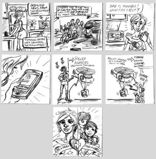
A good example is the “Be a Hero” storyboard from my book $1 Prototype:

This storyboard presents a powerful use case: A person wants to support the typhoon relief efforts by sending funds to a charity of their choice. The benefits are clear: The person donating the supplies gets to feel like a hero, and the survivors of the disaster get the urgent help they need to start rebuilding their lives.
According to Fortune, the number one reason most startups fail is that they make a product no one wants. To make sure your mobile project doesn’t become another statistic, formulate a vision that people can get excited about.
Before doing any actual design or development, take the time to document your vision as a storyboard. Then, show it to both potential customers and your stakeholders to ensure that the response from all key people is enthusiastic.
Your vision must communicate a clear, compelling benefit; otherwise, the app will not be worth building. Once your vision is in place, it’s time to start designing and prototyping your solution.
Test Early, And Inform Executives
When plans for Vasa were first presented to the King of Sweden, he made two fatal modifications. One was to arm the ship to the teeth with heavy 24-pound cannons. The second was to make the ship thinner in order to make it faster.
Many would assume that such detailed design guidance meant that the king personally oversaw the construction. This was not the case. The king made only a single visit to the docks.
In fact, the first stability test was not performed until after Vasa was afloat and fully equipped. As Wikipedia tells it:
"Thirty men ran back and forth across the upper deck to start the ship rolling, but the admiral in charge stopped the test after they had made only three trips, as he feared the ship would capsize."
Despite the failed stability test, it was too late to do anything about the launch. No one wanted to bring bad news to the king, who insisted that the ship be put to sea as soon as possible.
In the end, we can say that the king got exactly what he wanted, but not what he needed — an impressive ship that sank just one mile offshore.
Nothing is wrong with executive feedback or changes to a proposed design. Both are absolutely essential and are a part of any significant project. What was lacking here was early concept testing and a timely feedback loop.
Just as your vision and prototypes need to be adequately tested at every step of the design and development, communicating the test results to the right people is equally important. Key people need to be part of the solution, or else they will become part of the problem.
As a designer, your job is to provide timely feedback to executives. Clearly communicate any product issues early, while they can still be addressed, to ensure that the best design moves forward.
How do you ensure that you get the executive feedback early? That’s where a minimum viable prototype can be extremely helpful.
Create An MVP: Minimum Viable Prototype
I had a chance to visit The Vasa Museum recently before my talk at From Business to Buttons 2015, a conference in Stockholm.
In the museum, next to the salvaged Vasa, sits a 1:10 scale model of the original ship as it looked on the fatal day of the launch. Such a model would have been ideal in refining the design: Anyone would have been able to see how making the ship thinner and taller and adding heavy cannons on top would compromise its stability.

However, this 1:10 scale model was built after Vasa sank, making it useless, except as a lesson to us: Build a model of your mobile product, get executive feedback early, and refine the design before investing in development.
Fortunately today, building a model of your app is extremely easy — you do not need wooden planks, any special equipment or software. Even better, your design and your prototype can be one and the same.
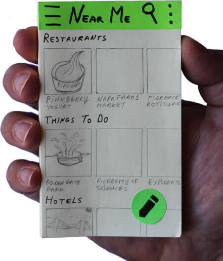
All you need is a pack of 3 × 5-inch plain sticky notes:

For example, here’s a minimum viable prototype for the Be a Hero app:

With this simple prototype, you can quickly and easily test and refine all of the basic design aspects of your app: the information architecture, the interaction design, the copy, etc. You can even test the icons and transitions.
The lean process is all about experimentation. By creating a minimum viable prototype to set up your experiment and going directly to potential customers for testing, you significantly speed up the process of experimentation and feedback, both internal and external.
In essence, you institutionalize failure in its cheapest and most expedient form.
Early continual user testing of your prototype reduces the likelihood of any fatal design issues when your app launches, vastly increasing your chances of success.
Early Design Tweaks Make All The Difference
While the Vasa disaster is quite famous, many people do not know about Vasa’s sister ship, the Apple. The builders of Apple made two important modifications: they installed lighter guns on the upper deck and widened the ship’s hull by 1 meter (just 10% of Vasa’s original width).
These simple tweaks made all the difference: The Apple sailed successfully for over 30 years.
To ensure the success of your own mobile project, test yearly and expect to make a lot of iterations in the beginning, until the design settles somewhat. Investing time and energy into a high-definition pixel-perfect design right from the start would be counterproductive.
Rather, keep the fidelity of the prototype appropriate to the state of the project. The key foundational aspects of the design (information architecture, interactions and copy) are best tested using quick and cheap minimum viable prototypes made with sticky notes.
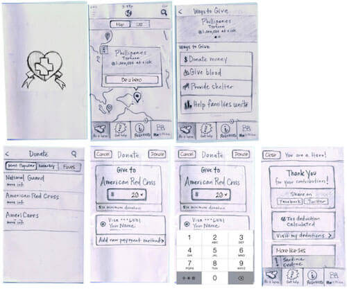
In the case of the Be a Hero app, for example, the sticky notes prototype of the home screen underwent five iterations before the team came up with a design that performed well:

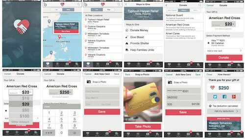
Only after the team had perfected the key elements of the design did they invest the extra time required to create the high-fidelity prototype:

Keeping the fidelity of the prototype appropriate to the state of the project helped the Be a Hero team move quickly and solve most problems early in the design process, enabling them to create the final design in just three weeks.
Don’t know about you, but that sounds like a lot of sunken ships were avoided for the cost of a pack of sticky notes — something even His Majesty the King of Sweden would surely approve!
Ensure Smooth Sailing For Your Mobile App
You have now seen how the history of the Vasa ship can help you avoid a major disaster with your mobile project if you follow a few simple but profound lean UX guidelines.
Before you begin, put your vision in place as a storyboard. Take the time to test it with potential customers and stakeholders — ensure that they are as enthusiastic about your idea as you are.
Once your vision has been approved, begin the design in lockstep with user testing by using a minimum viable prototype made from sticky notes. From this point, continual rapid prototyping and customer feedback should form the core of your mobile design process.
Along the way, don’t forget the importance of two-way communication with executive management and other key people on your team.
By including all of the key people in your feedback loop, you ensure that everyone on the team feels that their ideas are given due consideration from the start. This minimizes the likelihood that anyone will insist on last-minute changes that you cannot adequately test or implement.
Remember to make the fidelity of your prototype appropriate to the stage of the project. Do not invest time and effort in high-fidelity prototypes before you are comfortable with the key aspects of the design. Rather, stick with low-fidelity prototypes for as long as possible, testing design tweaks quickly, and continually incorporating insights back into your prototype.
Lean, rapid prototyping coupled with a continual feedback loop will help your team work smoothly, incorporate new ideas and build a mobile app that not only survives its maiden voyage with flying colors, but sails successfully for many years to come, striking fear into the hearts of competitors.
Further Reading
- How To Build An Agile UX Team
- How To Spark A UX Revolution
- The Lean UX Manifesto
- How To Become A UX Leader


 Agent Ready is the new Headless
 SurveyJS: White-Label Survey Solution for Your JS App


