The State Of Airline Websites 2015: Lessons Learned
From my home in Phoenix, Arizona, the entire world is only a few clicks away. I’ve booked flights to St. Louis, San Francisco, Honolulu, New York, London, Melbourne, Entebbe and beyond. Sometimes I’ll land in one location, travel around and leave from another. Sometimes I’ll switch or cancel a flight, and sometimes the weather does that for me. Regardless, I always get to where I want to go, and fantastic technology is in place to help me every step of the way.
All of this tends to be so easy that I take it for granted. But let’s think about this process from a designer’s perspective. Taking such a diverse system of possible actions and turning them into a user-friendly, self-serve experience is a pretty complex challenge. Any experienced traveler will tell you that some companies do it better than others. To find out, let’s take a closer look at a few airline websites from around the world.
Along the way, we’ll discover the critical steps of booking air travel and how they’re presented by different companies.
The Airlines
To begin, let’s select fifteen airlines, starting with the top five highest-ranked airlines worldwide.
To round out this list, we’ll sprinkle in ten other airlines from around the world.
- Virgin America (responsive)
- Lufthansa (kind-of-responsive)
- Ryanair (responsive)
- Air New Zealand
- Norwegian Airlines (responsive)
- Delta
- SWISS (responsive)
- KLM (responsive)
- Air Astana (responsive)
Limiting Our Scope
Obviously, a deep dive into 15 websites is far too much to cover in a single post. So, we’ll limit ourselves to certain areas: each website’s home page layout, booking process and performance. That’ll give us a good introduction to how each airline’s website operates. Also note that most of these websites have several localized versions. For the sake of sanity, we’ll stick to the English versions.
Fair warning: Objectivity is awesome, but any design critique you’ll ever read is chock-full of subjective observations. This one is no different. That being said, I welcome friendly disagreement and discussion.
Home Page
To begin, let’s briefly look at the home pages of each of these websites. This is the first place most potential customers will land when looking to book a flight, so it’s absolutely critical. After even two or three seconds on a website’s home page, you’ll find that you form qualitative opinions about the company that are difficult to ignore.
Design Goals
As we analyze these designs, we should always think about what the goals of the page are. Here are some truly base-level goals that I think all airline home pages share:
- Convey the company’s brand and identity.
- Inspire and educate curious potential travelers to make a purchase.
- Direct customers looking to make a purchase to the correct user flow (and/or answer their questions).
- Direct customers who have already made a purchase to the information or actions they need (checking in, checking flight status, etc.).
The websites we’ll be looking at were designed by professionals. All of them are fairly attractive and easy to use. So, when we talk about strengths and weaknesses, it’s really only relative to the other websites on this list.
White Space Vs. Efficiency
In comparing all websites, Turkish Airlines is the one that stands out as the most cluttered. The design very tightly clumps all of the various elements, without allowing for much breathing room. In the visual hierarchy, instead of a clear path, we find a lot of evenly weighted items competing for our attention (the busy background pattern doesn’t help). Instead of naturally finding a logical progression, my eyes bounce around, looking at all of the separate little UI elements. It takes quite a bit of effort to fully explore the page.
Qatar Airways (ranked number one worldwide) suffers from these same issues but to a lesser degree. Its design is a bit more airy, with sections that are a little more visually distinct.
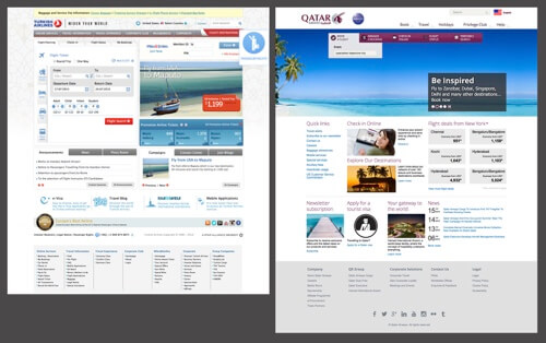
The upside of these designs is that they are quite efficient. Some of the other home pages look and feel much cleaner, but the design takes up a ton more room and requires a great deal of scrolling as a result. For example, Cathay Pacific’s home page is longer than Turkish Airlines and Qatar Airways’ combined! Emirates isn’t quite as long as Cathay, but ranks a close second.
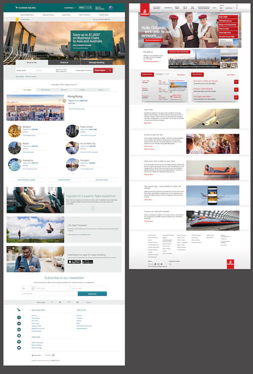
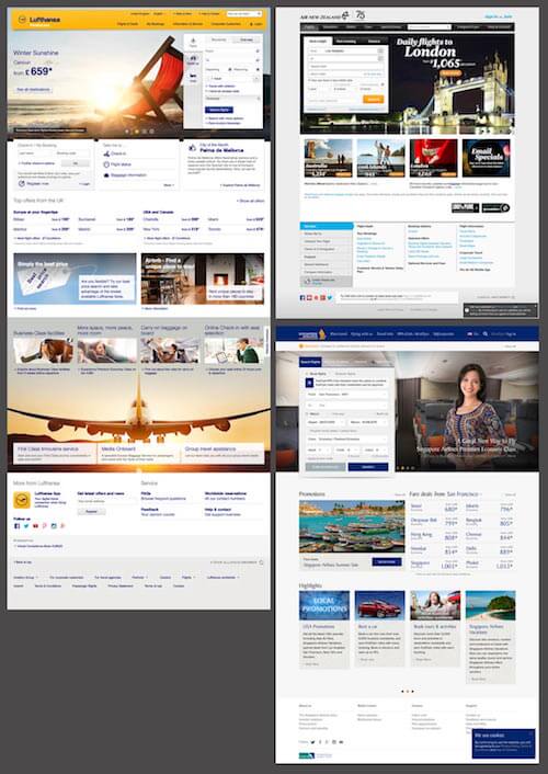
Moving along, Lufthansa has one of the more visually appealing pages, with its big, beautiful photos, and it’s another long scroller. By comparison, Air New Zealand’s is super-short, and Singapore Airlines’ falls somewhere in between.
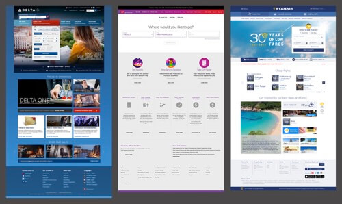
Finally, Delta, Virgin America and Ryanair all fall in the mid-range. All have plenty of information, options and white space on the home page, while minimizing the scrolling necessary to get through it all. On contrary, minimalistic designs by SWISS and Norwegian Airlines do seem as appealing as the ones with heavy imagery.
Aesthetically, I can’t help but feel that the most attractive pages here (Lufthansa, Cathay Pacific, etc.) take the longest to scroll through, unfortunately. Similarly, as mentioned, the shorter pages tend to be less attractive.
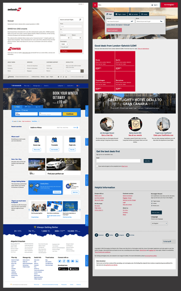
Design is about tradeoffs. Every seemingly simple decision, such as removing or adding white space, affects the overall experience. Of course we don’t know whether the airlines websites ran A/B tests on whether users find it easy to use the site, but the airlines websites with more white space did feel easier to work through. Always predict the effects that your decisions will have on end users, and then test those assumptions post-launch.
Promoting Airline Quality Vs. Wanderlust
Another interesting tradeoff I see in these designs speaks directly to two of the goals outlined earlier:
- Convey the company’s brand and identity.
- Inspire and educate curious potential travelers to make a purchase.
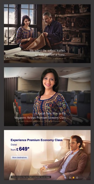
Both the imagery and copy on these websites tend to tackle only one of these goals at a time. Below, all three of the images, pulled from Singapore Airlines and Lufthansa, primarily promote the airlines themselves, rather than particular destinations. We all know that long flights can be incredibly uncomfortable, so the primary message here is that these airlines have your comfort as a top priority. Also, notice that two of the three promise added comfort through a more expensive ticket.
Contrast the technique here with the one exhibited in the images below. Here, it’s not about the airline itself, but about what flying represents — a way to escape to exciting and exotic locations: Australia, Cancun, Zanzibar.
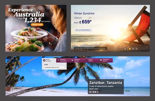
Some of the airlines focus on one of these strategies, while others try to juggle both, typically through the use of sliders that cycle through several messages and photos. This raises an important question. Are these sliders effective? Can these airlines effectively promote both their brand and their destinations by cycling through different sales pitches?
Sliders Everywhere
Almost every website in our list uses at least one image slider. Some use several. Singapore Airlines uses three sliders on the home page alone (four, if you count the small rotating news feed). In fact, sliders seem to be a logical and attractive way to fit a ton of content in a small space. However, as it turns out, some faulty assumptions might be at play here — namely, that a typical user will pay attention to, wait for and/or interact with a slider. Yet in many cases, sliders can actually cost you conversions. A quick search of studies and discussions on sliders reveals quite a bit of animosity towards this particular UI element.
Notice the strong language in the titles of these articles. Some designers are not only abandoning sliders, but viciously attacking them, too. That being said, we can’t assume that this sentiment is universal. Just because some people have found that their own sliders have reduced conversions doesn’t necessarily mean that all sliders on all websites are bad. Some UX professionals advocate not for killing sliders altogether, but rather for optimizing their design for better results.
One slider that clearly needs some work is Delta’s:

Regardless of the viewport’s width, the photos in these sliders are brutally murdered by CSS. They’re being squished instead of cropped, an effect that’s exaggerated when you see the original images before the CSS takes hold:
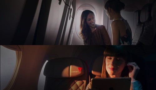
This is a clear case of a slider being poorly executed. However, we can’t accuse all sliders of having these same problems. A simple way to make a slider more usable is to provide context to users — for example, thumbnails and text that explain what each item in the slider stands for. Sliders could also be made responsive, showing more items prominently when enough space is available and fewer items otherwise.
Airlines seem to depend on this particular UI element quite heavily, which makes all of the sliders look very similar, almost generic. I’d argue that the airlines might be well served by exploring and testing alternatives, such as an accordion or tabbed widget.
Secondary Tasks
Now that we’ve made some sweeping macro-level observations about these pages, let’s dive to the micro level. Referring to our goals above, we see that visitors to these home pages often need to accomplish a number of secondary tasks (the purchase flow being the primary directive): checking in, checking their flight status, etc. Most of the websites are similar in how they handle these tasks, but a few interesting details are worth noting.
The winner in this category is Virgin America. Rather than bombarding you with a million options, the home page is amazingly simple. One of the first items on the page distills almost all of the visitor’s major tasks into three simple categories: “Book,” “Check in” and “Manage.”
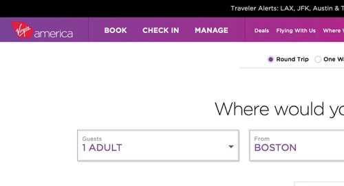
Even if we zoom out and consider the entire navigation menu, it’s surprisingly concise. The visual hierarchy is straightforward, too. Notice how the designers have used bolded text and all caps as well as subtle vertical dividers to differentiate the sections.

Contrast this with Emirates’ experience, which has both vertical and horizontal navigation. However, the information all blends together. The page doesn’t have many more links than Virgin’s, but the lack of differentiation and hierarchy makes it feel much more difficult to sift through. Quick skimming is not a possibility here. I feel like I have to slowly and deliberately read each item to find what I’m looking for.
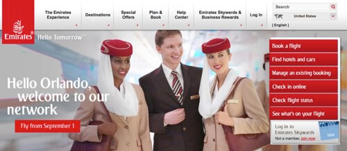
One link that I always find myself hunting for on any airline website is the one for checking in. It’s a key step when you have an upcoming flight, and it should be easy to find on any airline website. As we saw above, it’s pretty prominent on Virgin America’s home page. In fact, most of the websites in our list prioritize it in the header.
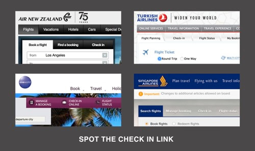
Unfortunately, not all websites make it so easy. Let’s see Lufthansa’s header.
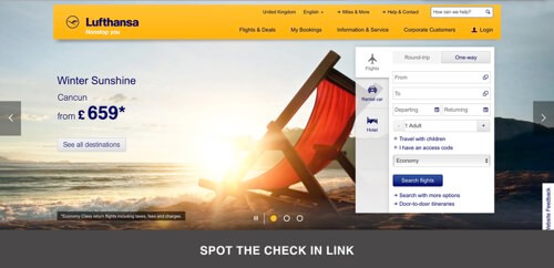
Given up yet? You should have, because the link for checking in is nowhere to be found in the top 600 pixels of the home page. It’s way down, below that big graphic:

To be fair, this area is dedicated almost entirely to checking in, and it is also very clean and attractive. As much as I appreciate the design of this section on its own, though, my instinct was to hunt for this information at the top of the page, and not being able to find it was pretty frustrating.
It’s quite unlikely that Lufthansa’s user data shows that this is the best spot for the check-in widget. Or maybe that’s just where the designers stuck it because it looked good in the layout. Nevertheless, checking in doesn’t seem to be prioritized for the user, and unless you travel with Lufthansa a lot, it is difficult to spot. One can imagine that many travellers, once disappointed, would query “Lufthansa check-in” in a search engine instead — not a good experience.
It holds true everywhere: as designers, our job is to simply prioritize important actions and display them prominently. Never hide them behind an icon or button. Make them visible and easily accessible on desktop, tablet and mobile. Prioritize user needs, not company’s branding.
Your list of priorities might be huge and difficult to rank, and that’s exactly what designers of airline home pages face. One place to look for help is competing websites; you could identify common problems with user flow and start designing a better experience for precisely those problems.
Everybody wants to be better than their competitors, so address these issues head on. You could go as far as creating a spreadsheet with the most critical tasks and constraints: How could you add a bit of delight to the experience or reduce complexity? If you’re building a responsive website, look into the content itself in its purest form, examine it and repackage it to best suit the challenges of different form factors.
If you present pricing options for flights in a table on the desktop, you don’t necessarily have to keep it as a table on tablets and phones; it could be a set of accordions with data lists, for example. A seating plan on the desktop could be transformed into a UI that first offers general seating options and, based on the user’s selection, provides a simplified seating map with zooming functionality and a supporting data list.
Mobile Experience
Another important aspect of airlines websites is mobile strategy. In this data set, we have a sort of microcosm for how the Internet as a whole handles mobile users in 2015: A few websites have gone fully responsive, even more reroute users to a dedicated mobile website, and still others do absolutely nothing. Fortunately, at the time of writing only one airline, Ryanair, leaves mobile users out completely (depending on the user’s IP address, though — it seems to be rolling out a new responsive website now).
Here are the airlines with a responsive website:
- Singapore Airlines
- Cathay Pacific Airways
- Virgin America
- Lufthansa (kind-of-responsive)
- SWISS
- KLM
- Air Astana
- Norwegian Airlines
- Ryanair
Here are the airlines with a dedicated mobile website:
- Qatar Airways
- Lufthansa (which has both a mobile website and a responsive desktop website)
- Turkish Airlines
- Air New Zealand
- Delta
- Emirates
Flight-Booking Process
Now we get to the good stuff: booking a flight. Every airline on our list agrees on one thing: that this process should start right on the home page. That’s where the agreement ends, though. From here on out, it’s a battle of ideas and UX strategies.
Let’s focus on some of the major pain points that we encountered with some airlines and how these are solved or addressed by others.
Too Much Or Too Little
The flight-booking widgets across the home pages vary dramatically in complexity. Typically, you’ll see something like Singapore Airlines’ widget:
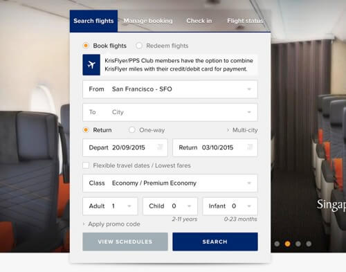
As you can see, the user has a good bit of work to do here. They have to choose their cities, type of flight, dates, seating class and so on, all from the home page before hitting the search button. Now contrast this widget with Virgin’s:
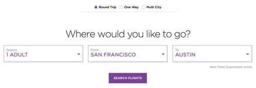
The interesting thing is that both airlines have to collect the same information. Singapore Airlines chooses to do it all in one place, which can be daunting but convenient. Virgin opts to draw out the process, pushing a lot of the work to later screens, but it feels more guided.
Overall, I like Virgin’s approach. The copywriting is friendly, and the simple interface makes me feel like the process is going to be easy. Remember that not every user books a flight and travels the globe regularly. For many, flying is quite a stressful experience. As designers, we have a great opportunity and even an obligation to reduce the stress associated with complex activities by making UIs that are simple, intentional and friendly.
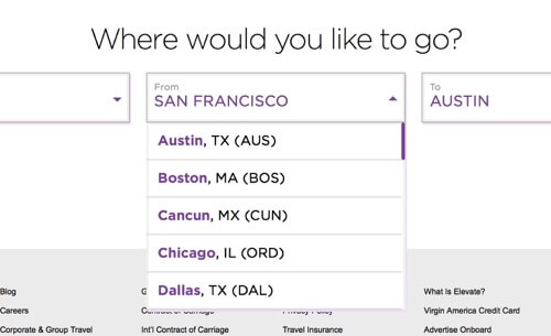
That being said, Virgin’s widget is so simple that it might be frustrating. For instance, every other website lets users type to filter their destination. Virgin forces you to scroll through a list of results and manually click where you want to go. (Update: This has either been fixed or I totally missed that you can type in a destination in my earlier review. Either way, it works great now.)
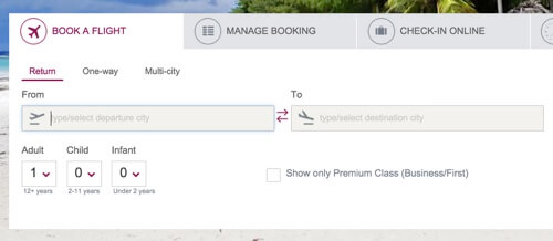
Qatar Airways is similarly limited but in exactly the opposite way. It has no dropdown menu for users to choose from at all. Instead, users are forced to type in the destination.
Revealed Complexity
A smart technique for dealing with a complex process is to make the first step as simple as possible and then slowly reveal more as the user works through the steps.

As you can see, Ryanair’s home page widget is both attractive and simple. Once the user enters their destination, another step is revealed.
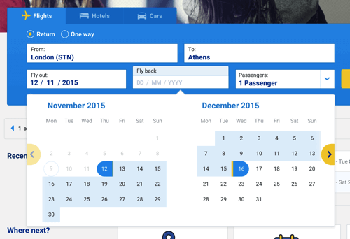
If this happened more than once, it’d be frustrating, but I found the interaction to be friendly enough the way it’s implemented.
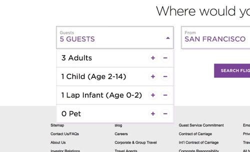
A similar approach makes Virgin’s widget, which we saw earlier, seem simpler than it actually is. The guest controls are hidden in a fairly unconventional but easy-to-use dropdown menu.
Date-Picker Dilemmas
Providing a way for users to pick dates for a flight seems pretty straightforward, but here’s an interesting question: How many months should you show in the date-picker?
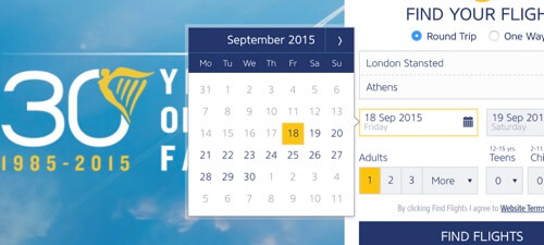
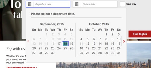
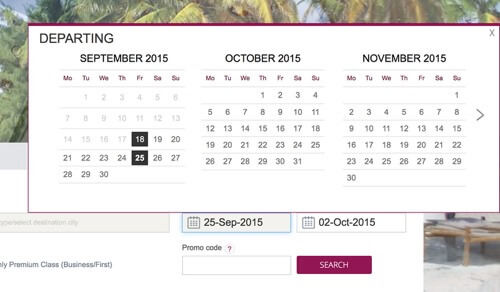
Some airlines show one month at a time, most show two, and Qatar throws caution to the wind, showing a huge widget that lets users view three months at a time.
Personally, I find that three months feels excessive and takes up way too much space for a modal (it blocks half the page). One month is fine, but two months is the sweet spot. Context is important: I’d wager that the vast majority of round-trip flights aren’t longer than a month, so a two-month view should be more than sufficient, while minimizing side-scrolling.
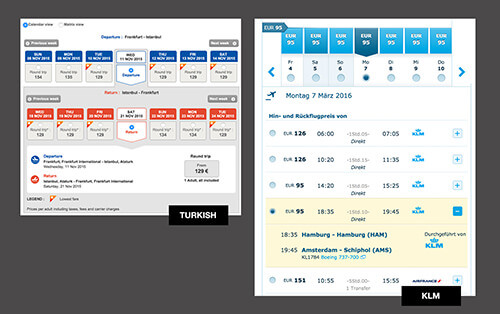
In Search Of Low Fares
Choosing a date is one of the main areas of frustration for me when booking a flight. Like many travellers, I’m flexible with my schedule because I know that leaving a day earlier or later than planned can save me hundreds of dollars.
When forced to choose a firm date in one of those booking widgets, I worry that I won’t be given the chance to see a calendar of fares and that I’ll be stuck with my selection, instead of being able to shuffle my dates.
Airlines deal with this pain point in different ways. Delta allows users to choose between “Exact dates” and “Flexible days” (although the wording there is inconsistent).
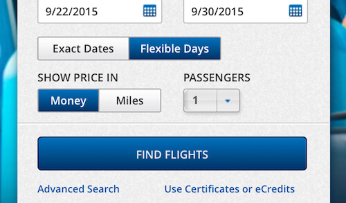
Next, though, they show this crazy, mutant date-picker that has both a horizontal and vertical axis, allowing users to choose their departure and return dates in one go. In fact, this component is consistently used pretty much everywhere to display outbound and inbound flights along two axis, with prices along both dimensions. The matrix can get quite complex and overwhelming, especially if it contains more than 7 days on each axis.
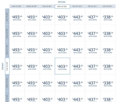
The whole double-axis thing is interesting, but in practice, I needed a few seconds to figure out just what the heck I was looking at.
Air New Zealand implements its own version of this same idea to help users find a low fare:
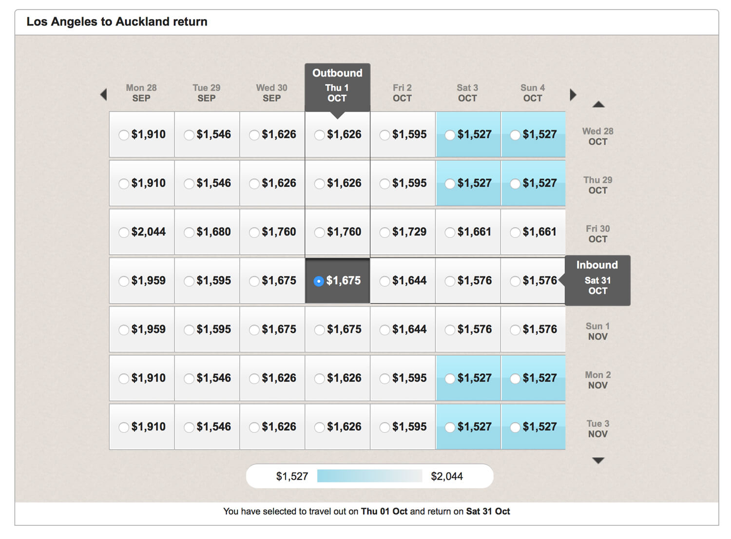
Putting the vertical-axis titles on the right side and not rotating the text makes Air New Zealand’s fare finder easier to figure out, but I’m still not convinced this piece of UI is user-friendly.
Instead of using a matrix, International shows a nice overview of options, with corresponding prices, reducing the number of options to four days. Norwegian Airlines shows prices for five days, and Cathay Pacific, Singapore Airlines, Delta Airlines and Turkish Airlines show for seven days. Air Astana provides a complicated comparison table, with huge images as well as filtering and ordering options, which make the interface quite difficult to use. Air New Zealand doesn’t have a matrix at all; instead, it lets users choose a day to focus on (along with a corresponding price) and then shows all of the options for that day.
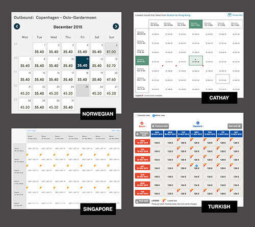
I wonder whether an alternate view of an accordion with flight options sorted by price would make the interface slightly less complex and the experience slightly more enjoyable. The user could then choose the view they prefer. In fact, the dual-view approach could work in many scenarios — for example, when data could be presented as a graph or as a table, or when an overview of products could be presented in a thumbnail-grid view or as a data list.
“Don’t Make Me Repeat Steps”
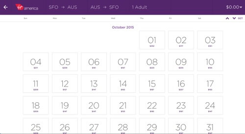
One frustrating thing that Air New Zealand does (as well as others) is force users to choose a date in the home page widget and then push them into the calendar fare view, where they have to choose again. I appreciate the effort in helping me find a low price, but if you’re going to take me to the low-fare calendar anyway, why make me choose a date on the home page? Wouldn’t it be better to ask me for the month or week when I’ll be travelling instead, or guide me to the low-fare calendar only if I explicitly choose to do so?
Virgin’s simpler process wins again here by making users choose dates only once, and doing it on a page that lets them compare fares.
Actions That Aren’t Actions
Another surprisingly frustrating action is choosing an actual flight. Seems like it should be easy, right? Not always. Take the flight schedule from Singapore Airlines below. First, I don’t find the plane/no-plane icon system to be intuitive, but let’s ignore that for now. Let’s also ignore the lack of prices in this list. Instead, let’s consider that you can’t actually select any of the flights in this schedule.
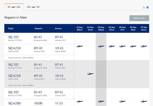
Instead, you have to memorize which flight you want, then click “Book Now,” and then start the booking process over with the widget on the home page. It seems downright ludicrous to me that this is the process, but that’s how it works.
Virgin makes a less serious but similarly confusing mistake. It presents fare options in rows, and each row is highlighted when you hover over it, which makes you think you can click it — but you can’t.
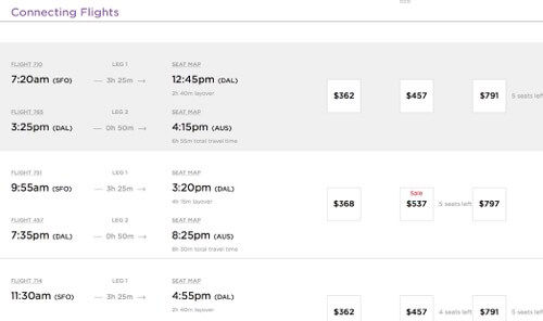
Instead, you have to click on one of the little three squares. This makes for a confusing experience in which you try to select a flight, click around, realize you’re doing it wrong, and then hunt around for the right solution. To me, a hover effect almost always implies that a click event is possible. This could be reworked so that a click on a row does make a selection, which would refocus your attention by highlighting the price boxes, or so that a click on a row selects one of the options (probably the cheapest).
A final example of click frustration is shown below in Lufthansa’s widget:
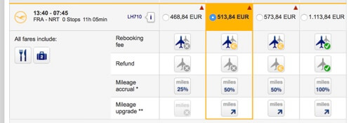
This little chart is a bit confusing. To make it worse, all of those vague little icons look like clickable buttons, but they’re not; they simply indicate the status of various options.
Checkout Flow: From Start To Finish
The essence of an airline website’s experience is to enable customers to purchase tickets seamlessly. Well, at least that’s what one would expect. In reality, the checkout experience is often anything but straightforward or seamless. Many things can (and do) go wrong, leaving customers in the dark, forcing them to figure out an interface or compare flight options. Admittedly, checkout experiences in general can get quite complex, so getting it right isn’t exactly easy.
This complexity is evident in the amount of effort required from the user to complete their purchase. Most airlines have between five and seven steps in their checkout process — the travel dates are followed by the flight selection, followed by upsells, followed by the seat selection, followed by payment, followed by the confirmation screen. Obviously, keeping the user actively involved throughout the process is critical; so, many airlines highlight the selected flight and price by fixing them either in the sidebar or at the top of the page — always within view.
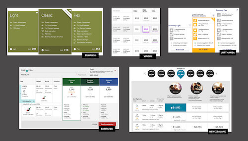
Sometimes, the booking experience is quite frustrating from the very first step. Most airlines force you to select an airport to fly from, not just a city. Selecting a multi-city route is often difficult because the system assumes that you want to return to the city that you departed from. Selecting more than two multi-city flights is often simply impossible. For whatever reason, the lowest fare is usually highlighted with a tiny triangle in the upper-left or upper-right corner of the flight option — whereas highlighting the entire option instead might be better.
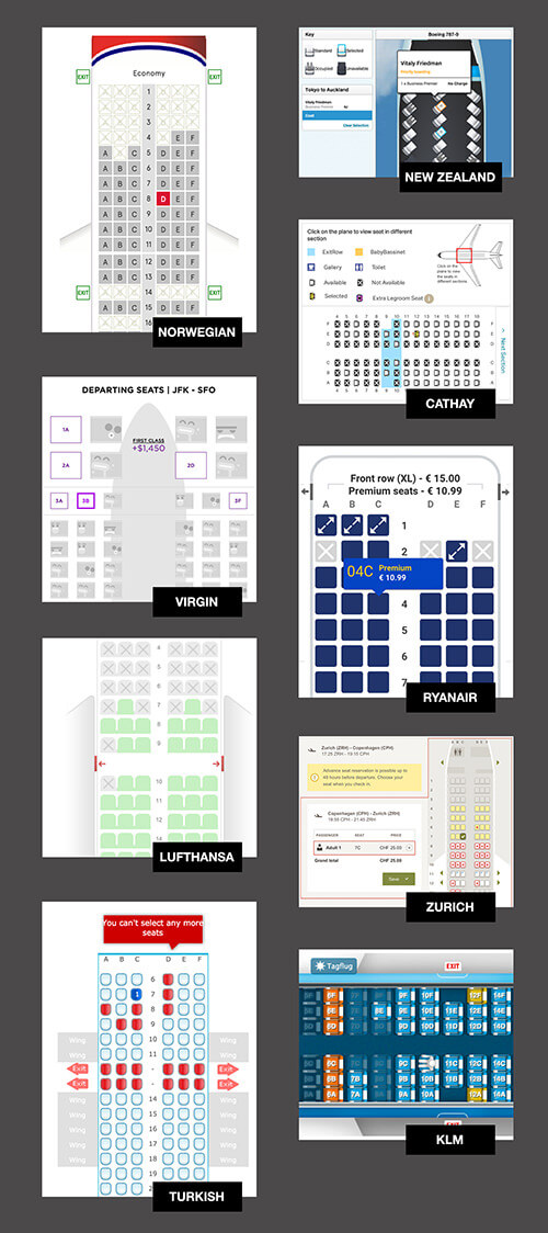
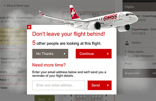
Airlines often distinguish between low-fare calendars and normal searches for flights, which assumes that users must explicitly search for low-fares when booking a flight. On Singapore Airlines’ website, one can choose between “View schedules” and “Search” for flights. The interface for selecting a seat is usually annoyingly small; icons that are used remarkably often are just as often unclickable; and users often have to verify their email address by retyping it (of course, most of us will just copy and paste our address, making this verification quite useless). KLM tries to motivate visitors to make a quick purchase by showing how many customers have just bought a similar flight or are looking at the option right now.
On the bright side, most airlines allow users to check out as a guest by default; as mentioned above, airport inputs usually have autocompletion; a currency converter is provided more often than one might expect; and sometimes you can even save a trip for future reference (Ryanair’s “wishlist”), “hold a flight” for a couple of days (Air New Zealand), automate your check-in (SWISS sends a boarding pass automatically 20 hours before departure) or even see the price in airlines miles (Delta).
All airlines have a good old-fashioned payment form with 5–7 input fields. Not a single airline, though, uses the single-field credit-card input pattern; customers are usually required to select their credit-card type first and then input their digits. Testing transactions is a bit beyond the scope of this article (and our financial allowance, too, by the way).
Performance
Performance matters, and it affects conversions. However, finding a fast airline website — whether responsive or not — proved to be quite difficult. In most cases, airline websites load Modernizr, jQuery, a jQuery plugin for carousels, custom web fonts and a tracking script such as Omniture, Optimizely, OpenTag or uTag. All of these scripts together, with an A/B testing application running in the head of the page, make most of the websites quite slow. In fact, none of the reviewed websites have a start-rendering time below 1.8 seconds, even with optimal connectivity conditions, an average PageSpeed score is 50.5 on mobile and 63.4 on desktop, and none of the websites support HTTP/2.
Airline websites with better performance did turn out to be responsive. The fastest, though, proved to be New Zealand Airlines’s old non-responsive website, with a start-rendering time of 1.79 seconds.
In terms of HTTP requests, the home page for Norwegian Airlines turned out to be the leanest (and are probably the newest), with 42 HTTP requests and weighing in at 1.1 MB. The design is well crafted, yet too many scripts block the rendering of the pages. Norwegian Airlines uses AngularJS. Performance is way better on subsequent loads, though. Norwegian Airlines’ CSS runs 15,610 lines long; both follow the BEM methodology.
Responsive doesn’t necessarily mean fast. Air Astana’s home page, weighing in at 4.1 MB, is responsive yet only starts rendering after 7 seconds; Bootstrap, jQuery, jQuery UI, three different theme skins and Telerik’s web UI have been crammed into the head of the page. KLM’s responsive home page is faster and scores the highest on PageSpeed, but it loads a blank.gif file that is 365 bytes yet causes 569 milliseconds in latency. Lufthansa is again slightly better, yet it requires jQuery, Dojo and uTag.
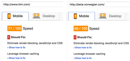
Apart from Air Astana, another performance offender is Emirates, with its 306 HTTP requests and 151 KB (Gzipped) of JavaScript (controls-main.js), although it starts rendering within 2.4 seconds! Also, Ryanair’s new responsive home page, with its whopping Speed Index of 21,745, makes 89 HTTP requests and has a start-rendering time of 9.5 seconds on a cable connection. Ryanair makes heavy use of AngularJS and also loads a number of JavaScripts in the head synchronously, blocking rendering of the website. As discovered by Ben Schwarz, the reason for that is a plethora of expensive selectors being used — after all, the CSS file is 2.88Mb in size ungzipped.
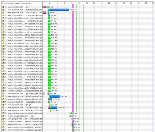
On average, the home pages of airline websites are around 1.94 MB. The code is usually quite up to date, yet every now and again you’ll find legacy scripts and techniques used. For example, Emirates still uses Cufón to deliver web fonts, with text embedded in images, and Lufthansa still uses Flash for checking in and selecting seats.
Lessons Learned
If you’ve never worked on an airline website, then hopefully this article will help you appreciate the scale of the work, even if it just scratches the surface of the complexity involved. From predicting hundreds, even thousands, of user actions to deciding what to promote in a limited amount of space, and even figuring out how many months to show in a date-picker, a lot of design decisions need to be made.
Frustrations
All of these airline websites get the job done, but we discovered plenty of minor and major frustrations:
- Home page clutter overwhelms users with options.
- To avoid clutter, too many airlines over-rely on sliders, which either hide important information or are clunky.
- Multiple navigation menus on a single page can look crammed and flow in different directions, competing with each other visually.
- Complex multi-matrix flight-booking widgets make the process of selecting a flight intimidating.
- Redundant actions force users either to make choices they’re not ready to make or to repeat selections they’ve already made.
- The UI for comparing flight prices is often weird and unexpected.
- Users are often forced to play a guessing game about what’s clickable.
- Low-fare calendars often appear at the wrong time and cause confusion, largely due to design.
- During check-in, typing in passport and visa information is often very cumbersome. Smart defaults would go a long way. For example, birth date input fields and select menus are often set on the current date and, hence, require a lot of annoying scrolling.
- After check-in, many airlines don’t provide enough information about the terminal, luggage restrictions and airplane.
- Multi-city flights are typically impossible to book or just broken. Trips are often assumed to be either one way or return. And if you book a multi-city trip, you are expected to return to the city you departed from.
Responses
In addressing these complaints, we can derive some important lessons on designing projects of this scale:
- Sliders might feel like a great way to manage clutter, but they are often a complete failure in interaction. If you’re putting critical information two or three slides in, odds are that many users will never see it. Never hide important content.
- The answer to problems of information architecture isn’t to add a bunch of navigation menus. Prioritize and put the important content up front, throughout the different form factors.
- Obvious but worth pointing out: in addition to keeping menus lean, consider visually differentiating them to establish a clear hierarchy, instead of having 15 identically styled links.
- For lengthy processes, consider gradually revealing complexity as users progress, rather than overwhelming them up front.
- Always be aware of which items are indicated as being clickable. Nothing confuses users quicker than not being able to figure out where to click.
- Instead of showing a complex, mutant date-picker matrix, provide an overview of options for 4 days and highlight the lowest fares prominently (or even as a default selection).
- Handy features such as airport input autocomplete, wishlist, flight reservation, automated check-in or currency converter help make the experience more delightful.
- By prioritizing performance and providing a smooth UX, you can outperform competitors by a long shot — mostly because most airlines websites out there are quite slow and the experience is quite frustrating.
Break Down The Complexity
Overall, airline websites are so completely inundated with information, options, possible user flows, instructions and sales pitches that I found any website that simply cleared out the mess and gave me some space to be a breath of fresh air.
This is a primary reason why Virgin received more attention throughout this article than almost any other airline. Overall, its website just felt better. The design was clean and attractive, the copy was friendly, and I was guided through the steps without much extra thought or frustration.
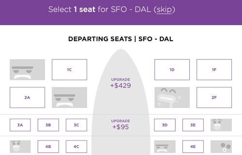
You need only look at the image above to get a feel for what it’s like to book a flight with Virgin. When you get to selecting a seat, the occupied areas are adorned with silly faces. Most airlines take themselves far too seriously to ever consider this delightful little design quirk, which makes it that much more fun and refreshing.
Websites that try the hardest to think of and provide everything a user might need are often the ones that fail the most in meeting our desires and expectations. Those rare websites that cut away all the bloat and leave us with a limited but solid core experience are the ones we remember and come back to again and again. Sounds familiar, doesn’t it? Well, it remains to be seen how airline websites will evolve — hopefully, towards leaner, faster and more delightful experiences.
Accessibility
[Update Nov. 17, 2015] This section on accessibility was written by Adrian Roselli, which he has submitted after a conversation in our comments. [Ed.]
Too many equate accessibility support with screen reader support, which is short-sighted (ugh, pun) and inaccurate. It also requires some tools and experience to do well.
Instead of screen readers, I’ll often quickly test a web site for accessibility using one or two quick techniques to determine how likely further testing will show more issues. I start with a keyboard, and then use a color contrast tool. As such, I am limiting the scope of accessibility testing to just keyboard and contrast.
I looked at the top 5 airlines as Joshua did, but I stopped there:
Qatar Airways
Qatar makes extensive used of the tabindex attribute, generally a bad idea if the value is greater than 0. Thanks to this, I am immediately brought to the From field to book a flight when I start tabbing on the page.
While I can pick cities, I cannot access the calendar controls at all to choose a date — I have to type my dates. I also cannot change the number of people flying, whether by typing a number or hitting the enter key to open the menu. Without “valid” dates, I cannot even submit the form.
If I want to check in online, it takes me 33 taps of my Tab↹ key to get to the tab control and activate the panel, then another 57 taps to get to the first field. This includes a trip through every link in the footer and browser’s address bar.
If you tried to check in using an option from the primary navigation, it will take 39 taps to find you cannot open the menu at all. If you sit on the page long enough, you’ll be rewarded with an overlay that requires a full round-trip of every focusable item on the page in order to find the unlabeled close button.
Compounding this experience is the low contrast body text coupled with links that don’t differ much in contrast from that text, nor from themselves when they receive focus. Navigation items have a barely-perceptible difference in color when they receive focus, making the site incredibly difficult to use with a keyboard.
Singapore Airlines
Singapore Air takes the confounding keyboard experience a step further and removes all focus indicators when using a keyboard. Even looking to your browser’s footer for an indication where a link may take you is fruitless, as navigation links only use “#” as the URL. This may be moot, as once you open a menu you cannot get into it.
If you want to check in to a flight, your best bet is to hit the Tab↹ key 28 times to get to the From field where you search for flights, then Shift + Tab↹ (backward) three times and hit the Enter key (you won’t know what you’ve selected until you press the key).
The tabs that allow you to check in, book a flight, etc., are the best examples of the contrast issues on the page. They are white text with a bit of a drop shadow, in boxes that are mostly transparent to a cycling set of background images (often white or light gray). Much of the time they are completely illegible.
You might notice a box near the top of the page with the text Important
set in orange. Not only is that alert text too low contrast, but each alert itself is a link and therefore a tab-stop on the page. There is no indication how many there are, which makes tabbing through the page even trickier as it’s hard to count visually as you go.
The site also demonstrates how you can satisfy a checklist by using labels and make the experience worse — it has a value of , ensuring it will bring no value. This isn’t as funny as the flag image which has a longdesc value that points to a 404.
Cathay Pacific Airways
At this point, Cathay Pacific is a breath of fresh air. The site is generally keyboard friendly. The links have underlines, the menus are usable with a keyboard, and most items on the page have a focus style.
The site has an accessibility statement that primarily talks about users with visual impairments. From within the site there is even a control to enlarge the text on the page, though it doesn’t carry over to the home page.
As you scroll down the page, an overlay banner appears to show the site logo and represent the site navigation in a hamburger menu. The problem is when you reverse-tab back up the page, this has the effect of partially covering elements you want to see.
The tab control works with a keyboard, which is great and easy. Unfortunately, the fields themselves visually hide the labels and rely on placeholder text that has insufficient contrast.
From just a keyboard and contrast perspective, the site gets a lot right though.
Turkish Airlines
Turkish Air brought me back down. Without any focus indicators, it’s nearly impossible to see where you are on the page.
When booking a flight, form controls such as the city search or calendars get no focus and cannot be activated via the keyboard. Not only that, you cannot change the dates by typing, a theme which carries into the passenger count. There are plus/minus images (spans) which cannot receive focus, and typing a number, hitting the Enter key or space bar all have no effect.
Thanks to the use of tabindex, the visual order does not match the tab order. The search icon (it’s supposed to be an an input type=“submit”, but due to a type it’s just a text field with a magnifying glass background image) has tabindex of 1, but the search field itself has no tabindex. You’d have to press the Tab↹ key 18 times to enter search text.
A more compelling example of the keyboard problems: it will take you 28 presses to get to the Check in
tab on the home page, 3 more presses to get to the fields to choose between e-ticket or reference number, then 145 tabs to get to the field itself to enter your number (which has tabindex of 21).
Contrast for the content is generally good, though links often lack enough contrast between themselves and the background color and the surrounding copy color. The lack of any focus styles also means no contrast change when the links are selected.
Emirates
Like the close of a good fairy tale, Emirates made me hopeful again.
Not only does Emirates use focus styles throughout the home page, it even has a Skip to main content
link that works (by using a button to script around the Chrome bug). In fact, the very first link in the tab order is to an accessibility statement (though the link is visually hidden). It’s not just boiler-plate either, it was written with some thought, echoing the effort I see on the site.
Here we learn that the site uses accesskey, which while they can be problematic, leans primarily on numbers for navigating the site elements, seemingly based on the old UK government standard.
Most of the expanding elements on the page can be quickly collapsed by pressing the Esc key, including a user-activated video. The Esc key implementation can use some tweaking, as it doesn’t always put the focus back where the user was when activating the control. Many of these items have a Close
link as well, though it’s not always first in the flow.
While there are a few javascript:void(0) links on the page, the control that allows you to choose between booking or checking in is coded so if the JavaScript fails, the link itself will take you to a real page.
Particularly exciting is that not only do the calendar controls to work with the keyboard, they support the arrow keys to quickly move through them.
Contrast is generally very good. The links in the body copy can use some work as they don’t have enough contrast to indicate hover states (they are easier to see when tabbing through them) and they have no underlines.
Further Reading
- How To Design Style Guides For Brands And Websites
- How To Make An Effective Style Guide
- A Hawaiian Airlines Case Study
- Transforming Lufthansa’s Brand Strategy: A Case Study


 JavaScript Form Builder — Create JSON-driven forms without coding.
 Bring your design to life
 Enterprise UX Masterclass, with Marko Dugonjic
 Register For Free

