Responsive And Fluid Typography With vh And vw Units

Email Newsletter
Weekly tips on front-end & UX.
Trusted by 182,000+ folks.
 Register for Free
 Custom Web Forms for Angular, React, & Vue. Your backend.


 Celebrating 10 million developers
Embracing fluid typography might be easier than you think. It has wide browser support, is simple to implement and can be achieved without losing control over many important aspects of design.

Unlike responsive typography, which changes only at set breakpoints, fluid typography resizes smoothly to match any device width. It is an intuitive option for a web in which we have a practically infinite number of screen sizes to support. Yet, for some reason, it is still used far less than responsive techniques.
This might be because typography is so deeply rooted in the centuries-old history of typesetting. The concept of having “fluid” anything is often at odds with this tradition. In print, dimensions have always been fixed, but they don’t need to be on the web. That’s why I think fluid typography is a perfect match for the web. It’s a different approach for a completely different medium.
This doesn’t mean we need to throw out all conventions and everything we know about typography. We just need to learn how to apply the techniques we know in a slightly different way. Careful attention to detail will ensure we still have a perfectly crafted experience at all screen sizes.
Getting Started With Fluid Typography
Viewport units are what make fluid typography on the web possible. Viewport units refer to a percentage of the browser’s viewport dimensions. For example, 1 viewport width (vw) is equal to 1% of the viewport’s width. The units differ from percentages because they are always relative to the viewport, whereas a percentage is relative to the element’s parent container.
This means that, unlike all other unit types, viewport units are not in any way related to the base font size. This difference is significant and makes the units interesting and unique.
Four viewport units are available to us:
vw: viewport widthvh: viewport heightvmin: the smaller value of the viewport’s width and heightvmax: the larger value of the viewport’s width and height
The easiest way to start using fluid typography is to set the font-size on the html element to be a fluid unit:
html { font-size: 2vw; }In this example, we’ve set the root element to 2vw. Therefore, we have changed the “root em.” Because all em and rem units are either directly or indirectly related to the root em, they will now also be fluid. For example:
h1 { font-size: 2em; }A heading size of 2em is now equivalent to 4vw because this is twice the current font size of 2vw.
Using viewport-relative units alone comes with some drawbacks. We don’t get precise control over the rate of scale; we don’t have min or max font sizes; and, just like pixels, a declaration might override the user’s font-size preferences. Luckily, there are ways to overcome all of these limitations.
Controlling Viewport Units To Get Minimum And Maximum Font Sizes
Sticking 2vw on the html element, seeing that everything is fluid and calling it a day is easy, but it wouldn’t yield the best result. Viewport units are a blunt instrument and require some additional effort to get a workable result.
Because viewport units are always relative to the viewport, on very small screens, you could end up with ridiculously small font sizes.
Ideally, we’d be able to set a minimum font size, but we don’t yet have min-font-size property in CSS. With a little lateral thinking, though, we can achieve the same result in a few different ways.
First, we could use a calc() expression:
html { font-size: calc(1em + 1vw); }In this example, at a viewport width of 0, the font-size would be exactly 1em. As the screen gets larger, the value of 1vw would be added to the minimum font size of 1em. But this technique is not always ideal; often we want to set a minimum font size at a screen size other than zero. We can handle this using media queries:
@media screen and (min-width: 50em) {
  html {
    font-size: 2vw;
  }
}
In this example, the font size would become fluid once the viewport reaches a width of 50 ems. This works really well, but it usually means a jump between the fixed and fluid values. To eliminate this, we can work out the precise point at which the fluid value matches the fixed value and set a breakpoint at that viewport size.
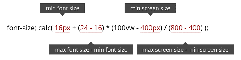
If the default font size is 16 pixels and if 2vw is 2% of the viewport’s width, then the calculation for working out the breakpoint would be 16 ÷ (2 ÷ 100). This gives us 800 pixels.
Because we want to use em units for our media queries, let’s convert the pixels to ems. We’ll divide 800 by 16 (or whatever the root em is equal to in pixels): 800 ÷ 16 = 50. If you find it easier, we could do the calculation in ems: 1 ÷ (2 ÷ 100) = 50. As you can see in the example above, by setting a font size of 2vw and a breakpoint of 50em, we get a seamless transition between the fixed and fluid values.
We can use the same calculation to work out a maximum font size. If we wanted a maximum font size of 24 pixels, we could calculate like so: 24 ÷ (2 ÷ 100) = 1200px. In ems, that would be: 1.5 ÷ (2 ÷ 100) = 75. Then, above 75 ems, we would reset the font size to a fixed value.
@media screen and (min-width: 75em) {
  html {
    font-size: 1.5em;
  }
}
These calculations are not difficult, but I find that a table helps us to visualize the breakpoints and the rate at which fonts scale with different viewports units. The viewport unit values are across the top, and the device resolutions run down the left side of the table.
| 1vw | 2vw | 3vw | 4vw | 5vw | |
|---|---|---|---|---|---|
| 400px | 4px | 8px | 12px | 16px | 20px |
| 500px | 5px | 10px | 15px | 20px | 25px |
| 600px | 6px | 12px | 18px | 24px | 30px |
| 700px | 7px | 14px | 21px | 28px | 35px |
| 800px | 8px | 16px | 24px | 32px | 40px |
Looking at this table, you can see that we have little control over the rate at which the viewport units change. Using viewport units alone, we are limited to the font sizes available in a single column of the table.
Controlling The Rate Of Scale
If we wanted to choose a font size of 16 pixels at a screen resolution of 400 pixels and then transition to 24 pixels at a resolution of 800 pixels, we wouldn’t be able to — not without a breakpoint. As well, you might have noticed we have been calculating the breakpoints for the minimum and maximum font sizes, not choosing them.
How do we get around these limitations? The answer is to use calc(). Using calc() and viewport units together, we can get advanced fluid typography that scales perfectly between specific pixel values within a specific viewport range. We simply need to create a basic mathematical function.
This function takes a value within a range and works out what the new value would be if applied to a different range. So, if we had the numbers 1 and 100 and a value of 50 and then applied this to a new range between 1 to 200, our new value would be 100. Both of these values remain right in the middle of the range.
This is a common function for mapping values, and I’ve used it a lot when working with data in JavaScript. I was curious about the possibility of using functions with calc(), and when I noticed that this was a purely mathematical function, I knew that all I needed was a variable. That’s the key difference with viewports: The viewport’s size is variable. A value of 100vw is the variable in this equation because the resolved value of 100vw changes as the viewport’s size changes. With this initial idea, I took a while longer to get the function to work. The calc() function handles unit types in equations in very specific ways. If you are interested in this type of thing, I highly recommend reading the W3C’s specification on unit types and values; if nothing else, it will make for great conversation at your next dinner party.
Though the calculation looks slightly complex, it is fairly simple. We choose the minimum and maximum font size and the screen sizes over which the font should scale and then plug them into the equation. We can use any unit type, including ems, rems or pixels. I’ve been using pixels for the examples in this article because they make it easier to understand the concepts, but I usually use rem units in my work. Whichever you choose, the only thing to remember is that you must use the same unit type for all values in the equation and you must strip the units, as shown in the example.
If you don’t want to write this by hand, plenty of tools make it easier, including mixins for Sass and LESS and a PostCSS plugin. However you roll, you’re covered!
Maintaining Ideal Line Length
In his book The Elements of Typographic Style, Robert Bringhurst suggests that a comfortable line length is around 45 to 75 characters.
"Anything from 45 to 75 characters is widely regarded as a satisfactory length of line for a single-column page set in a serifed text face in a text size. The 66-character line (counting both letters and spaces) is widely regarded as ideal."
The same rule can be directly applied to fluid typography, and, in many cases, achieving a consistent line length as the text scales is possible.
In a responsive approach, in which we adjust the font size at set breakpoints, we will often also arbitrarily adjust the width of a container to maintain the right line length. However, with fluid typography, adjustment at specific breakpoints becomes unnecessary. Just set the size of the container to scale at the same rate as the font. We can use the calc() technique described above on the width property just as easily as we do on font-size. This makes it easy to maintain a perfect line length — and I have noticed my style sheets are far easier to read and maintain, too.
Be aware that maintaining an ideal line length becomes impractical on very small screens. There comes a point when reducing the font size to maintain an “ideal” reading length will impair readability. We just have to accept this and set the container’s width to something sensible for mobile devices.
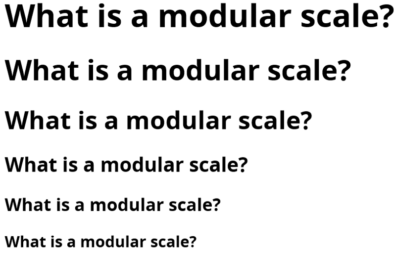
Implementing A Modular Scale
A modular scale is a series of numbers that are harmoniously proportional to each other. This is best described visually:
Different scales work better for different screen sizes.
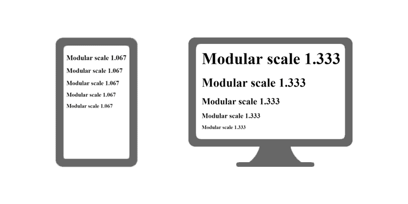
On a small screen, heading sizes should be more uniform; a large screen has room for greater variation. We can use the typographic techniques described above to fluidly transition between different modular scales. Simply pick a ratio for small screens and a different ratio for large screens, and then work out the minimum and maximum font sizes for each heading level.
To calculate the modular scale, take the base font size and multiply it by the desired ratio to get larger numbers. For smaller numbers, divide. Repeat this process with subsequent results to get each required step in the scale.
Larger
- 1em × 1.125em = 1.125em
- 1.125em × 1.125em = 1.266em
- 1.266em × 1.125em = 1.424em
- 1.424em × 1.125em = 1.602em
Smaller
- 1em ÷ 1.125em = 0.889em
- 0.889em ÷ 1.125em = 0.790em
- 0.790em ÷ 1.125em = 0.702em
- 0.702em ÷ 1.125em = 0.624em
Let’s use 1.125 as our minimum scale and do the same calculations for 1.250 as our maximum scale. We’d then apply different steps in the scale to our heading levels.
- Minimum scale: 1.125
- Maximum scale: 1.250
| Heading level | Minimum font size | Maximum font size |
|---|---|---|
| Heading 1 | 1.602em | 2.441em |
| Heading 2 | 1.424em | 1.953em |
| Heading 3 | 1.266em | 1.563em |
| Heading 4 | 1.125em | 1.250em |
I’ve set up an example of fluid modular scale headings on Codepen for you to look at. You can read more about the significance of modular scales in Tim Brown’s article “More Meaningful Typography.”
If you need help choosing an appropriate scale, I recommend the websites Type Scale by Jeremy Church and Modular Scale by Tim Brown and Scott Kellum.
Maintaining Vertical Rhythm
Vertical rhythm has to do with maintaining consistent and proportional space between elements on the page. You can find out more about vertical rhythm in Espen Brunborg’s article “CSS Baseline: The Good, the Bad and the Ugly.”
To maintain vertical rhythm in our layout, we need to set the vertical spacing of each element as a proportion of our baseline measure. One thing many people find challenging with responsive typography is finding a vertical rhythm that works for both small and large screens. Typically, we might want different baseline measures for small and large screens, or we might want to use different proportions.
With fluid typography, the baseline can be fluid, just like the font size. In fact, if we have already set the root element to a fluid value, we can use em or rem units, and we can use calc() to make this easy.
Let’s say we make 1.5rem our baseline. Let’s set the padding on the body element to a single unit of our baseline.
body {
  padding: 1.5rem;
}
We’ll do the same for the line height and margins.
p {
  line-height: 1.5rem;
  margin-bottom: 1.5rem;
}
For heading elements, I want a different line height. However, I want the height of the line plus the margins to equal an increment of the baseline. This is where calc() helps.
h1 {
  font-size: 2rem;
  line-height: 2rem;
  margin-top: calc((1.5rem - 2rem) + 1.5rem);
  margin-bottom: 1.5rem;
}
In this example, the total height of the heading element plus the margins will be 3rem, which is exactly twice the value of our baseline.
I’ve created an example of this technique using Sass variables so that you can play around with different baselines measures to see how it works.
In the future, custom CSS properties will make this technique even more interesting. We will be able to use CSS variables in calc() expressions to change our baseline measure with media queries.
Working With Constraints
Perhaps you want to implement fluid typography on a website that has existing layout constraints, or you have to work within a predefined layout in WordPress or Bootstrap. In this situation, the containers would likely not be fluid or, if they are, probably won’t change at the same rate as the font size.
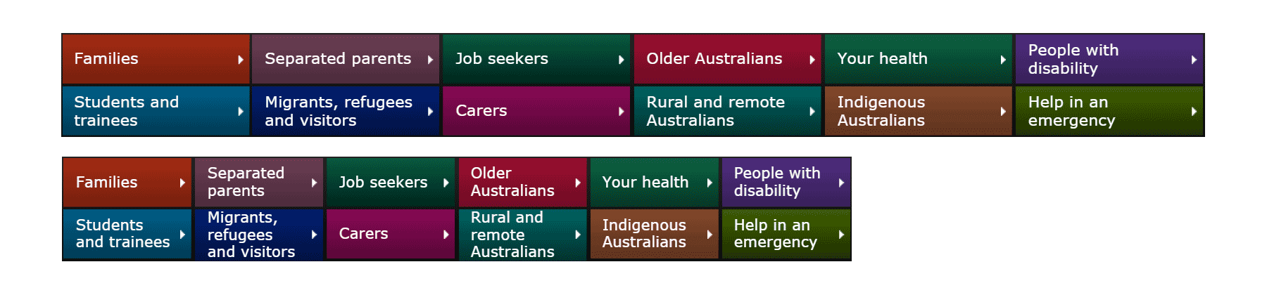
I recently helped to implement fluid typography for the Australian Government’s Department of Human Services. It’s a large website with challenging content, and we had to work with an existing design. I had two main concerns in implementing fluid typography on such a heavily trafficked website.
First, how could I prevent the layout from breaking? In particular, I expected content in navigation containers to overflow when the text size changed at a different rate from the container. To my surprise, this wasn’t a problem.
In fact, it turned out to be quite the opposite. Content now naturally adapted to fit containers, whereas previously it needed adjustment at certain breakpoints. Overall, the style sheet needed fewer media queries, and, for the most part, components needed far fewer style declarations.
This was an unexpected benefit, and in many places we ditched the design treatment for tablets because the desktop presentation now worked on smaller screens.
Below is an example of a navigation component that previously needed several adjustments at different screen sizes. While not perfect at small sizes, it holds together and remains functional, without breaking.
My second concern was that, because I had to work with some fixed widths, I knew I could not always achieve the ideal length of characters per line. Instead, I adjusted the font size to be within the ideal length on phones and tablets — where I think it matters most.
I had to accept that, because the main container does not scale at the same rate as the text, some text would inevitably reflow when the browser is resized. This was a concern only because I did not want readers to lose their place when changing the device’s orientation. Because we could not avoid this, the only thing we could do was to test the impact on certain devices. With the choices we made, luckily the reflowing was hardly noticeable on mobile devices, and even on large tablets the impact was minimal.
In the end, we were happy with the result. While we could do more to improve the typography, without a doubt we’ve improved the readability of the website. With the lessons learned from implementing fluid typography, the next iteration of the design will likely have a strong focus on typography and readability.
Tips For Implementing Fluid Typography On An Existing Website
- Carefully choose the rate of scale and the minimum and maximum font sizes that work best with your design.
- Use em units for font sizes. If you need to turn off fluid typography in a particular container, such as the navigation, set the font size of the container to a fixed value. Em values in this container will then be relative to the fixed value.
- Similarly, if you need to, you can set fluid typography only for certain containers. If you set the font size of a particular container to be a fluid value, then all em values in the container will become fluid.
- Reflowing text is not necessarily a bad thing if it only happens when the browser is resized or the device’s orientation changes.
- Maintaining a perfect line length might be impossible. Aim for an ideal line length on mobile and tablet first.
Browser Support And Bugs
I often hear that Safari, and mobile Safari in particular, has significant bugs with both viewport units and calc() expressions. However, more often than not, specific problems are not mentioned, so I thought I would do my own testing.
I tested calc() expressions and viewport units on their own, as well as the advanced fluid typography techniques that combine viewport units and calc(). I didn’t find any problems that would stop me from using these techniques today.
I found that both calc() and viewport units work fine in modern browsers. However, in versions of Safari below 8 and in Internet Explorer below version 11, viewport units when used in a calc() expression are not re-evaluated when the browser window is resized.
You can force an expression to be re-evaluated with additional media queries:
/* Older browsers */
html { font-size: 16px; }

/* Modern browsers only need this one */

@media screen and (min-width: 25em){
  html { font-size: calc( 16px + (24 - 16) * (100vw - 400px) / (800 - 400) ); }
}

/* Safari <8 and IE <11 */
@media screen and (min-width: 25em){
  html { font-size: calc( 16px + (24 - 16) * (100vw - 400px) / (800 - 400) ); }
}
@media screen and (min-width: 50em){

html { font-size: calc( 16px + (24 - 16) * (100vw - 400px) / (800 - 400) ); }
}
This technique forces Safari below version 8 and Internet Explorer below version 11 to recalculate the font size at set breakpoints.
Forcing old browsers to recalculate the layout with a window resizing event in JavaScript might be possible, but I could not find a reliable method of doing so, and it could impair performance. In most cases, forcing a recalculation at set breakpoints should be an acceptable fallback for these browsers.
For legacy browsers that don’t support viewport units or calc() expressions, the fluid technique will simply be ignored. If sensible defaults are set, this technique can be applied with progressive enhancement.
Using Fluid Typography Today
If you plan on implementing fluid typography today, first decide on the approach you are going to take.
If the entire design is going to be fluid, then you will probably want to consider making the root em fluid, by declaring a font size with a fluid unit on the html element. You can then use em and rem units throughout the rest of the design.
Choose your minimum and maximum font size carefully. At this point, you’ll need to decide whether to use viewport units directly or to exert more precise control over the rate of scale. If the latter, then the mixin for Sass or LESS or the PostCSS plugin will make things easier.
Make sure to get the minimum and maximum font size right. This is the most important decision. Once you change the root em, the font size for all other components will be relative to this. Changing this late in a project could mean that you have to adjust everything.
Don’t forget to declare a default font size before implementing a fluid technique. This default will be used in browsers that don’t support fluid units, and it does not need to be the same as your minimum font size.
Finally, consider the constraints of your design and how you are going to approach things like heading levels and line length. Look at the techniques in this article. If you have components other than headings that you want to scale at a different rate from the regular text, consider readability and the maintenance of style sheets carefully before adding many calc() expressions.
I hope you feel encouraged to think about where fluid typography might fit in your next project.
Essential Reading
- “Fit to Scale,” Trent Walton
- “Fluid Type,” Trent Walton
- “Viewport Sized Typography,” Chris Coyier
Related Reading
- “Responsive Typography With SASS Maps,” Jonathan Suh
- “Benton Modern: A Case Study on Art-Directed Responsive Web Typography,” Marko Dugonjić
- “Advanced Web Typography: Responsive Web Typography,” Elliot Jay Stocks
Other Resources
- “Everything I Know About Responsive Web Typography,” Zell Liew
- “Responsive Typography With REMs: How to Build a Scalable Typographic Foundation in Three Steps,” Max Luster
- “Fluid Typography for Responsive Websites,” Ana Sampaio
- “Responsive Typography,” Responsivedesign.is
Further Reading
- 16 Pixels: For Body Copy. Anything Less Is A Costly Mistake
- Introducing Responsive Web Typography With FlowType.JS
- 10 Principles For Readable Web Typography
- The Perfect Paragraph
 (rb, vf, il, al, mrn)

