Building Web Layouts For Dual-Screen And Foldable Devices
It’s now been more than two years since the Samsung Galaxy Fold and Surface Duo were introduced to the world. Since then, the Surface Duo 2, Samsung Galaxy Z Fold 3 and Galaxy Z Flip 3 have all hit the market. Foldable devices are available to purchase, and are currently being used by consumers today, and with it comes an opportunity where we, as developers, can start to explore this new class of device and the next evolution in responsive design.
The APIs that were initially designed to solve for building layouts on dual-screen devices have gone through some revisions after feedback from developers who used the APIs in browser origin trials. The beautiful thing about these APIs is that they integrate with existing concepts, so designers and developers don’t have to spend time learning new concepts, but can think about how to build enhanced experiences for users on dual-screen devices.
Detecting Foldable Devices With New CSS Media Features
Dual screen and foldable devices are just the next step in responsive design, so they’re viewed as another responsive design target that we can style for with media features. We already use media features and queries to target desktops, tablets, and mobile phones today, and now we have the CSS Viewport Segments media feature to target our foldable and dual-screen devices.
horizontal-viewport-segments
The viewport segments media query can have two values. The first one is horizontal-viewport-segments, and this represents the state of the device when the device hinge is vertical and the viewports are split by the hardware hinge or fold into columns.
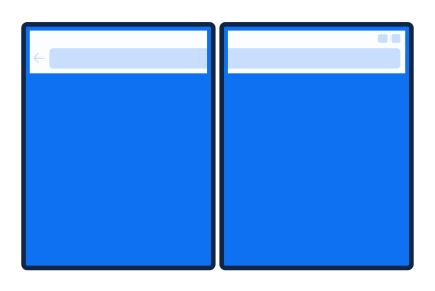
horizonal-viewport-segment targets the device when the hinge is in the vertical fold posture. (Large preview)To serve styles specifically for a foldable device in this orientation we would write the following:
@media (horizontal-viewport-segments: 2) {
// Styles specific to the device in this orientation
}
The integer represents the number of viewports present in the device orientation. When the device is in the vertical fold posture like a book, we have two distinct viewports in the horizontal direction and only one viewport in the vertical direction.
We can also combine our media queries to target dual screen devices and certain viewport widths to serve up specific styles:
@media (horizontal-viewport-segments: 2) and (min-width: 540px) {
    body {
        background: yellow;
    }
}
vertical-viewport-segments
Our second value for the viewport segments media feature is vertical-viewport-segments, and this is the state of the device when the device hinge is horizontal, and the hardware hinge splits our viewports into rows.
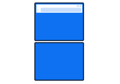
vertical-viewport-segments targets the device in the horizontal fold posture. (Large preview)To target devices that are rotated in this direction we would use the following code:
@media (vertical-viewport-segments: 2) {
    // Styles specific to the device in this orientation
}Using JavaScript To Detect Foldable Devices
There are instances where you may not be able or want to use CSS media queries to detect whether your user is on a foldable device, and this is where the JavaScript API comes in. Initially, a brand-new API called Windows Segments Enumeration was proposed, but after the feedback from the developer community through origin trials, it made more sense to build off the existing Visual Viewport API draft specification.
Viewport Segments Property
Viewport segments represent the regions of the window that reside on separate displays that are adjacent to each other. To detect a dual-screen device you would query the segments property with the following code:
const segments = window.visualViewport.segments;The value returned from this query will be an array of DOMRects that indicate how many viewports there are. If there is only one viewport segment, the query will return null, and is implemented this way to prevent future compatibility issues, so that developers don’t start using visualViewport.segments[0] to target single-screen devices.
On dual-screen devices, the query will return 2 DOMRects, representing the 2 viewports available when the browser window is spanning across the fold.
This value we have stored in the segments constant is an immutable snapshot of the device state when the attribute was queried, and if the browser window is resized or the device is rotated, the viewport segments previously retrieved are no longer valid and need to be queried again through a resize or orientation event (or both).
If you resize the browser window to span across only one display region, we’ll fire the resize event.
If you rotate the device, this will fire both the resize and orientation event, and you can use the events to query the attribute again to get the current state of the browser display regions.
window.addEventListener("resize", function() {
    const segments = window.visualViewport.segments;
    console.log(segments.length); *// 1*
});
When To Use The JavaScript API vs The CSS Media Features To Detect Devices
Both the CSS media features and JavaScript segment property will detect a dual-screen device, but the JavaScript property is best used when there’s no CSS being used, which can happen when you’re working with objects in Canvas2D and WebGL. An example would be a game that you’re developing that could leverage both screens.
Using CSS env() Variables
In addition to the CSS media features, six new CSS environment variables have been introduced to help developers calculate the geometry of the display regions, calculate the geometry of the hinge area when it’s being obscured by a physical hardware feature like on the Surface Duo, and they can also be used to help place content with the bounds of each display region.
The six new environment variables are as follows:
env(viewport-segment-width <x> <y>);env(viewport-segment-height <x> <y>);env(viewport-segment-top <x> <y>);env(viewport-segment-left <x> <y>);env(viewport-segment-bottom <x> <y>);env(viewport-segment-right <x> <y>);
The x and y positions represent the two-dimensional grid created by hardware features that separate each viewport segment, with the coordinates 0,0 starting at the top-left segment.

When you have a device that is in the vertical fold posture with the viewports side by side, the viewport segment on the left would be represented by env(viewport-segment-width 0 0), and the one on the right would be represented by env(viewport-segment-width 1 0). If you turned the device into the horizontal fold posture with the viewports stacked, the top would be represented by env(viewport-segment-height 0 0), and the bottom viewport by env(viewport-segment-height 0 1).
When using env(viewport-segment-width) and env(viewport-segment-width), in addition to the indices, we can set a fallback value like the following:
env(viewport-segment-width 0 0, 100%);
But this additional fallback value is optional and up to the discretion of the author, if they’d like to include it.
Calculate The Hinge Width
When you have a device that has a hinge obscured by hardware features, you’re able to calculate it using the environment variables provided.

In our example, we have a device in the vertical posture and want to find the hinge width, so that no content is obscured. We’ll subtract the left viewport segment of the right display from the right viewport segment of the left display:
calc(env(viewport-segment-left 1 0) - env(viewport-segment-right 0 0));Placing Content With The CSS env() Variables
We can use the CSS environment variables to place content within the display region boundaries, and these are especially helpful if you want to place content directly against the hinge or fold.
In our example below, we’re going to place an image directly against the hinge in the first display region on the left. This area is the right segment of the viewport, so we’ll use viewport-segment-right to place it with the following code:
img {
    max-width: 400px;
}

@media (horizontal-viewport-segments: 2) {
    img {
        position: absolute;
        left: env(viewport-segment-right 0 0);
    }
}
If we emulate our screen in the Edge Developer Tools in Surface Duo mode, we’ll get the following layout:
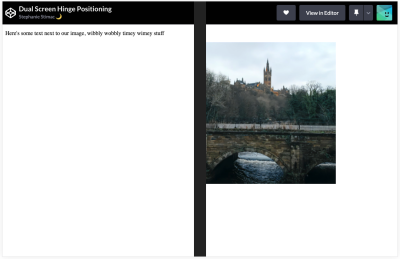
This isn’t what we wanted. The image should be in the display region on the left side.
Because the image is absolutely positioned with the left property, the left edge of the image ends up aligned to the viewport-segment-right display area.
We then need to subtract the width of the image from our environment variable to get the image aligned to the correct hinge edge:
img {
    max-width: 400px;
}

@media (horizontal-viewport-segments: 2) {
    img {
        position: absolute;
        left: calc(env(viewport-segment-right 0 0) - 400px);
    }
}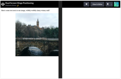
And now we have the image placed where we want it. For other examples on how to align items along the hinge, you can check out this simple box demo. Open the Edge Developer Tools > Device Emulation and then choose Surface Duo and ensure your Duo emulation is in the correction orientation posture.
Putting It All Together: Let’s Build A Recipe Page That Adapts To A Dual Screen Device
As someone who constantly uses her phone while cooking, a recipe site that would adapt when I’m on my dual-screen device would be so helpful. Let’s walk through how to think about adapting an individual recipe page for it.
I want to think about how I’m going to chunk out my main content. Typically, at minimum, I see a recipe title, how many servings it makes, how long it’s going to take to cook, an image or multiple images, the ingredients, and the steps to make the dish.
When I sketch out my wireframe, I get the following:
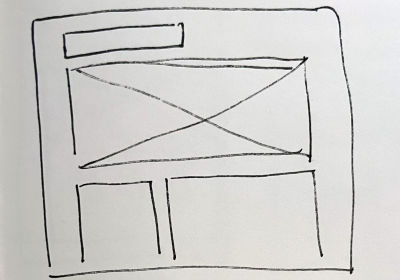
I want my title and the recipe details at the very top, followed by an image that’s going to take up the whole content width, then the ingredients list, and the recipe steps. I don’t want to stack the latter two content groups, because the ingredient list will have a lot of white space to the right of it if I stack them, so I want the steps to sit next to the ingredients, giving me two columns below the image.
CSS Grid Or Flexbox For Layout?
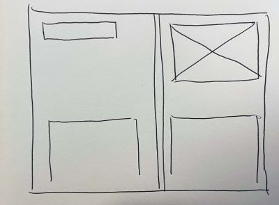
I know how I want to lay this recipe out on a normal desktop screen, and there are multiple ways I can go about coding this layout and grouping content, but how I group it, and what layout I want to achieve on a dual-screen device will need to be considered before I code. Based on the sketch I did for a desktop view, I could use a combination of flexbox and CSS Grid to achieve the layout I want, where I group the ingredients and steps in a flex container. But let me sketch out how I want my page to display on a dual screen.

If I want more flexibility in layout, then I can’t group my ingredients and steps in a flex container, otherwise, there’s going to be a big gap of white space in whichever column the image doesn’t go into.
Adding Our Content
I’m going to use nothing but CSS Grid for the desktop and dual-screen layouts. So, let’s build out our content.
<main>
    <section class="recipe">
        <div class="recipe-meta">
            … <!—Contains our recipe title, yield and servings -->
        </div>
        <img src="imgs/pasta.jpg" alt="Pasta carbonara photographed from above on a rustic plate" />
        <div class="recipe-details__ingredients">
            …<!— Contains our ingredients list -->
        </div>
        <div class="recipe-details__preparation">
            … <!— Contains our list of steps to put the ingredients together -->
        </div>
    </section>
</main>
Next, let’s build the structure of the page. I’m going to define my grid: I only want three columns, and I want those to be an equal fraction of the container.
.recipe {
display: grid;
grid-template-columns: repeat(3, 1fr);
Next, I’m going to define my rows, and I’m going to use grid-auto-rows with minmax, so that my rows are a minimum of 175px but can grow to a max of the maximal content height.
grid-auto-rows: minmax(175px, max-content);Then I’m going to add a few more properties: my grip-gap, my max-content width, and a margin to center my layout on the page.
grid-gap: 1rem;
max-width: 64rem;
margin: 0 auto;
}
I’m then going to place my content into the grid I’ve defined:
.recipe-meta {
    grid-column: 1 / 4;
}

.recipe-meta p {
    margin: 0;
}

img {
    width: 100%;
    grid-column: 1 / 4;
}

.recipe-details__ingredients {
    grid-row: 3;
}

.recipe-details__preparation {
    grid-column: 2 / 4;
    grid-row: 3;
}
And that’s going to give me the layout based on my sketch:
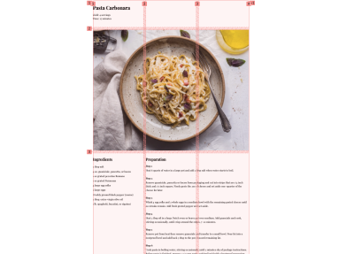
Great! But what about my dual-screen layout? Let’s dive in and start with our horizontal-viewport media feature and our grid for dual screens.
Using Media Queries And Adjusting The Container Layout
First, this is what my layout looks like on a dual screen right now:

And if we scroll down:
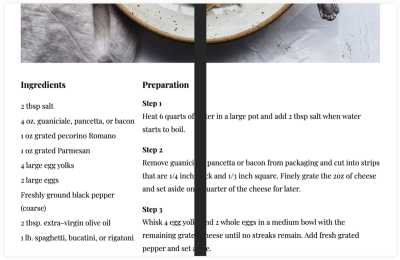
Not great. Our content is being obscured by the hinge, so let me start redefining my grid.
For my grid columns I’m still going to use three columns, but I want one column to take up the first viewport segment on the left, and the other two split on the right viewport segment, so I’d get to use my CSS environment variable env(viewport-segment-width 0 0) which tells the browser, for my first column, I want it to occupy the whole viewport of the first display region.
@media (horizontal-viewport-segments: 2) {

/* Body styles for smaller screens */
body {
        font: 1.3em/1.8 base, 'Playfair Display', serif;
        margin: 0;
    }

.recipe {
    grid-template-columns: env(viewport-segment-width 0 0 1fr 1fr;
    grid-template-rows: repeat(2, 175px) minmax(175px, max-content);
}

}
For my rows, I want a little more flexibility in the placement, so I’m going to repeat two rows of 175px, which is about the height of the container with the recipe title, yield, and time information, and the rows after that should match what I defined in my grid originally.
If I check my design in the DevTools, I can see that the width and margin I set on my recipe container originally are pushing the grid lines that I want to be aligned with my viewport segment into the right viewport segment.
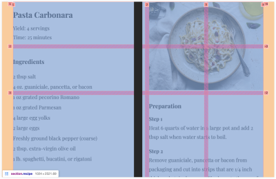
To reset this, I’m going to reset my margin and max-width.
@media (horizontal-viewport-segments: 2) {

.recipe {
    grid-template-columns: env(viewport-segment-width 0 0) 1fr 1fr;
    grid-template-rows: repeat(2, 175px) minmax(175px, max-content);
    margin: 0;
    max-width: 100%;
}

}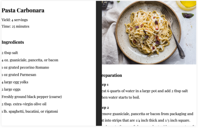
And now I’m going to place my content within the grid and adjust my layout.
.recipe-meta {
    grid-column: 1 / 2;
    padding: 0 2rem;
}

img {
    grid-column: 2 / 4;
    grid-row: 1 / 3;

    width: 100%;
    height: 100%;
    object-fit: cover;
    /* necessary to keep the image within the grid lines */
}

.recipe-details__ingredients {
    grid-row: 2;
    padding: 0 2rem;
}

.recipe-details__preparation {
    grid-column: 2 / 4;
    grid-row: 3;
    padding: 0 2rem 0 3rem;
}
I’ve applied padding to the content except for the image which I’ve decided I want to span the whole viewport. For the content underneath the image, due to the nature of the gridline starting under the physical hinge, I want to add extra padding, so it looks like it has the same padding on the left side as the other items with padding. If I don’t add extra, it will fall too close to the hinge. Because I already have a grid-gap of 1rem and I want to double the padding, I’ll add 3rem instead of 4rem which gives us our final layout on a dual-screen device:

With just some small adjustments to our CSS and the use of one of the new media features, we have a layout that adapts to a dual-screen device. To check out the experience, head to the demo site here in Edge or a Chromium-based browser and open the browser developer tools to check out Surface Duo emulation. If you’re opening the site in Chrome, ensure the experimental web platform features flag is enabled under chrome://flags, so that the demo displays correctly.
Single Screen Responsive Design Details
And just to ensure we’re taking into consideration small, single-screen devices, the code I choose for a layout on a phone uses flexbox and puts everything into a single column:
@media (max-width: 48rem) {

    body {
        font: 1.3em/1.8 base, 'Playfair Display', serif;
    }

    .recipe-details {
        display: flex;
        flex-direction: column;
    }

}
API Browser Availability And Testing Without A Device
These dual-screen APIs are available in Microsoft Edge and Edge on Android starting in version 97 by default. These are slated to come to other Chromium browsers soon, but there is no confirmed date for when that will be. To enable these APIs in Chrome, go to chrome://flags and enable experimental web platform features.
And while these are relatively new devices, many are now going into their 2nd and 3rd generations, so companies are investing in them. If you can’t get your hands on a physical device, the best way to test is in the browser developer tools. I’ve tested my site in both the emulation tool and on a Surface Duo, and the emulation tool for Duo appears to be identical. My design looks the same way on the device as it does in the DevTools. It makes building and designing for a dual-screen device just as easy as developing for desktop and single screen mobile devices.
If you are on a desktop or a device that doesn’t support these APIs, there is a polyfill available for the Visual Viewport segments property. There is no API for the CSS Media Queries. Currently, the dual-screen devices on the market are Android-based, and these APIs are planned to be in Chromium-based browsers which are available on Android.
If a browser on a foldable device doesn’t support these features, you can either use the polyfill or ensure your website still renders well on a small single screen, as the user has the flexibility to choose how to display a website on a dual-screen device. They can span a website across both displays, or they can choose to have it span across one display, and if they choose the latter, it will display as it would on a tablet or phone with a single screen. Even if your website doesn’t have a dual-screen implementation, users can still opt for the single display view. The dual-screen APIs offer a way to progressively enhance the experience for users who have the devices.
Closing
Dual-screen devices are just the next evolution in responsive design. If you have a PWA or website, the APIs available make integrating into your existing code base seamless. There are also other ways to build apps for dual-screen devices, which you can check out on the Surface Duo documentation. It’s an exciting time for layout on the web, and dual screens provide an opportunity to get even more creative.
Further Resources
- “Dual-Screen Web Experiences,” Microsoft
- “Horizontal Viewport Segments: The
horizontal-viewport-segmentsFeature,” Media Queries Level 5, W3C Working Draft (Dec. 2021) - “Viewport Segment Variables,” CSS Environment Variables Module Level 1, Editor’s Draft (Aug. 2021)
- “Visual Viewport API,” Draft Community Group Report (Feb. 2022)


 Click here to kickstart your project for free in a matter of minutes.
 Check the frontend report!
 Take a break with a 3D game built on Netlify!
 Start with a free demo —


