Photoshop Techniques And Professional Tutorials
This overview features a hand-picked and organized selection of the most useful and popular Photoshop techniques, articles and tutorials published on Smashing Magazine over the past few years.
Quick Overview
- Setting Up Photoshop For Web, App and iPhone Development
- Establishing Your Grid
- Exporting
- Top 10 Killer Combo Moves
- Unknown Tricks And Time Savers
- Designing for iPhone 4 Retina Display: Techniques and Workflow
- Useful Tips And Tricks For Photo Retouching
- Photo Retouching Tips And Tricks
- Brushing Up On Photoshop’s Brush Tool
- The Ultimate Guide To Cloning
- Top Non-Destructive Photoshop Techniques
- Mastering Photoshop With Paths
- Pixel Perfection When Rotating, Pasting And Nudging In Photoshop
- Unveiling Masks
- The Whys And The Hows Of Textures In Web Design
- Mastering Noise, Textures, Gradients and Rounded Rectangles
- Mastering Layer Styles
- The Ails Of Typographic Anti-Aliasing
Setting Up Photoshop For Web, App and iPhone Development
Most people who have designed websites or apps in Photoshop will, at one point or another, have had issues trying to match colors in images to colors generated by HTML, CSS or code. This article aims to solve those problems once and for all. So how can we achieve color management that matches colors across multiple devices?
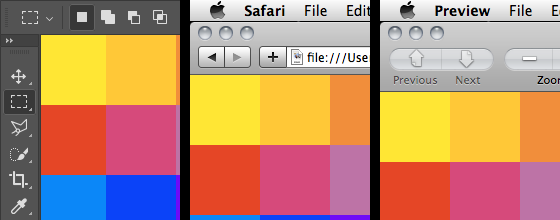
In the print world, color management typically involves calibrating your entire workflow, from scanner or digital camera to computer display to hard proofs to the final press output. This can be quite a tall order, especially when the devices use different color spaces — matching RGB and CMYK devices is notoriously hard. Read more…
Establishing Your Grid
Creating a grid is typically one of the very first things you do when starting a design comp. After all, it provides the basic structure on which the rest of your design will lie. In this article, we’ll provide two different methods for efficiently establishing a grid. These methods enable you to quickly and smartly form a grid so that you can spend more time designing.
Exporting
Congratulations. You’ve just completed a pixel-perfect mock-up of an app, and you’ve gotten the nod from everyone on the team. All that’s left to do is save the tens, hundreds or maybe even thousands of production assets required to bring it to life.
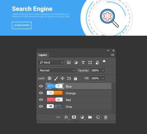
It’s probably the least interesting part of designing software, usually entailing hours of grinding. Saving images to multiple scales — as required by iOS and other platforms — adds complication to the process. But there are ways to streamline or automate the exporting process. Read more…
Top 10 Killer Combo Moves
Is time kickin’ your ass? Well, learn to defend yourself! Master these killer Photoshop keyboard combos and you’ll find yourself with more time for the important things (e.g. Facebook trivia questions). These combos assume you’re using Photoshop CS3 on Windows platform with default keyboard shortcuts.

Unknown Tricks and Time-Savers
We all have shortcuts that are essential to our daily workflow. A majority of them are staples such as Copy (Command + C) and Paste (Command + V), but occasionally we stumble upon a shortcut we wish we’d learned years ago. Suddenly, this simple shortcut has streamlined our process and shaved quite a bit of time off our day. Collected here are some lesser known but extremely useful shortcuts. Many of these are not documented in the “Keyboard Shortcuts” menu, and some of them don’t even have equivalent menu options.
Please note that all of the shortcuts listed below assume that you are using Photoshop CS4 on OS X. They will work on the Windows platform by converting as follows: Command → Control and Option → Alt. Read more…
Designing for iPhone 4 Retina Display: Techniques and Workflow
The iPhone 4 features a vastly superior display resolution (614400 pixels) over previous iPhone models, containing quadruple the 153600-pixel display of the iPhone 3GS. The screen is the same physical size, so those extra dots are used for additional detail — twice the detail horizontally, and twice vertically. For developers only using Apple’s user interface elements, most of the work is already done for you.
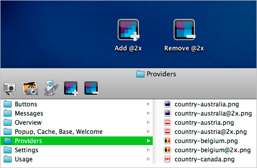
For those with highly custom, image-based interfaces, a fair amount of work will be required in scaling up elements to take full advantage of the iPhone 4 Retina display. Scaling user interfaces for higher detail displays — or increasing size on the same display — isn’t a new problem. Interfaces that can scale are said to have resolution independence. Read more…
Useful Tips And Tricks For Photo Retouching
When it comes to designing, there is a myriad of ways one could use to achieve a certain result, especially when it comes to photo retouching. Designers use technique they are most confident as well as comfortable with, which is great because it’s always useful to peek into the workflow of our colleagues and learn new design approaches. We have had articles on cloning, compositing, masks and obscure time-savers in the past. This article is different.

I’ll be covering some of the useful techniques and tricks which I’ve learned from my experience. You may know some of them, but hopefully not all of them. All images used in this article were purchased and are used according to their licenses. The second part of this post will be published in 2 weeks. Read more…
Photo Retouching Tips And Tricks
Previously we published the first part of tips and tricks for photo retouching. Today, we’ll be presenting the rest of the article. We hope that these techniques will be quite useful for your workflow. You may know some of them, but hopefully not all of them. We have had articles on various tools in Adobe Photoshop but this one is focused more on the techniques rather than the tools provided. Please note that all images used in this article were purchased and are used according to their licenses.

If you want to redefine the foreground and background colors, use the Eyedropper tool to select the foreground color, and then switch the position with the background color, maybe by using the shortcut X, and pick up the next color. But there is an easier way.
Read more…
Brushing Up On Brush Tool
When laid by a learned hand, brush strokes can convey a sense of energy, tactility and humanness. These qualities speak to your audience’s subconscious, whispering ideas that words alone can’t convey. In the digital realm, a website with beautiful brushwork is a welcome break from the stark precision of most corporate websites.
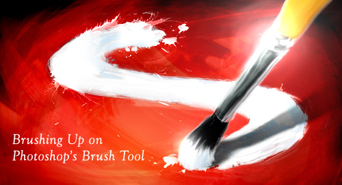
Mastering the digital brush is by no means easy. It carries the same difficulties as the sable brush hidden at the bottom of your art bin. In fact, the difficulty is multiplied by the disconnect between the hand and monitor. Developing Photoshop brush skills takes time, but it is well worth the effort. This article outlines the plethora of options that Photoshop affords, so that you can efficiently create and use brushes like the Old Masters. Read more…
The Ultimate Guide To Cloning
Photoshop’s wide array of cloning tools is the cause of many of the absolute best and worst works created with the application. In a skilled and experienced hand, these tools lead to phenomenal results. In the hands of a careless artist, cloning can be disastrous to the credibility of the result. This article introduces the several cloning tools available and goes over the proper usage and best practices of each.

The Clone Stamp tool is the oldest and most widely known of the cloning tools. The basic concept is that you duplicate certain portions of an image using a source, destination and brush. To clone out the name on the tombstone above, you would select a source that shares the texture of the area you want to replace. In this case, the area around the words provides an ample source of stone texture from which to clone. Read more…
Top Non-Destructive Techniques
The creative process is not a linear one. As artists and designers, we often set off in one direction only to decide that the proper solution lies somewhere else completely. Unfortunately, many of the creative software packages we use (Photoshop in particular) can be pretty unforgiving when in comes to making changes late in the game.
In this video post, I’ll show you some of my favorite techniques and tools for keeping your files flexible, including Smart Objects, Smart Filters, Layer Styles, Adjustment Layers, Masks and more. The approaches shown in this video should provide a solid starting point. But like anything in Photoshop, there is no “one right way” to approach it. The key is to find the method that best supports your workflow so please feel free to add your favorite non-destructive tricks in the comments section below! Read more…
Mastering Paths
Anomalously residing within the pixel-gridded world of Photoshop are a series of tools waiting to break out of the canvas’ inherent squareness. Mastering these tools opens the stage for a higher level of flexibility, full of clean lines and non-destructive editing. Presented here is a guide to help you build proficiency, increase productivity and demystify the elusive world of Paths.

The Pen tool (P) – simple to use but difficult to master. It provides a precise method for creating paths, but requires an experienced hand to plot naturally flown curves. The power unlocked by mastering this tool is well worth the time needed to do so. While no amount of instruction can make you a Bezier master, below are some tips to keep in mind as you practice. Read more…
Pixel Perfection When Rotating, Pasting And Nudging
When creating Web and app interfaces, most designers slave over every single pixel, making sure it’s got exactly the right color, texture and position. If you’re not careful, though, some common functions like moving, rotating and pasting can undo your hard work, resulting in a blurry mess. But with some small changes to your workflow, you should be able to maintain the highest-quality artwork from the start to the end of the project.
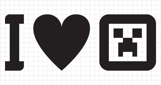
If you’re not careful, rotating layers in Photoshop can damage them in a very noticeable, pixel-mashing way. When rotating layers with Free Transform (and some other tools) to exactly 90 or 270°, the quality of the outcome is determined by the layer’s size. If the layer is of an even width and even height, then you’ll be fine. If it’s of an odd width and odd height, you’ll also be okay. But if they’re of an odd width by even height or even width by odd height, then you’ll see something like the result below. Read more…
Unveiling Masks
Design is a fluid and shifting process in which layers are constantly modified and tweaked. As complexity builds, so does the need for preserving data in a flexible way. Learning non-destructive editing techniques helps you produce documents that bend along with your creativity. Masks are the cornerstone of this process. Not only do they preserve important pixel data, but they allow for the creation of flexible interface elements as well. In this article, we’ll explore the technical aspects and creative advantages of incorporating masks into your workflow.
Photoshop offers five methods of masking: Pixel Masks, Vector Masks, Quick Masks, Clipping Masks and Clipping Paths, all of which define pixel opacities without affecting the original data. Each of them has its own pros and cons, and knowing which method to use is extremely important for creating clean, flexible and properly masked layers. Read more…
The Whys And The Hows Of Textures In Web Design
Texture is becoming integral to design. It’s gone beyond being a trend — it’s now a simple and effective way to add depth to a website. Wielding the power of texture is a great responsibility. It increases the effectiveness of websites and is a quality tool in the arsenal of designers. It can guide the user’s eye and emphasize the importance of key elements.

However, texture has long been synonymous with “dirty” or “grungy” design. Its overuse can be seen throughout the world of music group websites and has left a bad taste in the mouths of designers. Due to its frequent misuse, its benefits have long been overlooked. Texture can bring a website together, but should not be the main focus. Read more…
Mastering Noise, Textures, Gradients and Rounded Rectangles
Often, it’s the little details that turn a good layout into a great design; details such as subtle textures, shading and smooth shapes. Photoshop contains a vast array of tools for embellishing a design, but choosing the right one isn’t always easy. Being the obsessive-compulsives that we are, we’ve conducted a huge range of experiments to determine the benefits and disadvantages of each technique. Here, then, is an obsessive-compulsive’s guide to some frequently used tools and techniques for Web and UI design in Photoshop.
Subtle noise or texture on UI elements can look great, but what’s the best way to add it? Our goal is to find the best method that maintains quality when scaled but that is also easy to implement and edit. To find out which is best, we’ll judge each method using the following criteria. Read more…
Mastering Layer Styles
Layer Styles are nothing new. They’ve been used and abused again and again. Despite their ubiquity, or perhaps because of it, many designers do not yet realize the full potential of this handy menu. Its beauty lies in our ability to create an effect and then copy, modify, export, hide or trash it, without degrading the content of the layer.

Below we present, step by step, several practical techniques to help you refine your designs, increase productivity and reduce layer clutter. Read more…
The Ails Of Typographic Anti-Aliasing
As printed typography enjoys the fruits of high-DPI glory, proudly displaying its beautiful curves and subtleties, its on-screen counterpart remains stifled by bulky pixels, living in a world of jagged edges, distorted letterforms and trimmed serifs. Until display manufacturers produce affordable 200 or 300 PPI monitors, we’ll have to rely on software advances to fix these problems.

Enter anti-aliasing: the next best thing to a world of higher-resolution monitors. The concept of anti-aliasing is fairly simple: add semi-transparent pixels along the edges of letterforms to smooth the appearance of the “stair-step” effect.
However, many factors and technologies determine the actual effectiveness of the process: hinting, subpixel rendering, software capabilities and operating system specifications, to name a few. Here, we’ll look at what you as a designer can do to improve the results of anti-aliasing with Photoshop, Flash and CSS. Plus, we’ll explain the constraints of hardware, browsers and operating systems. Read more…


 JavaScript Form Builder — Create JSON-driven forms without coding.
 Get a Free Trial
 Register for free today!
 Try if for free!

