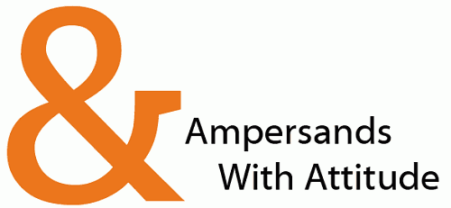
Ampersands With Attitude
By Huw Wilkins
Ampersands have long been the character in a typeface with which typographers can indulge themselves. Sweeping curves, flirtatious finishes and bold statements - these are the things that make ampersands an exciting character to use and, better still, to design.
Can you spot what typeface is used to display the ampersand in the image above? Large view
There are, however, two problems. The first is that the English language gives us few situations to use such a daring character. We seldom get to show off these beautiful examples of typography. The second is that the poor little ampersand so often goes unnoticed.
Allow me to share with you my top 10 different styles of ampersands. Some are similar, but each have their own personality. In an effort to limit my sample selection, I have only chosen ampersands from freely available sans fonts.
1. Nilland
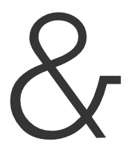
Here we have a pretty run-of-the-mill ampersand. It comes from the font Nilland. You see this style in common fonts like Helvetica and Arial. It has the classic one piece figure-of-eight body. The little horizontal tail finishes this character off nicely, it seems to give a certain perkiness that it otherwise might have lacked.
2. Bitstream Vera Sans
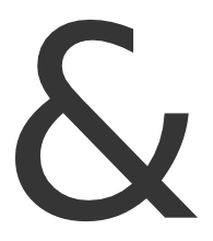
You might recognise this style as well. This particular character comes from Bitstream Vera Sans. There are a few ways to look at this ampersand, and this is one of the reasons this character works so well. It looks like the ampersand above, only with the top right side of the figure-of-eight cut out (yet it actually ends up not looking very much like the above character). It also looks like a sweeping back-to-front 3 with a extension from the middle (you can see this better if you turn your head so your left ear is pressed against your shoulder).
3. BPmono
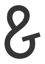
This is where things start to get a little weird. Is it a ‘g’ gone wrong? Is it a swan? Is it a fishing hook? Actually it’s the ampersand from BPmono. I probably shouldn’t have likened it to a swan and a fish hook, because now you’re probably having a hard time seeing it for what it is… a sweet little ampersand with a cute tucked in style.
4. Kontrapunkt
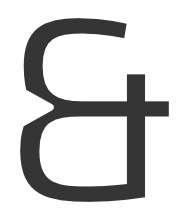
Here we have another style entirely. It’s an evolution of what you might see in handwriting. However, on paper the line would be drawn down the middle of the ‘E’ shape. This is the font Kontrapunkt, so it’s been given angles and a lovely boldness.
5. Diavlo
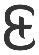
Diavlo is a great font with nice tips, and this character is no exception. At this size it looks like it has an oriental brush stroke style.
6. La Peruta FLF
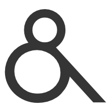
Oh! I’m glad someone managed to prop up that eight before it fell over… wait let’s make that into an ampersand. LaPerutaFLF, with a name like that, you have to be cheeky.
7. Skia

Another more classical approach from Skia. The nice variation here is how the two halves intersect in that off-set way.
8. Tuffy

And. There’s no confusion here. It knows what it’s there to do and does it. Somehow, though, in this font it looks great. Nice one, Tuffy.
9. Lacuna

I’ve decided to finish off with two italicized ampersands. This one is from Lacuna and looks like some kind of crazy ‘e’. Somehow, with that cross bar and the horizontal plate at the end, it still ends up feeling like an ampersand.
10. Fontin
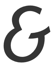
And last, but certainly not least, here is the italicized ampersand from Fontin. It has a cheeky bulbous bottom and that classic plate finish.
So there we have it. 10 interesting takes on the ampersand. I hope you’ve been educated, I hope you have fallen in love with typography a little more, and I hope that next time you are creating a typeface you will be inspired to make an ampersand with attitude.
About the author
Huw Wilkins is the lead creative for a digital agency. He has a passion for user experience, usability, interfaces and good design. He also has a background in development. His little corner of the web is at huwshimi.com.


 SurveyJS: White-Label Survey Solution for Your JS App


 Agent Ready is the new Headless