Retro and Vintage In Modern Web Design
Retro and vintage are becoming a new trend. Once rarely used in this robust, dynamic medium, early, retro and vintage elements are now becoming more and more popular in a variety of design contexts. Online shops, corporate designs, portfolios and blogs incorporate both styles on a small and large scale. When applying “old-style” elements to their works, designers produce creative and appealing designs that make their websites stand out and look really different. As a matter of fact, if executed carefully, such designs almost never look boring, although one might intuitively think that the opposite would be the case.
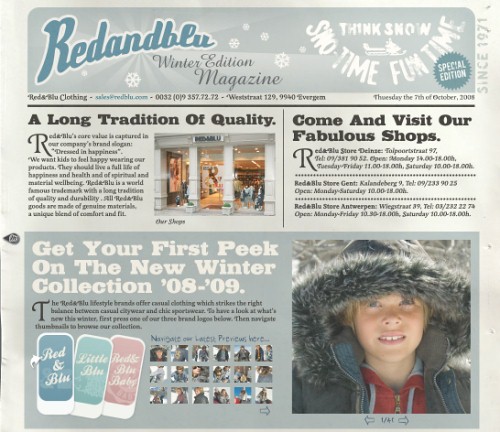
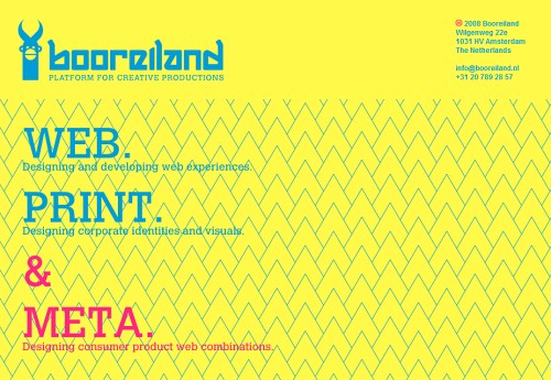
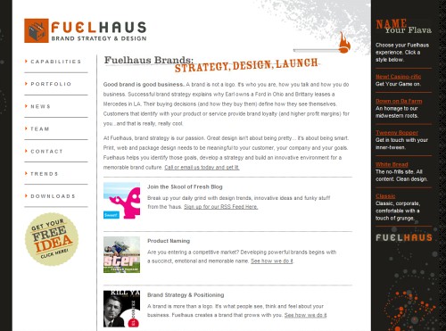
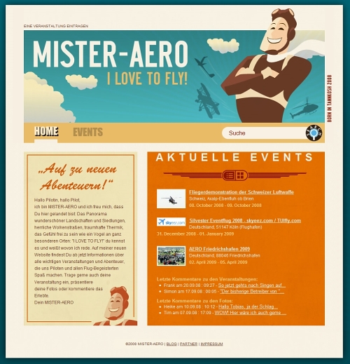
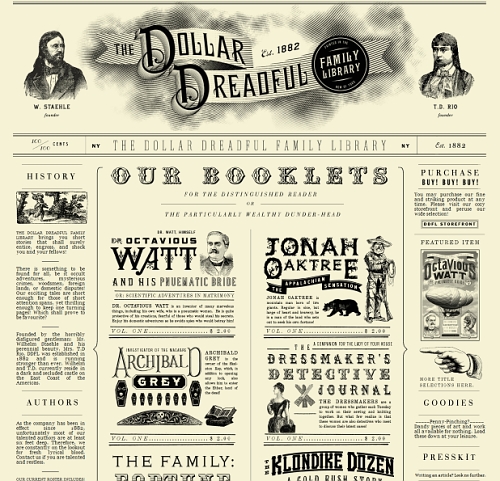
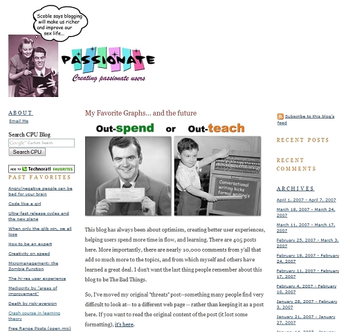
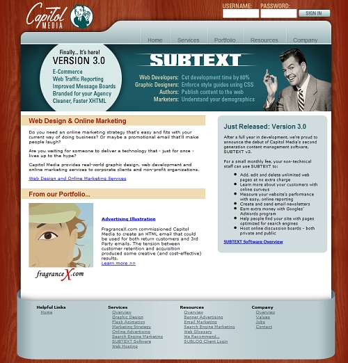
Retro and vintage designs exhibit graphic solutions that are strongly influenced by the time period that they are supposed to represent. While retro focuses on the style of the 1910s to 1930s, vintage recalls the time period between the 1950s and 1980s. In both cases, design elements reflect some old-fashioned motifs, trends, personalities and objects that had been an essential part of our lives in the past.
You might be interested in the following related posts:
- Celebration Of Vintage and Retro Design
- 35 Beautiful Vintage and Retro Photoshop Tutorials
- Smashing Retro Icon Set
Such elements create a nostalgic atmosphere, awaken feelings and memories and attempt to communicate information effectively using emotions. Some such designs make use of so-called “classical conditioning” – a technique used to associate a stimulus with an unconscious physical or emotional response.
The Secrets Of Vintage and Retro Designs
What elements do designers use to create a genuine vintage or retro atmosphere? What colors are used? And what kinds of graphics are usually embedded in such designs? Let’s find out. According to our research, common graphic elements for such designs are:
illustrations from old posters, movies, newspapers, CDs, vinyls, ads;

old-style typography (e.g. Roman typefaces);
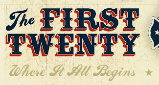
script fonts and handwriting;
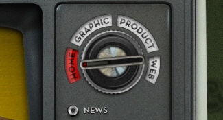
old radio devices;
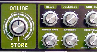
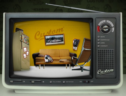
old TV devices;
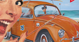
old cars;
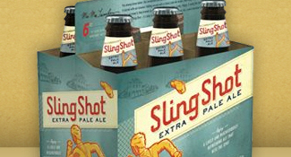
old packaging;
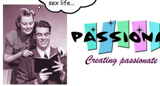
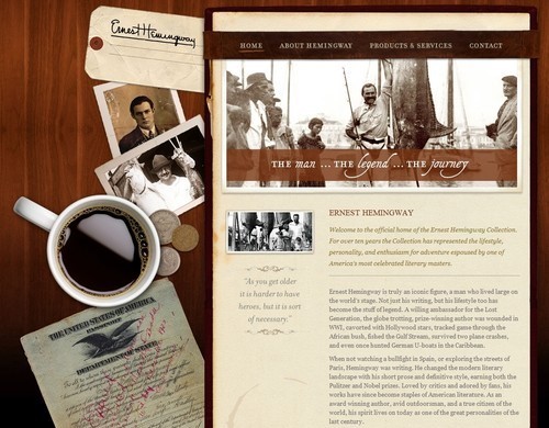
old photos;
vibrant rainbow colors (high contrast, neon-style);

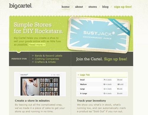
torn, used paper with stains (often yellowish paper);
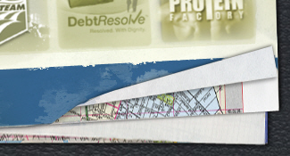
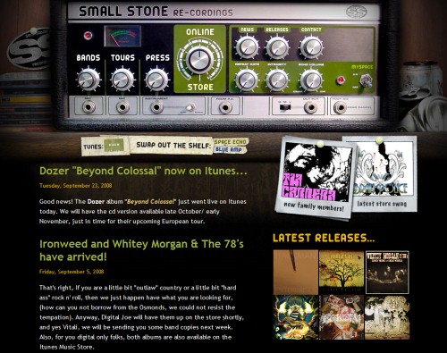
dark, dirty colors (brown, dark red, dark blue) and textures (e.g. paper);
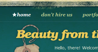
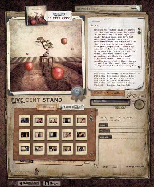
scrapbooks;
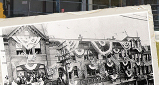
pop-art elements (see also Pop Art Is Alive: Classics and Modern Artworks);
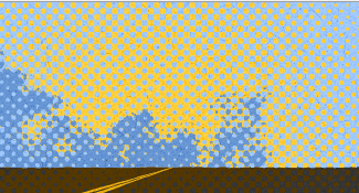
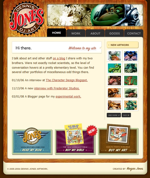
retro illustrations;

Vintage and retro are often combined with a hand-drawing style and grunge style.
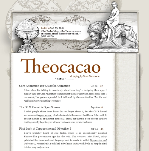
Some designs go even further and not only use retro or vintage elements but try to achieve a Renaissance look. You can find some examples of such designs at the end of this post.
In all of these cases, designers use their creativity to offer something truly different and make the design literally stand out. Let’s take a look at some beautiful examples of what can be achieved using this technique.
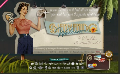
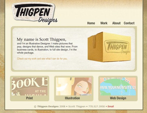
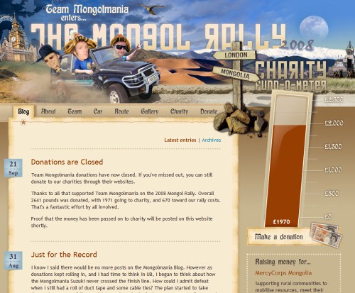
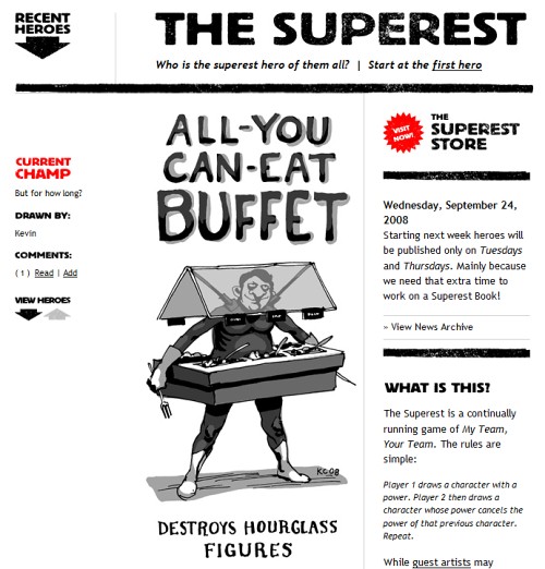
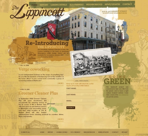
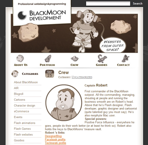
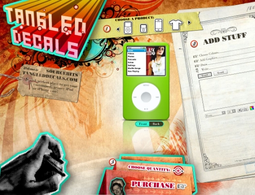
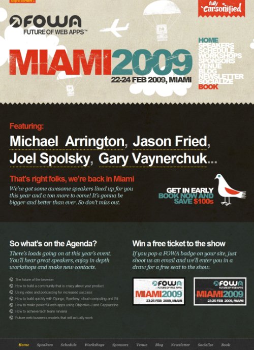
Below, you’ll find a showcase of 50 beautiful retro, vintage and Renaissance designs. Some of them are Flash-based, and most of them are CSS-based: for us it was not important how the design was achieved; rather, it was more important what came out of the designer’s approach in the end.
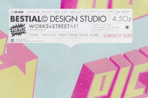
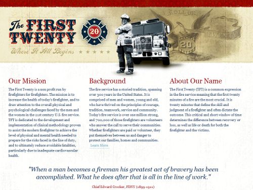
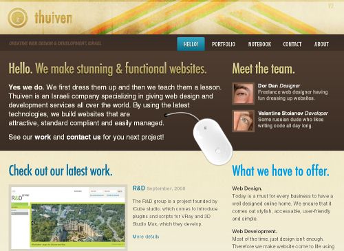
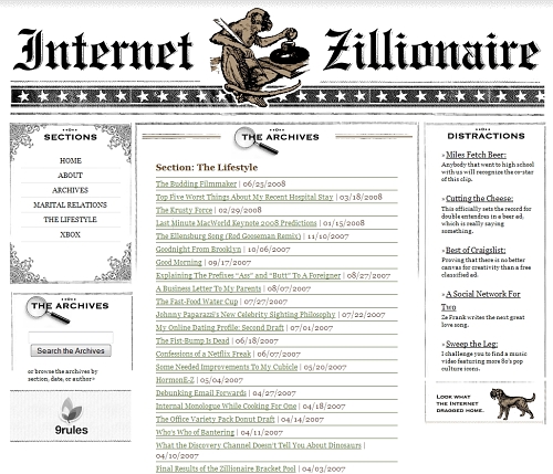
Showcase Of Retro and Vintage Web Designs
CSS Tinderbox (the design is different now - the site was recently redesigned)
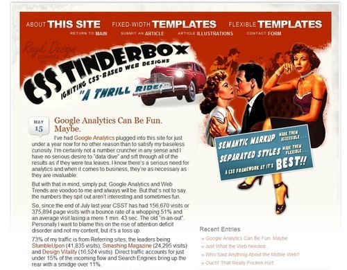
Custom Design
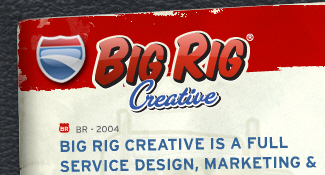
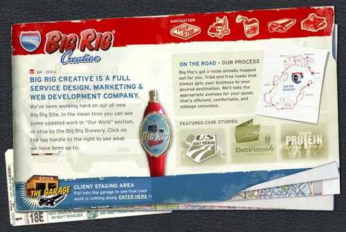
Big Rig Design
AdaptD.com

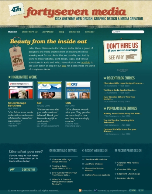
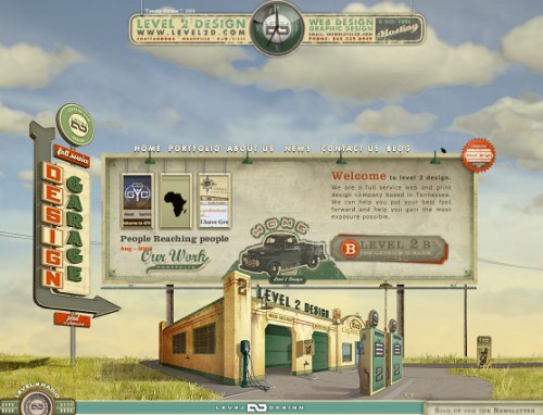
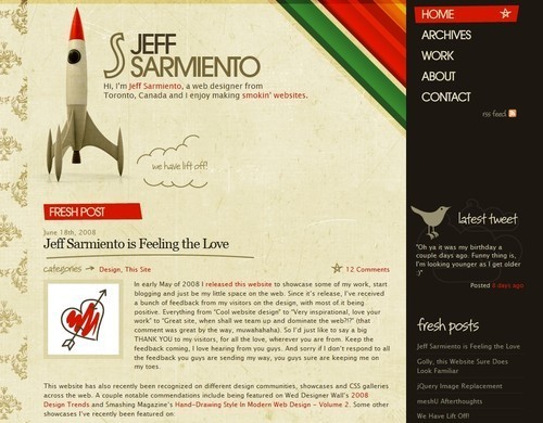 Level2D.com
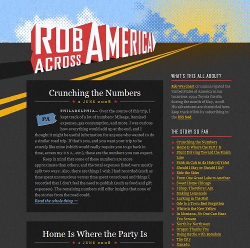
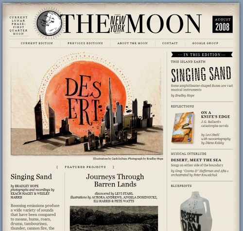
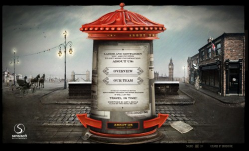 The New York Moon
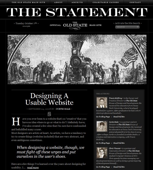
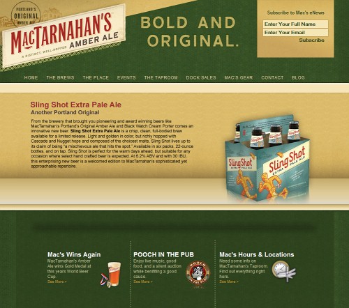
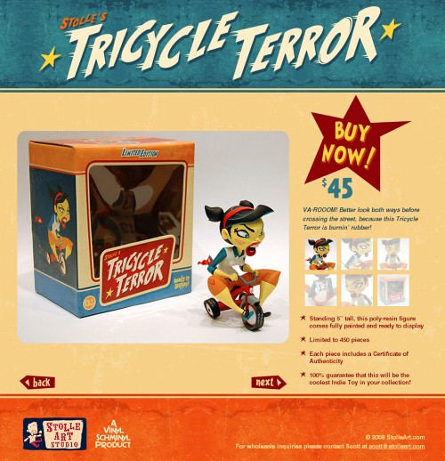
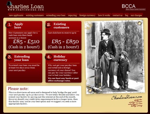

Renaissance-Designs


 Try ProtoPie AI free →
 Register Free Now
 SurveyJS: White-Label Survey Solution for Your JS App
 Celebrating 10 million developers

