Movie Website Designs: Examples And Current Practices
It can be an interesting experience looking around at websites in particular industries to identify trends and see how they differ from those in other industries. In this article, we’ll take a look at the websites of major motion pictures to see what types of websites are being created. Movies are a big part of the entertainment industry, and in recent years their websites have become increasingly critical to their overall success.
The Purpose of Movie Websites
Before getting into the details of specific movie websites and discussing current trends, it’s important first to consider the primary purpose of movie websites. Obviously, in order for a movie to be financially successful, it needs to do well at the box office, and today many moviegoers use the Internet to find movies to see and to buy tickets. Having things like trailers and other video clips helps to engage visitors and encourages them to find show times and buy tickets online.
You might be interested in the following related posts:
- What If Oscars Were Given To Movie Websites?
- The Art Of Film Title Design Throughout Cinema History
- 50 Beautiful Movie Posters
- 40 Exquisite Independent Film Posters
Movies are made to entertain audiences, and movie websites are much the same. In order to get visitors’ attention and encourage them to see the movie, a website needs to give them what they are looking for and provide some entertainment at the same time. Today’s movie websites make it easy to take a couple minutes and watch a few trailers before deciding which movie to see.
Because the purpose of movie websites is to pique interest and sell tickets, they generally include:
- Plenty of video, including trailers,
- Easy access to show times and online ticket purchasing,
- Cast bios and other general info.
Visitor Expectations
The design, style and content of a movie website is generally meant to meet visitors’ expectations of that website. Visitors expect to find websites that are graphically rich, with audio and video as well. They expect something special, and entertainment value is often more important than the website being very accessible or fast-loading.
Visitors expect to be able to arrive on a movie website and determine within a few minutes if they want to see the movie. For this reason, trailers are key elements: they are almost always easy to find or automatically start when the home page loads.
The design style also reflects visitor expectations, and the movie itself. You can usually tell very quickly upon arriving on a website whether it is for a comedy, drama, horror or action movie.
Trends Of Current Movie Websites
Among the sample movie websites discussed in this article, the following trends are apparent.
1. Flash
Most movie websites rely heavily on Flash for a dynamic and interactive experience. The audience of these websites typically expects to be entertained, so bells and whistles take priority, and heavy use of these elements is more acceptable than it would be on other types of websites.
2. Large Background Images
In addition to Flash, larger photos and images play a huge role in creating attractive and interesting movie websites. Most movie websites make use of large images, in many cases as the background of the page.
3. Video/Trailers
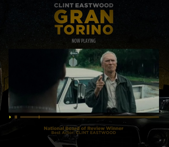
It’s only natural to assume that the website of a movie would include some video. Almost all movie websites include a full trailer, and in some cases a few different trailers. Many websites put the trailer on the home page or a splash page, and the trailers often start without being prompted by the user.
While audio and video that automatically starts is usually considered a negative feature, because of their subject matter, movie websites are a bit different than the average website. Because video is a priority for most visitors, it seems to be an accepted fact that movie websites will play a trailer automatically when the page loads. Those movie websites that don’t put the trailer on a splash page or the home page typically have a link in the navigation menu that clearly points to the trailer.
4. Show Times and Ticket Info
Because the goal of movie websites is to sell tickets, each one includes a link or form for visitors who want to find show times and ticket information for their area. Many websites link to Fandango and/or Moviefone. Making it easy for people to get tickets is a priority.
5. Splash Pages
About half of the movie websites we’ll look at later in this article show a splash page before the visitor enters the main website. Some of these splash pages are more useful than others. Many include a video of the trailer, and some have options to access country-specific sections of the website if the movie is playing worldwide.
6. Display of Nominations and Awards
Movie websites often attempt to demonstrate the quality of a movie by listing or displaying nominations and awards it has received. You’ll see this a lot on splash pages and home pages of award-winning pictures.
7. Short Page Length
It’s very common for movie websites to take up only the height of the screen, or just a bit more. It’s rare to find pages that are long and require a lot of vertical scrolling. With most websites being Flash-based or set against a large background image, the short page length keeps everything in view at all times.

8. Not Always On Company Domain
Not all movie websites have their own domain. Some studios, such as Fox Searchlight and Disney, keep their movie websites on their own domains. The number of major movie websites that are on the main company domain is far more than those that have their own, but it is still a trend for some companies.
9. Social Networking /Media Interaction
Many movies have pages set up on Facebook and MySpace to take advantage of social networking opportunities. With the popularity of these social networking websites, especially among younger users, it’s no surprise that movie companies are seeing the value of getting involved. A bit more surprising is the number of movie websites that include links to encourage votes on social media websites such as Digg, Delicious, StumbleUpon and Reddit.
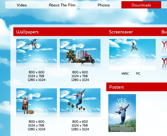
10. Downloads
Most movie websites include a downloads section where visitors can get free wallpaper, posters and buddy icons.
11. Fun Extras
Many movie websites, but not all, include more than just the typical movie and cast information along with the trailer. Games and activities are also very common. These elements can make the website more fun for visitors while also promoting the movie.
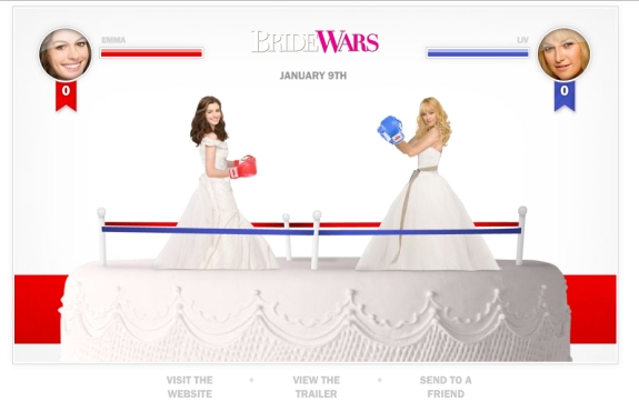
BrideWars includes Bridal Beatdown, a game in which you are one of the main characters in a boxing match. You can even upload your own photo to put on the character if you want.
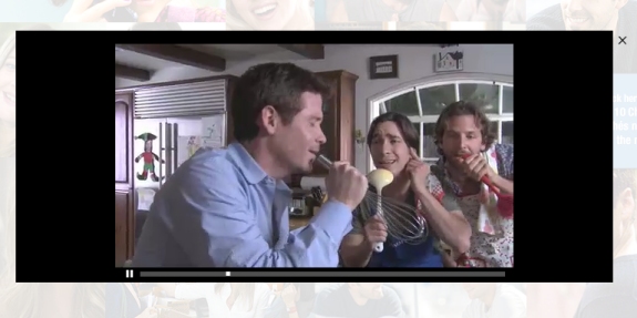
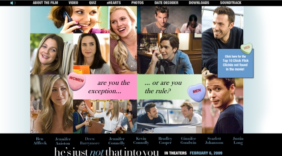
The website for He’s Just Not That Into You includes a video by the male characters of the cast called The Top 10 Chick Flick Cliches That Are Not In This Movie.
12. Widgets
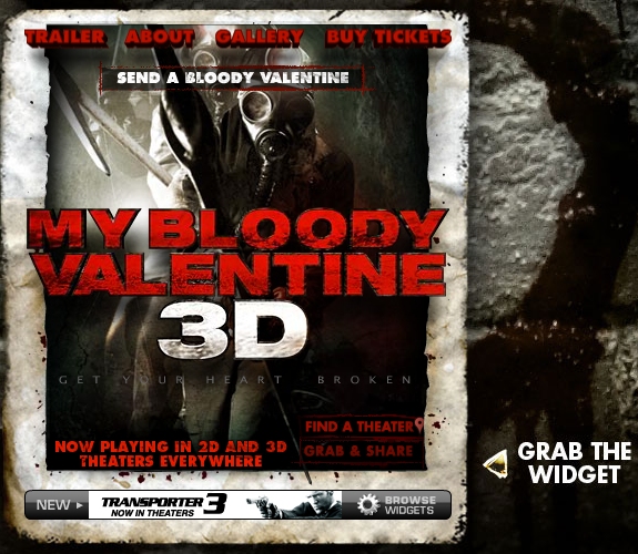
Many movie websites also include widgets that visitors can put on their own websites or social networking pages.
Showcase of Movie Websites
Now that we’ve looked at some of the trends of modern movie websites, let’s take a look at 40 websites of recent and upcoming movies. The websites were chosen because the movies are current (or upcoming) and popular, rather than because they are the “best” examples movie websites.
Taken
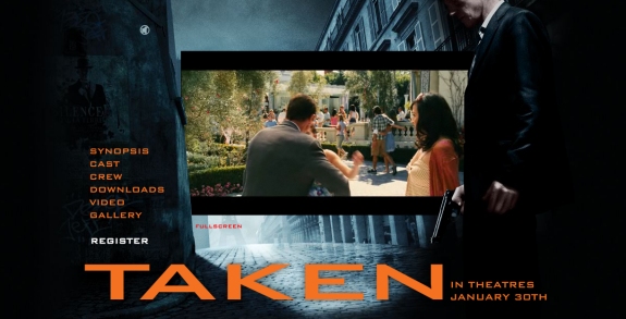
The website for Taken features the trailer in the center of the screen, with the option to view in full screen. The content of the website is set against a large dark background image. The navigation on the left side of the screen is simple and logical, making it easy for visitors to find what they want. Although audio plays automatically when the page is opened, it can easily be turned off with a conveniently located control.
Paul Blart: Mall Cop
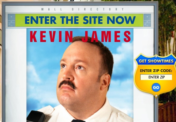
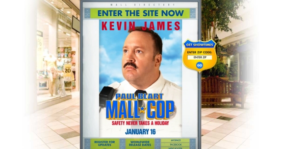
Paul Blart: Mall Cop uses a splash page that allows visitors to find a theater and show times by searching by zip code. Lower on the page are links to the movie’s pages on social networking websites like MySpace and Facebook.
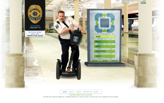
Clicking on “Enter the Site Now” opens a new window for the main website, which can be annoying to visitors. The website includes a large background image of Paul Blart on a scooter. The main navigation of the website is cleverly presented as a mall directory. Throughout the website, you’ll hear audio clips of mall security. Unlike many of the other websites, this one does not feature a trailer on the splash page or home page.
The Uninvited
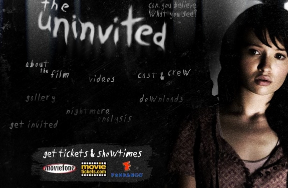
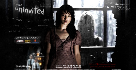
The website of The Uninvited has a dark design with hand-written text, including for the primary navigation. The style of the design is a good match for the type of movie it is. There is no splash page, and no trailer video plays upon arrival, but the trailer is accessible by clicking on “videos.” After the trailer plays, you’ll see options for embedding the video on another website, as well as for sharing via Facebook and email.
Hotel for Dogs
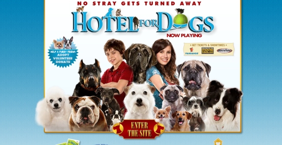
Hotel for Dogs uses a splash page that allows visitors to find local showings and get tickets, but not much else. Because this option is also available inside the main website, the splash page seems unnecessary.
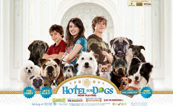
Once on the main website, you’ll see a large background image. The navigation options pop out on hover, and there is more content available on this website than on many others. The content includes information on the Hotel for Dogs video game, the opportunity to “Post your pup” by uploading photos of your dog and some other interactive options.
Gran Torino
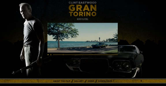
The website of Gran Torino is fairly similar to that of Taken, with a large dark background image and the trailer playing in the center of the screen. Simple navigation options are at the bottom of the screen, and just below that is an option to find shows and buy tickets. A lot of information is available in the “About the Film” section.
Slumdog Millionaire
Slumdog Millionaire has a splash page that displays the movie’s many nominations, awards and positive reviews.
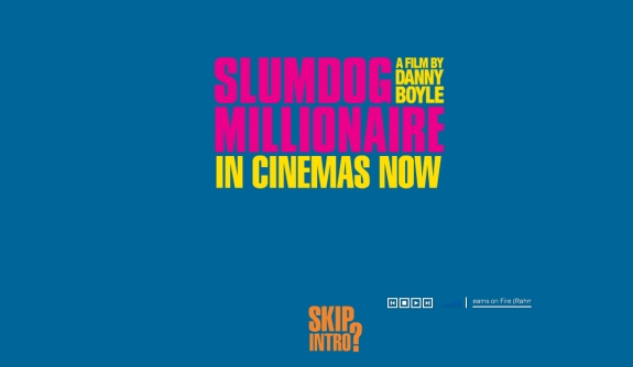
If you click on “Skip intro,” you’ll remain on a splash page that gives additional options, but you’ll need to click again to enter the main website.
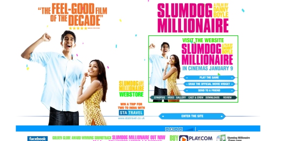
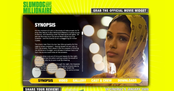
Once inside the website, you’ll hear audio unless you turn it off at the bottom of the screen, but there is no video that plays without prompting. The main navigation menu includes a link to videos, including the trailer. In addition to the typical options, you have the opportunity to post your own review on the Slumdog micro-blog.
Underworld: Rise of the Lycans
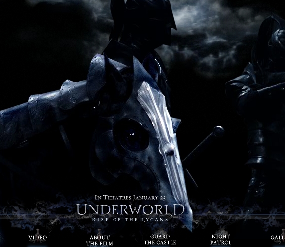
Underworld: Rise of the Lycans has a splash page with options to view the trailer, enter the website or get show times. There are also links to Facebook and MySpace pages. If you don’t click on anything, the trailer plays on its own.
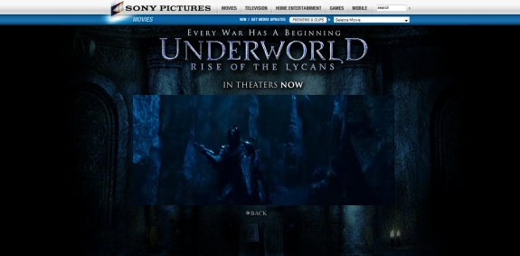
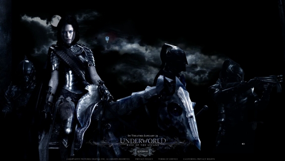
Both the splash page and main website feature large dark background images, which obviously fit the movie. The website is Flash-based, and the background is a huge image that scrolls horizontally. I found the navigation difficult to use.
New in Town
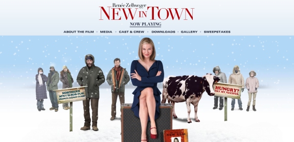
The website for New in Town is a snowy Minnesota scene with snowflakes that continuously fall. In addition to the usual options and pages, a Minnesota Pronunciation Guide shows funny clips from the movie. There’s also a “Try My Recipe” section where you can click on characters to see their recipes.
My Bloody Valentine
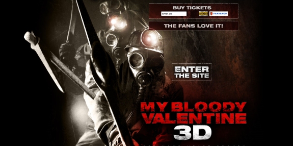
My Bloody Valentine 3D has a splash page that includes an option to find and buy tickets, as well as a link to a YouTube video of fan reviews of the movie.
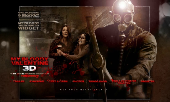
Once inside, you’ll see a dark website with red blood splatters. The style of the design fits well with what you would expect from a horror movie. There is a link to watch the trailer, as well as the typical navigational options. There’s also an option to send a bloody Valentine’s card to a friend.
Inkheart
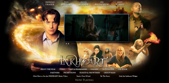
Inkheart’s website includes a large background image with several characters from the movie and some interesting lighting effects, In the center of the screen, a trailer plays unless the visitor stops it. The main navigation includes all the necessary items, such as information about the movie, additional videos and ticket information. The website also gives visitors the option of sending a “Toto E-Card.”
The Curious Case of Benjamin Button
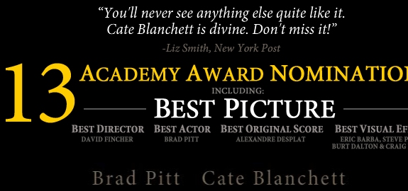
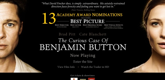
The Curious Case of Benjamin Button has a splash page with a solid black background and photos of the movie’s stars, Brad Pitt and Cate Blanchett. Yellow text is used to draw attention to its nomination for 13 Academy Awards. The splash page includes links to buy tickets, film info and a trailer in HD.
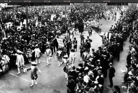
Once you enter the website, the browser opens in full screen by default (you can hit “Escape” on your keyboard to exit the full screen), and photos of Benjamin Button’s life rotate.
BrideWars
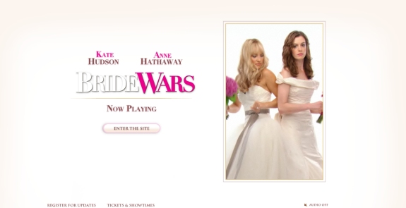
The website for BrideWars opens with a splash page that gives the options of entering the website, getting updates or finding show times and tickets. If you don’t click on anything, it automatically takes you into the website.
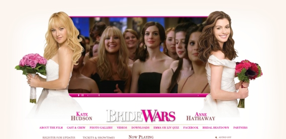
Once inside the website, you’ll see the movie trailer in the center of the screen between the two brides, with navigational options below. One additional feature is the “Emma or Liv Quiz,” which asks you a set of multiple choice questions and then tells you which of the two brides you are most like.
Revolutionary Road
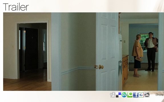
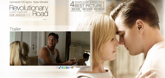
The Revolutionary Road website includes a large light background image of the movie’s stars. To the left of the screen, a trailer plays automatically. Below the trailer are options to share the page through social networking and social media websites, including Facebook, Digg, Delicious, StumbleUpon and Reddit.
Defiance
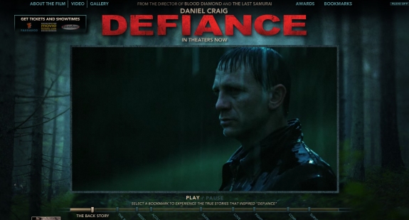
The website for Defiance also plays the trailer automatically upon page load. Behind the trailer is a large background image of a wooded area, with main navigational items at the top of the screen. Like the Revolutionary Road website, Defiance’s includes social media icons for Facebook, Digg, Delicious, StumbleUpon and Reddit.
The Reader
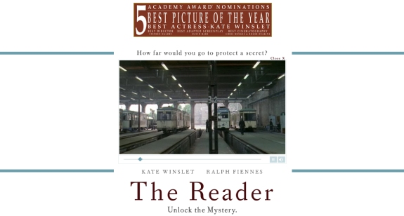
The splash page for The Reader is much more basic in design than that of many other movies. The page has a white background, with a video of the trailer playing in the center of the screen. At the top of the page is a notice that the movie has been nominated for five Academy Awards. Below the trailer you can click to enter the website.
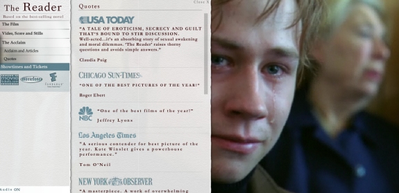
Inside the website, a major section of the screen displays the many excellent reviews the movie has received (this part of the layout can be closed to show more of the video). On the left are basic navigational options, including to find show times and tickets.
The Wrestler
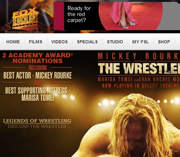
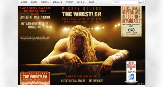
The Wrestler’s website is located on FoxSearchlight.com and includes the standard navigation at the top, with links to the studio’s other current movies. Most of the screen is taken up by a large picture of the wrestler, with a lot of information below, breaking the trend of short pages. Instead of the trailer playing automatically on the home page, a link is displayed to view it. Lower on the page are links to several reviews by critics, videos, cast information and news.
Notorious
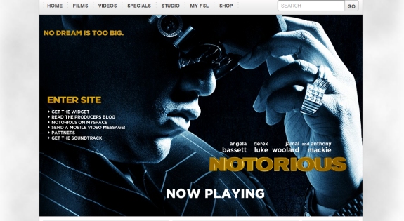
Notorious is also on FoxSearchlight.com, and the website is laid out like the websites of other movies on FoxSearchlight.com. Clicking “Enter Site” to the left shows the movie’s trailer.
Milk
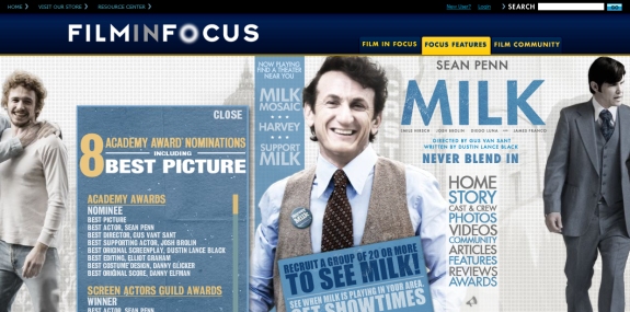
The home page for Milk includes a brief audio clip of Sean Penn from the movie. The layout includes photos of several characters from the movie and two vertical navigation menus. The website is hosted on FilmInFocus.com. On the left side of the screen you’ll see the eight Academy Award nominations it has received. The videos section includes the trailer and some other clips. From the community page you can visit Milk on Facebook.
Frost/Nixon
The Frost/Nixon splash page includes a pop-up that shows the nominations the movie has received. Once you close the pop-up, you see options for finding tickets, viewing the trailer and entering the website.
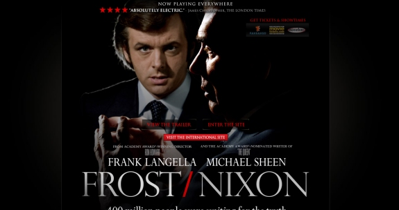
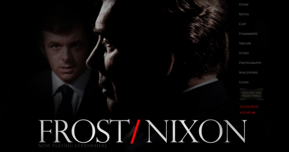
Once inside the website, some photos are flashed and an audio clip plays in the background. Then you’ll arrive on the page you see below, with a large photo of the two characters from the movie and navigation to the right.
Last Chance Harvey
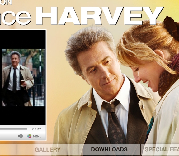
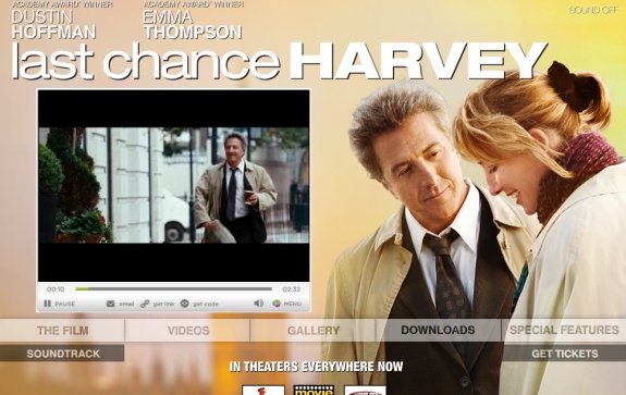
Last Chance Harvey has no splash page. The home page includes video of the trailer, shown on the left side of the screen. A large background image is used, with primary navigation towards the bottom of the screen. The “Special features” section includes an interactive quiz and a feature to create your own collage using pictures from all around the world.
The Unborn
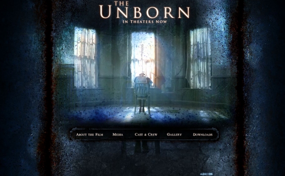
The splash page of The Unborn includes a large background photo, and the trailer plays automatically. Interestingly, a message says that if you return to the website between 9:00 pm and 9:00 am, you can see the after-hours trailer.

Once inside the website, you’ll see a dark textured background, with links to the typical options: about the film, media, cast and crew, gallery and downloads.
Marley & Movie
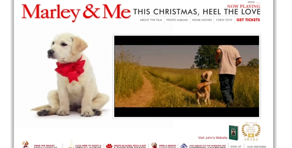
The website for Marley & Me plays the movie’s trailer automatically when the page is loaded. Throughout the website, you’ll see Marley chewing things up, licking the screen and pulling on a rope to bring the website’s photo album into view.
Doubt
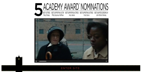
Doubt uses a splash page that shows its five Academy Award nominations at the top of the screen and the movie’s trailer below. You can also get to ticket information from the splash page.
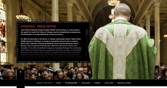
Once inside the website, each section displays a different background image that takes up the browser window. All the standard information about the movie and cast is available, as well as photos and videos.
Bedtime Stories
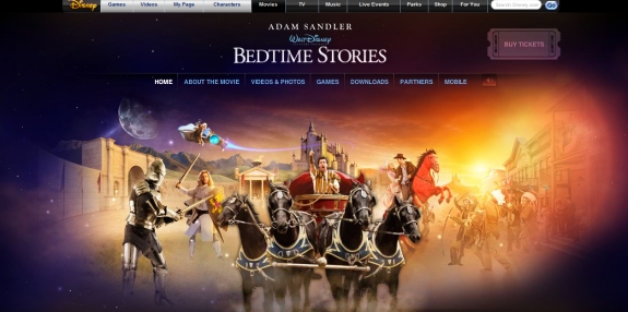
Disney’s Bedtime Stories is hosted on Disney.com instead of its own domain. The home page includes a large colorful image that takes up the full screen. The website includes basic movie information, videos and three different games to play.
Valkyrie
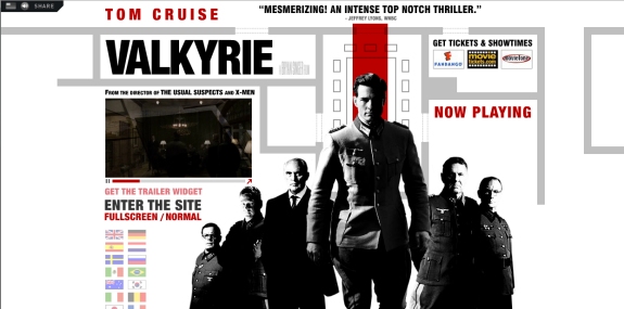
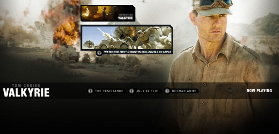
Valkyrie has a splash page with an image of Tom Cruise and the movie’s other characters overlaid on a map/blueprint. The trailer plays automatically on the left side of the screen, just above the link to enter the website. The splash page also includes flags that link to websites for other countries and languages.
Once inside the website, a war scene photo takes up the full screen. There is a link to watch the first six minutes of the movie on Apple, and a few navigational options are below.
Not Easily Broken
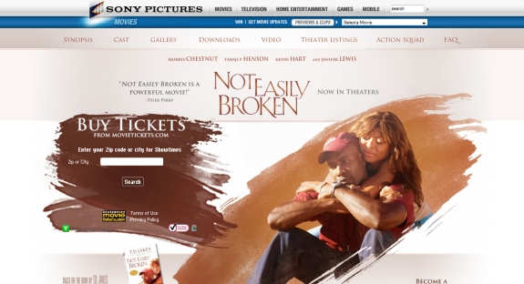
The website for Not Easily Broken is hosted on SonyPictures.com. Main navigation is at the top of the page and includes a link to the trailer. Much prime real estate on the front page is set aside for finding show times and ticket info. Lower on the page is a link to the movie’s Facebook page.
Tale of Despereaux
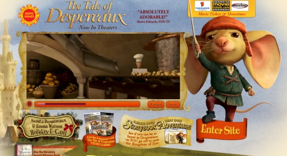
The Tale of Despereaux’s splash page includes an illustrated background (naturally), and the trailer plays automatically on the left side of the screen. At the bottom of the page are icons for sharing on Facebook, Digg, Delicious, StumbleUpon and Reddit.
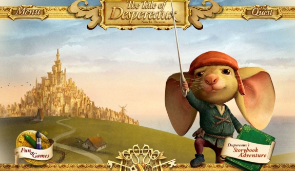
Inside the website you’ll see another illustrated scene. The full navigation only appears when you click on “Menu.” In addition to the standard content and information, clicking on “The Quest” brings you to some games.
Rachel Getting Married
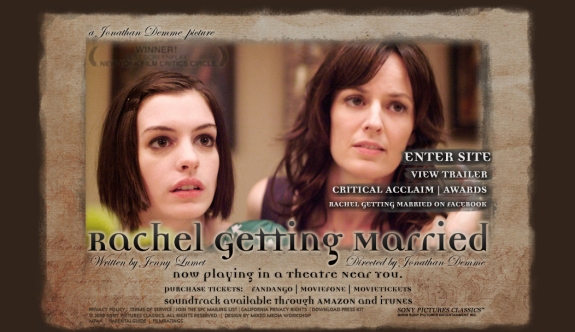
The splash page for Rachel Getting Married includes links to the main website, the trailer, information on awards, and the movie’s Facebook page. You can also access ticket info below. At the top of the page, the movie’s awards fade in and out.
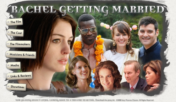
Inside the website, vertical navigation on the left shows links on images of tags. Clicking on the links changes the background image as well as the content.
Yes Man
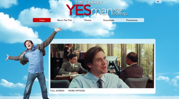
Yes Man’s website includes a quick Flash intro before the trailer begins playing. The whole website has a blue cloudy sky for a background. The site is hosted on WarnerBros.com.
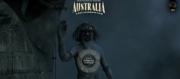
Australia
Australia’s Flash page includes a large background image of the movie’s two stars, and the trailer plays automatically in the center of the screen. There are links to get tickets and show times and to enter the website. Below you can also choose to enter the website of another country.
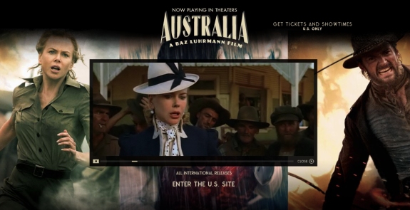
Once in the website, you’ll see a video with background music. There is a link in the top right to access the menu and a link in the center of the screen to “Experience Australia”, which also plays some video.
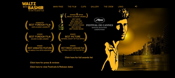
Waltz with Bashir
The home page for Waltz with Bashir displays a number of awards and nominations, with a link to even more. The home page has no additional content, just an image and navigation menu. The trailer is available by selecting “Clips.”
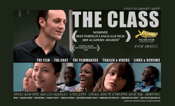
The Class
The home page of The Class includes some award nominations, pictures and navigation. All the basics, like film info, cast, filmmakers, trailers and videos and links are available. The website is hosted on SonyClassics.com.
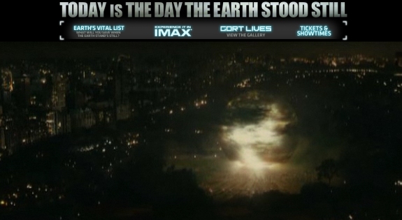
The Day the Earth Stood Still
The Day the Earth Stood Still uses a splash page that automatically plays the trailer in the center of the screen. You can choose to enter the website or select from a list of countries below.
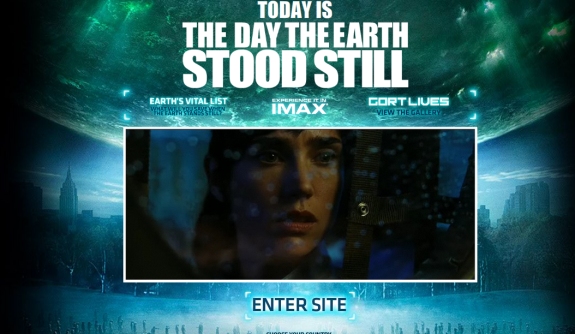
Inside the website, most of the screen is used for a video, with a menu button that follows your mouse around the screen. Click on the button and the menu expands.
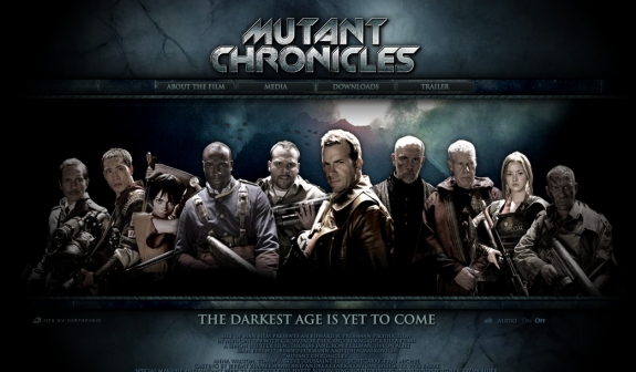
Mutant Chronicles
The website of Mutant Chronicles includes a large photo of the movie’s characters, a dark textured background and a navigation menu at the top. There is no trailer on the home page, but it is easily accessible from the navigation menu.
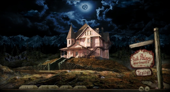
Coraline
The website of Coraline has a dark illustrated image that takes up the full screen. Navigation options are at the bottom of the page, including a link to the trailer. Show times and ticket information are also available from the menu.
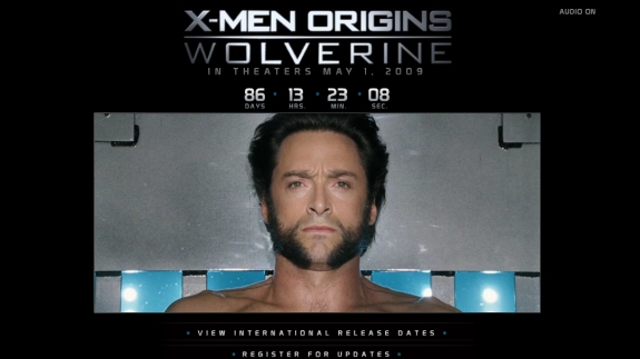
X-Men Origins
Currently, the website for X-Men Origins includes a countdown of the days, hours, minutes and seconds until the film is released. The trailer begins automatically in the center of the screen. At this point, not much else is available aside from links to MySpace and Facebook pages.
He’s Just Not That Into You
The home page for He’s Just Not That Into You includes a collage of many pictures from the movie. In addition to basic information and videos, the website includes fun and interactive content, like a quiz to find out if he or she is into you, e-candy hearts that you can send to friends, a date decoder and a video of the top 10 chick-flick cliches not found in the movie.
The Pink Panther 2
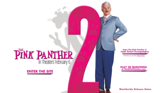
The website for the Pink Panther 2 is hosted on SonyPictures.com. The splash page includes links to enter the website, worldwide release dates, and a 20 Questions game. The 20 Questions game includes video responses from Steve Martin after each answer, in which he tries to guess what you’re thinking.
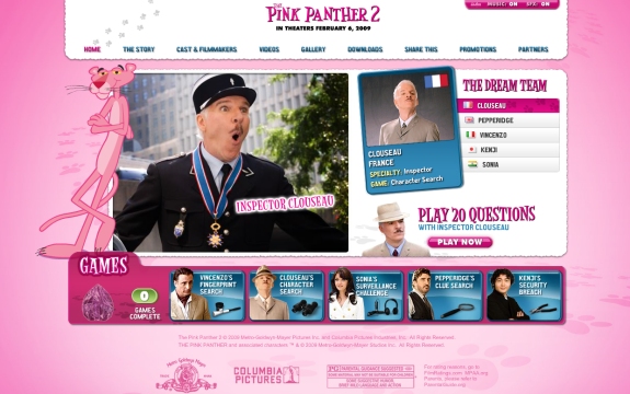
Inside, the design naturally has a lot of pink. Several other games can be played, and information on the movie, video and downloads are available.
Friday the 13th
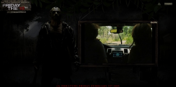
The dark design of the website for Friday the 13th is a good fit for a horror movie. The trailer plays automatically to the right of the screen, and a navigation menu is available to the left if you hover over “Menu”. At the top right of the screen is a “Share” option for social networking.
G.I. Joe: The Rise of Cobra
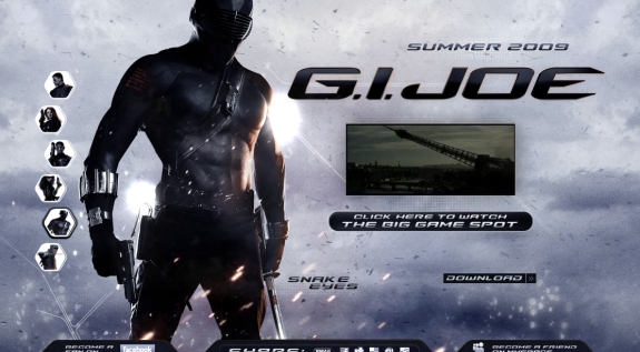
Right now only a short commercial promo is available on the website for the upcoming G.I. Joe movie, not a full trailer. The movie already has a Facebook page, and the website includes options for sharing through Facebook, Digg, Delicious, StumbleUpon and Reddit.
What Are Your Thoughts On Movie Websites?
What do you like or dislike about movie websites? Do you think they do an effective job of promoting their movies?


 Celebrating 10 million developers
 Register Free Now
 Try ProtoPie AI free →

