10 Simple and Impressive Design Techniques
Complex design techniques are often time-consuming and, well, complex. Some of these advanced effects can add plenty of depth to designs, but when used in the wrong place, they do little more than distract viewers from the project’s intended focus. These effects may be precisely what a design needs to have the impact it requires, but even in these cases, they should be complemented by simpler effects.
Simple effects and techniques are the building blocks of today’s designs. For example, what good is a stellar lighting technique if you can’t decide which colors to use or which text-based effects to use in conjunction with the effect?
With a “less is more” mentality, we’ve selected 10 very simple and impressive design techniques that can drastically improve the performance and appearance of your designs.
For more techniques, you may want to look at our previous articles:
- 12 Useful Techniques For Good User Interface Design
- Grid-Based Design: Six Creative Column Techniques
The basics first. Because you’ve got to crawl before you can walk, let’s start with the fundamental concepts of simple and effective design.
1. Add Contrast
Sadly, adding extra contrast is one of the most overlooked and under-used techniques.
Joost de Valk makes great use of thin, high-contrast lines that make it easy for the user to distinguish between different section of the page. In the enlarged portion of the above screenshot, you can see that most of the time this contrast is just a lightly colored 1-pixel line next to a dark 1-pixel line.
On the other hand, the “More” and “Go” buttons on his home page have so little contrast that they’re easy to miss even when you’re looking for them.
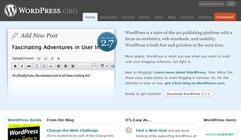
WordPress uses color to add contrast to its most popular link, “Download.” The red stands out among the calm palette of blues and grays but isn’t so bright that it hurts to look at it.
If you’re in doubt about whether you need more contrast, think of it a bit like applying makeup, strangely. The idea is not to get people to say, “Hey, look! Contrast!” You want to naturally draw their attention to important items on the page and highlight features that are already there.
2. Gradients
Developments in technology have brought tools for creating gradients to nearly anyone who wants them. But is that a good thing?
Media Temple has gradients on nearly every page of its website, but moderation and subtlety are the keys to the design’s success. The logo, headlines, buttons and backgrounds all have subtle or minor gradients to emphasize their content. The most complex gradients on the website are found on simple 120 pixel-wide buttons that are intended to grab attention.
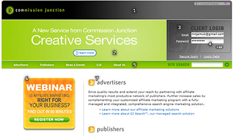
Commission Junction not only uses gradients far less subtly than Media Temple, but implements a variety of different types of gradient:
- Horizontal, linear gradient from black to medium gray at the top of the page.
- Green radial gradient in the background of the green header.
- Faint diagonal gradient over the “CJ” logo in the log-in box
- Light vertical linear fade in each input box background
- Vertical gradient in navigation bar background
- Bright linear fade in Webinar banner
- Another vertical linear fade for headings
The design is a bit adventurous, and for the most part, it works, but it has a few major problems. Most importantly, there’s no consistency. Much like choosing a sensible color palette, designers should carefully choose only a few types of gradient for each project.
For example, the large horizontal gradient (1) pulls the eye along the width of the page. That’s not a problem in and of itself, but right below are both a radial gradient (2) pulling the eye towards the center of the page and another linear fade (3) pulling the eye down and across to the bottom-right corner of the log-in box. This makes the page a little confusing for the user, and the choppy visual flow makes it a little difficult to read.
When working with gradients, it is important to keep a nice visual flow: use gradients sparingly or subtly. And most importantly, use them only when they complement the overall feel of the project.
3. Color
Using color well can be a challenge. Between coming up with a perfect palette and knowing where to put each tone, it’s easy to spend too much time coloring your design.
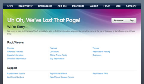
Realmac Software pulls off a very bold idea by inviting the entire spectrum of colors onto its 404 page. This works for a few reasons. First, Realmac has set the page against a neutral gray background. More importantly, it hasn’t used color anywhere else on the page, with the exception of the blue text links and the small splashes of color far below the fold.
Though the full-spectrum palette grabs attention right away, it’s still simple, and the use of gray keeps it from irritating the eye. Trying to use more than four or five colors in one design would usually overwhelm. Stick to simple four-color palettes unless you’re really confident the design calls for more.
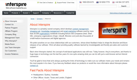
When you use color sparingly and intelligently in your design, it is so much easier to draw attention to important items. On Interspire’s “About Us” page, viewers are quickly drawn in turn to the dash of color in the logo at the top of the page, then straight to the headings and, lastly, to the logo at the right of the page content.
Working with fonts. Typography is an art far deeper than most of us realize. There’s certainly a place for details like ascenders and side bearings, but they’re not nearly as crucial to understand as the following techniques.
4. Letter Spacing
Letter spacing, or kerning, can make a huge difference in headlines, paragraphs, logos and anything else that involves text. It is nothing more than the distance between each pair of letters.
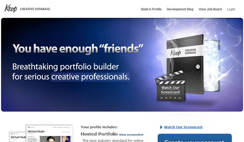
Krop’s new portfolio builder doesn’t do anything too extravagant with the text here. Most of the website’s image-based text reduces letter spacing to make statements more concise and powerful.

The above illustration shows how letter spacing can have a negative effect on your designs. Small or non-anti-aliased text is most difficult to read with modified letter spacing.
If you haven’t before, tinker a bit with letter spacing in your designs, and you’ll be shocked by the difference it can make. A few good fonts to start with are “Myriad Pro” for images and “Trebuchet MS” for HTML text.
5. Case
… As in uppercase and lowercase. Changing case requires nothing more than pressing the Shift or Caps Lock key, and yet so few designers take advantage of this technique’s potential.
Some of MSNBC’s use of case is obvious. Beyond the all-lowercase logo, however, the company makes subtle use of case in other areas. The large message bar at the top of the page usually says something like “WATCH LIVE” or “BREAKING NEWS.” Considering that the words usually highlight something very important, this is an excellent way to draw attention to these particular announcements.
Additionally, using only uppercase letters allows MSNBC to make its incredibly small buttons just clear enough to be legible. In this 5-pixel-tall application, lowercase letters such as a, m, x and z would be only 2 to 3 pixels tall and not readable at all.
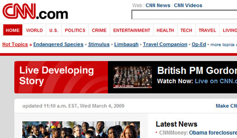
Sticking with news websites for the moment, CNN misses a lot of opportunities to use case to enhance its pages. To its credit, it uses an all-caps navigation menu, but the vast majority of the page is in traditional case, with only the first letter of each sentence capitalized.
6. Anti-Aliasing
Though technically a much more complicated process, anti-aliasing can be summarized as the smoothing out of edges, and it applies to all aspects of design. In the world of Web design, anti-aliasing is partially determined by whether the text will be in HTML or shown as an image. Complicating things a little more, some Web browsers and operating systems automatically smooth out HTML text a bit, but as a general rule, HTML text has no anti-aliasing.
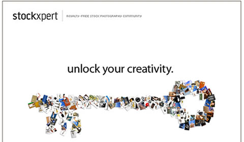
Stockxpert makes a conscious choice on its very simple landing page to anti-alias some lines of text and not others. Most of the text has a very smooth edge and does not appear choppy at all, but that’s not the case for the small text at the top and bottom of the page. Much like the small text on the MSNBC buttons mentioned above, the 5-pixel-tall text needs to have as sharp an edge as possible to be legible. Any blurring or anti-aliasing for text this small would have readers straining their eyes, only to give up.
Mess things up! Thing that look perfect often look fake or uninteresting. Leaves on trees are not exactly symmetrical; lighting of any kind provides uneven shadows and highlights; and camera lenses sometimes blur areas of the shot and produce lens flare. Some designs look great with clean and artificial-looking effects… some need something messier.
7. Imperfection
Anyone who has used a computer for more than 10 minutes will tell you they’re not perfect, but from a design perspective, they can produce perfect results. When you use the Line tool in your favorite design software, with the default settings, you get a perfectly straight line from point A to point B.
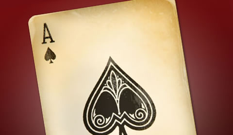
This Antique Ace of Spades tutorial goes through about a dozen steps to make this card look imperfect, which is, admittedly, not very simple. The concept itself, however, is very simple. Make things look old, dirty or otherwise imperfect to give your work a unique touch.

This butterfly photo that looks like it was taken in the mid-1900s is another example of imperfection at its best. The photo was actually taken on a digital camera, then degraded using a few filters and some quick color changes to give it a vintage look.
Successfully adding artifacts and imperfections to a design is easier than you may think. Start by converting items to grayscale or sepia tones, and then go from there.
8. Blur
If you’ve ever been stumped with the predicament of how to make something stand out more, stand out less, or nearly disappear, take a look at using blurs in different ways. By blurring objects in the foreground, background or by blurring the entire design, you can dramatically increase the impact of your project. Focus is, at least in part, relative. By blurring one object, it brings focus to another.
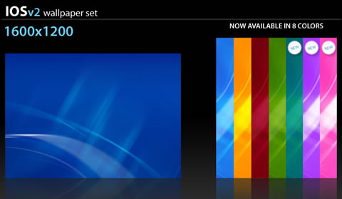
The Ios V2 wallpaper collection uses simple blurs to create a calm, organic view. There are only a few sharp lines to give the image focus, and the blurred background is crucial to the look of the wallpaper as a whole.
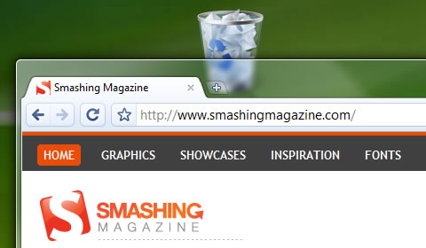
Blurs can also be used to give a sense of depth or layering. Windows Vista’s Aero theme blurs anything behind windows for a cool, diffused glass effect. A simple Gaussian Blur tool can create the same effect.
9. Alignment
Even while maintaining clean, straight lines, there are opportunities to give your project that “extra something” it needs.
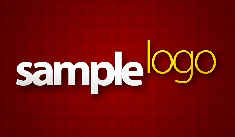
This sample logo gets most of its character from the raised “logo” letters. Altering the alignment of design elements can make them more memorable, more talked about and, consequently, much more effective.
This technique applies not only to text either. Some designers fall back on templates or personal work habits when conceptualizing a design. This can greatly increase the speed with which concepts are turned over to clients; but all too often, it also restricts creativity – especially with regard to alignment.
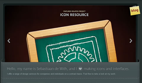
Icon Designer sets itself apart by rotating a few design components. The page would otherwise be fairly monotonous, but the simple rotations keep things interesting.
Most of today’s websites are 700 to 900 pixels wide, are centered vertically in the browser, and have straight edges down each side of the page that determine where content begins and ends. In a lot of cases, this kind of order and predictability is good, but a fair proportion of websites would benefit greatly by their designers’ thinking outside of the box… figuratively and literally.
And most importantly…
10. Trim Fat
Perhaps the most important and under-appreciated design technique, trimming unnecessary parts of a project, is also one of the hardest to do.
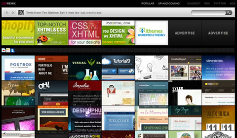
By trimming all unnecessary components, CSS Remix is left with only the essentials and can display seven premium ads (128 by 96 pixels), 53 favicon ads (16 by 16 pixels) and a whopping 56 websites at one time – all in the top 1000 pixels of the page! Even the website’s logo has been trimmed to 53 by 7 pixels.
As with most things in life though, too much of a good thing isn’t always a great thing. The logo is so small that it is hardly recognizable, and the featured websites can be very difficult to distinguish from one another at times. The Twitter feed at the top of the page is, strangely, far more prominent than the website’s logo or navigation.


 SurveyJS: White-Label Survey Solution for Your JS App
 Agent Ready is the new Headless


