Showcase Of Beautiful Sports Websites
We recently showcased beautiful websites from the fashion industry, and in response to reader requests, we’ll do the same thing here for sports websites. This article showcases the most beautiful website designs from the North American sports industry, including ones for news, teams and leagues, sports apparel and more.
You may also be interested in the following related posts:
- Web Design Showcases From Various Industries
- Global Web Design Showcases
- Portfolio Web Design Showcases
Trends In Sports Websites
As in any industry, sports websites have their own trends, as you will see below. However, because the websites showcased here fall into a number of different categories and serve different purposes, not all of the trends we discuss will be relevant or applicable to all types of sports websites.
1. Large Photos Many of the best sports websites include a lot of images and photos, and many use large photos in the background or a featured area. News websites obviously include a lot of smaller photos to accompany current stories, but team websites and sports apparel websites in particular often rely on large photos as a prominent part of their design.
2. Colorful Naturally, team and league websites are typically very colorful and highlight their official colors. Apparel and product websites are also frequently colorful.
3. News Area Even websites that aren’t news-focused, such as team and league websites and those of individual athletes, typically contain recent news items on the home page. As more sports fans turn to websites to get their news and stay up to date on their favorite players and teams, news and blog sections provide an opportunity for easy communication with few barriers.
4. Featured Content Area News websites of course have certain sections in their layout for headline news, but even team and league websites now provide content in feature areas of the website. In many cases, this featured content area works in conjunction with the news headlines mentioned in the previous point. Most of the featured content sections have a slider or similar effect that moves readers from one featured item to the next. Most also allow the user to override the slideshow effect and control what content is shown in the featured area.
5. Network Many of the leading sports news websites are part of larger networks. You will see many of them pointed out in the news section. Sometimes the sports section of the network is on its own domain, other times it is part of the main news website’s domain.
Showcase
Let’s look at a number of exemplary websites from the sports industry in several different categories.
News
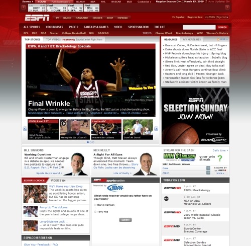
ESPN The ESPN redesign a few months ago drew a lot of attention from sports fans. The front page features less content than some other major news websites and aims to improve the user experience with improved navigation to different sections of the website.
NBC Sports The NBC Sports website is part of MSNBC.com, and it shares a similar look to the MSNBC front page in terms of layout and style. In this case, the familiar MSNBC header is replaced, but the side navigation and content area are much the same.
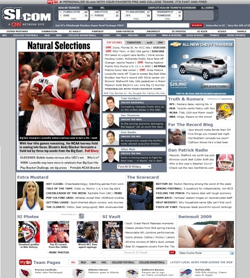
Sports Illustrated Sports Illustrated’s website is part of CNN.com. Like many sports news websites, Sports Illustrated has a scoreboard section at the very top of the page for games in progress or recently finished. SI uses a grid-based layout to present information from many different sports and leagues on its front page.
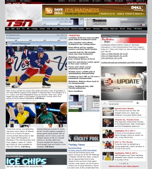
TSN TSN, Canada’s sports network, has a typical news-style layout. Naturally, much of the content features ice hockey news and information. Content for various sports and leagues is available via the main navigation at the top of the page.
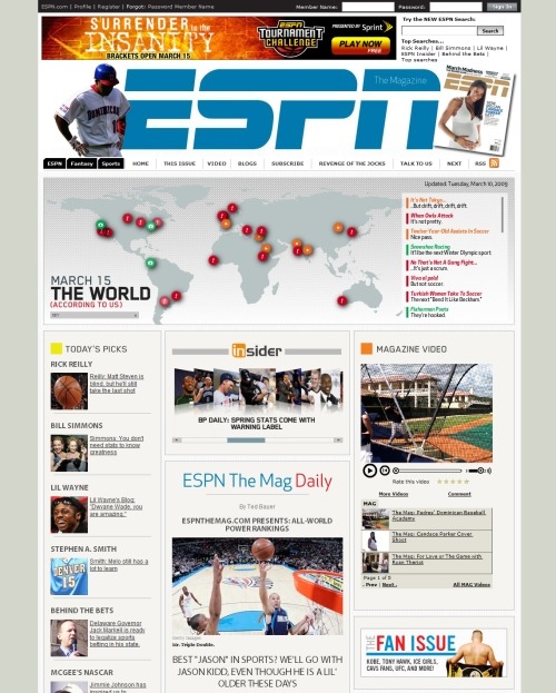
ESPN the Magazine ESPN the Magazine has it’s own website that is part of the larger ESPN website. The home page includes links to recent stories from the magazine, and the content area is a bit cleaner in design than many news websites.
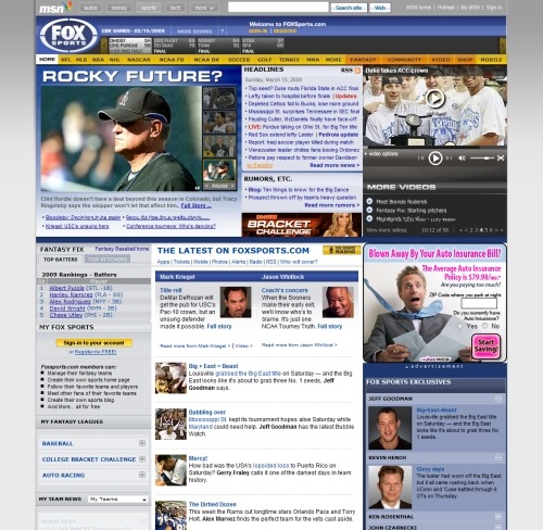
Fox Sports The Fox Sports website is part of the MSN network. The website includes a lot of content but does a pretty good job of keeping it organized. A drop-down navigation menu includes links to many specific pages for each sport or league.
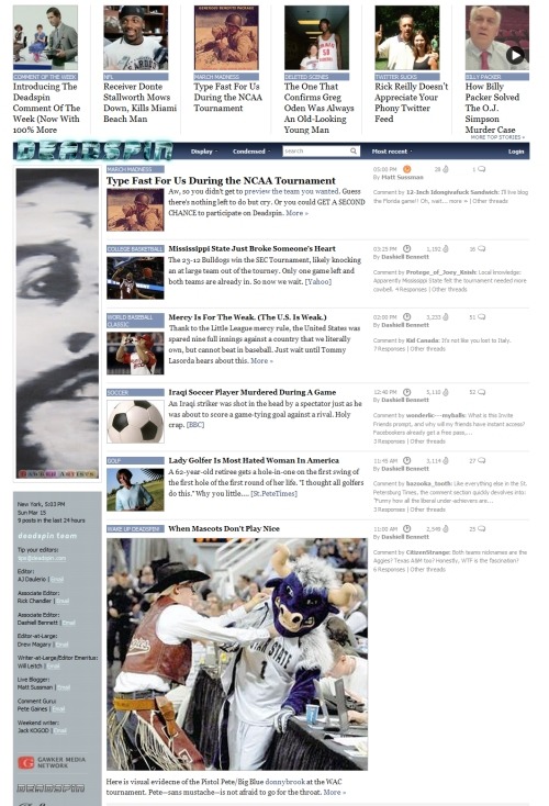
Deadspin Deadspin, the sports arm of the Gawker Network, has a design that will look familiar to visitors of the other Gawker websites, such as Gizmodo and Lifehacker. Featured items are shown at the very top of the page, and the main content area includes excerpts to additional items.
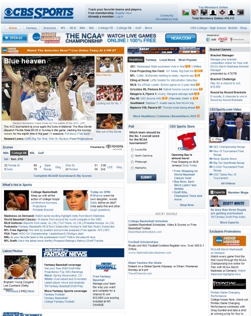
CBS Sports The CBS Sports front page includes information on a variety of different sports and leagues. The design uses a light color scheme of blues and white.
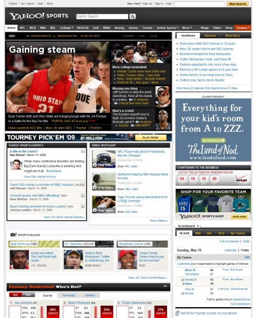
Yahoo! Sports Yahoo! Sports has a news-style layout, with navigation to sports and leagues at the top of the page. Unlike on some other sports news websites, the Yahoo! scoreboard is located in the sidebar rather than at the top of the page.
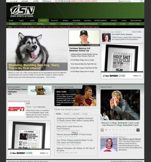
Onion Sports Network Satirical news website The Onion uses the Onion Sports Network for all of its sports stories. The Sports Network’s front page has a grid-based layout, like The Onion’s main front page, but with much less content. Navigation above the content leads to news on particular sports, as well as to other sections of The Onion.
Golf Digest Golf Digest Magazine has a news-style layout for its home page. The website includes information from the magazine, as well as golf news and blogs from experts.
Teams
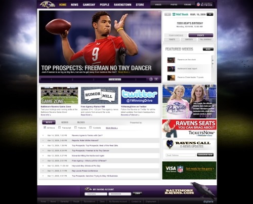
Baltimore Ravens The Baltimore Ravens of the NFL have a large background image of a sky scene that works with the team’s purple and black color scheme. The home page includes a large featured content area that slides from one item to the next, and the user can manually click to slide to other content.
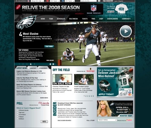
Philadelphia Eagles The Philadelphia Eagles of the NFL have a similar featured content area with different execution. The Eagles’ design has a dark-green splatter on a lighter-green background.
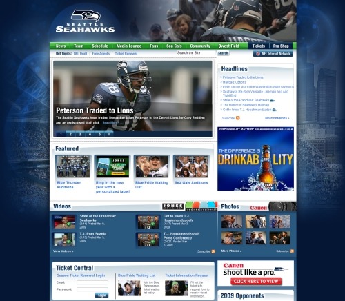
Seattle Seahawks The Seattle Seahawks of the NFL use a background image of the football stadium that includes a little bit of the city’s skyline as well. The photo has a blue tint to match the blue and green color scheme. Unlike many of these other team websites, the main navigation menu is not a drop-down.
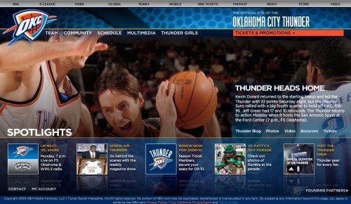
Oklahoma City Thunder The Oklahoma City Thunder of the NBA has a website that stands out from the other websites of NBA teams. The layout is not typical and features a large photo corresponding to a recent headline. The bottom of the page includes navigation to team information and news.
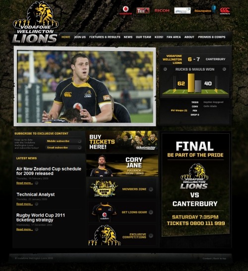
Wellington Lions The Wellington Lions, a rugby team from New Zealand, have a dark website with a rough, textured background that resembles a torn-up field. The home page includes a slideshow of photos of the team.
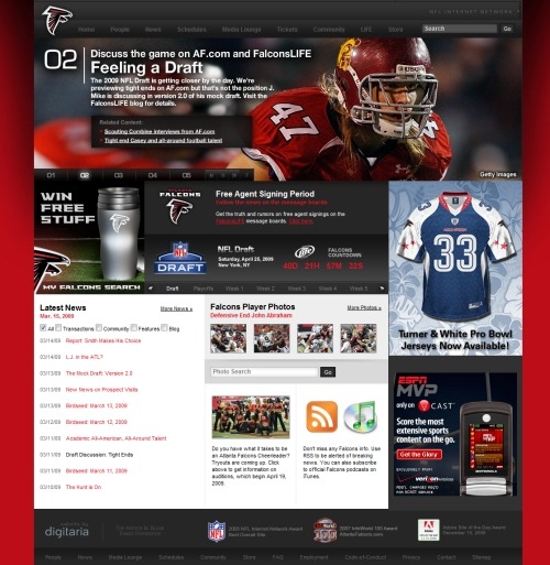
Atlanta Falcons The Atlanta Falcons of the NFL have a website that has a red background with black and dark gray throughout. Like other team websites, this one has a featured content area with large photos and links to current news and items of interest.
Athletes
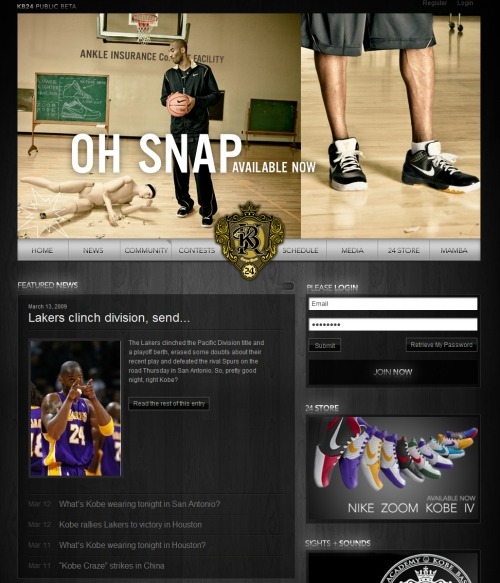
Kobe Bryant Kobe Bryant’s personal website features promotion of his products, including those from Nike. The home page has a blog-style news section with info on Kobe and the Lakers. The website also includes forums and a members-only section.
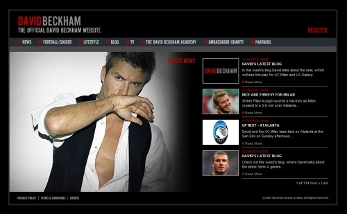
David Beckham David Beckham’s personal website has a dark design. The home page includes a large photo of David and recent news items. The news items contain excerpts from his blog posts as well as information relevant to his career.
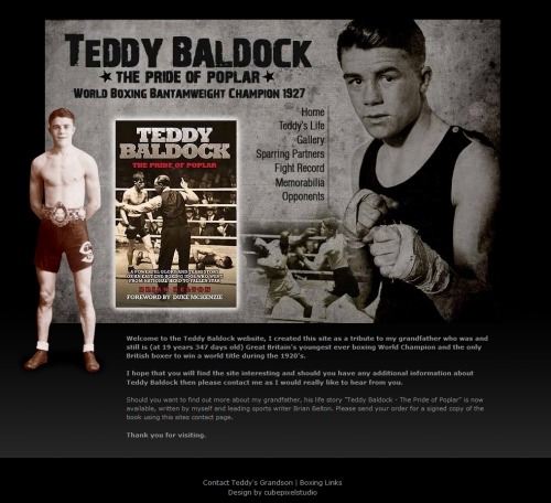
Teddy Baldock Teddy Baldock, a boxing champion from the late 1920s, is profiled on a website set up by his grandson as a tribute. The website includes information about Baldock’s career and life. The design has a dark background, some texture, and photos from his career.
Sports and Leagues
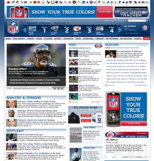
NFL The NFL.com front page has a news-style layout featuring content on all aspects of the NFL. The website features the league’s familiar red, white and blue color scheme.
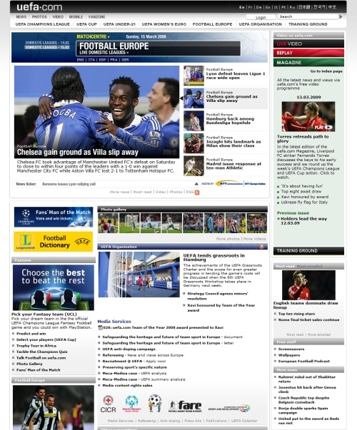
UEFA UEFA (European football association) has a news-style website that includes plenty of content on the front page. At the top are links to versions in several different languages.
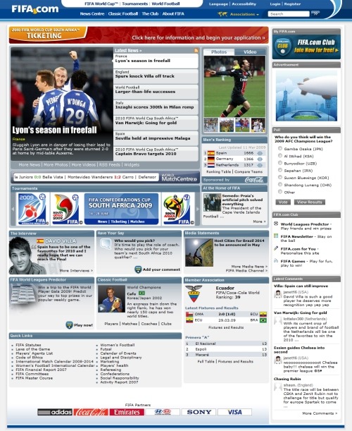
FIFA The FIFA website has a featured area for the most recent football news and headlines. It includes content on the sport around the world, and the front page has interactive content, such as polls and reader comments.
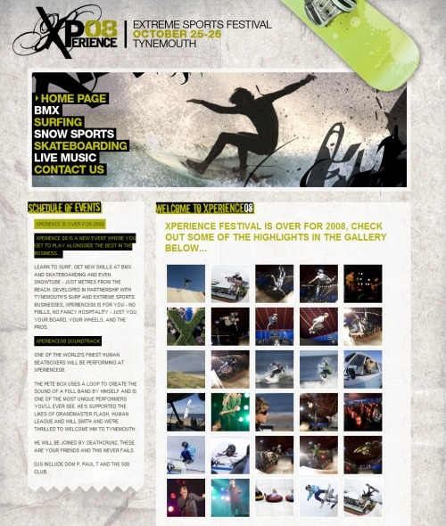
Xperience 08 Extreme Sports Festival Xperience 08 has a nice grungy design that has been showcased in a number of Web design galleries. The design features a textured paper background. From the home page, you can access information on the various sports that are part of the festival.
Apparel and Equipment
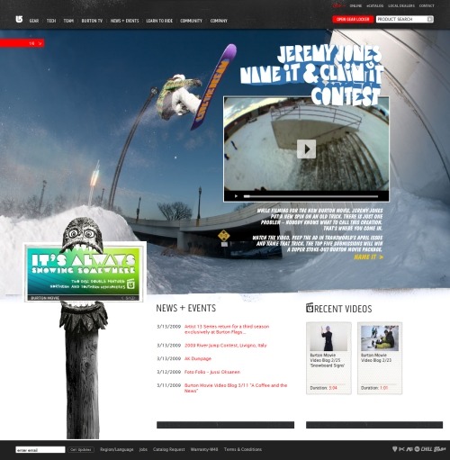
Burton You would expect a design with some edge from a company that focuses on snowboarding and skateboarding. Burton’s website delivers by sporting a number of different large background photos (refresh the home page to cycle through them).
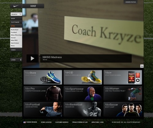
Nike The Nike home page serves as a gateway to divisions of the company, such as Nike Basketball and Nike Soccer (also showcased here). It also links to product information and the online store. The home page features a background photo of a football field.
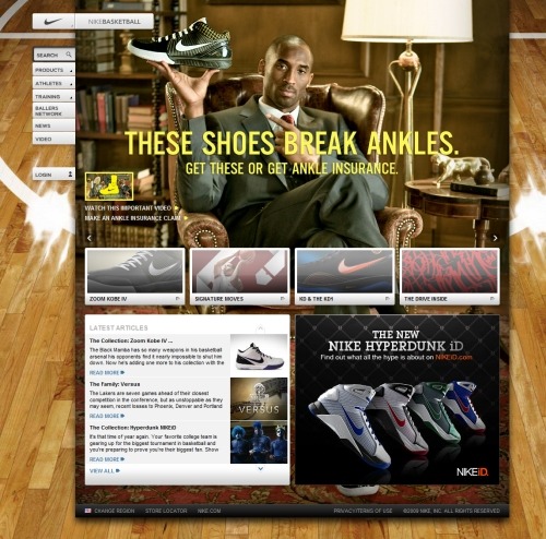
Nike Basketball Nike Basketball’s website has a huge background image of a wood floor from a basketball court, and a large photo of Kobe Bryant is currently featured on the home page. The website, of course, provides information on the company’s products, but it also includes information on the players who Nike sponsors, as well as training videos that teach you signature moves of some of the NBA’s best players.
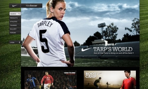
Nike Soccer Like the Nike Basketball website, the Nike Soccer website also features relevant products, information on players who Nike sponsors and training content, including videos. The design stays in line with the other websites in Nike’s network.
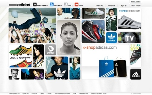
Adidas The Adidas home page has a bunch of different photos. Hover over one of them and it expands, revealing navigational options relevant to it. Links to the main product lines are available in the navigation menu at the top of the page.
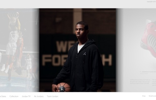
Jumpman 23 Jumpman 23, Michael Jordan’s division of Nike, has a large random image in the center of the design. The user can click on arrows to slide to the next or previous photo. Navigation at the bottom of the screen expands on hover.
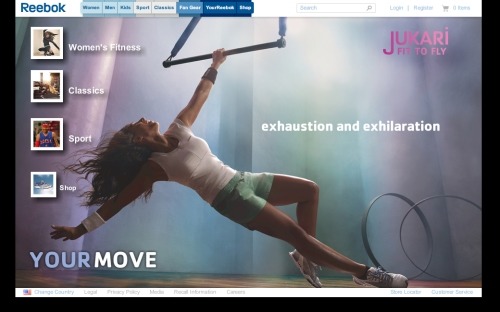
Reebok Sports apparel company Reebok shows a large photo on its website. Navigation to specific collections and product lines is at the top of the page and to the left. The navigation at the top brings up multiple options on hover that show photos instead of text to indicate where the links point to.
Products
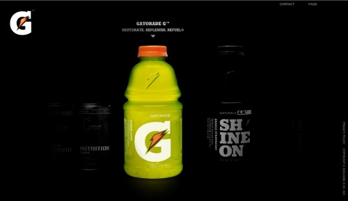
Gatorade The home page of sports drink Gatorade has a dark background, with product photos that cycle from one to the next. The user can control the slider, and, on hover, each product takes on color. Clicking on the products leads to pages with more information.
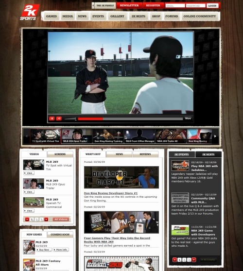
2K Sports Video-game maker 2K Sports has a wood background in its design. The home page has a large video area that currently promotes a new baseball video game. The main navigation includes drop-down links to each of 2K Sports’ current games, as well as all kinds of content for video-game lovers, such as tournament events, forums and a store.


 Agent Ready is the new Headless
 SurveyJS: White-Label Survey Solution for Your JS App