Ask SM: CSS Quick-Question Edition
This is our sixth installment of Ask SM, featuring reader questions about Web design focusing on HTML, CSS and JavaScript. These entries are not all questions, but rather quick Twitter responses to the query, “What has been your most difficult CSS challenge?” Among other things, this post covers the sticky footer issues, positioning elements at bottom of a div, on having layout, aligning labels and inputs, auto top and bottom padding, z-index and more.
You may want to take a look at the following related posts:
- [Ask SM: CSS] Equal Spacing, CSS Font Replacement
- Mastering CSS, Part 1: Styling Design Elements
- The Mystery Of The CSS Float Property
Div A Before Div B
@leewillis77 writes:
I currently have div B before div A in the HTML, and div B has float. I want to reproduce this, but with div A before div B in the HTML.
As long as both div B and div A have fixed widths, which when added together is less than or equal to the width of its parent, then it doesn’t matter which of them comes first in the HTML!
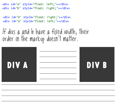
Equally important to mention is that if div A and div B do not have a fixed with, then they should, because floating elements without widths is a recipe for trouble.
Sticky Footer
@ilove2design writes:
I must admit, the “sticky footer” CSS problem was damn annoying until I found some solutions on the Web.
Agreed! The “sticky footer” pure-CSS solutions out there are pretty darn clever and come in handy regularly. Here are two:
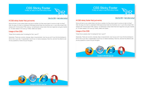
The both share one weakness, though, in that they require the footer to be a fixed pixel height, which is occasionally problematic. Generally, I just go bigger than necessary and give the text plenty of room to grow.
Positioning Elements At Bottom Of Div
@_Zapp writes:
How do you position stuff at the bottom of a div with (or without) position absolute and relative, so that it will look the same on all browsers.
When you give an element relative positioning, that limits the scope of absolute positioning on all its child elements. This is one of my favorite techniques in CSS Web design. I go over it in more detail here, but let’s take a quick look.
<div id="parent">
     Lorem ipsum....
     <p id="child">*Just a little footnote</p>
</div>
#parent {
position: relative;
padding-bottom: 20px;
}
#child {
position: absolute;
bottom: 0;
right: 0;
}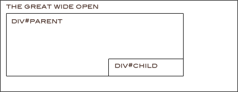
Just a quick note, the bottom/right combo needs hasLayout in IE 6 to work right.
Positioning Of Divs, Despite Source Order
Alex Ross writes:
Div top, middle, bottom. Top goes below content.
I think what you are getting at here is having the header of a website come after the main content in the HTML markup yet appear to be on top, where a header belongs. Part of the power that CSS gives us is that our designs don’t have to be source-order-dependent, like table-based layouts do. Here is how I would do it:
<div id="page-wrap">
     <div id="main-content"></div>
     <div id="header"></div>
</div>
#page-wrap { padding-top: 100px; position: relative; }
#header { position: absolute; top: 0; left: 0; width: 100%; }This could potentially bring SEO benefits, especially if loads of content in the header are pushing down more important page content. See an example of this, where I talk about putting excessive navigation below the content.
Centering Inside Resizeable Area
@olliepee writes:
I always have mental problems centering an automatically resizable div inside a 100%-width div.
Divs default to 100% wide, so if you have a div within a div without setting a specific width, that inside div will be the same width as its parent. If you do set a width for the inside div, you can make sure it’s centered with the ol’ classic centering trick.
div {
    margin: 0 auto;
}
On Having Layout
@devolute writes:
Forgetting to apply zoom: 1; on everything in the IE conditional style sheet.
If anyone hasn’t heard of this, applying zoom: 1; to elements is a way to force elements to gain the proprietary hasLayout property in IE browsers. This can fix a number of (truly) weird bugs in IE.
Read more about it here.

Aligning Labels And Inputs
@ofaurax writes:
Correct alignment of a form’s “label-input”. I’ve not found a definitive solution in pure CSS.
Both labels and inputs (all the various types) are inline elements by default. Doing things like making them block-level elements and floating them can be very useful and help you avoid “unnecessary” markup. However, I think that’s the first step towards cross-browser inconsistency. I have pretty decent luck many times leaving them as inline elements and using the vertical-align: middle; property to keep things inline. Then wrap the label/input pairs in divs to cause the necessary line breaks. This is particularly useful with radio buttons and checkboxes. Also remember that if only IE is giving you grief, you can use conditional style sheets and relative positioning to nudge particular elements into place.
Text With Gradient Background
@pannpann writes:
Creating background gradients inside dynamic numbers/letters.
Typically, text in Web design can be set to a solid color, and that’s it. If you’d like a gradient effect over real Web text, a couple of methods are floating around. One is to lay a transparent PNG on top of the text that darkens a portion of it. Web Designer Wall has a tutorial on this, but note that this causes the potentially serious usability problem of not being able to highlight the text.
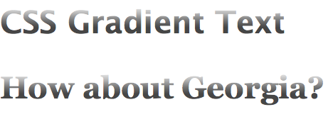
If progressive enhancement is your game, Jay Robinson has a demo on how you can use WebKit’s proprietary -webkit-background-clip to achieve this.

Another slightly more laborious method would be to create all 10 digits as graphics, and then create unique CSS classes for each digit. Then use markup like <span class=“one”>1</span><span class=“two”>2</span> to present the letter 12, and use CSS image replacement to replace the 1 and 2 with your custom graphics.
Auto Top And Bottom Padding
@_Naz writes:
Trying to make a div auto-center in your browser! ugh! still cant get it to pad auto top and bottom!
Unfortunately, vertical centering in CSS is a lot more difficult than horizontal centering. If you know the exact height of your div (that is, you set it yourself), you can use absolute positioning to get it done.
div {
    position: absolute;
    left: 0;
    top: 50%;
    margin-top: -100px; /* half of div's height */
    height: 200px;
}
If you don’t know the height, as painful as it is to say, using a table and the vertical-align property of table cells can get it done. If you’d like to explore other methods, the ThemeForest blog has a nice roundup of different methods.
Position Absolute With Text Wrap?
@HerrWulf writes:
Been having difficulties positioning a div to the bottom-right, with text wrapping around it…
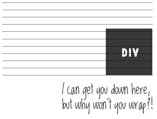
This is an interesting one. Of course we can position a div to the bottom-right with absolute positioning as described above. But as soon as we do that, the div is “removed from the flow” of the document, meaning that regular text in the parent div will ignore its placement and go right over it.
I’m struggling to think of a really great solution for this… So if anyone has something, please share it in the comments. One short-term, hacky solution would be to force some sensibly placed line breaks in the text at the bottom that would make it seem like it’s wrapping at default font sizes. Or place the image inline and floated to the right, but in the middle of the text, towards the bottom of it.
Separate Or Multiple CSS Files?
@scottradcliff writes:
What is your preferred method of using CSS? A few separate files (e.g. type.css, layout.css, etc.) or one large file?
The only circumstance in which I like to break out CSS into multiple files is when the CSS is totally unique to a certain page, and loading it for every other page would be useless. Like if you have an “About” page that has unique styling, I’d load the default style.css, and then load an about.css file after it to override anything that it needs.
I don’t like breaking CSS into layout.css, typography.css, etc. just because that isn’t how I think. When I look at the footer on a website, I want to look at all the CSS for that region in one place, not have to open two different files. That is just how my mind works, but I don’t have any particular problem with doing it the other way.
Super-efficent nerds will yell at you for requiring unnecessary HTTP requests to load extra CSS files, which can slow things down. And so, to be extra fast, you should load only one CSS file and one JavaScript file per page. They would be right, of course, if speed were the only consideration. Practicality, though, counts for a lot in my book. And let’s face it, for most of the websites that we work on, half a zillionth of a second doesn’t matter as much as the budget.
Z-index And Drop-Downs
@andrewturner writes:
The hardest issue I’ve been working on was one last week, where I was stuck with an issue relating to z-index and drop-down menus
I’m surprised at how often problems with this come up. Most drop-down menus rely on some combination of absolute and relative positioning. Once elements have this, they become part of the z-index “flow,” so giving them high values will usually get them on top of whatever you need them to be on top of.
The big exception, which seems to come up incredibly often, is when you need to overlay Flash content. Usually the solution here is to make sure that the Flash content is embedded with wmode=transparent. SWFObject can help with this and offers numerous other advantages.
Customizing Radio Buttons And Checkboxes
Anonymous Email writes:
For some time, I have been trying to create custom combo boxes and checkboxes for my forms based on images. I followed some tutorials with no good results, and I haven’t yet found a solution. What is a clean way to get this done?
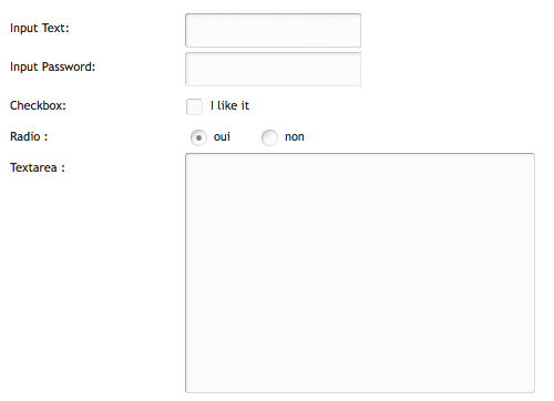
With pure CSS, there is no way to truly customize radio and checkbox inputs, at least not by replacing them with custom graphics. JavaScript comes to the rescue, though, by hiding them and replacing them with custom elements. Those custom elements will have click handlers on them that visually replicate a radio button being on or off, and invisibly updating the “real” hidden form element.
This jQuery plug-in does a nice job of it.
No JavaScript Tooltips
@firewalker06 writes:
How can we get a tooltip effect that can be used in any browser and without JavaScript?
CSS Globe had an article way back that does a good job of explaining it. It definitely can be done, and I’ll explain briefly here. You can count on the :hover effect on anchor links in any browser, so you’ll want to use that. Within the anchor link, you can have a <span> element which by default is set to display: none;. Then, with the hover CSS, you can display the span.
a span {
    display:none;
}
a:hover span {
    display:block;
    position:absolute;
    float:left;
    white-space:nowrap;
    top:-2.2em;
    left:.5em;
    background:#fffcd1;
    border:1px solid #444;
    color:#444;
    padding:1px 5px;
    z-index:10;
}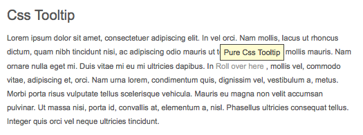
These values display a box with the width it needs to appear above and to the right of the link, much like browser defaults. But you can customize this however you’d like. But make sure not to use a title attribute on the link, otherwise both would show up on hover and would look weird. So, this effect should purely be an added bonus and not valuable required content because it won’t be very “accessible.”
That wraps up another installment of Ask SM! If you have questions to ask, refer to the top of this article on ways to submit them.


 SurveyJS: White-Label Survey Solution for Your JS App
 Agent Ready is the new Headless

