10 Useful CSS/JS-Coding Solutions For Web-Developers

Email Newsletter
Weekly tips on front-end & UX.
Trusted by 200,000+ folks.
 Try if for free!
 Get a Free Trial

 Register for free today!

Over the last months we’ve been paying closer attention to interesting design techniques and coding solutions and tried to understand how each of these solutions work and how they can benefit other designers and developers. Such designs are often hard to find, so it would be great if you could suggest some solutions that are worth exploring in detail – we’ll certainly cover them in our next posts!
So let’s take a closer look at 10 useful CSS & Javascript techniques and coding solutions that can turn out to be useful for your next project. You should have at least a basic knowledge of CSS and JavaScript before you read the entire article.
1. Inline Content Imagery #
When viewing a blog post or an online article, we typically tend to find that most images which are “dropped” into the story’s actual content are often presented in a boring or bland manner.
However, it is actually quite easy to create attractive content imagery that maintains a strong sense of design and branding, yet still manages to flow naturally with the content of your site. UXBooth provides a clean and elegant example of this technique (scroll down until you see a silverback). In the screenshot below, notice how the Silverback's image sits naturally in-line and in flow with the content on the page.
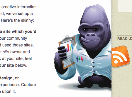
UxBooth's Inline Content Imagery in Action
How Is It Done? #
At the first glance the silverback looks like a background image that has been positioned in the center of the content column with CSS or JavaScript (or a combination of the two); however, this is a pure CSS solution. A div wrapping the image of the silverback (a simple .png-image) is floated to the right. Immediately after that in the HTML comes a paragraph and an ordered list. The "silverback"-div has a left-margin of 47px which keeps the p tag and the ol tag's content from overlapping the image, thus providing good visual spacing and overall page flow.
HTML
CSS
2. Typographic Tricks #
CommandShift3, self proclaimed hot-or-not of websites, uses an interesting typographic trick to display the vote results for each website in which you have submitted a vote. Obviously, this effect is achieved using only CSS.
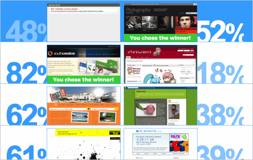
Nice typographic effects to show percentages of votes
How Is It Done? #
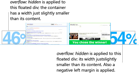
Each result line contains a "winning percentage"-div + screenshot as well as a "losing percentage"-div + screenshot (the image below should make it clear what is meant here). Each of the percentages blocks is given a width that is slightly smaller than the width it needs to display its full text. Besides, the CSS attribute overflow:hidden is applied to hide the content that is not needed.
This is all the code necessary for the "winning percentage"-div. The "losing percentage"-div gets the same bit of code with the addition of a negative margin to make it appear to slide behind the losing site's thumbnail.
HTML
CSS
3. Inline Informational Overlays #
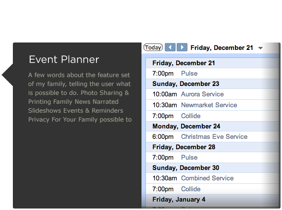
This 31three.com version of myfamily.com has an interesting use of icons sprinkled throughout the body text. If you roll over the calendar icon an informational overlay (very similar to a tooltip) is displayed – the latter one shows a graphic of what your potential calendar would look like when you sign up with myfamily.com. Notice the transparency effect and the arrow on the left side of the appearing block.

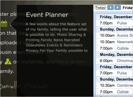
When a user mouses over the calendar icon, JavaScript is used to show a hidden div that contains a transparent .png-image. When your mouse moves away from the calendar icon, the div is hidden again. This particular example doesn't use a JavaScript framework like jQuery or Prototype, instead it uses two custom functions to hide and show the div accordingly.
Please notice that this code does not adher to good coding practices as it does not separate JavaScript functionality from the styling of the site. You should never include Javascript events as inline attributes and this example is rather a quick prototype. It is better to encapsulate the JavaScript code in a single .js-file and embed it on your web page using the <script>-tag. Read more in our article jQuery: Examples and Best Practices.
HTML
Javascript
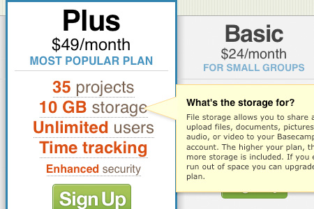
4. Product Highlighting #
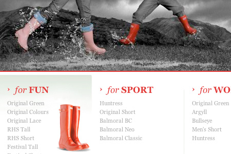
Basecamp, a 37signals product, chooses to highlight its most popular product plan in order to draw attention to it and hopefully create more conversions of visitors to customers. The featured product plan also has the added bonus of Javascript tooltips to offer more detail to the highlighted product features. Please notice that each link has its own tooltip that appears on the right hand side when a text link is hovered.

Featured Product Plans for Basecamp
The team at 37signals choose to use Prototype.js and CSS to achieve the tooltip effect, while relying on pure CSS to highlight the featured product plan. Each of the plans resides in its own div, with a class "short"; the highlighted plan replaces the short class with a class "tall".
The divs to the left and right of the highlighted plan have additional CSS classes added to them to provide shadows on their left and right hand sides to give the appearance that the featured plan is rising off the page. The Javascript, written using prototype.js, listens for each of the product features to be hovered over. When a feature is hovered over, the tooltips are all hidden, and then the appropriate tooltip is shown.
Product Plan Tooltips in Action
HTML (for the highlighted plan)
CSS
Javascript
37Signals created a custom class HoverObserver (see the .js-snippet) that uses the functionality from prototype.js. Note that there are other ways to achieve this same effect.
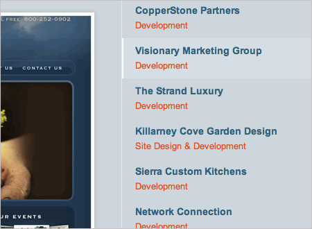
5. Sliding Menus #
The portfolio section at Clear Focus Designs contains a nice menu on the right hand side of the page that follows you as you scroll down. This sliding menu with JQuery and CSS is an effective way to display a long list of information and still present a constant navigation choice to website visitors.
This menu detects when the page scrolls and follows it
How Is It Done? #
This page uses a jQuery plugin called scrollFollow which allows a specified div to follow the page as the user scrolls through the page. In the Clear Focus Designs example, the right hand menu is being told by this plugin to follow the page.
HTML
Javascript
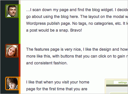
6. Authors “Flagging” #
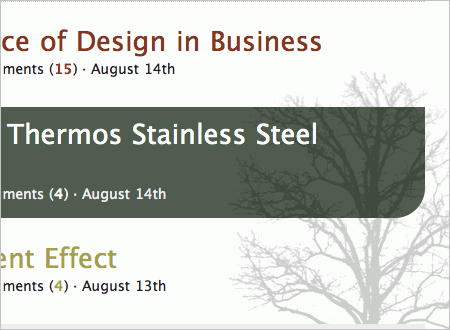
Placing avatars next to an individual’s post in a comment thread is quite a common practice. UxBooth (again) has taken comment flagging a step further by allowing a user’s thumbnail to float outside of his/her comments in the article. This allows a user to quickly scan the page and know who posted a response on that page. UxBooth does approach this method a little differently, as the article is written by several different authors. Using this ‘flagging’ method helps a user identify which author contributed which part of the article.
UxBooth’s Using comment ‘Flags’ to show which author wrote the comment
How Is It Done? #
On UxBooth, each author has his/her own div with a class named after the author. For example, the author, Andrew, has an author div with a class “author andrew”. The “author” class sets up the basic styling that is common among all authors comments. The div is placed in the document using the relative positioning within the document’s flow.
Inside of the div there is an image with a class of “avatar”. The “avatar” class is positioned absolutely within the relatively positioned parent-element (using the classic Making the absolute, relative-CSS-technique). The image is given a top value of 0, with a left value of -54px. Essentially, this technique sucks the image out of the content column and lays it over the container background color/image.
HTML
CSS
7. Archive Page Layouts #
Warpspire uses a different approach when it comes to the layout of their archive page. Instead of a long list, they’ve chosen to use a column approach underneath each month in the archive.
How Is It Done? #
Each entry in the archive contains a h3- and a p-tag inside of a listed item li. Each even numbered li is floated to the left, each odd numbered li is floated to the right. And that’s it – as simple as that.
HTML
CSS
8. Transparent Rounded Rollovers #
This is an example of another archive layout, this time from Particletree, which uses transparent pngs as article title rollover backgrounds.
Transparent Rollovers at ParticleTree
How Is It Done? #
Each article title is placed inside of a h3-element that has an anchor (a) inside. The a tag has a transparent .png-background image that has its background-position shifted on hover as well as a background color.
The .png-image is positioned to the right hand side and sits above the tree image. The background color fills the space between the two, creating the illusion of 3D-dimension (the content block appear to be in front of the “tree”-image). Each link also uses CSS-based rounded corners (using -moz-border-radius).
HTML
CSS
9. Blending Flash and CSS #
HunterBoot.com has wonderfully constructed black and white imagery on their homepage panel. This imagery is a part of a Flash movie that contains not only the imagery, but also nice hover-effects for the link lists at the bottom of the layout. See the screenshot below for a better understanding of what is going on structurally. When you mouse over one of the links in the four columns below the main image panel, you get a nice animated rollover in the background of that column.
How Is It Done? #
At first glance it appears that this is some type of jQuery plugin or something similar. However this is a pure CSS-based solution that uses Flash-elements for hover-effects. This technique starts out with some markup. There is a main div that contains the Flash movie (inside a containing div), then four distinct divs, one for each of the sections.
These four divs have a heading and then an unordered list containing the individual links. The main containing div is positioned relatively to its parent. These four URLs are positioned absolutely inside of the relative main container div – this puts the URLs on the top of the Flash movie. When you move your mouse over the four implied columns, this triggers a rollover animation in the Flash movie, because your mouse is actually over the Flash movie. Since the links sit above the Flash you can still click on them with no unfcomfortable side effects.
HTML
CSS
10. Popular Tags Graphs #
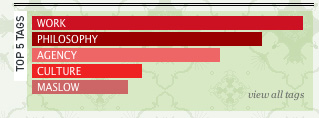
Ogilvy chooses to display their popular tags with a graph-like background (scroll all the way to the bottom to see the “Top 5 Tags”).
How Is It Done? #
The tag list is a simple unordered list; each list item has an inline style with a hard coded width given to it (not really a good coding solution). This seems like it is coming from a server side calculation and being outputted inline on the element. Oglivy uses PHP, but this could be done in pretty much any server side language, or it could even be done with JavaScript if necessary. Each of the li’s has its own background color and because they all have different widths this gives the appearance of a graph.
HTML
CSS
What coding solutions should we cover next? #
Please feel free to suggest interesting, unusual, creative, advanced techniques in the comments to this post! We’ll do our best to take a closer look at them and explain them in details in one of our upcoming posts!
Related posts #
You may be interested in the following related posts:


— Comments 67
Awesome! Excellent list, very useful.
Good list.. =)