Mastering CSS, Part 1: Styling Design Elements
And CSS isn’t nearly as tricky as some people tend to believe. Below are fresh tips and techniques for creating and styling design elements with CSS. They’re a good place to start if you’re new to CSS but are valuable even if you’re a veteran designer. Not all the techniques are strictly CSS; some include integration with JavaScript or XHTML to extend the functionality of your site.
Be sure to check out the following articles:
- Mastering CSS, Part 2: Advanced Techniques and Tools
- 50 New Useful CSS Techniques, Tutorials and Tools
- 50 Useful Coding Techniques (CSS Layouts, Visual Effects and Forms)
- The Future Of CSS Typography
1. Layout and User Interface Techniques
CSS is now the primary language used to create page layouts on modern websites. There are almost limitless possibilities for creating page layouts and user interfaces with CSS, but below are some of the more interesting techniques.
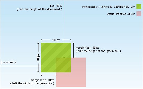
The simplest way to horizontally and vertically center a DIV This article covers centering a DIV, both vertically and horizontally, using CSS. While many code snippets out there show how to do this through the use of parent and child DIVs, this particular method uses a single DIV and is much simpler.
New CSS Sticky Footer - 2009 Here’s a sticky footer technique that’s completely cross-browser compatible. It even works in Google Chrome. And it doesn’t require an empty push DIV either.
Simple Page Peel Effect with jQuery and CSS This tutorial combines jQuery and CSS to create a page peel effect. Most sites using this effect are Flash-driven, so this is a nice alternative if you’re not crazy about using Flash (or don’t know how).

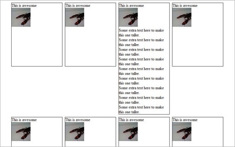
Equal height boxes with CSS Here’s a basic example of creating equal-height boxes (faux columns) using CSS. It works similarly to cells in a table, but without the messy table bits.
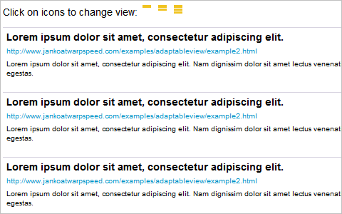
Adaptable view - how do they do it? Letting users manually change the way your site appears can greatly improve the site’s usability and the likelihood that users will have positive experience (and come back for more). This tutorial shows you how to implement adaptable viewing techniques for your site.
CSS: The All-Expandable Box Here’s a tutorial for creating a CSS box that will expand in all directions to fit the content contained within it, instead of just vertically. It works especially well if users increase the font size but making the entire box larger, instead of just shifting the content around and making the box longer vertically.
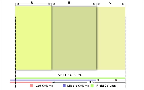
Four Methods to Create Equal Height Columns Here’s another tutorial for creating equal-height columns in CSS, this time covering four different techniques. The techniques covered work in all major browsers (even IE6).
Vertical Centering With CSS This post covers a variety of the best techniques for centering CSS elements vertically on a page. It also covers how to create a simple little vertically-centered website using the techniques.
CSS vertical center using float and clear Here’s another tutorial for creating a vertically-centered CSS box using float and clear. It even works in IE5 for the Mac, just in case.
Cross-Browser Inline-Block This tutorial covers how to create an inline-block layout that works with varying levels of content without breaking the layout.
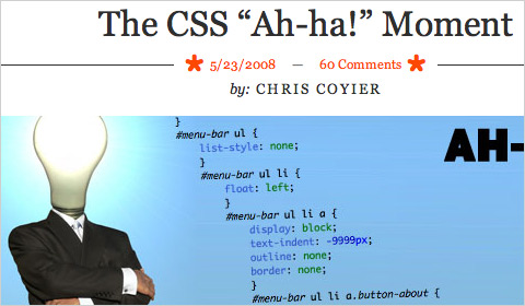
The CSS “Ah-ha!” Moment Here’s a post talking about the “Ah-Ha!” moment most designers have at some point in their careers, where some vital bit of design knowledge suddenly makes perfect sense. In this case, it’s the relationship of CSS boxes within a layout.
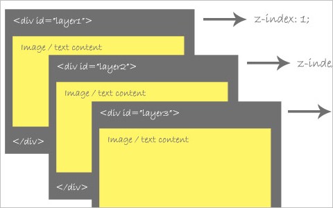
An Indepth Coverage On CSS Layers, Z-Index, Relative And Absolute Positioning This article gives a comprehensive overview of CSS layers, relative and absolute positioning, and Z-Index properties.
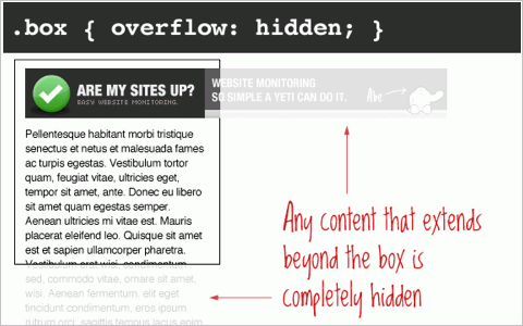
The CSS Overflow Property Here’s a complete run-down of how the different settings for the CSS overflow property work. It includes visible (the default), hidden, scroll, and auto, with illustrated examples of each.
Absolute, Relative, Fixed Positioning: How Do They Differ? The differences between absolute, relative, and fixed positioning with CSS can be confusing at times. This article shows the difference between each one and when it’s appropriate to use one or another.
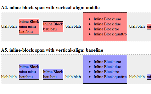
display: inline-block Here’s a cross-browser (mostly) compatible method of creating inline blocks in a variety of styles. There are some differences, though, between the vertical alignment interpretation between browsers.
2. Navigation and Menu Techniques
Good navigation is vital part of any website. Good navigation is both user-friendly and complements the rest of the site’s design elements. Below are some techniques and tips for creating navigation that does both.
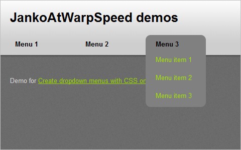
Create dropdown menus with CSS only A complete tutorial on creating CSS-based dropdown menus that behave like dropdown lists. It’s a short and easy-to-implement method.
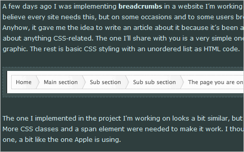
Simple scalable CSS based breadcrumbs Using breadcrumbs on your site can make it easier for your visitors to navigate. And this tutorial shows a method for creating scalable breadcrumbs using CSS.
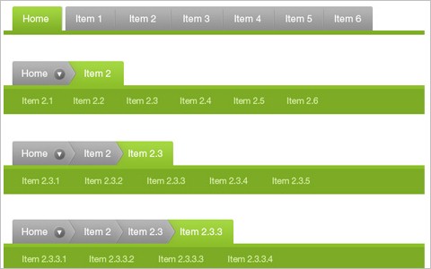
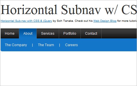
Horizontal Sub-nav with CSS and jQuery Here’s a complete tutorial on creating a horizontal navigation submenu using purely CSS (in most cases, anyway). If you want it to work in IE6, you’ll need to implement some jQuery, too.
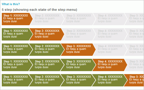
CSS Step Menu Creating a stepped menu (also referred to as a “wizard menu”) can be tricky, especially when it has to change the number of steps depending on what it’s being used for. Here’s an example of one with information on how to create your own.
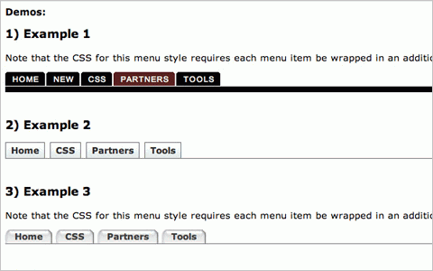
The Tabbed Breadcrumb Navigation A comprehensive tutorial on creating breadcrumb navigation formatted as tabs.
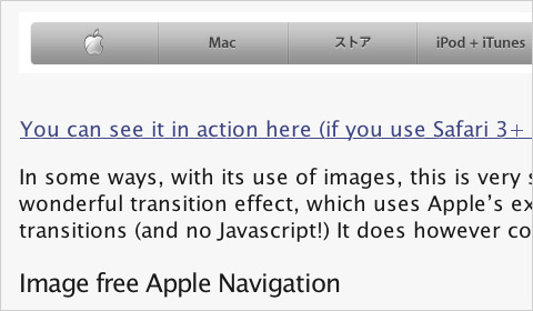
Apple’s Navigation bar using only CSS This tutorial shows how to create an Apple-like navigation bar using only CSS and HTML (with no images).
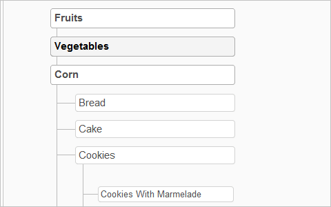
Sitemap Celebration Here’s a sitemap style that’s cross-browser compatible (even back to IE5 for the Mac) and based on nested lists.
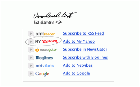
Nice CSS menu with feed reader icons list Create a menu of feed reader icons using CSS. It could easily be adapted to other types of menus.
Multi-level Menus with jQuery and CSS Here’s a collection of techniques for creating multi-level menus in pure CSS and CSS/JS. In addition to basic techniques, it also covers more advanced and creative examples.
3. Image Styles and Galleries
Styling of images is an oft-overlooked element of page design. The techniques and tips featured below should help you remedy that situation on any of the sites you’ve designed.
Centering images with CSS Some basic information on centering images using CSS instead of deprecated HTML.
Add a Custom “Trendy” Border Around Blog Images With CSS and JavaScript A complete rundown of how to create a variety of border styles around the images on your blog using both JavaScript and CSS.
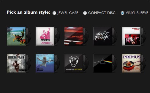
Sexy Music Album Overlays A great tutorial for adding a bit more style to any image gallery, though it uses an album cover gallery as an example.
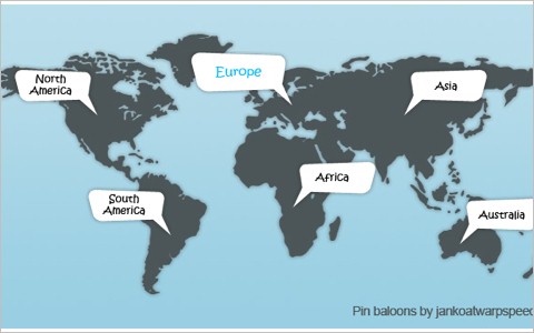
Create CSS pin balloons with ease This is an awesome technique for adding pin balloons or speech bubbles to an image or map that expand on rollover from an anchor point.
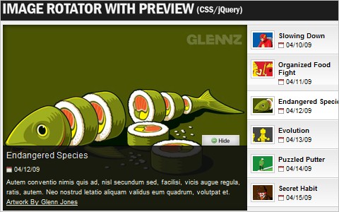
Create an Image Rotator with Description (CSS/jQuery) A great tutorial on how to create an image rotator/gallery using CSS and jQuery. It creates a clean UI for displaying a portfolio or general image gallery.
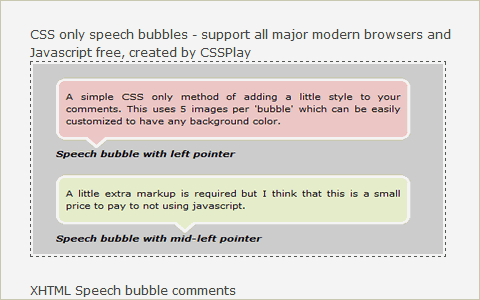
5 Popular CSS Speech Bubbles A collection of five different techniques for creating speech bubbles using CSS (some of them using only CSS).
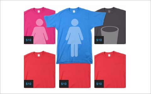
How to Make a Threadless Style T-Shirt Gallery A tutorial for creating an image gallery similar to the one on the Threadless website, with a caption or overlay on top of an image or thumbnail, among other features.
CSS image replacement for… images? It makes sense for print. (Ask the CSS Guy) Here’s a method for swapping special print- and screen-optimized images into your pages depending on the stylesheet being used.
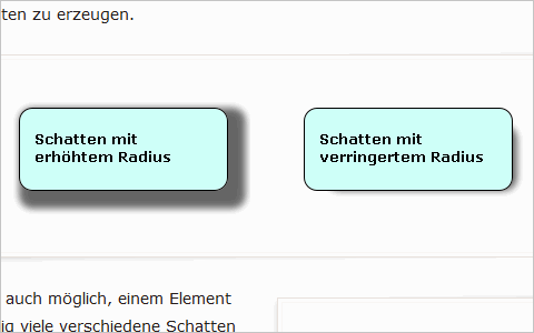
Beautiful new CSS: box-shadow (in German)
4. Typography Techniques
CSS really excels at typography styling. Everything from font type to weight to color is defined using CSS. Here are a number of tutorials to help you create better web typography.
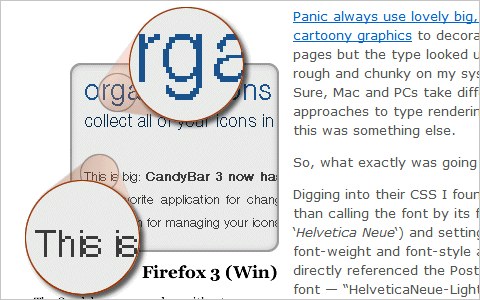
Truetype, Font Variants and Antialiasing A great article on some issues with using Truetype fonts and how they sometimes don’t show up as you had hoped (or planned).
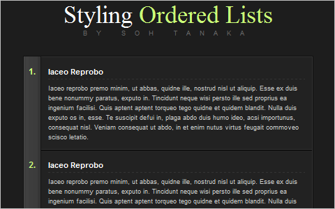
Styling Ordered Lists with CSS A tutorial for creating a very appealing ordered list with CSS.
Beautiful fonts with @font-face The basics of using @font-face for inserting truetype fonts within your designs.
Forgotten possibilities of :first-letter in CSS (in Russian)
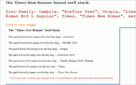
8 Definitive Web Font Stacks A collection of eight CSS font stacks that are based on the format of exact font, nearest alternative, platform-wide alternative(s), universal (cross-platform) choice(s), and generic. These are grouped depending on the impression they’re likely to give visitors.
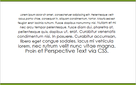
Mike’s Experiments - CSS: Perspective Text An interesting example of creating text with a perspective effect (so the bottom of a block of text looks closer than the top).
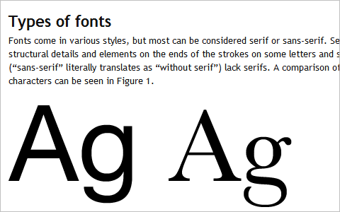
Fonts for web design: a primer A great guide to typography aimed specifically at web designers that includes an overview of the types of fonts, their appropriate uses, and the use of specialist typefaces for web design.
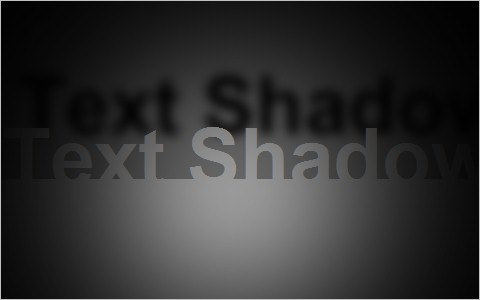
CSS text-shadow Fun: Realtime Lighting Demo A really neat example of using the text-shadow property combined with JavaScript to create a lighting demo.
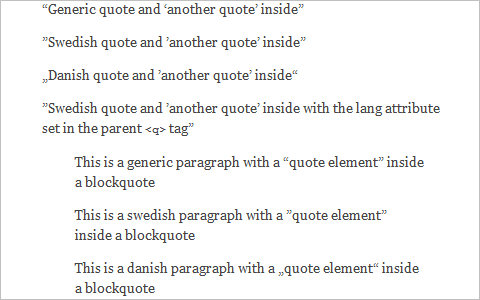
Rendering Quotes With CSS A guide to using quotation marks in CSS, including how to create standard quotes for different countries.
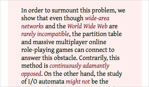
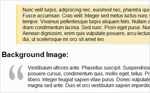
Six Ways to Style Blockquotes A tutorial of different methods for styling the blockquote XHTML tag with CSS.
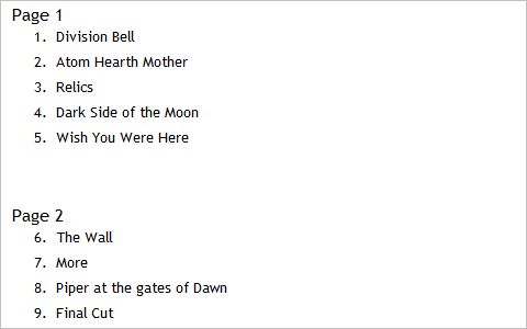
Make OL list start from number different than 1 using CSS A simple tutorial for starting an ordered list number from any number you want.
Use CSS to Override Default Text Selection Color Choose any color you want to become the text highlight color on your sites with this method.
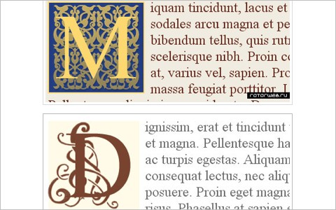
CSS Drop Cap Effect A drop cap can set your site apart, especially if it’s a magazine or book website (or otherwise related to the literary trades). Here’s a CSS method for creating them.
5. Icons, Buttons and Links
Icons, buttons and links are another overlooked element on many pages. But they can also make a huge impact on your overall design. Below are some resources for styling better ones.
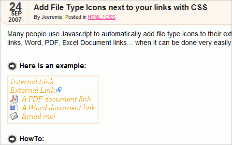
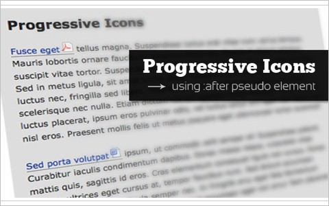
Add Progressive Icons to Your Site Using :after pseudo-element This tutorial shows how to use descriptive icons for your links, mainly to show the type of file being linked to (such as a PDF or ZIP archive).
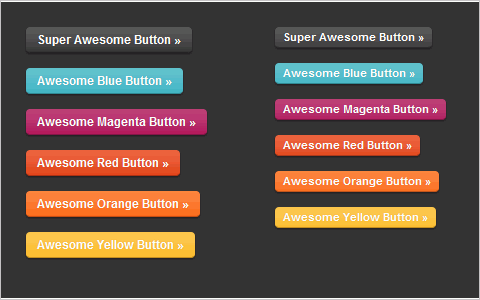
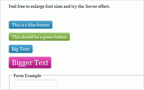
Super Awesome Buttons with CSS3 and RGBA A tutorial for creating great buttons using CSS3 and alpha-blending techniques.
Scalable CSS Buttons Using PNG and Background Colors A tutorial for creating buttons scalable both horizontally and vertically using PNG images. The technique degrades gracefully, so even users in IE6 will still see the button (just without the PNG).
Add File Type Icons next to your links with CSS Another tutorial for adding file type icons to your links.
22 CSS Button Styling Tutorials and Techniques Here’s a comprehensive resource list covering more than 20 techniques for creating buttons of all shapes and sizes with CSS.
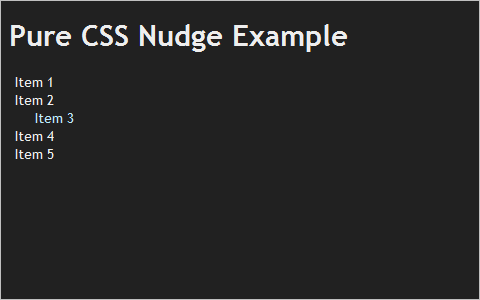
CSS Tricks’ Link Nudge A tutorial for creating links that nudge sideways when they’re hovered over.
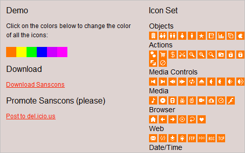
Sanscons This is an icon set that can be recolored using just CSS.


 Try ProtoPie AI free →


 Celebrating 10 million developers
 Register Free Now
