The Z-Index CSS Property: A Comprehensive Look
z-index so that you can use this special type of property confidently and effectively.Most CSS properties are quite simple to deal with. Often, applying a CSS property to an element in your markup will have instant results — as soon as you refresh the page, the value set for the property takes effect, and you see the result immediately. Other CSS properties, however, are a little more complex and will only work under a given set of circumstances.
The z-index property belongs to the latter group. It has undoubtedly caused as much confusion and frustration as any other CSS property. Ironically, however, when z-index is fully understood, it is a very easy property to use, and offers an effective method for overcoming many layout challenges.
In this article, we’ll explain exactly what z-index is, how it has been misunderstood, and we’ll discuss some practical uses for it. We’ll also describe some of the browser differences that can occur, particularly in previous versions of Internet Explorer and Firefox. This comprehensive look at z-index should provide developers with an excellent foundation to be able to use this property confidently and effectively.
Further Reading on SmashingMag:
- Sassy Z-Index Management For Complex Layouts
- Mastering CSS Principles: A Comprehensive Guide
- The Definitive Guide to Using Negative Margins
- Stronger, Better, Faster Design with CSS3
What is z-index?
The z-index property determines the stack level of an HTML element. The “stack level” refers to the element’s position on the Z axis (as opposed to the X axis or Y axis). A higher value means the element will be closer to the top of the stacking order. This stacking order runs perpendicular to the display, or viewport.
3-dimensional representation of the Z axis:
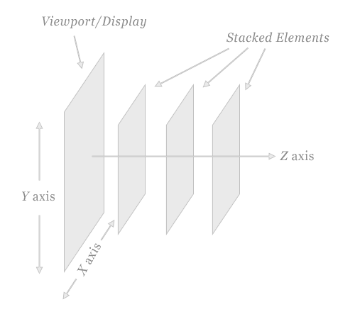
In order to clearly demonstrate how z-index works, the image above exaggerates the display of stacked elements in relation to the viewport.
The Natural Stacking Order
In an HTML page, the natural stacking order (i.e. the order of elements on the Z axis) is determined by a number of factors. Below is a list showing the order that items fit into a stacking context, starting with the bottom of the stack. This list assumes none of the items has z-index applied:
- Background and borders of the element that establish stacking context
- Elements with negative stacking contexts, in order of appearance
- Non-positioned, non-floated, block-level elements, in order of appearance
- Non-positioned, floated elements, in order of appearance
- Inline elements, in order of appearance
- Positioned elements, in order of appearance
The z-index property, when applied correctly, can change this natural stacking order.
Of course, the stacking order of elements is not evident unless elements are positioned to overlap one another. Thus, to see the natural stacking order, negative margins can be used as shown below:
Grey Box
Blue Box
Gold Box
The boxes above are given different background and border colors, and the last two are indented and given negative top margins so you can see the natural stacking order. The grey box appears first in the markup, the blue box second, and the gold box third. The applied negative margins clearly demonstrate this fact. These elements do not have z-index values set; their stacking order is the natural, or default, order. The overlaps that occur are due to the negative margins.
Why Does it Cause Confusion?
Although z-index is not a difficult property to understand, due to false assumptions it can cause confusion for beginning developers. This confusion occurs because z-index will only work on an element whose position property has been explicitly set to absolute, fixed, or relative.
To demonstrate that z-index only works on positioned elements, here are the same three boxes with z-index values applied to attempt to reverse their stacking order:
Grey Box
Blue Box
Gold Box
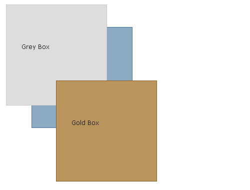
The grey box has a z-index value of "9999"; the blue box has a z-index value of "500"; and the gold box has a z-index value of "1". Logically, you would assume that the stacking order of these boxes should now be reversed. But that is not the case, because none of these elements has the position property set.
Here are the same boxes with position: relative added to each, and their z-index values maintained:
Grey Box
Blue Box
Gold Box
Now the result is as expected: The stacking order of the elements is reversed; the grey box overlaps the blue box, and the blue box overlaps the gold.
Syntax
The z-index property can affect the stack order of both block-level and inline elements, and is declared by a positive or negative integer value, or a value of auto. A value of auto gives the element the same stack order as its parent.
Here is the CSS code for the third example above, where the z-index property is applied correctly:
#grey_box {
  width: 200px;
  height: 200px;
  border: solid 1px #ccc;
  background: #ddd;
  position: relative;
  z-index: 9999;
}

#blue_box {
  width: 200px;
  height: 200px;
  border: solid 1px #4a7497;
  background: #8daac3;
  position: relative;
  z-index: 500;
}

#gold_box {
  width: 200px;
  height: 200px;
  border: solid 1px #8b6125;
  background: #ba945d;
  position: relative;
  z-index: 1;
}
Again, it cannot be stressed enough, especially for beginning CSS developers, that the z-index property will not work unless it is applied to a positioned element.
JavaScript Usage
If you want to affect the z-index value of an element dynamically via JavaScript, the syntax is similar to how most other CSS properties are accessed, using “camel casing” to replace hyphenated CSS properties, as in the code shown below:
var myElement = document.getElementById("gold_box");
myElement.style.position = "relative";
myElement.style.zIndex = "9999";
In the above code, the CSS syntax “z-index” becomes “zIndex”. Similarly, “background-color” becomes “backgroundColor”, “font-weight” becomes “fontWeight”, and so on.
Also, the position property is changed using the above code to again emphasize that z-index only works on elements that are positioned.
Improper Implementations in IE and Firefox
Under certain circumstances, there are some small inconsistencies in Internet Explorer versions 6 and 7 and Firefox version 2 with regards to the implementation of the z-index property.
<select> elements in IE6
In Internet Explorer 6, the <select> element is a windowed control, and so will always appear at the top of the stacking order regardless of natural stack order, position values, or z-index. This problem is illustrated in the screen capture below:
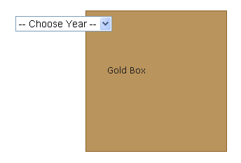
The <select> element appears first in the natural stack order and is given a z-index value of “1” along with a position value of “relative”. The gold box appears second in the stack order, and is given a z-index value of “9999”. Because of natural stack order and z-index values, the gold box should appear on top, which it does in all currently used browsers except IE6:
– Choose Year – 2009 2010 2011
Gold Box
Unless you’re viewing this page with IE6, you’ll see the gold box above overlapping the `
This bug in IE6 has caused problems with drop-down menus that fail to overlap <select> elements. One solution is to use JavaScript to temporarily hide the <select> element, then make it reappear when the overlapping menu disappears. Another solution involves using an <iframe>.
Positioned Parents in IE6/7
Internet Explorer versions 6 and 7 incorrectly reset the stacking context in relation to the nearest positioned ancestor element. To demonstrate this somewhat complicated bug, we’ll display two of the boxes again, but this time we’ll wrap the first box in a “positioned” element:
Grey Box
Blue Box
The grey box has a z-index value of "9999"; the blue box has a z-index value of "1" and both elements are positioned. Therefore, the correct implementation is to display the grey box on top of the blue box.
If you view this page in IE6 or IE7, you’ll see the blue box overlapping the grey box. This is caused by the positioned element wrapping the grey box. Those browsers incorrectly “reset” the stacking context in relation to the positioned parent, but this should not be the case. The grey box has a much higher z-index value, and should therefore be overlapping the blue box. All other browsers render this correctly.
Negative Values in Firefox 2
In Firefox version 2, a negative z-index value will position an element behind the stacking context instead of in front of the background and borders of the element that established the stacking context. Here is a screen capture displaying this bug in Firefox 2:
Below is the HTML version of the above screen capture, so if you view this page in Firefox 3 or another currently-used browser, you’ll see the proper implementation: The background of the grey box (which is the element that establishes the stacking context) appears below everything else, and the grey box’s inline text appears above the blue box, which agrees with the “natural stacking order” rules outlined earlier.
Grey Box
Blue Box
Gold Box
Showcase of Various Usage
Applying the z-index property to elements on a page can provide a quick solution to various layout challenges, and allows designers to be a little more creative with overlapping objects in their designs. Some of the practical and creative uses for the z-index property are discussed and shown below.
Overlapping Tabbed Navigation
The CTCOnlineCME website uses overlapping transparent PNG images with z-index applied to the “focused” tab, demonstrating practical use for this CSS property:

CSS Tooltips
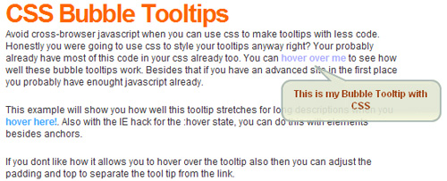
The z-index property can be used as part of a CSS-based tooltip, as shown in the example below from trentrichardson.com:
Light Box
There are dozens of quality light box scripts available for free use, such as the JQuery plugin FancyBox. Most, if not all of these scripts utilize the z-index property:
Light box scripts use a semi-opaque PNG image to darken the background, while bringing a new element, usually a window-like <div> to the foreground. The PNG overlay and the <div> both utilize z-index to ensure those two elements are above all others on the page.
Drop-Down Menus
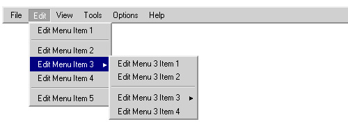
Drop down menus such as Brainjar’s classic Revenge of the Menu Bar use z-index to ensure the menu buttons and their drop-downs are at the top of the stack.
Photo Gallery Effects
A unique combination of JQuery animation and z-index can create a unique effect for use in a slideshow or photo gallery, as shown in the example below from the usejquery.com website:

Polaroid Photo Gallery by Chris Spooner utilizes some CSS3 enhancements combined with z-index to create a cool re-stacking effect on hover.
In this Fancy Thumbnail Hover Effect Soh Tanaka changes z-index values in a JQuery-based script:

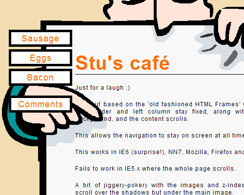
CSS Experiments by Stu Nicholls
Stu Nicholls describes a number of CSS experiments on his website CSSplay. Here are a few that make creative use of the z-index property:
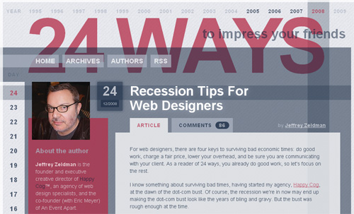
Layered Layout Enhancements
The 24 ways website implements z-index to enhance the site’s template, weaving year and date columns that stretch the length and width of the site’s content, for a very interesting effect.
Fancy Social Bookmarking Box
The Janko At Warp Speed site uses z-index in a “fancy share box”:

Perfect Full Page Background Image
This technique was described by Chris Coyier and used on the ringvemedia.com website. It implements z-index on content sections to ensure they appear above the “background” image, which is not a background image, but only mimics one:
Conclusion
Stacking contexts in CSS are a complex topic. This article did not attempt to discuss every detail on that topic, but instead has attempted to provide a solid discussion of how a web page’s stacking contexts are affected by z-index, which, when fully understood, becomes a powerful CSS property.
Beginning developers should now have a good understanding of this property and avoid some of the common problems that arise when trying to implement it. Additionally, advanced developers should have a stronger understanding of how proper use of z-index can provide solutions to countless layout issues and open doors to a number of creative possibilities in CSS design.


