Redesign: When To Relaunch The Site and Best Practices
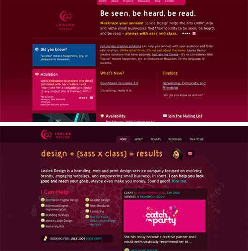 Why is doing a simple redesign so daunting? Why is it so difficult to follow through, even when we’ve decided to do it? How can we work on designing our clients’ websites successfully every day and then perpetually neglect our own?
The problem is both a lack of correct planning and a lack of understanding of the root need for the redesign. Once we’ve identified these elements, we’re set for success. In this article, we’ll discuss how to plan and execute a redesign, and how to find the perfect timing for it.
Why is doing a simple redesign so daunting? Why is it so difficult to follow through, even when we’ve decided to do it? How can we work on designing our clients’ websites successfully every day and then perpetually neglect our own?
The problem is both a lack of correct planning and a lack of understanding of the root need for the redesign. Once we’ve identified these elements, we’re set for success. In this article, we’ll discuss how to plan and execute a redesign, and how to find the perfect timing for it.Redesigning a website is a big job (needless to say) and should be handled with care. Many of us with a portfolio, blog or other website have probably thought about a redesign or at least know we need one. For many designers, though, that redesign never comes. As big and important as it is, the job can turn into a hugely daunting task that we put straight on the backburner of our to-do list.
Why is doing a simple redesign so daunting? Why is it so difficult to follow through, even when we’ve decided to do it? How can we work on designing our clients’ websites successfully every day and then perpetually neglect our own?
The problem is both a lack of correct planning and a lack of understanding of the root need for the redesign. Once we’ve identified these elements, we’re set for success. In this article, we’ll discuss how to plan and execute a redesign, and how to find the perfect timing for it.
Also consider our previous articles:
- From Russia With Love: Behind The Responsive Redesign Of Kremlin.ru
- How To Launch Anything
- Building An Effective ‘Coming Soon’ Page For Your Product
What’s All The Fuss About?
Every designer has their own clients and projects. Every day, the designer handles their clients and earns a living for their hard work. When they have spare time on their hands, they may work on side projects that help their personal growth or gain marketing exposure, or both. Sometimes, that side project is to update or maintain their portfolio.
To most, this schedule is all too familiar. The point being: we usually give our side projects a low priority, no matter how much we love them. Although we’d like to develop our website, our time is limited, and clients come first. It’s no wonder that we never find the time or energy to redesign that special side project of ours.
We usually manage to squeeze in time to work on our redesign, usually at the end of the day, in the hope of finishing it a bit at a time. This may seem viable at first, but trying to be productive at the end of a long, stressful day is no way to go about this effectively. We’ll often find ourselves thinking, “I’ll work on it tomorrow.”

Another reason we don’t follow through is that we can’t articulate why we need a redesign in the first place. What should be included, and what should the process look like? When we finally open Photoshop to get started, we realize we don’t know where to begin. All we know is that, for some reason, we are not satisfied with our current design. This leads us to our only tangible conclusion: the new design has to be better than the last.
And so we are never fully motivated to work on it: we get tired and confused and we put a lot of pressure on ourselves for perfection.
Understanding why we have failed, though, is the first step to success. Let’s look at how to combat all of these obstacles and get that redesign done. Let’s finally cross it off our to-do list, shall we?
Should You Do It At All?
Not every website should be redesigned—at least not at any given time. Being bored with your current design is no reason to change it. In fact, that’s a very poor reason. The purpose of a redesign is to improve usability, update the brand or take the website into a new era.
If you have no good reason for it, a redesign could actually be detrimental. Below are a few reasons why:
- People love consistency. We love consistency in the websites we visit every day. Whether your website has a large following or not, its design is tightly bound up with its identity and is, in fact, part of your branding. With a complete overhaul, would the website still be recognizable to those people? Would they love it just as much, and would it suit their tastes?
- Redesigns take time. Planning, designing, trying different things, detailing, development: this is all time taken out of your work day. The redesign may not be a paying job, but it can be worth it if it serves a clear purpose. If it’s needed, take the plunge; if not, why bother? Ultimately, don’t redesign out of boredom.
- With incorrect or careless planning, you could seriously impair usability or degrade elements. In trying to improve the design, we could very well be making it worse.
We crave a redesigning so much sometimes that we don’t consider its purpose or how a misguided attempt can lead our business astray. If your website could use a bit of cleaning up and not a complete overhaul, consider the option below.
Redesigning vs. Realigning
Cameron Moll wrote a popular article on A List Apart way back in 2005, and it is just as relevant today. Good Designers Redesign, Great Designers Realign compares people who constantly want to redesign their website and people who upgrade or “tweak” their website as necessary.
”…the differences between Redesigners and Realigners might be summarized as follows: The desire to redesign is aesthetic-driven, while the desire to realign is purpose-driven. One approach seeks merely to refresh, the other aims to fully reposition and may or may not include a full refresh.”
Check out the full article to see exactly what he means and for further arguments. Before undertaking a redesign, ask yourself, “Does this website need an entirely new look or just a few tweaks to make things look and function better?”
If you’ve decided that a complete redesign is not right for your website, then congratulations: you’ve just saved yourself a lot of time and unproductive work. You may have chosen instead to realign by updating the look of the website, adding interactive elements, improving user-friendliness or something else entirely. You may have chosen to cut things out and minimize the design to highlight the bare necessities.
If you’ve decided that a redesign is still necessary, which it could very well be, then the rest of this article discusses how to make it successful. The first phase is to plan adequately.
Finding The Right Time
Because a redesign will take up so much time, planning ahead for the project’s specifics and timeframe is important. A designer should create a timeline and set a schedule for their own project, just as they would for a client.

Redesigning Is A Project, Not A Chore
Don’t set up a schedule that allows you the excuse of, “I’ve done enough for today” or “I can do this tomorrow.” If you set aside two hours at 1:00 pm every working day, the redesign will get done. Make it a task of your working day, rather than a chore at the end.
Just as you allocate time for new clients, do the same for this project until it is completed. Once you have set aside time each day for it, be conscious of it and schedule other client projects accordingly. You may need to take on fewer clients during this phase, so be prepared financially as well.
What Time Is Best for the Website?
Finding the right time for the website is just as important as finding the time in your schedule. If you’re redesigning your portfolio, are you in the midst of pursuing any clients. If so, would seeing your website under construction scare them off?
Do you plan on any big changes, upgrades or features that could coincide with the redesign? For example, Smashing Magazine timed its redesign to coincide with the introduction of the Smashing Network, rather than just redesign the blog alone. Redesigning any sooner or later would have been pointless; the new feature made a greater impact by being a part of this other change.
Review your goals for the website and upcoming changes. Planning your redesign around them would probably be most effective.
The Planning Stage
To answer the “Where do I begin” question, we must plan appropriately and in sufficient detail. Without a plan, we’ll run into problems later on, causing us to make many fixes and perhaps give up. Or we might finish the redesign (or come close) and realize that it is not coming together as well as we had envisioned.
So, planning is essential. Below are the elements that need to be planned before starting the redesign or even sketching ideas on paper.
Content Requirements
At the beginning, many designers will start thinking about navigation placement, visual elements, the “feel” of the website and so on. For whatever reason, we don’t think of content first. But we should.
No matter how cool Web design is, content is still king. Good design helps, and so a good redesign will help, but it won’t keep the website alive. A redesign requires one to think about readability, imagery and detailed typography (e.g. tags such as pre, blockquote, ol, ul, etc.) first and foremost.
Assess the current website’s readability. It may be great, but could it be better? Even if it’s readable, look for weak points:
- Is there enough contrast?
- Do the alignment, baseline, line height and so on complement the design?
- Does the width of the content area help or hinder the readability of the content?
- If the design is flexible, at what point when it stretches or contracts does the content become illegible?
- Do style elements such as
preandblockquoteserve their purpose and stand out? - Is the font suited to the letter spacing you’ve set, and is it appropriate to your audience and industry?
- Even if readable, could the typography be enhanced by vertical rhythm, a typographic scale or something else?
For more information on many of these matters, check out 8 Simple Ways to Improve Typography In Your Designs.
Get out a notebook and thoroughly analyze the typography of your current design. Get feedback from others (both designers and non-designers) on readability, content placement and overall typographic appeal.
One more thing to consider for the content area is the type and size of your existing content. If images have always been a certain width, the content area’s width will need to be matched accordingly. Likewise, content inside pre tags will not naturally break to the next line or adjust to the new content area’s width (after all, that’s it purpose), so take that into consideration as well. Depending on the website, video, imagery and other multimedia may require a redesign to accommodate the content area’s width and position.
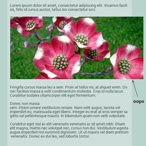
As a general rule, do not redesign the content area to be narrower than what it was before, otherwise a number of complications could arise. If a wide content area has compromised readability, though, approach the resizing systematically. Resize images and optimize content first, then do the redesign.
Back-End Requirements
This stage applies more to complex websites, websites that have WordPress themes or ones with automated content management. Because many designers have websites that fall into this category or are looking to upgrading their website to a more automated system of maintenance, this step in the plan must be considered.
Many websites have specific technical requirements, as well as features that need to be customized. When we did Webitect’s redesign, we forgot to plan for some such features, leaving us with a much longer conversion process than expected. Our previous theme used WordPress features such as excerpts and custom fields to help manage the content on the front page. By not planning for this, the new theme did not have these features implemented, and we were forced to manually customize each post accordingly. Situations like this need to be taken into consideration with other websites and planned accordingly.
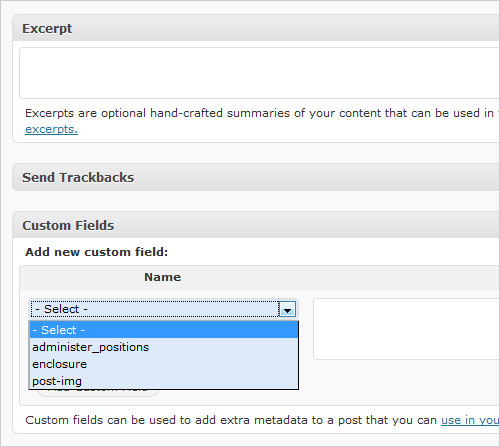
Giving specific examples is difficult because each website’s conditions are different. To aid the process, write down a list of special requirements that need to be implemented, so that the conversion to the new design is smooth and no features are forgotten. Taking the time to organize these specifics will save time down the road.
New and Updated Goals
A great redesign should account for how a website has developed since the last design was implemented. To correctly do so, one must analyze exactly how it has developed. What goals of the website have been achieved or expired, and what new goals need to be formulated?
If an new goal for the website is more user interactivity, a number of design elements could be implemented to achieve that result — in addition to all of the technical elements. Perhaps that means a better contact form, a more prominent “call to action” button or a more trustworthy design and color scheme to exude credibility.
With a redesign, we must start over, in a way, taking a fresh look at the website and where it needs to go. Below are a few resources on formulating and achieving your website goals.
- Define a Clear Goal for Your Website
- Reach Website Goals by Understanding the Customer Decision-Making Process (Part 1 of 2)
- Goal-Setting (About.com)
- Set Specific Goals to Increase Success
It’s About What Visitors Want
During the planning stage, consider what the visitors actually want. Conduct a poll, ask people directly, and especially ask those who have never visited the website before (via forums, community websites, etc.) for their fresh eyes.
Aside from asking visitors directly, you must understand your target audience. Many people do this during the planning phase of the initial design, and probably a few times throughout the course of the website’s life. However, a thorough in-depth analysis needs to be done again, and the redesign should reflect the interests of its users. Even for a website with a small audience, such as a portfolio, what kind of client is it currently attracting, and what kind do you want it to attract? Both questions should be considered to push a website in the right direction.
This is also the time to address any accessibility issues that the old design may have had. Think not only about what users want, but about what they need. Would the redesign benefit from a dark or light background? Would it benefit from larger or resizable text? What about a fixed or fluid design?
Optimizing
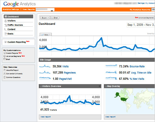
As a website evolves, so does its content and keywords and probably your business plan as a whole. A redesign requires a fresh look at optimization. What are people searching for to get to your website? Where are they coming from? Are they finding what they need?
Optimize keywords, content placement and other SEO-related elements. The redesign is a great time to overhaul the website’s optimization systematically, so that the new design enhances it, rather than gets in its way. It’s also a great time to plan for the website’s loading speed. If it was slow before, a good redesign would make it faster.
Redesign aside, this step will also help you better assess your current content and how it can be improved. Better content goes great with a new look.
Check out the resources below if you are unsure where to begin:
- Web Page Analyzer
- Best Practices for Speeding Up Your Website
- Google’s Search Engine Optimization (SEO)
- SEO Book
Review Competitors
After obtaining this preliminary information, it’s time to start thinking outside the box. A quick review of competitors’ websites can help. Needless to say, don’t copy them, but noting their strengths and deficits is a great way to build your own website.
What design features do these competitor websites use? What is their content like? And what do they highlight? You may want to use similar techniques in your redesign or draw new ideas based on what you’ve seen.
Draw a list of competitors and take proper notes in your research. It will help you better understand your own design style, where they’re lacking and even what their goals are.
Analyze the Current Design
Of course, we’ve been analyzing our current design all along in the steps above, but when you go through it again this time, note any minor details in the design and functionality that could be improved. Also write down random thoughts that you might build on later.
This is the brainstorming stage. After writing down as many ideas as possible, organize the list into actionable steps.
1. Updating Your Brand
Our notes are prepared and our research done, and we are now ready to begin the redesign. The first step in this phase is to examine our brand. Having prepared this much, we may find that our logo, color scheme, tag line and other elements need adjustment.
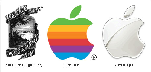
Of course, there is a difference between upgrading and re-doing a brand. Even upgrading a brand too much can do more harm than good. We’ll want to keep much of our brand the same (i.e. the general style, logo and message). But could we update it with any of the following?
- The logo should stay the same for the most part, but could it use a glossy makeover? If it was made years ago, technology and trends have changed; so while it should remain recognizable, it might benefit from a polishing.
- Examine your tag line, slogan or “elevator pitch.” Does it still match the purpose of the website today? Did it become outdated when you adjusted the goals of the website?
- Each website has its own style (e.g. creative, modern, sleek), and some websites mix styles. The design is a part of your brand. Going from a Web 2.0 style to a grunge style obviously wouldn’t make for an effective redesign. Whatever style you decide on will have to be in sync with your branding?
- Colors play a big role. You may want to cut down on or increase the colors, but your specific colors should stay the same. Perhaps you could introduce a complementary color, while still maintaining your others. Because color has such a big influence on mood and perception, the colors in the redesign should reflect your style and brand.
You’ll want to update your logo, too, including the overall look, the colors, and small details. Brainstorm on these elements, but always keep your updated brand in mind.
2. Wireframing
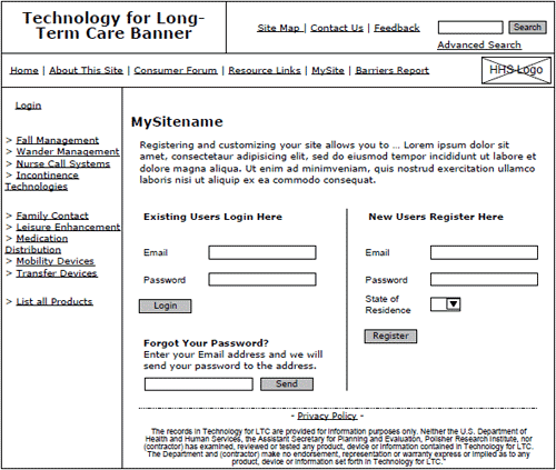
As designers, we know that wireframing ahead of time can yield better balance, alignment and visual hierarchy; and it is a great way to position everything early on without worrying about the details.
Site Map
At this stage, we can plan the site map. It may or may not be the same as before. As we continue in our steps, we begin to see that redesigning a website is not only about the design, but about usability, functionality and organization as well.
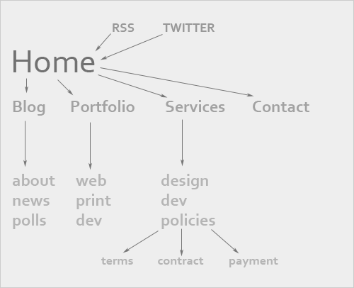
Begin with the home page, and work down through the primary navigation and on to secondary navigation. Various features will need to be added to certain pages (e.g. RSS link on the front page of the blog), so keep that in mind. Setting up a site map can aid in visualizing your content.
Without a site map, you can easily forget important content as you move to the wireframe, which would create problems down the road when you try to fit a certain element in somewhere.
The Wireframe Itself
Wireframing is definitely an art in itself, and it takes time and practice. It is one of the most important stages in the Web design process, so giving it due attention during the redesign is essential.
Working from your site map, create an initial wireframe that has everything you need. Then, improve upon a few of the ideas. Asking for second opinions on your wireframes can help as well. Ask your volunteers to point out the sections that stand out the most, the order in which they notice elements and the prominence of key features.
Because wireframing is a lot more involved than we can get into here, consult the list of resources below for assistance:
- Sitepoint’s Wireframe Your Site
- 16 Design Tools for Prototyping and Wireframing
- 35 Excellent Wireframing Resources
- Get Wireframing: The All-in-One Guide
- 20 Steps to Better Wireframing
3. Main Design
Now that we’ve planned and just begun redesigning our brand, we can move on to the exciting part: the actual website. Most of us who have given up our attempts to redesign in the past probably started the process at this stage. We opened Photoshop, chose a pretty color and gave up shortly thereafter.
Now, though, we are much better prepared:
- We have researched.
- We have worked out our branding, colors and style.
- We have laid down a wireframe.
Wow! We’re pretty much done—that is, at least with the boring stuff. At this point, we don’t have to stop the flow of our creativity to worry about technical details or about whether we’re doing it right or need to start over. We have it all planned out, and the plan is solid.
The only things to keep in mind for this phase are what we’ve already gone over. If your research spanned a few days or weeks, review what you’ve prepared. Print out the wireframe and site map and keep them on hand for reference. Start putting everything in place, and then go from there: add the design elements, detailing, alignment, balancing. Make the plan a reality.
4. Development And Testing
Finally, we’ve come to development and testing. Code the design (or outsource it) and make it fully functional. Mind the technical back-end requirements, as well as accessibility issues.
This process is fairly straightforward and needs no further explanation. If you stick to your plan, everything should run smoothly.
Testing and Review
Because we have transferred old content into a new design, we may find errors after we’ve completed the last step. In fact, we likely will. Use a link-checker to double-check all links, and check some manually. Test for speed, and optimize further if necessary. Double-check for validation one more time, and fix any behind-the-scenes errors.
This is also your last chance to ask volunteers to review your working version. You may have overlooked some accessibility issues, forgotten essential content or let some confusing elements slip in. Even with the most detailed planning, mistakes happen, and catching them before you launch is critical.
Your final testing should be thorough. You wouldn’t want to scare off your regular visitors.
One more thing to consider for the content area is the type and size of your existing content. If images have always been a certain width, the content area’s width will need to be matched accordingly. Likewise, content inside pre tags will not naturally break to the next line or adjust to the new content area’s width (after all, that’s it purpose), so take that into consideration as well. Depending on the website, video, imagery and other multimedia may require a redesign to accommodate the content area’s width and position.

As a general rule, do not redesign the content area to be narrower than what it was before, otherwise a number of complications could arise. If a wide content area has compromised readability, though, approach the resizing systematically. Resize images and optimize content first, then do the redesign.
Back-End Requirements
This stage applies more to complex websites, websites that have WordPress themes or ones with automated content management. Because many designers have websites that fall into this category or are looking to upgrading their website to a more automated system of maintenance, this step in the plan must be considered.
Many websites have specific technical requirements, as well as features that need to be customized. When we did Webitect’s redesign, we forgot to plan for some such features, leaving us with a much longer conversion process than expected. Our previous theme used WordPress features such as excerpts and custom fields to help manage the content on the front page. By not planning for this, the new theme did not have these features implemented, and we were forced to manually customize each post accordingly. Situations like this need to be taken into consideration with other websites and planned accordingly.

Giving specific examples is difficult because each website’s conditions are different. To aid the process, write down a list of special requirements that need to be implemented, so that the conversion to the new design is smooth and no features are forgotten. Taking the time to organize these specifics will save time down the road.
New and Updated Goals
A great redesign should account for how a website has developed since the last design was implemented. To correctly do so, one must analyze exactly how it has developed. What goals of the website have been achieved or expired, and what new goals need to be formulated?
If an new goal for the website is more user interactivity, a number of design elements could be implemented to achieve that result — in addition to all of the technical elements. Perhaps that means a better contact form, a more prominent “call to action” button or a more trustworthy design and color scheme to exude credibility.
With a redesign, we must start over, in a way, taking a fresh look at the website and where it needs to go. Below are a few resources on formulating and achieving your website goals.
- Define a Clear Goal for Your Website
- Reach Website Goals by Understanding the Customer Decision-Making Process (Part 1 of 2)
- Goal-Setting (About.com)
- Set Specific Goals to Increase Success
It’s About What Visitors Want
During the planning stage, consider what the visitors actually want. Conduct a poll, ask people directly, and especially ask those who have never visited the website before (via forums, community websites, etc.) for their fresh eyes.
Aside from asking visitors directly, you must understand your target audience. Many people do this during the planning phase of the initial design, and probably a few times throughout the course of the website’s life. However, a thorough in-depth analysis needs to be done again, and the redesign should reflect the interests of its users. Even for a website with a small audience, such as a portfolio, what kind of client is it currently attracting, and what kind do you want it to attract? Both questions should be considered to push a website in the right direction.
This is also the time to address any accessibility issues that the old design may have had. Think not only about what users want, but about what they need. Would the redesign benefit from a dark or light background? Would it benefit from larger or resizable text? What about a fixed or fluid design?

Optimizing
As a website evolves, so does its content and keywords and probably your business plan as a whole. A redesign requires a fresh look at optimization. What are people searching for to get to your website? Where are they coming from? Are they finding what they need?
Optimize keywords, content placement and other SEO-related elements. The redesign is a great time to overhaul the website’s optimization systematically, so that the new design enhances it, rather than gets in its way. It’s also a great time to plan for the website’s loading speed. If it was slow before, a good redesign would make it faster.
Redesign aside, this step will also help you better assess your current content and how it can be improved. Better content goes great with a new look.
Check out the resources below if you are unsure where to begin:
- Web Page Analyzer
- Best Practices for Speeding Up Your Website
- Google’s Search Engine Optimization (SEO)
- SEO Book
Review Competitors
After obtaining this preliminary information, it’s time to start thinking outside the box. A quick review of competitors’ websites can help. Needless to say, don’t copy them, but noting their strengths and deficits is a great way to build your own website.
What design features do these competitor websites use? What is their content like? And what do they highlight? You may want to use similar techniques in your redesign or draw new ideas based on what you’ve seen.
Draw a list of competitors and take proper notes in your research. It will help you better understand your own design style, where they’re lacking and even what their goals are.
Analyze the Current Design
Of course, we’ve been analyzing our current design all along in the steps above, but when you go through it again this time, note any minor details in the design and functionality that could be improved. Also write down random thoughts that you might build on later.
This is the brainstorming stage. After writing down as many ideas as possible, organize the list into actionable steps.
1. Updating Your Brand
Our notes are prepared and our research done, and we are now ready to begin the redesign. The first step in this phase is to examine our brand. Having prepared this much, we may find that our logo, color scheme, tag line and other elements need adjustment.

Of course, there is a difference between upgrading and re-doing a brand. Even upgrading a brand too much can do more harm than good. We’ll want to keep much of our brand the same (i.e. the general style, logo and message). But could we update it with any of the following?
- The logo should stay the same for the most part, but could it use a glossy makeover? If it was made years ago, technology and trends have changed; so while it should remain recognizable, it might benefit from a polishing.
- Examine your tag line, slogan or “elevator pitch.” Does it still match the purpose of the website today? Did it become outdated when you adjusted the goals of the website?
- Each website has its own style (e.g. creative, modern, sleek), and some websites mix styles. The design is a part of your brand. Going from a Web 2.0 style to a grunge style obviously wouldn’t make for an effective redesign. Whatever style you decide on will have to be in sync with your branding?
- Colors play a big role. You may want to cut down on or increase the colors, but your specific colors should stay the same. Perhaps you could introduce a complementary color, while still maintaining your others. Because color has such a big influence on mood and perception, the colors in the redesign should reflect your style and brand.
You’ll want to update your logo, too, including the overall look, the colors, and small details. Brainstorm on these elements, but always keep your updated brand in mind.
2. Wireframing
As designers, we know that wireframing ahead of time can yield better balance, alignment and visual hierarchy; and it is a great way to position everything early on without worrying about the details.
Site Map
At this stage, we can plan the site map. It may or may not be the same as before. As we continue in our steps, we begin to see that redesigning a website is not only about the design, but about usability, functionality and organization as well.

Begin with the home page, and work down through the primary navigation and on to secondary navigation. Various features will need to be added to certain pages (e.g. RSS link on the front page of the blog), so keep that in mind. Setting up a site map can aid in visualizing your content.
Without a site map, you can easily forget important content as you move to the wireframe, which would create problems down the road when you try to fit a certain element in somewhere.
The Wireframe Itself
Wireframing is definitely an art in itself, and it takes time and practice. It is one of the most important stages in the Web design process, so giving it due attention during the redesign is essential.
Working from your site map, create an initial wireframe that has everything you need. Then, improve upon a few of the ideas. Asking for second opinions on your wireframes can help as well. Ask your volunteers to point out the sections that stand out the most, the order in which they notice elements and the prominence of key features.
Because wireframing is a lot more involved than we can get into here, consult the list of resources below for assistance:
- Sitepoint’s Wireframe Your Site
- 16 Design Tools for Prototyping and Wireframing
- 35 Excellent Wireframing Resources
- Get Wireframing: The All-in-One Guide
- 20 Steps to Better Wireframing
3. Main Design
Now that we’ve planned and just begun redesigning our brand, we can move on to the exciting part: the actual website. Most of us who have given up our attempts to redesign in the past probably started the process at this stage. We opened Photoshop, chose a pretty color and gave up shortly thereafter.
Now, though, we are much better prepared:
- We have researched.
- We have worked out our branding, colors and style.
- We have laid down a wireframe.
Wow! We’re pretty much done—that is, at least with the boring stuff. At this point, we don’t have to stop the flow of our creativity to worry about technical details or about whether we’re doing it right or need to start over. We have it all planned out, and the plan is solid.
The only things to keep in mind for this phase are what we’ve already gone over. If your research spanned a few days or weeks, review what you’ve prepared. Print out the wireframe and site map and keep them on hand for reference. Start putting everything in place, and then go from there: add the design elements, detailing, alignment, balancing. Make the plan a reality.
4. Development And Testing
Finally, we’ve come to development and testing. Code the design (or outsource it) and make it fully functional. Mind the technical back-end requirements, as well as accessibility issues.
This process is fairly straightforward and needs no further explanation. If you stick to your plan, everything should run smoothly.
Testing and Review
Because we have transferred old content into a new design, we may find errors after we’ve completed the last step. In fact, we likely will. Use a link-checker to double-check all links, and check some manually. Test for speed, and optimize further if necessary. Double-check for validation one more time, and fix any behind-the-scenes errors.
This is also your last chance to ask volunteers to review your working version. You may have overlooked some accessibility issues, forgotten essential content or let some confusing elements slip in. Even with the most detailed planning, mistakes happen, and catching them before you launch is critical.
Your final testing should be thorough. You wouldn’t want to scare off your regular visitors.
Conclusion
As creative types, we constantly feel the need to redesign and improve our Web presence. Often, though, our website is good enough already, and we have to recognize that. The first best practice, then, is to consciously decide whether a redesign is needed at all.
If we decide that a redesign is needed, then we need to follow certain steps to ensure successful results. Without adequate preparation and a thorough analysis, even the best designers wouldn’t be able redesign their website effectively. It takes more than a great designer; it takes determination and organization. With these two characteristics, anyone can carry out the perfect redesign.
Further Resources
You may also be interested in these additional resources:
- How to Redesign a Website .NET magazine’s insight on redesigning also includes a debate on whether to redesign in the first place, as well as many common obstacles to overcome.
- 21 Factors to Consider Before a Redesign A great set of questions to ask yourself during the redesign process.
- Why Redesign Your Website The article highlights the main reasons why one should redesign, supporting some points that other designers have argued against.
- Redesigning Your Website: Who’s Taking Care of the Content? This article goes into depth on how we need to plan for the content before starting the redesign.
- 6 Things to Note Before Changing Your Site Design An article similar to the one you’re reading, but with a bit more technical insight and advice.


 SurveyJS: White-Label Survey Solution for Your JS App

 Agent Ready is the new Headless
