Incredible Black and White Typography
I love the use of different colors in design. Designs that use vibrant colors really attract my attention. I’ve definitely done my part in showcasing colorful designs.
Today, we will be focusing on black and white. In the world of design, black and white definitely have their place. Using black and white can definitely add a touch of class as well as a classical element to a design. Just take for instance, black and white movies. Because of the lack of color, these movies automatically generate a classic feel.
You may also want to take a look at the following related posts:
- Black and White Fractals That Capture Creativity
- Exquisite Black and White Photography
- Out of This World Typography
White
When using white in design, it signifies purity, innocence, minimalism, as well as a very clean feeling. White definitely goes well with any other color.
Black
On the other hand, black just always stands out. The reverse “print”, as some would call it, is very popular in newspaper ads because they attract the most attention. Black is bold, elegant, mysterious, sophisticated, but it can also convey a conservative feeling as well.
“If everything isn’t black and white, I say, why not?” - John Wayne
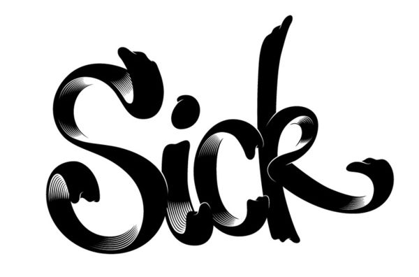
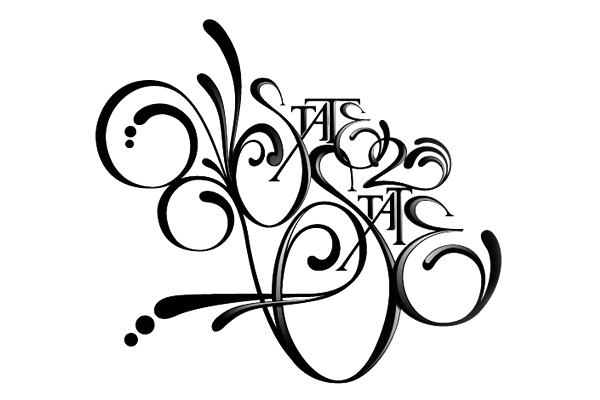
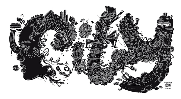
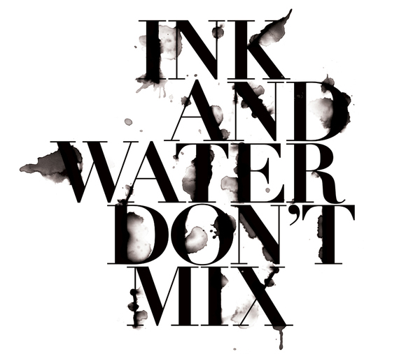
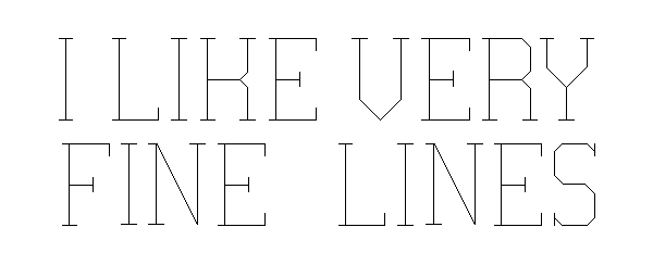
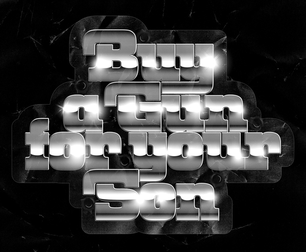
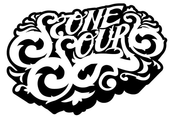
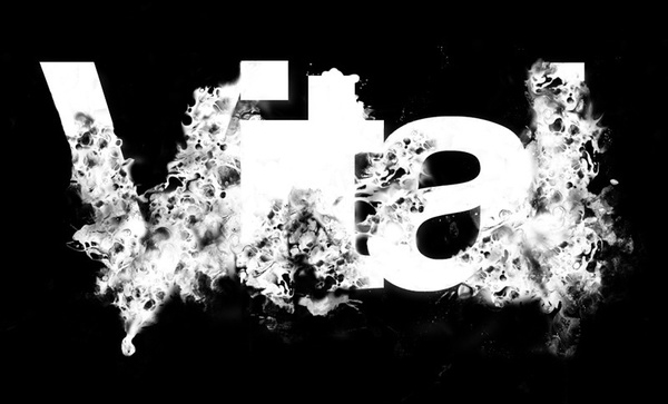
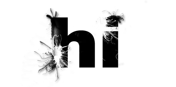
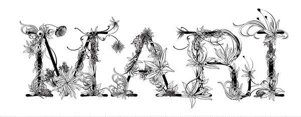
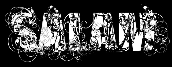
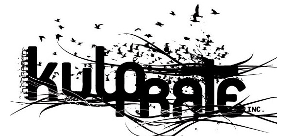
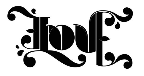
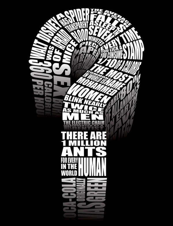
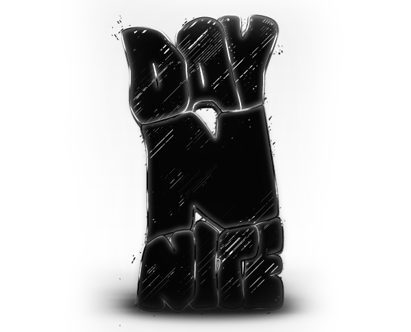
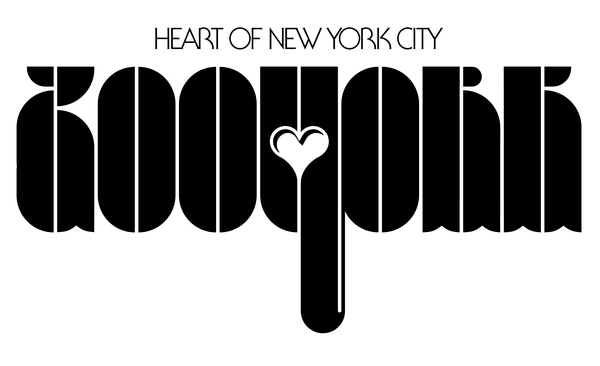
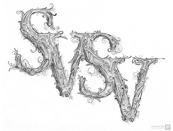
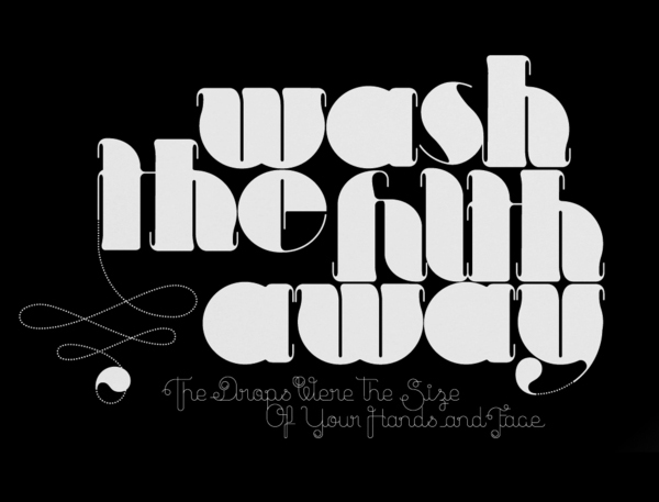
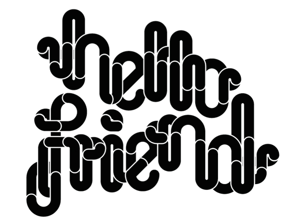
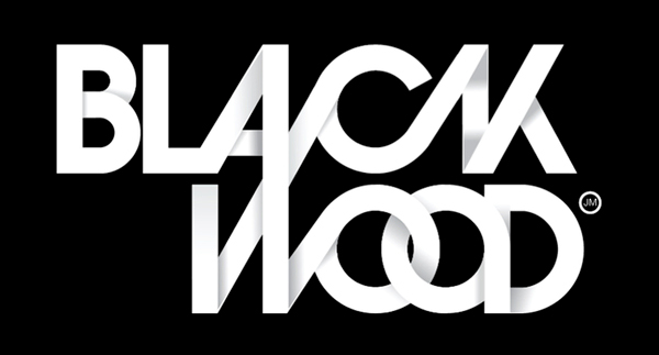
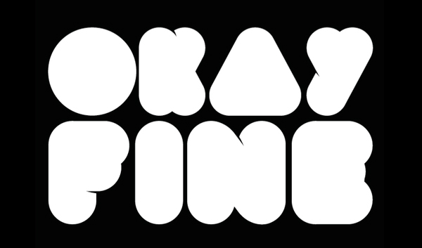
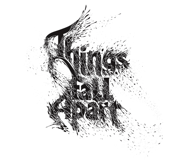
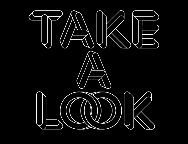
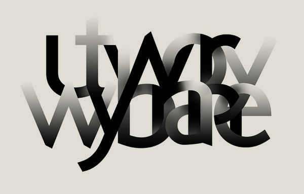
Let’s take a look at 50 incredible examples of black and white typography.
Note: Please click on the images to see them in their websites and to learn more about their artists.
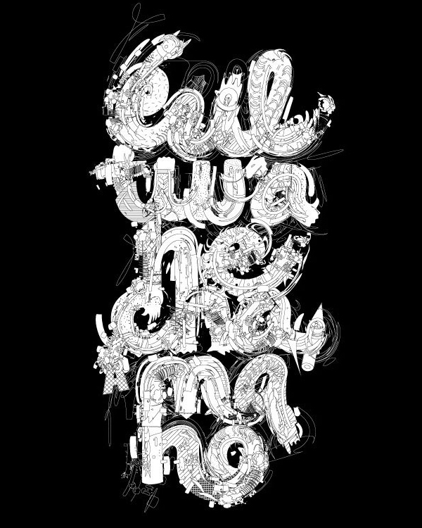
“There’s something strange and powerful about black-and-white imagery.”
So what are your thoughts about these typography pieces? Which ones are your favorite and why? Please make sure that you join in on the discussion and leave your thoughts below.
Well, thanks for viewing and if you liked this post, please stumble and bump it. You can follow me on twitter here.
wp-


 Celebrating 10 million developers
 SurveyJS: White-Label Survey Solution for Your JS App

 Register Free Now
