Principles Of Effective Search In E-Commerce Design
On the contrary, well-devised advanced search offers several benefits and can be more than just a clumsy, complicated tool. First of all, effective search can accelerate the sales process. And faster sales can increase conversions, because you will not be losing customers who give up trying to find products. Furthermore, fast, precise and successful searches increase your customers’ trust.
In this article, we will review how to build an interface that offers users the power of advanced search while preserving the clarity of simple search.
Also consider our previous articles:
- Search Results Design: Best Practices and Design Patterns
- Designing The Holy Search Box: Examples And Best Practices
- 15 Common Mistakes in E-Commerce Design
1. Dismantling Barriers
Although almost every e-commerce website has advanced search, visitors do not use it. First of all, people only use tools that they see. Advanced search is usually hard to detect. The link is usually too small and ugly, and so the flashy simple search button nearby overwhelms it. So even if the user was inclined to perform an advanced search, they have no motivation to do it.
The word itself is scary: “advanced.” It suggests we are about to encounter something complicated. And very often, we do. But even if we notice the advanced search link and are not intimidated by it, we don’t use it because we don’t see the benefit. The few who do use it see that once they perform the search, all “advanced-ness” is lost. So, to help our users exploit the power of advanced search, we have to fix usability problems, implement new approaches and improve our search terminology.
2. Approaches
There are several ways to enhance search. The classic approach for advanced search is parameter search. The user sets parameters using text boxes, operators and drop-down menus. When usability gurus tell you not to use advanced search, they are generally referring to this type. It usually has a complicated interface but can be very simple and effective if only the most important fields are shown and you stick to the basic guidelines of form design.

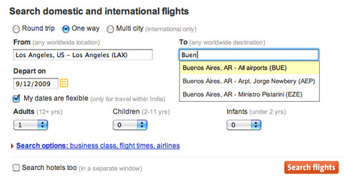
Momondo elegantly and effectively sticks to the most important input fields, making parameter search user-friendly.

Trulia’s parameter search is a bit more complicated but thoughtfully supported by input hints and prompts. Even more options are hidden under the “More search options” link for advanced users.
A good way to avoid intimidating people is to disguise the complexity of the parameter search. Show only snippets of the interface by using the responsive disclosure/responsive enabling pattern. When the user sets a parameter, they move along, and then the next filter is shown. This solution can be useful for guiding novice users, but it can bore and irritate advanced users.
![]()
On MyBankTracker, users have to select “Yes” for the “Compare your bank APY” option for the “What is your current APY?” question to be displayed.
Faceted search is becoming the de facto standard for e-commerce website. The user performs a simple search first, but then on the results page, they can narrow the search through a drill-down link (for a single choice) or a checkbox selection (for multiple non-overlapping choices).
This can be faster than the progressive disclosure/enabling pattern and easier to use than plain advanced search. Amazon takes a similar but slightly modified approach: when a user begins a search, they can set some narrowing filters like “Only books” at the very start.

Filtering on Amazon.

The search filtering on Plus+ is a bit more complex but still easy to use. Again, it is supported by input hints and prompts.
From here
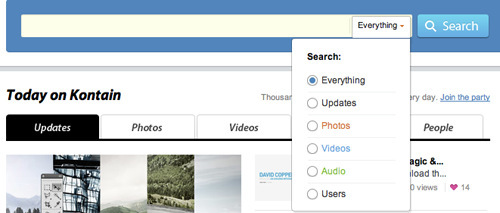
Kontain emphasizes the most important filtering options with different colors.
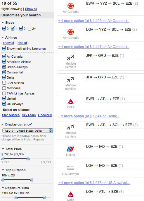
Travelers begin with a parameter search on Cleartrip but then find the best deal with faceted search.
Website maintainers may choose to tag products, or even let users tag them themselves. Tagging gives a website an overlapping taxonomy so that users have different ways to reach products.

After a user performs a keyword search, Issuu shows related tags to help the user narrow down the results. Note that the tags that are semantically closer to the search term have brighter colors.
3. Building Better Search
Faceted search is the easiest and now safest method by which developers can offer users advanced search functionality. But how to implement it?
Before undertaking something as time-consuming as that, make sure your website conforms to basic search usability principles. Is the search box in the right place? Does it work as expected?
The structure of the search results page must also be crystal clear. The results must be ranked in a logical order (i.e. for the user, not for you) by relevance. Users should be able to scan and comprehend the results easily. Queries should be easy to refine and resubmit, and the search results page should show the query itself.
Consider basic user needs and behavior when planning search. You could frame it as adopting an “incremental construction” pattern. Let users create their own search, step by step. People may not comprehend the whole system at once, but if you guide them gently, searching will be made easier. Make their exploration of search functionality safe: users should be reassured that they can undo any option and not lose their results or settings.

MyFonts allows users to control the complexity of their queries by using the - and + buttons to add and remove filters.
Your imagination may be a good start in defining which features deserve facets, but it is far from enough. Examine the traffic from your website and the search terms that users have typed into the simple search interface. Analyzing search query logs helps you handle spelling issues more effectively. Based on your analysis, you can also refine your auto-suggest system. What words, categories or taxonomy would describe these searches best? Use the most popular words in your search logs to label your facets and options.
Don’t forget to check your competitors’ categories either. Perhaps you would sort your products differently, but you may get good ideas from them. When you have sorted out your facets, test them with real users. Don’t just test the interface during the final phase; let users play with earlier versions as well.
4. Categorizing Products
Let users choose from among only the features that might influence their purchase. Omit features that are not important to users, even if you think they are. Features rarely chosen by customers should be put at the end of the list or hidden under a “More options” link.
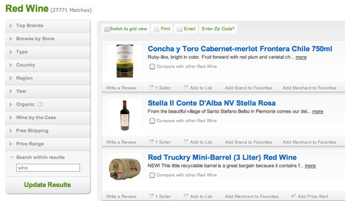
PriceGrabber allows users to control the complexity of their queries by using the - and + buttons to add and remove filters.
For your facets to work perfectly, you need a good taxonomy (categories). If users don’t understand your system, you lose. Don’t make users have to guess your system. Figure out their mental model of your product range first. The categories in your taxonomy should cover all products without overlap. For example, if a user can filter by color, do not omit colorless items in the results, or items for which color is irrelevant. Avoid vague words like “Other” and “More.” The category hierarchy should be shallow, so that users do not have to drill too deep to find a product.
5. Architecture Of Search
Although faceted search is much easier to use than the classic advanced search, it can become complex if too many facets are shown. Based on George A. Miller’s research, humans can deal adequately with 7 items, plus or minus 2. This short-term memory constraint also informs the popular recommendation of the number of items to include in a navigation menu. Don’t have more than 10 facets. Any more will confuse users, and the results will be about as helpful as the Dewey Decimal system.
Hide extra facets under a “More filters” link, even if you think they’re all important. Everything cannot be equally important. If you think certain facets will be important for one user group and other facets important for another, then create a drag-and-drop interface, and allow users to close facets. Letting them save results or facet settings is useful, too, but make sure unregistered users can do it as well.
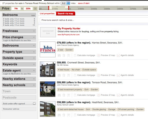
Globrix has many facets, but the interface can be cleaned up easily by closing unused ones.
Order facets by importance. Most users will use only a few. Display only filter values that apply to the inventory you have available. If a facet has more than seven or eight options, put the extra options under a “More options” link or a different panel.
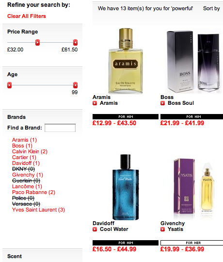
The Perfume Shop gives priority to age and price. Note that it also indicates what is available in a given price range.
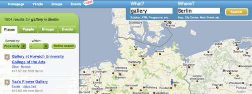
Rate My Area offers an unconventional combo input box to begin a search, but its role is communicated clearly. After performing a search, the user can access various facets in different panels.
Faceted search is still keyword-driven. If products would be easier to find by referring to categories or if users will have problems identifying their needs, then use filtered search or a well-designed parameter search. Faceted search is cool but not a cure-all.
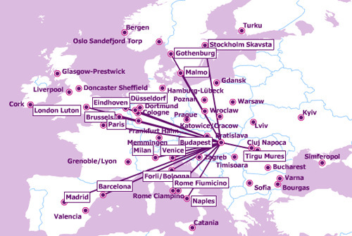
You do not have to type in your flight destination at Wizz Air. Simply select it from a map.
6. Enhancing Search
Whatever method you choose, you have several means of enhancing search. Do not automatically order the results page of the most frequent queries. Prioritize what you think best matches the search (i.e. the best bets). Add popular queries to the ones you’ve verified, and review the most popular results from time to time.
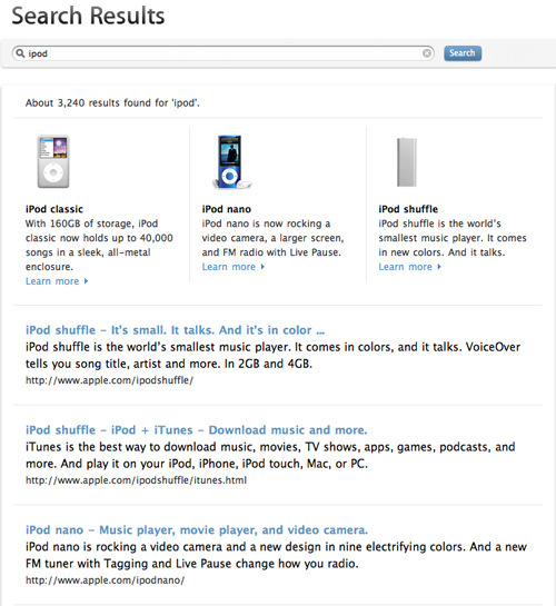
Apple puts what most users look for front and center. These best bets are supported with pictures.
Cluster results based on your or your users’ tags, or get clustering algorithms to do the job. Clustering groups search results into categories but must be implemented with a powerful algorithm that can compete (or at least cooperate) with human tagging.
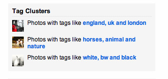
Tag clusters on Flickr group results.
Spell-check is also crucial. Many products have names that are hard to remember or type correctly. Users might think to correct their misspelling when they find poor results, but they will be annoyed at having to do that… or worse, they might think that the website either doesn’t work properly or does not have their product.
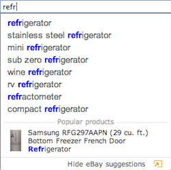
eBay helps users type complicated words.
Auto-suggestions can decrease the problems caused by mistyping or not knowing the proper terminology. Queries usually start with words, so unambiguous character inputting is crucial.
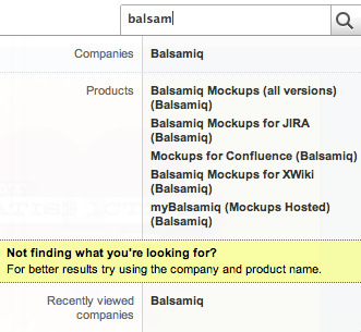
Get Satisfaction offers auto-suggestion that is easily scannable and structured.
If your results are somehow able to be localized in the real world, always show them on a map.
![]()
MyBankTracker shows its results on Google’s well-known map. The pins are fairly big so that users can see what’s on them, while the transparency maintains visual consistency.
7. Communication And Language
The success of your search depends heavily on your users’ understanding of what facets, filters and parameters do. Label them in easily understood language. Think about non-native English speakers as well. Communicate the benefits of advanced search clearly and concisely, and show visitors that advanced search helps them be more effective. Change the terrifying phrase “Advanced search” to something friendlier, like “Better search” or “Smart search.” If your advanced search functionality is integrated in the simple search area, just name the whole tool “Search.”
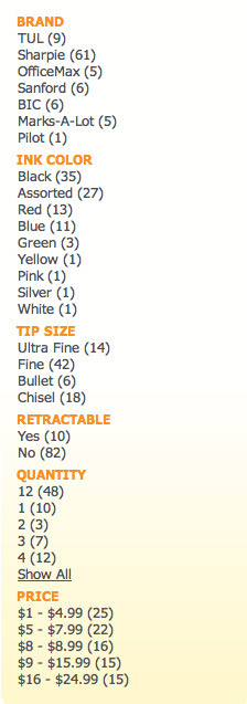
OfficeMax names labels facets in simple and unambiguous language.
8. Grouping And Alignment
Group similar items and separate different items clearly. Indicate what is selected or not selected. Use a “Select” button that turns into an “Unselect” button when the user selects something, rather than a “Select all” checkbox (after checking “Select all,” the user might want to check other boxes, in which case the system might not behave consistently). When you arrange items in a facet, think of what would be the most common workflow for using the facet.
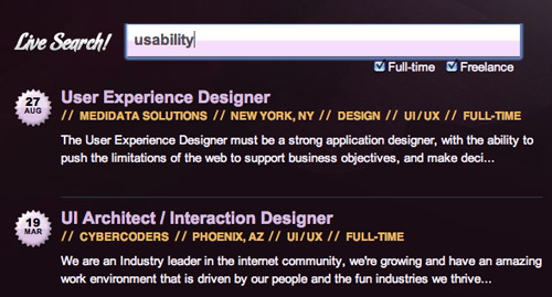
Your Web Job provides checkboxes for narrowing a search. The page has no search button; when the user finishes typing, the search begins. Although this way of handling search is unconventional, it works because the feature is fast.
Several interface patterns are available to make search more usable. Titled sections can effectively separate facets. Use bigger font for titles, and position them close to the content. Allow panels to be closed and moved. Align labels flush with input fields to make them more scannable, even when they vary in length. If you have a lot of facets or if the filters on the search results page have many options, you can arrange them using card stacks. But beware, information that users manipulate in one card won’t be visible when they manipulate another. They may forget their settings or assume that search results will be based on the last-manipulated facet and that earlier filtering has been undone.
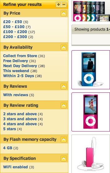
Comet lets users narrow their searches by clicking on facet links. Users can close and add facets, and the groupings show unambiguously what belongs to which facet. Note that Comet shows the number of items in a category beside each link.
Diagonal balance and a liquid layout make a search interface more usable. If users are able to change the size of the search interface, be aware of what happens to labels and values in drop-down lists when the size is set very small. Beautiful interfaces can fall apart if their behavior is not tested at many screen resolutions. And don’t forget about mobile users, even if you don’t have a mobile version yet.
Buttons play an important role in a search interface. Have as few as possible, but anything that triggers an action should be a button. Do not disguise such functionality with a non-button-like element. Label meaningfully; avoid vague words like “Okay” and “Done.” Make buttons stand out on the page so that users see them when they’ve finished what they’re doing. Place buttons at the end of workflows. Do not put anything that can modify the results of a button-triggered action after the button.
9. Forms And Controls
The design of facets is up to you. Text boxes and drop-down lists are usually more than enough, but you might want to use other things that can make forms and controls more usable.
Choose sensible defaults for radio buttons and drop-down lists. Also, illustrations often convey information much better than words. For example, illustrating types of mobile phones is much less clumsier than describing them. Forgiving formats and structured formats help users input useful queries. Forgiving formats give users flexibility in entering data, while structured formats help them enter data more precisely.
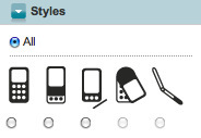
Vodafone uses simple yet attractive icons to help users choose quickly.
Input prompts tell users what to do or type in a field, whereas input hints explain to users what they are expected to input in a field. Use them wisely: input prompts can be deleted, and too many input hints will annoy users. Also, the visual clutter might make them simply ignore important information.
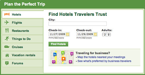
TripAdvisor uses input hints, illustrated options and sensible defaults to enhance the usability of its parameter search.
10. Handling Results
Use dynamic filtering where possible. Users want immediate results, so don’t disappoint. If dynamic filtering would make your architecture too slow, consider reprogramming the page or narrowing the number of options. It might be worth it.
Show the number of actual results as well as the number of results the user would get if they were to filter by some other options. “List” and “tiled” are the basic views, but alternative views could help users scan results more easily.
11. Conclusion
Contrary to widespread belief, advanced search is not an old lumbering monster of the past. If usability is taken into account and key structural and conceptual modifications are made, it can be an effective tool for increasing conversions and helping your users access more products. Of course, not every e-commerce website needs advanced search. You may have too few products or your products may be unique and hard to categorize. Advanced or faceted search is more useful when you have a wide variety of products.
Showcase of Effective Search Interfaces
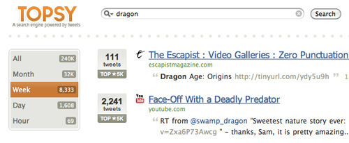
_Topsy implements just one facet, but the visual accents are effective._

Collabfinder helps users with input hints in the parameter search.

Firefox combines parameter search with faceted search in a complex but easy-to-use interface.
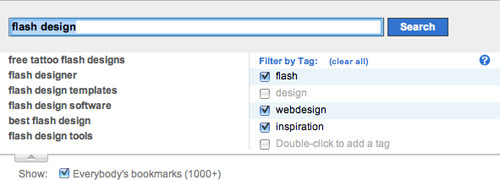
Delicious allows filtering by tags and auto-suggests during searches.
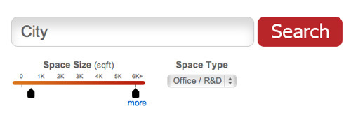
Rofo implements a slider and drop-down menu in its filtered search. Users can refine their search results with facets, too.
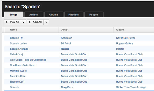
Grooveshark filters by tabs. It could have used a drop-down menu, but this solution lets users see all of their options at once.
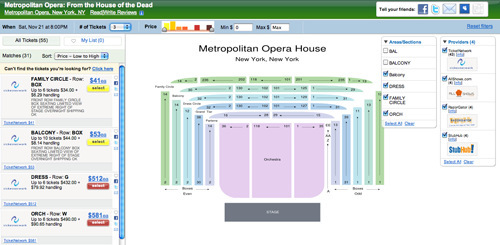
FanSnap uses illustrations and good defaults to handle complex data. Putting the search results on the left is a bit unusual, but good visual highlighting helps users understand the role of each tool.

A simple yet elegant implementation of filtered search by The Dubai Mall.
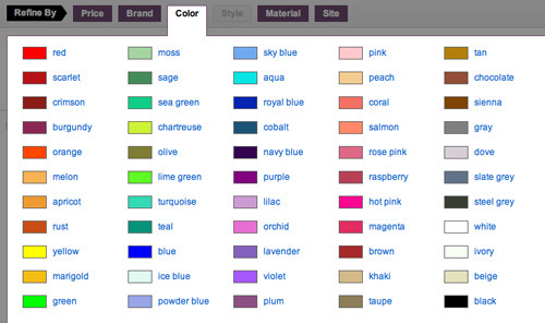
Like.com includes a color-picker panel as part of its filtering options. The visual samples help, because color names have different meanings for different people.


 Agent Ready is the new Headless
 SurveyJS: White-Label Survey Solution for Your JS App

