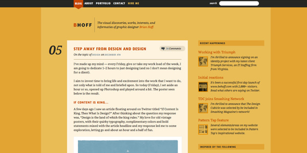
Ask the Expert: Typography Talk with Brian Hoff
Ask the Expert is a weekly series here on Design Informer. For this week’s theme, we will be talking about typography. Brian Hoff is this week’s expert.
Brian is a graphic designer from the always-sunny Philadelphia. He collaborates mostly on corporate identity and branding, but is also experienced in building all kinds of quality, strategic design, both in print and on the web.
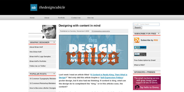
In addition to his design services, he also writes for the popular graphic design and creative business blog, The Design Cubicle. The blog not only teaches, inspires and helps other designers, but also focuses on client education and design awareness, while showcasing his work, creative processes, and personal practices.
Typography Talk
Jad: Hi Brian, it’s good to have you as a guest on the Design Informer. Thanks for agreeing to do the interview. Let’s get started. What is typography?
Typography is about knowing when and how to use type and its many faces and how to articulate it on a blank page to allow for a better visual communication in the form of letters, numbers and characters. It’s an understanding of, for example, when to use certain fonts, how big they should be, how words and blocks of text should be aligned, formed, spaced, ordered, etc.
Jad: How important is typography in graphic and web design?Typography is extremely important no matter what the medium. In school typography was always one of the last elements of design that students, including myself, learned and understood, but once understood can really set you apart from others. Great design can be lost with bad typography.
Jad: I’m going to give you a few words. What are the fonts that come to your mind when you hear each word?- Bold: Knockout Sumo - This font is a dense beauty.
- Classy: Goudy Old Style - I love the super classy ampersand!
- Rough: I had to think about this one for a few, but maybe Interstate with it’s sharp ends. (It might rough someone one up!)
- Playful: Bello - It’s a playful, chunky script with fun swashes and ligatures.
- Ugly: Type… ugly? I’ve never seen such a thing! :)
- On Web Typography by Jason Santa Maria
- Type-Inspired Interfaces by Dan Mall
Jad: What resources can you recommend to those who are really looking to further their knowledge of typography? Books? Articles?
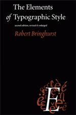
In addition to the articles above, The Elements of Typographic Style is pure genius and a must have for anyone interested in learning about typography, typefaces, type history, font pairing, and more valuable typography-related information.
Other resources include:
- Thinking with Type by Ellen Lupton (book)
- Getting It Right With Type by Victoria Squire (book)
- The Elements of Typographic Style Applied to the Web (website)
- Typedia: A Shared Encyclopedia of Typefaces (website)
- WeLoveTypography: great for looking at tons of great typography (website)
Jad: What is your favorite typeface? Wow, difficult question! For the past few months I've been fixated on FF Absara (even has a complimentary sans version), but I'm sure that will change once I lay my eyes on a new beauty.Jad: What is your favorite quote about typography?
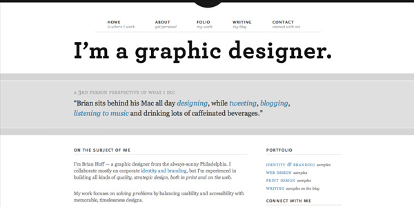
"Make it bigger."—Paula Scher discussing amateurs making their type too large.Jad: You mentioned in one of your articles that it is very important for designers to purchase typefaces and build their collection. How many typefaces have you purchased? What do you plan on purchasing next? 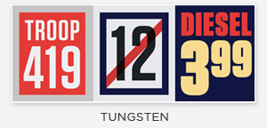 Through client projects and personal purchases I've probably acquired around 30+ quality fonts (not entire families) in the past 6-7 years. I try to buy around 5 a year and with the holidays among us may be buying some new ones very soon. I have my eyes on you, Tungsten!Jad: Can you explain the difference between a typeface and a font? In short, a typeface is the name, such as Helvetica or Georgia, and a font refers to the style, such as bold or roman.Jad: Name three of the most common typography mistakes that you see people make on the web. 1. **Tight line-heights of body copy.** Solution: Try setting line-height to around 1.5em of the body copy font size. 2. **Not letter-spacing all caps or small caps.** Solution: Try adding 1px of letter-spacing which helps to improve readability. 3. **Bad layout and flow to text.** Solution: Plan your content in advance.Jad: Please name some rules that you follow when setting type for the web. Here's a link to an article I wrote, Typography is the backbone of good web design, that covers many of the rules I follow in the creation of my information portfolio site, brianhoff.net.
Jad: I'm going out on a limb here. Can you name some ways that I can improve the typography here on Design Informer? At first glance, readability looks good... breathing room looks good. The only thing I might consider is the width of your body copy blocks. Since you are using a smaller sans serif for the copy the lines tend to run a bit long horizontally, which could inhibit readably a bit. Try possibly increasing the copy size by a single point size (not too much) to have less characters on one line or making the width of your article area smaller — but this is just me being nit-picky! **Note:** I will make the changes to the site in a few days. I didn't want to make the changes yet so you can see what Brian was talking about.Jad: Thank you very much for the tip! Please give us your final thoughts/advice for those who want to become experts at typography? In my opinion, as the same as all aspects of design, you have to study and surround yourself with it as much as possible. This is not a field that when you leave school you stop learning. Embrace design.
Conclusion
I just want to thank Brian for doing this interview. I really appreciate the fact that he took time from his busy schedule to give detailed, well thought out answers to the interview questions.
The next topic will be another interesting and helpful one. We have a very talented web designer for the next interview. I don’t want to give out too much details yet, so please stay tuned. You can follow me on Twitter and subscribe to the RSS feed here.


 Agent Ready is the new Headless


 SurveyJS: White-Label Survey Solution for Your JS App