Ask the Expert: Design Discussion With James White
His personal art and design ambitions has landed him in many worldwide creative publications such as Computer Arts magazine, Computer Arts Projects, Advanced Photoshop magazine, Wired UK and the spanish DT Platinum magazine where he was included in their ‘21 People of the Century’ article. Additionally, James was also named as the Best Visual Artist in The Coast’s ‘Best of Halifax 2009’ readers poll. James White also maintains a popular design and inspiration blog called Signalnoise.
James White and the Design Process
Jad: James, first of all just wanted to thank you for doing this interview. I absolutely love your designs. Let’s get started. Can you give us a little background of your training in design? How did you get started with it all?
James: Thanks very much for the opportunity to speak to your readers! My creative side started very early on, as soon as I could hold a pencil at the age of 4. I didn’t stop drawing all through school and upon graduation of grade 12, I enrolled in graphic design at a local community college in my hometown, this was 1995. I learned all the basics there, including using Photoshop and Illustrator for the first time. After that I took 2 years of interactive technology in 1997 where I learned how to make websites, CD-Roms and other technology… new at the time. :) Upon graduation in 1998, I was swept up into the web boom and have been working in the industry ever since.
Jad: Now, on to the design process. Do you think that sketching on paper first is necessary, or do you just jump straight into Photoshop or Illustrator?
“Sketching is where everything needs to start.”
James: I have a couple of sketch books on the go all the time, whether it’s planning a current project or jotting down ideas on the fly. To plan out a specific poster design, I might sketch 40 thumbnails before landing on something I’m confident with before moving to the computer.
The power of sketching is:
- Getting ideas out quickly.
- Pre-planning how the composition will be built.
There are times when I jump to the computer too quickly and get mired in Photoshop trickery where I should be concentrating on the concept itself. So I’ve found the best thing to do is go to my local watering hole with a sketchbook and draw for an hour or two away from the computer. I’m normally armed with a few choice books of inspiration to keep different ideas flowing.

Colors
Jad: You have pretty much mastered the use of color in your designs. The colors in your design are bright, bold, and vibrant. How important is choosing the right colors in design? With pretty much an unlimited choice, how do you determine what colors will work on your designs?
James: That’s a very difficult aspect of my work to nail, and it’s an element that shifts and changes as I build each piece. Under normal circumstances, I have a very general idea of the palette I would like to use, but that inevitably changes as I start experimenting with my overlays. Typically, my colors start with simple gradient overlays which I duplicate over and over and adjust opacities and blending modes. Each time I alter a given color layer it throws the entire palette into a new direction, which 9 times out of 10 looks terrible.
“But I enjoy looking for that one happy mistake that breaths new life into the color palette.”
I’ve worked on a few pieces where the colors turned out completely different then I intended, but this is a result of my organic process of trial and error. It’s all about watching what happens with color and making sure it benefits the design while not overblowing or taking over.
Jad: Your work definitely stands out from the crowd with the use of prismic colors. What inspired you to start using these colors?
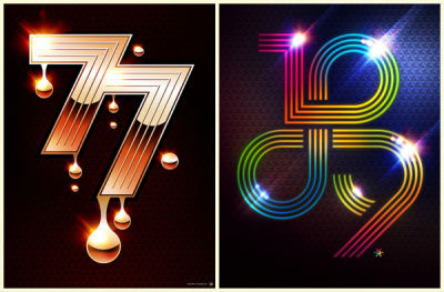
James: I’m very inspired by things from my childhood, the greatest of which is old television logo animations aired during the late 70s and early 80s. The motion graphics people back then couldn’t rely on fancy computers to create their effects, so they had to create most everything by hand in order to make their logo stand out from the crowd. In terms of color choice, my biggest influence is the NBC peacock. NBC always had the brightest colors onscreen with a logo that included the full spectrum, certainly a huge influence on me and my work.
Retro–Futurism
Jad: Most of the great designers that I know have a certain style that they are known for. Most people would classify your work as retro–futurism. Would you agree with that? What is retro–futurism anyway?
James: The majority of my influences stem from the past’s interpretation of the future. When you look back at design (whether it’s motion or static) where a specific time period is trying to visualize the future, it is always bright and optimistic full of fancy colors, bright lights and ’state of the art’ imagery. As time passes, those futuristic representations become part of the era when they were created, which is kind of opposite of what the image was intended to be.
My work is created in the ’now’, but is made in a way to mimic the past’s interpretation of what the future might be like. I’m very fascinated with that idea, and ’retro–futurism’ seems to be a pretty suitable name. I started calling my work ’retro–cosmic’ a while back as a fun nickname because I use so many themes from outer space and science fiction.
Jad: What advice can you give us that can help us create some awesome, retro–futuristic art?
James: Research! If you have an interest in that kind of style, don’t look at my stuff. :) Check out the real deal like old magazine ads from the 70s, Atari video game covers, television network id animations, Swiss poster design, special effects in sci–fi movies, the list goes on. Photoshop is wonderful for creating effects and fancy colors, but you have to keep in mind that people back in the 1970s didn’t have Photoshop, they created everything by hand which brings with it a certain human appeal. It’s not perfect, they have imperfections whether caused by the human hand or aging. And when coming up with a concept, try to get into the time period you are inspired by.
- What was popular back then?
- What were people talking about?
- What were the kids into?
- What was happening in the world?
Lines and Shapes
Jad: You have some amazing shapes in your designs. Can you tell us a little bit about that?
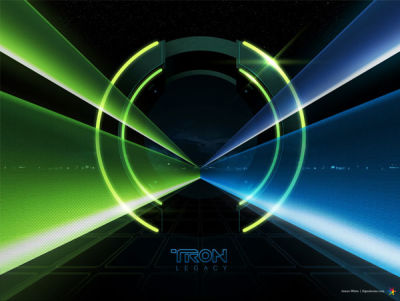
James: I started experimenting with my vector ’shard’ shapes while I was building a randomization generator in Flash a few years ago. Much like the work of Joshua Davis, I wanted to have a little program on hand which would take vector elements I create and lay them out randomly on the fly. I’m normally very meticulous about the elements I use, so this relinquished a bit of the control I had and allowed the shapes to fall randomly. I would then port these groups of shapes into Illustrator where I cleaned them up and manipulated them. After much experimenting, I discovered that overlaying these groups onto one another in Photoshop yielded some cool results, a strange intricate mess of shards and lines. I then added colors and effects to these shapes. It was all one big experiment.
Typography
Jad: I had to ask a few questions about typography since i’m a big–time fan of nice typography. What are your favorite fonts?
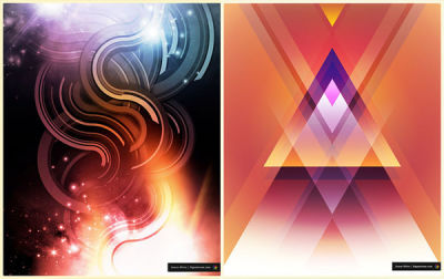
James: During my education, typography was one of the areas we didn’t get very deep into which was a bit of a disappointment. So, I had to take it upon myself to learn what typefaces were usable, and in what area. A lot of what I know comes from looking at design icons from the past, specifically Swiss, to see what they used and why. Josef Müller–Brockmann is a huge influence, as well as his usage of Akzidenz Grotesk. After looking through many magazine ads from the 1970s I discovered Bookman Swash, a lovely display face with nice swoops yet still highly readable. I’ve used Bookman many times in my work. Egyptienne is the face I use on Signalnoise.com for the titles and things, which I came across back in 2000. I’ve been using Trade Gothic quite a bit these days, a direct result of Scott Hansen over at ISO50. I think I learn more about type from Scott’s blog then anywhere else. :)
Jad: How can we achieve the shiny–type effect?
James: That’s all vector, man. I started dissecting the type effects found on Metallica’s ’Ride the Lightning’ cover, as well as ’Painkiller’ by Judas Priest to see how they created that cool chrome effect. It was a lot of experimenting in Illustrator but it all came down to Offset Path, adding Clipping Masks and applying selective gradients. I’d like to say there is one way of achieving the effect every time, but every set of letters is different and the method varies from word to word. After the vectors are done, drop on some big lens flares and start your guitar solo. :)
Improving and Inspiration
Jad: I saw your website’s design graveyard. Man, your designs have come a long way since your original sites. What are some things that you did to improve your skills?
"I never stopped working, it’s that simple."
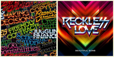
James: Even now when I look back at my earlier designs I can see what I was trying to accomplish, what I was inspired by, and what tools I was learning at the time. I cringe a lot when looking at my work from 10 years ago, but it’s all just a path that leads to something else. If I didn’t make that crumby looking angel thing, I wouldn’t have understood how layer masks work. All of those designs from the Graveyard are things I did on my own time, outside of my day job. I felt compelled to make something that was my own, away from clients and employers, which is why I kept trying as hard as I could to create things… anything really. Website designs, comic books, character designs, flyers. I just kept learning because I loved it.
Jad: Can you give us your main sources of inspiration?
James: I have a lot of art and design books onhand all the time to keep the inspiration flowing. I not only have books about Swiss poster design and Bauhaus, but also more traditional works by Roger Dean, Drew Struzan, Picasso, Norman Rockwell, Moebius, etc. I love looking at traditional works with design sensibility, and these guys used their hands to create, not a computer.
That said, I gain lots of inspiration from modern artists and designers such as Scott Hansen, Joshua Davis, Chuck Anderson, Aaron Draplin, Robert Hodgin and Mike Orduna.
Outside of specific artists, I get a full meal of inspiration everyday from websites such as Ffffound.com, Abduzeedo.com, Drawn.ca, The Canadian Design Resource.
Jad: Looking at so many different designs and websites every day, how do you keep yourself from becoming a copy–cat?
"I proudly wear my inspirations on my sleeve."
James: If I create a poster inspired by the work of others I’ll talk about it on my website and provide links or images to tell the story. When it comes to any given poster, the idea is the at the epicenter. When I’m coming up with the overall idea or message I want to put into my work, I stay away from inspiration so I can get an original concept free from influence. This way it’s more personal. Style is one thing, but ideas are what sets us all apart as artists.
Jad: In closing, any last words of advice for those designers who are aspiring to be a the level where you are at?
James: Never stop! If you love what you do, never stop creating things as you will only get better. Make things for yourself, think about what makes you happy and why you enjoy them and use that creatively. Don’t bide your time waiting for a client to come along in order to create something, just do it yourself and things will happen. In short, never stop creating. Work hard!

The Work of James White
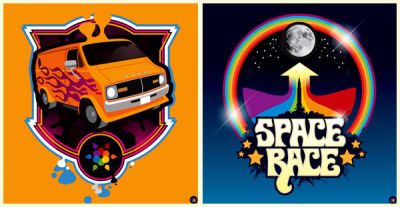
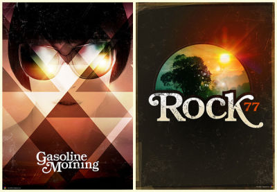
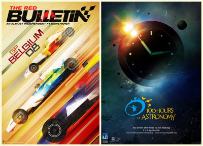
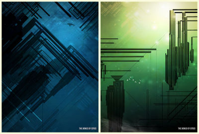
James White is an amazing designer. Not only is his work quality, but he also has a large quantity of finshed work. Here are just a few of the many wonderful designs that James has done over the years. By the way, every single design that James creates is definitely breathtaking and you can definitely tells that he gives it his best. You can also see more of his work on his Flickr.

Conclusion
Again, I just want to say thanks to James for doing this interview. I really appreciate the fact that he took time from his busy schedule to give detailed, well thought out answers to the interview questions. Personally, I have learned so much from the interview and it has also inspired me to create and design better things.
Also consider the following Smashing Magazine articles:
- Beautiful Photoshop Illustrations By Artists Around The World
- Retro Futurism At Its Best: Designs and Tutorials
- 20 Talented and Impressive Illustrators
- Breaking Out Of The Box: Design Inspiration (December 2016)


 SurveyJS: White-Label Survey Solution for Your JS App
 Register Free Now
 Celebrating 10 million developers


