Letterhead Fonts: Typography Eye Candy
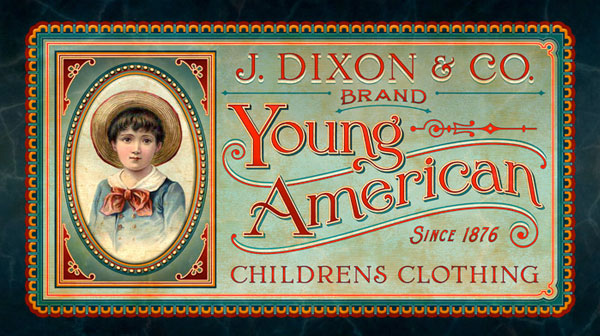
The other day, while I was sorting out and organizing my bookmarks, I ran across this site called Letterhead Fonts. I had completely forgotten about this site and the moment I saw it, I knew I had to feature them here. If you like typography, then this showcase is definitely for you.
Background
I contacted Chuck, the founder of Letterhead Font and asked him if I could feature the designs from his website and he graciously accepted.
Here is what Chuck had to say about Letterhead Fonts.
Letterhead Fonts began in October 1999 with 4 fonts.
"As a sign painter who had come from a hand–lettering background, I couldn’t find the fonts I wanted – so I made them myself. Others also appreciated these styles and the website grew."
I’ve always preferred the older letters from the late 1800’s and early 1900’s, so that is what I focused on most. Other artists joined me later. Today, Letterhead Fonts has 18 regular contributors (including myself) and over 300 fonts (I have removed several over the years). All of these artists are professionals in the sign and graphics industries, which gives them a unique perspective and insight as to the balance of the letters.
The purpose of Letterhead Fonts remains the same as it was 10 years ago–– to make unique, high quality fonts that serve a purpose. If it isn’t something that we would use ourselves or if it already exists, we won’t do it.
Letterhead Fonts only offers Postscript OpenType fonts. We stopped offering the horrible format of TrueType in 2007. Postscript is the only format that ensures the letters look exactly the way the original artist drew them. TrueType on the other hand, adds new points to the letters–– thereby changing the shape of the letters. It’s like painting a masterpiece and then having someone Xerox it 50 times. Very frustrating.
Because we make all of our own fonts and sell them directly from our site, we can provide good customer service to our users. If anyone has a problem, we can fix the issue right away for them (or help them install the fonts or provide other technical assistance). We have our own server and a very advanced account system that keeps track of the customer’s purchases. When we release a new version of a particular font, it is automatically updated in everyone’s account so they can download it again.
Though this method of being both the creators and exclusive distributors is more work, I prefer this way of doing business over selling through a third party. Besides, who wants to give away 30–50% of their sales to someone else?
Showcase of Letterhead Font Designs
Here are just some of the designs that were created from Letterhead Fonts.
Please do not copy or post these images anywhere. Special permission was granted by Letterhead Fonts to Design Informer to use these designs.
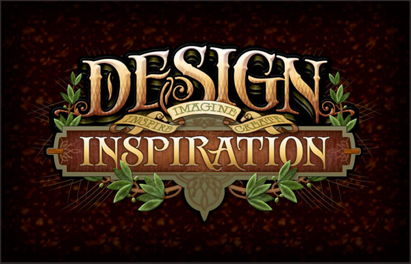

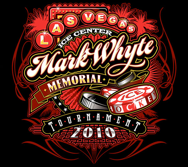
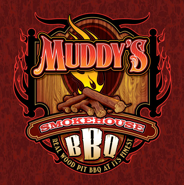
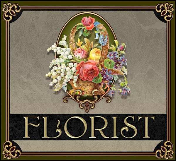
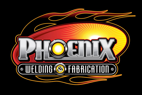
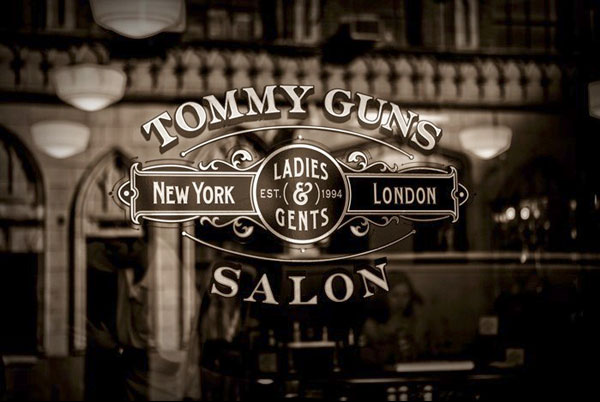
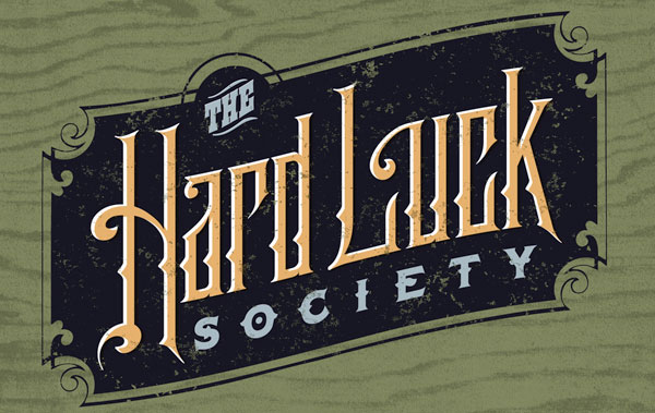
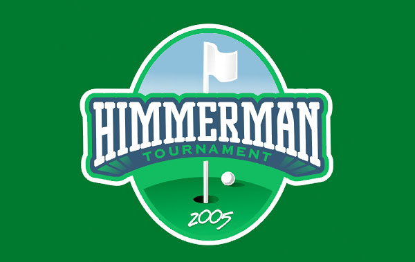
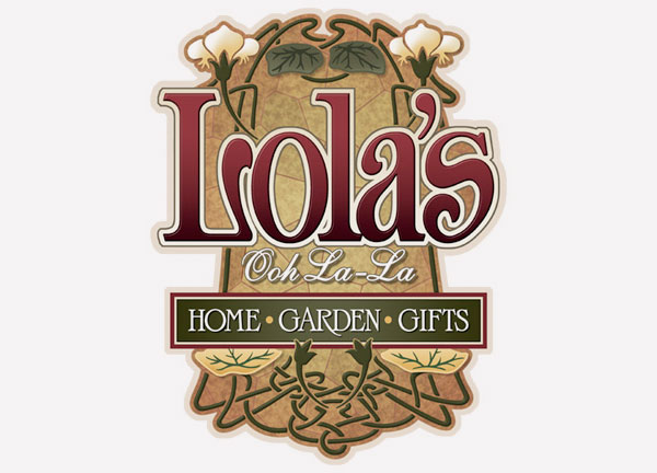

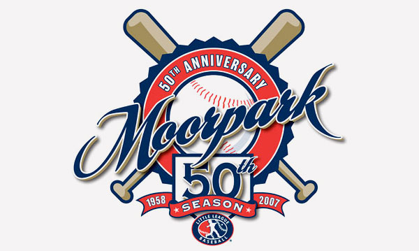
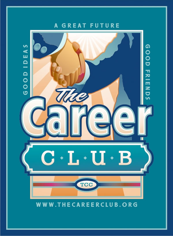

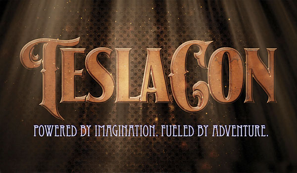
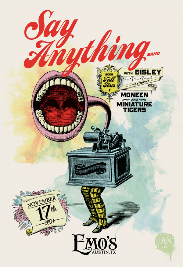
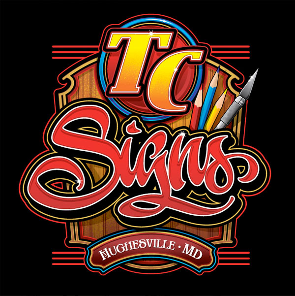
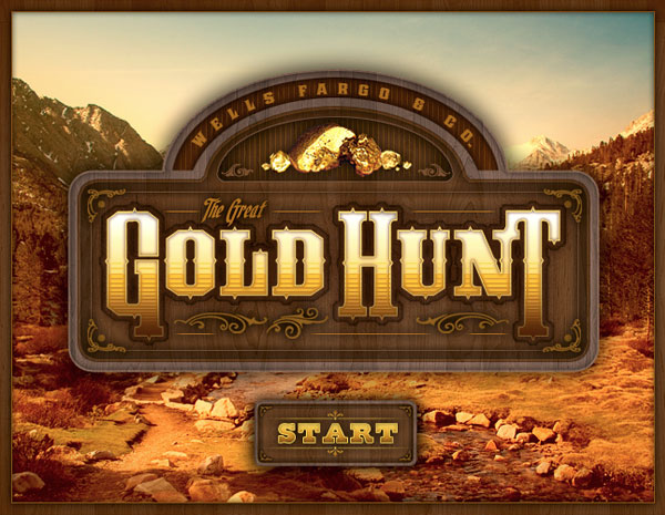
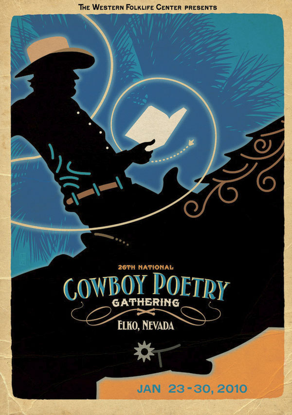
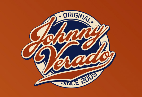
To see more of the Letterhead Font designs, please make sure you visit their gallery.
Well, thanks for viewing the Letterhead Font showcase. Do you like this vintage style typography? By the way, which one of the designs did you really like and why? Please let me know in the comments below.
One last thing, please bump and stumble this article so the rest of the design community can see these amazing designs. Thank you so much.
Further Reading on SmashingMag:
- Gorgeous Examples of Floral Typography
- Out of This World Typography
- Respect Thy Typography
- Massive Collection of Nature Inspired Typography


 Agent Ready is the new Headless


 SurveyJS: White-Label Survey Solution for Your JS App

