Shalom! Showcase Of Web Design In Israel
Israel is a young country with an old heart. It has been quickly built up over the last 60 years as an independent democratic Jewish state and is shockingly cutting edge for a country so new.
It is a tiny surreal sliver of land smack dab in the middle of the Middle East: a very European, modern civilization… just programmed to Jewish tradition. Israel has great weather, nice beaches along the Mediterranean sea, fresh and tasty food and a warm and friendly culture. It is home to historic holy sites of the world’s three major religions, and buses drive down streets whose stones are older than anything you’ll find in Europe.
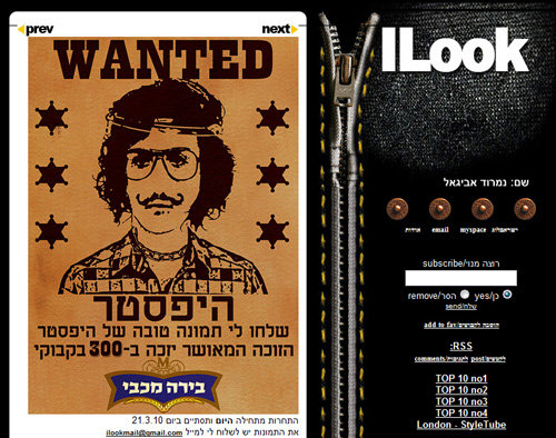
Israeli design at its best: ILook, an Israeli street-fashion blog. The text on the left side says: “Send me a good picture of a hipster and win 300 bottles of Maccabi beer” (via Tal Sach).
It feels as if Israel has one foot in Silicon Valley and the other in ancient Canaan — with an undercurrent of Middle Eastern hospitality and culture in this already multi-cultural society. And yet, English is commonly spoken here because many Jews from all over the world immigrate here regularly (not to mention the thousands of tourists from around the globe who pour in for sun, falafel, nightlife and a dash of biblical archaeology.) In some areas, you hear as much Spanish, French, Russian and English on the streets as Hebrew.
You may be interested in the following related posts:
- Web Design In The Arab World
- Showcase of Web Design in Russia
- Showcase of Web Design in Germany
- Web Design In Poland
Because of its small size and the everyone-knows-everyone effect of being a bunch of Jews, cabin fever (and completion of mandatory army service for the younger generation) drives Israel’s citizens out on frequent travels across the globe, to India, Asia, and South America. As a result, a unique mix of cultural discoveries abroad is woven into Israeli culture.
Tel Aviv is Israel’s most urban, chic city: the capital of all things sexy, secular and spiritual (in alternative ways to traditional Judaism.) You can read more on Tel Aviv’s unique soul in this article by Ehud Azriel Meir.
Much like many of Israel’s cities — hastily built and functional, yet poorly planned — such is the unfortunate state of most of the country’s websites. Most Israeli websites look unfinished, and they probably are. And Hebrew being a right-to-left language doesn’t help! Being victims of circumstance, Israeli Web designers cannot unleash their creative potential to make modern, usable working websites.
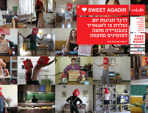
agadir, a Hamburger joint.
Even though some cutting-edge technologies are being developed right here in Israel — which is home to former hot startups such as ICQ (which became AOL messenger) and Intel (which is inside your machine… have a look!) — most business owners still putter around in IE6. Israel opened its first official Mac store only last year.
What’s Unique About Israeli Web Design? #
Here are some other issues that designers face here (and, I imagine, in most places outside the US, Canada and Western Europe):
- Websites must work in legacy versions of IE (though IE6 is finally almost out). Israeli business owners emphasize this more than getting their websites to work in Safari or Firefox.
- There is a strong liking for Flash-based designs… it must be a cultural thing.
- Little value is given to Web designers (and those in related fields, such as copywriting — although marketers and SEO people seem to being doing okay), and many designers are not taking back their profession.
- Clients care more about cost than usability and standards.
- CSS-based designs are not standard, and many of the people responsible for hiring are not aware of it.
- Big agencies are usually asked to make conventional designs, and although they do quite impressive branding work, the websites they turn out are behind the times. Because they are launched by such big companies, the websites succeed “in spite of themselves,” leading many to believe that this is the formula for wildly successful websites: for Agency X to do our website the way they did for Company Y.
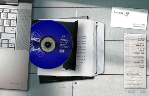
The Lionways website.
- Many entrepreneurs here believe that because they are smart and successful in tech that they know your field as well as their own. They think they can write English better than a US-born copywriter and can design better than a graduate of FIT. Needless to say, this can be frustrating for the person trying to build a new website for them.
- Despite that, usability is starting to be demanded by many website owners, especially the genuinely intelligent tech companies, Web app providers and social media startups; hundreds of these are in Israel, mostly in English.
- Israel is always a few years behind American and European trends and standards, and this is no different on the Internet.
The State Of Affairs #
We spoke to key people in the Web design industry in Israel to get their point of view on the state of affairs.
Q: Do you find you have to convince and educate clients a lot to be able turn out the high-end websites that you do?
Arie Zonshine (Lionways.com): “Most people calling for a quote don’t really know what they want. It’s as if they are calling to get the price of an air conditioner. It doesn’t matter if they want a new site or a make-over of an existing site: they usually don’t have written specifications, they don’t know what kind of pages they want and they don’t have a visual concept.
“So, I have to guide them through a series of questions, maybe looking at a few sites together in order to understand their needs. Sometimes, their lack of knowledge leads them ask for functionality that would work against them in terms of SEO, for example. I usually don’t have to work too hard to convince them to do things the right way.”
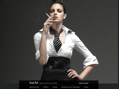
Eran Pal
Q: Are clients surprised by how much you quote them? What buzzwords do you hear most from clients?
Zonshine: “Always! Naturally, customers want the best price and, unfortunately in most cases, are not aware at all of the time and work invested. It’s even more problematic with issues such as Web standards and browser compatibility, because these aspects of the work have no visual impact on the website and are difficult for the client to appreciate. [I hear] SEO, AdWords and Flash. Very few mention browser compatibility, Web standards, semantic mark-up or CSS-based design”.
Q: Approximately what percentage of Israeli businesses are into the new standards of websites written in XHTML and CSS, that are non-Flash and that use minimal JavaScript?
Zonshine: “The numbers are unfortunately very low. I would say about 5%. Maybe less.”
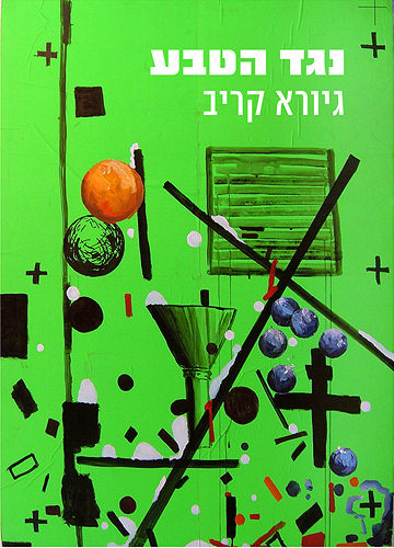
Alfred Gallery Exhibitions
Q: Why do you think most Israelis are into conceptual Flash designs that are hard to navigate, outdated and slow? Is this a cultural thing? Are more people waking up?
Zonshine: “In too many initial conversations with potential clients, I hear requests to make things ‘Move on the screen like in PowerPoint.’ Many Israelis forget that the inside is just as important as the outside, and that foundations are more important than a cool façade (i.e. a flashy home page with clever animation) that has nothing behind it. I do believe it’s a cultural thing: you can see it in many areas. The ‘great façade with no foundation’ combo is very representative of Israeli culture. You see it everywhere. However, I do believe that appreciation of quality grows with time, experience and knowledge. More and more people call in already understanding the disadvantages of a Flash-only website”.
Q: Arie, I notice in your portfolio that you still use Flash, though you seem to have found the middle road between Flash and usability. Please explain.
Zonshine: “Exactly. We wanted to make the point that cool and functional can work together seamlessly and are not contradictory. It was indeed an early decision that I took together with my partner Dana Ronen, who is responsible for the Flash programming on the site. We wanted to show creativity and Flash capabilities but also show that it can be done without compromising the accessibility, functionality and SEO of the site.
“So, on almost every page, there is a small or big gimmick in Flash, depending on the content of the page and its function. On the home page, the flying business card gets center-stage; similarly, on the ‘About us’ page, the laptop CD tray makes an exciting entrance. On other pages we wanted the client to focus on the content itself, so the gimmicks were demoted to a supporting role and, in most cases, done in Flash (e.g. the credit card terminal, the coffee steam and the compass) and in other cases in jQuery (e.g. the changing color stamp on the contact page)”.
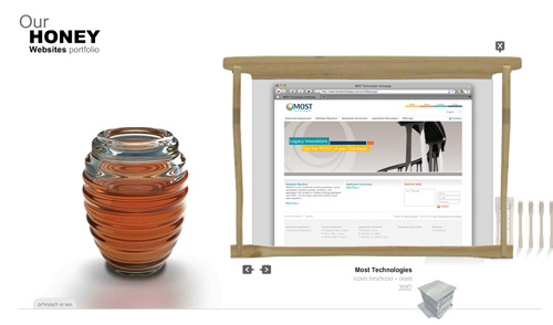
Bee Creations Design Agency
Q: How does the fact that Hebrew is written from right to left influence your design work?
Zonshine: “If the site will be Hebrew, you just need to flip your way of thinking horizontally. In terms of layout, it means that the logo would be probably placed in the top-right corner of the page rather than the top-left. You also need to mirror the placement of elements on the page, because the visitor’s eye-tracking patterns are mirrored in Hebrew.
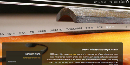
“The issue becomes more complicated when the site has both Hebrew and English or another left-to-right language. A good example of a dilemma that arises is a design that has a large background image, which I use quite often. When the background image cannot be flipped, it usually results in the logo and other elements being positioned on the “wrong” side of the page for one of the languages (Lionways is a good example of that). If, on the other hand, the image can be flipped, it’s much easier, as the Jerusalem Camerata site shows [see below] — the large violin image is mirrored on the English side of the site”.
Another example of this issue is Twitter, which scrambles any right-to-left tweets to an almost ridiculous degree. But again, Israel’s creative minds come to the rescue with Talker, a Twitter API-based… well, Twitter, except in Hebrew and right-to-left. Compare a Twitter Talker right-to-left account with a left-to-right account.
Q: How does Hebrew affect other aspects of Web design?
Zonshine: “First of all, a much smaller selection of safe fonts can be used for live text. Arial is probably the most common, followed by Times New Roman, Tahoma and Courier. That’s it, more or less. There aren’t any equivalents of Trebuchet, Georgia, Palatino or other fonts.
“Also, if the site has both Hebrew and English, choosing a font for titles and logos becomes much trickier, because you usually need to choose two separate fonts — for English and Hebrew — that work well together. The Hiddush logo is a good example of that. I spent hours searching until I found a close-enough English font (Anderson the Secret Service) that worked well with the Hebrew one (AgadaMF), and even then I had to clean it a little to match the other. A few font shops in Israel, such as FontBit, offer quality fonts that are designed to blend well in both Hebrew and English”.

“On top of all this, there are many technical problems with dealing with right-to-left texts in graphic elements, especially Flash components. Small and trivial things suddenly become an issue, such as the inability to control the location of punctuation marks, numbers and other symbols. Sometimes the only solution, as silly as it sounds, is simply to avoid certain characters, but this is impossible to control when dealing with dynamic content.“
Q: Do clients pay on time. And what is negotiating like?
Zonshine: “Negotiating is a part of Israel’s culture. People almost always ask for a discount. I almost always get paid on time”.
Uzi Shmilovici (co-CEO at Netcraft) adds: “A lot of the logos that are designed in Israel have English typography. So the question is, where should the logo appear on the site: the left side or the right side?”
Examining some of the biggest websites in Israel shows that this dilemma remains unsettled.
“The other issue”, Shmilovici continues, “is using English words and phrases (either quotes or special terms) in the middle of Hebrew sentences. They force users to change the direction of their reading, which affects the flow of the article and scanning”.
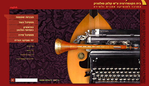
Israeli web design: Confederation House by bigdesign
Typography #
Typography is one of the most interesting crafts related to Hebrew websites and design. While traditional Hebrew fonts are great for creating an ancient or holy atmosphere, Web designers face a big challenge in finding or creating modern (or even futuristic) fonts from an alphabet that was invented for one thing: Torah books.
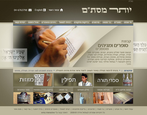
Typography fans might be interested in the “Torah Scribe,” written by a person who handwrites Torah books and who follows a strict set of rules and guidelines. The slightest mistake makes the book un-kosher, and he has to throw it away and start all over again (which is why Torah books cost so much).
Another trend in Hebrew typography is nostalgic fonts from the early days of the state (the British Mandate). A great example is the Palestina font created by Oded Ezer (see image below), which is an effort to fuse an ancient typeface to a modern design.
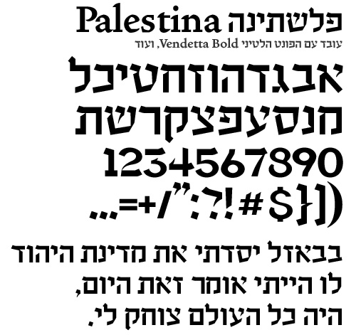
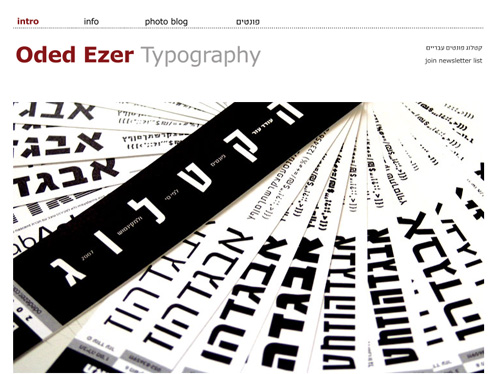
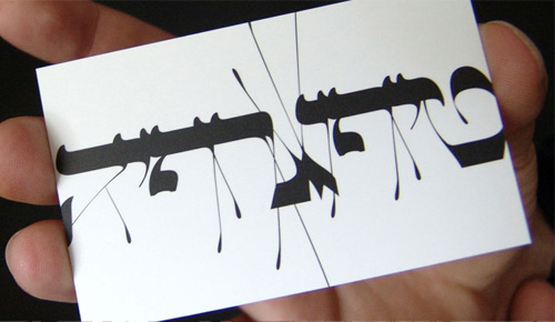
Oded Ezer’s website is a great place to look for modern Israeli fonts and experiments in Hebrew typography. A leading Israeli typographic artist, Ezer also runs the blog Spare Type. If you are into typography (and who isn’t?), you must check out two works by Ezer in particular: Ketubah and Typosperma.
Any Israeli knows how hard it is to find beautiful fonts in Hebrew. Lucky we have Oded Ezer, a typographic artist, logo and type designer, lecturer and typographic experimentalist. His studio is located in Israel.
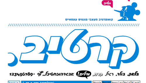
Fontef, Israeli font designers.
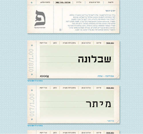
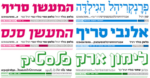
Ha’Gilda: Hebrew fonts
Interesting Solutions to Israeli Design Problems #
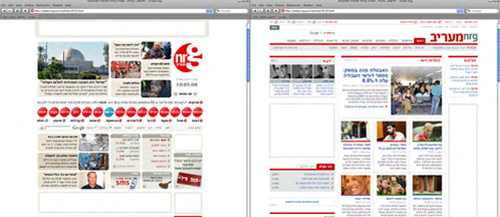
Yotam Hadar redesigned nrg.co.il, Israel’s second-most popular news source and seventh most popular website. The old version had too many boxes, low readability and nowhere to focus the eye, not to mention unconventional and hard-to-use navigation. Since its redesign, the website has continually gained popularity (and the statistics show much longer stays), yielding more income and a smaller team on which to rely for maintenance. (The website was completed while the designer was working at Maariv, in collaboration with NRG’s design team, under chief designer Amir Hadad.)
Efficiency Is A Double-Edged Sword #
In a 62-year-old country that is in a constant state of war, where every citizen has to join the army at the age of 18, efficiency (not to be mistaken for productivity or effectiveness) is almost sacred. It has been the most important quality in building this country, and it tends to be the most valued quality in any project. One could say, “It doesn’t matter if it’s good, as long is it works…” Sort of… Close enough. Thus usability, aesthetics and trends are ignored quite often, making the job of the designer secondary.
Another side effect of this harsh efficiency-driven attitude is the de-emphasis on a proper technological education. Because clients only demand that things “work,” standards, trends and aesthetics are the last thing on a developer’s mind. In turn, clients lack a real understanding of the media, which is why so many Israeli websites use Flash. The lack of variety of supported Hebrew Web fonts is also a factor. But fortunately SEO is creeping in and forcing even the most stubborn clients to ditch Flash for HTML and to replace images with live text as much as possible, which will hopefully push typography awareness to the next level.
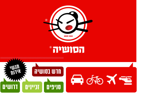
ha’Sushia has an original navigation menu.
Adam Benayoun (CEO and co-founder of Lionite), puts it very well: “It is a technology-oriented market. A lot of Israeli companies don’t focus on the front end, design, UI, experience, because we are all developing and selling technology to the US.”
Lea Aharonovitch (a senior product manager at Answers.com and a UI/UX blogger) adds: “I would even go further to blame each and every one of us Israelis as consumers for not demanding higher standards from websites that prefer banner spots to design.”
“Just a quick look at some of the 130 Israeli Web 2.0 companies demonstrates how much creative types and services are trying to solve problems and foster new exciting ways to do more on the Web… If we support designers and let them show us what they can really offer, we stand a chance that the next ‘Made in Israel’ design article will boast about how Israel has become the cutting edge of intuitive and excellent user-centered design.”
Lea is also a former manager of UPA Israel (Usability Professionals Association), which recently initiated a series of usability reviews published weekly on Israel’s biggest news website Ynet (the equivalent of CNN in terms of traffic and importance), inspecting a different Israeli website every week.
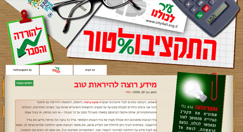
Tel Aviv city budget
Q: What other setbacks against designers in Israel can you identify?
“Behind every Israeli designer stands a team of managers who just don’t get it,” says Aharonovitch. “Managers don’t think they can afford to offer simple, less monetized interfaces, so designers are required to add as many monetization elements as possible”.
Shmilovici: “Strong interactive companies lead clients to invest a lot of money in the media (where they have big commissions), and the result is usually less resources for UX and design (because the development part is a must anyway)”
Oded Ezer, whose work was featured earlier in this piece, give us a typographer’s point of view: “Conservativeness. Instead of relying on 3,000 years of documented culture and Jewish heritage, young designers are looking to modern European design for inspiration.”
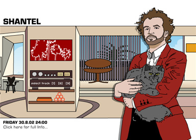

Dinamo-Dvash
Local Influences #
It’s worth mentioning that the second official language of Israel is Arabic, another right-to-left language with amazing appeal to typographers. But a whole other article would be required for that and for the question of why Israel has so few Arabic websites.
Mossawa Center
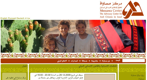
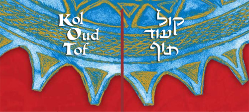
Koloudtof. This website is Hebrew but influenced by local cultures. Remarkably, about 50% of Israelis come from Arab countries.
Let’s Turn To The Future #
Web designers in Israel seem to have two choices: find work overseas, or deal with the conditions in Israel, which in most cases mean lower wages and having to dabble in print design and other unrelated design work. This is another reason why finding good examples of Israeli Web design is hard, because most of the work is done for European and American clients or, if done for domestic clients, just doesn’t compare to the quality of design overseas.
But as Israelis, we always look at the bright side and seek solutions. “Clients in Israel are just like clients all over the world,” says Adam Benayoun, putting as much of the blame on service providers. “We need to educate clients on the importance of design,” he says, advice that is as true of designers in Israel as it is anywhere else.
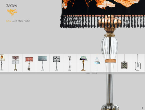
Baboo, a lighting boutique.
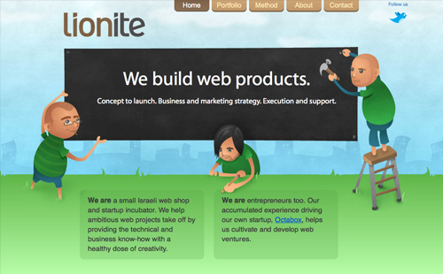
Lionite is a great example of Israeli creativity in business model and workflow. The Tel Aviv-based Web shop provides a complete solution for clients in Israel and overseas, combining development, design and even marketing. “Clients overseas prefer us because of our standards, not because of or despite of our being Israeli,” says CEO Adam Benayoun. “We believe you have to be good no matter where you are from, no excuses.”
Netcraft’s Uzi Shmilovici seems to agree with that philosophy: “Although Israel is not the cheapest place on earth, it is still cheaper than Europe and the US. That said, professionally, Israeli designers are definitely on par with European and American designers. Take those two facts together and you’ll understand why Israeli design gives you the best value for your money.”
Q: So, what do you think we have to offer the world in terms of style, influence, etc.?
Shmilovici: “I do think that some of our unique typography issues have led to some nice progress. Because the Israeli font inventory was weak, we had to come up with new fonts quickly. Some of those explorations, done by Oded Ezer for example, ended up in the MoMA.”
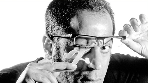
Oded Ezer
Aharonovitch: “Israel is considered one of most innovative nations in the world when it comes to technology. It’s hard to compete with our sense of creativity, our high level of adaptability and flexibility and our high skill level in problem-solving and other traits.
”While at times it may seem that we’re not organized or that our affairs are managed informally or that our processes are not well defined, these are our advantages when considering the Agile or Lean development method that has been gaining popularity recently. The last thing to mention is the emotional strength and maturity that many Israelis develop at an early age — mainly derived from growing up in as challenging an environment as the Middle East and serving in the army at the age of 18.”
Showcase of Israeli Web Design #
Schlafstunde
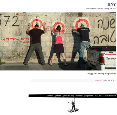
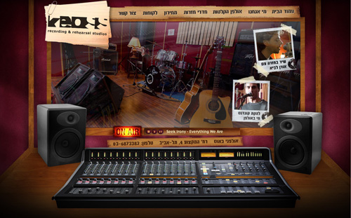
Keoss Studios (warning: music is turned on automatically!)
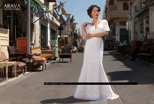
Arava
E-Dologic.co.il
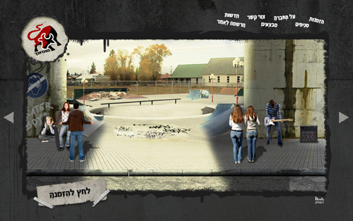
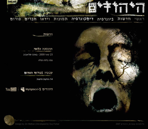
Hayehudim, an Israeli music band.
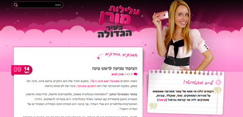
Moran in the big city
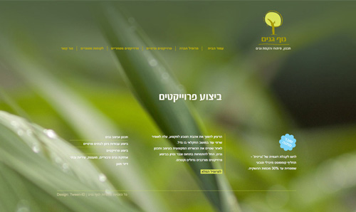
Segal Wines
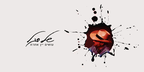
Oded Babayoff
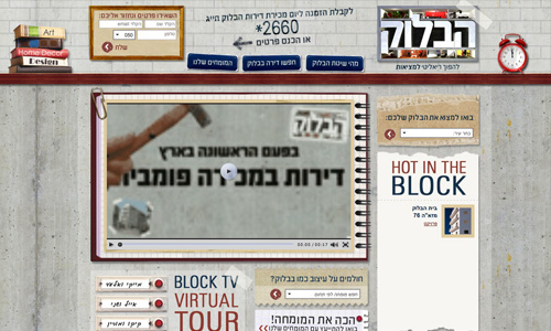
“The Block”
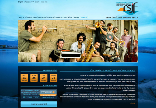
The Red Sea Jazz Festival Website
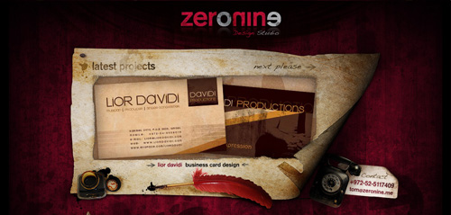
Zero Nine
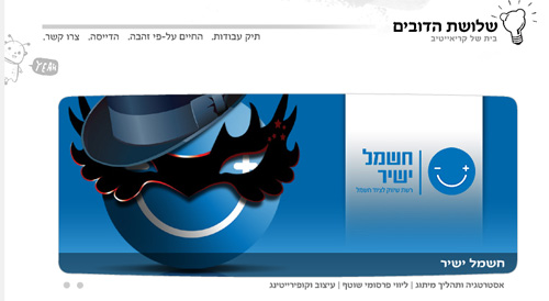
Studiogavriel’s work
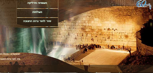
The Wall, Jerusalem.
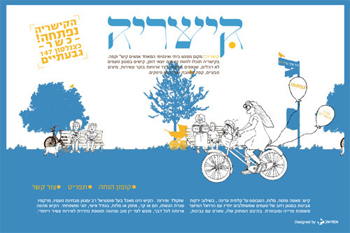
Quicheria, one of the many Flash-based websites in Israel (via Wix.com)
Quicheria, one of the many Flash-based websites in Israel (via Wix.com)
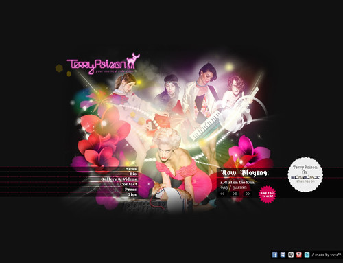
Terry Poison, electro-rock and roll band.
Duddi Hasson, Fashion photographer.
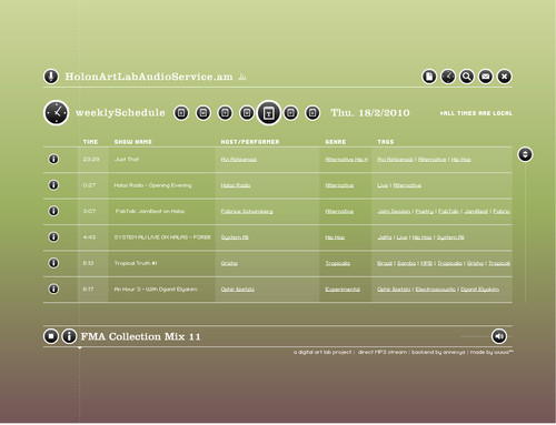
halas.am, Holon Art Lab Audio Service
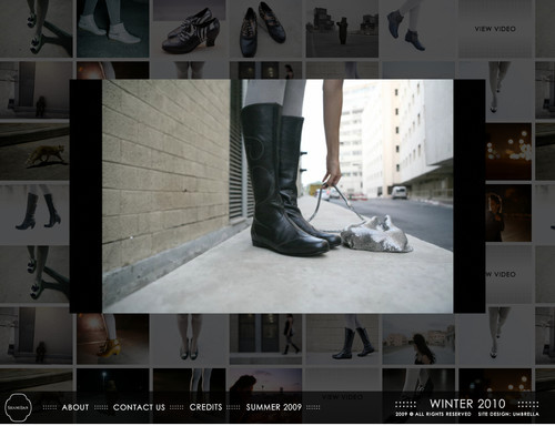
shani bar, Fashion designer.
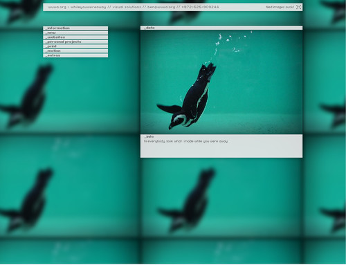
while you were away, Ben Ben-Horin.
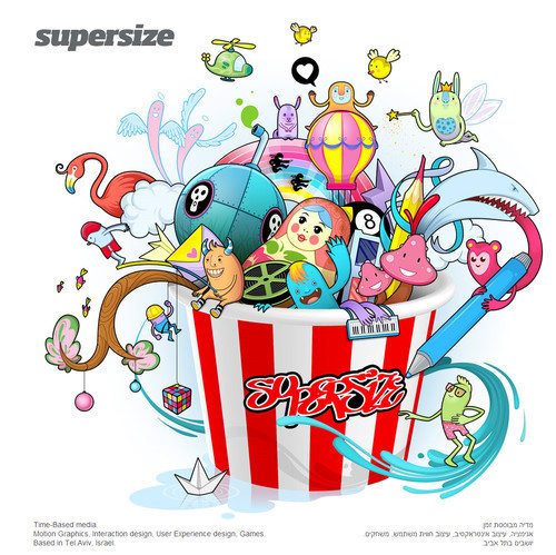
hello supersize, Matty Marianski (Supersize), Motion graphics and interaction design.
Israeli Designer Showcase #
Those who are able to rise above the circumstances end up turning out top-notch websites. Some such stars are featured here.
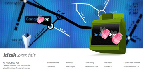
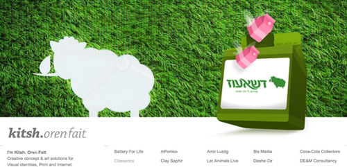
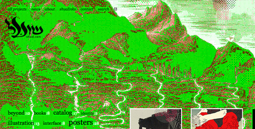
Shual (meaning “Fox” in Hebrew) is a two-person team that churns out modern Web-standard websites. Its own portfolio is startlingly green. Aside from this neon-green page complete with fox howl, the team turns out such beautiful websites as the following:
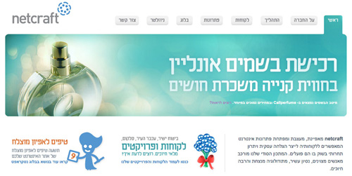
Netcraft does it right and sets a good standard. It is one of the leading agencies in Israel.
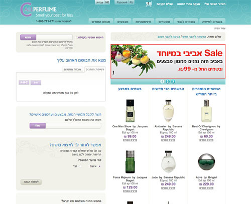
It designed this well-known e-commerce website:
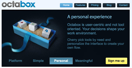
Lionite is an Israeli agency with a unique approach to business.
It also created Octabox…
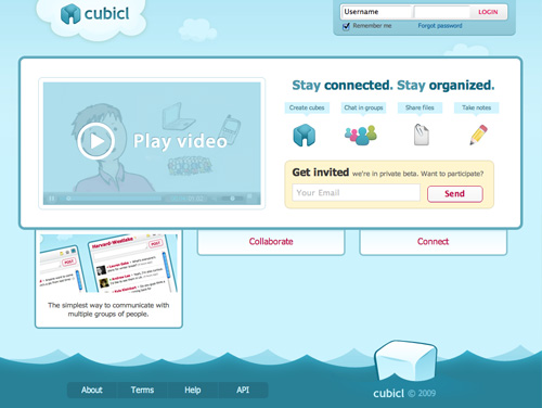
… and Cubicl.
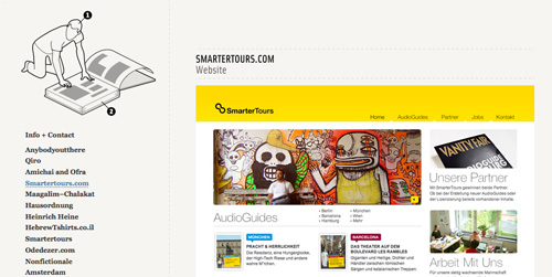
Itamar Lerner is an Israeli-born graphic designer. He started working as a designer at 2002. In the following three years, he was employed by several design studios around Tel Aviv.
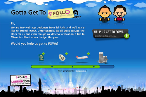
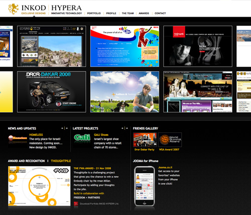
Adam Tal (a collaborator on this article) and the design agency Internetlife created the Gottagettofwa.com website.
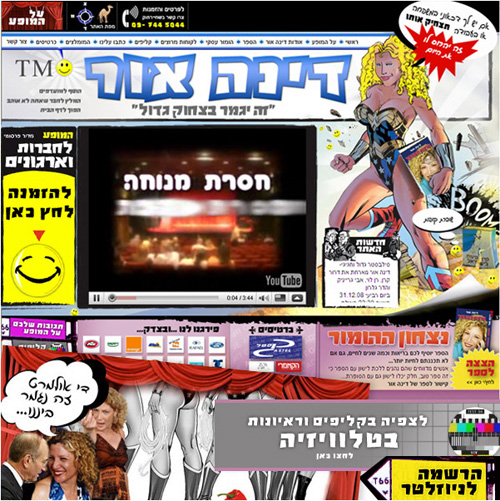
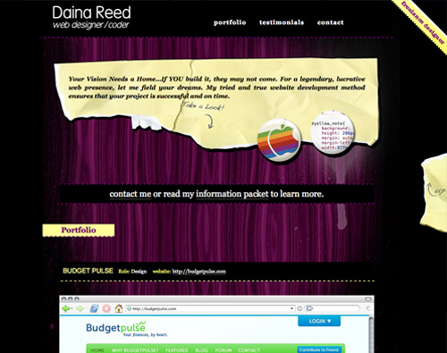
Daina Reed is a freelance Web designer in Tel Aviv.
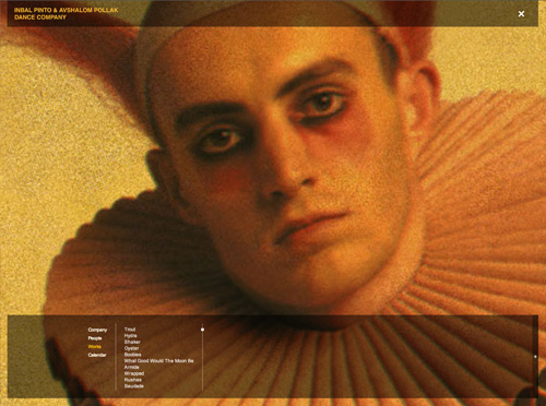
Inbal Pinto and Avshalom Pollak Dance Company created this beautiful, simple and artistic Flash website, which may be impractical for most in the real world.
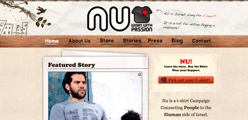
nucampaign offers great insight into the real Israel (as opposed to the Israel you know from the news).
Illustrators #
Liron Tocker is a talented Israeli illustrator and icon designer who lives in Germany.
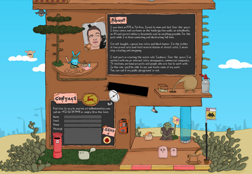
Mikimottes is commendable for his sketching of everyday Israeli scenery.
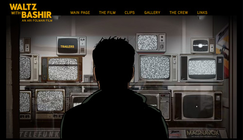
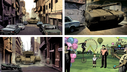
Asaf Hanuka worked on the art for the award-winning animated documentary feature film by director Ari Folman.
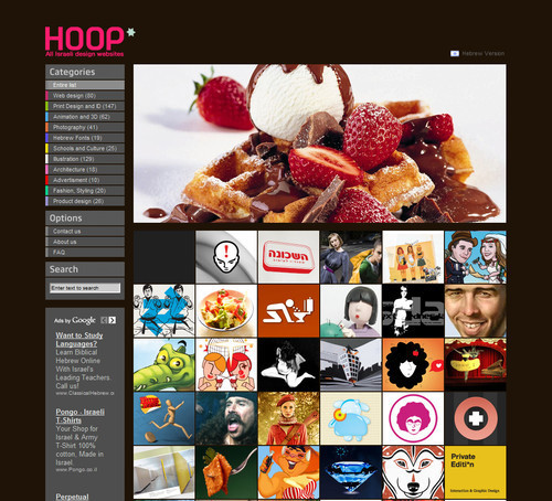
hoop: this is just about the end of our journey. If you wish to absorb more Israeli design, you should visit hoop.
About the Authors #
Daina Reed is a freelance Web designer and Web project manager in Tel Aviv.
Adam Tal is a Web entrepreneur who believes that code is poetry and design is music. Follow him on Twitter @adamtal, or check out his website.
Sara Eisen is a freelance writer, editor, journalist and “marcom” and Web content consultant. She blogs at https://the-word-well.com.
Also, this article wouldn’t have been possible without the contributions of Joey Simhon and Lior Yair of Netcraft, a digital agency in Tel Aviv that specializes in user experience and Web technologies. Special thanks to Avi Joseph, CEO of SmediaC for helping with the research for this article.
(al) (dr) (at) (vf)


 JavaScript Form Builder — Create JSON-driven forms without coding.
 Get a Free Trial
 Register for free today!


 Try if for free!




— Comments 331
Thanks!
Great collection ! Thx, Bravo.