Art Manifestos and Their Applications in Contemporary Design
What might happen if you injected some of those materials with a healthy dose of poetry, humor, or bravado? Obviously, doing so will not be appropriate in some forums, but when it is, this may be a good way to express yourself and differentiate your brand from the crowd.
You may want to take a look at the following related posts:
- About Art – What Do We Really Mean
- Pop Art Is Alive: Classics and Modern Artworks
- Modern Art Movements To Inspire Your Logo Design
- Learning From The Past: Design Legacies & Arts
Some of the most electrifying examples of writing about art and design come in the form of the manifesto. The manifesto has played a pivotal role in some of the most important creative movements of the previous century: Futurism, Surrealism, and Cubism among them. Most graphic designers working today will probably not require their own manifesto, but it can be helpful to write a mission statement or expression of your creative goals. Likewise, most of us probably don’t intend to launch a full-scale ‘movement,’ but this genre of writing may inspire you to reconsider the literary content of your creative work and its public representation.
What is a manifesto?

The 1963 Fluxus manifesto by George Maciunas includes rousing proclamations in the form of both handwriting and typewriter copy.
The artists’ manifesto is a “document of an ideology, crafted to convince and convert” (Mary Ann Caws, Manifesto: a Century of isms). The word ‘manifesto’ contains elements of the Latin terms ‘manus’ (hand) and ‘festus,’ which may be derived from the root ‘fendere,’ as in ‘offendere.’ In other words, the manifesto is a personal or even handwritten statement intending to shock, inspire, or offend. Most of the artists in this selection lived in times that they felt desperately required change, and their solution was revolution.
Artists’ manifestos were being written as early as 1886, but the genre developed into a “new literary sport” after the publication of Italian artist/provocateur F.T. Marinetti’s first Futurist manifesto in 1909 (Marjorie Perloff, The Futurist Moment). Marinetti’s writing had mythmaking qualities; this ringleader of the Futurists “became a public figure as a result of, not prior to the publication” of his manifesto.
Here are four artists’ manifestos, beginning with that of Futurism – the lunatic grandaddy of all artists’ manifestos. A review of each manifesto is accompanied by historical context, images of relevant artwork, and inspiration for contemporary applications of the ideas within.
Futurism
An Overview
“Everything of any value is theatrical.” –F.T. Marinetti
Futurism originated in Italy in 1909 as an avant-garde movement that glorified technology, modernity, and even war. In their artwork, the Futurists strove to capture the speed and ‘force lines’ of motion and progress. This ideology pushed their work towards abstraction, and Futurism helped fuel the invention of Cubism.
Highlights from the Manifestos
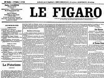
F.T. Marinetti’s Futurist manifesto was first published in French newspaper Le Figaro in 1909. The manifesto text is preceded by a disclaimer about the author’s “singularly audacious ideas.”
“We have been up all night, my friends and I, beneath mosque lamps whose brass cupolas are bright as our souls, because like them they were illuminated by the internal glow of electric hearts… we have been discussing right up to the limits of logic and scrawling the paper with demented writing.”
So begins F.T. Marinetti’s Futurist manifesto, which is full of “demented writing” and poetic language (“celestial bivouacs,” “rogue locomotives”) intended to rouse and mesmerize. The concept of the “internal glow of electric hearts” is an example of Marinetti’s glorification of industrial machinery and his desire to emulate it. This fascination with technology is a familiar notion in this current gadget age we live in today.
Perhaps even more than most artistic movements, the Futurists were obsessed with demolishing the ideals that preceded them. In his Manifesto of Futurist Painters (1910), Italian artist Umberto Boccioni declared, “We will fight with all our might the fanatical, senseless and snobbish religion of the past, a religion encouraged by the vicious existence of museums. We rebel against that spineless worshipping of old canvases, old statues and old bric-a-brac, against everything which is filthy and worm-ridden and corroded by time. We consider the habitual contempt for everything which is young, new and burning with life to be unjust and even criminal. ”
“We want no part of it, the past”, Marinetti wrote, “we the young and strong Futurists!”
Futurist Work Samples
The Futurists excelled at experimental typography, and there’s no greater example than Fortunato Depero’s book Depero Futurista, boldly bound with two metal bolts. Once again, the Futurists are seizing the opportunity to incorporate industrial machinery into their work. This also must’ve made the book annoyingly difficult to shelve, which probably had them brimming with mischievous glee.
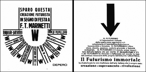
Two internal pages from Depero Futurista.
Depero’s page layouts reveal the force of his bold compositional strength. View the designer’s advertisments for Campari for further evidence of his typographic and compositional muscle.
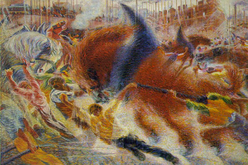
Umberto Boccioni, The City Rises, 1910.
Boccioni exalts the colossal energy of the massive horses in this scene of urban labor. The horses test the limits of their harnesses while men direct the explosive equestrian strength. Man and horse appear almost as one. The artist could not have compressed more dynamism onto the canvas.
Contemporary Applications
Is your business a brand or a bland?
The Futurists excelled at drama. Say what you will about their work (the paintings are somewhat repetitive and occasionally, well, ugly), but they were never boring. It is a movement that never murmured, preferring to shout, sing, or scream.
Futurism shares a major quality with the contemporary web design community and that is a passion for progressive technology. The Futurists were intensely devoted to smashing the past while realizing the future. Web designers are always pushing the boundaries of what we’re capable of achieving, whether we’re developing new uses for content management systems or discussing the future potential of CSS (see the Surrealism section of this article for some distant future ideas). The lesson here is Always Evolve.
Another lesson is to keep it personal. Marinetti’s manifesto obsesses over machines, but it does so with intense emotion, which is a fundamentally human quality. In other words, don’t let your professional writing grow too cold. Those who excel in social networking excel at this aspect. Especially if your business identity is stark and pristine, a human touch goes a long way.
Dada
An Overview
To the Dadaists, logic was a pestilence. They believed that logic had led to a culturally and morally deficient society. These artists were so appalled by World War I that they violently rejected existing notions of culture, aesthetics, and even reason. Their work was anti-war, anti-bourgeois, and anti-conformity. Freedom was the goal; Dada sought to liberate a variety of media and its meanings from the shackles of the past. The Dadaists’ most powerful tools were biting satire and brazen provocation. Their ideology laid the foundation for Surrealism and their delight in anarchy makes them a cultural precursor to the punk movement that was born half a century later.
One of the most widely recognized symbols of the Dada movement is Marcel Duchamp’s Fountain (1917). The artist turned a urinal on its back, scrawled the absurd pseudonym ‘R. Mutt’ on its side, and declared it art. It was a lewd gesture towards the notion of contemporary art itself, which Duchamp criticized as being too ‘retinal’ in nature - mere aesthetic decoration. He succeeded with his ‘readymades’ at putting art “in the service of the mind” (hence, the constant labeling of his work as ‘conceptual’). The piece is emblematic of “the vehemently untraditional and bitingly critical nature of the Dada movement” (Marcel Duchamp 1887-1968, an essay by Nan Rosenthal). Dadaism assaulted the traditional values of fine art; Duchamp’s work succeeded in redefining the conception of what belongs in a museum setting, and therefore, the conception of what is considered art.
Highlights from the Manifestos
The Dadaists published many polemical manifestoes designed to provoke their critics and un-define their work. They insisted that the word ‘Dada’ was nonsense and that they were not a ‘movement.’ Each manifesto does its best to shatter any conventional thought on the matter. One such manifesto concludes, “Long live Dadaism in word and image! … To be against this manifesto is to be a Dadaist!”
Dadaist poet Tristan Tzara’s 1918 Dada Manifesto is a blustering rant. It is full of sound and fury, signifying nada. “DADA DOES NOT MEAN ANYTHING,” it demands. Intoxicated with energy, Tzara delivers stream-of-consciousness poetry that reels from social commentary to dream-drunk nonsense. “I destroy the drawers of the brain, and those of social organisation: to sow demoralisation everywhere, and throw heaven’s hand into hell, hell’s eyes into heaven.”
“Publicity and business are also poetic elements,” Tzara writes, foreshadowing Warhol’s claim that “business art is the best art.”
Work Samples
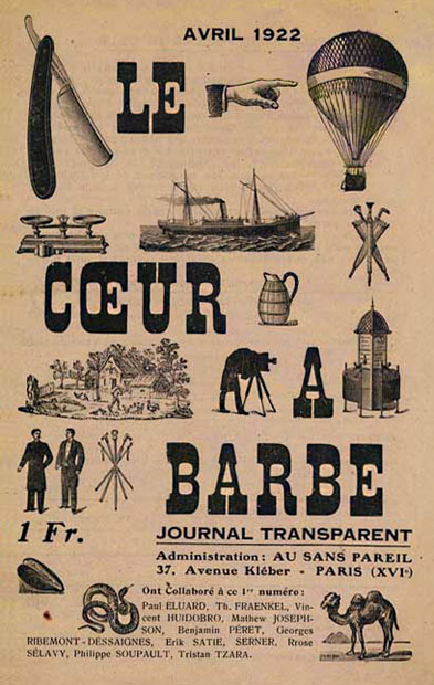
This gorgeous cover design for Le Coeur à Barbe: Journal Transparent (1922) is attributed to the writer and artist Iliazd (also known as Ilia Zdanevich). Publication of this esoteric, single-issue journal was prompted by a feud between Dada leaders Francis Picabia and Tristan Tzara. The cover is regarded as an important example of early Twentieth-century avant-garde page layout.
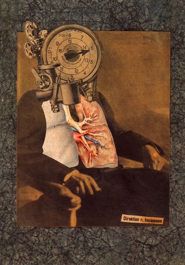
Photomontage by Raoul Hausmann
Photomontage and collage developed into two of Dada’s most effective tools of artistic communication. The reappropriation of images from the mass media allowed for deft social commentary. Dissonant combinations of photos, advertisements and text seemed to capture the jolts of modern reality.
Contemporary Applications
Dadaism was a revolt, an “attack on the culture of a bankrupt society,” which “brought about a violent renewal of meanings” (The Dada Movement 1915-1923, by Marc Dachy).
Those of us who achieve notoriety as designers face a unique opportunity: the opportunity to be heard. Can you use that power to take a stand for your beliefs, to bring about change through good design and positive values? We make a statement – actively or passively – by every professional association we make, every client we choose to represent, and every product we validate by inclusion in our portfolio. Here in America, our designs exist in a culture fractured by deep ethical fissures. It is a culture where gun violence rears its hideous head in the headlines regularly - recently, on a daily basis. It is a culture where so desperate is the desire for fame that people are willing to infiltrate a White House party or stage a hoax involving the life of a child - all in the hopes of achieving reality television stardom. If the Dadaists realized a desire to shift their problematic cultural values, so should we, no matter what nationality we are. We do not require a ‘movement’ to do so. Cultural change is also affected by the simple choices of intelligent individuals. You do not need a soapbox. But look down; you may be standing on one.
If the best thing we designers have to get upset about are the font choices in Ikea brochures, our priorities are unbalanced. There are plenty of better things to rebell against - namely war, climate change, and the filmography of Nicolas Cage.
Surrealism
An Overview

René Magritte’s work is known for clever twists of visual logic.
Surrealism is a weird dream. This dream can be a vivid exploration of personal identity (Frida Kahlo) or a startling hallucination fraught with Freudian fears (Salvador Dalí). Oh, and there’s often weird fruit involved (think pomegranates or an orange in a doorway).
In short, Surrealism sought to explore the unconcious in order to break creative ground. Their artwork rejects rational thought in favor of absurdity and illogicality, suggesting that these qualities may offer more accurate representations of modern life’s disturbing complexities.
Highlights from the Manifesto
“We are still living under the reign of logic,” begins André Breton’s Le Manifeste du Surréalisme (1924). Breton rails against the supremacy of logic, and credits the work of Sigmund Freud for unleashing a “current of opinion” on the subjects of dreams and the subconscious. “Perhaps the imagination is on the verge of recovering its rights,” says Breton. “If the depths of our minds conceal strange forces capable of augmenting or conquering those on the surface, it is in our greatest interest to capture them.”
Ironically, Breton’s is the most sober and rationally argued manifesto in this selection. He is laying the philosophical groundwork for the artwork that will be built upon these ideals. The wildest language he uses is employed in this assessment of the dream state: “The mind of the dreaming man is fully satisfied with whatever happens to it. The agonizing question of possibility does not arise. Kill, plunder more quickly, love as much as you wish. And if you die, are you not sure of being roused from the dead? Let yourself be led.”
Work Samples

A razor is drawn towards a woman’s eye in this still from the film Un Chien Andalou by Salvador Dalí and Luis Buñuel, 1928.
Un Chien Andalou is a piece of Surrealist film that has had a profound and lasting impact on cinema. It can be seen as an example of Dalí’s skill with “the usual paralyzing tricks of eye-fooling.” The film has been thoroughly absorbed by pop culture; the rock band Pixies famously refer to it in the song ‘Debaser’ when Frank Black wails, “Got me a movie / I want you to know / Slicin’ up eyeballs!”
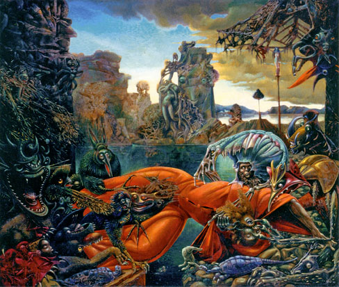
Max Ernst, The Temptation of St. Anthony, 1945.
Goblins and gremlins galore! Ernst’s take on this classic painter’s narrative is visual feast of nightmares, but its monsters are also a bit cartoony with their grinning jowls and muppet eyes. St. Anthony is being overtaken and physically invaded by transforming plant creatures. Ernst described St. Anthony’s plight thusly: “Shrieking for help and light across the stagnant water of his dark, sick mind, St. Anthony receives as an answer an echo of his fear: the laughter of the monsters created by his visions.”
Corresponding visual sensibilities might be found in the work of contemporary filmmakers Tim Burton and Joe Dante (director of Gremlins and a memorable segment of Twilight Zone: The Movie). For another Surrealist take on the tale of St. Anthony, view Dalí’s composition of the same title.
Contemporary Applications
In many aspects of graphic design and marketing, the idea reigns supreme. A clever concept can be the key to a unique logo design; a startling idea can distinguish an advertisement from the crowd. Surrealists like Dalí and Magritte were idea men. View any of Magritte’s major works and you are looking at a stroke of conceptual brilliance that would humble the cleverest contemporary illustrator.
The conceptual strength shows in their words as well. Consider this choice quote from Dalí: “I consider perversion and vice to be the most revolutionary forms of thought and activity, just as I consider love to be the only attitude worthy of the life of a man.”
Dalí’s most famous painting is The Persistence of Memory, with its melting clocks, which have become the most recognized symbol of Surrealism. The theme of that painting is time, and the multiple melting clocks imply the simultaneous existence of various temporalities. What if we allowed ourselves similar freedoms with our imagination? What will CSS look like in ten years, or fifty (assuming CSS and civilization are still in existence)? What if there were a ‘Time’ property in CSS, and what would it do beyond mere animation? Perhaps CSS of the future will have a variety of temporal qualities, and perhaps it will go 3D as well. Could tomorrow’s cascading style sheets create a holographic effect? Could the cascade apply to past, present, and future?
Fluxus
An Overview
Like a cloud, Fluxus tends to appear in a different shape from one moment to the next. Their goal of ‘intermedia’ creativity blurred the boundaries of visual art, music, publishing, graphic design, and performance art. An international movement that began in the early 1960’s, the Fluxus artists entertained the absurdly paradoxical notion of becoming an “anti-art art movement.” Much like their ideological predecessors in Dadaism, this meant that they would attack the reigning notions of what art could or could not be. It also reveals their predilection for the absurd.
Highlights from the Manifesto
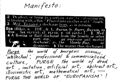
ABOVE: A portion of George Maciunas’ Fluxus Manifesto.
Like Fluxus itself, George Maciunas’ manifesto is a wild mongrel of a thing. According to Fluxus scholar Simon Anderson, Fluxus “deliberately experimented with, ignored, and tore down so many of the barriers and heirarchies of contemporary culture that no analogy suffices: [Fluxus] defies description, a condition that is perhaps its most potent source of strength.” (In the Spirit of Fluxus, Janet Jenkins, ed.)
Maciunas’ manifesto - which includes collaged literary definitions juxtaposed with his ranting handwritten voice - directly reflects the nature of his movement. It’s a good reminder: does the literary content of your design business accurately reflect the voice of your visual content?
Maciunas asked Fluxus artists to ‘purge’ their work of “bourgeois sickness” and “professional & commercialized culture.” A professional demeanor in the design industry is of utmost importance. However, if you’ve ever met a branding professional whose entire personality has been crafted into an ‘elevator pitch,’ you know how creepy and cold that can be. Speak to people like friends when you can. Never speak to them like just another potential sale. That’s rude and it makes you seem robotic.
Fluxus Work Samples

Fluxkit, 1969, various Fluxus artists.
Fluxus was a graphic designer’s dream: typographic freedom, multimedia publishing, visual puns galore, audacious self-promotion. Looking for inspiration for your next promotional mailer? The Fluxus artists packed dozens of clever ideas into the diverse contents of their witty, mass-produced ‘Fluxkits’ and ‘Fluxboxes.’ Make absolutely sure to view the dense, inspiring collection in the Fluxus room at the Tate Modern the next time you’re in London.
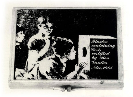
Ben Vautier, Fluxbox containing God, 1961.
Fluxus was conceived as a publishing enterprise specializing in pamphlets, flyers, games, and various unpredictable objets d’art. The spirit of publishing remained central to its nature even though Fluxus artists eventually tried their hands at every other medium under the sun.
Contemporary Applications
“Too bad he died before its advent,” wrote the Village Voice, “(Fluxus founder George Maciunas) would’ve loved the internet.” If the internet is a playground, then take time to play between professional projects. Many of us draw for fun often, but when’s the last time you built a website for fun? Build a site for your own amusement. Build a humorous site that raises money for charity. Build a site in a day.
Fluxus artists spent a lot of time probing the concept of ‘intermedia’ art and performances. What applications or intersections of your media haven’t you considered yet? The Fluxus artists were fond of puzzles and games; what if you built a website that had a logic puzzle built into the code, with clues hidden in the ‘target’ function so that users could hunt for them by rolling their cursor over areas of text?
Or what if we plundered the online trends of other industries for ideas we can implement in design projects? The first bullet listed in these online media predictions in the publishing industry has ‘viral gold’ written all over it. Who will exploit ‘intermedia’ opportunities like these?
Web designers work in one of the only thriving, pivotal industries of this extraordinarily progressive era. Almost all prominent cultural industries have been thrown into upheaval due to the evolutionary progress of the web and a variety of other twenty-first century factors. Cultural monoliths are falling to their knees all around us - the record industry, the publishing industry, and the automobile industry among them. How can we learn from them? And more importantly, how can we help each other evolve?
Web design in the twenty-first century means much more than the unfolding potential of CSS and the dead, discarded shells of old browser versions. It means that we will be central to social, cultural, and political revolutions worldwide. It means opportunity - the opportunity to expand and assist the progress of global cultures.
In Conclusion
Build your business into a brilliant brand, not a boring bland. Seek new and unusual intersections of media. Look at the big picture. What’s going on in your neighbor’s industry today that will affect yours tomorrow?
Go to a museum. Put more art in your design. Always evolve. Be witty and unpredictable. Just remember, as illustrator Sergio Baradat once said, “It’s okay to pull a rabbit out of your hat, but sometimes a rabbit out of a hat is not what’s called for.”
Promote positive change in the world around you when you can. Support a charitable cause. Use your voice. Don’t waste words. Make them sing and dance.
Further Reading
- States of Flux The Village Voice on Fluxus founder George Maciunas.
- Marcel Duchamp (1887-1968) An essay on ‘one man art movement’ Marcel Duchamp. Essay by Nan Rosenthal of the Metropolitan Museum of Art.
- Dada at MoMA This New York Times review of a 2006 Dada show at the Museum of Modern Art includes a slideshow of artwork.
- The Many Temptations of St. Anthony A collection of famous artworks on the theme of ‘The Temptation of St. Anthony.’ Compiled by Dan Redding.
- Dada’s Girl: Hannah Höch Show review and biography of influential Dada photomontage artist Hanna Höch.


 Click here to kickstart your project for free in a matter of minutes.
 Start with a free demo —

 Take a break with a 3D game built on Netlify!
 Check the frontend report!


