The Future Of CSS Typography
There has been an increasing and sincere interest in typography on the web over the last few years. Most websites rely on text to convey their messages, so it’s not a surprise that text is treated with utmost care. In this article, we’ll look at some useful techniques and clever effects that use the power of style sheets and some features of the upcoming CSS Text Level 3 specification, which should give Web designers finer control over text.
Keep in mind that these new properties and techniques are either new or still in the works, and some of the most popular browsers do not yet support them. But we feel it’s important that you, as an informed and curious Web designer, know what’s around the corner and be able to experiment in your projects.
Be sure to check out the following articles:
- 8 Simple Ways to Improve Typography In Your Designs
- CSS Baseline: The Good, The Bad And The Ugly
- The Perfect Paragraph
- Applying Macrotypography For A More Readable Web Page
A Glance At The Basics
One of the most common CSS-related mistakes made by budding Web designers is creating inflexible style sheets that have too many classes and IDs and that are difficult to maintain.
Let’s say you want to change the color of the headings in your posts, keeping the other headings on your website in the default color. Rather than add the class big-red to each heading, the sensible approach would be to take advantage of the DIV class that wraps your posts (probably post) and create a selector that targets the heading you wish to modify, like so:
.post h2 {
    font-weight: bold;
    color: red;
}
This is just a quick reminder that there is no need to add classes to everything you want to style with CSS, especially text. Think simple.
The Font Property
Instead of specifying each property separately, you can do it all in one go using the font shorthand property. The order of the properties should be as follows: font-style, font-variant, font-weight, font-size, line-height, font-family.
When using the font shorthand, any values not specified will be replaced by their parent value. For example, if you define only 12px Helvetica, Arial, sans-serif, then the values for font-style, font-variant and font-weight will be set as normal.
The font property can also be used to specify system fonts: caption, icon, menu, message-box, small-caption, status-bar. These values will be based on the system in use, and so will vary according to the user’s preferences.
Other Font Properties
A few font-related properties and values are not as commonly used. For example, instead of using text-transform to turn your text into all caps, you could use font-variant: small-caps for a more elegant effect.
You could also be very specific about the weight of your fonts, instead of using the common regular and bold properties. CSS allows you to specify font weight with values from 100 to 900 (i.e. 100, 200, 300, etc.). If you decide to use these, know that the 400 value represents the normal weight, while 700 represents bold. If a font isn’t given a weight, it will default to its parent weight.
Another useful property, sadly supported only in Firefox for now, is font-size-adjust, which allows you to specify an aspect ratio for when a fall-back font is called. This way, if the substitute font is smaller than the preferred one, the text’s x-height will be preserved. A good explanation of how font-size-adjust works can be found on the W3C website.
Dealing With White Space, Line Breaks And Text Wrapping
Several CSS properties deal with these issues, but the specs are still in the works (at the “Working Draft” stage).
White Space
The white-space property lets you specify a combination of properties for which it serves as a shorthand: white-space-collapsing and text-wrap. Here’s a breakdown of what each property stands for:
normalwhite-space-collapsing: collapse/text-wrap: normalprewhite-space-collapsing: preserve/text-wrap: nonenowrapwhite-space-collapsing: collapse/text-wrap: nonepre-wrapwhite-space-collapsing: preserve/text-wrap: normalpre-linewhite-space-collapsing: preserve-breaks/text-wrap: normal
This property can be useful if you want to, for example, display snippets of code on your website and preserve line breaks and spaces. Setting the container to white-space: pre will preserve the formatting.

WordPress uses white-space: nowrap on its dashboard so that the numbers indicating posts and comments don’t wrap if the table cell is too small.
Word Wrap
One property that is already well used is word-wrap. It supports one of two values: normal and break-word. If you set word-wrap to break-word and a word is so long that it would overflow the container, it is broken at a random point so that it wraps within the container.

The International Gorilla Conservation Programme website uses word-wrap for its commenters’ names.
In theory, word-wrap: break-word should only be allowed when text-wrap is set to either normal or suppress (which suppresses line breaking). But in practice and for now, it works even when text-wrap is set to something else.
Bear in mind that according to the specification, the break-strict value for the word-break property is at risk of being dropped.
Word And Letter Spacing
Two other properties that are often used are word-spacing and letter-spacing. You can use them to control—you guessed it—the spacing between words and letters, respectively. Both properties support three different values that represent optimal, minimum and maximum spacing.

Show & Tell uses letter-spacing on its navigation links.
For word-spacing, setting only one value corresponds to the optimal spacing (and the other two are set to normal). When setting two values, the first one corresponds to the optimal and minimum spacing, and the second to the maximum. Finally, if you set all three values, they correspond to all three mentioned above. With no justification, optimal spacing is used.
It works slightly different for letter-spacing. One value only corresponds to all three values. The others work as they do for word-spacing.
The specifications contain a few requests for more information and examples on how white-space processing will work and how it can be used and be useful for languages such as Japanese, Chinese, Thai, Korean, etc. So, if you’d like help out, why not give it a read (it’s not that long), and see how you can contribute?
Indentation And Hanging Punctuation
Text indentation and hanging punctuation are two typographical features that are often forgotten on the Web. This is probably due to one of three factors:
- Setting them is not as straightforward as it could be;
- There has been a conscious decision not to apply them;
- Designers simply aren’t aware of them or don’t know how to properly use them.

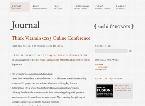
The Sushi & Robots website has hanging punctuation on bulleted lists.
Mark Boulton has a good brief explanation of hanging punctuation in his “Five Simple Steps to Better Typography” series, and Richard Rutter mentions indentation on his website, The Elements of Typographic Style Applied to the Web. These are two very good reads for any Web designer.
So, the theory is that you should apply a small indentation to every text paragraph after the first one. You can easily do this with an adjacent sibling combinator:
p + p {
    text-indent: 1em;
}
This selector targets every paragraph (i.e. p) that follows another paragraph; so the first paragraph is not targeted.
Another typographic rule of thumb is that bulleted lists and quotes should be “hung.” This is so that the flow of the text is not disrupted by these visual distractions.
The CSS Text Level 3 specification has an (incomplete) reference to an upcoming hanging-punctuation property.
For now, though, you can use the text-indent property with negative margins to achieve the desired effect:
blockquote {
    text-indent: -0.2em;
}
For bulleted lists, just make sure that the position of the bullet is set to outside and that the container div is not set to overflow: hidden; otherwise, the bullets will not be visible.
Web Fonts And Font Decoration
font-face
Much talk has been made on the Web about font-face and whether it’s a good thing—especially after the appearance of Typekit (and the still-in-private-beta Fontdeck). The debate is mainly about how much visual clutter this could bring to Web designs. Some people (the argument goes) aren’t sufficiently font-savvy to be able to pull off a design in which they are free to use basically any font they wish. Wouldn’t our sensitive designer eyes be safer if only tested, approved Web-safe fonts were used?
On whatever side of the argument you fall, the truth is that the examples of websites that use font-face beautifully are numerous.

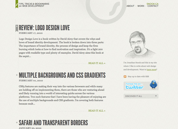
Jonathan Snook’s recently redesigned website uses the font-face property.
The font-face property is fairly straightforward to grasp and use. Upload the font you want to use to your website (make sure the licence permits it), give it a name and set the location of the file.
In its basic form, this is what the font-face property looks like:
@font-face {
    font-family: Museo Sans;
    src: local(“Museo Sans”), url(MuseoSans.ttf) format(“opentype”);
}
The two required font-face descriptors are font-family and src. In the first, you indicate how the font will be referenced throughout your CSS file. So, if you want to use the font for h2 headings, you could have:
h2 {
    font-family: Museo Sans, sans-serif;
}
With the second property (src), we are doing two things:
- If the font is already installed on the user’s system, then the CSS uses the local copy instead of downloading the specified font. We could have skipped this step, but using the local copy saves on bandwidth.
- If no local copy is available, then the CSS downloads the file linked to in the URI. We also indicate the format of the font, but we could have skipped that step, too.
For this property to work in IE, we would also need the EOT version of the font. Some font shops offer multiple font formats, including EOT, but in many cases we will need to convert the TrueType font using Microsoft’s own WEFT, or another tool such as ttf2eot.
Some good resources for finding great fonts that can be used with font-face are Font Squirrel and Fontspring.
text-shadow
The text-shadow property allows you to add a shadow to text easily and purely via CSS. The shadow is applied to both the text and text decoration if it is present. Also, if the text has text-outline applied to it, then the shadow is created from the outline rather than from the text.

Neutron Creations website uses text-shadow.
With this property you can set the horizontal and vertical position of the shadow (relative to the text), the color of the shadow and the blur radius. Here is a complete text-shadow property:
p {
    text-shadow: #000000 1px 1px 1px;
}
Both the color and blur radius (the last value) are optional. You could also use an RGBa color for the shadow, making it transparent:
p {
    text-shadow: rgba(0, 0, 0, 0.5) 1px 1px 1px;
}
Here we define the R, G and B values of the color, plus an additional alpha transparency value (hence the a, whose value here is 0.5).
The specification still has some open questions about text-shadow, like how should the browser behave when the shadow of an element overlaps the text of an adjoining element? Also, be aware that multiple text shadows and the text-outline property may be dropped from the specification.
New Text-Decoration Properties
One problem with the text-underline property is that it gives us little control. The latest draft of the specification, however, suggests new and improved properties that may give us fine-grained control. You can’t use them yet, but we’ll give you a condensed sneak peek at what may come.
**text-decoration-line**Takes the same values astext-decoration:none,underline,overlineandline-through.**text-decoration-color**Specifies the color of the line of the previous property.**text-decoration-style**Takes the values ofsolid,double,dotted,dashedandwave**text-decoration**The shorthand for the three preceding properties. If you specify a value of only one ofnone,underline,overlineorline-through, then the property will be backwards-compatible with CSS Level 1 and 2. But if you specify all three values, as intext-decoration: red dashed underline, then it is ignored in browsers that don’t support them.**text-decoration-skip**Specifies whether the text decoration should skip certain types of elements. The proposed values arenone,images,spaces,inkandall.**text-underline-position**With this property, you can control, for example, whether the underline should cross the text’s descenders or not:auto,before-edge,alphabeticandafter-edge.
Controlling Overflow
The text-overflow property lets you control what is shown when text overflows its container. For example, if you want all of the items in a list of news to have the same height, regardless of the amount of text, you can use CSS to add ellipses (…) to the overflow to indicate more text. This technique is commonly seen in iPhone apps and websites.

The New York Times iPhone app uses an ellipsis for overflowing text.
This property works in the latest versions of Safari and Opera and in IE6 (where the overflowing element should have a set width, such as 100%) and IE7. To be able to apply the property to an element, the element has to have overflow set to something other than visible and white-space: nowrap. To make it work in Opera, you need to add the vendor-specific property:
li {
    white-space: nowrap;
    width: 100%;
    overflow: hidden;
    -o-text-overflow: ellipsis;
    text-overflow: ellipsis;
}
In the Editor’s draft of the specification, you can see that other properties related to text-overflow are being considered, such as text-overflow-mode and text-overflow-ellipsis, for which text-overflow would be the shorthand.
Alignment And Hyphenation
Controlling hyphenation online is tricky. Many factors need to be considered when setting automatic hyphenation, such as the fact that different rules apply to different languages. Take Portuguese, in which you can hyphenate a word only at the end of a syllable; for double consonants, the hyphen must be located right in the middle.
The specification is still being developed, but the proposed properties are:
hyphenate-dictionary;hyphenate-beforeandhyphenate-after;hyphenate-lines;hyphenate-character.

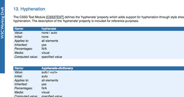
Proposed specification for hyphenation on the W3C website.
This is a good example of how the input of interested Web designers is vital. Thinking about and testing these properties before they are finalized has nothing to do with being “edgy” or with showing off. By proposing changes to the specification and illustrating our comments with examples, we are contributing to a better and stronger spec.
Another CSS3 property that hasn’t been implemented in most browsers (only IE supports it, and only partially) is text-align-last. If your text is set to justify, you can define how to align the last line of a paragraph or the line right before a forced break. This property takes the following values: start, end, left, right, center and justify.
Unicode Range And Language
Unicode Range
The unicode-range property lets you define the range of Unicode characters supported by a given font, rather than providing the complete range. This can be useful to restrict support for a wide variety of languages or mathematical symbols, and thus reduce bandwidth usage.
Imagine that you want to include some Japanese characters on your page. Using the font-face rule, you can have multiple declarations for the same font-family, each providing a different font file to download and a different Unicode range (or even overlapping ranges). The browser should only download the ranges needed to render that specific page.
To see examples of how unicode-range could work, head over to the spec’s draft page.
Language
Use the :lang pseudo-class to create language-sensitive typography. So, you could have one background color for text set in French (fr) and another for text set in German (de):
div:lang(fr) {
    background-color: blue;
}

div:lang(de) {
    background-color: yellow;
}
You might be wondering why we couldn’t simply use an attribute selector and have something like the following:
div[lang|=fr] {
    background-color: blue;
}
Here, we are targeting all div elements whose lang attribute is or starts with fr, followed by an -. But if we had elements inside that div, they wouldn’t be targeted by this selector because their lang attribute isn’t specified. By using the :lang pseudo-class, the lang attribute is inherited to all children of the elements (the whole body element could even be holding the attribute).
The good news is that all latest versions of the major browsers support this pseudo-class.
Conclusion
In surveying the examples in this article, you may be wondering why to bother with most of them.
True, the specification is far from being approved, and it could change over time, but now is the time for experimentation and to contribute to the final spec.
Try out these new properties, and think of how they could be improved or how you could implement them to make your life easier in future. Having examples of implementations is important to the process of adding a property to the spec and, moreover, of implementing it in browsers.
You can start with the simple step of subscribing to the CSS Working Group blog to keep up to date on the latest developments.
So, do your bit to improve the lot of future generations of Web designers… and your own!
Resources and Interesting Links
- CSS3 Text (Editor’s Draft), W3C
- Hyphenation, W3C
- CSS3 Fonts, W3C
- The Elements of Typographic Style Applied to the Web
- Type Experiments with HTML
- Styling a Poem With Advanced CSS Selectors
- CSS3: Examples and Best Practices


 SurveyJS: White-Label Survey Solution for Your JS App
 Agent Ready is the new Headless

