Case-Study: Deconstructing Popular Websites
In our past articles, we’ve experimented with better ways to engage users on web pages with CSS3. We love getting into the nuts and bolts of web design by showing off some nifty coding tricks. In this article we’ll take a step back to provide some reasoning for designers to embark on that next redesign.
Great web design happens with sound user needs, solid business goals and focused metrics. Learning how to deconstruct a website is an important step in building a plan that aligns the company vision with the needs of users. A good review will put the focus on the profitability of the business.
We deconstructed a few popular web pages below to stimulate the discussion around specific interaction issues many companies face. We were not part of any of the design decisions and did not have access to the business objectives; our recommendations are based on experience and repeated patterns we observe in web design. And with that, here are five content heavy homepages deconstructed.
Mashable
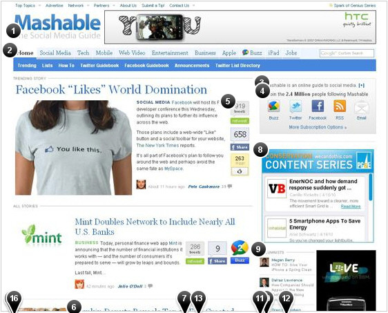
Mashable is a huge social media news website. Mashable does a good job fronting up articles — they know their audience. It’s refreshing to see a single focus on the top of the page. They also do a good job of presenting headlines and pumping out regular content to their news-thirsty readers. Advertising, however, seems at odds with their content strategy in many places on the page (this is a common trend in content sites). It may be useful to consider changing the placement of advertisements to encourage more click-through.
Full interactive view | Summary view
- Regular readers might understand this statement, but based on the content on the homepage, it’s really hard to understand how these articles tie to social media.
- Holy navigation! People read body copy first, so this much navigation on the top probably doesn’t create more clicks into the site.
- This is great, but it gets lost and it’s not clear that you can read more by clicking on the ‘+’ symbol.
- Good use of the bandwagon technique to get people following Mashable.
- Right now these might be good for encouraging participation with the content, but it should be watched closely because of burnout. The homepage is heavily devoted to using these social media tools (which it should eat it’s own dogfood) &mdash as long as the site stays focused on good content, the use of them should only help grow readership.
- Butting the headline up against the image actually creates more interest in the summary. It’s a good technique to create a quickly “scannable” headline.
- With all the good things the layout does to get you invested in the content, the buttons create a heavy distraction, though the numbers on the buttons are extremely useful to users. The Google Buzz icon shouts for attention.
- A Med Rec like this performs better near the top when it’s tied to content. In the stream of information, this type of add will be ignored.
- Interesting approach to get people to view the sky scrapper ad. Tying these headlines to the ad probably increases the click through on the ad. $
- Square ads this low on the page probably don’t perform well- integrating them between content articles will increase activity. $$$
- We called this out on TechCrunch — taking sponsored events like this and putting them into ad space defeats the purpose of a powerful publishing platform.
- Where are the benefits? Please sell me on why I need this iPhone app. If it is a money maker, or provides more compelling ways to connect to users, then it makes sense to promote it. $$$
- According to usability studies, clouds like this don’t help users very much.
- We assume this is more for SEO than readers- it’s a daunting list of topics to get through at the bottom of a page. Users will click on a high percentage of links if they are focused at the bottom of a page. This list, however, is too long to reap this benefit.
- These probably provide a revenue stream or help paying for the services. Not very useful for users.
- Interesting placement: this probably does fine in the middle of the page. Is it sponsored? Might be good to call this out.
MSN
MSN’s current design is a radical departure from their old homepage and a welcome change in a crowded market of news aggregators. MSN has struggled to separate itself from Yahoo and Google – this makeover helps differentiate the service.
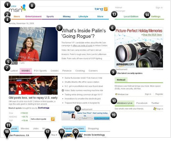
Microsoft has struggled to drive profits with their web properties because of their lack of laser-like focus on users. The airy, light feel of the page makes it very approachable and inviting. Users will rejoice. It may be useful to create stronger hierarchies below the fold to encourage more return clicks — the way it is designed now doesn’t make the links look very valuable.
Full interactive view | Summary view
- It’s interesting how companies alert people to a new site. Putting a beta or preview label allows a team to deal with failure upfront. But why?
- The navigation is simple and easy to drill down to a topic (large clicking area), but the drop down menus get in the way. They’re a bit slow to respond to the rollover.
- Great use of a headline. Big and bold. A huge departure from the old MSN homepage.
- Now, this is a bold move by one of the most traffic pages on the Web. The white space alone seems like a huge risk for such an advertising dependent page.
- This is a new trend by Yahoo as well: cycle more news stories onto a single page. The problem is that these are too small to accurately control.
- Incredible discipline to not jam the ad higher on the page. If you compare this design with the old homepage, they’re still able to get the ad higher on the page.
- Bummer, unlike the top nav, the clickable area on this subnav is relegated to the words.
- Interesting treatment on the search bar. This is a huge departure from the previous Bing search box. Associating the search clicking action with Bing is good, but it’s going to be extremely difficult to get people to say, “just bing it.” All other search filters have been removed: it seems like a smart move.
- Very odd placement for a security update! This has to be a business requirement that was thrown into the page.
- Amazing amounts of effort and money have been thrown into being with the cool kids, Facebook and Twitter. Microsoft put $250,000,000 into Facebook, so it’s surprising that Twitter gets free advertising.
- We are surprised again by the constraints of this redesign. Local, movies, maps and jobs are probably the four most used links (Yahoo on the other hand forces you to choose your links). This was a sound choice by MSN.
- Huge effort around local content. Full headlines are important (Yahoo truncates the headlines of local news).
- This is a nice addition; local content is going to start growing.
- Useful settings, but it’s unclear why this was included as a main nav item. The functionality is different.
- Instead of just showing popular searches, contextual information is provided next to the term. Very cool.
- Odd placement of “advertisement,” the top ad has this below the ad.
- Very sparse. A small call to action might increase use of the search form.
- Interesting constraint on this footer nav for a huge business that has hundreds of business units. It will be interesting to see this one playing out.
- It’s incredible to see a big white patch here. It gets filled with your information from the social site, but it’s an activity that most people will not do. Anyone in advertising yelling?
- Big departure: links are not blue and not distinguished unless you rollover the text.
Smashing Magazine
True to its roots, Smashing Magazine has a strong focus on content. Over the years it’s added depth to the site through new content and features. With most growing websites, it’s balanced new opportunities with its bread and butter, web design articles.
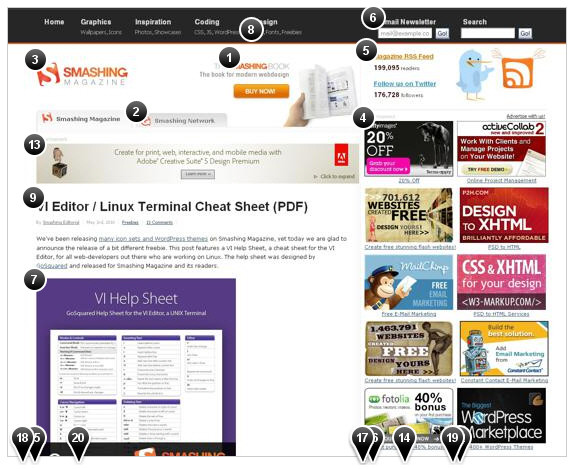
The number of new visitors that come to the site is staggering (based on referral traffic we seen). This makes it extremely difficult to balance the needs of the new readers with their loyal followers. Staying focused on good content makes this task easier. From a business perspective, it is recommendable to better align revenue streams (ads, jobs, books, etc) with the content. The risk of alienating readers is small; most users will tolerate offers if Smashing Magazine reduces the overall clutter and redundancy on the site.
Full interactive view | Summary view
- Good use of different images on each page load. Returning users will find this subtle technique draw them into the graphic. The competition with the top horizontal ad makes this a battle of attention: where do you want me to click?
- Integrating content from a network is a great way to encourage cross traffic and it should be balanced with the overall goals of the site. Finding a middle ground between a tab and fully featured posts would help this effort.
- The white space around the logo gives it some nice breathing room and focus. To give return users a little more value, tighten up the spacing and bring a little more content above the fold.
- Generous size ads for the advertisers, but the wall of ads probably lowers the overall click-through. $$$
- The Twitter and RSS numbers provide strong validation of the site. The graphics are nice, but the visual style is not used anywhere else on the page.
- This is a great idea, but the value is unclear: why do I want to sign up for the newsletter?
- Great use of big images to sell the story. However, a wide gap is created when the ad is placed at the top.
- Excellent use of quick links under the header. Too many sites try to hide these in drop downs.
- Yes! Simple, big headlines scream: Read our content.
- There are some great articles that get lost in this list. This duplicates the tab on the top of the page. It’s a balance between creating traffic and loosing traffic.
- This is an odd place to introduce general site content.
- This additional list of tweets doesn’t help attract new followers. The text is out of context with replies and the visual style seems out of place.
- This is near the headline, so it’s a great benefit to the advertiser… but it also pushes the width of the content much wider.
- This is a revenue stream that is hidden down in the sidebar. Integration of jobs into the site will make traffic to this section higher. $$$
- Focusing on the headlines and lead-in is a good tactic. The usability doesn’t fall apart with a slower loading image down the page.
- Placing this new property on the lower half of the page reduces the exposure this new effort requires. It also suffers from ad blindness.
- Popular posts are great, but more context might make the value of the links go up. When sprinkled down the page the impact declines.
- The footer has good links. Improving the hierarchy of links will provide more clicks and revenue. People tend to look for launch points after scrolling down a page.
- This type of personality goes a long way in building a loyal following.
- The addition of pagination doesn’t provide much context for the vast majority of visitors. Focusing on a single call to action will increase the number of clicks.
TechCrunch
TechCrunch has put a heavy emphasis on providing great, up-to-date content. This is a strategy that will continue to fuel their growth. They have a number of efforts on the page that aren’t presented well, but their focus on content will continue to drive traffic to those initiatives.
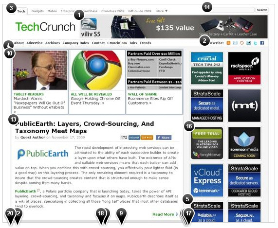
Full interactive view | Summary view
- Boxing in the ad around a piece of content helps increase click-through. The logo, however, doesn’t offer much in terms of actions and is likely to reduce the click-through.
- TechCrunch does a great job of getting feed sign-ups, but these actions get lost in the shuffle. It is very likely that people who subscribe to a feed are more likely to engage in the site. $$$
- Good choice: people want content, not navigation. However, the calls to action for these destinations should be stronger within the page.
- The downside of a “modular,” boxed in design is that intersecting lines fight for the user’s eye.
- The downside of this advertising model is repeated ads- it grabs the attention of a user, but this effort will provide limited value for the advertiser.
- In a blog structure like this, content space is valuable: but why treat the event as an ad? Content that supports the event would drive more invested clicks.
- Is this an ad? Editorial? Clicking on this graphic takes you to a blog entry, but it appears to be advertising. It’s very misleading.
- Good information. It costs money, but why treat this as an ad?
- Interesting use of buttons to show popularity of a post. For design consistency it would be nice to right align with the dotted line.
- Great use of images and headlines to draw people into the site. This feature is a huge win over most editorial sites. An A/B test might reveal having one big rotating editorial image and headline would actually encourage more clicks down the page and increase advertising click-through rates.
- This is great. Showing activity encourages more activity.
- Boxing in the ad increases the click-through. Removing the dotted line to the right might increase it even more.
- Bold headers are a good choice. Users appreciate the simplicity of a clear call to action. They can choose to read the article or not.
- This is where a user would expect to see search, though it feels a tad crammed and the rounded form elements don’t seem to gel with the heavy grid system.
- Logos seem odd and out of place. For a site that considers placement of content, these seem to be thrown onto the page.
- Eventually the value of these placements will go down as users continue to return for content. Reducing the number of ads and increasing payments might encourage more click-through.
- These two ad placements probably don’t get a high click-through rate.
- Humor keeps things real. Even if it is for stats.
- Content, content, and content. TechCrunch gives users what they want. A long scrolling page of content keeps people coming back.
- Considering a better footer might increase traffic and engagement. $$$
CNN
CNN made a bold move by restructuring the entire website and putting a huge emphasis on video. It’s a very stark contrast from their old website, and while we like the dynamic elements, the three column approach makes it difficult to understand the hierarchy of the information. It could be helpful to reduce the heavy red banner, simplify the columns and use more of the design choices made on the article pages.
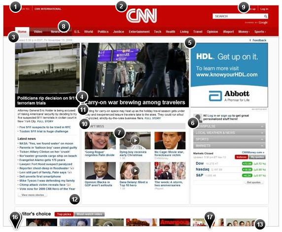
Full interactive view | Summary view
- This red header competes with the content. It’s a branding effort that fights with the use of the site. Over time people will be influenced more by the quality of the content.
- This is a unique branding decision to center align the logo. It certainly creates awareness of the logo, but over time it will get in the way of what users want: content. 84 pixels is a lot of vertical space to highlight a logo.
- This is a nice feature. It’s great to know how current the content is. As a large news organization is something that users will appreciate. It’s also a competitive advantage over smaller news outlets.
- It’s an interesting technique, but the headline gets lost as white text on black. I’m also conflicted-should I start reading on the left or center image.
- Based on our experience, placement of the ad here probably reduces the click-through, especially considering that people are trying to figure out if they need to read the center feature block or left feature block.
- This blocky navigation competes with the content. It seems a bit out of place.
- This video call to action is nifty, but it creates noise by centering it over the image.
- Does the general population understand what beta means? If it’s not ready for everyone, invite people to a private release of the feature.
- Clicking on this sign-up link pops up a sign-up form, but it’s unclear why I would want to sign-up. The benefits are not highlighted.
- Don’t Miss? If CNN wants clicks it should be a directive, like ‘click on these feature stories’. This will increase the percentage of click-through.
- This is surprisingly small text for a feature story. Most older people will have difficulty reading this summary text.
- Creating gutters like this only adds more noise. Convergence of lines like this direct the eye in the wrong direction.
- Scrolls like this are less neat. Users don’t like these features.
- This must have been an organizational fight to put this at the bottom of the page.
- Oh, just what I needed at the bottom of my national news page, weather?
- Wholly content blocks batman! This seems like an odd choice to put this content in the middle of the page.
- Why put this in the middle of the page? Shouldn’t this just be balanced near the top of the page with stories that people want to read? So the ‘confused seal on the side of the road’ is not a hot topic?
Conclusion
A grounded, business-focused approach to redesigning a web page will go a long way helping companies understand the value of design. Deconstructing a web page is a great tool to open up the conversation and start a productive dialog. Balancing the needs of users with the business goals is critical to the success of a company.
So, what should you include? Historical examples bring context to the existing web page and provide insights that influence a redesign. Referencing other pages also makes it easier to understand a broader perspective. And let’s not forget, revenue opportunities!


 Agent Ready is the new Headless


 SurveyJS: White-Label Survey Solution for Your JS App