Connecting The Dots With CSS3
text-shadow & border-radius to good use while stepping into background-clip and visual effects like transitions and animations. We’ve also spent a great deal of time debating how and when to implement these properties. Just because a property isn’t widely supported by browsers or fully documented at the moment, it doesn’t mean that we shouldn’t be working with it.In fact, I’d argue the opposite.
Best practices for CSS3 usage need to be hashed out in blog posts, during spare time, and outside of client projects. Coming up with creative and sensible ways to get the most out of CSS3 will require the kind of experimentation wherein developers gladly trade ten failures for a single success. Right now, there are tons of property combinations and uses out there waiting to be discovered. All we have to do is connect the dots. It’s time to get your hands dirty and innovate!
Where Do I Start?
One of my favorite things to do is to scan a list of CSS properties and consider which ones might work well together. What would be possible if I was to connect @font-face to text-shadow and the bg-clip:text property? How could I string a webkit-transition and opacity together in a creative way? Here are a few results from experiments I’ve done recently. While some may be more practical than others, the goal here is to spark creativity and encourage you to connect a few dots of your own.
Note: While Opera and Firefox may soon implement specs for many of the CSS3 properties found here, some of these experiments will currently only work in Webkit-browsers like Google Chrome or Safari.
Example #1: CSS3 Transitions
A safe place to start with CSS3 visual effects is transitioning a basic CSS property like color, background-color, or border on hover. To kick things off, let’s take a link color CSS property and connect it to a .4 second transition.
Start with your link CSS, including the hover state:
a { color: #e83119; }
a:hover { color:#0a99ae; }
Now, bring in the CSS3 to set and define which property you’re transitioning, duration of transition and how that transition will proceed over time. In this case we’re setting the color property to fade over .4 seconds with an ease-out timing effect, where the pace of the transition starts off quickly and slows as time runs out. To learn more about timing, check out the Surfin’ Safari Blog post on CSS animations. I prefer ease-out most of the time simply because it yields a more immediate transition, giving users a more immediate cue that something is changing.
a {
-webkit-transition-property: color;
-webkit-transition-duration:.4s;
-webkit-transition-timing:ease-out;
}
You can also combine these into a single CSS property by declaring the property, duration, and timing function in that order:
a { -webkit-transition: color .4s ease-out; }The final product should be a red text link that subtly transitions to blue when users hover with their mouse pointer. This basic transitioning technique can be connected to an infinite amount of properties. Next, let’s let’s create a menu bar hover effect where border-thickness is combined with a .3 second transition.
To start, we’ll set a series of navigation links with a 3 pixel bottom border, and a 50 pixel border on hover:
border-nav a { border-bottom: 3px solid #e83119 }
border-nav a:hover { border-bottom: 50px solid #e83119 }
To bring the transition into the mix, let’s set a transition to gradually extend the border thickness over .3 seconds in a single line of CSS:
border-nav a { -webkit-transition: border .3s ease-out; }Examples
This is just one example of how to use these transitions to enhance links and navigation items. Here are a few other sites with similar creative techniques:
Team Excellence The webkit transition on all navigation items, including the main navigation set at .2s provides a nice effect without making visitors wait too long for the hover state.
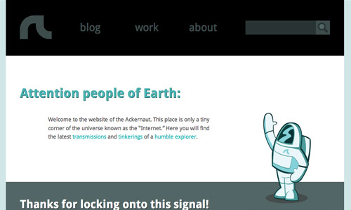
Ackernaut Ackernaut has subtle transitions on all link hovers, and extends the property to fade the site header in/out.
SimpleBits The SimpleBits main navigation transitions over .2 seconds with linear timing.
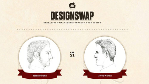
DesignSwap On DesignSwap, all text links have a .2 second transitions on hover and the swapper profiles fade out to real details about the latest designs.
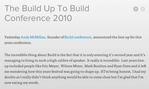
Jack Osborne Jack Osborne transitions all of the blue links as well as the post title link on his home page.
Eric E. Anderson
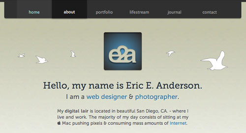
Eric E. Andersion has taken CSS3 implementation even further by implementing a transition on his main navigation for background color and color alongside border-radius and box-shadow.
Example #2: Background Clip
When connected to properties like text-shadow and @font-face, the background-clip property makes all things possible with type. To keep things simple, we’ll start with taking a crosshatch image and masking it over some text. The code here is pretty simple. Start by wrapping some HTML in a div class called bg-clip:
<div class="bg-clip">
<h3>kablamo!</h3>
</div>
Now to the CSS. First, set the image you will be masking the text with as the background-image. Then, set the -webkit-text-fill-color to transparent and define the -webkit-background-clip property for the text.
.bg-clip {
background: url(../img/clipped_image.png) repeat;
-webkit-background-clip: text;
-webkit-text-fill-color: transparent;
}This opens the door for you to start adding texture or other graphic touches to your type without resorting to using actual image files. For even more CSS3 text experimentation, we can add the transform property to rotate the text (or any element for that matter) to any number of degrees. All it takes is a single line of CSS code:
-webkit-transform: rotate(-5deg);
-moz-transform: rotate(-5deg);
-o-transform: rotate (-5deg);
Note: While background-clip isn’t available in Firefox or Opera, the transform property is, so we’ll set this for each browser.
Examples
This is a fairly simple implementation, but there are quite a few really interesting and innovative examples of this technique:
Trent Walton
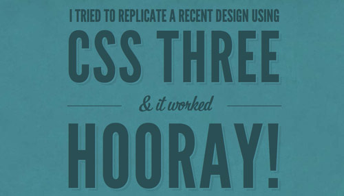
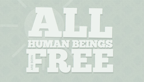
An experiment of my own, combining bg-clip and @font-face to recreate a recent design.
Neography
An excellent example of what is possible when you throw rotate, bg-clip and @font-face properties together.
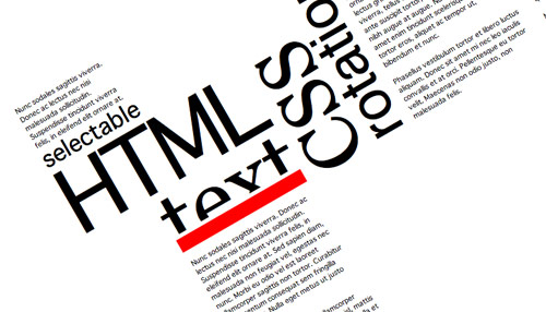
Everyday Works One of the earliest innovative implementations of CSS text rotation I’ve seen.
Panic Blog
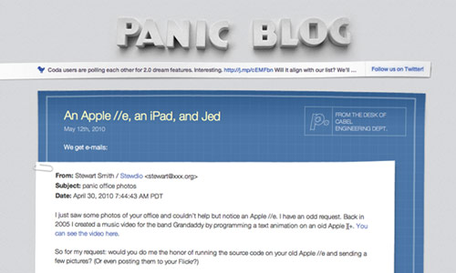
The Panic blog randomly rotates divs / posts. Be sure to refresh to see subtle changes in the degree of rotation.
Sam Brown Sam’s got a really nice text-rotate hover effect on the “stalk” sidebar links.
Example #3: CSS Transforms, Box Shadow and RGBa
What used to take multiple divs, pngs and extra markup can now be accomplished with a few lines of CSS code. In this example we’ll be combining the transform property from example 2 with box-shadow and RGBa color. To start things off, we’ll create 4 image files, each showing a different version of the Smashing Magazine home page over time with a class for the shadow and a specific class to achieve a variety of rotations.
Here’s the HTML:
<div class="boxes">
<img class="smash1 shadowed" src="../img/smash1.jpg" alt="2007"/>
<img class="smash2 shadowed" src="../img/smash2.jpg" alt="2008"/>
<img class="smash3 shadowed" src="../img/smash3.jpg" alt="2009"/>
<img class="smash4 shadowed" src="../img/smash4.jpg" alt="2010"/>
</div>
Let’s set up the CSS for the RGBA Shadow:
.shadowed {
border: 3px solid #fff;
-o-box-shadow: 0 3px 4px rgba(0,0,0,.5);
-moz-box-shadow: 0 3px 4px rgba(0,0,0,.5);
-webkit-box-shadow: 0 3px 4px rgba(0,0,0,.5);
box-shadow: 0 3px 4px rgba(0,0,0,.5);
}
Before moving forward, let’s be sure we understand each property here. The box-shadow property works just like any drop shadow. The first two numbers define the shadow’s offset for the X and Y coordinates. Here we’ve set the shadow to 0 for the X, and 3 for the Y. The final number is the shadow blur size, in this case it’s 4px.
RGBa is defined in a similar manner. RGBa stands for red, green, blue, alpha. Here we’ve taken the RGB value for black as 0,0,0 and set it with a 50% alpha level at .5 in the CSS.
Now, let’s finish off the effect by adding a little CSS Transform magic to rotate each screenshot:
.smash1 { margin-bottom: -125px;
-o-transform: rotate(2.5deg);
-moz-transform: rotate(2.5deg);
-webkit-transform: rotate(2.5deg);
}
.smash2 {
-o-transform: rotate(-7deg);
-moz-transform: rotate(-7deg);
-webkit-transform: rotate(-7deg);
}.smash3 {
-o-transform: rotate(2.5deg);
-moz-transform: rotate(2.5deg);
-webkit-transform: rotate(2.5deg);
}.smash4 {
margin-top: -40px;
-o-transform: rotate(-2.5deg);
-moz-transform: rotate(-2.5deg);
-webkit-transform: rotate(-2.5deg);
}Examples
Here are a few additional sites with these properties implemented right now:
Butter Label
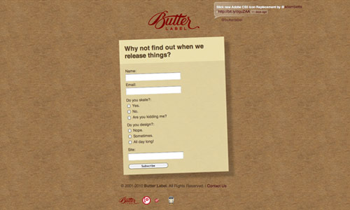
This site is jam packed with well-used CSS3. Notice the transform and box-shadow properties on the subscribe form.
Hope 140
Another site with plenty of CSS3 enhancements, Hope 140’s End Malaria campaign site features a collage of photographs that all have the same shadow & transform properties outlined in our example.

For A Beautiful Web
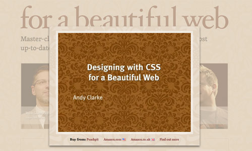
For A Beautiful Web utilizes RGBa and box-shadow for the overlay video clips boxes linked from their 3 master-class DVDs. While you’re there, be sure to note the transforms paired with the DVD packaging links.
Simon Collison
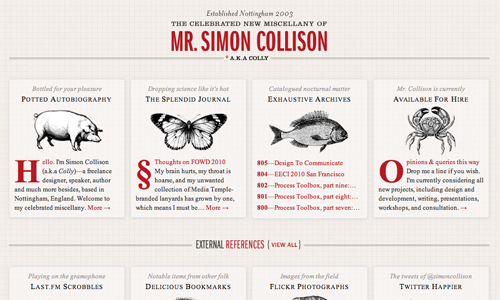
Simon Collison has implemented RGBa and box-shadow on each of the thumbnail links for his new website.
Example #4: CSS3 Animations
If you really want to push the envelope and truly experiment with the latest CSS3 properties, you’ve got to try creating a CSS3 keyframe animation. As a simple introduction, let’s animate a circle .png image to track the outer edges of a rectangle. To begin, let’s wrap circle.png in a div class:
<div class="circle_motion">
<img src="/img/circle.png" alt="circle"/>
</div>
The first step in the CSS will be to set the properties for .circle_motion, including giving it an animation name:
.circle_motion {
-webkit-animation-name: track;
-webkit-animation-duration: 8s;
-webkit-animation-iteration-count: infinite;
}
Now, all that remains is to declare properties for each percentage-based keyframe. To keep things simple here, I’ve just broken down the 8 second animation into 4 quarters:
@-webkit-keyframes track {
0% {
margin-top:0px;
}
25% {
margin-top:150px;
}
50% {
margin-top:150px;
margin-left: 300px;
}
75% {
margin-top:0px;
margin-left: 300px;
}
100% {
margin-left:0px;
}
}Examples
A few examples of CSS3 animations online now:
Hope 140 Hope 140 subtly animates their yellow “Retweet to Donate $10” button’s box shadow.

Hardboiled Web Design Andy Clarke puts iteration count, timing function, duration and delay properties to good use when animating a detective shadow across the background of Hardboiled Web Design.
Optimum7 Anthony Calzadilla has recreated the Spider Man opening credits using CSS3 with JQuery and HTML5. You can also learn more about the process in his article “Pure CSS3 Spiderman Cartoon w/ jQuery and HTML5 – Look Ma, No Flash!”.
The Many Faces Of…
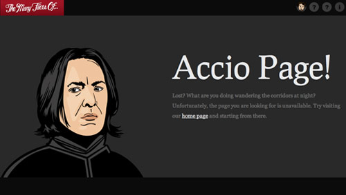
The Many Faces Of… animates the background position of a div to create an effect where characters creep up from the bottom of the page.
Trent Walton I recently wrote a post about CSS3 usage, and animated a blue to green to yellow background image for the masthead.
OK, Dots Connected! Now What?
Yes, all of this CSS3 stuff is insanely exciting. If you’re like me, you’ll want to start finding places to use it in the real world immediately. With each new experimental usage come even more concerns about implementation. Here are a few of my ever-evolving opinions about implementing these properties online for your consideration.
- CSS3 enhancements will never take the place of solid user-experience design.
- Motion and animation demands attention. Think about a friend waving to get your attention from across a crowded room or a flashing traffic light. Heavy-handed or even moderate uses of animation can significantly degrade user experience. If you are planning on implementing these techniques on a site with any sort of A to B conversion goals, be sure to consider the psychology of motion.
- Don’t make people wait on animations. Especially when it comes to hover links, be sure there is an immediate state-change cue.
- Many of these effects can be used in a bonus or easter-egg type of application. Find places to go the extra mile.
This is a group effort. Don’t be afraid of failure, enlist the help of other developers, join the online discussions, and above all, have fun!
Further Reading
Also consider the following Smashing Magazine articles:
- Start Using CSS3 Today: Techniques and Tutorials
- Why We Should Start Using CSS3 And HTML5 Today
- Take Your Design To The Next Level With CSS3
- Using CSS3 Transitions, Transforms and Animation A very extensive and detailed overview of CSS3 techniques for transitions, transforms and animations, with numerous examples.
- Sexy Interactions with CSS Transitions many of us have never created animations in JavaScript, Flash or some other environment before, and are therefore not as well-versed in the unwritten rules of the animation world. This article explains how to create nice CSS transitions with CSS3.
- Examples of CSS3 in the Wild Showcase of sites using CSS3 properties.
- CSS3 Transitions – Are We There Yet?
- Cross-Browser Animated CSS Transforms — Even in IE.


 Agent Ready is the new Headless
 SurveyJS: White-Label Survey Solution for Your JS App


