Resurrecting User Interface Prototypes (Without Creating Zombies)
Every user interface designer is familiar with this procedure to some extent: creating a prototype and evaluating it with potential users to understand how the user interface should look and behave. Users will tell you what nags them and should therefore be improved before you code. So, at the beginning of any UI design process, you can expect your prototype to have to be modified in order to work.
Because you (and your client) want the changes to be as cost-efficient as possible, you are better off adopting change-friendly prototyping methods and tools. This is especially true in the early stages of the project, when your ideas for potential solutions are rather vague. In this early phase, most often you don’t even know the exact problem for which you are hunting for a solution. You are still analyzing more than designing.
To work change-friendly and cheap, then, it’s wise to start the prototype roughly (maybe as a paper sketch) and make it more sophisticated as you understand the requirements—that is, assessing what users will need (or what they won’t need) and how willing your client is to give it to them (yes, those are not always in line).
Also consider the following related articles:
- Optimizing Your Design For Rapid Prototype Testing
- Choosing The Right Prototyping Tool
- Content Prototyping In Responsive Web Design
- Design Better And Faster With Rapid Prototyping
Finally, when the prototype has reached a certain level of expressiveness, it could even serve as a “living specification” for developers, to tell them how the front end should look and feel. These are sometimes referred to as high-fidelity prototypes. As soon as the developers know exactly what to code, your high-fidelity prototype can die in peace. It has no future… Or does it?
While this approach is plausible and indeed makes perfect sense for many situations, it needs to be slightly reconsidered in the context of new UI paradigms.
A New Challenge
Think of what is nowadays commonly called “natural” user interface (NUI). These fancy multi-touch (and similar) playgrounds are on their way to replacing (or at least augmenting) our good old graphical user interfaces (GUIs), just as GUIs replaced command line interfaces (CLIs), lowering the burden for users to interact with a system, because everything is now more direct than it was with a mouse and pointer.
UIs Become Natural… Well, Almost
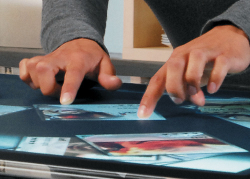
With multi-touch apps, you just tap directly on what you want to manipulate or make a gesture on it, and there you go. NUIs are not solely about multi-touch either: a speech recognition system is a NUI, too. Just say what you want and the system will do it for you.
Let’s forget for a while that, though called “natural” user interfaces, they are still far from being truly natural. They just feel more natural than before. With multi-touch systems, most gestures are implicit, and you don’t get any convincing tactile feedback so far. Talking to a machine (like one with a speech-recognition system) can be pretty embarrassing. Nonetheless, NUIs are brilliant stuff and will conquer the world.
A Nightmare (to Come) for Developers
Unfortunately, what is brilliant for the user can be a nightmare for the developer. Admittedly, we are still ramping up the hype cycle (especially for multi-touch technologies), and yet programmers are already so fascinated by the possibilities that they are burning the midnight oil to get the job done. This enthusiasm won‘t last forever: NUIs will become common, as will their implementation. The problem that seems exclusive to developers is, in fact, a problem for UI designers, too: what’s hard to develop for the front end is also usually hard to design, prototype and specify.
Multi-touch UIs are especially delicate: so many nifty details influence the user experience that capturing them comprehensively takes a lot of effort. Which gesture will trigger which action? How many fingers should be needed to perform a particular gesture? How fast should the fingers move? How should a manipulated object or scene behave after a long time to keep up a proper cause-and-effect interplay?
Prototyping Becomes More Expensive…
As long as you concentrate your design efforts on a simple photo-sorting application, you won’t run into problems. You can easily prototype this experience by… well, sorting real photos. But multi-touch applications will become more complex, and gestures will occur in greater variety and (hopefully) help to solve more realistic problems. This gives the UI designer an unfamiliar challenge. Prototyping cheaply and, in the process, learning about the experience of solving a complex problem using gestures is almost impossible if there’s no suitable analogy in real life.
Of course, you could prototype parts and approximate a decent design, but then you would have that nagging feeling that you missed something and would doubt that you really translated what you intended. So, to design amazing interaction experiences for NUIs, you have to be prepared to rack your brain by performing more and smaller prototyping-feedback cycles. Creating an expressive prototype requires more time and expertise. Christopher Alexander has said:
Things that are good have a certain kind of structure. You can’t get that structure except dynamically. Period. In nature you’ve got continuous very-small-feedback-loop adaptation going on, which is why things get to be harmonious. That’s why they have the qualities we value. If it wasn’t for the time dimension, it wouldn’t happen. Yet here we are playing the major role creating the world, and we haven’t figured this out. That is a very serious matter.
As a building architect, Alexander has nothing to do with GUIs or NUIs. Still, his words are so universally true that they can be translated to the context of user interface architecture. The more natural and harmonious a UI designer wants a user interface to be, the more time and more iterations he will need to get there.
Good designers might require fewer iterations than poor designers, but they couldn’t do it without any (unless they made a one-to-one copy taken straight from nature itself). We can use simple deductive reasoning: good UI designs in the future will require more feedback loops; more feedback loops will make prototyping more expensive; and the more expensive prototyping is, the higher the burden of throwing a prototype away.
… Too Expensive to Throw Things Away
So, instead of throwing it away, what else can you do with your prototype? You could, of course, develop it over time, which means building on what you have and just adding or modifying the things that you’ve learned from feedback are missing or need to change. Even after development has finished, you can put the prototype on hold and get back to it later, as necessary. And let’s not deceive ourselves: even when you’ve gotten the requirements, the day will come when one of them will become invalid, at which point you will need to dig up your almost-forgotten creation to make changes.
But how effective is it really to evolve prototypes this way, and is the process enough to address the challenges that modern UI paradigms pose? To answer this, let’s look at what support a modern prototyping tool can give the UI designer. After all, not being able to do something with a prototyping tool may render the approach impractical. In the second part of this article, I’ll shed light on Expression Blend, because it now handles the widest set of possibilities we have faced so far for squeezing the most out of a prototype.
Prototype Recycling with Expression Blend
Let’s say you want to make use of Blend to design a NUI that is based on Silverlight or WPF and that lets you easily manipulate items on the screen. In the beginning, you wouldn’t even touch the tool at all; rather, you would “invent” whatever gesture you think is intuitive to perform this operation. Most likely, you would do this in your head or on a whiteboard. You’ll discuss and refine the design with teammates or potential users.
At this stage, everything is still low-fidelity, so throwing out things isn’t costly yet. When you have a good feeling about the rough design, you can start prototyping in higher fidelity, to be really sure that your idea works. To simulate the intended interaction experience, every single detail is critical in later prototyping stages.
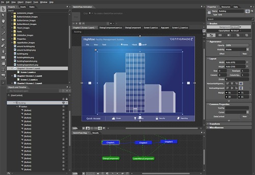
Defining Behaviors
First of all, defining how an item behaves during manipulation is interesting. In fact, Expression Blend allows you to attach such “behaviors” to an object, telling the object how to move, resize or do anything else according to a certain user input. The nice thing about behaviors is that they are self-contained software objects that you can use out of the box, without needing to know exactly how they work.
Because a growing community of developers already codes behaviors and publishes them on the Web free of charge, searching first for an existing behavior that approximates what you want to achieve is a good idea. In some cases, you may need to tweak the behavior to suit your needs; you do this either by yourself (if you’re one of those rare “designer/developers”) or by asking another developer for quick help.
Caring About Every Detail
Because you really want to engage users with your UI design, you may want to add stunning animation and other visual effects to the item being manipulated. Expression Blend offers a timeline for creating an animation storyboard, as well as a lot of properties to change the style of an item.
With animation, for example, an object that lethargically follows the path of your finger feels very different than one that organically accelerates and decelerates according to physical properties of the real world.
Everyone with an iPhone loves the “elastic strap resistance” behavior they get when scrolling through a list. To get such an immersive, engaging and to some extent natural experience, you have to perfectly coordinate all parameters, including location, speed, size, color, shape, etc.. Thus, you can elicit the precise emotional response in users that you’re aiming for only by composing, tweaking, testing usability, tweaking again, animating, styling, re-testing usability, modifying the styles, etc.
Usability testing, then, does not always need to happen a grand scale. Involving as few as two to three people can also yield quick valuable feedback. Still, you cannot do entirely without usability testing.
Getting Real
As soon as the prototype is finished, you will have to really implement it. Even though it took blood, sweat and tears to build it, it’s still just a prototype, after all, not a real application. You need the supports of developers to realize it.
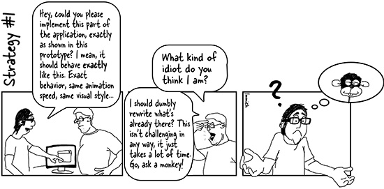
So, how do you manage to implement the prototype while preserving all of the nifty details that you put together with painstaking effort? One way is to say to the developer:
Hey, could you please implement this part of the application exactly as shown in the prototype? It should behave exactly this way: same behavior, same animation speed, same visual style…”
You might possibly get the following answer:
What kind of an idiot do you think I am? You just want me to blindly rewrite what’s there? That isn’t challenging in any way. It just takes a lot of time. Go ask a monkey to do it.
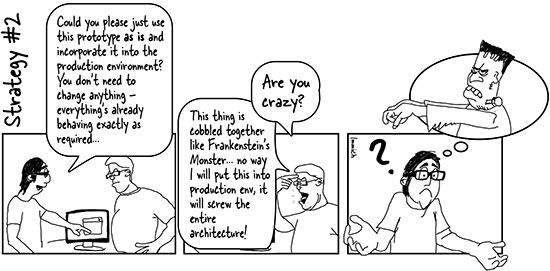
So, you may have to change your strategy:
Could you please take my stuff as is and incorporate it into the production environment? You don’t need to change anything. Everything behaves exactly as required.
To which the developer replies:
Are you crazy? This thing is cobbled together like Frankenstein’s monster. No way will I put this into a production environment. It will screw up the entire architecture.
A big question mark might now magically appear over your head, because you cannot seem to get it right for the developer either way, and you don’t know why. Admittedly, we are exaggerating and simplifying here; if you are on a team, you wouldn’t put the request in yourself, nor would the developer be so offended by you. Still, the developer is justified both ways: he is right not to rewrite everything you’ve done, and he is right to worry about jeopardizing the system architecture. Here’s why.
Architecture, and Its Absence
Your prototype, as impressive as it looks and feels on the outside, has gone through several cycles and has accumulated a messy internal structure. It has copy-and-pasted spaghetti code from several community programmers, each of whom has a different level of expertise and follows a different coding convention (or worse, no convention at all). All kinds of software artifacts have been duplicated, thus violating the appropriately abbreviated “DIE” principle (“duplication is evil”). Also, the prototype would be memory-hungry and would perform poorly if it ran with real data. To summarize: the problem with your prototype’s inner architecture is that it has no inner architecture.
Yoder describes this kind of un-architecture as a big ball of mud, and that’s a good way to put it: adding a big ball of mud to clean stuff makes dirty stuff in result. Exactly the same thing happens when you hand over a big ball of mud for the developer to integrate into a cleanly organized architecture. Frankenstein’s monster is another apt analogy: if you try to keep your prototype alive as is, with body parts taken from different sources, at some point it will come around to bite you in the rear.
Preparing For The Recycling Process
So, how do you reincarnate your prototype as a living element in the production environment, instead of letting it die disgracefully or creating a zombie? Can this be achieved at all?
Quick Diversion: The Packaging Industry
To answer this, let’s look at the packaging industry. In the packaging industry, most waste is reused, for either the same or a different purpose. This is what we commonly call recycling. For this to work effectively, products are created from parts that consist of different materials or layers. A yogurt cup, for instance, is made of plastic, while the label may be cardboard.
So, after you’ve eaten your tasty dessert, each part finds its own way through the recycling process. Some of the materials are processed into new products, while others are thrown away. The key thing here is that the packaging industry separates a product into different components beforehand to be able to reuse as much as possible afterwards.
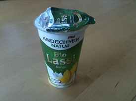
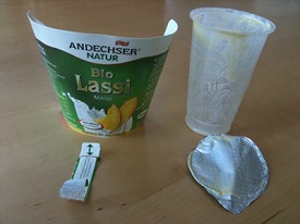
Now, how can this approach be adapted to UI prototyping and creating software? Borrowed wholesale, this would mean separating the prototype into several fragments during creation so that some of them can be used in the final system (either as they are or modified), while others are thrown out. Let’s see how Blend supports us here.
Back in Blend: Fundamental Concepts
If you use Expression Blend, splitting a UI prototype into different layers this way is easier than it sounds. Blend already has all of the bells and whistles to do it; for example, it has a bunch of clearly contoured and complementary concepts, such as control templates, behaviors, converters, styles, dependency properties, data bindings, triggers, etc. So, a control template would allow the designer to completely redefine a control’s visual elements without changing its fundamental behavior, while a behavior makes an object do things it would not do on its own, independent of how it looks.
This large set of orthogonal concepts was not created to annoy designers. It was designed to support them, by making their work more organized and formal and without restricting their creative freedom, which in turn allows for healthier collaboration between the designer and development team. After all, the development team has to get the job done in the end, or else the design team is doomed to languish on Prototype Island.
In fact, when you follow Blend’s concepts strictly, you create a number of artifacts that developers can reuse. Take a control template: a UI designer who does not want their UI to look standard will at some point have to create a control template. The good thing is that, because a control template is essentially about defining a UI’s visual elements, the designer can’t go wrong here: his job is to define visual elements. In turn, every single control template could likely be reused as is in the application. In other words, the “look” layer can be separated from the messy stuff below and therefore survive without causing any harm.
An Example: Why Use Value Converters?
For control templates, it is pretty clear why they can survive. Other concepts are not as clear but just as applicable. Let’s look at the concept of converters. A converter is a simple software class that takes one value and spits out another. What does this have to do with UI design?
A lot, because among other things, you will likely benefit from converters when you want cleanly formatted labels. As a practical example, think of email messages displayed in a table. Each row shows a single email message, with all its details, including subject, sender, date and time received, etc. For formatting, the date and time detail is the most interesting, as modern mail applications like Thunderbird and Apple Mail illustrate.

Thunderbird displays the date only for messages older than the current date, otherwise it just shows the time. Apple Mail displays “Today” instead of an absolute date if the email was received on the current date.
The intention is clear: get rid of any information that is not absolutely necessary. By doing so, you reinforce the important information by making it more scannable.
A good UI design is in the details. Converters can help improve how well a piece of information is detected and understood. Of course, you could just fill in the information “by hand”—in the case of our email example, typing “Today” in each cell as needed. But if you will have to evaluate alternative designs and formats with users, tweaking the converter is much quicker than manually typing uniquely formatted text in each cell. What’s more, just like behaviors, converters are self-contained, which will motivate community developers to write and share them with you, allowing you to use them out of the box.
Increasing Your Prototyping Speed
As you can see, by aligning the internal structure of the prototype with these different concepts, not only will you increase your prototyping speed in the long run, but you will end up with different parts that you can choose individually whether to throw away.
With converter, you may still encounter bad coding and naming conventions (which is sometimes the price of tapping community resources). In that case, you wouldn’t be able to use it because it would violate the internal structure of the final system. The good thing is, being a distinct concept, a converter is pretty agnostic in relation to the rest of the prototype, so you will have a clear idea of where to look to remove problems in the converter’s internal structure.
The converter itself, then, can be recycled instead of thrown away. And you can decide individually whether to reuse, recycle or throw away every distinct concept in your prototype.
The Recycling Process, Or “Rising From The Dead”
While the designer’s job when building a prototype is to follow Blend’s concepts, the developer’s job is to look after the recycling. But if you use the word “recycling” with a developer, he may look puzzled. In developer terms, this is actually called “refactoring.”
Refactoring: The Big Spring Clean
Refactoring means improving the internal structure of a system without changing its observable behavior. This is not voodoo magic. It just means that the developer has to change bad names to good names (while adhering to certain coding conventions) and that all of the duplications from your copy-and-paste orgies have to be centralized in a single location.
Renaming objects sounds tedious, but it’s not. Because the developer can open the same Expression Blend project that you worked on in Visual Studio, he can rename objects almost automatically without fear of breaking something.
Of course, the deeper the developer’s changes, the greater the risk of breaking something. This could lead to a good internal structure but a UI that does not look or behave as intended. An example of a deep change is centralizing duplicated code. Developers, though, especially those of the Extreme Programming school, have a way of avoiding such risks.
Avoid Risk With Test Cases
Developers would likely write some test cases before touching a prototype’s structure. A test case confirms a certain output or reaction whenever a certain input or interaction occurs. If it’s confirmed, the test case is considered a success; if not, it is considered a failure. The developer can tell exactly what output will result from what input just by using the prototype and discussing some of details with you (for example, determining what didn’t work as intended because you didn’t have the necessary time or skill).
Once the test cases are written and all of them have run successfully, the developer can begin the refactoring process. Whenever a fundamental refactoring step has finished, he will likely check the test cases again to see whether they still run successfully. If they don’t, he will need to undo his most recent changes and perform the step again. At the end of the process, if all of the test cases have run successfully, you will probably have a final application that has a clean internal structure and that looks and behaves as your prototype does. After refactoring, the prototype can be thrown away for good… but without shedding a tear, because every piece of it lives on in the final system.
And then the next time you have to make minor changes to your design (for example, because a requirement has changed), you will be working on the actual application, not the dead prototype. This allows you to benefit from everything the development team has done so far (such as performance optimization). Also, your and the developer’s work will not go out of sync, as would happen if your prototype and the actual system were being run simultaneously.
Although the refactoring process sounds complex and time-consuming, it is common practice in most development projects. Don’t be vain about it: the developer is not doing this just for you; he does it to keep the system maintainable and extensible.
Wrapping Up
To create a good user interface design, prototype your concepts and evaluate them with real users. The more natural you want the user interface to feel, the more details you will have to take care of. This makes prototyping more challenging and time-consuming than the conventional notion of prototyping, which is to “build something rapidly and cheaply.”
For this reason, some designers are tempted to simply turn their high-fidelity prototype into the actual system, as is. After all, throwing it away would be such a shame. But this approach is not advisable because it jeopardizes the system’s integrity, mainly because of the prototype’s messy internal structure, which arose as a result of the many changes that you implemented in response to user feedback.
Fortunately, modern prototyping tools such as Expression Blend allow you to create prototypes using different orthogonal concepts. They make it possible to split a prototype into parts and decide whether to throw out or keep each part individually.
For those parts that you cannot reuse as is, you can at least recycle or, to use the parlance, refactor them. Refactoring cleans up the messy structure of your prototype without changing its look and feel. The developer’s test cases ensure that everything is preserved as you intended.
So, if you are open to recycling prototypes, what are you left with? You get a user interface that looks and behaves exactly as intended, but that’s actually live. Also, you and the developer get to work on the same thing without conflicting with each other. Both of you do what you’re good at, and you generate something you can appreciate: you generate a nice UI, and the developer generates a clean system architecture.
And yet, all of this is possible only if your prototyping tool of choice supports it. It’s not always about “people over tools.” Sometimes it’s the other way around: pick the right tools, use them correctly and then see how people from different disciplines gel as a team.
Further Reading
- Effective Prototyping The website to accompany the book Effective Prototyping for Software Makers by Jonathan Arnowitz, Michael Arent and Nevin Berger. The book provides broad and useful information on prototyping in general.
- User Interface Prototypes in Usability Engineering A blog article on the process of creating prototypes in the early stages of a project.
- Hands-on Natural User Interfaces The website for the book Multitouch on Windows: NUI Development with WPF and Silverlight by Joshua Blake. The book is not finished yet but looks promising.
- Designing Gestural Interfaces The website for the book of the same name by Dan Saffer.
- Big Ball of Mud A brilliant article on architecture and evolution, by Brian Foote and Joseph Yoder.
- How Buildings Learn The Wikipedia entry for Steward Brand’s book.
- Refactoring The Wikipedia page on the meaning and purpose of (code) refactoring. As for books on the topic, Martin Fowler’s Refactoring: Improving the Design of Existing Code is highly recommended.
- Extreme Programming Explains extreme programming (XP).
- The New Iteration The subtitle of this book by Karsten Januszewski and Jaime Rodriguez is “How XAML transforms the collaboration between developers and designers in Windows Presentation Foundation (WPF).”
- Electric Beach The website of Christian Schormann, product manager of Expression Blend.
- Modern User Interface Design Tools A blog article comparing Microsoft Expression Blend and Adobe Flex Builder.


 SurveyJS: White-Label Survey Solution for Your JS App
 Agent Ready is the new Headless