The Process Behind Good Illustration (Part 1)
“Art” is something philosophers have spent centuries trying to define, sadly with no satisfactory result (a debate that is far beyond the scope of this article). But illustration, while it covers a broad range of image-making, does have very distinct meanings, and it is very different from just artwork.
Illustration is not the same thing as art.
This is not a tutorial. It’s not about how to make a glossy Twitter icon, how to replicate that anime pic step by step, or how to make 30 awesome heavy-metal texture effects in Photoshop (linked is an article that inspired me very much). While studying illustration in college and exploring it on my own, the biggest lesson that I’ve learned so far hasn’t been how to vector the best darn shiny things you’ve ever seen. What I learned was that to be good at illustration means to first understand exactly how it differs from just putting down nice-looking doodles on paper, and that the rest just flows from there.
In this two-part article, I’d like to share some tenets behind what I think good illustration is, and what I learned about the process and technique behind how to execute it. Hopefully some fellow aspiring illustrators out there will find some of these helpful — or maybe even identify with some as part of their own process, too!
If any of my professors are reading this: I hope I didn’t disappoint you, please don’t fail me in your classes.
Further Reading on SmashingMag:
- Inspiring Illustrator Artworks By Artists Around The World
- How To Create A Water Lily In Illustrator
- Create a Cute Little Tiger in Illustrator
- 40 Excellent Adobe Illustrator Tutorials
- How To Create A Dramatic Vector Illustration
Part 1: What is illustration?
A picture is worth a thousand words.
You see art around you all the time. No doubt your attention was once seized by an interesting editorial graphic, which offered an intriguing metaphor to a drab politics-related story you’d never dive into otherwise. You’ve certainly encountered visually compelling band posters, and storybook pictures that are much more rewarding to peruse than the text itself. But yet, comparatively, the idea of looking at an equally visually lush oil still life makes some part of your brain yawn. Why is that?
The type of art we call illustration has a two-fold purpose. The first and foremost is that it speaks to you. It tells you a story, visually represents an idea, conveys a message, delivers information, offers a visual accompaniment to text, etc. — it does something. Second, but certainly not least, it presents that “something” in an interesting and engaging fashion.
…So, that’s pretty vague, right? Hmm. Well, let’s first try to place “illustration” in context of the general term of “art” and see if we can’t pull out some of its defining characteristics. After all, something makes that oil still life so much less engaging for our brain.
1. Illustration is taking art, and putting it to work.
What we think of as “fine art” tends be focused on the aesthetics of its craft and its visual — tangible paintbrush strokes, interplay of colors and values, the juxtaposition of different media, the expression of technique, for instance; the most primitive visual elements of execution that in and of themselves are meant to be appreciated, beautiful, or evocative.
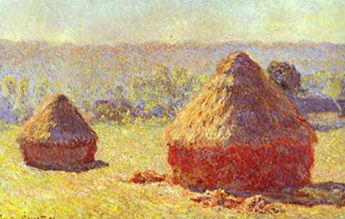
Often, it’s meant to go beyond just being visually provoking, which is where it approaches the illustrative realm. For instance, Monet’s haystacks were meant to be a visual documentary of light-rays upon hay at different seasons and times of the day; but until that is brought to the forefront, fine art is marked by the fact that the subject tends to be less important than how it looks.
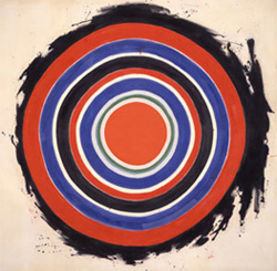
And Kenneth Noland’s circles look pretty neat, but, as the painting sits there now, it doesn’t illustrate anything except… well, itself. Nor does it do anything aside from expressing its aesthetic. Illustration, by definition, must always have representation intent that goes beyond merely its looks. It must not express, it must communicate, and it cannot be evoking form alone. That is, “looking pretty” cannot be its only function.
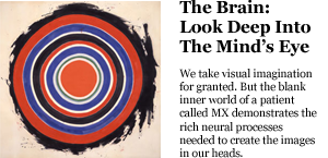
Sometimes you’ll really need context to help, and that’s okay. For instance, what if those circles were to accompany the article on the left? You wouldn’t be able to resist reading psychological meaning into those rings of color, without which the art was silent. In this simple example, we’ve taken the art and put it to work.
So, is that it, it’s an illustration now? Definitely. Is it the best we can do? Perhaps not, since the painting wasn’t optimized for this particular interpretation when it was being painted, which suggests we can do better.
On the right is the graphic that accompanied the article. Which one you’d prefer is subject to taste, since arguably both visually address the article in compelling ways. But it’s clear that the brain illustration on the left is loaded with much more communicative symbolism because it can tell its story even when it stands alone. It’s an image that must be designed, and nothing that can be arrived at just by sticking your brush onto the paper and letting your love of colors take over.
2. Illustration is clear, empirical, and intentional.
It would seem that perfection is attained not when no more can be added, but when no more can be removed. — Antoine de Saint Exupéry
To reiterate: as an illustrator, your job is not to demonstrate your painting techniques, color mixing, or your mastery of the male nude — only to find the most efficient, clear, and direct way to make the viewer feel and know what you want them to feel and know. Do nothing extra, because extra stuff (be it extra details, people, trees, colors, lines, etc.) in your illustration could only hamper this process. Just like writing an overly wordy essay or an instruction manual with too many details makes information difficult to digest.
Keep in mind also that “clear” is not the same thing as “simple.” A complicated drawing can communicate an idea very clearly, and a simple drawing can be hard to understand. But the best illustrations, be they simple or detailed, are clear — that is, they have the fewest unnecessary things in them. And what they do have in them is there for a reason, and it all has the function of manipulating your focus, attention, and emotional response to what the illustrator intends you to get out of it. They have been stripped down to the most empirical essential colors, shapes, lines, etc. needed to get their point across in the most efficient manner.
3. An illustration’s visual style, colors, etc. are not random either.
I find that a lot of young artists (including myself only mere months ago) tend to think of style-selection backwards. They look at some awesome illustrations, and think about what about it makes it look so awesome, dead-set on replicating the awesomeness in their own works. And it’s great that they’re out looking at stuff. The worst thing you can do is sit inside your own head and “scrape your brain” for ideas, as Jillian Tamaki put it.
Unfortunately, what they usually arrive at is something like this:
“Okay, I’m going to do my entire piece with acrylics in these reds and oranges like that second one, do my highlights just like that first one in Photoshop, and, oh yeah, maybe do something in a paper-cut-out style to have a bold shape in the background like that third one, and it’ll look as cool as those do.”
A noble pursuit, to boot! But the problem with such reasoning is that looking “cool” should only be a byproduct of its being functional. Else we’re just making art.
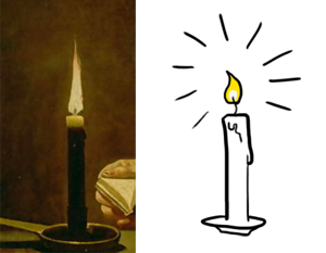
The way I think is best to go about it is exactly the opposite — first thinking what you want your illustration to do, then what techniques could make that happen best, and then how to make those techniques visually compelling. Finding the most effective medium/colors/ style/etc. usually will take some experimenting, but the most important thing is to go for “brains over looks” and not the other way around (much more on this later).
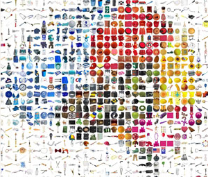
You might find you don’t even need to be a staggeringly skilled painter to pull it off. For example, which image on the left communicates “shiny candle” in the fastest and clearest way?
Note: This is not to impugn the importance of artistic skill, however! While you can certainly find your niche in illustration even without intimate familiarity with many subjects and mediums, it definitely helps. Sloppy execution or inaccurate detail will hurt illustrations, even if the idea behind them is sound; so the more artistic sensitivity you have, the fewer stumbling blocks you’ll face. Artistic skill alone, however, does not a good illustrator make.
4. ____________?
There are plenty of other ways to define illustration that many hold close to their hearts. For instance, some of my peers have defined it as:
- art that is purposely made to be displayed to or be meaningful to someone else
- art that stands in for a concept
- designed artwork
- art with communication value
Somewhere in there is a good definition; yours may be different still, but they all hover roughly around the same idea. Illustration is making images that have more purpose than merely expressing their aesthetic and expressing you — they have value beyond mere visual expression, whether it’s offering a visual component to text, telling a story, representing a concept, et cetera.
In fact, if you’ve ever thought that you can never venture into the image-making realm because InDesign and beautiful typography is where you hang out, think again! The better designers — rather than the better artists — tend to make the better illustrators.
In The Process Behind Good Illustration (Part 2) we’ll look at how all this rote textbook knowledge can translate to specific process and technique in your work, no matter your skill level, preferred medium, or strengths.


 SurveyJS: White-Label Survey Solution for Your JS App
 Agent Ready is the new Headless
