How To Build A Mobile Website
In wealthy countries, the shift is being fueled by faster mobile broadband connections and cheaper data service. However, a large increase has also been seen in developing nations where people have skipped over buying PCs and gone straight to mobile.
Unfortunately, the mobile arena introduces a layer of complexity that can be difficult for developers to accommodate. Mobile development is more than cross-browser, it should be cross-platform. The vast number of mobile devices makes thorough testing a practical impossibility, leaving developers nostalgic for the days when they only had to support legacy browsers.
Further Reading on SmashingMag:
- Why We Shouldn’t Make Separate Mobile Websites
- The (Not So) Secret Powers Of The Mobile Browser
- How To Use CSS3 Media Queries To Create a Mobile Version of Your Website
- Building A Better Responsive Website
In addition to supporting different platforms, each device may use any number of mobile web browsers. For instance, an Android user could access your site using the native Android browser, or could have also installed Opera Mini or Firefox Mobile. It’s fine as long as the smartphone uses a progressive web browser (and it’s safe to say that most browsers are progressive nowadays), but it doesn’t have to.
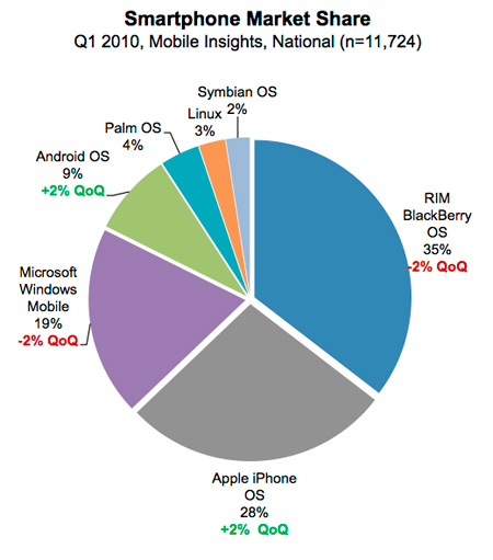
Source: Nielsen Study, Image credit
The mobile web reintroduces several issues that have been largely ignored in recent years. First, even with 4G networks, bandwidth becomes a serious issue for mobile consumers. Additionally, mobile devices have a significantly reduced screen size, which presents screen real estate issues that have not existed since the days of projection monitors. Combine these issues with cross-platform compatibility problems, and it isn’t hard to see how mobile development is a lot like ‘stepping backwards in time’. So let’s tackle these issues one at a time and create a road map for mobile web development:
- How To Implement Mobile Stylesheets
- What To Change With Mobile Stylesheets
- Beyond Stylesheets
- Special Concerns For iPhone / iPad
How To Implement Mobile Stylesheets
The first step to adding mobile support to a website is including a special stylesheet to adjust the CSS for mobile devices:
Server-side Methods & The UA String
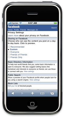
One approach to including mobile stylesheets involves detecting the user agent string with a server-side language such as PHP. With this technique, the site detects mobile devices and either serves an appropriate stylesheet or redirects the user to a mobile subdomain, for instance m.facebook.com. This server-side approach has several advantages: it guarantees the highest level of compatibility and also allows the website to serve special mark-up/content to mobile users.
While this technique is perfect for enterprise level websites, there are practical concerns that make it difficult to implement on most sites. New user agent strings come out almost daily, so keeping the UA list current is next to impossible. Additionally, this approach depends on the device to relay its true user agent. Even though, browsers have spoofed their UA string to get around this type of detection in the past. For instance, most UA strings still start with “Mozilla” to get through the Netscape checks used in the 90’s, and for several years Opera pretended to be IE. As Peter-Paul Koch writes:
“It’s an arms race. If device detection really catches on, browsers will start to spoof their user agent strings to end up on the right side of the detects.”
Client-side Methods & Media Queries
Alternately, the easiest approach involves detecting the mobile device on the client side. One of the earliest techniques for including mobile stylesheets involves taking advantage of the stylesheet’s media type, for instance:
<link rel="stylesheet" href="site.css" media="screen" />
<link rel="stylesheet" href="mobile.css" media="handheld" />
Here we’ve included two stylesheets, the first site.css targets desktops and laptops using the screen media type, while the second mobile.css targets mobile devices using handheld. While this would otherwise be an excellent approach, device support is another issue. Older mobile devices tend to support the handheld media type, however they vary in their implementation: some disable the screen stylesheets and only load handheld, whereas others load both.
Additionally, most newer devices have done away with the handheld distinction altogether, in order to serve their users fully-featured web pages as opposed to duller mobile layouts. To support newer devices, we’ll need to use media queries, which allow us to target styles to the device width (you can see another practical adaptation of media queries in Ethan Marcotte’s article Responsive Web Design). Since mobile devices typically have smaller screens, we can target handheld devices by detecting screens that are 480px and smaller:
<link rel="stylesheet" href="mobile.css" media="only screen and (max-device width:480px)"/>
While this targets most newer devices, many older devices don’t support media queries, so we’ll need a hybrid approach to get the largest market penetration.
First, define two stylesheets: screen.css with everything for normal browsers and antiscreen.css to overwrite any styles that you don’t want on mobile devices. Tie these two stylesheets together in another stylesheet core.css:
@import url("screen.css");
@import url("antiscreen.css") handheld;
@import url("antiscreen.css") only screen and
(max-device-width:480px);
Finally, define another stylesheet handheld.css with additional styling for mobile browsers and link them on the page:
<link rel="stylesheet" href="core.css" media="screen"/>
<link rel="stylesheet" href="handheld.css" media="handheld,
only screen and (max-device-width:480px)"/>
While this technique reaches a large market share of mobile devices, it is by no means perfect. Some mobile devices such as iPad are more than 480 pixels wide and will not work with this method. However, these larger devices arguably don’t need a condensed mobile layout. Moving forward, there will likely be more devices that don’t fit into this mold. Unfortunately, it is very difficult to future-proof mobile detection, since standards are still emerging.
Besides device detection, the media query approach also presents other issues. Mainly, media queries can only style content differently and provide no control over content delivery. For instance, a media query can be used to hide a side column’s content, but it cannot prevent that mark-up from being downloaded by your users. Given mobile bandwidth issues, this additional HTML should not simply be ignored.
User Initiated Method
Considering the difficulties with mobile UA detection and the pitfalls of media queries, some companies such as IKEA have opted to simply allow the user to decide whether to view the mobile version of their website. While this has the clear disadvantage of requiring more user interaction, it is arguably the most fool-proof method and also the easiest to accomplish.
The site contains a link that reads “Visit our mobile site” which transports the user to a mobile subdomain. This approach has some drawbacks. Of course, some mobile users may miss the link, and other non-mobile visitors may click it, since it is visible regardless of what device is being used. Even though, this technique has the advantage of allowing the user to make the mobile decision. Some users prefer a condensed layout that is optimized for their device, whereas other users may prefer to access the entire website, without the restrictions of a limited mobile layout.
What To Change With Mobile Stylesheets
Now that we’ve implemented mobile stylesheets, it’s time to get down to the nuts and bolts of which styles we actually want to change.
Increase & Alter Screen Real Estate
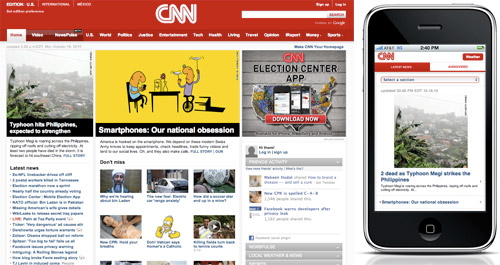
The primary goal of mobile stylesheets is to alter the layout for a smaller display. First and foremost this means reducing multi-column layouts to single columns. Most mobile screens are vertical, so horizontal space becomes even more “expensive” and mobile layouts can rarely afford more than one column of content. Next, reduce clutter throughout the page by setting display: none; on any less important elements. Finally, save additional pixels by reducing margins and padding to create a tighter layout.
Reduce Bandwidth
Another goal of mobile stylesheets is to reduce bandwidth for slower mobile networks. First make sure to remove or replace any large background images, especially if you use a background image for the whole site. Additionally set display: none on any unnecessary content images.
If your site uses images for buttons or navigation, consider replacing these with plain-text / CSS counterparts. Finally if you’d like to force the browser to use the alternate text for any of your images, use this snippet (and use JavaScript to add the as-text class for img and make sure that alt-attributes are properly defined in your markup):
img.as-text { content: attr(alt); }Other Changes
Besides addressing screen size and bandwidth concerns, there are a few additional changes that should be made in any mobile stylesheet. First, you can improve readability by increasing the font size of any small or medium-sized text. Next, clicking is generally less precise on mobile devices, so make sure to increase the clickable areas of any important buttons or links by setting display: block and adding padding to the clickable elements.
Additionally, floated elements can cause problems for mobile layouts, so consider removing any floats that aren’t absolutely necessary. Remember that horizontal real estate is especially expensive on mobile, so you should always opt for adding vertical scrolling as opposed to horizontal.
Finally, mouseover states do not work with most mobile devices, so make sure to have proper definitions of :active-states. Also, sometimes it may be useful to apply definitions from the already defined :hover states to the :active states. This pseudo-class is displayed when the user clicks an item, and therefore will work on mobile devices. However this only enhances the user experience and should not be relied on for more important elements, such as drop-down navigation. In these cases it is best to show the links at all times in mobile devices.
Beyond Stylesheets
In addition to mobile stylesheets, we can add a number of special mobile features through mark-up.
Clickable Phone Numbers
First, most handheld devices include a phone, so let’s make our phone numbers clickable:
<a href="tel:15032084566" class="phone-link">(503) 208-4566</a>
Now mobile users can click this number to call it, however there are a few things to note. First, the number in the actual link starts with a 1 which is important since the web is international (1 is the US country code).
Second, this link is clickable whether or not the user has a mobile device. Since we’re not using the server-side method described above, our best option is to simply hide the fact that the number is clickable via CSS. So use the phone-link class to disable the link styling in your screen stylesheet, and then include it again for mobile.
Special Input Types
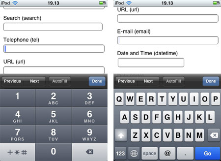
When it comes to mobile browsing, another concern is the difficulty of typing compared to a standard full-sized keyboard. But we can make it easier on our users by taking advantage of some special HTML5 input types:
<input type="tel" />
<input type="email" />
These input types allow devices such as iPhone to display a contextual keyboard that relates to the input type. In the example above type=“tel” triggers a numeric keypad ideal for entering phone numbers, and type=“email” triggers a keypad with @ and . buttons.
HTML5 input types also provide in-browser validation and special input menus that are useful in both mobile and non-mobile browsing. Furthermore, since non-supportive browsers naturally degrade to view these special input types as <input type="text" />, there’s no loss in using HTML5 input types throughout your websites today.
See a complete list of HTML5 input types. You can find some information about the current browser support of HTML5 input attributes in the post HTML5 Input Attributes & Browser Support by Estelle Weyl.
Viewport Dimensions & Orientation
When modern mobile devices render a webpage, they scale the page content to fit inside their viewport, or visible area. Although the default viewport dimensions work well for most layouts, it is sometimes useful to alter the viewport. This can be accomplished using a <meta> tag that was introduced by Apple and has since been picked up by other device manufacturers. In the document’s <head> include this snippet:
<meta name="viewport" content="width=320" />
In this example we’ve set the viewport to 320, which means that 320 pixels of the page will be visible across the width of the device.
The viewport meta tag can also be used to disable the ability to resize the page:
<meta name="viewport" content="width=320,user-scalable=false" />
However, similar to disabling the scrollbars, this technique takes control away from the user and should only be used for a good reason.
Additionally, it is possible to add certain styles based on the device orientation. This means that different styles can be applied depending on whether the user is holding their phone vertically or horizontally.
To detect the device orientation, we can use a media query similar to the client-side device detection we discussed earlier. Within your stylesheet, include:
@import url("portrait.css") all and
(orientation:portrait);
@import url("landscape.css") all and
(orientation:landscape);
Here portrait.css styles will be added for vertical devices and the landscape.css will be added for horizontal.
However orientation media queries have not been adopted by all devices, so this is best accomplished with the max-width media query. Simply apply different max-width queries for the different orientation widths you want to target. This is a much more robust approach, since presumably the reason to target different orientations is to style for different widths.
Special Concerns For iPhone / iPad
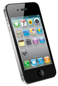
With a market share of 28% and estimates of as much as 50% of mobile browsing going through iPhone, it makes sense that developers make special accommodations for the mobile giant.
No Flash
Regardless of Apple’s ethics, the reality is that iPhones do not play Flash unless they are jailbroken. Fortunately, there are alternatives to Flash, and iPhone’s issues with this technology are often easy to get around. The main use for Flash in modern websites is Flash video, which can easily be circumvented using HTML5 video. However since older browsers don’t support HTML5, make sure to include a Flash backup for non-supportive browsers (this is why the whole debate about Flash vs. HTML5 is a bit pointless, because you can actually offer both to your users and the user’s device will pick up the one it can render automatically).
Beyond video, it is usually best to use JavaScript to accommodate any simple functionality. JavaScript libraries such as jQuery make it easy to build rich interactive applications without Flash. Regardless of your desire to support iPhone, these JavaScript apps typically have a number of additional advantages over Flash alternatives.
Finally, certain applications are simply too hard to recreate with HTML5 and Javascript. For these, iPhone users will have to be left out, however make sure to include appropriate alternate content.

A spoof of Adobe’s “We Love Apple” campaign, where the heart is replaced by the broken plugin icon.
Other Shortcomings
Besides Flash, there are a few additional caveats to supporting iPhones and iPads.
First, iPhone does not support <input type="file" />, since it does not have an accessible internal file structure. While most mobile devices connect to a computer as an external hard-drive, Apple has taken steps to ensure that the iPhone file structure remains obfuscated.
Next, iPhone will only cache files that are 25 kb or less, so try to keep any reused files under this restriction. This can be a bit counter-intuitive, as it often means breaking out large image sprites and concatenated JavaScripts into smaller chunks. However be careful to serve these files only to iPhone, or it will cause extra HTTP requests in all other browsers.
Finally, when it comes to @font-face font embedding, iPhone’s Mobile Safari doesn’t fully support it and supports the SVG file format instead. However, SVG fonts are only supported by Chrome, Opera and iPhone, so we’ll need a hybrid approach to target all browsers. In addition to the SVG, we’ll need an .otf or .ttf for Firefox and Safari, as well as an EOT for IE (IE has actually supported @font-face since IE4).
After obtaining the necessary files, tie them all together with the appropriate CSS:
@font-face {
    font-family: 'Comfortaa Regular';
    src: url('Comfortaa.eot');
    src: local('Comfortaa Regular'),
         local('Comfortaa'),
         url('Comfortaa.ttf') format('truetype'),
         url('Comfortaa.svg#font') format('svg');
}
For more information, read this article on cross-platform font-face support.
Special iPhone / iPad Enhancements
Despite iPhone’s various shortcomings, the device offers a wonderfully rich user experience that developers can leverage in ways not possible with older mobile devices.
First, there are a variety of JavaScript libraries that can be used to access some of the more advanced functionality available in iPhone. Take a look at Sencha Touch, jQTouch and iui. These three libraries allow you to better interface with the iPhone, and also work on similar devices such as Android. Additionally, keep an eye on the much anticipated jQuery Mobile which has just been released in alpha.
Next, the App Store isn’t the only way to get an icon on your users’ iPhones: you can simply have them bookmark your page. Unfortunately the default bookmark icon is a condensed screen shot of the page, which doesn’t usually look very good, so let’s create a special iPhone icon. Also check the Icon Reference Chart by Jon Hicks for further details.
Start by saving a 57 x 57 pixel PNG somewhere on your website, then add this snippet within your <head> tag:
<link rel="apple-touch-icon" href="/customIcon.png"/>
Don’t worry about rounded corners or a glossy effect, iPhone will add those by default.
Conclusion
As the worldwide shift to mobile continues, handheld device support will become increasingly important. Hopefully this article has left you with both the desire and toolset necessary to make mobile support a reality in your websites.
Although mobile occupies a significant chunk of global web browsing, the technology is still very much in its infancy. Just as standards emerged for desktop browsing, new standards are emerging to unify mobile browsers. This means that the techniques described in this article are only temporary, and it is your responsibility to stay on top of this ever-changing technology.
In fact, the only thing in web development that remains constant is the perpetual need to continue learning!
Additional Reading
- State of Mobile Web Development - A general discussion of mobile dev in 3 parts
- Return of the Mobile Stylesheet - More about the client-side stylesheet technique we used
- Hardboiled CSS3 Media Queries - How to target stylesheets for specific devices
- CSS Media Query for Mobile is Fool’s Gold - Arguments against using media queries
- Mobile Web Design - A design perspective
- Mobile operating systems and browsers are headed in opposite directions - Trends in mobile platforms and browsers
- Pocket-Sized Design: Taking Your Website to the Small Screen - An older but still useful high quality article.
(ik) (vf)


 Agent Ready is the new Headless
 SurveyJS: White-Label Survey Solution for Your JS App
