The Bright (Near) Future of CSS
In this article, the focus is on what’s coming: styling techniques you’ll use in the immediate and near-term future. From styling HTML 5 elements to rearranging layout based on display parameters to crazy selection patterns to transforming element layout, these are all techniques that you may use tomorrow, next month, or next year. With partial browser support, they’re all on the cutting edge of Web design.
Accordingly, be careful not to get cut! A number of useful sites can help you figure out the exact syntaxes and patterns you need to use these techniques.
Further Reading on SmashingMag:
- The Future Of CSS: Embracing The Machine
- Laying Out A Flexible Future For Web Design With Flexbox
- The Future Of CSS: Experimental CSS Properties
Furthermore, a number of JavaScript libraries can extend support for advanced CSS back into older browsers, in some cases as far back as IE/Win 5.5. Some are very narrowly focused on certain browser families, whereas others are more broadly meant to allow support in all known browsers. These can be useful in cases where your visitors haven’t quite caught up with the times but you don’t want them to miss out on all the fun. (Some of these libraries are CSS3 PIE, cssSandpaper, :select[ivizr], ie7-js, eCSStender).
There are also a good many CSS enhancements available as plug-ins for popular JavaScript libraries such as jQuery. If you’re a user of such a library, definitely do some digging to see what’s been created. Again: Be careful! While these techniques are powerful and can deliver a lot of power to your pages, you need to test them thoroughly in the browsers of the day to make sure you didn’t just accidentally make the page completely unreadable in older browsers.
Styling HTML 5
Styling HTML 5 is really no different than styling HTML 4. There are a bunch of new elements, but styling them is basically the same as styling any other element. They generate the same boxes as any other div, span, h2, a, or what have you.
The HTML 5 specification is still being worked on as of this writing, so this may change a bit over time, but the following declarations may be of use to older browsers that don’t know quite what to do with the new elements.
article, aside, canvas, details, embed, figcaption, figure, footer, header, hgroup, menu, nav, section, summary {
  display: block;
}
command, datalist, keygen, mark, meter, progress, rp, rt, ruby, time, wbr {
  display: inline;
}
You may have noticed that I left out two fairly important new elements: audio and video. That’s because it’s hard to know exactly how to treat them. Block? Inline? All depends on how you plan to use them. Anyway, you can place them in the declaration that makes the most sense to you.
But what about really old browsers, like IE6? (Note I said “old,” not “unused.” In an interesting subversion of popular culture, browser popularity has very little to do with age.) For those, you need to use a bit of JavaScript in order to get the browser to recognize them and therefore be able to style them. There’s a nice little script that auto-forces old versions of IE to play nicely with HTML 5 elements. If you’re going to use and style them, you should definitely grab that script and put it to use.
Once you’ve gotten your browser ducks in a row and quacking “The Threepenny Opera,” you can get down to styling. Remember: There’s really nothing new about styling with these new elements. For example:
figure {
  float: left;
  border: 1px solid gray;
  padding: 0.25em;
  margin: 0 0 1.5em 1em;
}
figcaption {
  text-align: center;
  font: italic 0.9em Georgia, "Times New Roman", Times, serif;
} 
Figure 7-1: A styled HTML 5 figure and figure caption.
Classing like HTML 5
Perhaps you like the new semantics of HTML 5, but you’re just not ready to take your sites to full-on HTML 5. Maybe your site’s user base is mostly older browsers and you’d rather stick to known quantities like HTML 4 or XHTML. Not to worry: You can have the best of both worlds with the venerable class attribute.
This approach was documented by Jon Tan in his article. The basic idea is to use old-school elements like div and span, and add to them classes that exactly mirror the element names in HTML 5. Here’s a code example.
.figure {
  float: left;
  border: 1px solid gray;
  padding: 0.25em;
  margin: 0 0 1.5em 1em;
}
.figcaption {
  text-align: center;
  font: italic 0.9em Georgia, "Times New Roman", Times, serif;
} 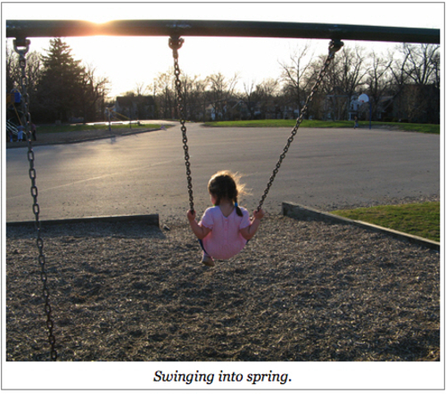
Figure 7-2: A styled HTML 4-classed figure and figure caption.
If you compare the styles there to those found in the preceding section, you’ll see that the only difference is that the names figure and figcaption are preceded by periods — thus marking them as class names. The markup is a little different, of course, though it’s the same basic structure.
The advantage of this approach is that if you have these styles in place at the point when you decide you can convert to HTML 5, then all you need to do is change your markup to use HTML 5 elements instead of classed divs and then strip off the periods to turn the class selectors into element selectors. That’s it. Easy as cake!
Media Queries
This could honestly be its own article, or possibly even its own book. Thus, what follows will necessarily be just a brief taste of the possibilities. You should definitely follow up with more research, because in a lot of ways this is the future of Web styling.
The point of media queries is to set up conditional blocks of styles that will apply in different media environments. For example, you could write one set of styles for portrait displays and another for landscape displays. You might change the colors based on the bit depth of the display. You could change the font based on the pixel density of display. You might even rearrange the page’s layout depending on the width or number of pixels available in the display.
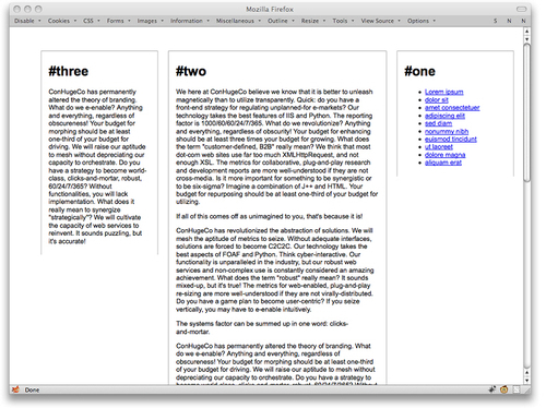
Figure 7-3: A basic three-column layout.
How? Consider some basic layout styles for a three-column layout:
body {
  background: #FFF;
  color: #000;
    font: small Arial, sans-serif;
}
.col {
  position: relative;
    margin: 3em 1%;
    padding: 0.5em 1.5%;
    border: 1px solid #aaa;
    border-width: 1px 1px 0 1px;
  float: right;
  width: 20%;
}
#two {
  width: 40%;
}
#footer {
  clear: both;
}
As nice as this might be (in a minimalist sort of way), it is likely to run into trouble on smaller—which is to say, narrower—displays. What if you could magically change to a two-column layout on such displays?
Well, you can. First, restrict the three-column layout to environments that are more than 800 pixels across. This is done by splitting the layout bits into their own declarations:
body {
  background: #fff;
  color: #000;
    font: small Arial, sans-serif;
}
.col {
  position: relative;
    margin: 3em 1%;
    padding: 0.5em 1.5%;
    border: 1px solid #aaa;
    border-width: 1px 1px 0 1px;
}
#footer {
  clear: both;
}
.col {
  float: right;
  width: 20%;
}
#two {
  width: 40%;
}
Then wrap those last two declarations in a media query:
@media all and (min-width: 800px) {
    .col {
      float: right;
      width: 20%;
    }
    #two {
      width: 40%;
      }
}
What that says is “the rules inside this curly-brace block apply in all media that have a minimum display width of 800 pixels.” Anything below that, no matter the medium, and the rules inside the block will be ignored. Note the parentheses around the min-width term and its value. These are necessary any time you have a term and value (which are referred to as an expression).
At this point, nothing will really change unless you shrink the browser window until it offers fewer than 800 pixels across to the document. At that point, the columns stop floating altogether.
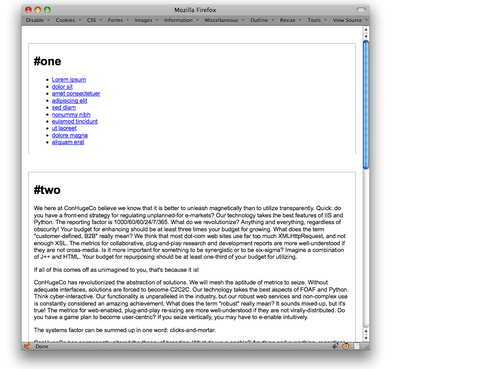
Figure 7-4: What happens below 800 pixels.
What you can do at this point is write another media-query block of layout rules that apply in narrower conditions. Say you want a two-column layout between 500 and 800 pixels):
@media all and (min-width: 500px) and (max-width: 799px) {
    .col {
      float: left;
      width: 20%;
    }
    #two {
      float: right;
      width: 69%;
    }
    #three {
      clear: left;
      margin-top: 0;
    }
}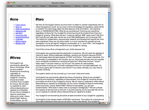
Figure 7-5: The reworked layout, which shows between 500 and 800 pixels.
And finally, you can apply some single-column styles for any medium with fewer than 500 pixels of display width:
@media all and (max-width: 499px) {
    #one {
      text-align: center;
    }
    #one li {
      display: inline;
      list-style: none;
    padding: 0 0.5em;
    border-right: 1px solid gray;
    line-height: 1.66;
  }
    #one li:last-child {
      border-right: 0;
    }
    #three {
      display: none;
    }
}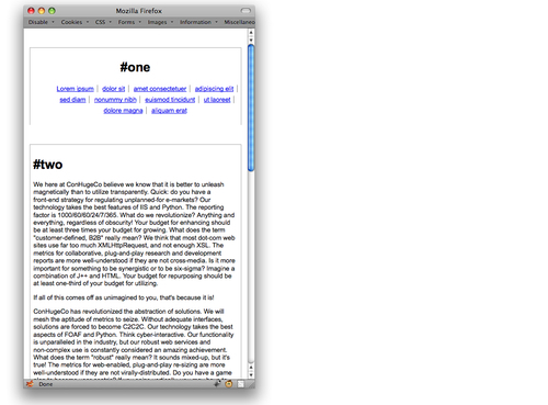
Figure 7-6: Single-column layout, which shows below 500 pixels.
Note that in all these queries, layout styles are defined in relation to the display area of the browser window. More generically, they are defined in relation to the display area available to the document in any medium in which it is rendered. That means that if a printer, for example, is used to print the document and it has an available display area 784 pixels wide, then the two-column layout will be for printing.
To restrict the column shifting to screen media only, alter the queries, like so:
@media screen and (min-width: 800px) {...}
@media screen and (min-width: 500px) and (max-width: 799px) {...}
@media screen and (max-width: 499px) {...}
But what if you want the three-column layout used in some non-screen media, like print and TV displays? Then add in those media using commas, like so:
@media print, tv, screen and (min-width: 800px) {...}
@media screen and (min-width: 500px) and (max-width: 799px) {...}
@media screen and (max-width: 499px) {...}
The commas here act as logical ORs, so the first query reads “use these styles on print media OR TV media OR a display area on a screen medium where the display area is 800 pixels or more.”
And if you want the three-column layout used in all non-screen media? Add a statement to the first query using the not modifier saying “anything that isn’t screen.”
@media not screen, screen and (min-width: 800px) {...}
@media screen and (min-width: 500px) and (max-width: 799px) {...}
@media screen and (max-width: 499px) {...}
As before, the comma joins the two in an OR statement, so it reads as “anything not on a screen medium OR a display area on a screen medium where the display area is 800 pixels or more.”
There is also an only modifier, so that a query can say something like only print or only screen and (color). As of this writing, not and only are the only modifiers in media queries.
You aren’t restricted to pixels for the previous queries, by the way. You can use ems, centimeters, or any other valid length unit.
Table 7-1: The base media query terms
| Term | Description |
| width | The width of the display area (e.g., a browser window). |
| height | The height of the display area (e.g., a browser window). |
| device-width | The width of the device’s display area (e.g., a desktop monitor or mobile device display). |
| device-height | The height of the device’s display area. |
| orientation | The way the display is oriented; the two values are portrait and landscape. |
| aspect-ratio | The ratio of the display area’s width to its height. Values are two integers separated by a forward slash. |
| device-aspect-ratio | The ratio of the device display’s width to its height. Values are two integers separated by a forward slash. |
| color | The color bit-depth of the display device. Values are unitless integers which refer to the bit depth. If no value is given, then any color display will match. |
| color-index | The number of colors maintained in the device’s “color lookup table.” Values are unitless integers. |
| monochrome | Applies to monochrome (or grayscale) devices. |
| resolution | The resolution of the device display. Values are expressed using units dpi or dpcm. |
| scan | The scanning type of a “TV” media device; the two values are progressive and interlace. |
| grid | Whether the device uses a grid display (e.g., a TTY device). Values are 0 and 1. |
Table 7-1 shows all the query terms that can be used in constructing media queries. Note that almost all of these terms accept min- and max- prefixes (for example, device-height also has min-device-height and max-device-height cousins). The exceptions are orientation, scan, and grid.
Styling Occasional Children
There are times when you may want to select every second, third, fifth, eighth, or thirteenth element in a series. The most obvious cases are list items in a long list or rows (or columns) in a table, but there are as many cases as there are combinations of elements.
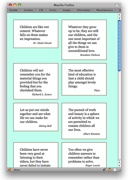
Consider one of the less obvious cases. Suppose you have a lot of quotes that you want to float in a sort of grid. The usual problem in these cases is that quotes of varying length can really break up the grid.
A classic solution here is to add a class to every fourth div (because that is what encloses each quote) and then clear it. Rather than clutter up the markup with classes, though, why not select every fourth div?
.quotebox:nth-child(4n+1) {
  clear: left;
}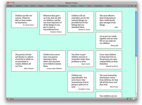
Figure 7-7: The problem with floating variable-height elements.
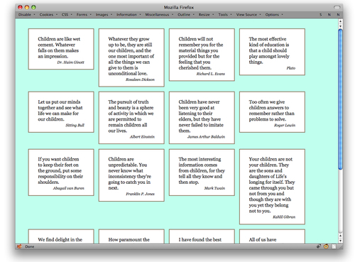
Figure 7-8: Clearing every fourth child.
A quick explanation of the 4n+1 part:
4nmeans every element that can be described by the formula4timesn, where n describes the series 0, 1, 2, 3, 4… .That yields elements number 0, 4, 8, 12, 16, and so on. (Similarly,3nwould yield the series 0, 3, 6, 9, 12… .)- But there is no zeroth element; elements start with the first (that is, element number 1). So you have to add + 1 in order to select the first, fifth, ninth, and so forth elements.
Yes, you read that right: the :nth-child() pattern starts counting from 0, but the elements start counting from 1. That’s why + 1 will be a feature of most :nth-child() selectors.
The great thing with this kind of selector is that if you want to change from selecting every fourth element to every third element, you need only change a single number.
.quotebox:nth-child(3n+1) {
  clear: left;
}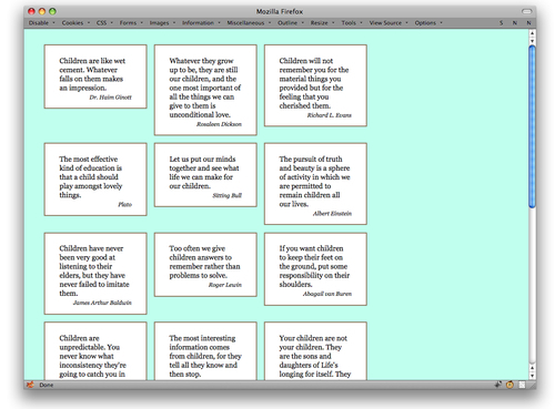
Figure 7-9: Clearing every third child.
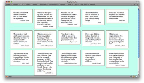
That might seem pretty nifty on its own, but it gets better. If you combine this approach with media queries, you get an adaptable grid-like layout.
@media all and (min-width: 75.51em) {
    .quotebox:nth-child(5n+1) {
      clear: left;
    }
}
@media all and (min-width: 60.01em) and (max-width: 75em) {
    .quotebox:nth-child(4n+1) {
      clear: left;
    }
}
@media all and (min-width: 45.51em) and (max-width: 60em) {
    .quotebox:nth-child(3n+1) {
      clear: left;
    }
}
@media all and (min-width: 30.01em) and (max-width: 45.5em) {
    .quotebox:nth-child(2n+1) {
      clear: left;
    }
}
@media all and (max-width: 30em) {
    .quotebox {
      float: none;
    }
}
Figure 7-10: Two views of an adaptable floated grid.
Note that this particular set of queries is based on the width of the display area of the browser as measured in ems. That helps make the layout much more adaptable to changes of text size and browser window.
If you’re interested in selecting every other element — let’s say, every other table row — there are some more human alternatives to 2n+1. You can select even-numbered or odd-numbered children using :nth-child(even) and :nth-child(odd), as in this example.
tr:nth-child(odd) {
  background: #eef;
}
Styling Occasional Columns
It’s easy enough to select alternate table rows for styling, but how about table columns? Actually, that’s just as easy, thanks to the :nth-child and :nth-of-type selectors.
In a simple table with rows consisting of nothing but data cells (those are td elements), you can select every other column like so:
td:nth-child(odd) {
  background: #fed;
}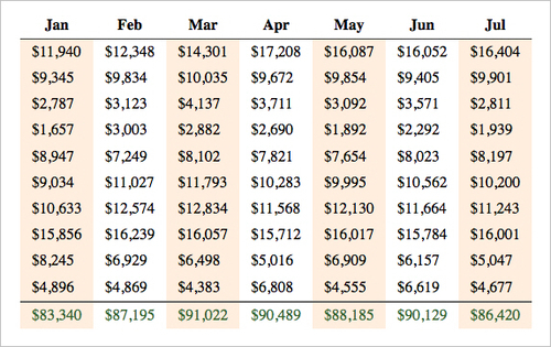
Figure 7-11: Styling the odd-numbered columns.
Want to fill in the alternate ones!
td:nth-child(odd) {
  background: #fed;
}
td:nth-child(even) {
  background: #def;
}
If you’re after every third, fourth, fifth, or similarly spaced-out interval, then you need the n+1 pattern.
td:nth-child(3n+1) {
  background: #edf;
}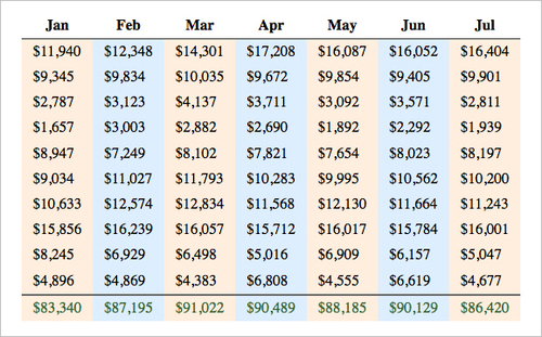
Figure 7-12: Styling both odd- and even-numbered columns.
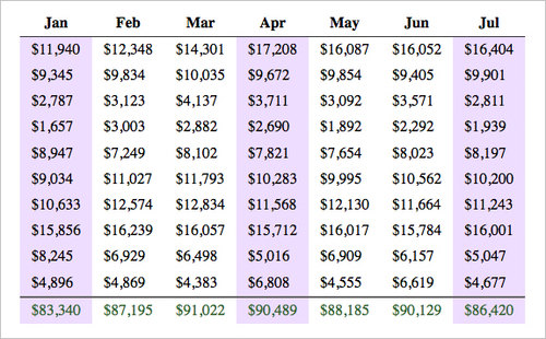
Figure 7-13: Styling every third data column.
That’s all relatively straightforward. Now, what happens when you put a th at the beginning of each row? In one sense, nothing. The columns that are selected don’t change; you’re still selecting the first, fourth, seventh, and so on children of the tr elements. In another sense, the selected columns are shifted, because you’re no longer selecting the first, fourth, seventh, and so on data columns. You’re selecting the third, sixth, and so on data columns. The first column, which is composed of th element, doesn’t get selected at all because the selector only refers to td elements.
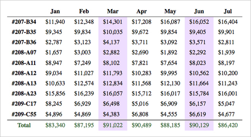
Figure 7-14: Disrupting the pattern with row headers.
To adjust, you could change the terms of the :nth-child selector:
td:nth-child(3n+2) {
  background: #edf;
}
Alternatively, you could keep the original pattern and switch from using :nth-child to :nth-of-type:
td:nth-of-type(3n+1) {
  background: #fde;
}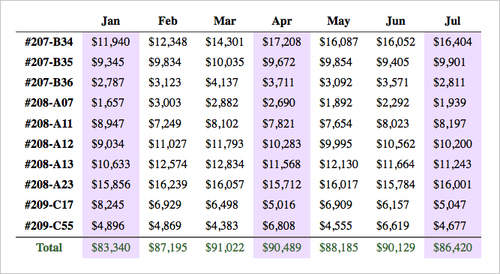
Figure 7-15: Restoring the pattern by adjusting the selection formula.
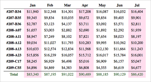
Figure 7-16: Restoring the pattern with :nth-of-type.
This works because it selects every nth element of a given type (in this case, td elements) that shares a parent element with the others. Think of it as :nth-child that also skips any elements that aren’t named in the :nth-child selector.
RGB Alpha Color
Color values are probably one of the most familiar things in all of CSS; some people are to the point of being able to estimate a color’s appearance based on its hexadecimal representation. (Go on, try it: #e07713.) It’s not quite as common to use the rgb() notation for colors, but they’re still pretty popular.
In CSS 3, the rgb() notation is joined by rgba() notation. The a part of the value is the alpha, as in alpha channel, as in transparency. Thus you can supply a color that is partly see-through:
.box1 {
  background: rgb(255,255,255);
}
.box2 {
  background: rgba(255,255,255,0.5);
}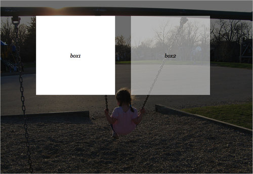
Figure 7-17: Boxes with opaque and translucent RGB backgrounds.
You can also use the percentage form of RGB color values in RGBA:
.box1 {
  background: rgb(100%,100%,100%);
}
.box2 {
  background: rgba(100%,100%,100%,0.5);
}
The alpha value is always represented as a number between 0 and 1 inclusive, with 0 meaning “no opacity at all” and 1 meaning “fully opaque.” So half-opaque (and thus half-transparent) is 0.5. You can’t put a percentage in there for historical reasons that are too messy to get into here.
If you supply a number outside the 0 to 1 range, it will (in the words of the specification) be “clamped” to the allowed range. So if you give an alpha value of 4.2, the browser will treat it as if you’d written 1. Also, it isn’t clear what should happen when an alpha of 0 is used. Since the color is fully transparent, what will happen to, say, invisible text? Can you select it? If it’s used on a link, is the link clickable? Both are interesting questions with no definitive answers. So be careful.
RGBA colors can be used with any property that accepts a color value, such as color and background-color. To keep older browsers from puking on themselves, it’s advisable to supply a non-alpha color before the alpha color. That would take a form like so:
{
  color: #000;
  color: rgba(0,0,0,0.75);
}
The older browsers see the first value and know what to do with it. Then they see the second value and don’t know what to do with it, so they ignore it. That way, at least older browsers get black text. Modern browsers, on the other hand, understand both values and thanks to the cascade, override the first with the second.
Note that there is no hexadecimal form of RGBA colors. Thus, you cannot write #00000080 and expect half-opaque black.
HSL and HSL Alpha Color
A close cousin to RGBA values are the HSLA values, and an even closer cousin to them are HSL colors. These are new to CSS 3, and will be a delightful addition to many designers.
For those not familiar with HSL, the letters stand for Hue-Saturation-Lightness. Even if you didn’t know the name, you’ve probably worked with HSL colors in a color picker.
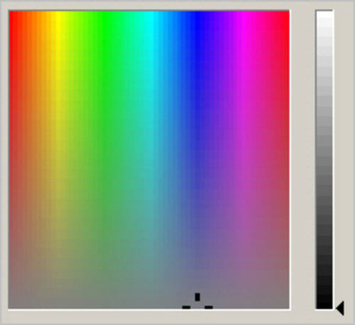
Figure 7-18: An HSL color picker.
The hue is represented as a unitless number corresponding to the hue angle on a color wheel. Saturation and lightness are both percentages, and alpha is (as with RGBA) a number between 0 and 1 inclusive. In practice, you can use HSL colors anywhere a color value is accepted. Consider the following rules, which create the equivalent effect.
.box1 {
  background: hsl(0,0%,100%);
}
.box2 {
  background: hsla(0,0%,100%,0.5);
}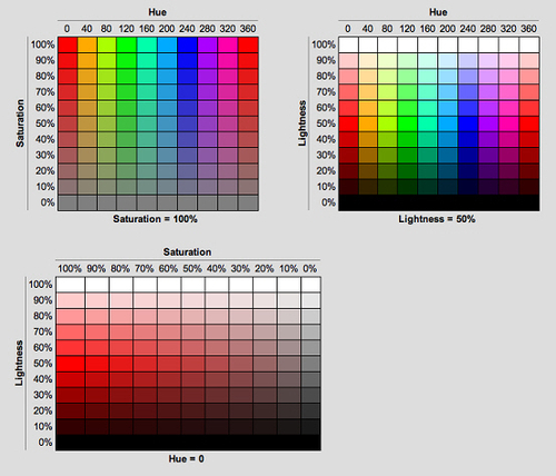
Figure 7-19: Various HSL color tables.
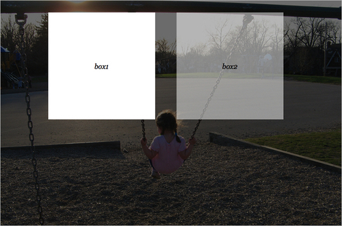
Figure 7-20: Boxes with opaque and translucent HSL backgrounds.
You can do old-browser fallbacks with regular RGB values, though having to specify an RGB color and then HSL color does sort of detract from the point of using HSL in the first place. HSL allows you to get away from RGB altogether.
Shadowy Styles
Ah, drop shadows. Remember drop shadows? In the mid-90’s, everything had a drop shadow. Of course, back then the shadows were baked into images and constructed with tables even more tortuously convoluted than usual. Now you can relive the glory days with some fairly simple CSS. There are actually two properties available: text-shadow and box-shadow.
Take the former first. The following CSS will result:
h1 {
  text-shadow: gray 0.33em 0.25em 0.1em;
}
The first length (0.33em) indicates a horizontal offset; the second (0.25em), a vertical offset. The third is a blur radius, which is the degree by which the shadow is blurred. These values can use any length unit, so if you want to do all your shadow offsets and blurs in pixels, go to town. Blurs can’t be negative, but offsets can: A negative horizontal offset will push the shadow to the left, and a negative vertical offset will go upward.

Figure 7-21: Dropping shadows from a heading.
You can even have multiple shadows! Of course, whether you should, is a matter of opinion.
h1 {
  text-shadow: gray 0.33em 0.25em 0.1em, -10px 4px 7px blue;
}
Note that the color of a shadow can come before all the lengths or after them, whichever you prefer. Note also that the CSS 3 specification says that the first shadow is “on top,” which is closest to you. Shadows after that are placed successively further away from you as you look at the page. Thus, the gray shadow is placed over the top of the blue shadow. Now to shadow boxes. It’s pretty much the same drill, only with a different property name.
h1 {
  box-shadow: gray 0.33em 0.25em 0.25em;
}
Figure 7-22: A heading with multiple shadows.

Figure 7-23: Shadowing the element box of a heading.
Even though there’s no obvious element box for the h1, a shadow is generated anyway. It’s also drawn only outside the element, which means that you can’t see it behind/beneath the element, even when the element has a transparent (or, with RGBA colors, semi-transparent) background. The shadows are drawn just beyond the border edge, so you’re probably better off putting a border or a visible background (or both) on any shadowed box.
You can have more than one box shadow, just like you can with text shadows:
h1 {
  box-shadow: gray 0.33em 0.25em 0.25em, -10px 2px 6px blue;
}
Figure 7-24: Multiple shadows on the element box of a heading.
Here’s where I have to admit a small fib: The previous examples are the ideal cases. As of this writing, they wouldn’t actually work in browsers. As of mid-2010, to make the single-shadow example work, you’d actually need to say:
h1 {
  -moz-box-shadow: gray 0.33em 0.25em 0.25em;
  -webkit-box-shadow: gray 0.33em 0.25em 0.25em;
  box-shadow: gray 0.33em 0.25em 0.25em;}
That will cover all modern browsers as of mid-2010. Over time, the need for the prefixed properties (-moz- and –webkit-) will fade and you’ll be able to just write the single box-shadow declaration. When exactly will that happen? It all depends on your design, your site’s visitors, and your own sense of comfort.
If you also want to get drop shadows on boxes in older versions of Internet Explorer, then you’ll need to add in the IE-only Shadow filter. Read here to find out more.
Multiple Backgrounds
One of the really nifty things in CSS 3 is its support for multiple background images on a given element. If you’ve ever nested multiple div elements just to get a bunch of background decorations to show up, this section is for you.
Take, for example, this simple set of styles and markup to present a quotation:
body {
  background: #c0ffee;
  font: 1em Georgia, serif;
  padding: 1em 5%;
}
.quotebox {
  font-size: 195%;
  padding: 80px 80px 40px;
  width: 16em;
  margin: 2em auto;
  border: 2px solid #8d7961;
  background: #fff;
}
.quotebox span {
  font-style: italic;
  font-size: smaller;
  display: block;
  margin-top: 0.5em;
  text-align: right;
}
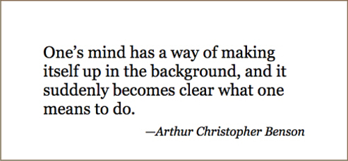
Figure 7-25: Setting up the quotation’s box.
Now, adding a single background image is no big deal. Everyone has done it about a zillion times.
.quotebox {
  background: url(bg01.png) top left no-repeat;
  background-color: #fff;
}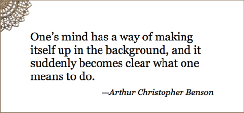
Figure 7-26: Adding a single background.
But what if you want a little quarter-wheel in every corner? Previously, you would have nested a bunch of divs just inside the quotebox div. With CSS 3, just keep adding them to the background declaration:
.quotebox {
      background:
             url(bg01.png) top left no-repeat,
             url(bg02.png) top right no-repeat;
      background-color: #fff;
}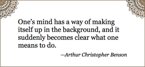
Figure 7-27: Applying two backgrounds to the same element.
Commas separate each background value to get multiple backgrounds:
.quotebox {
background:
             url(bg01.png) top left no-repeat,
             url(bg02.png) top right no-repeat,
             url(bg03.png) bottom right no-repeat,
             url(bg04.png) bottom left no-repeat;
      background-color: #fff;
}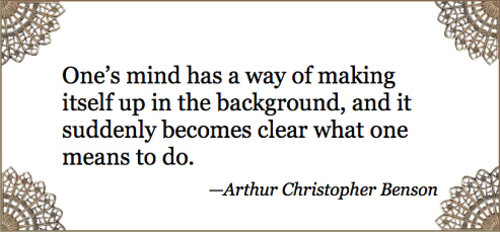
Figure 7-28: Applying four backgrounds to a single element.
The effect here is extremely similar to nesting a bunch of divs. It’s just that with CSS 3, you don’t have to bother any more.
That similarity extends into the way background are composited together. You may have noticed that I split out the background-color declaration in order to have a nice flat white behind all the images. But what if you wanted to fold it into the background declaration? Where would you put it? After all, each of these comma-separated values sets up its own background. Put the color in the wrong place, and one or more images will be overwritten by the color.
As it turns out, the answer is the last of the values:
.quotebox {
background:
             url(bg01.png) top left no-repeat,
             url(bg02.png) top right no-repeat,
             url(bg03.png) bottom right no-repeat,
             #fff url(bg04.png) bottom left no-repeat;
}
That’s because the multiple background go from “highest”—that is, closest to you as you look at the page—to “lowest”—furthest away from you. If you put the color on the first background, it would sit “above” all the others.
This also means that if you want some kind of patterned background behind all the others, it needs to come last and you need to make sure to shift any background color to it.
.quotebox {
background:
             url(bg01.png) top left no-repeat,
             url(bg02.png) top right no-repeat,
             url(bg03.png) bottom right no-repeat,
             url(bg04.png) bottom left no-repeat,
             #fff url(bgparch.png) center repeat;
}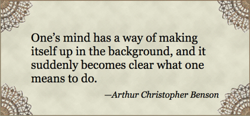
Figure 7-29: One element, five backgrounds.
Because of the possible complexities involved, I prefer to split any default background color into its own declaration, as shown earlier. Thus I’d write the preceding as:
.quotebox {
  background:
             url(bg01.png) top left no-repeat,
             url(bg02.png) top right no-repeat,
             url(bg03.png) bottom right no-repeat,
             url(bg04.png) bottom left no-repeat,
             url(bgparch.png) center repeat;
      background-color: #fff;
}
When you use the separate property, the color is placed behind all the images and you don’t have to worry about shifting it around if you reorder the images or add new images to the pile.
You can comma-separate the other background properties such as background-image. In fact, an alternate way of writing the preceding styles would be:
.quotebox {
    background-repeat: no-repeat, no-repeat, no-repeat, no-repeat, repeat;
    background-image: url(bg01.png), url(bg02.png), url(bg03.png), url(bg04.png), url(bgparch.png);
    background-position: top left, top right, bottom right, bottom left, center;
    background-color: #fff;
}
Different format, same result. This probably looks more verbose, and in this case it really is, but not always. If you drop the parchment background, then you could simplify the first declaration quite a bit:
.quotebox {
    background-repeat: no-repeat;
    background-image: url(bg01.png), url(bg02.png), url(bg03.png), url(bg04.png);
    background-position: top left, top right, bottom right, bottom left;
    background-color: #fff;
}
Figure 7-30: Similar background, alternate syntax.
Given those styles, none of the background images would be repeated, because the single no-repeat is applied to all the backgrounds that are assigned to the element. The only reason you had to write out all the repeat values before was that the first four have one value and the fifth had another.
And if you were to write two values for background-repeat?
.quotebox {
    background-repeat: no-repeat, repeat-y;
    background-image: url(bg01.png), url(bg02.png), url(bg03.png), url(bg04.png);
    background-position: top left, top right, bottom right, bottom left;
    background-color: #fff;
}
In that case, the first and third images would not be repeated, whereas the second and fourth images would be repeated along the y axis. With three repeat values, they would be applied to the first, second, and third images, respectively, whereas the fourth image would take the first repeat value.
2D Transforms
If you’ve ever wanted to rotate or skew an element, border, and text and all, then this section is definitely for you. First, though, a word of warning: In order to keep things legible, this section uses the unprefixed version of the transform property. As of this writing, doing transforms in a browser actually would require multiple prefixed declarations, like so:
-webkit-transform: …;
-moz-transform: …;
-o-transform: …;
-ms-transform: …;
transform: …;
That should cease to be necessary in a year or two (I hope!) but in the meantime, keep in mind as you read through this section that it’s been boiled down to the unprefixed version for clarity.
Time to get transforming! Possibly the simplest transform to understand is rotation:
.box1 {
  -moz-transform: rotate(33.3deg);
}
.box2 {
  -moz-transform: rotate(-90deg);
}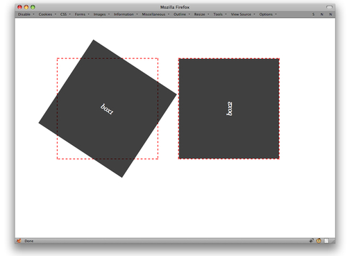
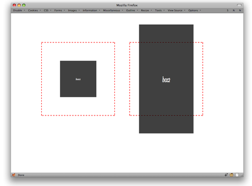
Figure 7-31: Rotated element boxes. The red dashes show the original placement of the elements before their rotation.
In a sense, transforming is a lot like relative positioning: The element is placed normally and then transformed. You can transform any element at all, and in the case of rotation can use any real-number amount of degrees, radians, or grads to specify the angle of rotation. If you’ve ever wanted to rotate your blog by e radians or 225 grads, well, now’s your chance.
As you no doubt noticed, the boxes in the preceding example were rotated around their centers. That’s because the default transformation origin is 50% 50%, or the center of the element. You can change the origin point using transform-origin:
.box1 {
  transform: rotate(33.3deg);
  transform-origin: bottom left;
}
.box2 {
  transform: rotate(-90deg);
  transform-origin: 75% 0;
}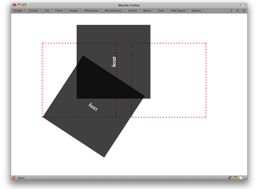
Figure 7-32: Elements rotated around points other than their centers.
Two notes: First, negative angles can be equivalent to positive angles. Thus, 270deg is equivalent to –90deg in the final positioning of the element, just as 0deg and 360deg are the same. Second, you can specify angles greater than the apparent maximum value. If you declare 540deg, the element’s final rotation will look exactly the same as if you’d declared 180deg (as well as –180deg, 900deg, and so on). The interim result may be different if you also apply transitions (see next section), but the final “resting” state will be equivalent.
Almost as simple as rotation is scaling. As you no doubt expect, this scales an element up or down in size, making it larger or smaller. You can do this consistently along both axes, or to a different degree along each axis:
.box1 {
  transform: scale(0.5);
}
.box2 {
  transform: scale(0.75, 1.5);
}One scale() value means the element will be scaled by that amount along both the x and y axes. If there are two values, the first specifies the horizontal (X) scaling, and the second, the vertical (Y) scaling. Thus, if you want to leave the horizontal axis the same and only scale on the y axis, do this:
.box1 {
  transform: scale(0.5);
}
.box2 {
  transform: scale(1, 1.5);
}
Alternatively, you can use the scaleY() value:
.box1 {
  transform: scale(0.5);
}
.box2 {
  transform: scaleY(1.5);
}
Along the same lines is the scaleX() value, which causes horizontal scaling without changing the vertical scaling.
.box1 {
  transform: scaleX(0.5);
}
.box2 {
  transform: scaleX(1.5);
}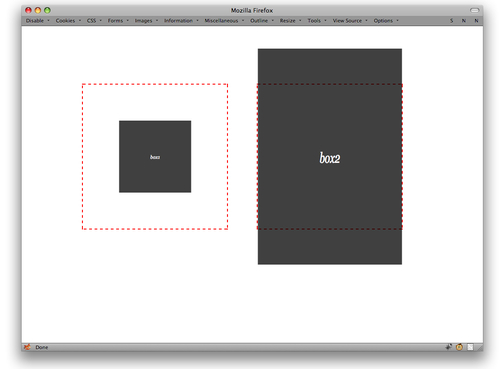
Figure 7-34: Two scaled elements, one scaled only on the Y axis.
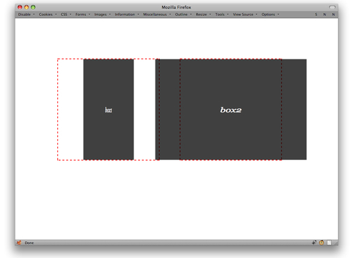
Figure 7-35: Two scaled elements, one scaled only on the X axis.
When writing CSS yourself, it seems most convenient to just stick with scale() and fill in a 0 for the horizontal any time you want a purely vertical scaling. If you’re programmatically changing the scaling via DOM scripting, it might be easier to manipulate scaleX() and scaleY() directly.
As with rotation, you can affect the origin point for scaling. This allows you, for example, to cause an element to scale toward its top-left corners instead of shrink down toward its center:
.box1 {
  transform: scale(0.5);
  transform-origin: top left;
}
.box2 {
  transform: scale(1.5);
  transform-origin: 100% 100%;
}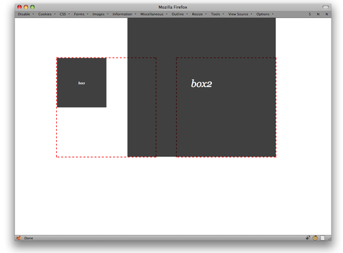
Figure 7-36: Two scaled elements, each with a different scaling origin.
Similarly simple is translation. In this case, it isn’t changing the language from one to another, but “translating” a shape from one point to another. It’s an offset by either one or two length values.
.box1 {
  transform: translate(50px);
}
.box2 {
  transform: translate(5em,10em);
}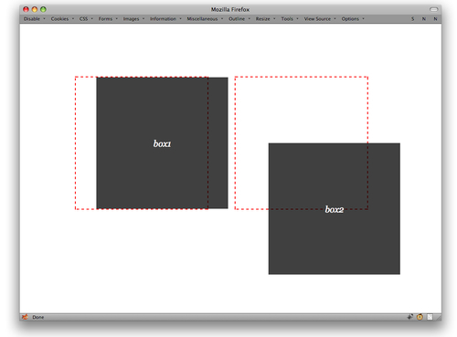
Figure 7-37: Translated elements.
Again, this is very much like relative positioning. The elements are placed normally and then transformed as directed. When there’s only one length value in a translate() value, it specifies a horizontal movement and the vertical movement is assumed to be zero. If you just want to translate an element up or down, you have two choices. First is to simply give a length of 0 for the horizontal value.
.box1 {
  transform: translate(0,50px);
}
.box2 {
  transform: translate(5em,10em);
}
The other is to use the value pattern translateY():
.box1 {
  transform: translateY(50px);
}
.box2 {
  transform: translate(5em,10em);
}
There is also a translateX(), which does about what you’d expect: moves the element horizontally!
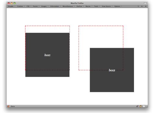
Figure 7-38: Two differently translated elements.
While you can declare a transform-origin in cases where you’re just translating, it doesn’t matter all that much whether you do so. After all, whether an element’s center or top-left corner is pushed 50 pixels to the right doesn’t really matter. The element will end up in the same place either way. But that’s only true if all you’re doing is translating. If you do anything else at the same time, like rotate or scale, then the origin will matter. (More on combining transforms in a bit.)
The last type of transformation, skewing, is slightly more complex, although the method of declaring it is no more difficult than you’ve seen so far.
Skewing an element distorts its shape along one or both axes:
.box1 {
  transform: skew(23deg);
}
.box2 {
  transform: skew(13deg,-45deg);
}
If you provide only a single value for skew(), then there is only horizontal (X) skew, and no vertical (Y) skew. As with translations and scaling, there are skewX() and skewY() values for those times you want to explicitly skew along only one axis:
.box1 {
  transform: skewX(-23deg);
}
.box2 {
  transform: skewY(45deg);
}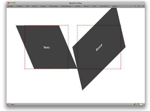
Figure 7-39: Two skewed elements.
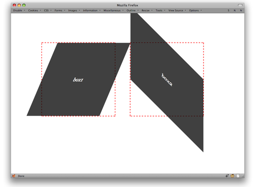
Figure 7-40: Two elements, each one skewed along a different axis.
Here’s how skewing works: Imagine there are two bars running through the element, one along each of the X and Y axes. When you skew in the X direction, the Y axis is rotated by the skew angle. Yes, the Y (vertical) axis is the one that rotates in a skewX() operation. Positive angles are counterclockwise, and negative angles are clockwise. That’s why the first box in the preceding example appears to tilt rightward: The Y axis was tilted 33.3 degrees clockwise.
The same basic thing happens with skewY(): The X axis is tilted by the specified number of degrees, with positive angles tilting it counterclockwise and negative angles tilting clockwise.
The interesting part here is how the origin plays into it. If the origin is in the center and you provide a negative skewX(), then the top of the element will slide to the right of the origin point while the bottom will slide to the left. Change the origin to the bottom of the element, though, and the whole thing will tilt right from the bottom of the element.
.box1 {
  transform: skewX(-23deg);
}
.box2 {
  transform: skewY(-23deg);
  transform-origin: bottom center;
}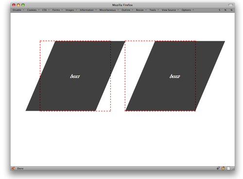
Figure 7-41: Two skewed elements, each with a different skewing origin.
Similar effects happen with vertical skews.
So those are the types of transforms you can carry out. But what if you want to do more than one at a time? No problem! Just list them in the order you want them to happen.
.box1 {
  transform: translateX(50px) rotate(23deg);
}
.box2 {
  transform: scale(0.75) translate(25px,-2em);
}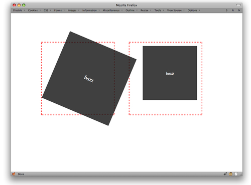
Figure 7-42: Multiple transforms in action.
In every case, the transforms are executed one at a time, starting with the first. This can make a significant difference. Consider the differing outcomes of the same transforms in different orders.
.box1 {
  transform: rotate(45deg) skew(-45deg);
}
.box2 {
  transform: skew(-45deg) rotate(45deg);
}
There is one more transformation value type to cover: matrix(). This value type allows you to specify a transformation matrix in six parts, the last two of which define the translation. Here’s a code example:
.box1 {
  transform: matrix(0.67,0.23,0,1,25px,10px);
}
.box2 {
  transform: matrix(1,0.13,0.42,1,0,-25px);
}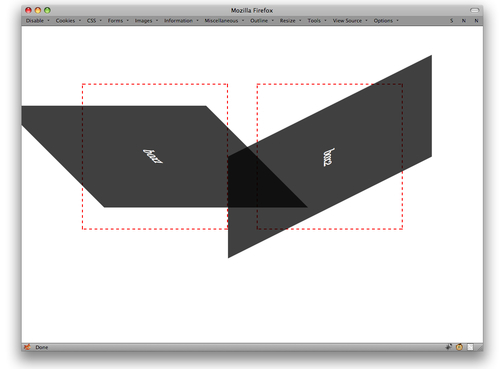
Figure 7-43: The differences caused by transform value ordering.
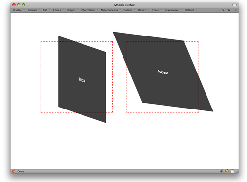
Figure 7-44: Matrix transforms.
Basically, the first four numbers are a compact form of expressing the end result of rotating, skewing, and scaling an element, and the last two translate that end result. If you understand matrix-transformation math, then you’ll love this. If you don’t, don’t worry about it overmuch. You can get to the same place with the other transform values reviewed in this chapter.
If you’d like to learn about matrix transforms, here are two useful resources:
About the book
Smashing CSS takes you well beyond the basics, covering not only the finer points of layout and effects, but introduces you to the future with HTML5 and CSS3. This book is for developers who already have some experience with CSS and JavaScript and are ready for more advanced techniques.
(vf) (ik)
table.terms { border: 1px solid #ccc; border-collapse: collapse; margin-top: 5px; } .terms thead { background-color: #ccc; font-weight: bold; } .terms td { padding: 6px 8px; } .terms tr { border-bottom: 1px solid #ccc; }


 Agent Ready is the new Headless


 SurveyJS: White-Label Survey Solution for Your JS App