Optimizing Error Pages: Creating Opportunities Out Of Mistakes
In this article, we’ll review a few techniques that will help Web designers and UI professionals improve their error pages in order to engage visitors and improve the experience. As C.S. Lewis said, “Failures are finger posts on the road to achievement.” Website designers should take this to heart.
We’ll focus on error and maintenance pages, from both a tracking and usability perspective. You’ll find examples on how to use analytics and defensive design in order to optimize the user experience on those pages.
First, let’s go over error pages and how to optimize them. We’ll try to answer the following questions:
- Does your 404 page succeed in engaging visitors, who are already frustrated from not finding what they came for?
- How do you decrease the number of people who arrive on your 404 page?
- How do you monitor 404 page traffic efficiently?
After, we’ll discuss techniques for improving conversion rates, even when the website is under maintenance. Here are some of the questions we’ll consider:
- How to time maintenance periods wisely?
- How to increase visitor engagement using a maintenance page?
Optimizing 404 Pages
The topic of improving error messages was thoroughly covered in Defensive Design for the Web, a book written by the 37signals team. They go over 40 guidelines to “prevent errors and rescue customers if a breakdown does occur.” In guideline 16 (page 93), they advise us to customize our “Page not found” error pages, and they offer interesting insight into how to create error pages:
Instead of merely saying a page is not found, your site needs to explain why a page can’t be located and offer suggestions for getting to the right screen. Your site should lend a hand, not kick people when they are down.Smart things to include on your 404 page:
- Your company’s name and logo;
- An explanation of why the visitor is seeing this page;
- A list of common mistakes that may explain the problem;
- Links back to the home page and/or other pages that might be relevant;
- A search engine that customers can use to find the right information;
- An email link so that visitors can report problems, missing pages and so on.
A while ago, I came across the great examples shared on Smashing Magazine (part 1 and part 2) and was inspired to create my own 404 page. But because understanding and analyzing online behavior is so important, I asked myself, Is what I’ve come up really good? How can I make it better? Below we’ll go over a few techniques to both monitor and optimize 404 pages.
If you do not have a customized 404 page, please refer to this simple explanation of how to set one up.
Monitoring 404 Page Traffic
How often do you check the traffic to your 404 page? Most of the companies I have worked with never did, even once. Yet it is hard to overemphasize the importance of consistently monitoring it. For example, if a prominent blog links to your website but the link is broken, this will make for a very poor experience for users (who will not find what they expect) and for search engines (which will not crawl the right content). Below are a few tips on tracking those pages seamlessly using Google Analytics. (The screenshots were taken from the new Google Analytics version, which is still in beta, so your mileage may vary.)
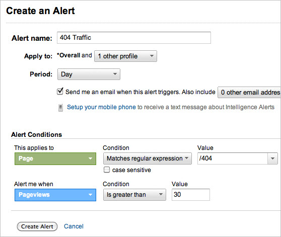
Create an alert on Google Analytics.
As seen in the screenshot below, you can set Google Analytics to alert you each time 404 traffic reaches a certain number of visits a day. This way, you have to do the work only once, but you’ll be alerted every time there is a problem.
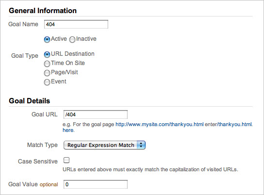
Track your 404 page as a goal.
Setting the 404 page as a goal on Google Analytics will yield important (and otherwise unattainable) information. For example, you’ll be able to see the three steps that visitors took to get to this page. In addition, setting this goal makes it easier to find traffic sources with broken links.
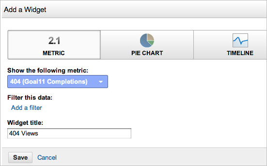
Add the 404 content report to your dashboard.
Every report in Google Analytics can be added to the dashboard. By adding the 404 page, you will be able to constantly monitor visitor trends on the page.
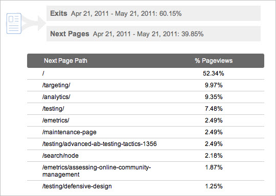
Check your navigation summary report.
This will help you understand what visitors do upon leaving this page, which is important for knowing how to optimize it.
Track internal searches from this page.
If your 404 page does not have a search box, seriously consider adding one. From searches performed on this page, you will be able to understand what people were expecting to find, and you will get an idea of what links to add to the page. Below are the metrics you will be able to track with this feature:
- Total unique searches The number of times people started a search from the 404 page. Duplicate searches from a single visit are excluded.
- Search result page views after searches The average number of times visitors viewed a search results page after performing a search.
- % search exits The percentage of searches that resulted in an immediate exit from your website.
- % search refinements The percentage of searches that resulted in a new search using a different term.
- Time after search The average amount of time visitors spend on your website after performing a search.
- Search depth The average number of pages that visitors viewed after performing a search.
Decrease Your Errors (Fixing Broken Links)
Monitoring 404 pages is important, but that alone won’t do you any good unless you act on it. Taking action means doing all you can do to decrease the number of people who reach the 404 page and improving the experience of users who do reach it (see the next section). Below are a few tips on finding and fixing both internal and external broken links.
Check the navigation summary report.
This will show you the route that visitors took on your website to get to the 404 page (and thus tell you which pages contain broken internal links). You will see the percentage of visitors who arrived on this page from internal sources as well as from external sources; and the internal sources will be listed in this report (see the navigation summary screenshot above).
Check the sources of traffic that lead to the 404 page.
This will clearly show which websites have broken links to your website. With the list, you should either contact the sources or create 301 redirects to the correct pages.

Usability Tips to Improve 404 Engagement
Basically, usability practices for error pages are not much different from general usability practices. Below are a few tips to help you increase the conversion rate of your 404 page. For our purpose, conversion is essentially the click-through rate (CTR), because our main objective is for visitors to find what they’re looking for.
- Be simple and focused. Appealing images and an original design are important, but a clear focus is critical. Users are already disoriented from landing somewhere they were not expecting, so make their lives easier by presenting a clear action to take.
- Know your visitors. Many 404 pages use humor, including geek humor. Keep in mind that you are not your visitor, and jokes can be misunderstood, so use humor wisely.
- Let the visitor decide. As I said in “Web Analytics Process”: “Customers should tell us what to do, not consultants, friends or feelings; data and online surveys are the place to look for customers’ needs.” The best way to understand what works for visitors is to present a few page versions and let the best one win. (See the review of advanced A/B testing techniques by Paras Chopra.)
Optimizing Maintenance Pages
Not long ago, I worked on a website that had weekly downtime for maintenance, about one to two hours a week. The owners chose the day with the least traffic for maintenance, but I believe they did not completely understand how this affected the website and, more importantly, how they could have optimized the user experience and taken advantage of the downtime. In a post on Smashing Magazine, Cameron Chapman provides a good checklist for designing effective maintenance pages:
- Keep the maintenance page simple and useful.
- Realize it’s an inconvenience to visitors.
- Don’t be afraid to use humor.
- Give the page the same look and feel as the rest of your website.
- Let visitors know when the website will be back up.
- Recommend content.
- Invite visitors to return when the website is online again.
- Inform visitors about the progress of the maintenance.
Two other rules are especially important to satisfy and engage visitors…
Time Maintenance Periods Wisely
Common practice for timing maintenance is to choose the time of day or day of week that has the lowest traffic. But this overlooks an important point: websites should be optimized for performance, not for traffic. By choosing the maintenance time based on visitor count, you could be optimizing for traffic and not for dollars. A better way to decide would be to run an hourly report and check what time of day or day of week has the lowest conversions.
Increase Visitor Engagement Using Maintenance Pages
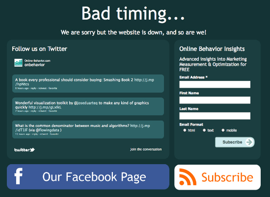
Increase visitor engagement while the website is in maintenance mode? Yes, you read that right. While in maintenance, you have a great opportunity to promote your other marketing channels: offline stores, Facebook fan pages, YouTube channels and Twitter accounts.
Parting Thoughts
Errors happen, and we must be prepared for them. We must lend a hand when visitors are most frustrated and make them feel comfortable again. People’s patience and understanding are decreasing, and users have a world of choices just a click away, so website owners cannot let one small error get in their way.
What are your thoughts on this subject? Feel free to share them with us in the comment section below!
Further Reading
You might be interested in the following related posts:
- Effective Maintenance Pages: Examples and Best Practices
- Website Maintenance Tips for Front-End Developers
- A Better 404 Page
- Optimizing Error Pages: Creating Opportunities Out Of Mistakes


 SurveyJS: White-Label Survey Solution for Your JS App

 Agent Ready is the new Headless


