The Future Of CSS: Experimental CSS Properties
Despite contemporary browsers supporting a wealth of CSS3 properties, most designers and developers seem to focus on the quite harmless properties such as border-radius, box-shadow or transform. These are well documented, well tested and frequently used, and so it’s almost impossible to not stumble on them these days if you are designing websites.
But hidden deep within the treasure chests of browsers are advanced, heavily underrated properties that don’t get that much attention. Perhaps some of them rightly so, but others deserve more recognition. The greatest wealth lies under the hood of WebKit browsers, and in the age of iPhone, iPad and Android apps, getting acquainted with them can be quite useful.
Even the Gecko engine, used by Firefox and the like, provides some distinct properties. In this article, we will look at some of the less known CSS 2.1 and CSS3 properties and their support in modern browsers.

Some explanation: For each property, I state the support: “WebKit” means that it is available only in browsers that use the WebKit engine (Safari, Chrome, iPhone, iPad, Android), and “Gecko” indicates the availability in Firefox and the like. Finally, certain properties are part of the official CSS 2.1. specification, which means that a broad range of browsers, even older ones, support them. Finally, a label of CSS3 indicates adherence to this specification, supported by the latest browser versions, such as Firefox 4, Chrome 10, Safari 5, Opera 11.10 and Internet Explorer 9.
WebKit-Only Properties
-webkit-mask
This property is quite extensive, so a detailed description is beyond the scope of this article and is certainly worth a more detailed examination, especially because it could turn out to be a time-saver in practical applications.
-webkit-mask makes it possible to apply a mask to an element, thereby enabling you to create a cut-out of any shape. The mask can either be a CSS3 gradient or a semi-transparent PNG image. An alpha value of 0 would cover the underlying element, and 1 would fully reveal the content behind. Related properties like -webkit-mask-clip, -webkit-mask-position and -webkit-mask-repeat rely heavily on the syntax of the ones from background. For more info, see the Surfin’ Safari blog and the link below.
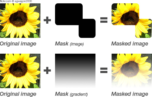
Example
Image mask:
.element {
   background: url(img/image.jpg) repeat;
   -webkit-mask: url(img/mask.png);
}
Example
Gradient mask:
.element2 {
   background: url(img/image.jpg) repeat;
   -webkit-mask: -webkit-gradient(linear, left top, left bottom, from(rgba(0,0,0,1)), to(rgba(0,0,0,0)));
}
Further reading: Safari Developer Library
-webkit-text-stroke
One of the shortcomings of CSS borders is that only rectangular ones are possible. A ray of hope is -webkit-text-stroke, which gives text a border. Setting not only the width but the color of the border is possible. And in combination with color: transparent, you can create outlined text.
Examples
Assigns a blue border with a 2-pixel width to all <h1> headings:
h1 {-webkit-text-stroke: 2px blue}Another feature is the ability to smooth text by setting a transparent border of 1 pixel:
h2 {-webkit-text-stroke: 1px transparent}Creates text with a red outline:
h3 {
   color: transparent;
   -webkit-text-stroke: 4px red;
}
Further reading: Safari Developer Library
-webkit-nbsp-mode
Wrapping can be pretty tricky. Sometimes you want text to break (and not wrap) at certain points, and other times you don’t want this to happen. One property to control this is -webkit-nbsp-mode. It lets you change the behavior of the character, forcing text to break even where it is used. This behavior is enabled by the value space.
Further reading: Safari Developer Library
-webkit-tap-highlight-color
This one is just for iOS (iPhone and iPad). When you tap on a link or a JavaScript clickable element, it is highlighted by a semi-transparent gray background. To override this behavior, you can set -webkit-tap-highlight-color to any color. To disable this highlighting, a color with an alpha value of 0 must be used.
Example
Sets the highlight color to red, with a 50% opacity:
-webkit-tap-highlight-color: rgba(255,0,0,0.5);Supported by: iOS only (iPhone and iPad).
Further reading: Safari Developer Library
zoom: reset
Normally, zoom is an Internet Explorer-only property. But in combination with the value reset, WebKit comes into play (which, funny enough, IE doesn’t support). It enables you to override the standard behavior of zooming on websites. If set with a CSS declaration, everything except the given element is enlarged when the user zooms on the page.
Further reading: Safari Developer Library
-webkit-margin-collapse
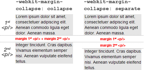
Here is a property with a quite limited practical use, but it is still worth mentioning. By default, the margins of two adjacent elements collapse, which means that the bottom distance of the first element and the top distance of the second element merge into a single gap.
The best example is two <p>s that share their margins when placed one after another. To control this behavior, we can use -webkit-margin-collapse, -webkit-margin-top-collapse or -webkit-margin-bottom-collapse. The standard value is collapse. The separate value stops the sharing of margins, which means that both the bottom margin of the first element and the top margin of the second are included.
Further reading: Safari Developer Library
-webkit-box-reflect
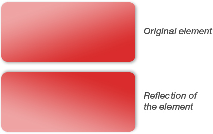
Do you remember the days when almost every website featured a reflection of either its logo or some text in the header? Thankfully, those days are gone, but if you’d like to make a subtle use of this technique for your buttons, navigation or other UI elements with CSS, then -webkit-box-reflect is the property for you.
It accepts the keywords above, below, left and right, which set where the reflection is drawn, as well as a numeric value that sets the distance between the element and its reflection. Beyond that, mask images are supported as well (see -webkit-mask for an explanation of masks). The reflection is created automatically and has no effect on the layout. Following elements are created using only CSS, and the second button is reflected using the -webkit-box-reflect-property.
Examples
This reflection would be shown under its parent element and have a spacing of 5 pixels:
-webkit-box-reflect: below 5px;This reflection would be cast on the right side of the element, with no distance (0); additionally, a mask would be applied (url(mask.png)):
-webkit-box-reflect: right 0 url(mask.png);Further reading: Safari Developer Library
-webkit-marquee
Here is another property that recalls the good ol’ days when marquees were quite common. Interesting that this widely dismissed property turns out to be be useful today, when we shift content on tiny mobile screens that would otherwise not be fully visible without wrapping.
The weather application by ozPDA makes great use of it. (If you don’t see shifting text, just select another city at the bottom of the app. WebKit browser required.)
Example
.marquee {
   white-space: nowrap;
   overflow:-webkit-marquee;
   width: 70px;
   -webkit-marquee-direction: forwards;
   -webkit-marquee-speed: slow;
   -webkit-marquee-style: alternate;
}
There are some prerequisites for the marquee to work. First, white-space must be set to nowrap if you want the text to be on one line. Also, overflow must be set to -webkit-marquee, and width set to something narrower than the full length of the text.
The remaining properties ensure that the text scrolls from left to right (-webkit-marquee-direction), shifts back and forth (-webkit-marquee-style) and moves at a slow rate (-webkit-marquee-speed). Additional properties are -webkit-marquee-repetition, which sets how many iterations the marquee should pass through, and -webkit-marquee-increment, which defines the degree of speed in each increment.
Further reading: Safari Developer Library
Gecko-Only Properties
font-size-adjust
Unfortunately, this useful CSS3 property is supported only by Firefox at the moment. We can use it to specify that the font size for a given element should relate to the height of lowercase letters (x-height) rather than the height of uppercase letters (cap height). For example, Verdana is much more legible at the same size than Times, which has a much shorter x-height. To compensate for this behavior, we can adjust the latter with font-size-adjust.
This property is particularly useful in CSS font stacks whose fonts have different x-heights. Even if you’re careful to use only similar fonts, font-size-adjust can provide a solution when problems arise.
Example
If Verdana is not installed on the user’s machine for some reason, then Arial is adjusted so that it has the same aspect ratio as Verdana, which is 0.58 (at a font size of 12px, differs on other sizes).
p {
   font-family:Verdana, Arial, sans-serif;
   font-size: 12px;
   font-size-adjust: 0.58;
}
Supported by: Gecko.
Further reading: Mozilla Developer Network
image-rendering
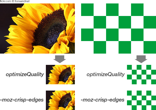
A few years ago, images that were not displayed at their original size and were scaled by designers, could appear unattractive or just plain wrong in the browser, depending on the size and context. Nowadays, browsers have a much better algorithm for displaying resized images, however, it’s great to have a full control over the ways your images will be displayed when scaled, especially with responsive images becoming a de facto standard in responsive Web designs.
This Gecko-specific property is particularly useful if you have an image with sharp lines and want to maintain them after resizing. The relevant value would be -moz-crisp-edges. The same algorithm is used at optimizeSpeed, whereas auto and optimizeQuality indicate the standard behavior (which is to resize elements with the best possible quality). The image-rendering property can also be applied to <video> and <canvas> elements, as well as background images. It is a CSS3 property, but is currently supported only by Firefox.
It’s also worth mentioning -ms-interpolation-mode: bicubic, although it is a proprietary Internet Explorer property. Nevertheless, it enables Internet Explorer 7 to render images at a much higher quality after resizing which is useful because by default this browser handles such tasks pretty poorly.
Supported by: Gecko.
Further reading: Mozilla Developer Network
-moz-border-top-colors
This property could be filed under ‘eye-candy’. It allows you to assign different colors to borders that are wider than 1 pixel. Also available are -moz-border-bottom-colors, -moz-border-left-colors and -moz-border-right-colors.
Unfortunately, there is no condensed version like -moz-border-colors for this property, so the border property must be set in order for it to work, whereas border-width should be the same as the number of the given color values. If it is not, then the last color value is taken for the rest of the border.
Example
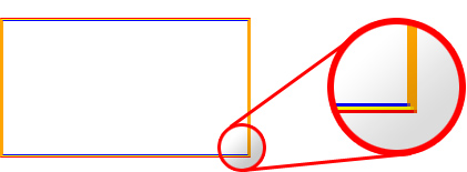
Below, the element’s border would have a standard color of orange applied to the left and right side (because -moz-border-left-colors and -moz-border-right-colors are not set). The top and bottom borders have a kind of gradient, with the colors red, yellow and blue.
div {
   border: 3px solid orange;
   -moz-border-top-colors: red yellow blue;
   -moz-border-bottom-colors: red yellow blue;
}
Supported by: Gecko.
Further reading: Mozilla Developer Network
Mixed Properties
-webkit-user-select and -moz-user-select
There might be times when you don’t want users to be able to select text, whether to protect it from copying or for another reason. One solution is to set -webkit-user-select and -moz-user-select to none. Please use this property with caution: since most users are looking for information that they can copy and store for future reference, this property is neither helpful nor effective. In the end, the user could always look up the source code and take the content even if you have forbidden the traditional copy-and-paste. We do not know why this property exists in both WebKit and Gecko browsers.
Supported by: WebKit, Gecko.
Further reading: Safari Developer Library, Mozilla Developer Network
-webkit-appearance and -moz-appearance
Ever wanted to easily camouflage an image to look like a radio button? Or an input field to look like a checkbox? Then appearance will come in handy. Even if you wouldn’t always want to mask a link so that it looks like a button (see example below), it’s nice to know that you can do it if you want.
Example
a {
   -webkit-appearance: button;
   -moz-appearance: button;
}
Supported by: WebKit, Gecko.
Further reading: Safari Developer Library, Mozilla Developer Network
text-align: -webkit-center/-moz-center
This is one property (or value, to be exact) whose existence is quite surprising. To center a block-level element, one would usually set margin to 0 auto. But you could also set the text-align property of the element’s container to -moz-center and -webkit-center. You can align left and right with -moz-left and -webkit-left and then -moz-right and -webkit-right, respectively.
Supported by: WebKit, Gecko.
Further reading: Safari Developer Library, Mozilla Developer Network
CSS 2.1. Properties
counter-increment
How often have you wished you could automatically number an ordered list or all of the headings in an article? Unfortunately, there is still no CSS3 property for that. But let’s look back to CSS 2.1, in which counter-increment provides a solution. That means it’s been around for several years, and even supported in Internet Explorer 8. Did you know that? Me neither.
In conjunction with the :before pseudo-element and the content property, counter-increment can add automatic numbering to any HTML tag. Even nested counters are possible.
Example
For numbered headings, first reset the counter to start at 1:
body {counter-reset: thecounter}Every <h1> would get the prefix “Section,” including a counter that automatically increments by 1 (which is default and can be omitted), where thecounter is the name of the counter:
.counter h1:before {
   counter-increment: thecounter 1;
   content:"Section"counter(thecounter)":";
}
Example
For a nested numbered list, the counter is reset and the automatic numbering of <ol> is switched off because it features no nesting:
ol {
    counter-reset: section;
    list-style-type: none;
}
Then, every <li> is given automatic incrementation, and the separator is set to be a point (.), followed by a blank.
li:before {
    counter-increment: section;
    content: counters(section,".")"";
}
<ol>
<li>item</li> <!-- 1 -->
<li>item <!-- 2 -->
<ol>
<li>item</li> <!-- 1.1 -->
<li>item</li> <!-- 1.2 -->
</ol>
</li>
<li>item</li> <!-- 3 -->
<ol>Supported by: CSS 2.1., all modern browsers, IE 7+.
Further reading: W3C
quotes
Are you tired of using wrong quotes just because your CMS doesn’t know how to properly convert them to the right ones? Then start using the quotes property to set them how you want. This way, you can use any character. You would then assign the quotes to the desired element using the :before and :after pseudo-elements. Unfortunately, the otherwise progressive WebKit browsers don’t support this property, which means no quotes are shown at all.
Example
The first two characters determine the quotes for the first level of a quotation, the last two for the second level, and so on:
q {
   quotes: '«' '»' "‹" "›";
}
These two lines assign the quotes to the selected element:
q:before {content: open-quote}
q:after  {content: close-quote}
So, <p><q>This is a very <q>nice</q> quote.</q></p> would give us:
«This is a very ‹nice› quote.»
Supported by: CSS 2.1., all browsers except WebKit, even IE 7+.
Further reading: W3C
Question: To add the character directly, does the CSS document have to have a UTF-8 character set? That’s a tough one. Unfortunately, I can’t give a definitive answer. My experimentation has shown that no character set has to be set for the quotes property to work properly. However the utf-8 character set doesn’t work because it shows “broken” characters (for example, “»”). With the iso-8859-1 character set, everything works fine.
This is how the W3C describes it: “While the quotation marks specified by ‘quotes’ in the previous examples are conveniently located on computer keyboards, high-quality typesetting would require different ISO 10646 characters.”
CSS3 Properties You May Have Heard About But Can’t Remember
To round out things, let’s go over some CSS3 properties that are not well known and maybe not as appealing as the classic ones border-radius and box-shadow.
text-overflow
Perhaps you’re familiar with this problem: a certain area is too small for the text that it contains, and you have to use JavaScript to cut the string and append “…” so that it doesn’t blow out the box.
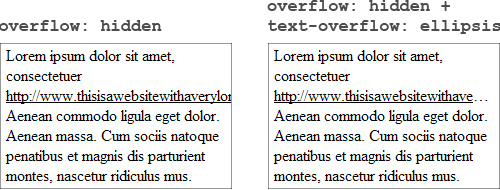
Forget that! With CSS3 and text-overflow: ellipsis, you can force text to automatically end with “…” if it is longer than the width of the container. The only requirement is to set overflow to hidden. Unfortunately, this is not supported by Firefox but will hopefully be implemented in a coming release.
Example
div {
   width: 100px;
   text-overflow: ellipsis;
}
Supported by: CSS 3, all browsers except Firefox, even IE6+.
Further reading: W3C
word-wrap
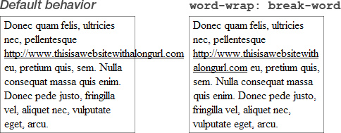
With text in a narrow column, sometimes portions of it are too long to wrap correctly. Link URLs especially cause trouble. If you don’t want to hide the overflowing text with overflow: hidden, then you can set word-wrap to break-word, which causes it to break when it reaches the limit of the container.
Example
div {
   width: 50px;
   word-wrap: break-word;
}
Supported by: CSS 3, all browsers, even IE6+.
Further reading: W3C
resize
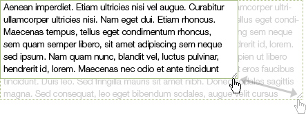
If you use Firefox or Chrome, then you must have noticed that text areas by default have a little handle in the bottom-right corner that lets you resize them. This standard behavior is achieved by the CSS3 property resize: both.
But it’s not limited to text areas. It can be used on any HTML element. The horizontal and vertical values limit the resizing to the horizontal and vertical axes, respectively. The only requirement is that overflow be set to anything other than visible.
Supported by: CSS3, all the latest browsers except Opera and Internet Explorer.
Further reading: Safari Developer Library
background-attachment
When you assign a background image to an element that is set to overflow: auto, it is fixed to the background and doesn’t scroll. To disable this behavior and enable the image to scroll with the content, set background-attachment to local.
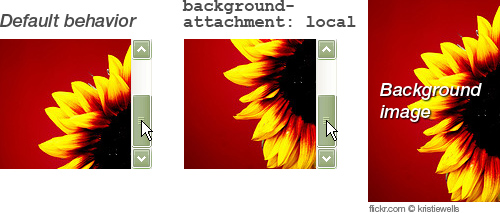
Supported by: CSS 3, all the latest browsers except Firefox.
Further reading: Safari Developer Library
text-rendering
With more and more websites rendering fonts via the @font-face attribute, legibility becomes a concern. Problems can occur particularly at small font sizes. While there is still no CSS property to control the subtle details of displaying fonts online, you can enable kerning and ligatures via text-rendering.
Gecko and WebKit browsers handle this property quite differently. The former enables these features by default, while you have to set it to optimizeLegibility in the latter.
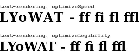
Supported by: CSS3, all WebKit browsers and Firefox.
Further reading: Mozilla Developer Network
transform: rotateX/transform: rotateY
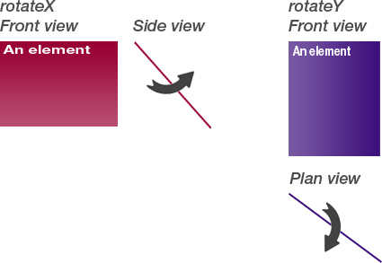
If you’ve already dived into CSS3 and transformations a bit, then you’re probably familiar with transform: rotate(), which rotates an element around its z-axis.
But did you know that it is also possible to spin it “into the deep” (i.e. around its x-axis and y-axis)? These transformations are particularly useful in combination with -webkit-backface-visibility: hidden, if you want to rotate an element and reveal another one at its back. This technique is described by Andy Clarke in his latest book, Hardboiled Web Design.
Example
If you hover over the element, it will turn by 180°, revealing its back:
div:hover {
   transform: rotateY(180deg);
}
Quick tip: To just mirror an element, you can either set transform to rotateX(180deg) (and respectively rotateY) or set transform to scaleX(-1) (and respectively scaleY).
Supported by: CSS3, only WebKit browsers, in combination with -webkit-backface-visibility only Safari and iOS (iPhone and iPad).
Further reading: Safari Developer Library (transform: rotate, -webkit-backface-visibility)
Some Last Words
As you hopefully have seen, there are many unknown properties that range from being nice to hav to being very useful. Many of them are still at an experimental stage and may never leave it or even be discarded in future browser releases. Others will hopefully be adopted by all browser manufacturers in coming versions.
While it is hard to justify using some of them, the WebKit-specific ones are gaining more and more importance with the success of the iOS devices and Android. And of course some CSS3 properties are more or less ready to be used now.
And if you don’t like vendor-specific properties, you can see them as experiments that still could be implemented in the code to improve the user experience for users browsing with the modern browsers. By the way, CSS validator from the W3C now also supports vendor-specific properties, which result in warnings rather than errors.
Happy experimenting!
Further Reading
- An Ultimate Guide To CSS Pseudo-Classes And Pseudo-Elements
- Houdini: Maybe The Most Exciting Development In CSS
- Learning CSS3: A Reference Guide
- Start Using CSS3 Today: Techniques and Tutorials


 SurveyJS: White-Label Survey Solution for Your JS App
 Agent Ready is the new Headless


