How To Design For Android
For designers, Android is the elephant in the room when it comes to app design. As much as designers would like to think it’s an iOS world in which all anyones cares about are iPhones, iPads and the App Store, nobody can ignore that Android currently has the majority of smartphone market share and that it is being used on everything from tablets to e-readers. In short, the Google Android platform is quickly becoming ubiquitous, and brands are starting to notice.
But let’s face it. Android’s multiple devices and form factors make it feel like designing for it is an uphill battle. And its cryptic documentation is hardly a starting point for designing and producing great apps. Surf the Web for resources on Android design and you’ll find little there to guide you.
If all this feels discouraging (and if it’s the reason you’re not designing apps for Android), you’re not alone. Fortunately, Android is beginning to address the issues with multiple devices and screen sizes, and device makers are slowly arriving at standards that will eventually reduce complexity.
This article will help designers become familiar with what they need to know to get started with Android and to deliver the right assets to the development team. The topics we’ll cover are:
- Demystifying Android screen densities,
- Learning the fundamentals of Android design via design patterns,
- Design assets your developer needs,
- How to get screenshots,
- What Android 3 is about, and what’s on the horizon.
Android Smartphones And Display Sizes
When starting any digital design project, understanding the hardware first is a good idea. For iOS apps, that would be the iPhone and iPod Touch. Android, meanwhile, spans dozens of devices and makers. Where to begin?
The old baseline for screens supported for Android smartphone devices was the T-Mobile G1, the first commercially available Android-powered device which has an HVGA screen measuring 320 × 480 pixels.
HVGA stands for “half-size video graphics array” (or half-size VGA) and is the standard display size for today’s smartphones. The iPhone 3GS, 3G and 2G use the same configuration.
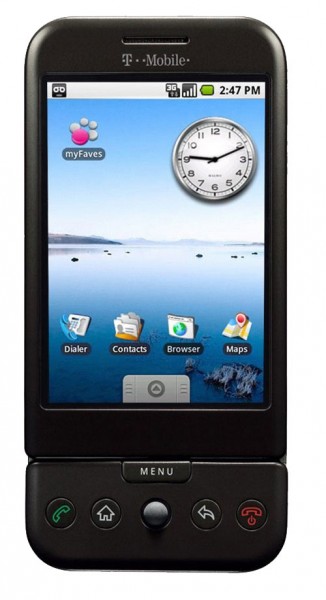
To keep things simple, Android breaks down physical screen sizes (measured as the screen’s diagonal length from the top-left corner to bottom-right corner) into four general sizes: small, normal, large and xlarge.
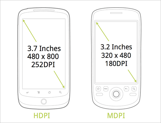
320 × 480 is considered a “normal” screen size by Android. As for “xlarge,” think tablets. However, the most popular Android smartphones today have WVGA (i.e. wide VGA) 800+ × 480-pixel HD displays. So, what’s “normal” is quickly changing. For now, we’ll say that most Android smartphones have large screens.
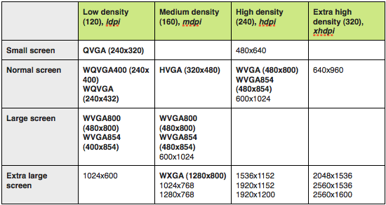
The variety of display sizes can be challenging for designers who are trying to create one-size-fits-all layouts. I’ve found the best approach is to design one set of layouts for 320 × 533 physical pixels and then introduce custom layouts for the other screen sizes.
While this creates more work for both the designer and developer, the larger physical screen size on bigger devices such as the Motorola Droid and HTC Evo might require changes to the baseline layouts that make better use of the extra real estate.
What You Need to Know About Screen Densities
Screen sizes are only half the picture! Developers don’t refer to a screen’s resolution, but rather its density. Here’s how Android defines the terms in its Developers Guide:
- Resolution. The total number of physical pixels on a screen.
- Screen density. The quantity of pixels within a physical area of the screen, usually referred to as DPI (dots per inch).
- Density-independent pixel (DP). This is a virtual pixel unit that you would use when defining a layout’s UI in order to express the layout’s dimensions or position in a density-independent way. The density-independent pixel is equivalent to one physical pixel on a 160 DPI screen, which is the baseline density assumed by the system of a “medium”-density screen. At runtime, the system transparently handles any scaling of the DP units as necessary, based on the actual density of the screen in use. The conversion of DP units to screen pixels is simple: pixels = DP * (DPI / 160). For example, on a 240 DPI screen, 1 DP equals 1.5 physical pixels. Always use DP units when defining your application’s UI to ensure that the UI displays properly on screens with different densities.
It’s a bit confusing, but this is what you need to know: Like screen sizes, Android divides screen densities into four basic densities: ldpi (low), mdpi (medium), hdpi (high), and xhdpi (extra high). This is important because you’ll need to deliver all graphical assets (bitmaps) in sets of different densities. At the very least, you’ll need to deliver mdpi and hdpi sets for any smartphone apps.
What this means is all bitmap graphics need to be scaled up or down from your baseline (320 × 533) screen layouts (note: there is also a way for parsing SVG files that provides a way to scale vector art on different screens sizes and densities without loss of image quality).
The bitmap requirement is similar to preparing graphics for print vs. the Web. If you have any experience with print production, you’ll know that a 72 PPI image will look very pixelated and blurry when scaled up and printed. Instead, you would need to redo the image as a vector image or use a high-resolution photo and then set the file’s resolution at around 300 PPI in order to print it without any loss of image quality. Screen density for Android works similar, except that we’re not changing the file’s resolution, only the image’s size (i.e. standard 72 PPI is fine).
Let’s say you took a bitmap icon measuring 100 × 100 pixels from one of the screens of your baseline designs (remember the “baseline” is a layout set at 320 × 480). Placing this same 100 × 100 icon on a device with an lDPI screen would make the icon appear big and blurry. Likewise, placing it on a device with an hDPI screen would make it appear too small (due to the device having more dots per inch than the mDPI screen).

To adjust for the different device screen densities, we need to follow a 3:4:6:8 scaling ratio between the four density sizes. (For the iPhone, it’s easy: it’s just a 2:1 ratio between the iPhone 4 and 3GS.) Using our ratios and some simple math, we can create four different versions of our bitmap to hand off to our developer for production:
- 75 × 75 for low-density screens (i.e. ×0.75);
- 100 × 100 for medium-density screens (our baseline);
- 150 × 150 for high-density screens (×1.5);
- 200 × 200 for extra high-density screens (×2.0). (We’re concerned with only lDPI, mDPI and hDPI for Android smartphone apps.)
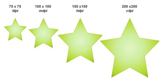
After you’ve produced all of your graphics, you could organize your graphics library as follows:
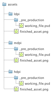
You might be confused about what PPI (pixels per inch) to set your deliverables at. Just leave them at the standard 72 PPI, and scale the images accordingly.
Using Android Design Patterns
Clients often ask whether they can use their iPhone app design for Android. If you’re looking for shortcuts, building an app for mobile Web browsers using something like Webkit and HTML5 is perhaps a better choice. But to produce a native Android app, the answer is no. Why? Because Android’s UI conventions are different from iPhone’s.
The big difference is the “Back” key, for navigating to previous pages. The Back key on Android devices is fixed and always available to the user, regardless of the app. It’s either a physical part of the device or digitally fixed to the bottom of the screen, independent of any app, as in the recently released Android 3.0 for tablets (more on this later).
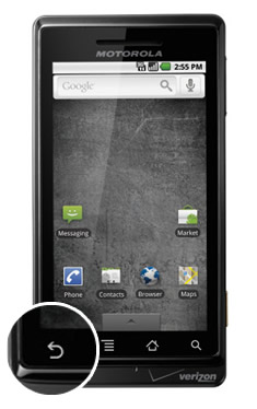
The presence of a Back key outside of the app itself leaves space for other elements at the top of the screen, such as a logo, title or menu. While this navigational convention differs greatly from that of iOS, there are still other differentiators that Android calls “design patterns.” According to Android, a design pattern is a “general solution to a recurring problem.” Below are the main Android design patterns that were introduced with version 2.0.
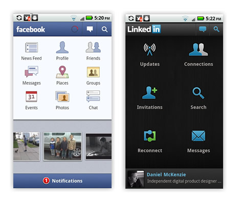
Dashboard
This pattern solves the problem of having to navigate to several layers within an app. It provides a launch pad solution for rich apps such as Facebook, LinkedIn and Evernote.
Action Bar
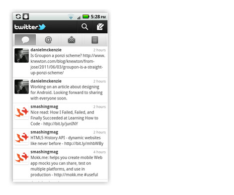
The action bar is one of Android’s most important design patterns and differentiators. It works very similar to a conventional website’s banner, with the logo or title typically on the left and the navigation items on the right. The action bar’s design is flexible and allows for hovering menus and expanding search boxes. It’s generally used as a global feature rather than a contextual one.
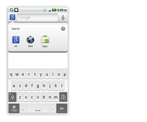
Search Bar
This gives the user a simple way to search by category, and it provides search suggestions.
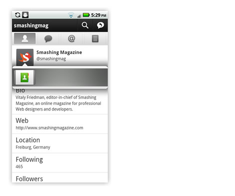
Quick Actions
This design pattern is similar to iOS’ pop-up behavior that gives the user additional contextual actions. For example, tapping a photo in an app might trigger a quick action bar that allows the user to share the photo.
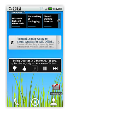
Companion Widget
Widgets allow an app to display notifications on the user’s launch screen. Unlike push notifications in iOS, which behave as temporary modal dialogs, companion widgets remain on the launch screen. (Tip: to select a widget for your Android device, simply tap and hold any empty space on one of the launch screens.)
Using established design patterns is important for keeping the experience intuitive and familiar for your users. Users don’t want an iPhone experience on their Android device any more than a Mac user wants a Microsoft experience in their Mac OS environment. Understanding design patterns is the first step to learning to speak Android and designing an optimal experience for its users. Your developers will also thank you!
Android Design Deliverables
OK, so you’ve designed your Android app and are ready to make it a reality. What do you need to hand off to the developer? Here’s a quick list of deliverables:
- Annotated wireframes of the user experience based on the baseline large screen size of 320 × 533 physical pixels. Include any additional screens for instances where a larger or smaller (320 × 480) screen size requires a modified layout or a landscape version is required.
- Visual design mockups of key screens for WVGA large size (320 x 533) screens (based on a WVGA 800 × 480 hdpi physical pixel screen size) in addition to any custom layouts needed for other screen sizes.
- Specifications for spacing, font sizes and colors, and an indication of any bitmaps.
- A graphics library with lDPI, mDPI and hDPI versions of all bitmaps saved as transparent PNG files.
- Density-specific app icons, including the app’s launch icon, as transparent PNG files. Android already provides excellent tips for designers on this topic, along with some downloads, including graphic PSD templates and other goodies.
How To Take Screenshots
Your product manager has just asked for screenshots of the developer’s build. The developer is busy and can’t get them to you until tomorrow. What do you do?! As of this writing, Android has no built-in way to take screenshots (bummer, I know). The only way is to just deal with it, and that means pretending to be a developer for a while and downloading some really scary software. Let’s get started!
The following software must be downloaded:
- All USB drivers for your Android device,
- Android software development kit (SDK),
- Java SE SDK
Then, on your computer:
- Extract the USB drivers to a folder on your desktop,
- Extract the Android SDK to a folder on your desktop,
- Install the Java SE SDK.
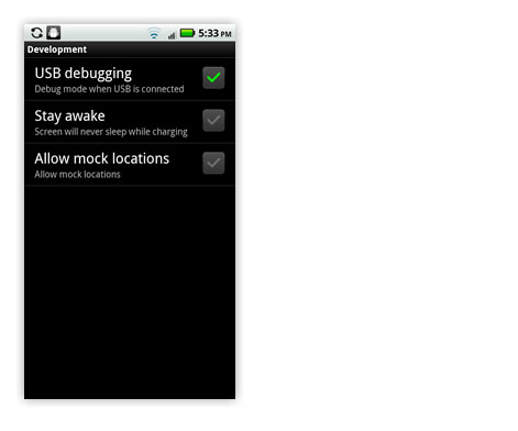
On your Android device:
- Open “Settings” (you’ll find it in the apps menu),
- Tap on “Applications,”
- Tap on “Development,”
- Check the box for “USB debugging.”
Now, for the fun part:
- Connect your Android device to your computer via USB. Windows users: allow Windows to install all drivers. One of the drivers may not be found and will require you to go to the Window’s Device Manager under the Control Panel. There, you can locate the device (having a yellow warning icon next to it) and right-click on it.
- Choose to “update/install” the driver for your device.
- Go to your desktop. Open the Android SDK folder and select SDK Setup.exe.
- Allow it to automatically refresh its list of the operating system SDKs that are available, and select to install all packages.
- Once finished, exit the application.
- Go back to the opened Android SDK folder on your desktop, and open the “Tools” folder.
- Click on the file ddms to open the Dalvik Debug Monitor.
- Select your device from the “Name” pane.
- In the application’s top menu, open the “Device” menu, and choose “Screen capture…” A Device Screen Capture window will open, and you should see the launch screen of your Android device.
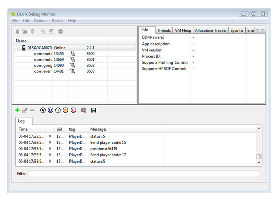
To navigate:
- Grab your Android device and navigate to any page. Go back to your computer and select “Refresh” in the Device Screen Capture window. The current screen from your Android device should appear.
- If you’re on a Mac, you can just do the old Shift + Command + 4 trick to take a screenshot. In Windows, you can copy and paste it into one of the Windows media applications.
About Android Tablets
At CES 2011, companies rained down Android tablets, with an array of screen sizes. However, after a quick review of the most popular ones, we can conclude that the two important screen sizes to focus on in terms of physical pixels are 1280 × 800 and 800 × 480.
With the Android 3.0 Honeycomb release, Google provided device makers with an Android UI made for tablets. Gone is the hard “Back” button, replaced by an anchored software-generated navigation and system status bar at the bottom of the screen.
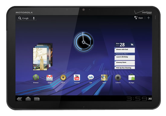
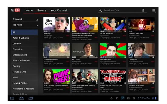
Android 3.0 got a visual refresh, while incorporating all of the design patterns introduced in Android 2.0. One of the major differences with 3.0 is the Action Bar which has been updated to include tabs, drop-down menus or breadcrumbs. The action bar can also change its appearance to show contextual actions when the user selects single or multiple elements on a screen.
Another new feature added to the Android framework with 3.0 is a mechanism called “fragments.” A fragment is a self-contained component in a layout that can change size and position depending on the screen’s orientation and size. This further addresses the problem of designing for multiple form factors by giving designers and developers a way to make their screen layout components elastic and stackable, depending on the screen limitations of the app. Screen components can be stretched, stacked, expanded and collapsed, and revealed and hidden.
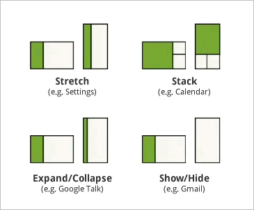
The next Android release, scrumptiously dubbed Ice Cream Sandwich, promises to bring this functionality to Android smartphones as well, giving designers and developers the option to build an app using a one-size-fits-all strategy. This could be a paradigm shift for designers and developers, who will need to learn to think of app design in terms of puzzle pieces that can be stretched, stacked, expanded or hidden to fit the form factor. In short, this will allow one Android OS to run anywhere (with infinite possibilities!).
A Word Of Advice
Do get your hands on an Android phone and tablet, and spend some time downloading apps and exploring their interfaces. In order to design for Android, you have to immerse yourself in the environment and know it intimately. This might sound obvious, but it’s always surprising to hear when even the product manager doesn’t have an Android device.
Online Resources
Here are some links to online resources I’ve found especially useful:
Presentations
Videos
- Designing and Implementing Android UIs for Phones and Tablets (Google I/O 2011)
Android Developers
Other
Further Reading
- What Every App Developer Should Know About Android
- Designing For A Maturing Android
- Mobile Design Practices For Android: Tips And Techniques
- Get Started Developing for Android with Eclipse


 Agent Ready is the new Headless


 SurveyJS: White-Label Survey Solution for Your JS App

